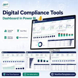
In the modern competitive business world, maintaining top-tier product quality is not a choice—it’s a necessity. With increasing demand for efficiency, transparency, and accountability, businesses need powerful tools to monitor their quality metrics effectively. Enter the Quality Assurance Dashboard in Power BI—a robust, ready-to-use solution that puts actionable insights at your fingertips. 🖥️⚙️
Built on the industry-leading Power BI platform, this dashboard is your go-to tool to visualize QA performance metrics, spot trends, and make data-driven decisions that enhance product and service quality.
✨ Key Features of Quality Assurance Dashboard in Power BI
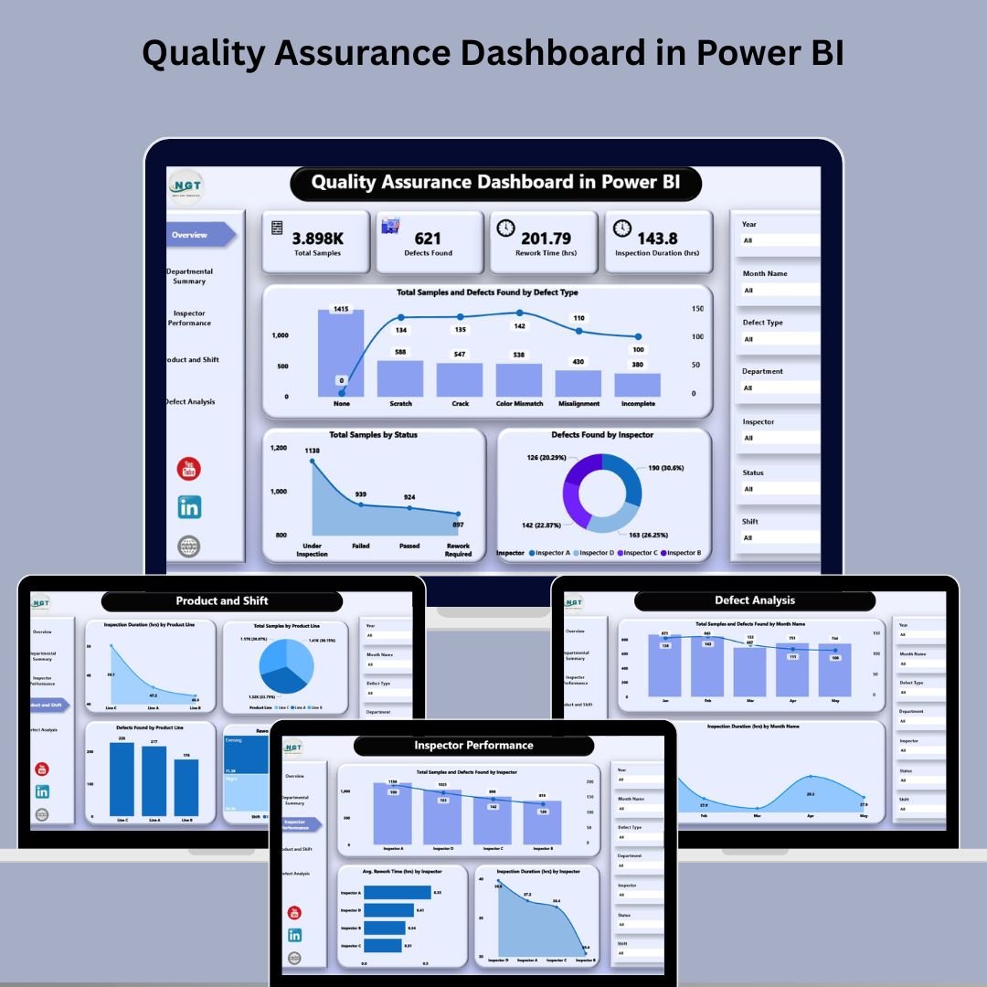
🏠 Overview Page – Quick Performance Summary
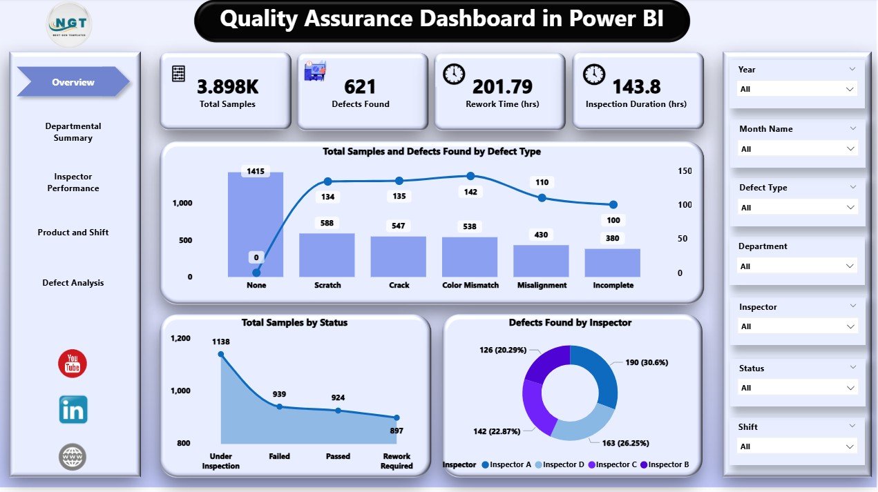
Features 7 dynamic slicers for filtering by department, product, inspector, and more.
5 interactive cards showing total samples, defects, and other KPIs.
Charts include:
Total Samples & Defects Found by Defect Type
Samples by Status
Defects Found by Inspector
➡️ A one-glance summary of your entire QA process performance!
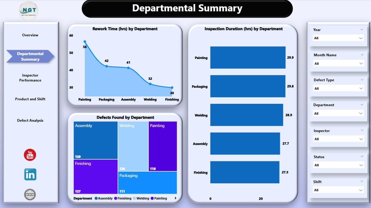
🏢 Departmental Summary – Team-Level Insights
Get breakdowns by department to pinpoint where quality issues originate.
Visualizations include:
Rework Time (hrs) by Department
Inspection Duration (hrs) by Department
Defects Found by Department
Ideal for quality leaders to direct training and process improvement initiatives.
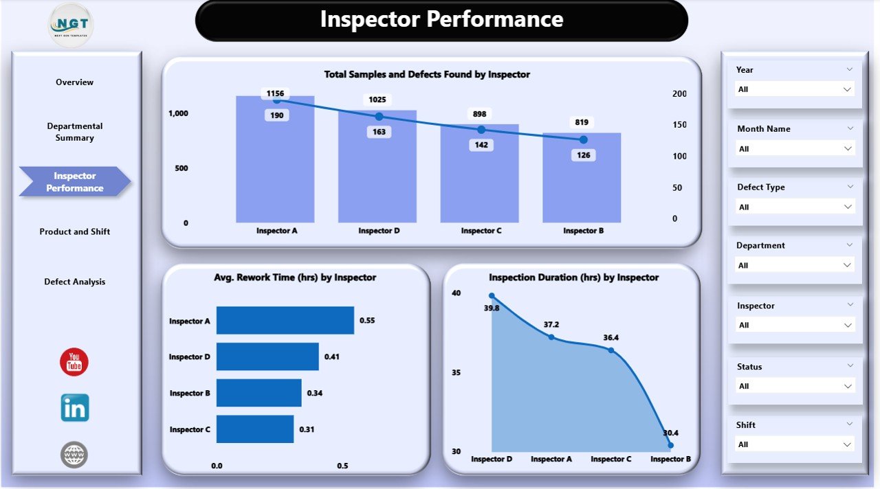
👷 Inspector Performance – Individual Accountability
Track and compare inspector metrics across:
Samples Inspected
Defects Detected
Average Rework Time
Drive transparency and enhance team productivity through data-backed evaluation.
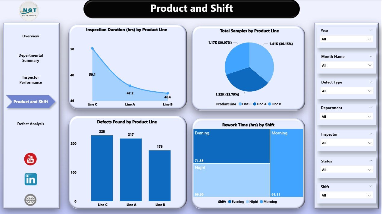
🛠️ Product & Shift View – Operational Insights
Analyze product line and shift-wise performance.
View insights across:
Inspection Duration by Product Line
Defects and Samples by Product
Rework Time by Shift
Helps managers align resources, shift timings, and inspection focus effectively.
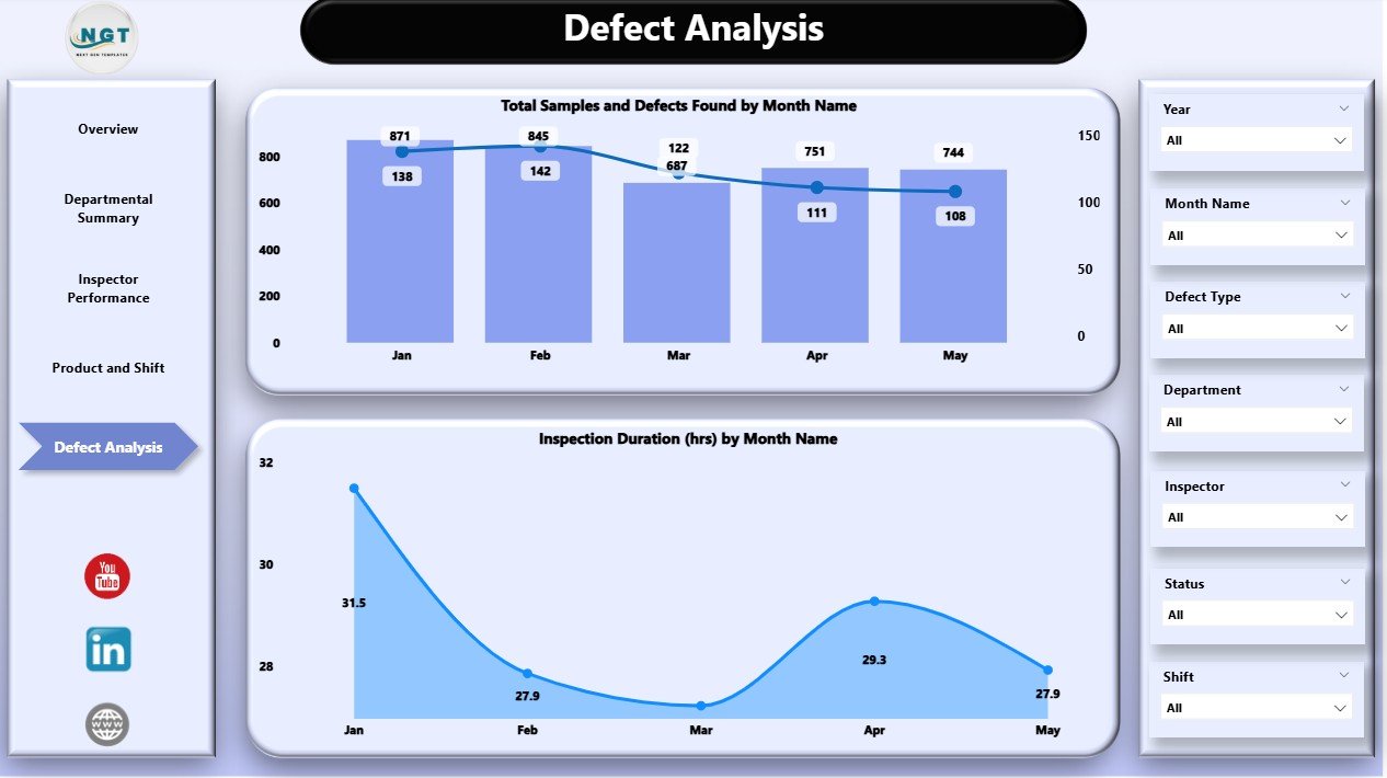
⚠️ Defect Analysis – Trend Spotting
Monitor monthly trends in defects and inspections.
Identify recurring issues early to minimize rework and enhance QA processes.
Visuals include:
Total Samples & Defects by Month
Inspection Duration by Month
📦 What’s Inside the Dashboard?
✅ 5 Powerful Pages – Fully interactive and data-rich
📊 20+ Custom Visualizations – Charts, cards, and slicers
📋 Drilldowns by Inspector, Product, Department, and Shift
⏳ Live Metrics – Rework time, inspection time, and defects
⚡ Connects to Excel – Pull real data and auto-refresh
🔍 Slicers for Data Filtering – Refine insights in real time
🎯 KPI-focused Analysis – Supports better decision-making
📂 Reusable Template – Works across industries and QA setups
🛠️ How to Use the Dashboard
Connect Your Data – Link your Excel QA data to the Power BI file.
Customize Slicers – Set up filters for departments, products, shifts, etc.
Navigate Pages – Explore Overview, Departmental, Inspector, Product & Shift, and Defect Analysis pages.
Spot Trends – Use visualizations to find areas that need action.
Refresh Regularly – Keep your dashboard updated with the latest data.
With minimal setup, your team is ready to make smart, fast, and informed decisions.
👥 Who Can Benefit from This Dashboard?
👨🏭 Quality Managers – Get real-time insights into inspection and rework
🧪 QA Analysts – Monitor trends and prepare actionable reports
🏭 Manufacturing Leads – Identify process inefficiencies across shifts
🧑🔧 Inspectors & Supervisors – Evaluate team performance transparently
📈 Business Leaders – Make high-impact decisions from live metrics
🛍️ Product Managers – Understand how product lines are performing over time