

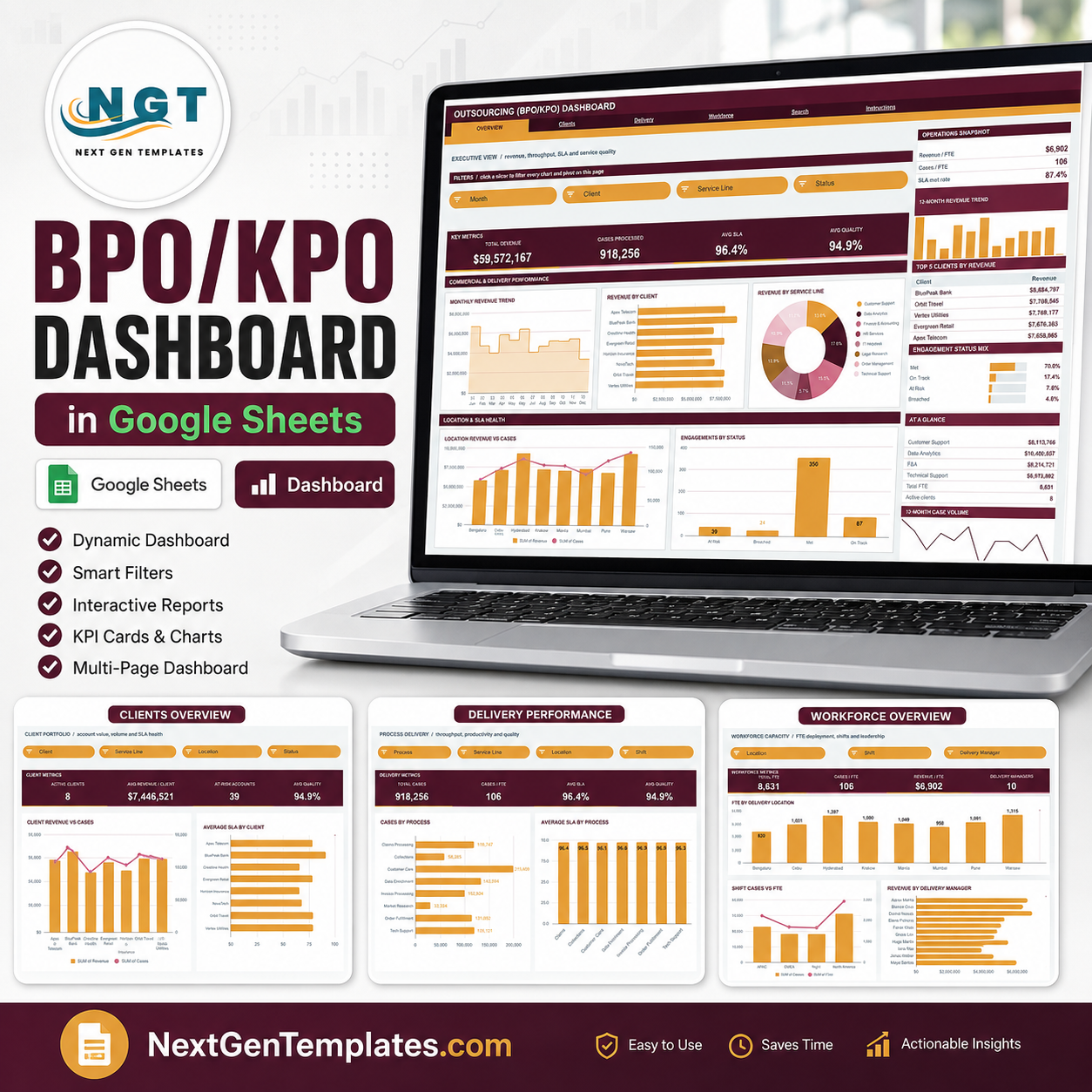

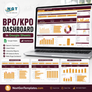
The Outsourcing (BPO/KPO) Dashboard in Google Sheets turns a flat delivery log into a six-tab reporting pack: 16 KPI cards, 18 charts and 15 slicers spread across four report pages, plus an engagement lookup and a built-in user guide. The sample book ships loaded with a full 12 months of engagements across 8 clients, 8 service lines, 8 processes, 8 delivery locations and 4 shifts, showing $59,572,167 in revenue, 918,256 cases, 96.4% average SLA and 94.9% average quality. Every pivot, slicer and formula is pre-wired to 1,000 data rows, so you paste your own engagements over the demo rows and the whole book redraws itself. One-time payment, no subscription, and the file lives in your own Google Drive.
It is built on native Google Sheets pivot tables and slicers – not screenshots, not an add-on, not a script that has to run on a schedule. That matters because the file keeps working with nothing installed, and anyone you share the link with can filter it themselves without touching your data.
Key Features of the Outsourcing (BPO/KPO) Dashboard
- Six tabs, four of them full report pages – Overview, Clients, Delivery and Workforce, plus a Search lookup and an Instructions guide.
- 16 KPI cards – four on every report page, including Total Revenue, Cases Processed, Avg SLA, Avg Quality, Active Clients, Avg Revenue / Client, At-Risk Accounts, Cases / FTE, Revenue / FTE, Total FTE and Delivery Managers.
- 15 native slicers – Month, Client, Service Line, Status, Location, Process, Shift and Delivery Manager, each wired to every pivot on its own page.
- 18 charts – revenue trend areas, revenue-by-client and cases-by-process bars, service-line and status donuts, revenue-vs-cases combo charts and SLA / quality column charts.
- A sidebar on every page – a snapshot block, a 12-month revenue trend, a Top 5 table, a share panel and an At A Glance list that stay visible while you work.
- Engagement Search page – pick any Engagement ID from a dropdown and read all 16 fields of that record on one screen.
- SLA and quality side by side – the engagement status mix (Met, On Track, At Risk, Breached) is reported on three separate pages, so a breach never hides behind a healthy revenue number.
- Auto-expanding to 1,000 rows – paste anywhere up to row 1001 and the pivots, slicers and formulas already cover it. The Apps Script file exposes a
DATA_ROWSconstant if you need more. - Burgundy and sand theme – ink #4A1526 with accent #E8A33D and a rose #D9788F second series, applied consistently across all four pages.
What’s Inside the Outsourcing (BPO/KPO) Dashboard
Overview – the executive view
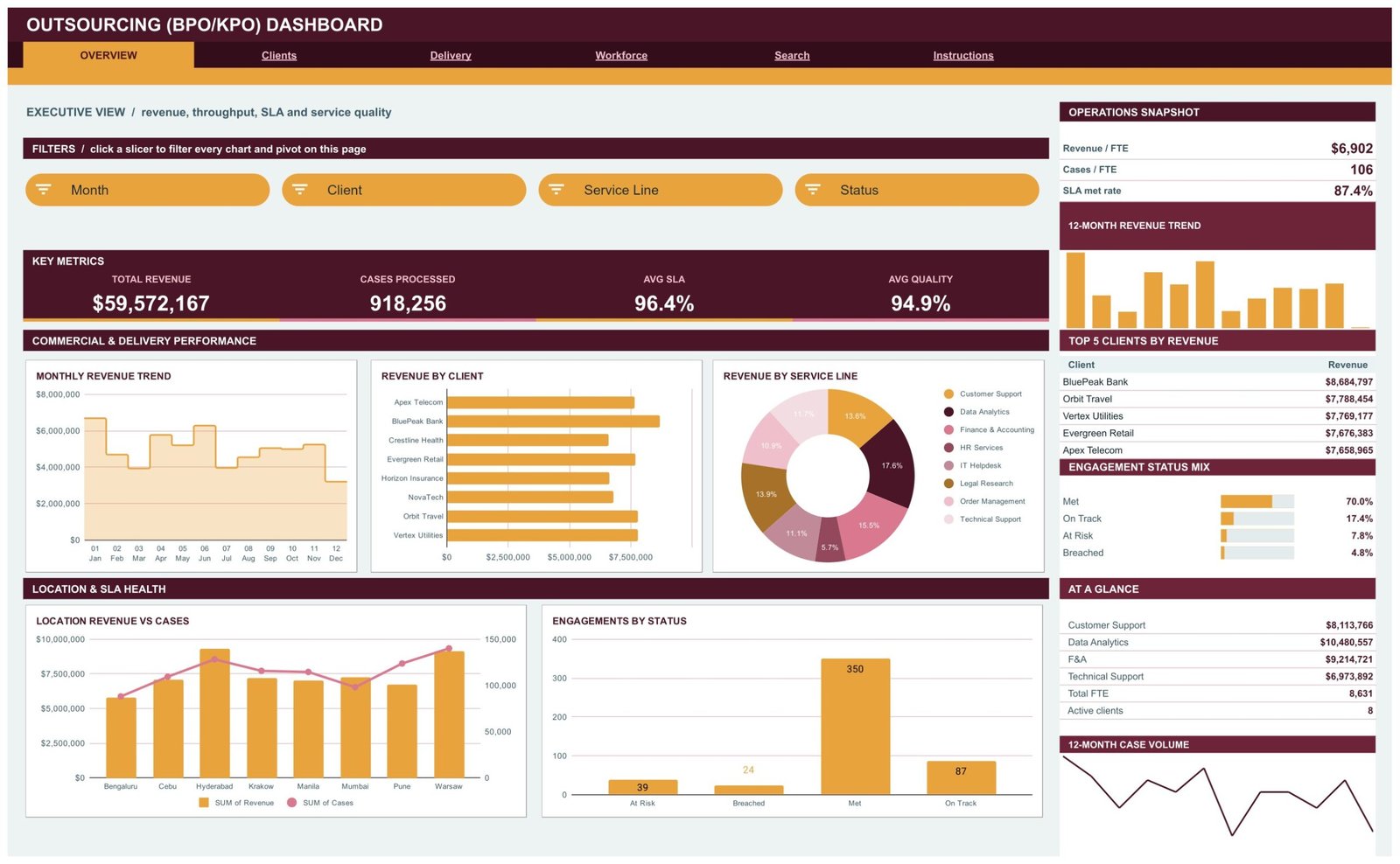
Revenue, throughput, SLA and service quality on one screen. Four slicers (Month, Client, Service Line, Status) drive a monthly revenue trend, revenue by client, a revenue-by-service-line donut, a location revenue-vs-cases combo chart and an engagements-by-status column chart. The sidebar carries an Operations Snapshot (Revenue / FTE $6,902, Cases / FTE 106, SLA met rate 87.4%), the Top 5 Clients by Revenue table and the Engagement Status Mix – Met 70.0%, On Track 17.4%, At Risk 7.8%, Breached 4.8%.
Clients – account value and service health
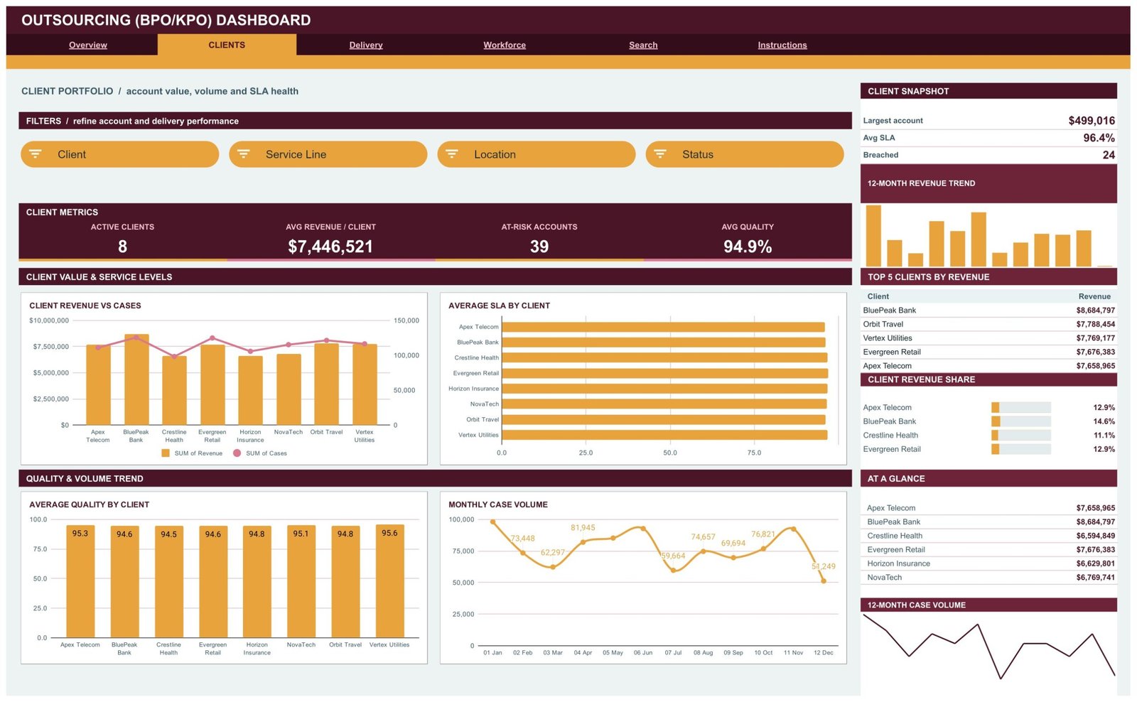
Client-side reporting: Active Clients, Avg Revenue / Client, At-Risk Accounts and Avg Quality as cards, then client revenue vs cases, average SLA by client, average quality by client and a labelled monthly case volume line. The sidebar shows the largest single account, the breached count and each client’s share of revenue.
Delivery – throughput, productivity and quality
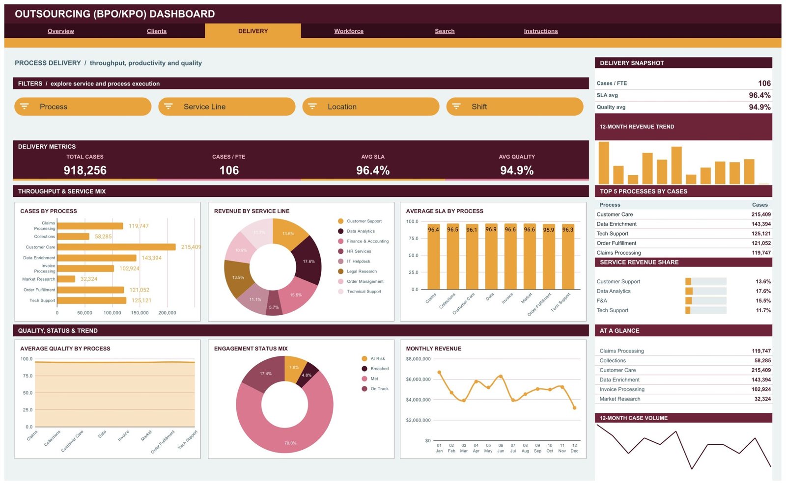
The process view. Cases by Process ranks all eight processes, from Customer Care at 215,409 cases down to Market Research at 32,324, while Average SLA by Process and an Average Quality by Process area chart show whether volume is coming at the cost of service. An Engagement Status Mix donut and a monthly revenue line close the page, with Top 5 Processes by Cases in the sidebar.
Workforce – FTE deployment, shifts and leadership
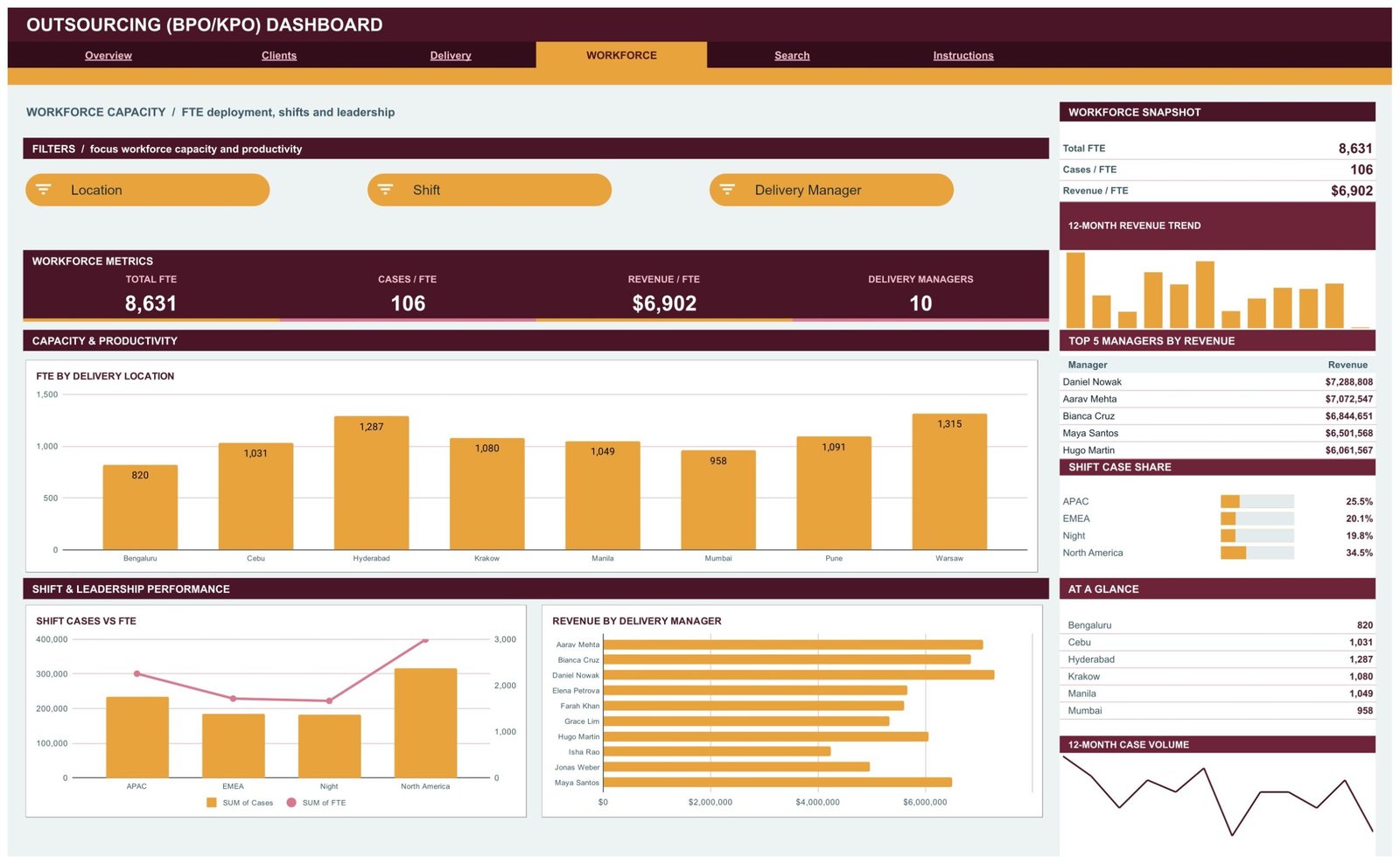
Total FTE 8,631, Cases / FTE 106, Revenue / FTE $6,902 and 10 delivery managers. FTE by Delivery Location compares all eight sites, from Warsaw at 1,315 down to Bengaluru at 820. Shift Cases vs FTE compares APAC, EMEA, Night and North America, and Revenue by Delivery Manager ranks the whole management bench. The sidebar carries Top 5 Managers by Revenue and the Shift Case Share.
Search – one engagement, all 16 fields
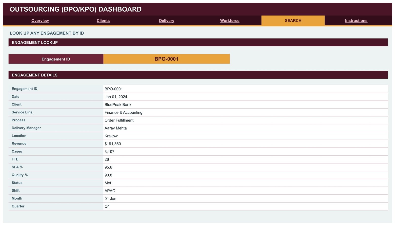
Choose an Engagement ID and the page returns Date, Client, Service Line, Process, Delivery Manager, Location, Revenue, Cases, FTE, SLA %, Quality %, Status, Shift, Month and Quarter. Useful when a client asks about one specific job and you do not want to filter four pages to find it.
Instructions – the ten-step user guide
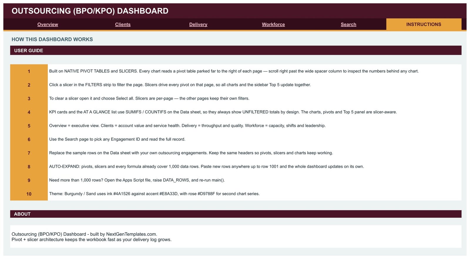
A built-in guide covering where the pivots are parked, how slicers behave per page, why the KPI cards are deliberately unfiltered, how to replace the sample rows and how to raise the row limit past 1,000.
Outsourcing (BPO/KPO) Dashboard vs. Excel vs. Paid BPO Analytics SaaS – Where This Fits
| This Google Sheets dashboard | Excel dashboard file | Paid BPO analytics SaaS | |
|---|---|---|---|
| Cost | One-time payment | One-time, plus a Microsoft 365 licence | Recurring per-seat subscription |
| Platform | Google Sheets, browser only | Desktop Excel | Vendor-hosted web app |
| Setup time | Minutes – copy the file, paste your rows | Minutes, once Excel is installed | Weeks of onboarding and data mapping |
| Real-time team collaboration | Yes, native co-editing | Limited | Yes |
| Mobile access | Yes, Sheets app or browser | Limited | Yes |
| Customisable fields | Fully – it is your spreadsheet | Fully | Only what the vendor exposes |
| Share with a link | Yes, view or edit | File attachment | Yes, per licensed seat |
| Year-1 cost at 5 users | One purchase, five viewers at no extra cost | One purchase plus five Office licences | Five seats, billed every year |
| SLA, quality and FTE on one page | Yes | Yes | Usually separate modules |
| You own the file | Yes, in your own Drive | Yes | No, it lives in the vendor’s system |
Who This Template Is For – and Who It’s Not For
It is for BPO and KPO delivery leads who report monthly to clients, operations managers who need SLA and quality visible next to revenue, account managers tracking eight to fifty client engagements, workforce planners comparing FTE across delivery centres, and small outsourcing firms that want a real reporting pack without paying for an analytics platform.
It is not for real-time queue management – this reports on a log, it does not connect live to a telephony or ticketing system. It is not a billing or invoicing engine, and it is not a workforce management or rostering tool. It is also not a compliance, contractual or legal instrument: the SLA % and Status columns are numbers and labels that you enter and that the dashboard summarises. Nothing here interprets a service agreement, calculates a contractual credit or penalty, or makes any statement about labour law, offshoring rules or data-protection obligations in any country. Treat the output as management reporting and keep contractual and compliance work where it already lives.
How to Use the Outsourcing (BPO/KPO) Dashboard
- Open the PDF in your download and click the “Make a copy” link. The dashboard lands in your own Google Drive.
- Open the Instructions tab first. Ten steps, two minutes, and you will know exactly how the pivots and slicers are wired.
- Go to the Data sheet and replace the sample engagements with your own. Keep the headers exactly as they are – the pivots, slicers and charts read them by name.
- Paste up to row 1001. Everything already covers 1,000 rows. Need more? Open the Apps Script file, raise
DATA_ROWSand re-runmain(). - Filter with the slicer strip. Click a slicer at the top of a page and every chart, pivot and Top 5 panel on that page updates together. Slicers are per page, so each tab keeps its own view.
- Read the KPI cards as totals. They and the At A Glance list use SUMIFS / COUNTIFS on the Data sheet and are unfiltered by design – the charts and the Top 5 panel are the slicer-aware half.
- Share it view-only with the client or the leadership group. They filter the view themselves without ever editing your numbers.
Real-World Use Cases
Priya, delivery head at a 900-seat BPO. Her monthly client review used to be four separate exports. She now pastes the month’s engagement log into the Data sheet, opens the Clients tab, filters to one account, and drops the SLA and quality charts straight into the deck. The At-Risk Accounts card is the first number she checks.
Marcus, operations manager across three delivery centres. He lives on the Workforce tab. FTE by Delivery Location and Shift Cases vs FTE tell him at a glance where headcount and volume have drifted apart, and Revenue by Delivery Manager gives him a like-for-like conversation with each lead.
Anita, founder of a 25-person KPO. No analyst, no BI budget. She keeps one sheet, updates it weekly, and shares a view-only link with her two largest clients. The Search page settles “what happened on engagement BPO-0142?” in five seconds.
Frequently Asked Questions
Does this template make my outsourcing operation compliant with anything?
No. It is a reporting template. It does not interpret contracts or service agreements, does not calculate contractual credits or penalties, and makes no claim about labour law, offshoring regulation or data-protection requirements anywhere. The SLA and quality figures are values you enter; the dashboard only totals and charts them.
Do I need Excel or any add-on?
No. It runs entirely in Google Sheets in a browser, using native pivot tables and slicers. Nothing to install and nothing to subscribe to.
How many rows can I load?
1,000 out of the box – every pivot, slicer and formula already covers that range. Beyond that, open the Apps Script file, raise the DATA_ROWS constant and re-run main().
Why don’t the KPI cards change when I click a slicer?
That is deliberate. The KPI cards and the At A Glance list use SUMIFS / COUNTIFS on the Data sheet and always show unfiltered totals, so you keep a fixed reference point while the charts, pivots and Top 5 panel respond to the slicers.
Is the data in the screenshots real?
No. Every client, manager, location and figure you see is generated sample data, there so the charts are readable before you load your own. Replace all of it on the Data sheet.
Can my team and my client use it at the same time?
Yes. It is a normal Google Sheet, so co-editing and view-only sharing work exactly as they always do. Share view-only if you want people to read and filter without changing anything.
Can I change the colours and add my own service lines?
Yes. The theme is plain Sheets formatting, and the service lines, processes, clients and locations are just values in the Data sheet – add your own and the pivots pick them up.
About the Author
Built by PK – Microsoft Certified Professional with 15+ years of Excel, Google Sheets, and Power BI experience. Founder of NextGenTemplates, reaching 300K+ subscribers across YouTube channels. Every template is hand-built and tested before release.
Explore Related Templates
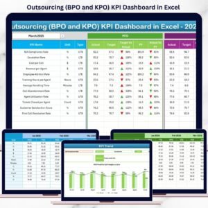
- Outsourcing (BPO KPO) Dashboard in Excel – the same subject built as a desktop Excel workbook.
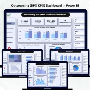
- Outsourcing (BPO KPO) Dashboard in Power BI – for teams already running Power BI Desktop.
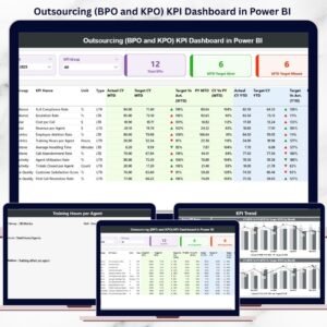
- Outsourcing (BPO and KPO) KPI Dashboard in Excel – a month-picker KPI scorecard rather than an analytical dashboard.
- Knowledge Management Dashboard in Google Sheets – a companion for the knowledge side of a KPO practice.
- Transportation Services Dashboard in Google Sheets – the same pivot-and-slicer architecture applied to logistics.
- Browse every Google Sheets Dashboard or the wider Google Sheets catalogue.
Get the Outsourcing (BPO/KPO) Dashboard in Google Sheets today. One payment, instant download, and a PDF with the “Make a copy” link that puts the whole six-tab book in your own Drive in under a minute. A full walkthrough is on the blog: Outsourcing (BPO/KPO) Dashboard in Google Sheets.
Last updated: 21 August 2026.






















Reviews
There are no reviews yet.