

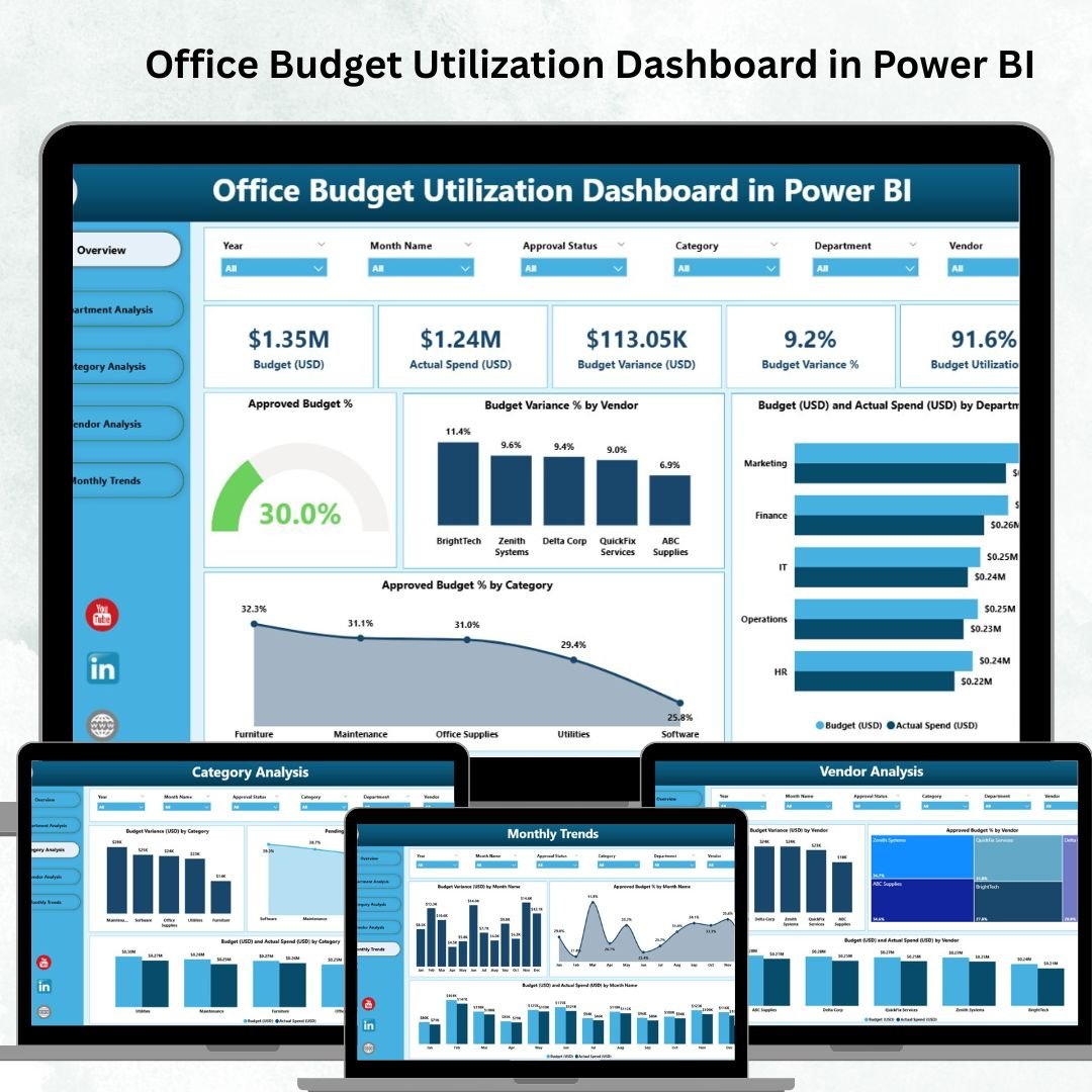

Managing office budgets effectively is one of the biggest challenges organizations face. Overspending, underutilization, and lack of visibility often create financial gaps that can impact growth. That’s why we created the Office Budget Utilization Dashboard in Power BI — a powerful, pre-built financial reporting solution that turns raw data into actionable insights 📊.
Instead of struggling with endless spreadsheets or waiting for monthly reports, you can now access real-time insights into budgets, spending, and variances across departments, categories, and vendors — all in one interactive dashboard.
This tool is designed for decision-makers who want clarity, accuracy, and accountability in budget utilization.
✨ Key Features of the Office Budget Utilization Dashboard in Power BI
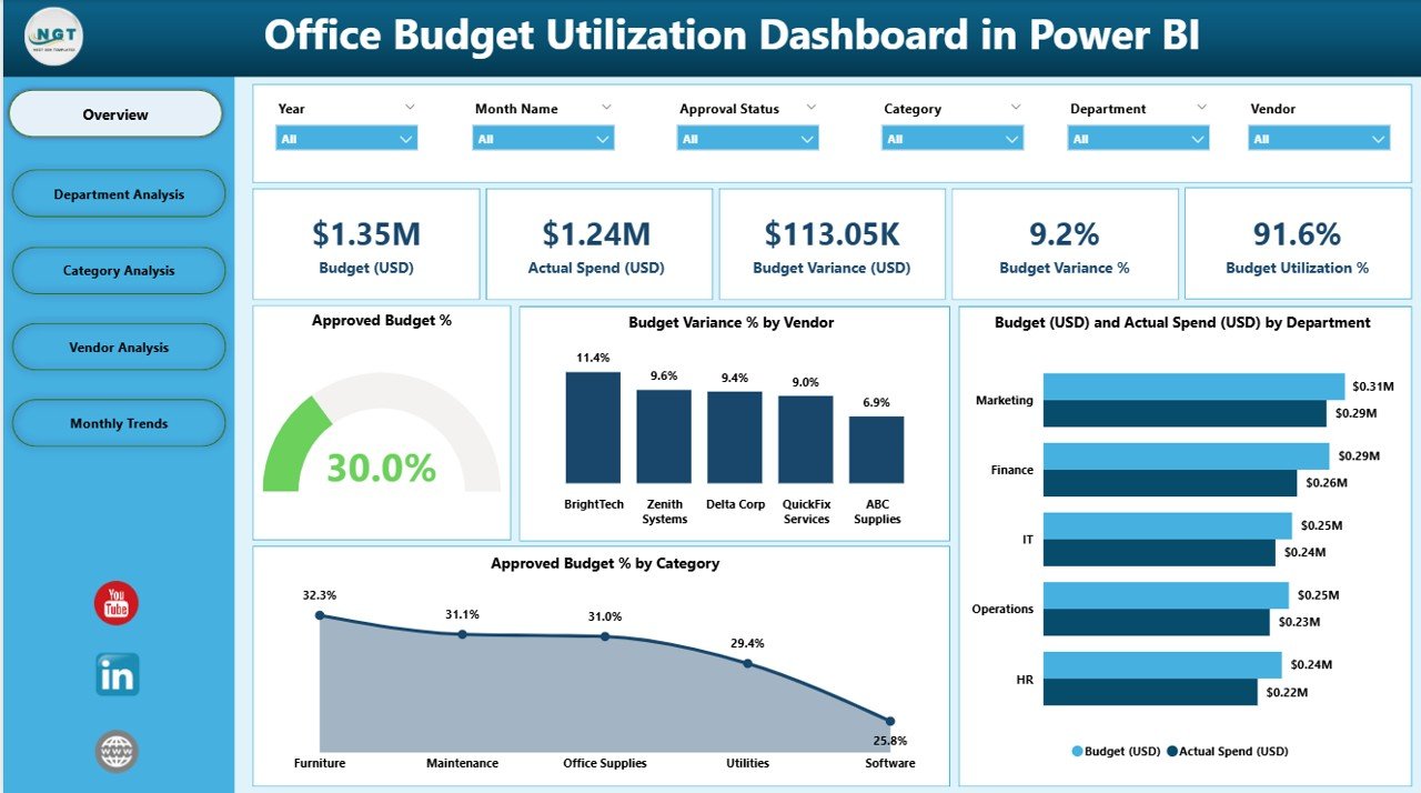
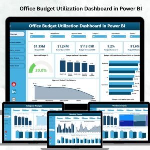
✅ Comprehensive Overview Page – High-level KPIs and summary charts for quick financial health checks.
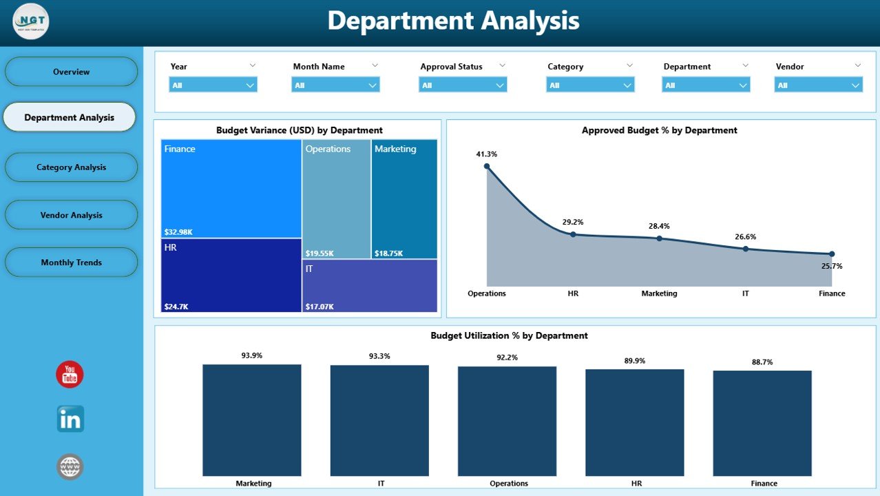
✅ Department Analysis Page – Drill into departmental spending, variances, and efficiency levels.
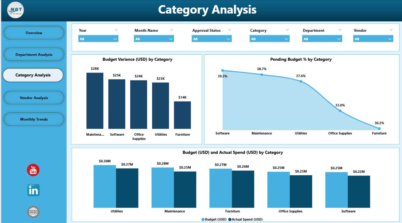
✅ Category Analysis Page – Understand budget allocation and utilization across categories like Marketing, HR, IT, and Operations.
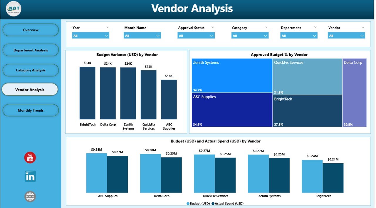
✅ Vendor Analysis Page – Evaluate costs and utilization for each vendor, promoting transparency and better negotiations.
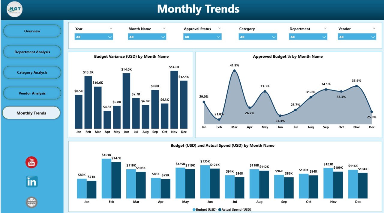
✅ Monthly Trends Page – Track spending behavior over time, detect seasonality, and improve forecasting.
✅ Interactive Slicers – Filter by time period, vendor, or category for personalized insights.
✅ Real-Time Data Refresh – Always work with the most up-to-date financial information.
✅ Scalable & Flexible – Connect with Excel, ERP, or other data sources to adapt it to your business needs.
📂 What’s Inside the Office Budget Utilization Dashboard
When you download this ready-to-use dashboard, you’ll get:
Overview Page – KPI cards & 4 financial charts (Budget %, Variance %, Department Spend, Category Spend).
Department Analysis Page – Variance, utilization %, and budget use by department.
Category Analysis Page – Pending budgets, category variances, and budget vs actuals.
Vendor Analysis Page – Vendor-specific spending patterns, utilization %, and cost overruns.
Monthly Trends Page – Compare budget vs actual spend by month, and identify forecasting gaps.
This five-page structure ensures every angle of financial management is covered.
⚡ How to Use the Office Budget Utilization Dashboard
Using the dashboard is simple and requires no technical expertise:
1️⃣ Connect Data – Link Excel sheets, ERP, or other financial data sources.
2️⃣ Explore KPIs – Use the Overview page to get instant financial health insights.
3️⃣ Dive Deeper – Navigate to Department, Category, or Vendor pages for detailed analysis.
4️⃣ Track Trends – Use Monthly Trends to forecast and identify spending patterns.
5️⃣ Filter Insights – Apply slicers to customize the view for your needs.
6️⃣ Share Reports – Export or share Power BI dashboards with stakeholders.
🎯 Who Can Benefit from the Office Budget Utilization Dashboard?
This dashboard is designed for organizations of all sizes and industries:
🏢 Corporate Teams – Gain department-level accountability and transparency.
🏥 Healthcare & Education – Track funding utilization across programs and vendors.
🛠 Operations & Procurement – Ensure vendors meet financial agreements.
📊 Finance Leaders – Monitor high-level KPIs and detect overspending quickly.
💡 Small & Medium Businesses – Optimize every dollar with real-time tracking.
✅ Why Choose This Dashboard?
Real-time visibility into budgets & variances
Improves decision-making with accurate insights
Promotes department-level accountability
Detects overspending & underutilization early
Ensures vendor cost transparency
Enhances forecasting & financial planning
📖 Click here to read the Detailed blog post
📺 Visit our YouTube channel to learn step-by-step video tutorials
Watch the step-by-step video tutorial:
Compatibility and Requirements
- Opens in Power BI Desktop, which is free. Microsoft explains the download in Get Power BI Desktop.
- Slicers filter the report by time period, vendor or category.
Frequently Asked Questions
What pages does the dashboard have?
Five pages: Overview, Department Analysis, Category Analysis, Vendor Analysis and Monthly Trends.
What is on the Overview page?
KPI cards and four charts: Budget %, Variance %, Department Spend and Category Spend.
Can I filter by vendor or category?
Yes. Slicers filter the report by time period, vendor or category.
Where does the data come from?
You connect Excel sheets or other financial data sources, then refresh the report.
Related Budget Templates
- Office Budget Utilization Dashboard in Excel: the same topic for Excel users
- Office Budget Utilization Dashboard in Google Sheets: the same topic in Google Sheets
- Office Budget Utilization Report in Excel: a report version in Excel
- Budget Forecasting Dashboard in Power BI: forecasts budgets in Power BI
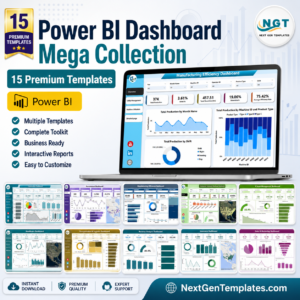
- Power BI Dashboard Mega Collection: 15 premium Power BI templates in one bundle
Browse all Power BI dashboards or the Power BI templates.











Reviews
There are no reviews yet.