


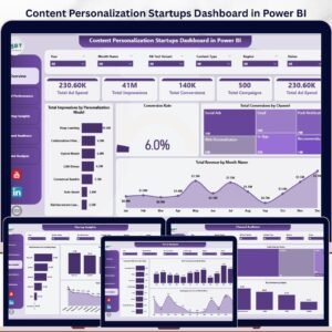
Content Personalization Startups Dashboard in Power BI helps startup founders, growth teams, and marketing analysts review 5 report pages, 5 headline KPI cards, and 16 chart views in one editable PBIX file. Instead of paying recurring BI, CRM, or marketing analytics fees, teams can use this $17.99 Power BI template to monitor ad spend, impressions, conversions, revenue, channel performance, personalization models, startup funding stages, devices, regions, and engagement trends. Open the file in Power BI Desktop, connect or replace the sample data, refresh the model, and use slicers to move from broad performance review to filtered decision-making.
Instant download. One-time payment. No subscription. No per-user template fee. Built for Power BI Desktop.
Key Features of Content Personalization Startups Dashboard in Power BI
- 5 Power BI report pages covering Overview, Model Performance, Startup Insights, Channel Audience, and Trend Analysis.
- Executive KPI cards for Total Ad Spend, Total Impressions, Total Conversions, Total Campaigns, and campaign investment visibility.
- 16 analytical chart views for ad spend, impressions, conversions, revenue, conversion rate, engagement, channel, device, region, funding stage, and content type analysis.
- Personalization model reporting to compare impressions, conversion rate, and revenue by model.
- Startup-specific insights by funding stage and startup name for portfolio, accelerator, and SaaS growth reporting.
- Interactive slicers so users can quickly filter report pages and review focused segments.
- Editable PBIX format for changing measures, visuals, fields, colors, and report layout in Power BI Desktop.
What’s Inside the Content Personalization Startups Dashboard in Power BI
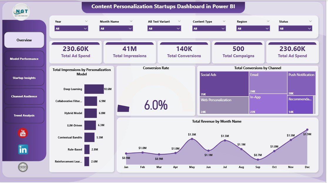
1. Overview Page
The Overview Page is the leadership snapshot for personalization campaign performance. The top cards show Total Ad Spend, Total Impressions, Total Conversions, Total Campaigns, and ad investment context, giving teams a fast read on reach, budget, and conversion activity.
Total Impressions by Personalization Model: This chart compares reach across different personalization approaches. It helps teams see which model is receiving the most exposure and whether campaign delivery matches the testing plan.
Conversion Rate: The conversion rate visual shows how efficiently audience interactions turn into desired actions. Use it to compare performance after applying slicers for channel, model, month, or audience segment.
Total Conversions by Channel: This chart highlights which channels are producing the most conversions. It helps growth teams decide where to shift campaign budget, content effort, or testing priority.
Total Revenue by Month Name: This monthly revenue trend shows whether personalization campaigns are creating steady commercial movement. It is useful for monthly reviews, investor updates, and campaign planning.
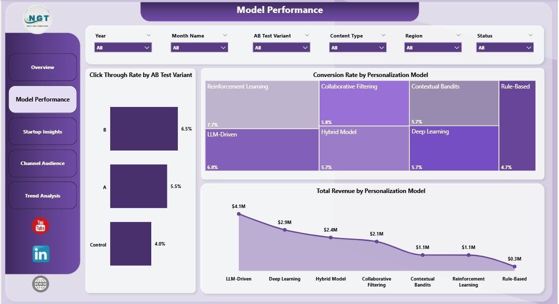
2. Model Performance
The Model Performance page helps teams compare personalization logic and A/B test outcomes. Click Through Rate by AB Test Variant shows which test version attracts more clicks, while Conversion Rate by Personalization Model shows which model converts traffic more effectively.
Total Revenue by Personalization Model connects each model to business results, not only engagement. This page is especially useful when deciding which personalization approach to scale, pause, or refine.

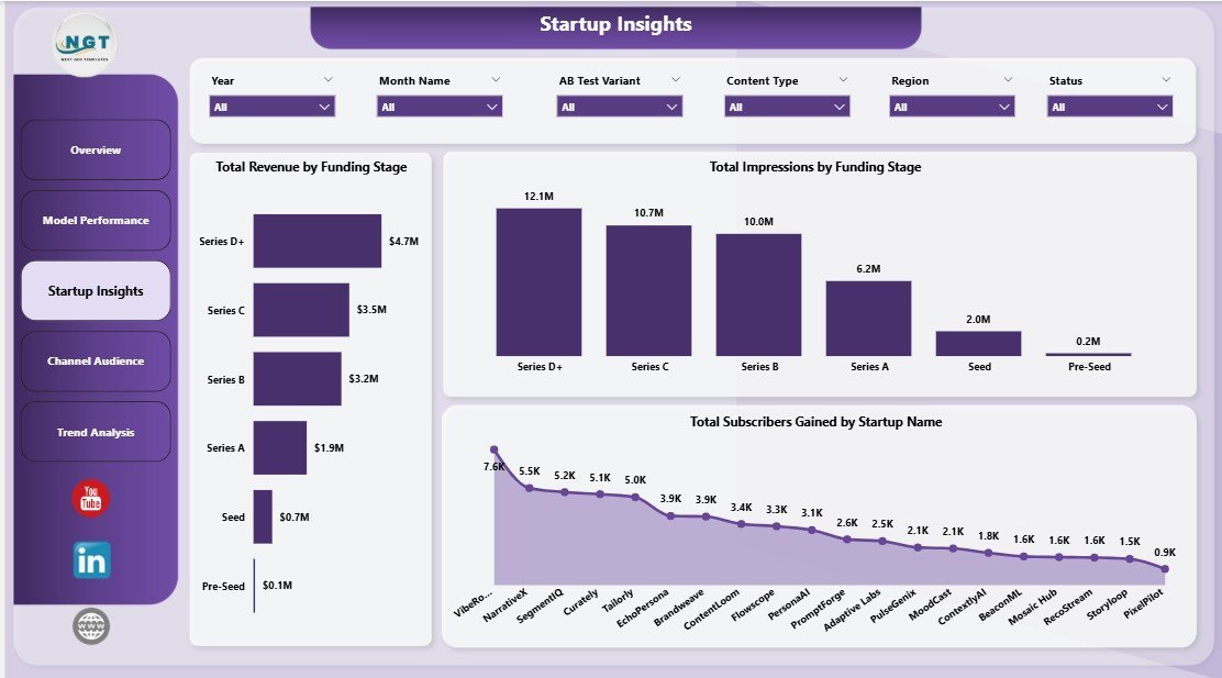
3. Startup Insights
The Startup Insights page connects campaign response with startup maturity and individual company performance. Total Revenue by Funding Stage helps teams understand whether seed, Series A, growth, or later-stage cohorts generate stronger revenue results.
Total Impressions by Funding Stage explains reach by company maturity, while Total Subscribers Gained by Startup Name identifies which startups are building audience momentum. This is valuable for accelerators, venture studios, startup marketers, and SaaS portfolio reporting.

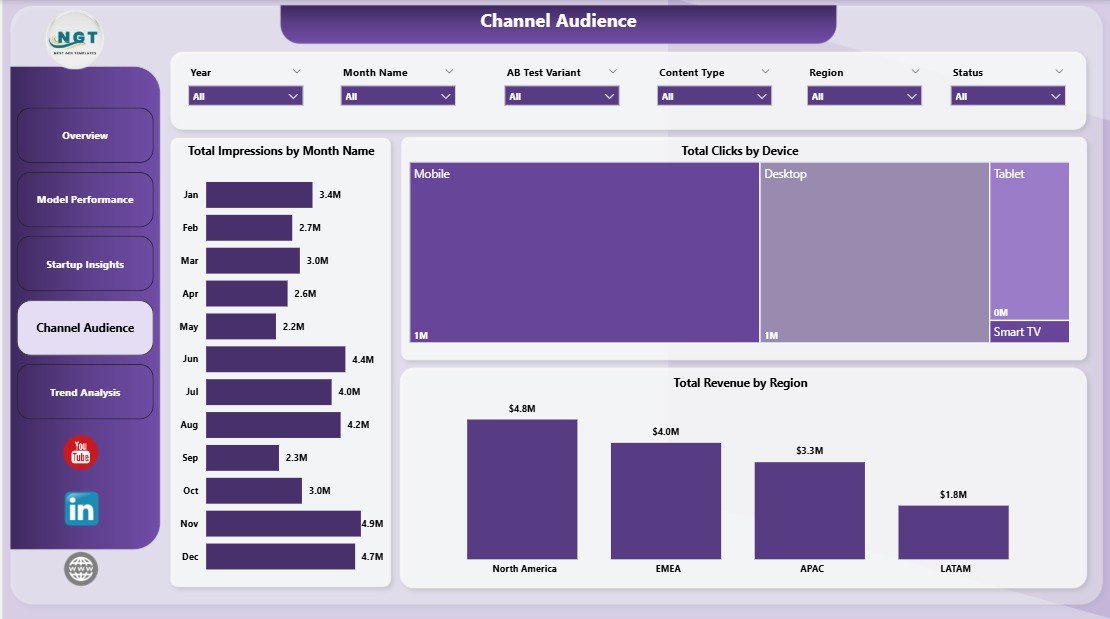
4. Channel Audience
The Channel Audience page shows how audience reach, clicks, and revenue vary across the reporting model. Total Impressions by Month Name reveals reach trends over time, making it easier to spot campaign seasonality or delivery changes.
Total Clicks by Device compares engagement across desktop, mobile, and other device groups. Total Revenue by Region shows which markets are producing stronger commercial outcomes, helping teams refine targeting and budget allocation.
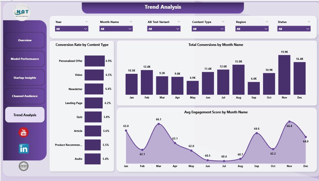
5. Trend Analysis
The Trend Analysis tab is built for month-end reporting and campaign learning. Conversion Rate by Content Type shows which content formats turn attention into action most effectively.
Total Conversions by Month Name helps teams track conversion volume over time, while Avg Engagement Score by Month Name shows whether audience quality and content relevance are improving. Together, these visuals support planning for future content and personalization experiments.
Content Personalization Startups Dashboard in Power BI vs. Tableau vs. Paid CRM/SaaS – Where This Fits
| Feature | This Power BI Dashboard | Tableau Alternative | Paid CRM/SaaS Alternative |
|---|---|---|---|
| Cost | $17.99 one-time template price | License or custom build cost | Monthly subscription or seat-based pricing |
| Platform | Power BI Desktop and Power BI Service | Tableau Desktop or Cloud | Vendor-hosted CRM or marketing platform |
| Setup time | Under 10 minutes after data mapping | Depends on workbook setup | Often requires onboarding and configuration |
| Personalization model analysis | Included across model and overview pages | Possible with custom build | Often limited by reporting plan |
| Customizable fields | Editable PBIX data model and visuals | Editable with Tableau skills | Limited by vendor permissions |
| Year-1 cost at 5 users | $17.99 plus Microsoft licensing you already use | Can rise with licenses | Can reach hundreds or thousands per year |
Who This Template Is For – and Who It’s Not For
This template is for content personalization startups, SaaS growth teams, lifecycle marketers, CRM analysts, startup accelerators, portfolio operators, and founders who already export campaign data and need a clear Power BI reporting layer.
It is not a live personalization engine, customer data platform, CRM automation workflow, attribution warehouse, or API sync package. If you need real-time identity resolution or automated campaign execution, use this template as an analytics companion rather than the core personalization platform.
How to Use the Content Personalization Startups Dashboard in Power BI
- Download and unzip the product file after purchase.
- Open the PBIX file in Power BI Desktop.
- Review the included sample data and report pages.
- Replace or connect the data source with your own campaign, startup, channel, and revenue data.
- Refresh the report so KPI cards, slicers, charts, and measures update.
- Use the five report pages for weekly growth reviews, monthly reporting, or investor updates.
Real-World Use Cases
Aisha, SaaS founder: She reviews the Overview and Trend Analysis pages before investor updates to explain ad spend, impressions, conversions, and revenue movement.
Daniel, lifecycle marketing lead: He compares A/B variants and personalization models before deciding which experiments should receive more traffic next month.
Meera, CRM analyst: She refreshes campaign exports in Power BI and uses slicers to share startup, channel, device, and region insights with the growth team.
Frequently Asked Questions
What does this dashboard track?
It tracks ad spend, impressions, conversions, campaigns, conversion rate, revenue, personalization model performance, A/B test variants, channels, funding stages, subscribers gained, devices, regions, content types, and engagement trends.
Do I need Power BI Desktop?
Yes. Open and customize the PBIX file in Power BI Desktop, which is free from Microsoft.
Can I replace the sample data?
Yes. Replace the sample source with your own structured campaign data, map the fields consistently, and refresh the report.
Can I customize the visuals?
Yes. You can edit report pages, colors, visuals, measures, data model fields, and slicers inside Power BI Desktop.
Does it connect directly to HubSpot, Salesforce, Segment, or an ad platform?
No prebuilt live connector is included. You can connect Power BI to supported sources or exported data if your team has the required access.
Is this a one-time purchase?
Yes. The template is sold as a one-time download from NextGenTemplates with no template subscription fee.
About the Author
Built by PK – Microsoft Certified Professional with 15+ years of Excel, Google Sheets, and Power BI experience. Founder of NextGenTemplates, reaching 300K+ subscribers across YouTube channels. Every template is hand-built and tested before release.
Explore Related Templates
- Content Personalization Startups Dashboard in Excel – spreadsheet version for teams that prefer Excel.
- Contact Center AI Dashboard in Power BI – AI service analytics and containment reporting.
- Employee Training KPI Dashboard in Power BI – KPI tracking in Power BI.
- Browse Power BI Dashboard templates.
Click here to read the detailed blog post
Ready to turn personalization campaign data into decision-ready Power BI visuals? Download the Content Personalization Startups Dashboard in Power BI and start tracking campaign performance with a cleaner reporting workflow.
Last updated: May 2026


Reviews
There are no reviews yet.