

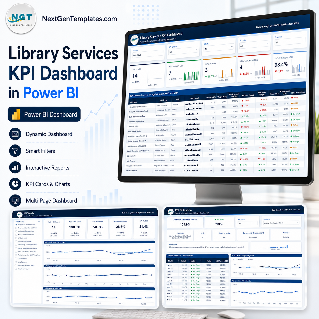
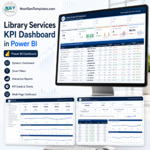
The Library Services KPI Dashboard in Power BI is a month-picker KPI scorecard for public library systems: 14 library KPIs across 6 KPI groups, each scored against its own target with MTD and YTD traffic lights, a 12-month sparkline and a year-over-year arrow. Four report pages, five synced slicers, two hover tooltip pages, and a fully editable .pbix – no locked visuals, no custom visuals to install, no subscription. The sample data runs a full twelve months to Dec 2025, so every page renders the second you open it. Download once and own the file for life, then swap in your own numbers through the three-sheet Data.xlsx that ships in the same zip.
This is the scorecard, not the analytics report. NextGenTemplates publishes two different library products and they are not interchangeable. This one answers “which KPIs hit target this month, and which did not?” If you want a slice-and-dice analytical report instead, the Libraries & Archives KPI Dashboard in Power BI covers a wider archives-and-special-collections scope. The same scorecard also exists as the Library Services KPI Dashboard in Excel and the Library Services KPI Dashboard in Google Sheets if Power BI Desktop is not your reporting tool.
Key Features of the Library Services KPI Dashboard in Power BI
- 14 KPIs in 6 groups – Access & Usage, Collection Use, Programs & Outreach, Community Reach, Finance & Efficiency and Service Delivery.
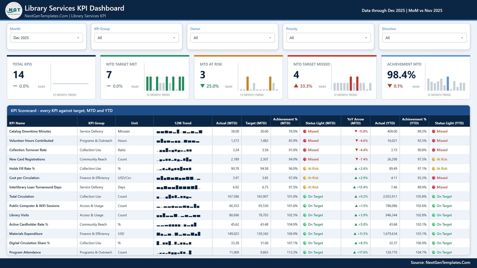
- Twelve scorecard columns – KPI Name, KPI Group, Unit, 12M Trend, Actual (MTD), Target (MTD), Achievement % (MTD), Status Light (MTD), YoY Arrow (MTD), Actual (YTD), Achievement % (YTD) and Status Light (YTD).
- Five summary cards – Total KPIs, MTD Target Met, MTD At Risk, MTD Target Missed and Achievement MTD, each with a month-on-month delta and its own 12-month trend bar.
- Direction-aware scoring – eleven KPIs are higher-is-better and three are lower-is-better, so Cost per Circulation, Interlibrary Loan Turnaround Days and Catalog Downtime Minutes score above 100% when they come in under target.
- Five slicers, synced across pages – Month, KPI Group, Owner, Priority and Direction.
- Two hover tooltip pages – compact 280×360 tooltip reports that appear when you hover a KPI row or a trend point.
- Custom theme in one file – recolour the whole report from the theme rather than visual by visual.
What’s Inside the Library Services KPI Dashboard in Power BI
The zip contains three files: the .pbix report, the Data.xlsx workbook it reads, and a Power BI Dashboard user manual in PDF. The report holds six pages – four you navigate and two hidden tooltip pages.
- Page 1 – KPI Scorecard. The month picker sits top-left; below it the five summary cards, then the full 14-row table. Traffic lights read On Target, At Risk or Missed, and each row carries both the MTD and the YTD verdict so a good month inside a bad year is visible immediately.
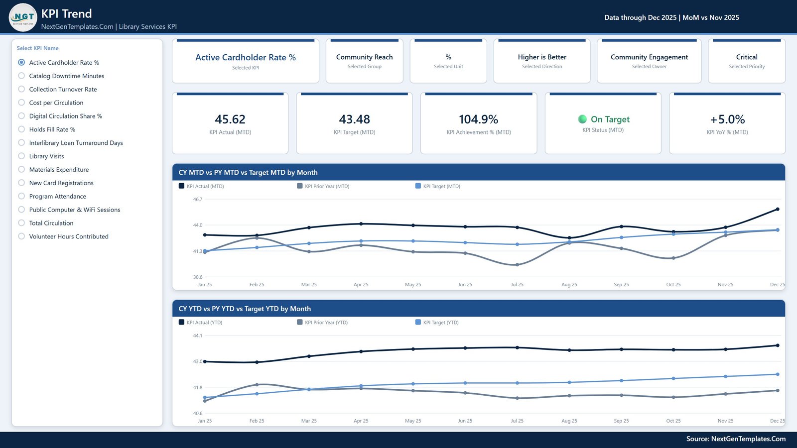
- Page 2 – KPI Trend. Pick one KPI from the list on the left. Six context cards restate its group, unit, direction, owner and priority; five value cards show Actual, Target, Achievement %, Status and YoY %; two line charts plot CY MTD vs PY MTD vs Target MTD by Month and CY YTD vs PY YTD vs Target YTD by Month.
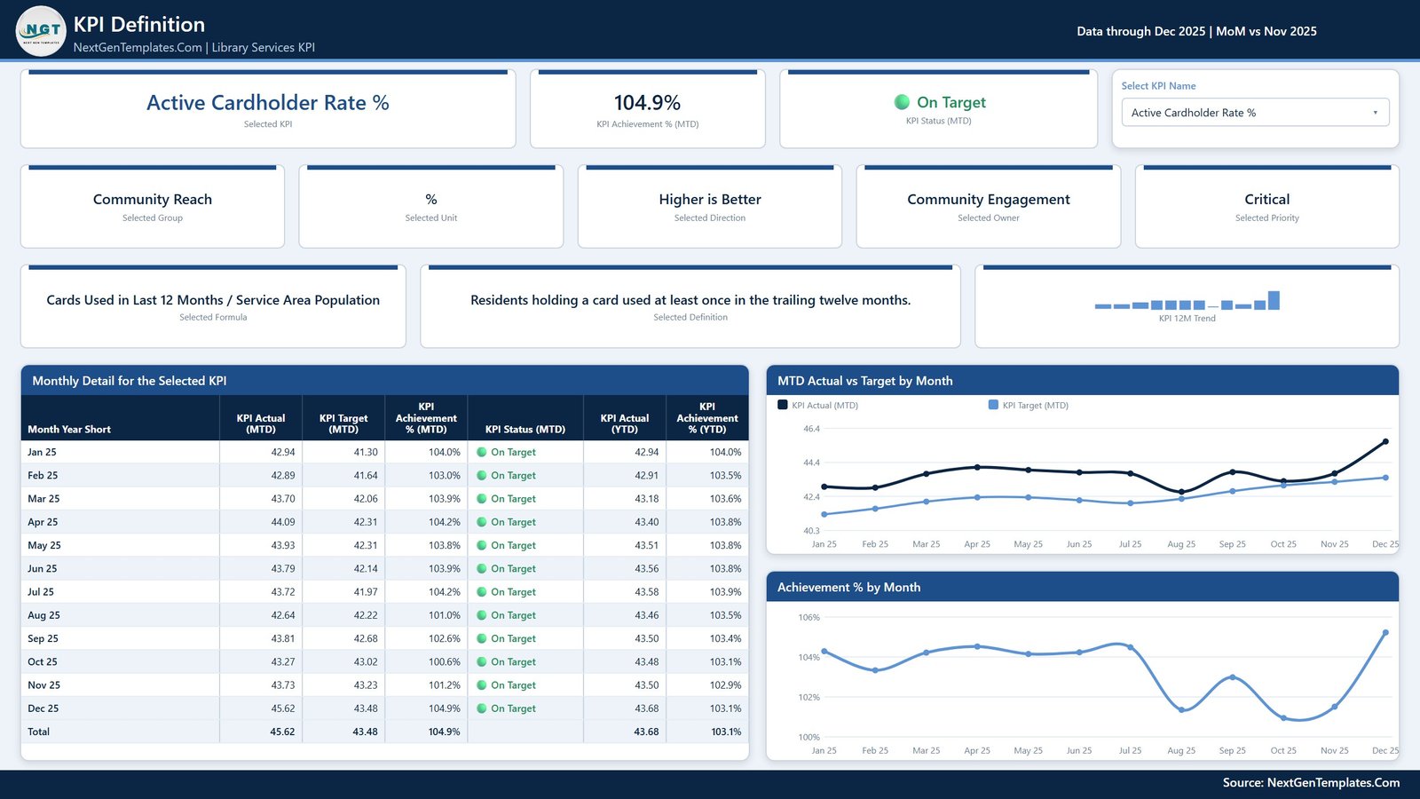
- Page 3 – KPI Definition. The same KPI selection, synced across from page 2, plus the formula and the plain-English definition, a 12-month trend, a month-by-month detail table and the MTD Actual vs Target by Month and Achievement % by Month charts.
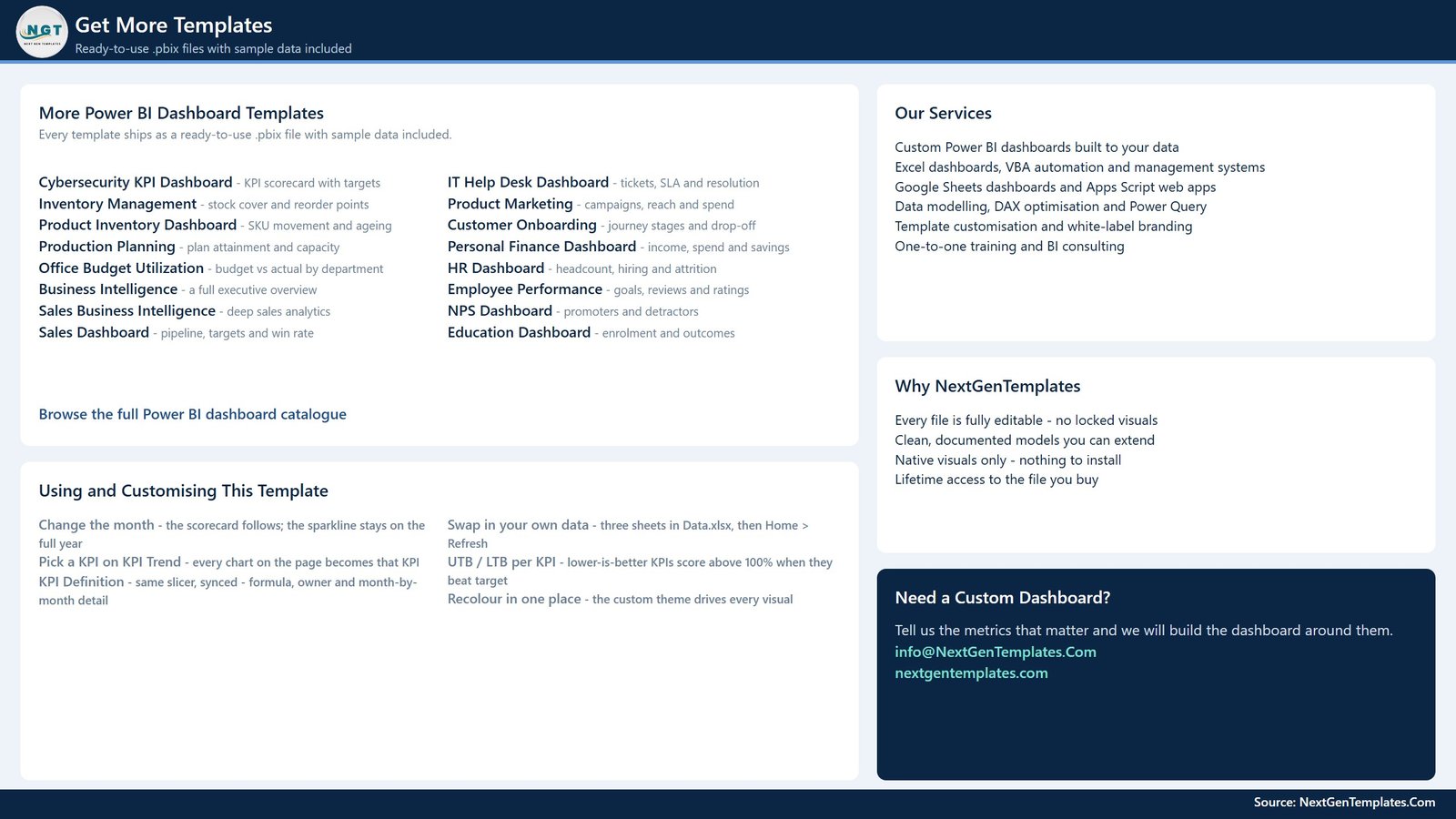
- Page 4 – Get More Templates. An in-report catalogue page with customisation notes and NextGenTemplates contact details. It ships as part of the file and is shown in the gallery above so there are no surprises.
Data.xlsx has three input sheets plus a Read Me: Input_ Target (168 rows – 14 KPIs across 12 months), Input_ Actual (336 rows – the same grid for the current and prior year) and KPI Definition (14 rows by 9 columns: group, name, unit, formula, definition, direction, owner and priority).
Power BI Scorecard vs a Tableau or Qlik Build vs Paid Library Analytics Software – Where This Fits
| This Power BI scorecard | Tableau / Qlik build | Paid library analytics platform | |
|---|---|---|---|
| Cost | One-off template price | Per-user licence plus build time | Annual subscription |
| Platform | Power BI Desktop (free) | Tableau or Qlik | Vendor-hosted web app |
| Setup time | Paste your numbers, then Refresh | Built from scratch | Vendor onboarding |
| Connects to your ILS | No – reads Data.xlsx | Depends on the build | Usually yes |
| Real-time team collaboration | Via Power BI Service if you publish | Via the vendor’s server | Built in |
| Mobile access | Power BI mobile app | Vendor app | Built in |
| Customisable fields | Every visual and measure is editable | Yes | Vendor-defined |
| Share with a link | After publishing to the Service | After publishing | Built in |
| Year-1 cost at 5 users | The template price, once | Five licences plus build | Five seats, recurring |
| MTD and YTD lights side by side | Yes | Build it yourself | Varies |
Who This Template Is For – and Who It’s Not For
It is for public library directors and branch managers who report monthly to a board or a funding authority, library systems and assessment staff who already export circulation and gate-count numbers, and consultants who need a presentable scorecard without a two-week build.
It is not for you if you need a live connection to an ILS, discovery layer or gate-counter feed – this reads a workbook you maintain. It is not a benchmarking product: the targets in the sample file are placeholders, and you set your own. And if you want per-item, per-branch or per-patron drill-down analytics rather than a KPI verdict, a slice-and-dice analytical dashboard is the better fit.
How to Use the Library Services KPI Dashboard in Power BI
- Unzip and open the
.pbixin Power BI Desktop. - Open
Data.xlsx. Replace the sample rows in Input_ Actual and Input_ Target with your own months and numbers. - Edit the KPI Definition sheet to rename KPIs, reword definitions, reassign owners or change a KPI from higher-is-better to lower-is-better.
- Back in Power BI Desktop, click Home > Refresh.
- Set the Month slicer to your reporting month and read the scorecard.
- Use KPI Trend and KPI Definition for the one or two KPIs your board will ask about.
Real-World Use Cases
Maria, director of a four-branch city system, reports to trustees on the second Tuesday of each month. She sets the Month slicer, screenshots the scorecard, and takes the KPI Trend page for whichever KPI turned red – last month that was Volunteer Hours Contributed at 85.9% of target.
Devin, an assessment librarian, owns the numbers rather than the narrative. He uses the Owner and Priority slicers to hand each department head only the KPIs they are accountable for, and the KPI Definition page settles arguments about how Collection Turnover Rate is actually calculated.
A regional consortium analyst keeps one copy of the file per member library, all fed by the same workbook layout, so the board sees identical scorecards with different numbers.
Frequently Asked Questions
Does this connect to my library management system?
No. It reads the included Data.xlsx. You export or key in your monthly figures, then refresh. There is no ILS, discovery-layer or gate-counter connector in the file, and none is implied.
Is this the same as the Libraries & Archives KPI Dashboard in Power BI?
No – different template, different scope. This one is the Library Services scorecard with 14 public-library service KPIs. Several titles in the catalogue are close in name, so check the page images before you buy.
Are the targets in the file benchmarks?
No. Every target is a placeholder you overwrite. Nothing in this template represents a national, state or association standard.
Can I add or remove KPIs?
Yes. Add or delete rows in the KPI Definition sheet and the matching rows in the two input sheets, then refresh. The scorecard table, the KPI list and the summary cards all follow.
Do I need a Power BI licence?
Power BI Desktop is free from Microsoft and is all you need to open, edit and use the file. A Power BI Service licence is only relevant if you want to publish and share it online.
Why do cost and downtime score above 100% when the number falls?
Three KPIs are marked lower-is-better in the definition sheet. Their achievement is calculated so that beating target – spending less per circulation, closing an interlibrary loan faster, losing fewer catalogue minutes – scores above 100% and lights green.
What exactly do I get in the download?
One zip with the .pbix, the Data.xlsx workbook and a Power BI Dashboard user manual PDF.
About the Author
Built by PK – Microsoft Certified Professional with 15+ years of Excel, Google Sheets, and Power BI experience. Founder of NextGenTemplates, reaching 300K+ subscribers across YouTube channels. Every template is hand-built and tested before release.
Explore Related Templates
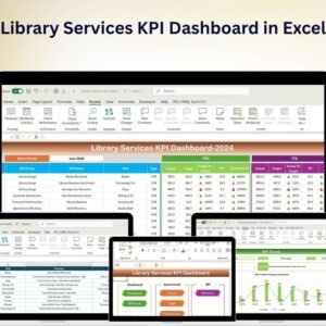
- Library Services KPI Dashboard in Excel – the same scorecard for teams without Power BI Desktop.
- Library Services KPI Dashboard in Google Sheets – browser-based, shareable by link.
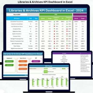
- Libraries & Archives KPI Dashboard in Power BI – wider archives and special-collections scope.
- Museum Operations KPI Dashboard in Power BI – the same scorecard format for a cultural venue.
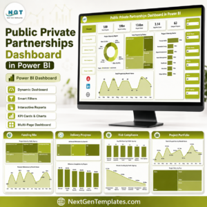
- Public Private Partnerships Dashboard in Power BI – analytical reporting for publicly funded programmes.
- Browse every Power BI KPI Dashboard or the full Power BI template category.
Ready to stop rebuilding the board pack every month? Add the Library Services KPI Dashboard in Power BI to your cart, open it in Power BI Desktop, paste in your numbers and refresh. One file, yours for life.
Last updated: 20 August 2026.










Reviews
There are no reviews yet.