

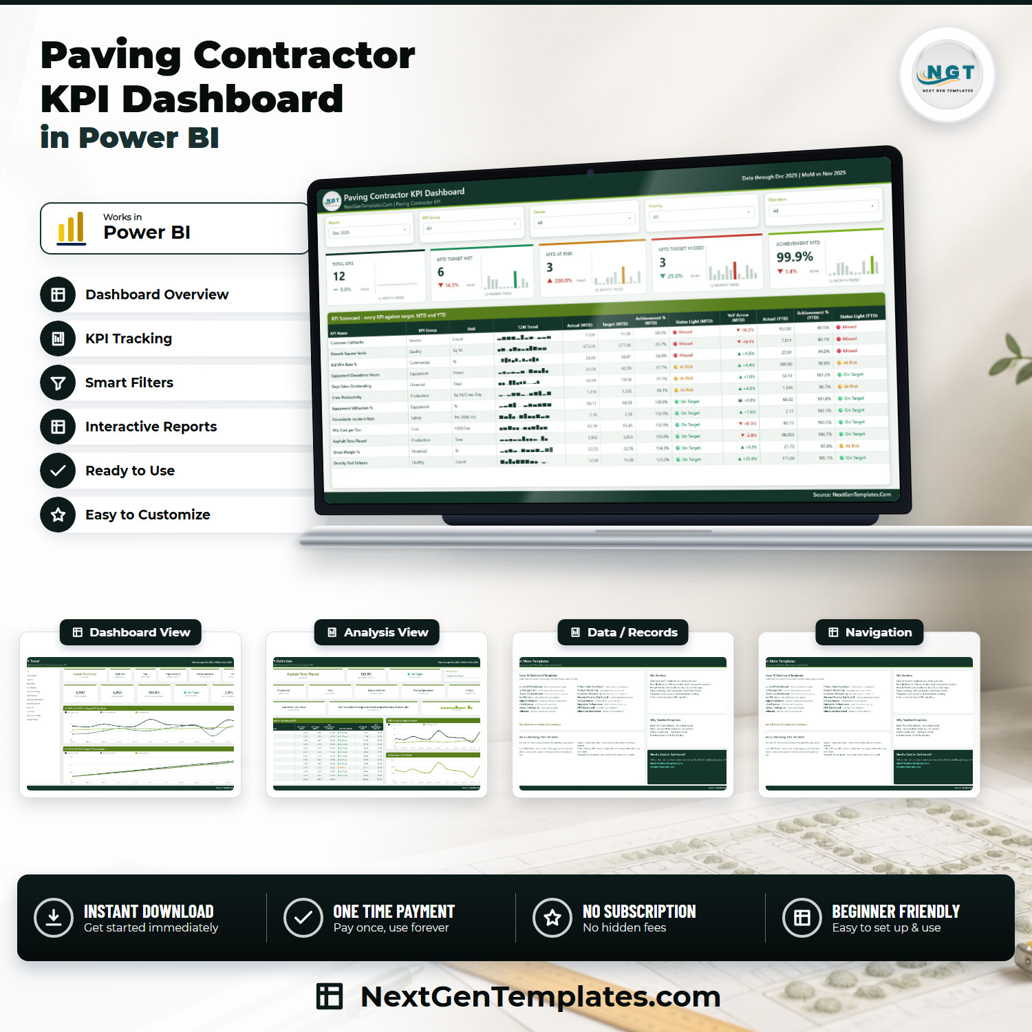

The Paving Contractor KPI Dashboard in Power BI scores 12 asphalt-paving KPIs against target every month, across 8 KPI groups, with MTD and YTD traffic lights sitting on the same row. Pick a month and the whole report follows. Achievement is direction-aware: 5 of the 12 KPIs are higher-is-better and 7 are lower-is-better, so beating a mix-cost, rework or callback target scores above 100% instead of reading as a failure. You get a fully editable .pbix, the Excel data pack that drives it and a user manual PDF, for one payment of $12.99 (regular $19.99) – no subscription, no per-seat licence, lifetime access to the file. Not what you needed? Tell us within 7 days and we will sort it out under our refund policy.
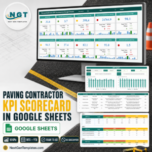
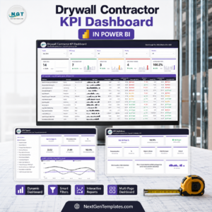
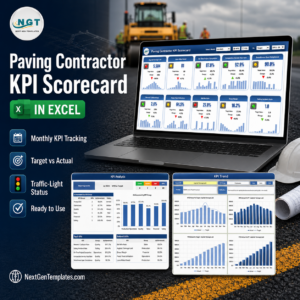
Which product is this? This is the KPI Dashboard line: a month picker, a target-versus-actual scorecard, three-state traffic lights, a KPI Trend page and a KPI Definition page. It is not the analytical “Dashboard” line that slices revenue by crew, job or region, and it is not the lighter Paving Contractor KPI Scorecard family, which is a single-file build with its own shorter KPI list. Three NextGenTemplates families carry deliberately similar paving names. Compare the page images above before you buy – and if you want more than one, they complement each other rather than repeat.
Also available as: the same trade in the lighter scorecard build – Paving Contractor KPI Scorecard in Excel and Paving Contractor KPI Scorecard in Google Sheets, both live now.
Key Features of the Paving Contractor KPI Dashboard in Power BI
- 12 paving KPIs, scored not just displayed. Asphalt Tons Placed, Crew Productivity, Mix Cost per Ton, Gross Margin %, Bid Win Rate %, Density Test Failures, Rework Square Yards, Customer Callbacks, Equipment Utilisation %, Equipment Downtime Hours, Days Sales Outstanding and Recordable Incident Rate.
- 8 KPI groups – Production, Cost, Financial, Commercial, Quality, Service, Equipment and Safety – so a monthly review runs group by group instead of number by number.
- Direction-aware achievement. Higher-is-better KPIs score Actual / Target. Lower-is-better KPIs score Target / Actual. That is why the shipped December sample scores Mix Cost per Ton at 102.8% when the delivered cost ($83.10 a ton) came in under the $85.45 target, and Density Test Failures at 125.0% on 12 failures against a tolerance of 15.
- Three-state traffic lights on two horizons. On Target at 100% or more, At Risk from 95% up to 100%, Missed below 95% – printed separately for MTD and for YTD, so a KPI that looks fine this month but is behind for the year cannot hide. Gross Margin % does exactly that in the sample: On Target for December at 104.3%, but At Risk for the year at 97.9%.
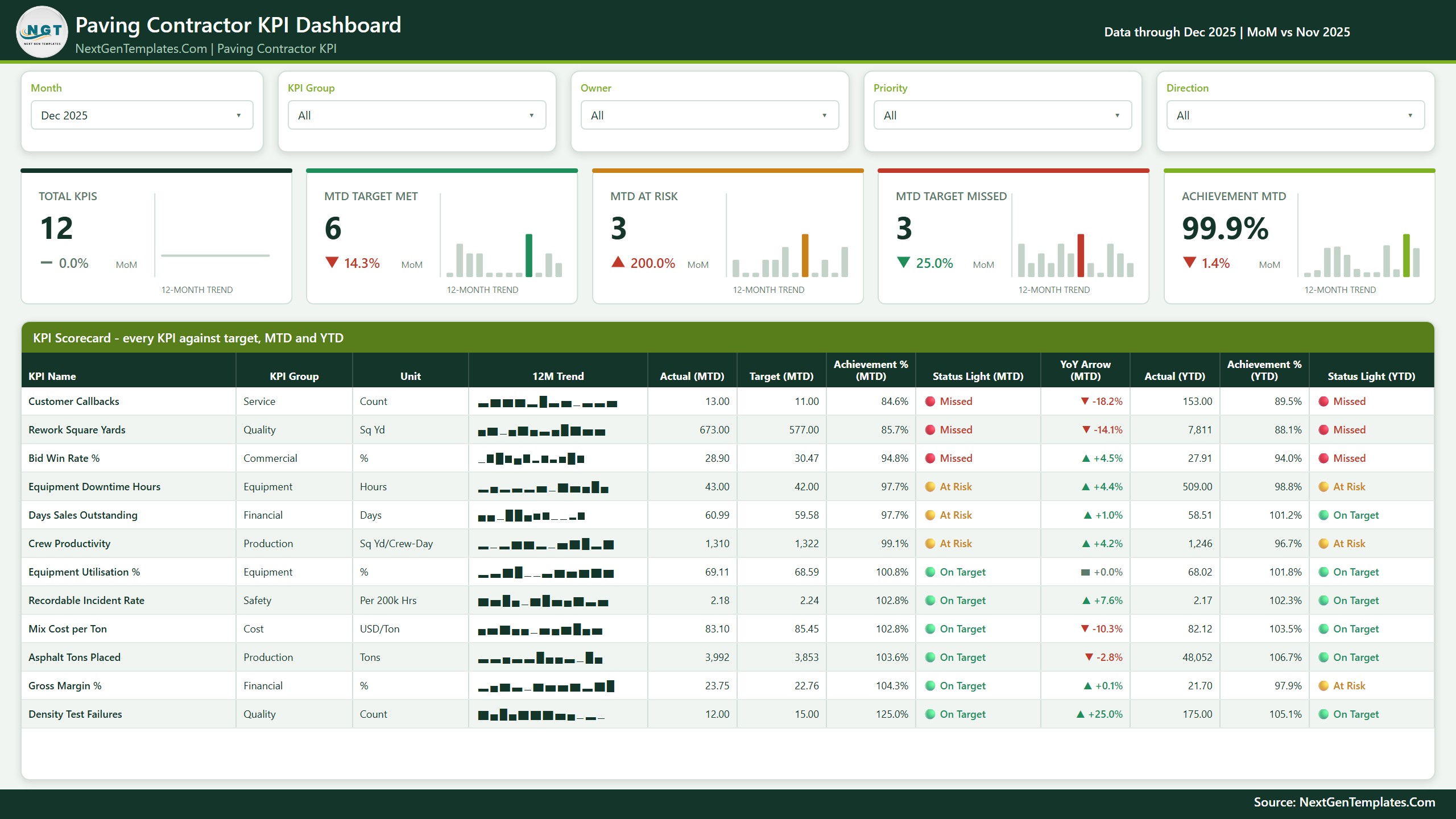
- Five slicers, synced across pages – Month, KPI Group, Owner, Priority and Direction. Change one on the scorecard and the KPI Trend and KPI Definition pages follow.
- A 12-month sparkline inside every scorecard row, plus five summary cards (Total KPIs, MTD Target Met, MTD At Risk, MTD Target Missed, Achievement MTD), each with its own 12-month trend and a month-on-month delta.
- An owner and a priority against every KPI. The sample ships 7 named ownership lines – Paving Operations, Estimating & Purchasing, Finance, Quality Control, Project Management, Equipment & Fleet and Safety & Compliance – at Critical (5 KPIs), High (5) or Medium (2).
- Real prior-year comparison. The data pack carries two full years of actuals – 2024 and 2025 – so every YoY arrow and every “PY” line on the trend charts comes from typed history, not from an estimate.
- Two hidden tooltip pages (KPI Detail and Trend Detail, 280×360) that surface on hover without adding clutter to the printed page.
- Native Power BI visuals only, plus one custom theme file that drives every colour. Nothing to install from AppSource, nothing that breaks when a custom visual is deprecated. 104 DAX measures sit behind the four pages.
What’s Inside the Paving Contractor KPI Dashboard in Power BI
The download is a single ZIP holding three files: the .pbix report, the Data.xlsx pack it reads from, and a Power BI Dashboard user manual PDF. Keep all three in one folder.
Page 1 – KPI Scorecard. Five slicers across the top, five summary cards under them, then the full scorecard table: KPI Name, KPI Group, Unit, a 12-month sparkline, Actual (MTD), Target (MTD), Achievement % (MTD), Status Light (MTD), YoY Arrow (MTD), Actual (YTD), Achievement % (YTD) and Status Light (YTD). Rows sort by achievement, worst first. The shipped December 2025 sample reads 12 KPIs, 6 met, 3 at risk, 3 missed and 99.9% achievement for the month.
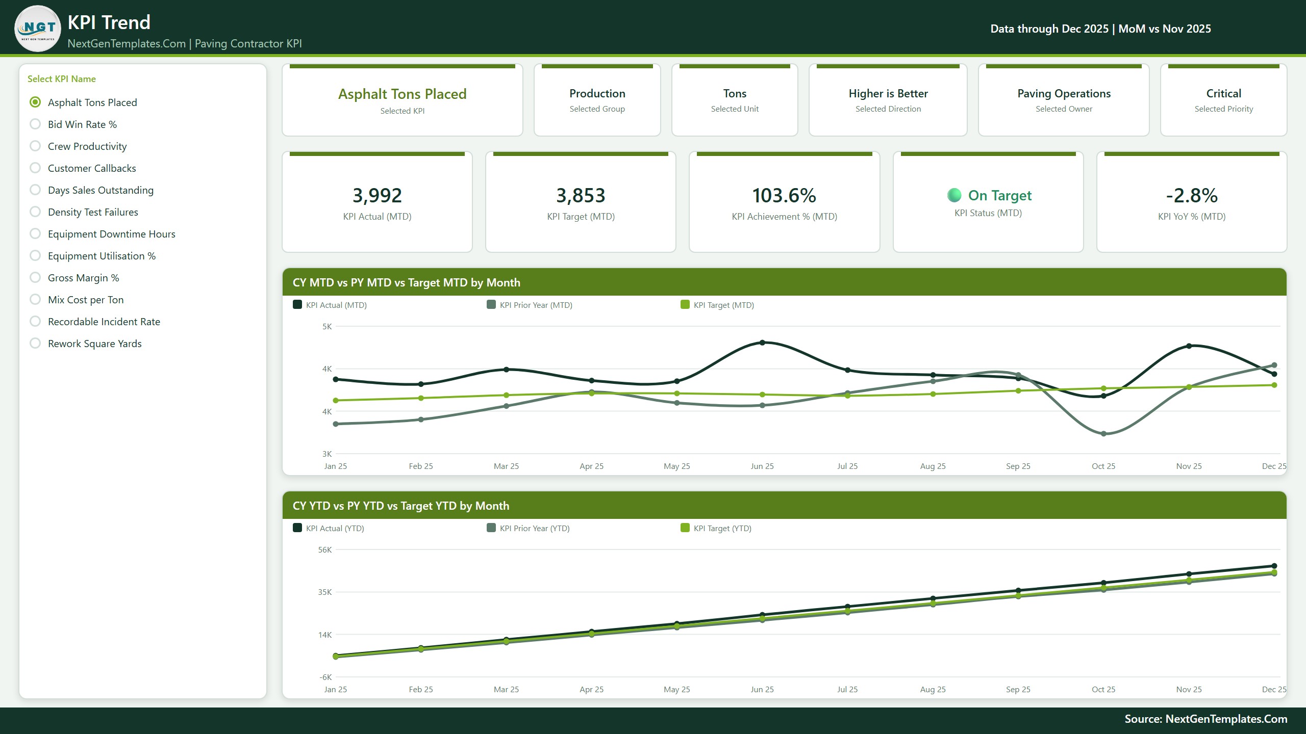
Page 2 – KPI Trend. A “Select KPI Name” list on the left, six context cards naming the selected KPI, its group, unit, direction, owner and priority, five value cards (KPI Actual MTD, KPI Target MTD, KPI Achievement % MTD, KPI Status MTD, KPI YoY % MTD) and two line charts – CY MTD vs PY MTD vs Target MTD by Month and CY YTD vs PY YTD vs Target YTD by Month. Three lines on each: this year, last year, target.
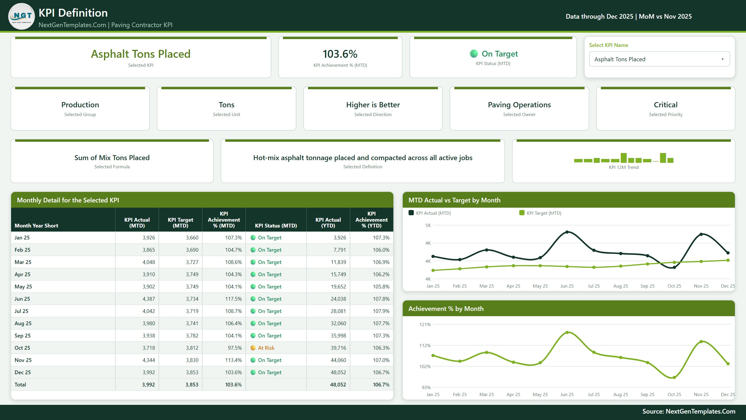
Page 3 – KPI Definition. The same synced KPI selector, and then the part most KPI packs leave out: the formula and the plain-English definition for whichever KPI is selected. Asphalt Tons Placed, for example, reads “Sum of Mix Tons Placed” with the definition “Hot-mix asphalt tonnage placed and compacted across all active jobs”. Under it sit a Monthly Detail table for all twelve months plus a total row, an MTD Actual vs Target by Month chart and an Achievement % by Month chart.
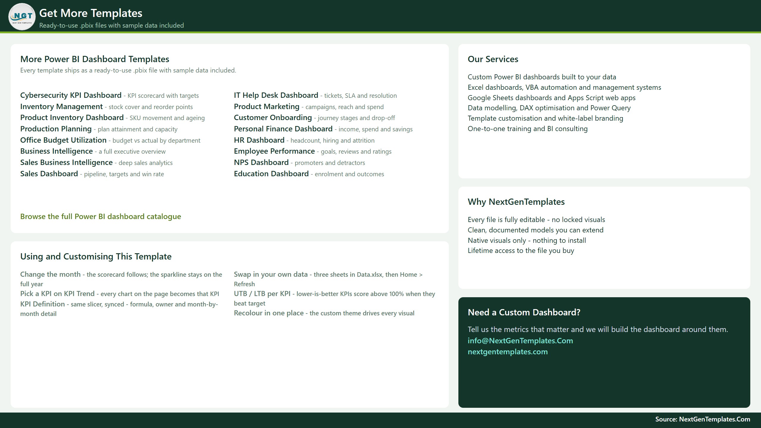
Page 4 – Get More Templates, a short catalogue and customisation page, plus the two hidden tooltip pages that never appear in the page tabs.
The data pack (Data.xlsx) has four sheets. Read Me explains the model, including the rule that a rate, ratio or index YTD is the average of the months so far and never a sum. KPI Definition is one row per KPI with group, unit, formula, definition, UTB/LTB type, owner and priority – 12 rows. Input_ Target holds 144 rows: 12 KPIs by 12 months, MTD and YTD. Input_ Actual holds 288 rows, because it carries 2024 as well as 2025. Nothing in the report hard-codes a KPI name: add a row, delete a row, or rename a KPI in all three sheets, press Home > Refresh, and the counts, the scorecard, the selector list and every chart follow.
Where the data comes from. The model is one imported table built from those three sheets, plus a Date table generated in Power Query. It connects to no live system – there is no API, no gateway and no accounting, dispatch or plant connector. You type numbers into the workbook and refresh. The report opens with the sample data already loaded, so you can look around before touching anything; before your first Refresh, point the query at your own copy with Home > Transform data > Data source settings > Change Source, because the path saved in the file is the folder it was built in.
Paving Contractor KPI Dashboard in Power BI vs. Tableau or Qlik vs. Paid Construction SaaS – Where This Fits
| This template (Power BI) | Tableau or Qlik build | Paving / construction SaaS | |
|---|---|---|---|
| Cost | $12.99 once | Roughly $70-$115 per user per month for a creator seat, plus build time | Quoted per crew or job volume, typically four figures a year and up |
| Platform | Power BI Desktop, free from Microsoft (Windows) | Tableau Desktop or Qlik Sense | Vendor cloud, browser only |
| Setup time | Open, retype 12 KPI rows, refresh – under an hour | Days to weeks for the same scorecard | Weeks, plus onboarding and data migration |
| Real-time team collaboration | No – publish to the Power BI Service if you need shared access | Yes, on a paid server | Yes |
| Mobile access | Via the free Power BI mobile app once published | Yes | Yes |
| Customisable fields | Every KPI, group, unit, formula, owner and priority is a spreadsheet row | Fully custom, but you write it | Limited to the vendor’s field model |
| Live plant, ticket or GPS feed | No – you type actuals into Data.xlsx and refresh | Possible, if you build the connection | Yes, that is the product |
| Year-1 cost at 5 users | $12.99, plus optional Power BI Pro seats if you publish | $4,200-$6,900 | Typically far higher again |
| Direction-aware scoring (UTB/LTB) | Built in – 5 higher-is-better, 7 lower-is-better | You build the logic | Fixed to the vendor’s metric set |
| Paving-specific KPI set out of the box | Yes – tonnage, crew productivity, mix cost, density failures, rework yards, callbacks | No – start from a blank canvas | Generic construction metrics |
Who This Template Is For – and Who It’s Not For
It fits an asphalt paving, sealcoating or striping contractor running anywhere from a couple of crews to a couple of dozen, a construction commercial manager who already reports monthly on tonnage, mix cost and field labour, an estimator comparing bids submitted with bids won, an equipment manager who owns paver, roller and milling-machine utilisation, or a Power BI user who wants a finished scorecard pattern to fork for another trade.
It is not for you if you want live data off a paver or a haul truck – this reads a spreadsheet you refresh by hand, with no telematics, GPS, plant-ticket or weigh-bridge feed. It is not for you if you want per-job, per-lift or per-street drill-down: the report is a company-level monthly scorecard by design, and jobs are not a dimension in the model. It is not a takeoff or estimating package, it is not accounting software, it does not schedule crews or trucks, and it does not connect to Sage, QuickBooks, Xero, Procore, HCSS, B2W or ServiceTitan. It is not a lien, retainage or pay-application system – Days Sales Outstanding here is a monitoring ratio you supply, not a receivables ledger. It is not a materials-testing or QC records system either: Density Test Failures is a count you type in, not a link to a nuclear gauge or a lab. And it is not a safety management system; see the FAQ. Paving Contractor KPI Dashboard in Power BI
How to Use the Paving Contractor KPI Dashboard in Power BI
- Unzip all three files into one folder and keep them together – the report reads
Data.xlsxfrom beside it. - Open the
.pbixin Power BI Desktop, free from Microsoft and Windows-only. Have a look around first: the sample data is already loaded. - Repoint the source before your first refresh. Home > Transform data > Data source settings > Change Source, and select your copy of
Data.xlsx. The path saved in the file is the folder it was built in. - Edit the KPI Definition sheet first. One row per KPI: group, unit, formula, definition, Type (UTB for higher-is-better, LTB for lower-is-better), owner, priority. The KPI Name is the join key across all three sheets, so a rename has to happen in all three.
- Fill Input_ Target – one row per KPI per month, MTD and YTD, for the year you are reporting. Remember the Read Me rule: for a %, a Days figure, a USD-per-ton rate or an index, the YTD value is the average of the months so far, never a sum.
- Fill Input_ Actual the same way, for the reporting year and the year before it. The prior year is what every PY line and YoY arrow reads from.
- Press Home > Refresh. Counts, cards, the scorecard table, the KPI selector and every chart follow.
- Pick a month on the KPI Scorecard. Then click a KPI on KPI Trend – the KPI Definition page shares that selection, so it already shows that KPI’s formula and monthly detail when you switch tabs. Paving Contractor KPI Dashboard in Power BI
Real-World Use Cases
Ray runs a six-crew asphalt outfit. His monthly commercial meeting used to open with a spreadsheet of raw tonnage and an argument about whether a number was good. Now it opens on the KPI Scorecard with Dec 2025 selected: 6 met, 3 at risk, 3 missed. The three misses – Customer Callbacks at 84.6%, Rework Square Yards at 85.7% and Bid Win Rate % at 94.8% – each carry a named owner on the row, so the meeting becomes three conversations instead of twelve.
Teresa buys the mix. She owns Mix Cost per Ton. She selects it on KPI Trend, sees the current-year line against target and against last year, and takes the twelve-month table off the KPI Definition page straight into the supplier review – with the formula card beside it, so nobody relitigates whether haul and fuel surcharge are in the number before the discussion starts.
Dev runs the fleet. He watches Equipment Utilisation % and Equipment Downtime Hours, and uses the Direction slicer to pull the whole scorecard down to the lower-is-better KPIs when he wants only the cost-and-loss side of the month. Utilisation reads 100.8% for December and 101.8% for the year; downtime is the one still sitting At Risk on both horizons.
Frequently Asked Questions
Do I need a Power BI licence to use this?
No. Power BI Desktop is free from Microsoft and opens, edits and refreshes the file. It runs on Windows only. A Power BI Pro or Premium seat is needed only if you want to publish the report to the Power BI Service and share it with colleagues.
Can I add, remove or rename KPIs?
Yes, and that is the point of the build. Nothing in the report hard-codes a KPI. Add a row to KPI Definition plus its monthly Target and Actual rows, or delete those rows, or rename the KPI in all three sheets, then refresh. The counts, the scorecard, the selector list and every chart follow. Paving Contractor KPI Dashboard in Power BI
Is there a drill-through page?
No – and it is worth saying plainly, because builds in this family vary. There is no right-click drill-through in this report. The KPI Definition page is reached from the page tabs; its KPI selector is synced with the KPI Trend page’s selector, so whichever KPI you picked is already applied when you get there. Two hidden tooltip pages appear on hover, and those are the only hidden pages.
Does it connect to my accounting, dispatch or plant system?
No. The model imports one Excel workbook and builds a Date table from it. There is no API, no gateway, no scheduled refresh against a live source and no connector to Sage, QuickBooks, Xero, Procore, HCSS, B2W, ServiceTitan, a weigh-bridge, a plant ticketing system or equipment telematics. Actuals and targets are typed into Data.xlsx. Paving Contractor KPI Dashboard in Power BI
Does it track density testing, mix design or DOT compliance?
No. Density Test Failures is a count you type in – your own figure from your own cores and nuclear-gauge readings. The dashboard does not store test results, does not check a Superpave or Marshall mix design, does not produce DOT or agency QC/QA submittals, and holds no specification or acceptance limits of any kind. It reports a number you already produce elsewhere.
Does this track OSHA recordables or manage site safety?
No. Recordable Incident Rate is a number you type in, however you calculate it. The dashboard does not perform OSHA 300 or 300A recordkeeping, does not manage silica, traffic-control, flagging or work-zone compliance, does not hold toolbox talks or training records, and is not a safety management system. Paving Contractor KPI Dashboard in Power BI
Are the targets industry benchmarks?
No. Every figure in the file is sample data, including all twelve targets. There is no benchmark set, no industry average, no NAPA, Asphalt Institute or state DOT rule and no external data source behind any number. Replace the targets with your own before anyone treats a traffic light as meaningful. Paving Contractor KPI Dashboard in Power BI
Is there an Excel or Google Sheets version of the same thing?
The lighter paving KPI Scorecard is already live in Excel and Google Sheets – close in name, different in build, with its own KPI list. An Excel edition of this same KPI Dashboard is being prepared alongside this one and will appear in the KPI Dashboard category when it is listed. Paving Contractor KPI Dashboard in Power BI
What exactly do I download?
One ZIP containing the .pbix report, Data.xlsx and a Power BI Dashboard user manual PDF. It is a one-time payment with lifetime access to the file you buy. Paving Contractor KPI Dashboard in Power BI
About the Author
Built by PK – Microsoft Certified Professional with 15+ years of Excel, Google Sheets, and Power BI experience. Founder of NextGenTemplates, reaching 300K+ subscribers across YouTube channels. Every template is hand-built and tested before release. Paving Contractor KPI Dashboard in Power BI
Explore Related Templates
- Paving Contractor KPI Scorecard in Excel and in Google Sheets – the lighter scorecard family, same trade, different KPI list.
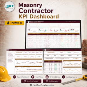
- Drywall Contractor KPI Dashboard in Power BI and Masonry Contractor KPI Dashboard in Power BI – the same scorecard build, other site trades.
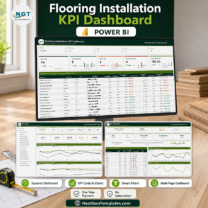
- Painting Contractor KPI Dashboard in Power BI and Flooring Installation KPI Dashboard in Power BI – same pattern, finishes trades.
- Electrical Contractor KPI Dashboard in Power BI and HVAC Contractor KPI Dashboard in Power BI – the MEP trades on the same build.
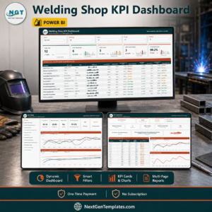
- Carpentry Workshop KPI Dashboard in Power BI and Welding Shop KPI Dashboard in Power BI – the shop-based trades.
- Browse every Power BI template or the full KPI Dashboard category.
A full walkthrough of every page, with the sample December numbers explained, is on the blog: Paving Contractor KPI Dashboard in Power BI.
Buy the Paving Contractor KPI Dashboard in Power BI for $12.99 (regular $19.99), download it straight away, and have twelve paving KPIs scored against target in an afternoon. One payment, no subscription, lifetime access to the file.
Last updated: 2 September 2026.
Watch the demo video:
Compatibility and Requirements
- Works in Power BI Desktop, which is free from Microsoft and runs on Windows.
- Keep the .pbix report, Data.xlsx and the user manual PDF in one folder. Microsoft explains where to get the app in Get Power BI Desktop.
- Publishing to the Power BI Service for sharing needs a Power BI Pro or Premium seat.














Reviews
There are no reviews yet.