

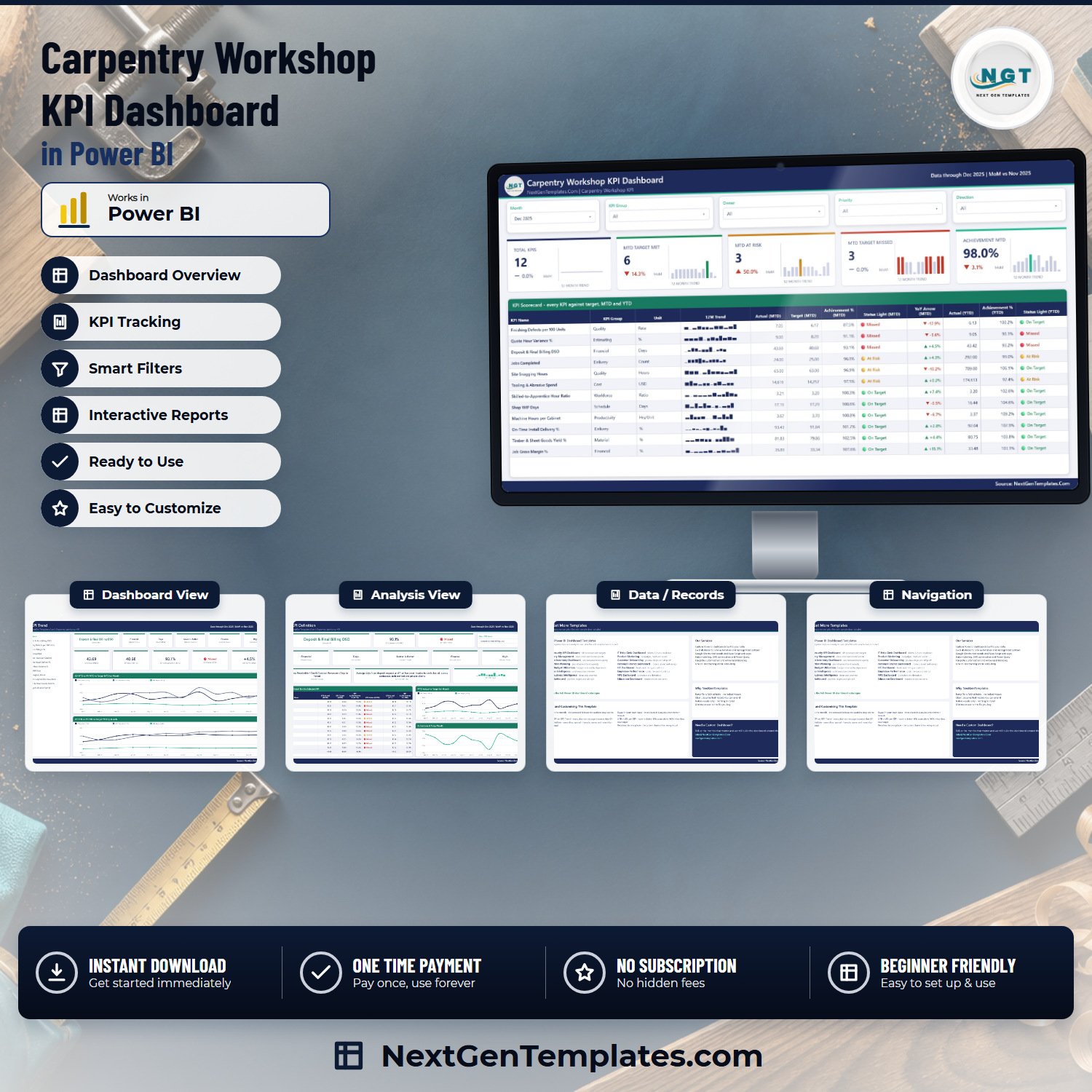

The Carpentry Workshop KPI Dashboard in Power BI is a ready-to-use .pbix report that scores 12 joinery and carpentry KPIs against target every month, in MTD and YTD, with three-state traffic lights on both. Pick a month at the top and the whole report follows: the scorecard re-ranks worst-first, the sparklines stay on the full year, and every summary card recalculates.
This is a KPI scorecard, not an analytical dashboard. It answers one question – are we hitting the numbers we said we would, and which ones are slipping? – and it answers it the same way every month, so the shop meeting stops being an argument about whose spreadsheet is right.
Key Features of the Carpentry Workshop KPI Dashboard in Power BI
- 12 carpentry workshop KPIs, each with a target, an actual, an achievement percentage and a status light – for both MTD and YTD.
- Nine KPI groups – Material, Productivity, Delivery, Estimating, Quality, Schedule, Cost, Financial and Workforce.
- Direction-aware scoring. Five KPIs are higher-is-better and seven are lower-is-better. Machine Hours per Cabinet, Quote Hour Variance %, Site Snagging Hours, Shop WIP Days, Finishing Defects per 100 Units, Tooling & Abrasive Spend and Deposit & Final Billing DSO all score above 100% when they come in under target – the maths is Target / Actual for those, Actual / Target for the rest.
- Three-state traffic lights – On Target at 100% or more, At Risk between 95% and 100%, Missed below 95%. Applied to MTD and YTD independently, so a KPI can be having a bad month inside a good year.
- Five synced slicers – Month, KPI Group, Owner, Priority and Direction. Set them once and they hold as you move between pages.
- A 12-month sparkline in every scorecard row, which stays on the full year even when you narrow the month picker.
- An owner and a priority on every KPI – Machine Shop, Project Management, Estimating, Site Installation, Production Planning, Finishing, Purchasing, Finance and Workshop Manager, at Critical / High / Medium – so the review has a name against each number.
- A written formula and a plain-English definition for every KPI, shown on the KPI Definition page rather than buried in a separate document.
- Two hidden tooltip pages (KPI Detail and Trend Detail) that surface on hover, with 37 named DAX measures driving the visuals.
- Fully editable .pbix – native Power BI visuals only, nothing to install, one theme file driving every colour.
- One-time payment. No subscription, no per-seat fee, lifetime access to the file you buy.
What’s Inside the Carpentry Workshop KPI Dashboard in Power BI
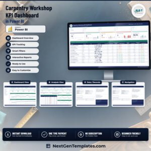
The report has four visible pages and two hidden tooltip pages, and the download holds three files.
KPI Scorecard
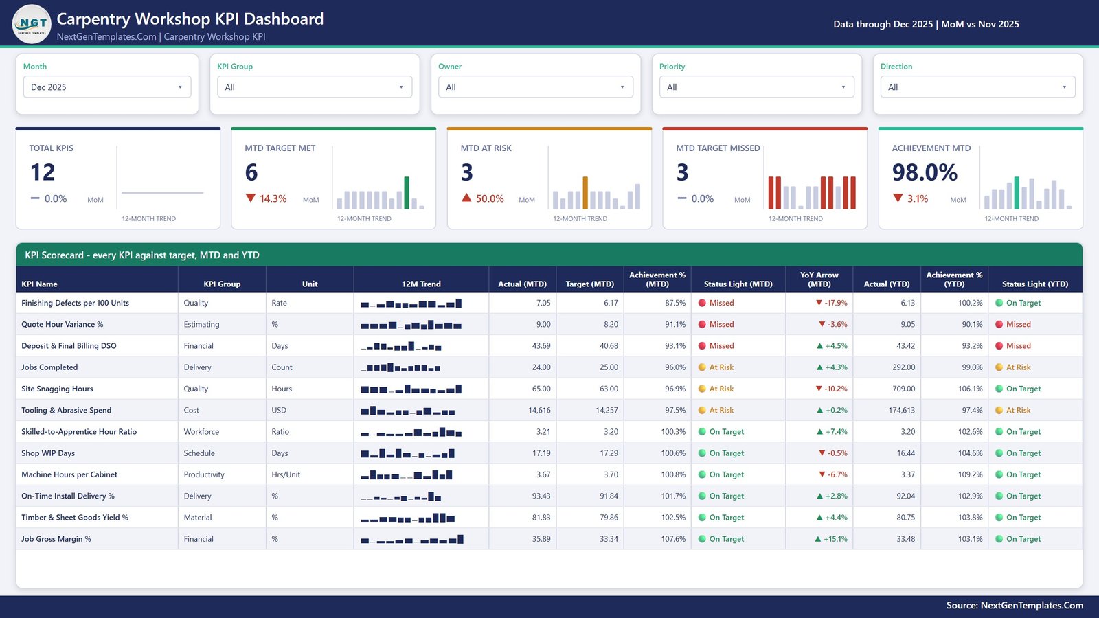
The landing page. Five slicers across the top (Month, KPI Group, Owner, Priority, Direction), then five summary cards – Total KPIs, MTD Target Met, MTD At Risk, MTD Target Missed and Achievement MTD – each with its own 12-month bar trend and a month-on-month delta. On the shipped December 2025 sample that reads 12 KPIs, 6 met, 3 at risk, 3 missed and 98.0% achievement.
Below that sits the scorecard table itself: every KPI with its group, unit, 12-month sparkline, MTD actual, MTD target, MTD achievement %, MTD status light, YoY arrow, YTD actual, YTD achievement % and YTD status light. It sorts worst-first by MTD achievement, so Finishing Defects per 100 Units and Quote Hour Variance % are at the top of the page rather than buried alphabetically.
KPI Trend
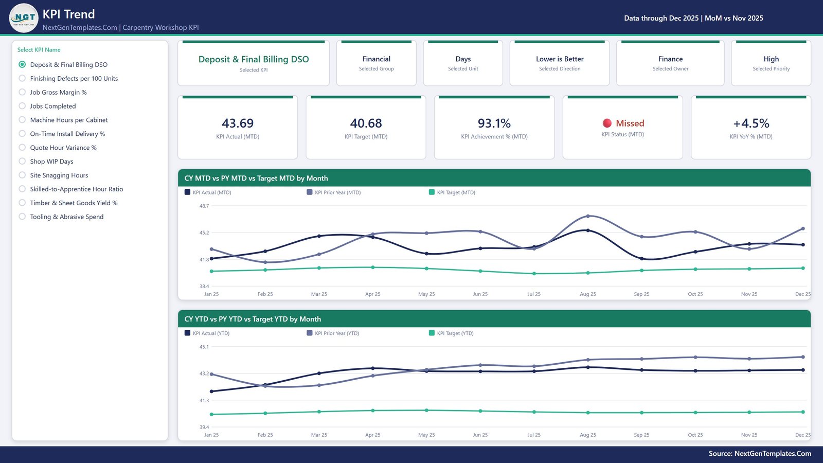
Pick one KPI from the radio list on the left and the whole page becomes that KPI. Six context cards name the selected KPI, its group, unit, direction, owner and priority; five value cards show MTD actual, MTD target, MTD achievement %, MTD status and MTD YoY %. Two line charts then run the full twelve months:
- CY MTD vs PY MTD vs Target MTD by Month – this year’s month-by-month value against the same month last year and against target.
- CY YTD vs PY YTD vs Target YTD by Month – the cumulative view, which for a rate or a ratio is the average of the months so far rather than a running sum.
KPI Definition
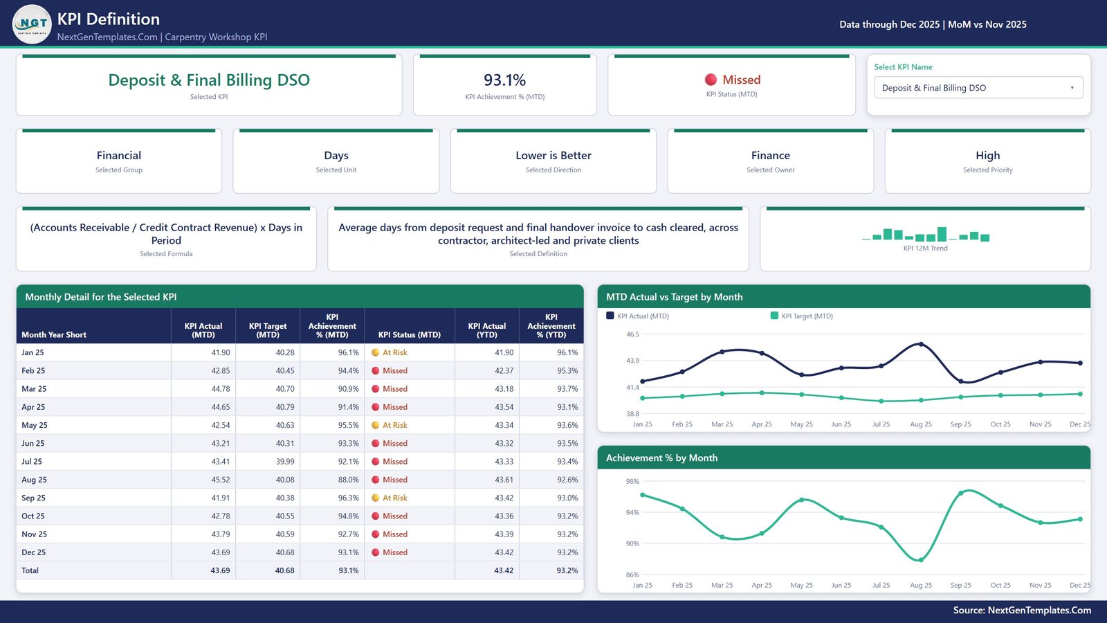
The same KPI selection, on a dropdown this time and synced with the Trend page. It shows the KPI’s formula and its written definition – so Timber & Sheet Goods Yield % is spelled out as Net Board Feet in Finished Parts / Board Feet Issued from Rough Stock, and described as the usable material recovered from rough-sawn hardwood and sheet goods after ripping, defecting out knots and cutting nested panel parts. Underneath, a month-by-month table (actual, target, achievement %, status, YTD actual, YTD achievement %) sits beside an MTD Actual vs Target chart and an Achievement % by Month chart.
Get More Templates
A fourth page inside the report that lists other NextGenTemplates Power BI dashboards and a short “using and customising this template” panel. It is a catalogue page, not a report page – delete it in ten seconds if you are handing the file to a client.
Data.xlsx and the user manual
The download is a ZIP holding three files: the .pbix, Data.xlsx, and a Power BI Dashboard user manual PDF. Data.xlsx is where you work. It has a Read Me sheet, a KPI Definition sheet (one row per KPI: group, name, unit, formula, definition, higher-is-better or lower-is-better, owner, priority), and Input_ Target and Input_ Actual sheets holding one row per KPI per month. The shipped sample carries twelve months of targets for 2025 and two full years of actuals – 2024 and 2025 – which is what makes the prior-year lines and the YoY arrows work out of the box.
The 12 KPIs in the Shipped File
Every one of these is editable. They are here so you can see the shape of the report before you buy, not because you are stuck with them.
| KPI | Group | Unit | Direction |
|---|---|---|---|
| Timber & Sheet Goods Yield % | Material | % | Higher is better |
| Machine Hours per Cabinet | Productivity | Hrs/Unit | Lower is better |
| Jobs Completed | Delivery | Count | Higher is better |
| Quote Hour Variance % | Estimating | % | Lower is better |
| Site Snagging Hours | Quality | Hours | Lower is better |
| On-Time Install Delivery % | Delivery | % | Higher is better |
| Shop WIP Days | Schedule | Days | Lower is better |
| Finishing Defects per 100 Units | Quality | Rate | Lower is better |
| Tooling & Abrasive Spend | Cost | USD | Lower is better |
| Job Gross Margin % | Financial | % | Higher is better |
| Deposit & Final Billing DSO | Financial | Days | Lower is better |
| Skilled-to-Apprentice Hour Ratio | Workforce | Ratio | Higher is better |
Power BI vs. a Hand-Built Spreadsheet vs. Paid Joinery SaaS – Where This Fits
| This template | A spreadsheet you build yourself | Joinery / shop management SaaS | |
|---|---|---|---|
| Cost | One payment, lifetime access | Free, plus the days you spend on it | Monthly, usually per seat |
| Time to first review | Open, refresh, pick a month | Weeks of building and debugging | Onboarding and data migration |
| Direction-aware scoring | Built in, per KPI | You have to remember to invert the cost and cycle-time KPIs | Usually built in |
| Your own KPIs | Add, rename or delete rows and refresh | Yes, if you rewrite the formulas | Only what the vendor exposes |
| Who owns the data | Your file, on your machine | Your file | The vendor’s platform |
| Job costing, quoting, CNC nesting | No – this reports the numbers, it does not produce them | No | Often yes, and that is what you pay for |
Who This Template Is For – and Who It’s Not For
It is for a bespoke joinery shop, a cabinet or furniture maker, a staircase or doorset manufacturer, a shopfitting workshop, or the site-install side of any of those – anywhere someone already runs a monthly numbers meeting and wants it to look the same every month. It suits an owner-manager, a workshop manager, a production planner or a finance lead who has the figures somewhere but not in one place.
It is not for anyone hoping the file will produce the numbers. You type twelve months of targets and actuals into the workbook. It is not a job-costing or estimating package, not a quoting tool, not a CAD or CNC nesting system, not a stock or timber-purchasing system, and not accounting software. It does not connect to your shop-floor terminals, your ERP, your accounts package or your CNC. It is also not a health-and-safety or CDM compliance system, and it holds no FSC or PEFC chain-of-custody records – Site Snagging Hours and Finishing Defects per 100 Units are management indicators you type in, not evidence for a customer, an auditor or an insurer.
How to Use the Carpentry Workshop KPI Dashboard in Power BI
- Unzip all three files into one folder and keep them together – the report reads Data.xlsx from beside it.
- Open the .pbix in Power BI Desktop, which is free from Microsoft.
- Look at the sample month first. The file ships with a full worked year through December 2025, so you can see what a finished review looks like before you touch anything.
- Edit the KPI Definition sheet in Data.xlsx – your KPI names, groups, units, formulas, definitions, owners, priorities, and the higher-is-better or lower-is-better type per KPI. Getting the direction right here is the single most important edit in the file.
- Fill Input_ Target and Input_ Actual – one row per KPI per month. Load the prior year into Input_ Actual too, or the YoY arrows and the prior-year lines will be empty.
- Watch your YTD convention. Add up money, spend, hours and counts; average the rates and ratios. A yield percentage that sums to 900% by September makes every YTD chart useless.
- Press Home > Refresh in Power BI Desktop. Counts, slicers, the scorecard and every chart follow the data.
- Pick your month on the KPI Scorecard, then walk the worst-first rows. Use KPI Trend for the KPI that needs a conversation, and KPI Definition when somebody asks how it is calculated.
- Recolour in one place if you want it in your own brand – the custom theme drives every visual.
If you move the workbook away from the report, repoint it with Home > Transform data > Data source settings > Change Source.
Real-World Use Cases
- The Monday shop meeting. Open the scorecard on last month, read the worst three rows, and the meeting has an agenda before anyone sits down.
- Estimating review. Quote Hour Variance % sits beside Job Gross Margin %, so an overrun on booked bench hours is on the same screen as the margin it ate.
- Material conversations. Timber & Sheet Goods Yield % next to Tooling & Abrasive Spend separates “the timber is worse” from “we are cutting it badly”.
- Quality and snagging. Finishing Defects per 100 Units and Site Snagging Hours make the cost of a spray-booth problem visible as second-fix hours on site.
- Capacity planning. Machine Hours per Cabinet against Shop WIP Days separates “we need another CNC” from “jobs are sitting waiting on the finisher”.
- Cash. Deposit & Final Billing DSO is scored lower-is-better beside margin, so a good month on paper that has not been collected shows up as one.
- Training and succession. Skilled-to-Apprentice Hour Ratio is scored as a KPI in its own right, so the apprenticeship stops being the first thing dropped in a busy quarter.
- The monthly pack. Export the scorecard page to PDF and it is the report for the owner, the board or the bank, in the same shape every month.
Frequently Asked Questions
Do I need a Power BI licence?
No. Power BI Desktop is free from Microsoft and opens, edits and refreshes this file. A Pro or Premium licence is only needed if you want to publish it to the Power BI Service and share it there.
Can I change the 12 KPIs to my own?
Yes, and that is the intended use. Nothing is hard-coded: add, rename or delete rows across the three data sheets in Data.xlsx and refresh. The counts, the slicer lists, the scorecard rows and every chart follow whatever is in the workbook.
Why do some KPIs score above 100%?
Because achievement is direction-aware. A lower-is-better KPI – Machine Hours per Cabinet, Quote Hour Variance %, Site Snagging Hours, Shop WIP Days, Finishing Defects per 100 Units, Tooling & Abrasive Spend, Deposit & Final Billing DSO – scores Target / Actual, so coming in under target reads above 100%. Higher-is-better KPIs score Actual / Target, as you would expect.
Is there a drillthrough page?
No. This report uses two hidden tooltip pages, KPI Detail and Trend Detail, that appear on hover, and the KPI Definition page carries the month-by-month detail – reached through a synced slicer, not a right-click. That is a design choice, not a missing piece.
Are the numbers in the file real?
No. The file ships with a realistic worked example – twelve months of targets and two years of actuals through December 2025 – so every visual is populated when you open it. It is illustrative sample data, not benchmark data for the joinery trade. Replace it with yours.
Is this also available in Excel?
An Excel edition of this same 12-KPI dashboard, the Carpentry Workshop KPI Dashboard in Excel, is being prepared for the catalogue alongside this one. If it is not listed yet, check back shortly or email us and we will point you at it. The two are built to the same KPI list, the same direction-aware scoring and the same traffic-light bands, so a team can run one in the workshop office and the other in the meeting without relearning the report.
How is this different from the Carpentry Workshop KPI Scorecard?
They are different products from different lines. The Carpentry Workshop KPI Scorecard in Excel and the Carpentry Workshop KPI Scorecard in Google Sheets are spreadsheet scorecards from our scorecard line, with their own KPI lists. This one is a Power BI report – a .pbix with a semantic model, DAX measures, synced slicers and tooltip pages. Same discipline, different tool and a different build. Buy the one that matches where your team already works.
Does this make my workshop compliant?
No. It is a management reporting template. It does not hold risk assessments, method statements, PUWER or LOLER records, timber chain-of-custody certificates, or anything an auditor, a main contractor or an insurer would accept as evidence. Keep those where your obligations require them.
About the Author
Built by the NextGenTemplates team – the people behind PK: An Excel Expert and the PK: An Excel Expert YouTube channel. We build Power BI, Excel and Google Sheets templates full time, and we use the same KPI structure across all three platforms so a team can move between them without relearning the report.
Explore Related Templates
- Carpentry Workshop KPI Scorecard in Excel – the same trade, as a spreadsheet scorecard from our Excel scorecard line.
- Carpentry Workshop KPI Scorecard in Google Sheets – the Google Sheets build of that scorecard.
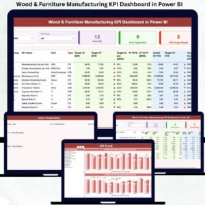
- Wood & Furniture Manufacturing KPI Dashboard in Power BI – the factory-scale sibling, for volume production rather than bespoke joinery.
- Wood and Furniture Manufacturing Dashboard in Power BI – the analytical dashboard line, if you want slice-and-dice rather than scoring against target.
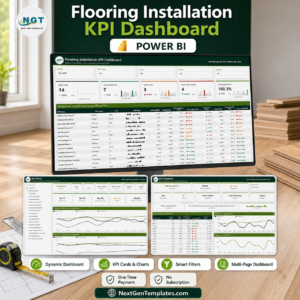
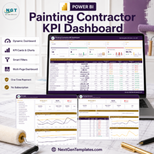
- Flooring Installation KPI Dashboard in Power BI and Painting Contractor KPI Dashboard in Power BI – the same scorecard build for the trades that follow you on site.
- Browse every Power BI template at NextGenTemplates.
Watch the demo video:
Compatibility and Requirements
- Works in Power BI Desktop, which is free from Microsoft. Download it from Get Power BI Desktop.
- Keep the .pbix and Data.xlsx in the same folder so the report can read the workbook.







Reviews
There are no reviews yet.