

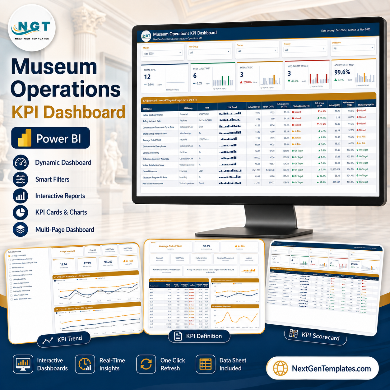
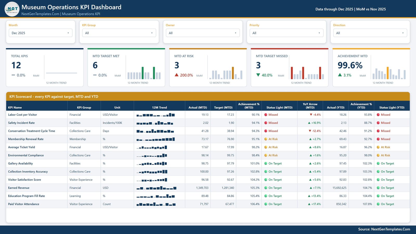
The Museum Operations KPI Dashboard in Power BI is a KPI scorecard, not a general analytics report. Its job is to answer one question every month, in one screen: which parts of the museum hit target, which are drifting, and which have already missed. Twelve museum-specific KPIs are measured against target on both a month-to-date and a year-to-date basis, given a red / amber / green status light, and paired with a twelve-month sparkline so you can see whether a miss is a blip or a trend.
Everything is driven by a Month slicer. Move it from Dec 2025 to any other month and every card, every light and every table re-states itself for that month, while the sparklines stay on the full twelve-month year for context. Four more slicers – KPI Group, Owner, Priority and Direction – let you narrow the scorecard to just Collections Care, just the Facilities team, or just the high-priority measures you take to the board.
Key Features
- One-screen KPI scorecard – all twelve KPIs on a single table with MTD actual, MTD target, achievement %, status light, YoY arrow, YTD actual, YTD achievement % and YTD status light.
- Traffic-light scoring – every KPI resolves to On Target, At Risk or Missed on both the MTD and the YTD column, so a good month inside a bad year is impossible to miss.
- Month picker drives the whole report – one slicer restates the cards, the lights and the detail tables; the sparklines keep the full year in view.
- Five summary cards – Total KPIs, MTD Target Met, MTD At Risk, MTD Target Missed and Achievement MTD, each with a MoM delta and its own twelve-month trend bar.
- Direction-aware achievement – lower-is-better KPIs such as Labor Cost per Visitor and Safety Incident Rate score above 100% when they come in under target, so a cheaper month never reads as a failure.
- Twelve-month sparkline per KPI – a miniature bar trend sits inside the scorecard row itself, no drill required.
- Synced KPI slicer across pages – pick a KPI once and the KPI Trend and KPI Definition pages both follow it. There is no drillthrough to learn; the pages stay in step on their own.
- Fully editable .pbix – native Power BI visuals only, no custom visual to install, a custom theme you can recolour in one place, and sample data included so it opens and works the moment you download it.
What Is Inside – the Four Pages
1. Museum Operations KPI Dashboard
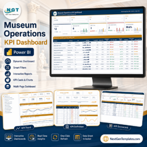
The scorecard itself. Five slicers across the top (Month, KPI Group, Owner, Priority, Direction), five summary cards, then the full KPI Scorecard table – every KPI against target, MTD and YTD. In the December 2025 sample, 6 KPIs are on target, 3 at risk and 3 missed, at 99.6% overall MTD achievement.
2. KPI Trend
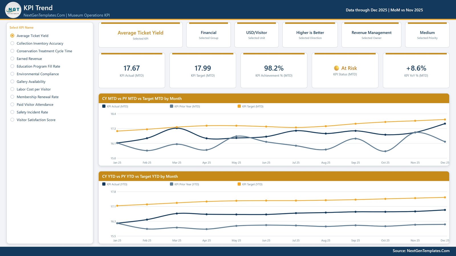
Select one KPI from the list on the left and the page rebuilds around it: its group, unit, direction, owner and priority as context cards, then its MTD actual, target, achievement %, status and YoY %. Two charts follow – CY MTD vs PY MTD vs Target MTD by Month and CY YTD vs PY YTD vs Target YTD by Month – so you can see the KPI against both last year and its own target across the full twelve months.
3. KPI Definition
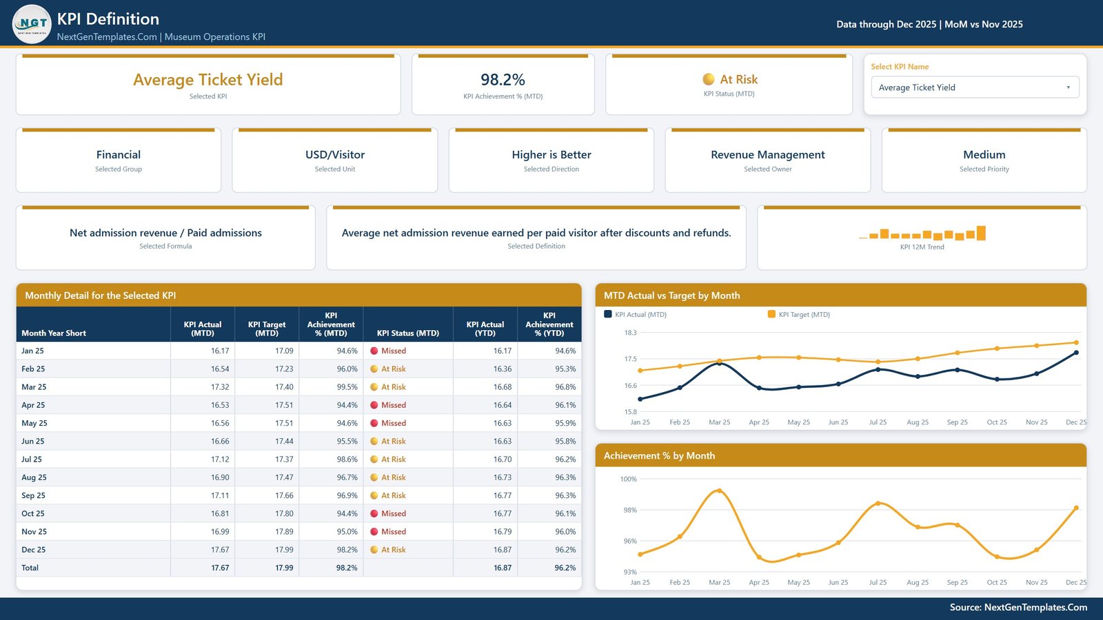
The governance page. For the selected KPI it shows the formula and the plain-English definition – for Average Ticket Yield, “Net admission revenue / Paid admissions” and “Average net admission revenue earned per paid visitor after discounts and refunds” – alongside its group, unit, direction, owner and priority. Below sits a Monthly Detail for the Selected KPI table with twelve rows of actual, target, achievement %, status and YTD figures, plus MTD Actual vs Target by Month and Achievement % by Month charts. This is the page that settles arguments about what a number means.
4. Get More Templates
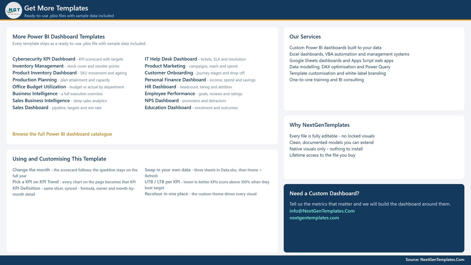
A closing page with customisation notes and the wider NextGenTemplates catalogue.
The Twelve Museum KPIs
| KPI | Group | Unit | Direction |
|---|---|---|---|
| Paid Visitor Attendance | Visitor Experience | Count | Higher is better |
| Visitor Satisfaction Score | Visitor Experience | % | Higher is better |
| Earned Revenue | Financial | USD | Higher is better |
| Average Ticket Yield | Financial | USD / Visitor | Higher is better |
| Labor Cost per Visitor | Financial | USD / Visitor | Lower is better |
| Membership Renewal Rate | Membership | % | Higher is better |
| Education Program Fill Rate | Learning | % | Higher is better |
| Collection Inventory Accuracy | Collections Care | % | Higher is better |
| Conservation Treatment Cycle Time | Collections Care | Days | Lower is better |
| Environmental Compliance | Collections Care | % | Higher is better |
| Gallery Availability | Facilities | % | Higher is better |
| Safety Incident Rate | Facilities | Incidents / 100K | Lower is better |
Scorecard or Analytics – Which One Do You Need?
NextGenTemplates publishes two different museum reports in Power BI. They are complements, not alternatives.
| Museum Operations KPI Dashboard (this product) | Museum Dashboard in Power BI | |
|---|---|---|
| Purpose | Score performance against target | Explore and slice the underlying activity |
| Core view | KPI scorecard table with traffic lights | Charts and analytical breakdowns |
| Time frame | MTD and YTD vs target and prior year | Period-over-period analysis |
| Best for | Monthly management meeting, board pack | Day-to-day analysis and deep dives |
| Pages | 4 (Scorecard, KPI Trend, KPI Definition, Get More Templates) | Multi-page analytical report |
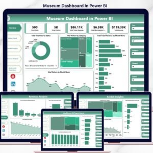
| Link | You are here | Museum Dashboard in Power BI |
How to Use It
- Download and unzip the file, then open the .pbix in Power BI Desktop (free).
- Explore the sample data first – move the Month slicer, watch the lights and the cards change, and click a KPI on the KPI Trend page to see the synced slicer carry it to KPI Definition.
- Open the included Data workbook. It holds three sheets – your KPI list with targets, the monthly actuals, and the KPI metadata (group, unit, direction, owner, priority, formula, definition).
- Replace the sample rows with yours, keeping the column headers exactly as they are.
- Set the direction per KPI – mark cost, cycle-time and incident measures as lower-is-better so achievement scores correctly.
- Refresh in Power BI Desktop (Home > Refresh). The scorecard, the lights and every chart rebuild against your numbers.
- Recolour once if you want museum branding – the custom theme drives every visual on all four pages.
Who It Is For
- Museum directors and COOs who present a monthly performance pack
- Visitor experience and front-of-house managers tracking attendance and satisfaction
- Collections and conservation teams reporting on accuracy, treatment cycle time and environmental compliance
- Membership and development teams watching renewal rates
- Facilities managers accountable for gallery availability and safety
- Galleries, heritage sites, science centres and cultural trusts that need the same scorecard shape
Frequently Asked Questions
Is this the same as the Museum Dashboard in Power BI?
No. This is the KPI scorecard – a month picker, targets, traffic lights and a KPI Definition page. The Museum Dashboard is the analytical report. Many customers own both: the scorecard for the meeting, the dashboard for the digging.
Which Power BI version do I need?
Power BI Desktop, the free version, is enough. Only native visuals are used, so nothing has to be installed or approved.
Can I change the twelve KPIs?
Yes. The KPI list lives in the data workbook, not in the visuals. Add, rename or remove KPIs there and the scorecard follows. The KPI Trend and KPI Definition pages pick up your names automatically.
How do lower-is-better KPIs get scored?
They are flagged in the data. A lower-is-better KPI scores above 100% when the actual comes in under target, so Labor Cost per Visitor at 19.13 against a 17.23 target correctly reads as a miss, not a win.
How do I get to the KPI Definition page?
Use the page tabs and the Select KPI Name slicer. The KPI selection is synced across the KPI Trend and KPI Definition pages, so whichever KPI you picked is already loaded when you arrive – there is no drillthrough step.
Does it come with data?
Yes – twelve months of realistic sample data for all twelve KPIs, so the report is fully populated before you touch it.
Can I edit or rebrand it?
Fully. Nothing is locked. Change the theme, the logo, the KPI set and the page layout as you like. Lifetime access to the file you buy.
Get the Dashboard
Stop rebuilding the monthly museum pack by hand. Download the Museum Operations KPI Dashboard in Power BI, drop in your numbers and have a board-ready scorecard – with targets, traffic lights and twelve months of trend – in the time it takes to refresh a file.
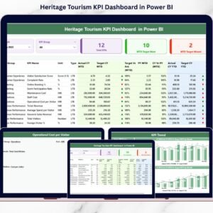
Read the full walkthrough on the blog: Museum Operations KPI Dashboard in Power BI. You may also like the Heritage Tourism KPI Dashboard in Power BI and the Arts and Culture Dashboard in Power BI.








Reviews
There are no reviews yet.