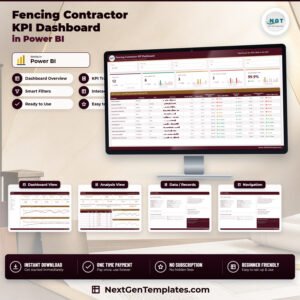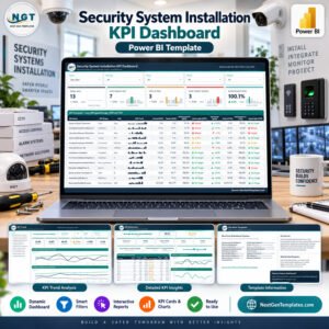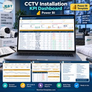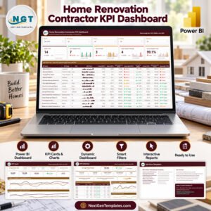


In today’s highly competitive market, Customer Journey Mapping KPI Dashboard is no longer a support function—it is a growth driver. Customers interact with brands across websites, apps, marketing campaigns, sales touchpoints, onboarding journeys, support channels, and loyalty programs. However, when customer journey data is tracked in disconnected spreadsheets, surveys, and reports, organizations struggle to understand where customers drop off and why.
That is exactly where the Customer Journey Mapping KPI Dashboard in Power BI becomes an essential solution.
This ready-to-use Power BI dashboard transforms customer journey data into clear, structured, and actionable insights. Instead of guessing customer behavior, organizations can track actual vs target performance, MTD and YTD trends, and year-over-year comparisons across every stage of the customer journey.
Because the dashboard uses Excel as the data source and Power BI for visualization, it remains flexible, scalable, and easy to maintain—without complex system integrations.
🔍 What Is the Customer Journey Mapping KPI Dashboard in Power BI?

The Customer Journey Mapping KPI Dashboard in Power BI is an interactive performance tracking tool designed to monitor customer experience KPIs across awareness, consideration, purchase, onboarding, usage, retention, and loyalty stages.
It consolidates:
Actual performance data
Target benchmarks
Historical (previous year) values
into a single Power BI dashboard with KPI cards, icons, tables, slicers, and trend charts.
As a result, CX teams, marketing leaders, sales managers, and executives gain complete visibility into customer journey health from one centralized platform.
⚙️ How Does the Dashboard Work?
The dashboard follows a clean and governance-friendly Excel-to-Power BI model.
📁 Excel Data Structure
1️⃣ Input_Actual Sheet
Stores actual KPI values.
KPI Name
Month (first date of month)
MTD Actual
YTD Actual
2️⃣ Input_Target Sheet
Stores KPI targets.
KPI Name
Month
MTD Target
YTD Target
3️⃣ KPI Definition Sheet
Defines KPI logic and governance.
KPI Number
KPI Group (Journey Stage)
KPI Name
Unit
Formula
Definition
KPI Type (UTB / LTB)
Once data is updated in Excel, Power BI automatically refreshes all visuals, saving hours of manual reporting.
📊 Dashboard Pages Explained
The Customer Journey Mapping KPI Dashboard in Power BI consists of three structured pages, each serving a specific analytical purpose.
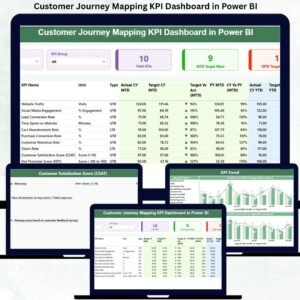
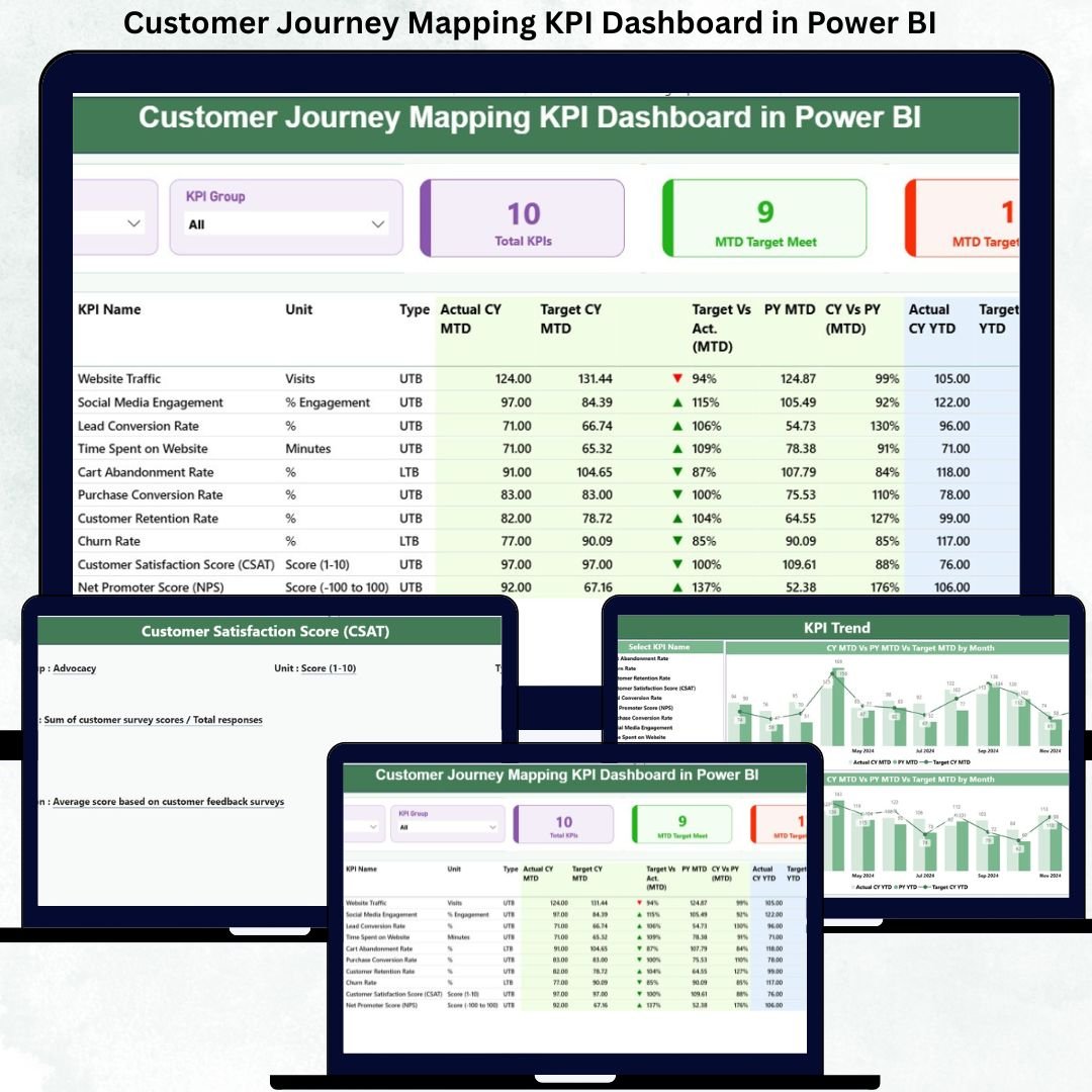
📌 1. Summary Page – Executive Control Panel
This is the main landing page of the dashboard.
Top Slicers
Month selector
KPI Group (Journey Stage)
KPI Cards
Total KPIs Count
MTD Target Met Count
MTD Target Missed Count
Detailed KPI Table
Displays complete performance metrics, including:
Actual vs Target (MTD & YTD)
Performance icons (▲ / ▼)
Previous Year comparison
CY vs PY growth percentages
This page enables leadership to instantly identify problem areas and strong journey stages.
📈 2. KPI Trend Page – Performance Over Time
The KPI Trend Page focuses on historical performance and trend analysis.
Key Features
Two combo charts:
MTD Actual vs Target vs Previous Year
YTD Actual vs Target vs Previous Year
KPI Name slicer for focused analysis
This page helps teams:
Identify improving or declining KPIs
Validate CX initiatives
Support forecasting and planning
📘 3. KPI Definition Page – Drill-Through Governance
This page acts as a reference and governance layer.
Shows
KPI Formula
KPI Definition
KPI Unit
KPI Type (LTB / UTB)
Users can drill through from the Summary Page to understand KPI logic and return easily using the back button.
🎯 Key KPIs You Can Track
This dashboard supports end-to-end customer journey KPIs, such as:
Awareness
Website Traffic Growth
Campaign Reach
Consideration
Engagement Rate
Lead Conversion Rate
Purchase
Conversion Rate
Cart Abandonment Rate
Onboarding
Time to First Value
Onboarding Completion %
Retention & Loyalty
Repeat Purchase Rate
Customer Lifetime Value
Net Promoter Score (NPS)
KPIs are fully customizable using the KPI Definition sheet.
🌟 Advantages of Customer Journey Mapping KPI Dashboard
✅ Centralized customer experience visibility
✅ Clear target vs actual accountability
✅ MTD, YTD, and YoY comparisons
✅ Faster decision-making
✅ Excel-based data control
✅ Power BI interactivity and scalability
✅ Cross-functional alignment
👥 Who Should Use This Dashboard?
Customer Experience Teams
Marketing & Growth Teams
Sales Leaders
Product Managers
Business Analysts
CX Consultants
Senior Management
### Click here to read the Detailed blog post
📺 Visit our YouTube channel for step-by-step tutorials
👉 https://youtube.com/@PKAnExcelExpert