

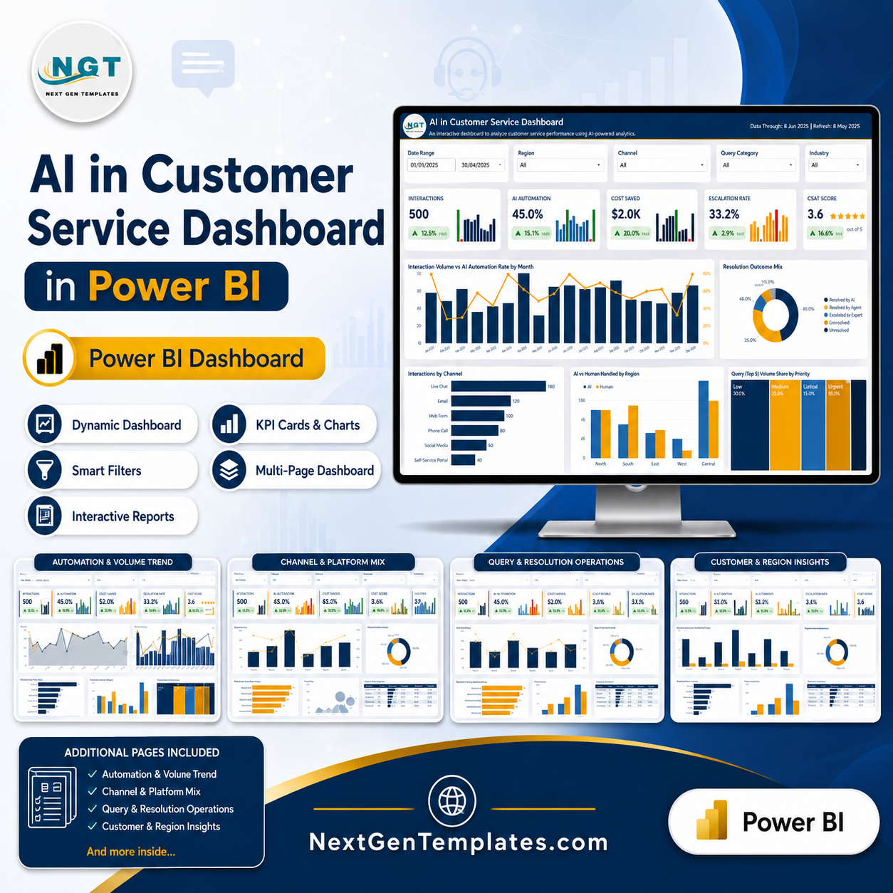


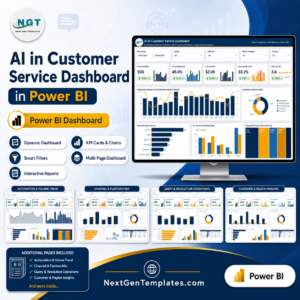
Once a support team has deployed AI, the reporting question changes shape. It is no longer “how many contacts did the bot handle” but “how many did it close, how many did it hand back, what did it cost to run, and did the customer come away happy”. The AI in Customer Service Dashboard in Power BI is built around that harder question: 6 report pages, 25 KPI cards each carrying a month-over-month delta and its own sparkline, five filters on every page, and three scorecard tables covering platform, channel and query category. The sample model holds 500 interactions across 18 months spanning 6 AI channels, 5 AI platforms, 7 query categories, 8 industries, 7 languages and 5 regions. Built by PK, a Microsoft Certified Professional with 15+ years in Excel and Power BI and 300K+ subscribers across two YouTube channels. Download the .pbix, open it in free Power BI Desktop, point the model at your own export, and every page follows. AI in Customer Service Dashboard in Power BI

Key Features of the AI in Customer Service Dashboard in Power BI
- Automation and escalation on the same card row. AI Automation and Escalation Rate sit beside each other on the Overview, so containment can never be reported without the handover rate that qualifies it.
- A resolution outcome mix, not a deflection number. Every interaction lands in one of five buckets – Resolved by AI, Escalated to Agent, Resolved by Agent, Abandoned or Pending. Abandoned contacts in particular tend to vanish from vendor reporting, and they are the ones that generate complaints.
- Month-over-month deltas on all 25 KPI cards. Each card shows the current figure, the MoM change with an up or down arrow, and a small bar chart of the trailing months, so a single good month never reads as a trend.
- Platform performance scorecard. All five AI platforms – Generative AI Assistant, Custom NLP Engine, Hybrid Agent Assist, Voice AI Engine and Rule-Based Bot – ranked on total interactions, automation rate, escalation rate and average resolution time in one table.
- Channel scorecard. AI Chatbot, Voice Bot, WhatsApp Bot, Live Chat Assist, Email AI and Social Media Bot on volume, automation rate, average response time and average satisfaction.
- Query category operations table. Seven categories with escalation rate, average resolution time and first-contact-resolution rate side by side – which is how you find the queries the AI should never have been given.
- Automation vs resolution time bubble chart where bubble size is volume, so the platform that is fast but rarely used is visually separated from the one that is slow and carries the load.
- Net savings, not gross. Cost Saved sits beside Net Savings and against Cost to Serve by industry, so the figure you take to finance already carries its own cost.
- Sentiment and language coverage. Positive sentiment as a KPI, sentiment against who handled the contact, and interaction volume across seven languages – the fastest way to see where a model is weakest.
- Agent hours saved and first contact resolution as first-class measures, because the operational case for AI is usually made in hours rather than currency.
- Five filters on every page. Date range, region, channel and query category are constant; the fifth changes per page – industry, status, AI platform, priority or customer type AI in Customer Service Dashboard in Power BI
What’s Inside the AI in Customer Service Dashboard
Six pages, each with the NGT header carrying the data-through date and the MoM comparison month.
1. Overview – automation coverage, cost savings and experience quality. Interactions, AI Automation, Cost Saved, Escalation Rate and CSAT Score as KPI cards, with Interaction Volume vs AI Automation Rate by Month, the Resolution Outcome Mix donut, Interactions by Channel, AI vs Human Handled by Region, and Query Mix broken down by Priority. AI in Customer Service Dashboard in Power BI
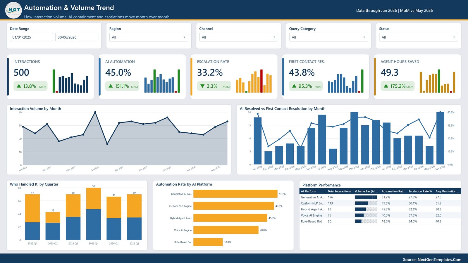
2. Automation & Volume Trend – how volume, containment and escalations move month over month. Interactions, AI Automation, Escalation Rate, First Contact Resolution and Agent Hours Saved, with Interaction Volume by Month, AI Resolved vs First Contact Resolution by Month, Who Handled It by Quarter, Automation Rate by AI Platform, and the Platform Performance scorecard.
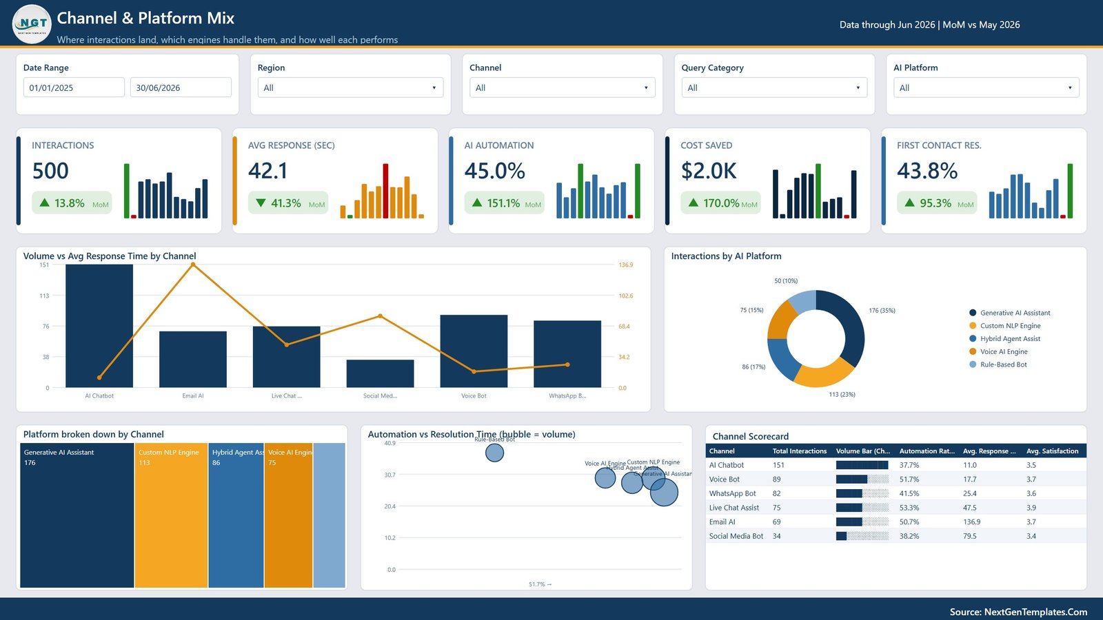
3. Channel & Platform Mix – where interactions land and how well each engine performs. Interactions, Avg Response in seconds, AI Automation, Cost Saved and First Contact Resolution, with Volume vs Avg Response Time by Channel, Interactions by AI Platform, Platform broken down by Channel, the Automation vs Resolution Time bubble chart, and the Channel Scorecard. AI in Customer Service Dashboard in Power BI.
4. Query & Resolution Operations – what customers ask, how long it takes, where AI hands off. Interactions, Avg Resolution in minutes, Escalation Rate, Abandonment Rate and First Contact Resolution, with Query Volume vs Avg Resolution Time, Interactions by Priority, Escalation Rate by Query Type, AI vs Human Handled by Priority, and the Query Category Operations table.
5. Customer & Region Insights – segment behaviour, sentiment, language and regional savings. Interactions, Cost Saved, Net Savings, Positive Sentiment and Revenue Impact, with Cost Saved vs Cost to Serve by Industry, Interactions by Customer Type, Interactions by Language, Sentiment vs Who Handled It, and the Regional Scorecard.

6. Get More Dashboards. A library page listing the wider NextGenTemplates Power BI catalogue and what the team builds for clients.
AI in Customer Service Dashboard in Power BI vs. the Excel Version vs. a Helpdesk Analytics Add-On – Where This Fits
| This Power BI dashboard | The Excel version | Helpdesk / CX analytics add-on | |
|---|---|---|---|
| Cost | 17.99 once | 17.99 once | Often 200+ per month on top of the helpdesk |
| Software needed | Power BI Desktop, free | Microsoft Excel | Vendor subscription |
| Setup time | Under an hour with your export | Under 30 minutes | Days, plus connector configuration |
| Cross-filtering between visuals | Yes, click any visual to filter the page | No, slicers only | Varies |
| Scheduled refresh | Yes, if you publish to the Power BI Service | No, manual refresh | Yes |
| Month-over-month deltas on KPIs | Yes, on all 25 cards | Not built in | Sometimes |
| Data volume | Millions of rows | Comfortable to tens of thousands | Unlimited |
| Combines several AI vendors | Yes – the model reads your table | Yes | Rarely, usually one vendor |
| Sharing | File, or a Service workspace | Send the file | Per paid seat |
| Year-1 cost for a support team | 17.99 | 17.99 | 2,400 and up |
The honest comparison: if your team lives in Excel, buy the Excel version – it answers the same questions with less setup. This one earns its place when you want cross-filtering, month-over-month deltas built into every card, or a scheduled refresh through the Power BI Service. AI in Customer Service Dashboard in Power BI
Who This Template Is For – and Who It’s Not For
A good fit if you are: a CX or support director who has to report AI performance to a board; a support operations lead comparing several AI platforms and channels; a Power BI analyst who wants a working model rather than a blank canvas; a BPO reporting AI performance to a client; a finance partner verifying a claimed automation saving.
Not the right tool if you are: looking for a real-time console – this refreshes on your schedule, not per second; unwilling to install Power BI Desktop, in which case the Excel version of this dashboard is the better buy; or expecting the data to be supplied, since the 500-row sample is illustrative and you bring your own export. AI in Customer Service Dashboard in Power BI
How to Use the AI in Customer Service Dashboard
- Unzip the download and open the .pbix in Power BI Desktop – the free version from Microsoft is enough. No Power BI Service licence is required to use the file.
- Look at the sample data first. Six pages of an 18-month picture show you what each visual is meant to say before you replace anything.
- Point the model at your own data. Use Transform Data to change the source to your interaction export, keeping the same column names so the DAX measures and relationships hold.
- Refresh and check the Overview. Interactions, automation rate and escalation rate will tell you within seconds whether the load landed correctly.
- Read the Resolution Outcome Mix before the automation rate. Abandoned and Pending are the two buckets that make an impressive containment number look different.
- Use cross-filtering. Click a channel bar or a priority slice and every other visual on the page filters to it – the feature that most separates this from the Excel build.
- Work the scorecards. Platform, channel and query category tables each rank the same population four ways; where the four rankings disagree is usually where the problem is.
- Publish to the Power BI Service if you want a scheduled refresh and a shareable link rather than a file.
Real-World Use Cases
Qualifying a 45% automation rate. The headline number looked strong until the Resolution Outcome Mix showed a third of interactions escalating to an agent and a further 8% abandoned. The reported figure did not change; what changed was the sentence next to it in the board pack.
Retiring a legacy bot. The Platform Performance scorecard put the Rule-Based Bot at an 18% automation rate and a 54% escalation rate against a generative assistant at 51.7% and 27.8%. Two columns of one table made the decommissioning case that a year of anecdote had not.
Finding the expensive queries. Escalation Rate by Query Type put Refunds & Returns at 51% and Complaints at 48.5%, while Product Info sat at 16.7%. The response was to route the first two straight to agents rather than keep paying for a bot attempt that mostly failed.
Frequently Asked Questions
Do I need a paid Power BI licence?
No. Power BI Desktop is free from Microsoft and is all you need to open, edit and use the file. A Power BI Service licence is only needed if you want to publish it for scheduled refresh and web sharing.
Does it connect to my helpdesk automatically?
No. The model reads a table you supply. That is what lets it work with any helpdesk, any AI vendor, and several of them in one view – and lets it survive a change of platform.
What data do I need?
One row per interaction with date, channel, AI platform, query category, priority, region, language, industry, customer type, resolution outcome, resolution time, response time, satisfaction score, cost saved, cost to serve and revenue impact. The sample file shows the exact shape.
Can I edit the DAX and visuals?
Yes. Nothing is locked. Every measure, relationship and visual is editable in Power BI Desktop, which is the point of shipping a .pbix rather than a published report.
How is automation rate calculated?
Interactions resolved by AI divided by total interactions. Escalations, abandonments and pending contacts are tracked as separate outcomes, so a handover is never counted as a resolution.
Can I rebrand it?
Yes. The theme colours, the header block and the logo are all editable, and the report uses a custom theme file rather than hard-coded formatting on each visual.
Is there an Excel version?
Yes – the AI in Customer Service Dashboard in Excel covers the same questions with pivot tables and slicers, for teams without Power BI.
About the Author
Built by PK – Microsoft Certified Professional with 15+ years of Excel, Google Sheets, and Power BI experience. Founder of NextGenTemplates, reaching 300K+ subscribers across YouTube channels. Every template is hand-built and tested before release.
Explore Related Templates
- AI in Customer Service Dashboard in Excel – the same analysis for teams without Power BI.
- AI Chatbot Providers Dashboard in Power BI – vendor-side comparison rather than your own operation.
- Sentiment Analysis Startups Dashboard in Power BI – a deeper look at sentiment data.
- SaaS Development Dashboard in Power BI – the product side of the same business.
- IT Manager & CISO Toolkit – ten templates for the wider technology function.
- Browse every Power BI dashboard or the full Power BI template catalogue. AI in Customer Service Dashboard in Power BI
Get Your Copy
Load last year’s interactions and open the Resolution Outcome Mix first. Most teams find the escalated and abandoned slices are larger than the deflection report suggested – which is the whole reason to build the report yourself. If anything does not work as described, contact us and we will put it right. AI in Customer Service Dashboard in Power BI
Last updated: 12 August 2026.


Reviews
There are no reviews yet.