

In the insurance and finance industries, precision, risk assessment, and predictive analysis are everything. Actuaries handle massive volumes of data — from premiums and claims to satisfaction scores and reserves — to ensure organizations stay profitable and compliant.
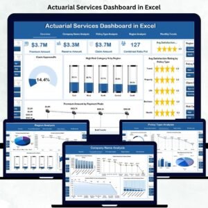
The Actuarial Services Dashboard in Excel is a ready-to-use analytical solution that transforms raw actuarial data into clear, actionable insights. Built for actuaries, insurance professionals, and risk managers, this Excel-based dashboard helps track, visualize, and interpret key performance indicators (KPIs) across multiple dimensions — including claims management, policy analysis, and risk exposure.
By combining Excel’s flexibility with automated analytics, this tool enables professionals to make faster, more data-driven decisions without relying on expensive BI software.
⚙️ Key Features of the Actuarial Services Dashboard in Excel
📊 5 Analytical Pages – Overview, Company Name, Policy Type, Region, and Monthly Trends.
🧭 Page Navigator – Switch between dashboards effortlessly via left-side navigation.
📈 Dynamic KPIs – Total Claims, Premium Amount, Combined Ratio %, and Customer Satisfaction.
💡 Interactive Charts – Drill down into risk categories, claim approvals, and performance ratios.
🎯 Actual vs Target Visualization – Compare results against business benchmarks.
🌍 Regional Risk Mapping – Identify high-risk or high-profit geographies.
📅 Monthly Trend Tracking – Detect seasonal variations in claims and premiums.
📘 Support & Data Sheets – Maintain reference data and raw inputs cleanly.
📤 Customizable Format – Add KPIs, adjust formulas, or integrate with databases easily.
🧭 Dashboard Structure Overview
🏠 1️⃣ Overview Page — Central Insight Hub
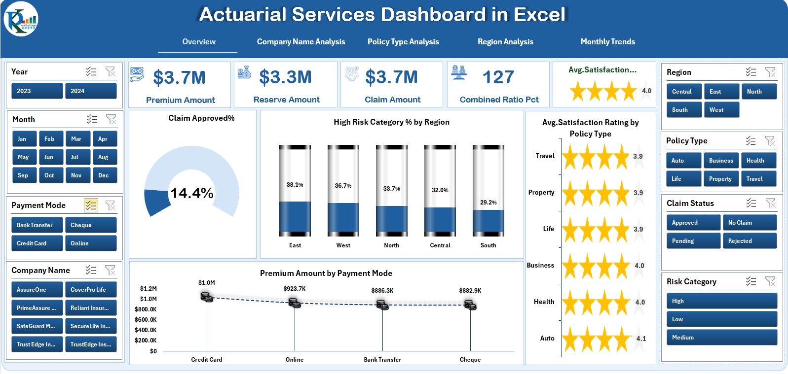
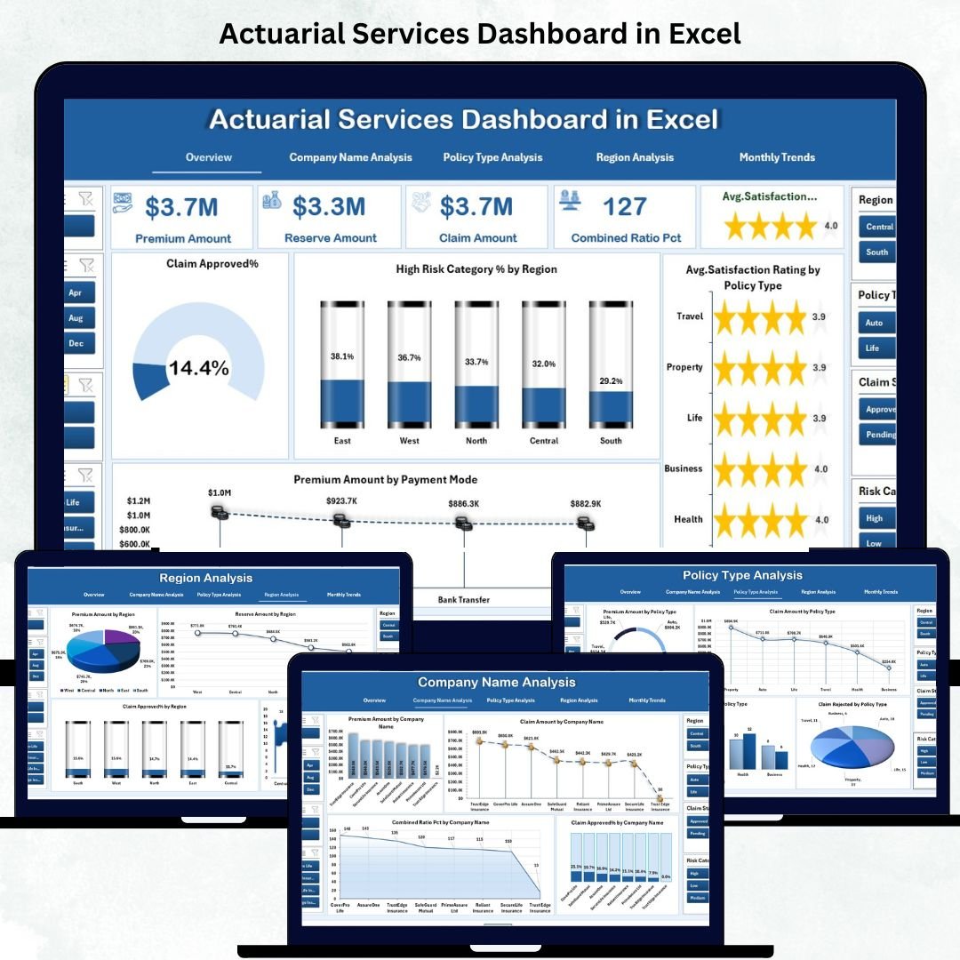
The main page features five key KPI cards (Total Claims, Premiums, Customer Satisfaction, etc.) and four interactive charts:
Claim Approved %
High-Risk Category % by Region
Premium Amount by Payment Mode
Average Satisfaction by Policy Type
💡 Purpose: Get a one-glance, 360° performance summary of actuarial operations.
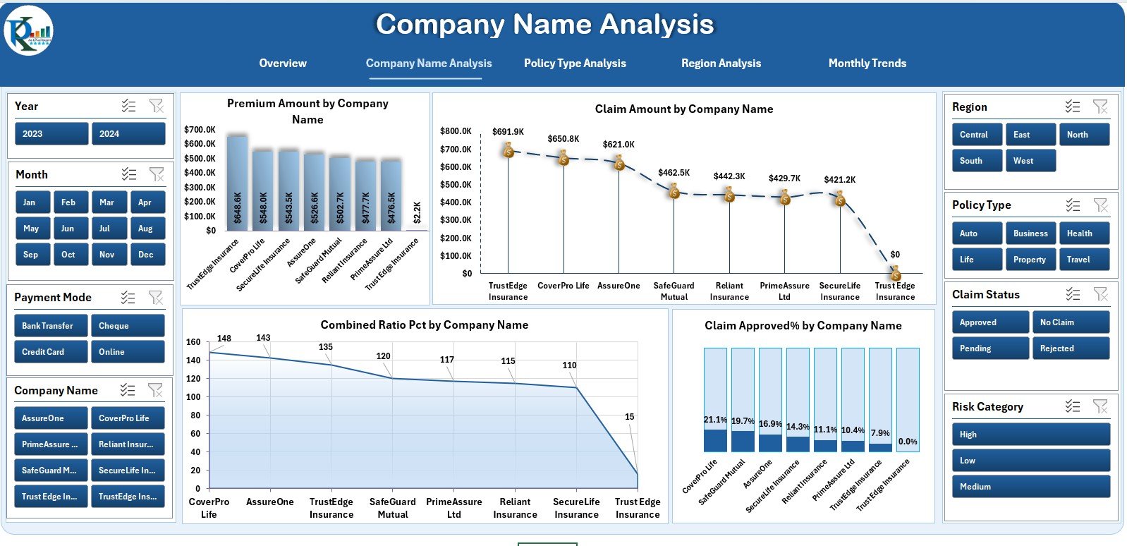
🏢 2️⃣ Company Name Analysis — Compare Insurer Performance
Analyze multiple insurers with four comparative visuals:
Premium Amount by Company
Claim Amount by Company
Combined Ratio (%) by Company
Claim Approved % by Company
🎯 Purpose: Benchmark insurer efficiency and identify improvement areas.
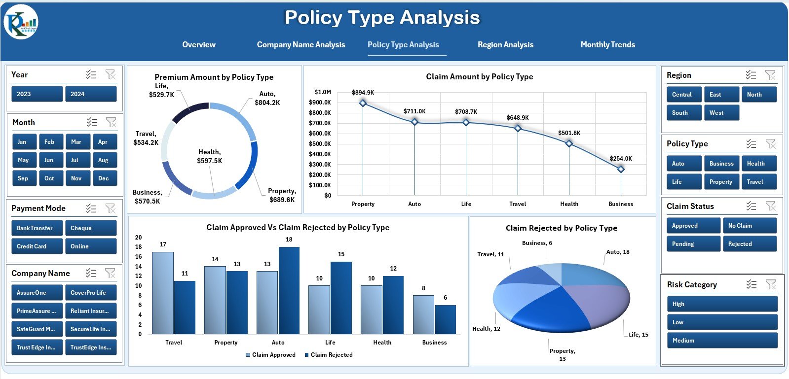
🧾 3️⃣ Policy Type Analysis — Evaluate Policy Effectiveness
Understand how each policy type performs:
Premiums and Claims by Policy Type
Claim Approved vs Rejected %
Rejected Claims by Category
💡 Purpose: Reveal which products are most profitable or risky.
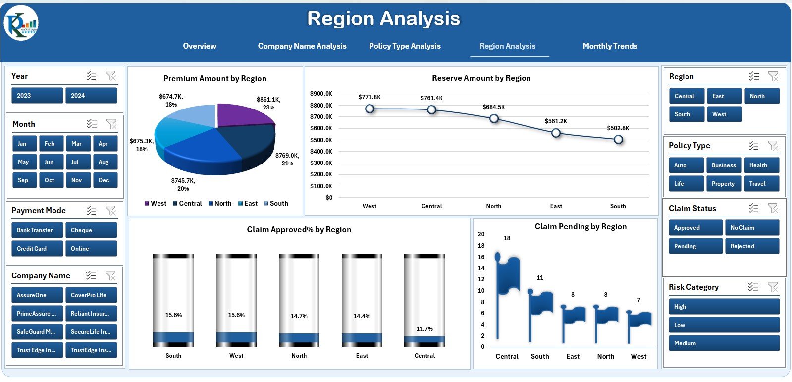
🌍 4️⃣ Region Analysis — Identify Geographical Risk
Gain a location-based view of business performance:
Premiums by Region
Reserve Amount by Region
Claim Approved % by Region
Pending Claims Count by Region
📊 Purpose: Detect risk hotspots and optimize regional pricing.
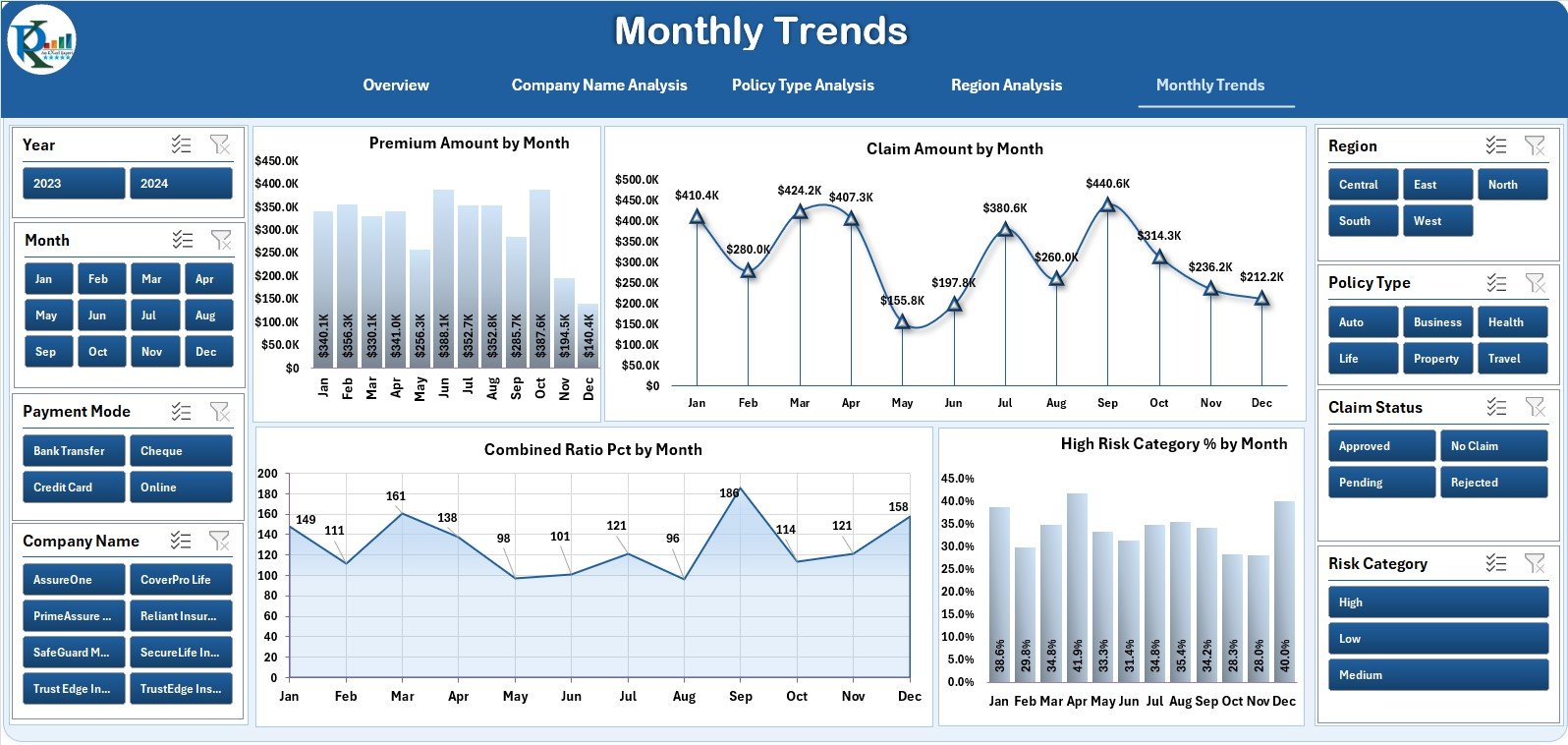
📅 5️⃣ Monthly Trends — Time-Series Performance
Monitor operational KPIs month-by-month:
Premium Amount by Month
Claim Amount by Month
Combined Ratio % by Month
High-Risk Category % by Month
🎯 Purpose: Identify seasonal cycles, forecast trends, and plan budgets.
🧩 Supporting Sheets
Data Sheet: Core transactional data for premiums, claims, and reserves.
Support Sheet: Stores reference data like policy types and regions.
Together, these power the entire dashboard dynamically.
🌟 Advantages of the Actuarial Services Dashboard
✅ Centralized Performance Tracking – View all actuarial KPIs in one structured file.
✅ Automated Analysis – Dynamic charts update instantly when data changes.
✅ Data-Driven Risk Management – Identify high-risk segments with visual cues.
✅ Enhanced Transparency – All departments share consistent performance views.
✅ Cost-Efficient – Provides analytical power without expensive software.
✅ Easy Customization – Modify KPIs, add formulas, or integrate Power Query.
🧠 Best Practices for Maximum Accuracy
📌 Validate all claim and premium entries before analysis.
📌 Define KPI targets clearly (e.g., Combined Ratio ≤ 95 %).
📌 Review Monthly Trends regularly for early warnings.
📌 Share insights with Finance, Risk, and Operations teams.
📌 Use slicers to filter by region, company, or policy.
📌 Back up data to cloud storage for version control.
👥 Who Can Benefit
👩💼 Actuarial Analysts & Consultants – Perform detailed risk and premium analysis.
🏢 Insurance Companies & Brokers – Monitor performance across portfolios.
📊 Risk & Finance Teams – Align claims data with business targets.
🎓 Academic Institutions – Teach actuarial modeling and reporting techniques.
💡 Why Excel Works Best for Actuarial Analysis
Familiar and flexible for quick modeling.
Supports complex formulas, pivot tables, and charts.
Easy to share, modify, and audit.
Integrates seamlessly with Power BI or databases when scaling up.




















Reviews
There are no reviews yet.