

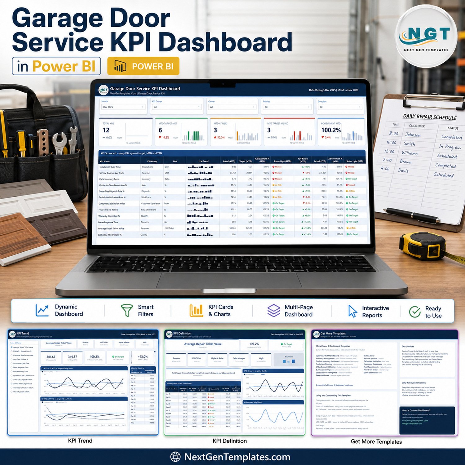

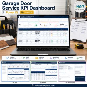
The Garage Door Service KPI Dashboard in Power BI tracks 12 service KPIs across 9 KPI groups on 4 report pages, with 5 synced slicers and 12 months of actuals, targets and prior-year figures already loaded. Setup takes under 10 minutes: replace three sheets in the included Data.xlsx, hit Home > Refresh, and every card, chart and traffic light follows.
🌍 Join 8,400+ teams in 40+ countries using NextGenTemplates to replace paid SaaS tools with one-time-purchase Excel, Google Sheets, Power BI and HTML templates.
✅ Instant download · One-time payment · No subscription · No per-user fees · Lifetime access
🔑 Key Features of the Garage Door Service KPI Dashboard in Power BI
🎯 12 garage door KPIs, scored against target every month. The scorecard tracks Installation Cycle Time, Service Revenue per Truck, Parts Inventory Turns, Quote-to-Close Conversion %, Same-Day Dispatch Rate %, Technician Utilization Rate %, Customer Satisfaction Index, First-Time Fix Rate %, Warranty Claim Rate %, Mean Response Time, Average Repair Ticket Value and Callback / Rework Rate %.
🚦 Direction-aware scoring, so lower-is-better metrics are not punished. Each KPI is flagged UTB (higher is better) or LTB (lower is better). Higher-is-better KPIs score Actual / Target; lower-is-better KPIs score Target / Actual, so beating a cycle-time or callback target scores above 100%. Status bands are fixed: On Target at 100% or more, At Risk from 95% to 100%, Missed below 95%.
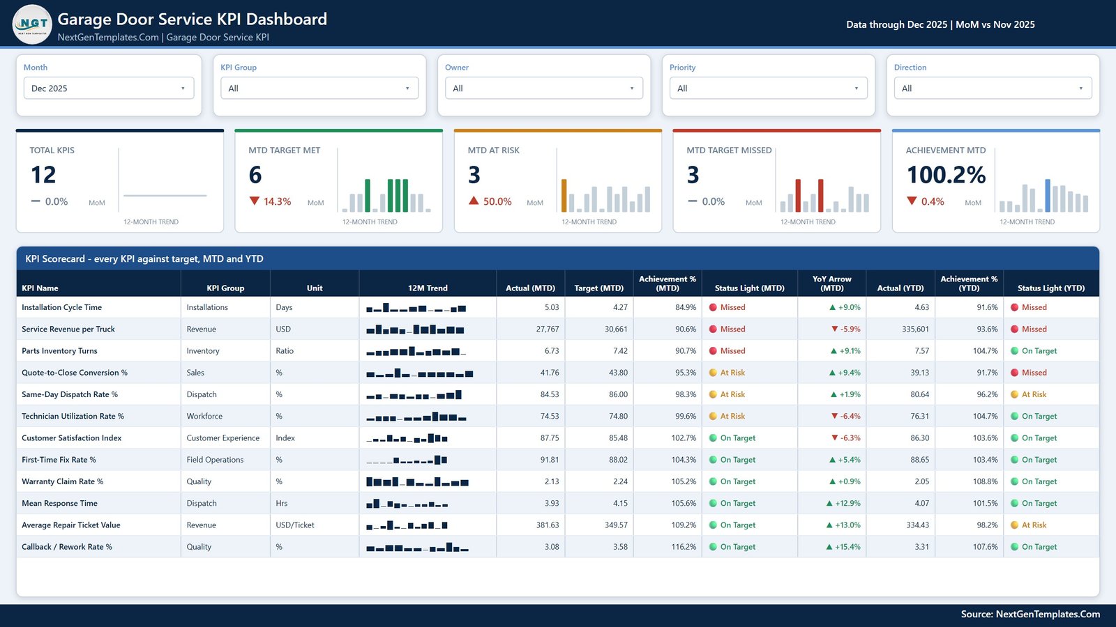
📅 A month picker that drives the whole report. Pick any month from the Month slicer and the five summary cards, the scorecard table and every status light recalculate. The 12-month sparkline on each card stays on the full year, so you never lose the trend while you drill into one period.
🔍 Five slicers on the scorecard page. Month, KPI Group, Owner, Priority and Direction filter the whole page together, so you can look at only the Dispatch group, only High-priority KPIs, or only the lower-is-better metrics.
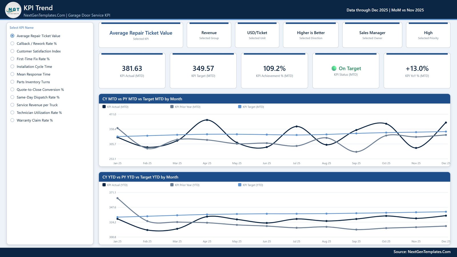
📈 Current year, prior year and target on the same axis. The trend page charts CY MTD vs PY MTD vs Target MTD by Month and CY YTD vs PY YTD vs Target YTD by Month, so a weak month is immediately visible as a gap against both last year and plan.
🧩 Nothing is hard-coded. No card, chart or table names a KPI. Add a KPI, rename one or delete one in the three input sheets, refresh, and the counts, the KPI list and every visual follow. Native Power BI visuals only — nothing to install, no locked objects, and one custom theme recolours the entire report.
📦 What Is Inside the Download
Page 1: KPI Scorecard
The landing page. Five slicers (Month, KPI Group, Owner, Priority, Direction) sit above five summary cards — Total KPIs, MTD Target Met, MTD At Risk, MTD Target Missed and Achievement MTD — each with a month-on-month percentage and a 12-month trend sparkline. Below them, the KPI Scorecard table lists every KPI with its group, unit, 12M trend, Actual (MTD), Target (MTD), Achievement % (MTD), Status Light (MTD), YoY Arrow (MTD), Actual (YTD), Achievement % (YTD) and Status Light (YTD).
Page 2: KPI Trend
Pick one KPI from the radio list on the left and the whole page becomes that KPI. Six context cards restate the selected KPI, its group, unit, direction, owner and priority; five value cards show KPI Actual (MTD), KPI Target (MTD), KPI Achievement % (MTD), KPI Status (MTD) and KPI YoY % (MTD). Two line charts follow: CY MTD vs PY MTD vs Target MTD by Month, and CY YTD vs PY YTD vs Target YTD by Month.
Page 3: KPI Definition
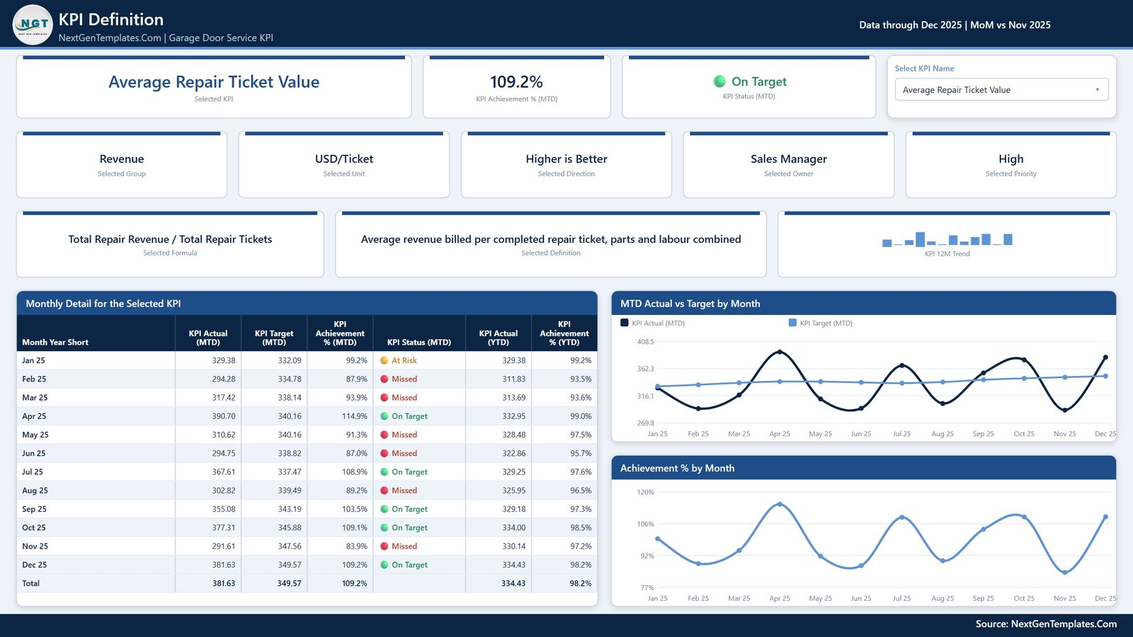
The audit page. A synced Select KPI Name dropdown drives cards for achievement, status, group, unit, direction, owner, priority, the KPI formula and its written definition, plus a 12-month sparkline. Underneath, Monthly Detail for the Selected KPI lists every month with Actual (MTD), Target (MTD), Achievement % (MTD), Status (MTD), Actual (YTD) and Achievement % (YTD) and a total row, alongside MTD Actual vs Target by Month and Achievement % by Month.
Page 4: Get More Templates
A reference page listing the wider Power BI catalogue, the customisation notes for this file (change the month, pick a KPI, swap in your own data, UTB / LTB scoring, recolour in one place) and how to commission a custom dashboard.
📊 Garage Door Service KPI Dashboard in Power BI vs. Tableau / Qlik vs. ServiceTitan / Jobber — Where This Fits
| Feature | This template | Tableau / Qlik build | ServiceTitan / Jobber |
|---|---|---|---|
| Cost | $12.99 one-time ✅ | $70-$115 per Creator seat, monthly | $49-$400+ per month, plan dependent |
| Platform | Power BI Desktop, free ✅ | Tableau or Qlik licence required | Vendor cloud only |
| Setup time | Under 10 minutes ✅ | Days of modelling and chart building | Weeks of onboarding and data migration |
| KPIs pre-built | 12, already scored against target ✅ | None — you build every measure | Fixed vendor metric set |
| Lower-is-better handling | Built in via UTB / LTB ✅ | Hand-written per measure | Varies by report |
| Customisable fields | Add, rename or delete any KPI ✅ | Yes, with developer effort | Limited to the vendor schema |
| Data stays on your machine | Yes — local .pbix and Excel ✅ | Depends on deployment | No, hosted by the vendor |
| Year-1 cost at 5 users | $12.99 total ✅ | $4,200-$6,900 | $2,900-$24,000+ |
For garage door companies that want a real KPI review pack without a BI licence or a field-service SaaS contract, the Garage Door Service KPI Dashboard in Power BI sits in the sweet spot.
👥 Who This Template Is For — and Who It Is Not For
✅ This template is built for:
- Owners and operations managers at garage door install and repair companies running 2-30 trucks
- Service managers who already report monthly numbers in a spreadsheet and want a Power BI review pack instead
- Franchise and multi-branch operators who need one comparable scorecard per location
- Analysts who want a working, documented Power BI KPI model to adapt rather than a blank canvas
❌ This template is NOT for:
- Teams needing live dispatch, scheduling or invoicing — this reports on your numbers, it does not run the jobs
- Anyone wanting an automatic connection to ServiceTitan, Jobber or a CRM; the input is an Excel file you refresh
- Mac-only shops, because Power BI Desktop is Windows-only
- Organisations that require SSO, row-level security and a governed enterprise tenant out of the box
⚙️ How to Use This Power BI KPI Dashboard Template
- Unzip the download and keep the .pbix file and Data.xlsx together in the same folder.
- Open the .pbix in Power BI Desktop, the free download from Microsoft.
- Open Data.xlsx and read the Read Me sheet — it explains the three input sheets and the scoring rules.
- Fill KPI Definition: one row per KPI with its group, unit, formula, owner, priority and UTB or LTB type.
- Fill Input_ Target with one row per KPI per month, and Input_ Actual with the same for this year and last year.
- Back in Power BI, choose Home > Refresh. Every card, table and chart rebuilds from the new rows.
- Use the Month slicer to pick a reporting period, then work down the scorecard from Missed to On Target.
💼 Real-World Use Cases
Dave owns a 6-truck garage door company in Ohio. He opens the scorecard on the first Monday of each month, filters to the Dispatch group, and sees Same-Day Dispatch Rate % sitting At Risk at 98.3% of target while Mean Response Time is comfortably On Target. That one screen decides what his Monday morning meeting is about.
Priya manages service operations for a three-branch installer. She uses the KPI Trend page to compare current year against prior year for Installation Cycle Time, and takes the CY MTD vs PY MTD chart straight into her quarterly board pack — replacing the three hours she used to spend rebuilding charts by hand.
Marcus is the analyst at a garage door franchise group. He kept the model and swapped the KPI list entirely, adding two franchise-specific metrics in the KPI Definition sheet. Because nothing in the report hard-codes a KPI name, the counts, the selector list and every visual picked the new metrics up on the first refresh.
❓ Frequently Asked Questions
What KPIs does this garage door dashboard track?
It tracks 12 KPIs across 9 groups: Installation Cycle Time, Service Revenue per Truck, Parts Inventory Turns, Quote-to-Close Conversion %, Same-Day Dispatch Rate %, Technician Utilization Rate %, Customer Satisfaction Index, First-Time Fix Rate %, Warranty Claim Rate %, Mean Response Time, Average Repair Ticket Value and Callback / Rework Rate %.
How long does setup take?
Under 10 minutes if your numbers are already in a spreadsheet. Unzip the file, open the .pbix in Power BI Desktop, paste your monthly targets and actuals into the three input sheets of Data.xlsx, then choose Home > Refresh. No DAX editing and no data modelling are required.
Can I add or remove KPIs?
Yes. Nothing in the report hard-codes a KPI name. Add a row to KPI Definition plus its monthly Target and Actual rows, or delete a KPI from all three sheets, then refresh. The card counts, the KPI selector list, the scorecard and every chart follow automatically.
How does it handle metrics where lower is better?
Each KPI carries a UTB or LTB flag. Higher-is-better KPIs score Actual / Target; lower-is-better KPIs such as Mean Response Time and Callback / Rework Rate % score Target / Actual, so beating the target scores above 100%. Status bands are On Target at 100% or more, At Risk 95-100%, Missed below 95%.
How does this compare to ServiceTitan or Jobber?
Those platforms run your dispatch, scheduling and invoicing and charge a monthly subscription. This is a reporting layer you own outright for a one-time $12.99. Export your monthly numbers from whatever system you already use, paste them in, and get a board-ready KPI review pack without another recurring bill.
Do I need a paid Power BI licence?
No. The Garage Door Service KPI Dashboard in Power BI opens in Power BI Desktop, which is free from Microsoft. A Power BI Pro licence is only needed if you want to publish the report to the Power BI service and share it with colleagues online.
What exactly is in the download?
A ZIP containing the .pbix report file, Data.xlsx with the Read Me and the three input sheets already filled with realistic sample data, and a Power BI Dashboard user manual PDF. Everything is fully editable — no locked visuals and no custom visuals to install.
👤 About the Author
Built by PK — Microsoft Certified Professional with 15+ years of Excel, Google Sheets and Power BI experience. Founder of NextGenTemplates, reaching 300K+ subscribers across YouTube channels (@PK-AnExcelExpert, @NextGenTemplates, @NeoTechNavigators). Every template is hand-built and tested before release.
🔗 Explore Related Templates
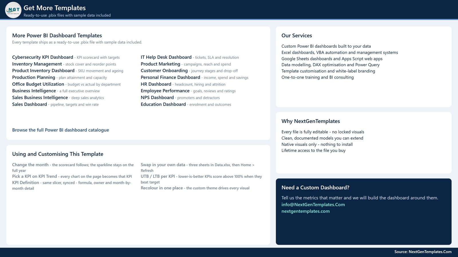
Also available as: the same 12-KPI scorecard ships as the Garage Door Service KPI Dashboard in Excel and the Garage Door Service KPI Dashboard in Google Sheets, so you can pick the platform your team already lives in.
Running a lighter monthly review? The Garage Door Service KPI Scorecard in Google Sheets is the one-page sibling of this pack. For adjacent trades, the Locksmith Business KPI Dashboard in Power BI, the Septic Tank Service KPI Dashboard in Power BI and the Pest Control Business KPI Dashboard in Power BI use the identical model. Browse the full range of Power BI Dashboards and Power BI templates.
📖 Click here to read the Detailed Blog Post
🎥 Visit our YouTube channel for step-by-step video tutorials
👉 YouTube.com/@NextGenTemplates
📅 Last updated: September 2026























Reviews
There are no reviews yet.