

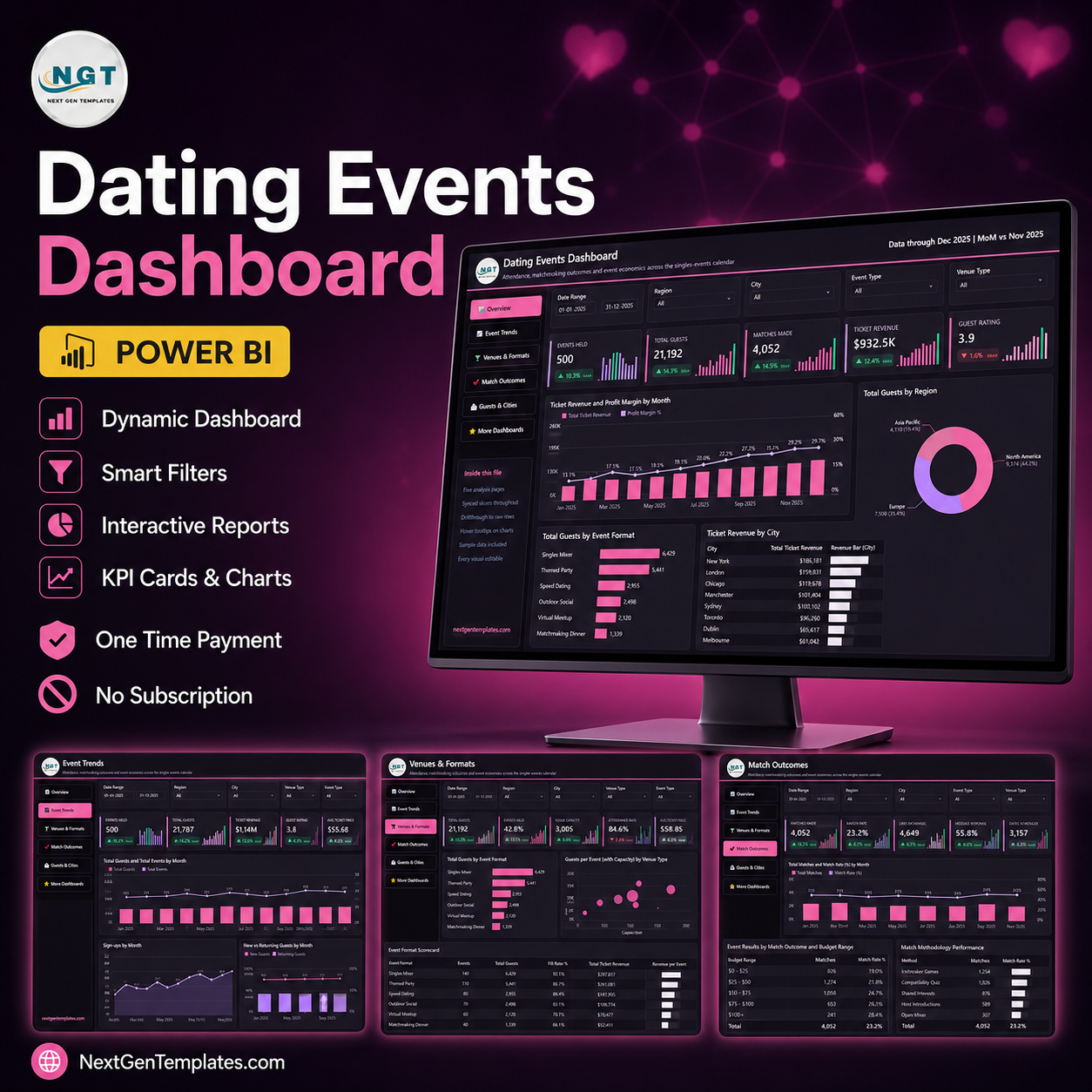

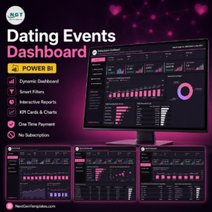
The Dating Events Dashboard in Power BI reports on 500 sample singles events across 9 venue types, 6 event formats and 8 cities, using 35 DAX measures spread over five analysis pages. The sample calendar covers January to December 2025 and totals 21,192 guests, 25,797 sign-ups, 4,052 matches and $932.5K of ticket revenue. Setup takes under ten minutes: open the .pbix, point Power Query at your own workbook, refresh.
🌍 Join 8,400+ teams in 40+ countries using NextGenTemplates to replace paid SaaS tools with one-time-purchase Excel, Google Sheets, Power BI and HTML templates.
✅ Instant download · One-time payment · No subscription · No per-user fees · Lifetime access
This is the analytical Power BI dashboard line — a five-page report you slice and drill into. It is not the month-picker KPI scorecard; if you want traffic lights against monthly targets, the Event Planning KPI Dashboard in Power BI is that product. The same report is also published as an Excel edition.
🔑 Key Features of the Dating Events Dashboard in Power BI
📊 Five analysis pages, 35 measures. Overview, Event Trends, Venues & Formats, Match Outcomes and Guests & Cities each open with five KPI cards carrying a month-on-month delta and a sparkline, then two or three charts beneath. Every measure, colour and visual is editable — nothing is locked.
🎛️ Synced slicers on every page. Date Range, Region, City and Event Type appear on all five pages and stay in step as you move between them. A fifth slicer changes with the page: Venue Type on Overview, Event Status on Event Trends, Age Group on Venues & Formats and Match Outcomes, and Host on Guests & Cities.
🔎 A real drillthrough to the raw rows. Right-click any bar, slice or table row and drill to the hidden Details page, which is wired to seven fields — Event Type, Venue Type, City, Region, Host, Age Group and Event Status. Two hidden tooltip pages give you a mini card and trend when you hover a chart.
📅 500 events of sample data, ready to swap. The included Data.xlsx holds one row per event across 20 columns: Event ID, Date, Event Name, Event Type, Venue Type, City, Region, Host, Age Group, Event Status, Seats Offered, Registrations, Attendees, Matches Made, Second Dates Confirmed, New Members, Ticket Revenue, Event Cost, Marketing Spend and Satisfaction Score.
🔐 No attendee data anywhere in the model. Every row is an event, not a person. There are no attendee names, emails, phone numbers, profiles, photos or messages. “Host” is the staff member who ran the event and “Age Group” is a single cohort label for the event as a whole, not an individual’s age.
📦 What’s Inside the Dating Events Dashboard in Power BI
The file ships nine pages in total: five analysis pages, a “Get More Dashboards” page, one hidden Details drillthrough page and two hidden 280×360 tooltip pages.
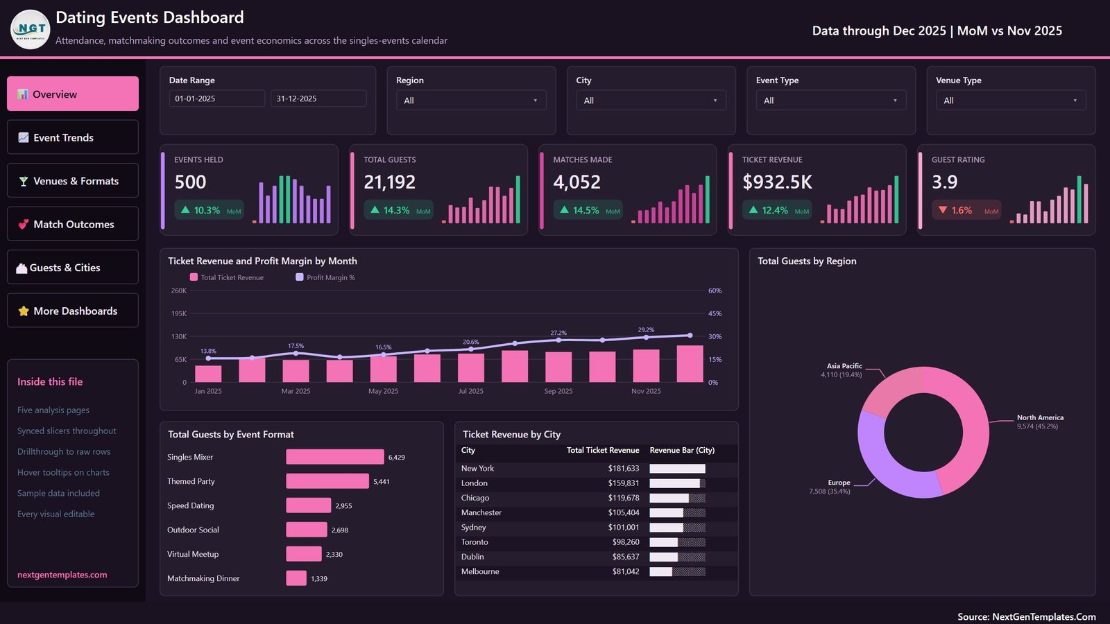
Page 1: Overview
Cards for Events Held, Total Guests, Matches Made, Ticket Revenue and Guest Rating — 500, 21,192, 4,052, $932.5K and 3.9 on the sample. Charts are Ticket Revenue and Profit Margin by Month, Total Guests by Region, Total Guests by Event Format, and Ticket Revenue by City.
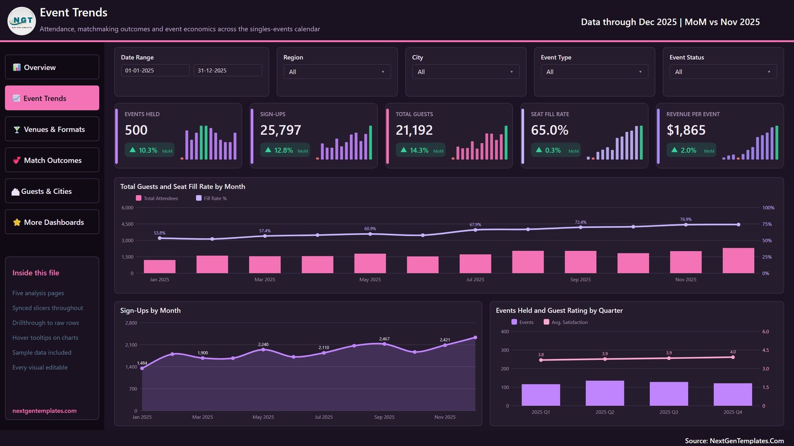
Page 2: Event Trends
Cards for Events Held, Sign-Ups, Total Guests, Seat Fill Rate and Revenue per Event — 25,797 sign-ups against 21,192 guests is a 65.0% seat fill on the sample. Charts are Total Guests and Seat Fill Rate by Month, Sign-Ups by Month, and Events Held and Guest Rating by Quarter.
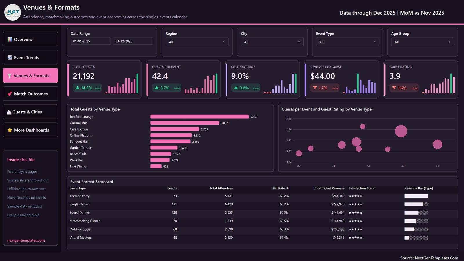
Page 3: Venues & Formats
Cards for Total Guests, Guests per Event, Sold Out Rate, Revenue per Guest and Guest Rating — 42.4 guests per event and $44.00 per guest on the sample. Charts are Total Guests by Venue Type and Guests per Event and Guest Rating by Venue Type, over an Event Format Scorecard listing events, attendees, fill rate, ticket revenue and a star rating per format.
Page 4: Match Outcomes
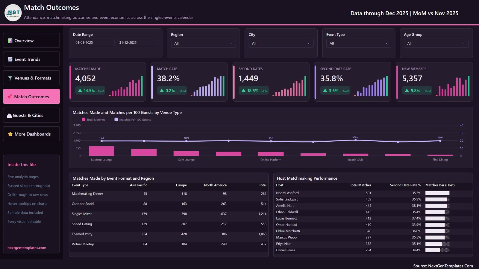
Cards for Matches Made, Match Rate, Second Dates, Second Date Rate and New Members — 4,052 matches, 1,449 second dates and 5,357 new members on the sample. Charts are Matches Made and Matches per 100 Guests by Venue Type, Matches Made by Event Format and Region, and a Host Matchmaking Performance table.
Page 5: Guests & Cities
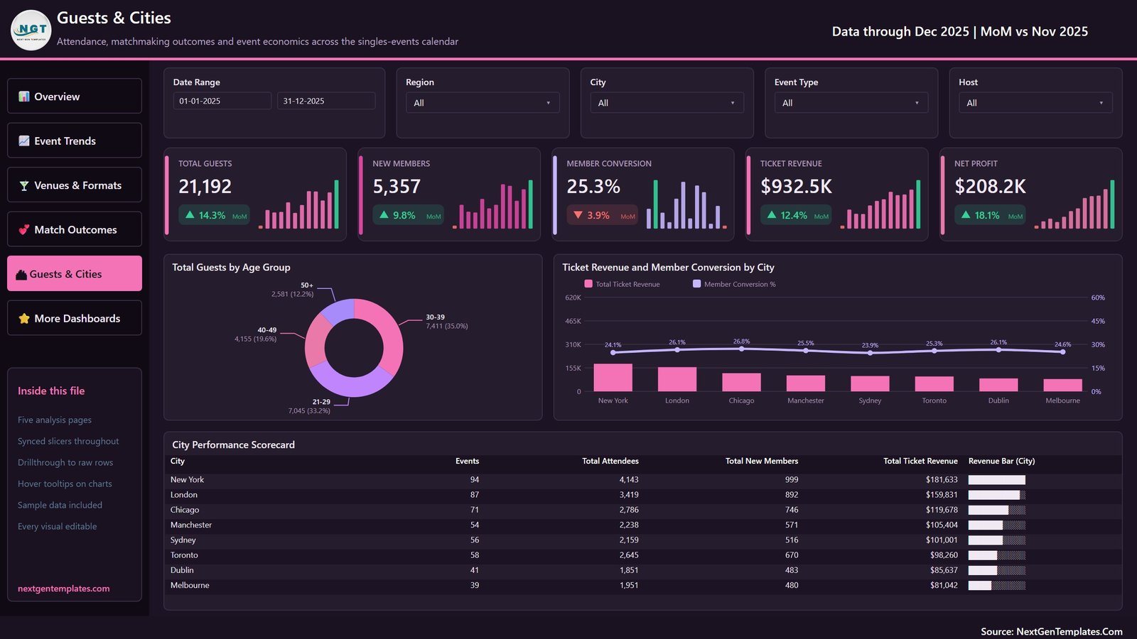
Cards for Total Guests, New Members, Member Conversion, Ticket Revenue and Net Profit — $208.2K net profit on the sample, after $474.6K of event cost and $249.8K of marketing spend. Charts are Total Guests by Age Group and Ticket Revenue and Member Conversion by City, over a City Performance Scorecard for all eight cities.
📊 Dating Events Dashboard in Power BI vs. Tableau / Qlik vs. Eventbrite Pro / Splash — Where This Fits
| Feature | Dating Events Dashboard in Power BI | Tableau / Qlik build | Eventbrite Pro / Splash |
|---|---|---|---|
| Cost | $17.99 one-time ✅ | $75 / user / month plus build time | $99-$500 / month plus ticket fees |
| Platform | Power BI Desktop (free) ✅ | Paid desktop licence | Vendor-hosted only |
| Setup time | Under 10 minutes ✅ | Days to weeks | Hours, plus data migration |
| Your data stays local | Yes — one .pbix on your machine ✅ | Depends on server | No, hosted by the vendor |
| Matchmaking metrics built in | Yes — match rate, second dates, matches per 100 guests ✅ | Build them yourself | No, ticketing metrics only |
| Venue and format profitability | Yes — 9 venue types, 6 formats ✅ | Build it yourself | Limited |
| Drillthrough to raw event rows | Yes — 7 fields ✅ | Yes, once built | Export to CSV |
| Rebrand for a client | Yes — every visual editable ✅ | Yes | Limited white-label tiers |
| Year-1 cost at 5 users | $17.99 ✅ | $4,500+ | $1,188-$6,000 |
For an events team that wants venue, format and matchmaking analytics without a per-seat BI licence or a hosted ticketing subscription, the Dating Events Dashboard in Power BI sits in the sweet spot.
👥 Who This Template Is For — and Who It’s Not For
✅ This template is built for:
- Singles-events and speed-dating organisers running 10-100 events a year across several cities
- Matchmaking agencies and social clubs that want venue and format profitability in one place
- Event marketers who need seat fill, sign-up-to-attendance and cost-per-guest reporting
- Analysts and freelancers building an events report for a client and starting from a working model
- Anyone learning Power BI who wants a finished report with drillthrough and tooltips to take apart
❌ This template is NOT for:
- Anyone wanting a matchmaking or compatibility engine — this reports on events that happened, it does not score, rank or predict anything about people or relationships
- Teams needing a ticketing or booking system — there is no checkout, no payments and no guest list here
- Anyone wanting to analyse individual attendees — the model is event-level by design, and building a person-level model brings data-protection duties this template does not cover
- Anyone without Power BI Desktop, which is Windows-only
- Teams needing live refresh from Eventbrite, Meetup or a CRM — there is no connector, you point Power Query at your own file
⚙️ How to Use the Dating Events Dashboard in Power BI
- Unzip the download. You get the .pbix, the Data.xlsx sample workbook and the Power BI user manual.
- Open the .pbix in Power BI Desktop, free from Microsoft. The report opens already populated with the 500 sample events.
- Copy Data.xlsx, replace the sample rows with your own events, and keep the 20 column headers exactly as they are.
- In Power BI, open Transform data, change the file path in the source step to your workbook, then close and apply.
- Hit Refresh. Every card, chart, scorecard and slicer repopulates from your data.
- Use the Event Status slicer to scope the report to events that actually ran before you quote any per-event average.
- Publish to the Power BI Service, or export the pages to PDF or PowerPoint for a board pack.
💼 Real-World Use Cases
Priya runs a speed-dating series across four UK cities. She uses the Venues & Formats page to compare guests per event and revenue per guest by venue, and found that her rooftop-lounge nights fill better than her fine-dining ones — so she rebooked the calendar around the venues that actually fill.
Marcus manages hosts for a matchmaking agency. The Host Matchmaking Performance table on Match Outcomes shows total matches and second-date rate per host, which he uses in monthly one-to-ones instead of guessing who is doing well.
Dana is a freelance analyst with an events client. She rebranded the theme, swapped in the client’s twelve months of data, and delivered a five-page report in an afternoon rather than building a semantic model from scratch.
❓ Frequently Asked Questions
What does the Dating Events Dashboard in Power BI actually measure?
The Dating Events Dashboard in Power BI measures event operations: events held, sign-ups, attendance, seat fill rate, sold-out rate, ticket revenue, event cost, marketing spend, net profit, guest rating, matches made, second dates and new members. Every figure is an event-level count, not a claim about any individual.
Does the template store any personal data about attendees?
No. The Dating Events Dashboard in Power BI holds one row per event, not per person. There are no attendee names, emails, phone numbers, profiles or messages in the model. “Host” is the staff member running the event and “Age Group” is a cohort label applied to the event.
How long does setup take?
Under ten minutes. Open the .pbix in Power BI Desktop, copy the included Data.xlsx, paste your own events under the same 20 headers, repoint the Power Query source at your file and refresh. No DAX editing is needed unless you want to change a definition.
Why is Guests per Event 42.4 when my calendar averages higher?
The sample calendar’s 500 rows include 27 cancelled and 27 postponed events, which carry zero attendees and zero revenue. Across the 446 events that ran, guests per event is 47.5 and revenue per event is $2,091. Use the Event Status slicer to scope any per-event average.
How does this compare to Eventbrite Pro or Splash?
Eventbrite Pro and Splash sell tickets and host your data for a monthly fee. The Dating Events Dashboard in Power BI does not sell tickets — it analyses the results afterwards, on your own machine, for a single payment, and adds venue, format and matchmaking analysis those platforms do not report on.
Can I change the KPIs and the branding?
Yes. All 35 DAX measures referenced by the visuals sit in the model and can be edited, and every visual, colour and page is unlocked. The Dating Events Dashboard in Power BI carries a commercial licence, so you can rebrand it and hand it to a client.
Is there a Google Sheets or Excel version?
An Excel edition of the Dating Events Dashboard is available as a separate product with its own page layout. The two are companions rather than duplicates — the Power BI build adds the drillthrough page, hover tooltips and synced slicers that Excel cannot reproduce.
👤 About the Author
Built by PK — Microsoft Certified Professional with 15+ years of Excel, Google Sheets and Power BI experience. Founder of NextGenTemplates, reaching 300K+ subscribers across YouTube channels (@PK-AnExcelExpert, @NextGenTemplates, @NeoTechNavigators). Every template is hand-built and tested before release.
🔗 Explore Related Templates
- Dating Events Dashboard in Excel — the same subject built as an Excel workbook, for teams without Power BI Desktop.
- Event Management Analysis Dashboard in Power BI — a wider events report covering budgets and attendance across event types.
- Private Clubs Dashboard in Power BI — membership, retention and venue revenue for a members’ club.
- Catering Services Dashboard in Power BI — the food-and-beverage side of the same events calendar.
- Event Planning KPI Dashboard in Power BI — the KPI-scorecard line, with a month picker and traffic lights instead of analysis pages.
Browse the full range of Power BI Dashboards.
📖 Click here to read the Detailed Blog Post
🎥 Visit our YouTube channel for step-by-step video tutorials
👉 YouTube.com/@NextGenTemplates
📅 Last updated: September 2026
Watch the demo video:
Compatibility and Requirements
- Works in Power BI Desktop, which is free from Microsoft. Download it from Get Power BI Desktop.
- Power BI Desktop runs on Windows.
- Your own event data goes in an Excel workbook with the same 20 column headers as the included Data.xlsx. Power Query reads that file when you refresh.














Reviews
There are no reviews yet.