

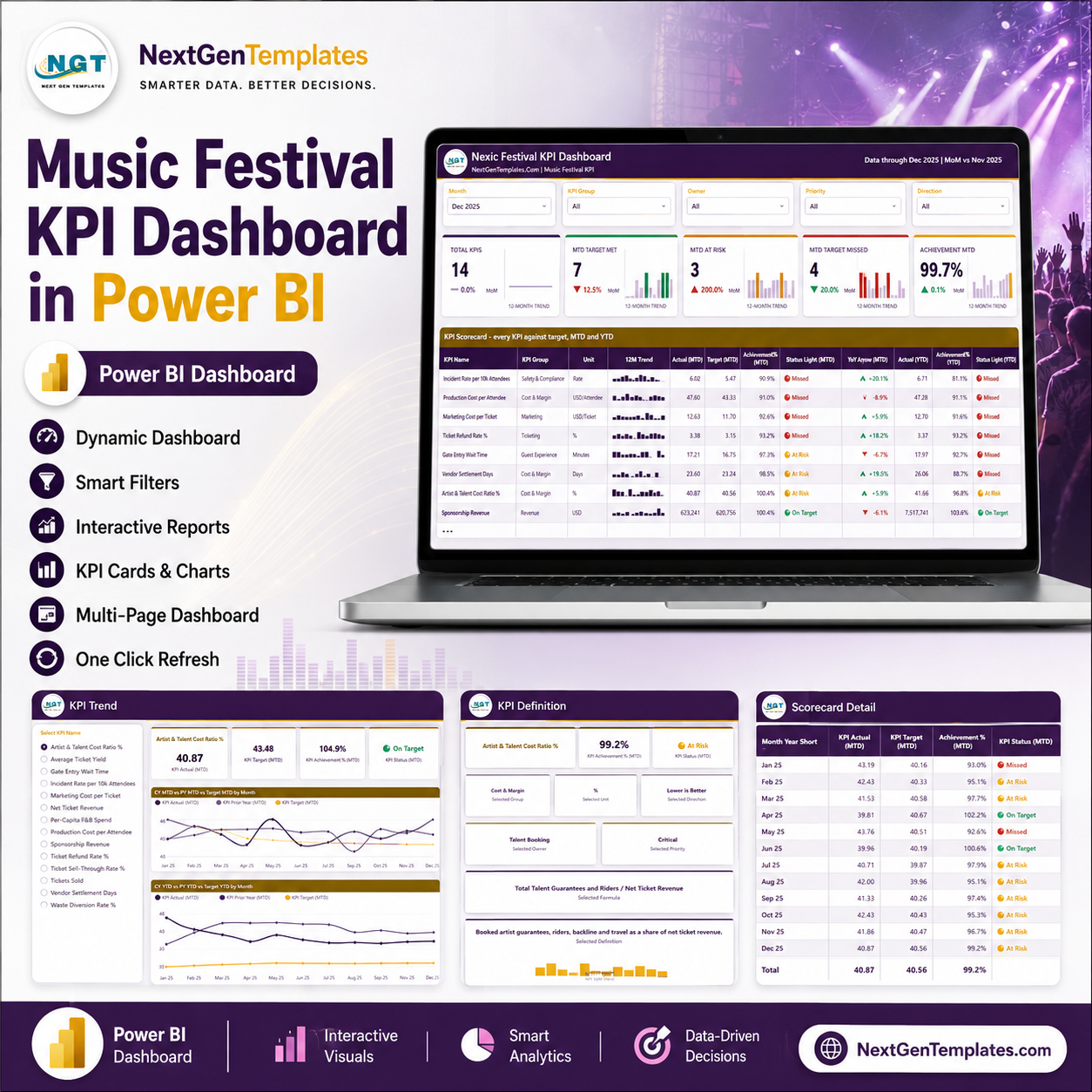
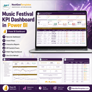
The Music Festival KPI Dashboard in Power BI tracks 14 festival KPIs across 4 report pages, with a month picker, direction-aware traffic lights and a 12-month sparkline on every scorecard row. Setup takes under 10 minutes: replace the sample rows in the three input sheets of Data.xlsx, press Home > Refresh, and every card, chart and status light follows.
🎪 This is the KPI scorecard edition — targets versus actuals, with MTD and YTD status lights. It is a different template from the analytical Music Festivals Dashboard in Power BI, which slices ticket, vendor and attendance transactions. Buy the scorecard to run the monthly review; buy the analytical dashboard to explore the underlying data.
🌍 Join 8,400+ teams in 40+ countries using NextGenTemplates to replace paid SaaS reporting with one-time-purchase Excel, Google Sheets and Power BI templates.
✅ Instant download · One-time payment · No subscription · No per-user fees · Lifetime access
🔑 Key Features of the Music Festival KPI Dashboard in Power BI
🎟️ 14 named festival KPIs, grouped seven ways. The scorecard ships with Ticket Sell-Through Rate %, Tickets Sold, Net Ticket Revenue, Average Ticket Yield, Per-Capita F&B Spend, Sponsorship Revenue, Artist & Talent Cost Ratio %, Production Cost per Attendee, Gate Entry Wait Time, Incident Rate per 10k Attendees, Vendor Settlement Days, Marketing Cost per Ticket, Waste Diversion Rate % and Ticket Refund Rate %.
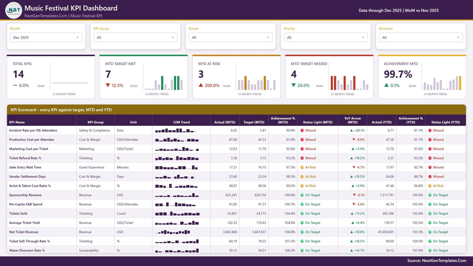
🚦 Direction-aware scoring, so cost KPIs are not punished. Seven KPIs are higher-is-better and score Actual ÷ Target; the other seven are lower-is-better and score Target ÷ Actual. Beating a cost or wait-time target therefore reads above 100%, exactly as it should.
🟢 Fixed, visible status bands. On Target is 100% or more, At Risk is 95% to 100%, and Missed is below 95%. Every row carries an MTD light and a YTD light, so a KPI that is green this month and red for the year cannot hide.
📅 The Month slicer drives the whole page. Pick a month and the five summary cards, the twelve scorecard columns and both status lights re-read. The 12-month sparkline deliberately stays on the full year, so you keep the shape of the season while you read one month.
🎚️ Five slicers, synced across pages. Month, KPI Group, Owner, Priority and Direction sit above the scorecard, and the KPI selection is synced between the KPI Trend and KPI Definition pages so you never re-pick the same KPI twice.
🧩 Nothing is hard-coded. Add a KPI, rename one, or delete one by editing the three input sheets — the KPI name is the join key. The card counts, the KPI list, the scorecard and every chart follow on refresh.
📦 What’s Inside the Music Festival KPI Dashboard in Power BI
The download is a .pbix file, the Data.xlsx pack that feeds it, and a Power BI user manual PDF. The report has four visible pages plus two hidden tooltip pages (KPI Detail and Trend Detail) that appear on hover.
Page 1: KPI Scorecard
The monthly review page. Five slicers (Month, KPI Group, Owner, Priority, Direction) sit above five summary cards — Total KPIs, MTD Target Met, MTD At Risk, MTD Target Missed and Achievement MTD — each with a month-on-month delta and a 12-month trend sparkline. Below them the scorecard table lists every KPI with its group, unit, 12-month trend, Actual (MTD), Target (MTD), Achievement % (MTD), Status Light (MTD), YoY arrow, Actual (YTD), Achievement % (YTD) and Status Light (YTD).
Page 2: KPI Trend
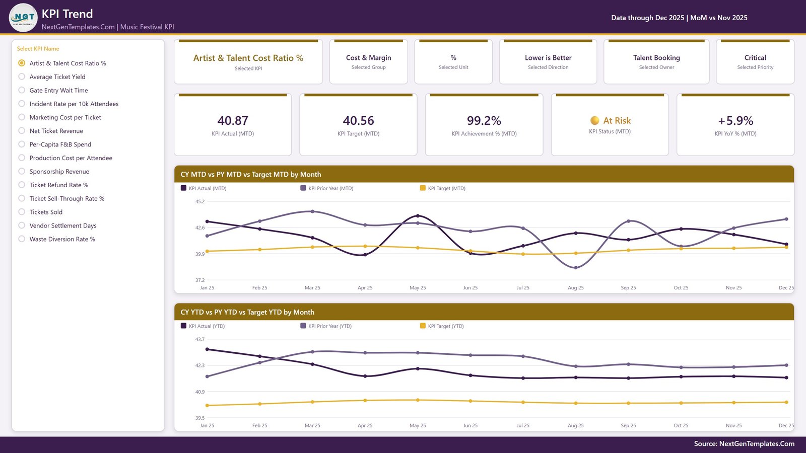
Pick one KPI from the radio list on the left and the whole page becomes that KPI. Six context cards show the selected KPI, group, unit, direction, owner and priority; five value cards show Actual (MTD), Target (MTD), Achievement % (MTD), Status (MTD) and YoY % (MTD). Two line charts follow: CY MTD vs PY MTD vs Target MTD by Month, and CY YTD vs PY YTD vs Target YTD by Month.
Page 3: KPI Definition
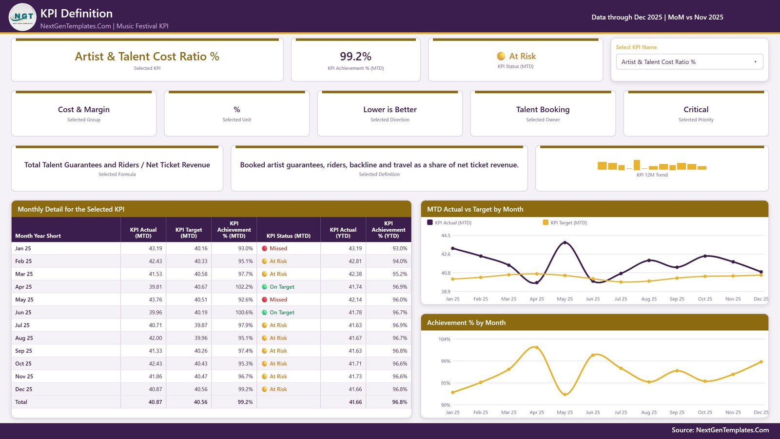
The page that settles arguments about what a number means. A dropdown selects the KPI and the page prints its formula and plain-English definition alongside its group, unit, direction, owner, priority, achievement and status. A Monthly Detail table lists Actual (MTD), Target (MTD), Achievement % (MTD), status, Actual (YTD) and Achievement % (YTD) for all twelve months, beside MTD Actual vs Target by Month and Achievement % by Month charts.
Page 4: Get More Templates
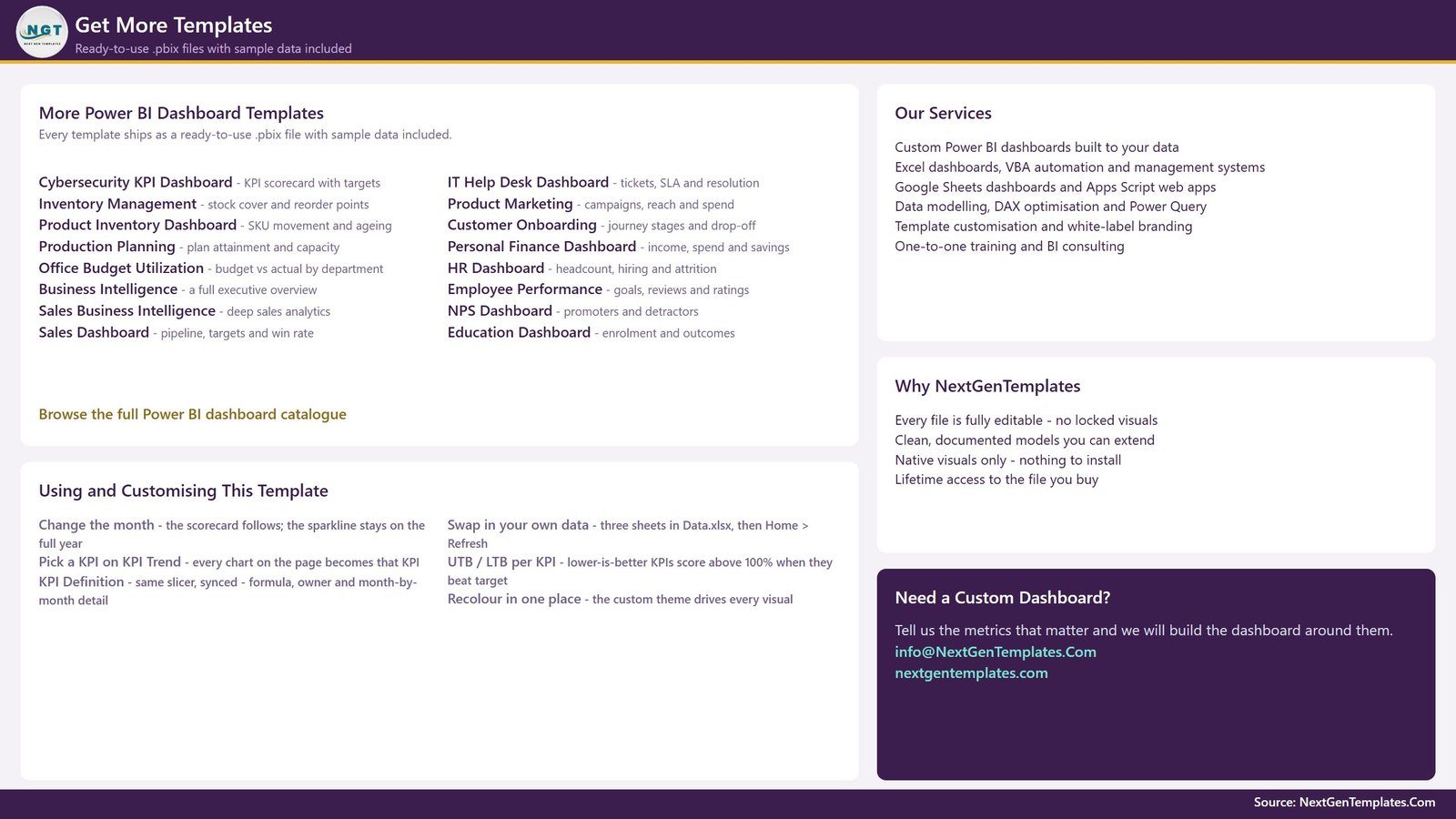
A catalogue page listing other ready-to-use .pbix templates, plus a short Using and Customising guide that explains the month picker, the KPI sync, the higher-is-better and lower-is-better rule and how to recolour the report from the single custom theme.
The Data.xlsx pack
Four sheets: a Read Me, KPI Definition (one row per KPI with group, unit, formula, definition, direction, owner and priority), Input_ Target (one row per KPI per month) and Input_ Actual (the same for the reporting year and the year before it, which is what every prior-year and YoY figure reads from). The shipped sample covers 2025 with 2024 as the comparison year.
📊 Music Festival KPI Dashboard in Power BI vs. Tableau / Qlik vs. Festival SaaS Reporting — Where This Fits
| Feature | Music Festival KPI Dashboard in Power BI | Tableau / Qlik build | Festival SaaS reporting (Festival Pro, Eventbrite add-ons) |
|---|---|---|---|
| Cost | $12.99 one-time ✅ | $75+ / user / month plus build time | $50-300 / month, often revenue-share |
| Platform | Power BI Desktop (free) ✅ | Tableau or Qlik licence required | Vendor’s own web portal |
| Setup time | Under 10 minutes ✅ | Days to weeks of dashboard building | Onboarding call plus data migration |
| Targets you set yourself | Yes, per KPI per month ✅ | Yes, if you build it | Often fixed to vendor metrics |
| Direction-aware scoring for cost KPIs | Built in (UTB / LTB) ✅ | Manual calculation work | Rarely offered |
| Works offline | Yes, it is a local file ✅ | Desktop yes, server no | No |
| Add or remove KPIs | Edit a spreadsheet row ✅ | Re-model and re-publish | Vendor roadmap |
| Year-1 cost at 5 users | $12.99 ✅ | $4,500+ | $600-3,600 |
| You own the file forever | Yes ✅ | No, licence lapses | No, data lives with vendor |
For festival teams that want a board-ready monthly scorecard without a BI licence or a per-event SaaS bill, the Music Festival KPI Dashboard in Power BI sits in the sweet spot.
👥 Who This Template Is For — and Who It’s Not For
✅ This template is built for:
- Festival directors and promoters running one to twenty events a year who need a monthly KPI pack for investors or the board
- Event operations and production managers tracking gate wait time, incident rate and production cost per attendee
- Festival finance and revenue-management teams watching net ticket revenue, ticket yield, sponsorship and vendor settlement days
- Agencies and venue groups who report the same 14 metrics across several festivals and want one repeatable format
❌ This template is NOT for:
- Teams wanting live box-office data — this reads a spreadsheet you refresh, not a ticketing API
- Anyone needing transaction-level analysis of individual orders, vendors or stages — the analytical Music Festivals Dashboard in Power BI does that instead
- Organisations that need row-level security, SSO or scheduled Power BI Service refresh out of the box
- People who want an industry benchmark set — every target here is a blank you fill in yourself
⚙️ How to Use the Music Festival KPI Dashboard in Power BI
- Unzip the download and keep the .pbix file and Data.xlsx in the same folder.
- Open Data.xlsx and edit the KPI Definition sheet — rename, add or delete KPIs and set each one’s group, unit, formula, direction, owner and priority.
- Fill Input_ Target with your monthly MTD and YTD targets for each KPI.
- Fill Input_ Actual with the same shape for the reporting year and the year before it, which powers every prior-year and YoY figure.
- Open the .pbix in Power BI Desktop and click Home > Refresh. Counts, lights and charts all follow.
- Use the Month slicer to run your monthly review, then the KPI Trend and KPI Definition pages to explain anything that is red.
- Moved the files? Use Home > Transform data > Data source settings > Change Source to repoint the query.
💼 Real-World Use Cases
Maya programmes a three-day city festival for 25,000 people. Each month she opens the KPI Scorecard, sets the Month slicer, and screenshots the five summary cards for her promoter’s update. When Artist & Talent Cost Ratio % turns amber she jumps to the KPI Definition page, shows the formula and the twelve-month table, and the conversation stops being about whose number is right.
Dan runs guest operations for a touring festival brand. He filters the scorecard by Owner to see only Guest Operations and Health & Safety rows, watching Gate Entry Wait Time and Incident Rate per 10k Attendees against target rather than against last week’s gossip.
Priya is the finance lead at a venue group with four festivals. She keeps one copy of the template per event, tracks Net Ticket Revenue, Average Ticket Yield and Vendor Settlement Days in an identical format, and produces four comparable board packs from the same 10-minute routine.
❓ Frequently Asked Questions
What KPIs does the Music Festival KPI Dashboard in Power BI track?
The Music Festival KPI Dashboard in Power BI ships with 14 KPIs across seven groups: Ticketing, Revenue, Cost & Margin, Guest Experience, Safety & Compliance, Marketing and Sustainability. Examples include Ticket Sell-Through Rate %, Net Ticket Revenue, Sponsorship Revenue, Production Cost per Attendee and Waste Diversion Rate %.
How long does setup take?
Under 10 minutes. Replace the sample rows in the three input sheets of Data.xlsx, keep the file beside the .pbix, and press Home > Refresh in Power BI Desktop. The Music Festival KPI Dashboard in Power BI rebuilds every card, light and chart from whatever rows exist.
Is this the same as the Music Festivals Dashboard in Power BI?
No. The Music Festival KPI Dashboard in Power BI is a KPI scorecard — targets, achievement percentages and traffic lights by month. The Music Festivals Dashboard in Power BI is an analytical dashboard that slices ticket, attendance and vendor transactions. Many teams own both.
Can I add or remove KPIs?
Yes. Nothing in the Music Festival KPI Dashboard in Power BI is hard-coded to a KPI name. Add a row to KPI Definition plus its monthly target and actual rows, or delete a KPI from all three sheets, then refresh. The KPI list, counts and charts follow automatically.
How does this compare to festival SaaS reporting tools?
Festival SaaS reporting typically costs $50-300 a month and keeps your history on the vendor’s servers. The Music Festival KPI Dashboard in Power BI is a one-time $12.99 purchase, runs in free Power BI Desktop, works offline and stays yours permanently — but it does not connect live to a ticketing platform.
Do the targets come with industry benchmarks?
No. Every target in the Music Festival KPI Dashboard in Power BI is a placeholder you set yourself, and the shipped 2024-2025 figures are demo data. Nothing in the file is a benchmark, a recommendation or a safety standard.
Does it need Power BI Pro or any custom visual?
Neither. The Music Festival KPI Dashboard in Power BI uses only native Power BI visuals — cards, line charts, bar charts, tables and slicers — and opens in the free Power BI Desktop. There is nothing to install from AppSource.
👤 About the Author
Built by PK — Microsoft Certified Professional with 15+ years of Excel, Google Sheets and Power BI experience. Founder of NextGenTemplates, reaching 300K+ subscribers across YouTube channels (@PK-AnExcelExpert, @NextGenTemplates, @NeoTechNavigators). Every template is hand-built and tested before release.
🔗 Explore Related Templates
- Music Festivals Dashboard in Power BI — the analytical companion that slices the transactions behind these KPIs.
- Concert Promoters Dashboard in Power BI — for the promoter side of the same business.
- Music and Performing Arts Dashboard in Power BI — a wider view across venues and productions.
- Library Services KPI Dashboard in Power BI — the same scorecard engine for a public-services team.
Also available as: Music Festival KPI Dashboard in Excel · Music Festival KPI Dashboard in Google Sheets · Music Festival KPI Scorecard in Excel. Browse the whole range of Power BI KPI Dashboards.
📖 Click here to read the Detailed Blog Post
🎥 Visit our YouTube channel for step-by-step video tutorials
👉 YouTube.com/@NextGenTemplates
📅 Last updated: August 2026







Reviews
There are no reviews yet.