



The Golf Course KPI Dashboard in Power BI is a four-page KPI scorecard that puts 14 club metrics on one screen with MTD and YTD traffic lights. It ships as an editable .pbix file plus a three-sheet Data.xlsx pack holding 168 target rows and 336 actual rows, so the sample year and the prior year are both already populated. Change the month on the slicer and every card, sparkline and status light follows. Nothing is hard-coded: rename a KPI, add one, or delete one in the workbook, hit Refresh, and the report rebuilds around it. One-time payment, no subscription, lifetime access to the file, and a clear refund policy if it is not what you expected.
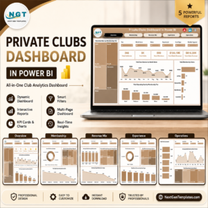
This is the KPI scorecard line, not the analytical dashboard line. It answers “did we hit target this month, and are we ahead or behind last year” for a fixed list of KPIs. If you want slice-and-dice analytics across tee times, outings and F&B categories, the Private Clubs Dashboard in Power BI is the analytical build. Near-identical names exist in both families on purpose – they are companions, not duplicates.
Key Features of the Golf Course KPI Dashboard in Power BI
- 14 golf KPIs across 6 groups – Golf Operations, Revenue, Membership, Food & Beverage, Course Maintenance and Member Experience.
- Direction-aware scoring – higher-is-better KPIs score Actual / Target; lower-is-better KPIs (Average Pace of Play, Maintenance Cost per Acre, Irrigation Water Use) score Target / Actual, so beating a cost target scores above 100%.
- Three status bands you can change – On Target at 100% and above, At Risk from 95% to 100%, Missed below 95%.
- MTD and YTD side by side – each KPI carries its own actual, target, achievement % and status light for both, plus a YoY arrow against the prior year.
- A 12-month sparkline per KPI that stays on the full year even when you filter the scorecard to one month.
- Five slicers – Month, KPI Group, Owner, Priority and Direction – synced across pages so your selection travels with you.
- 38 DAX measures referenced by the report visuals, all written against the three input sheets rather than any external service.
- Native Power BI visuals only – no custom visual to install, no locked objects, no gateway.
What’s Inside the Golf Course KPI Dashboard in Power BI
Six pages in total: four you navigate and two hidden 280×360 tooltip pages (“KPI Detail” and “Trend Detail”) that appear when you hover a visual.
Page 1 – KPI Scorecard
Five summary cards across the top (Total KPIs, MTD Target Met, MTD At Risk, MTD Target Missed and Achievement MTD), each with its own 12-month trend bar and a month-on-month delta. Below them the full scorecard table lists every KPI with its group, unit, sparkline, MTD actual and target, achievement %, status light, YoY arrow, and the same achievement and status again for YTD. It sorts worst-first by achievement, so the KPIs that need a conversation are already at the top.
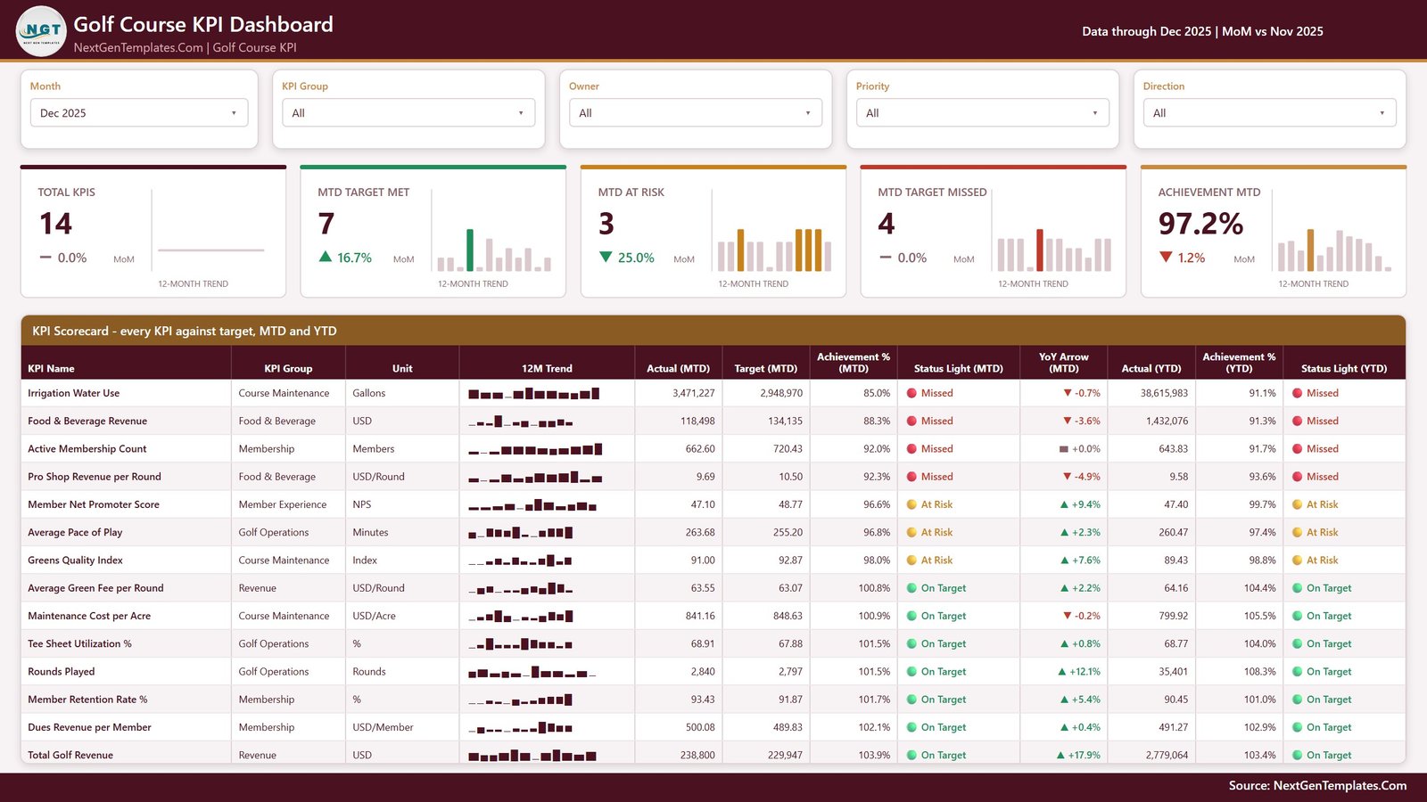
KPI Scorecard page
Page 2 – KPI Trend
Pick one KPI from the list on the left and the whole page becomes that KPI. Context cards restate its group, unit, direction, owner and priority; five figure cards show MTD actual, target, achievement %, status and YoY %. Two line charts follow: CY MTD vs PY MTD vs Target MTD by Month and CY YTD vs PY YTD vs Target YTD by Month, so you can see whether a gap is a bad month or a twelve-month drift.
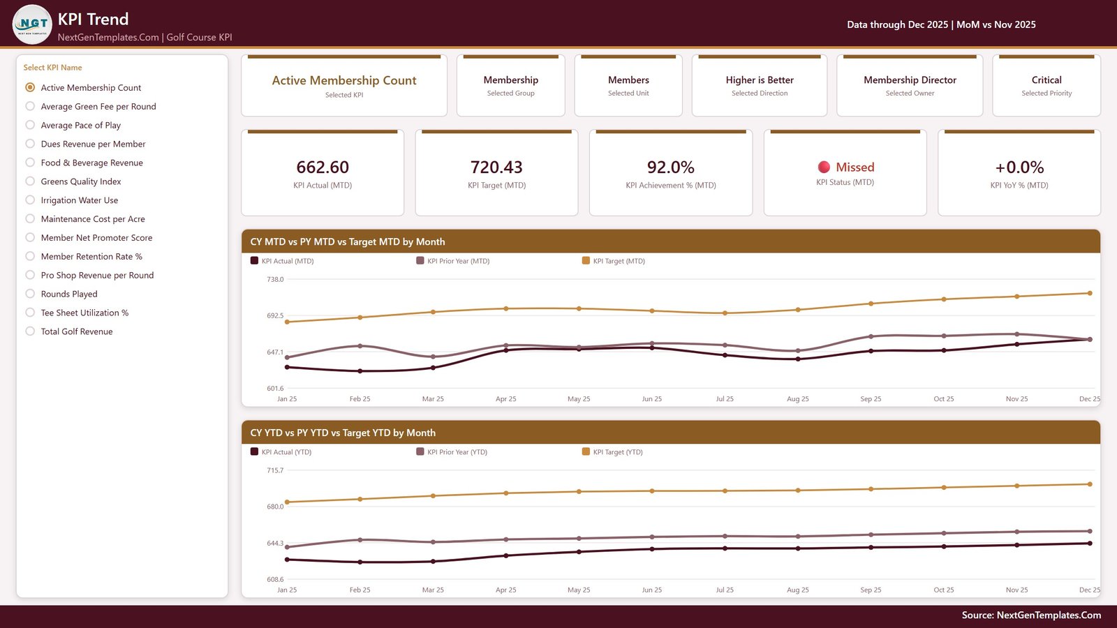
KPI Trend page
Page 3 – KPI Definition
The same KPI selection, carried over by a synced slicer, shown as documentation: the formula in words, the written definition, the owner, the priority, the direction and a 12-month trend. Underneath, a month-by-month table of MTD actual, target, achievement %, status and YTD, beside MTD Actual vs Target by Month and Achievement % by Month. This page is reached by the slicer, not by a drillthrough – there is no drillthrough in this build.
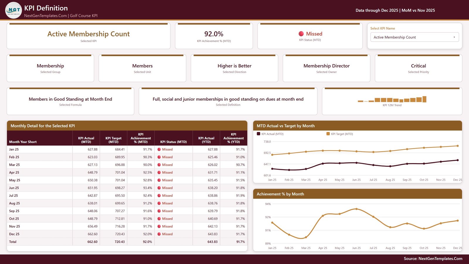
KPI Definition page
Page 4 – Get More Templates
An in-file index page: other Power BI templates in the catalogue, a short “Using and Customising This Template” panel, and our contact details. It is a catalogue page rather than a reporting page, and it is included here so you know exactly what the four tabs are.
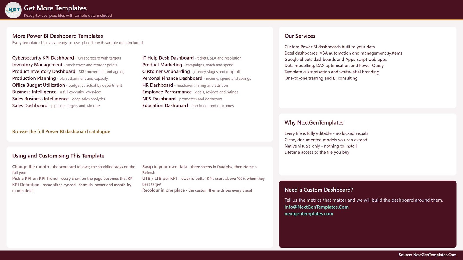
Get More Templates page
The data pack
Data.xlsx holds four sheets: a Read Me, Input_ Target (168 rows, one per KPI per month), Input_ Actual (336 rows, covering the reporting year and the year before it), and KPI Definition (14 rows across 9 columns – group, name, unit, formula, definition, UTB/LTB type, owner and priority). The KPI name is the join key across all three input sheets.
Golf Course KPI Dashboard in Power BI vs. Excel vs. Paid Club Management SaaS – Where This Fits
| This Power BI scorecard | Excel KPI dashboard | Paid club management SaaS | |
|---|---|---|---|
| Cost | One payment, no renewal | One payment, no renewal | Monthly or annual per-course fee |
| Platform | Power BI Desktop (free from Microsoft) | Microsoft Excel | Vendor web app |
| Setup time | Open, point at your Data.xlsx, Refresh | Open and type over the sample data | Implementation project |
| Connects to your tee sheet or POS | No – figures are typed in | No – figures are typed in | Yes, that is what you pay for |
| Add or rename a KPI yourself | Yes, in the workbook | Yes, in the workbook | Usually a support ticket |
| Prior-year comparison built in | Yes, MTD and YTD | Varies | Yes |
| Publish to colleagues | Publish to your own Power BI workspace | Share the file | Included |
| Year-1 cost for a small club | The price on this page | The price of the Excel edition | Typically four figures and up |
Who This Template Is For – and Who It’s Not For
A good fit if you are a general manager, director of golf, club controller or membership director who already pulls monthly numbers out of a tee sheet, a POS and an accounting package, and wants one board-ready page instead of four exports. It also suits a management company reporting the same fourteen lines across several properties.
Not a fit if you want live figures. This file does not connect to any tee-sheet or booking platform, any point-of-sale system, or any handicap authority – not the USGA, WHS or CONGU – and it does not calculate handicaps, post scores or take bookings. Every number comes from the workbook, typed or pasted by you. It also makes no agronomic assessment: Greens Quality Index is simply whatever composite audit score you enter, scored against whatever target you enter. If you need daily operational alerts rather than a monthly scorecard, this is the wrong shape of tool.
How to Use the Golf Course KPI Dashboard in Power BI
- Unzip the download and keep the
.pbixandData.xlsxin the same folder. - Open
Data.xlsx. In KPI Definition, set your fourteen KPIs – or add and remove rows freely – and mark each one UTB or LTB. - Fill Input_ Target with one row per KPI per month, and Input_ Actual with the same for this year and last year. The prior year is what every YoY arrow reads from.
- Keep YTD honest: sum it for money, volume and counts; average it for a %, index or ratio. A compliance percentage that reaches 1,900% by December makes every YTD chart useless.
- Open the
.pbixin Power BI Desktop and click Home > Refresh. If you moved the folder, use Transform data > Data source settings > Change Source. - Set the Month slicer, then use KPI Group, Owner, Priority and Direction to narrow the scorecard for a specific meeting.
Real-World Use Cases
Priya, general manager at a 27-hole daily-fee course. She runs a monthly ops meeting off page 1 alone. Sorting worst-first means Irrigation Water Use and F&B Revenue lead the agenda instead of the metrics that are already fine.
Daniel, membership director at a private club. He filters the scorecard to the Membership group, then opens KPI Trend for Active Membership Count to show the board the twelve-month line against target and prior year rather than a single month’s number.
Rachel, controller for a three-property management company. She keeps one copy of the file per property with identical KPI definitions, so the fourteen lines mean the same thing in every board pack.
Frequently Asked Questions
Does this connect to my tee sheet, my POS or a handicap system?
No – to all three. There is no integration with any booking or tee-sheet platform, no point-of-sale connection, and no link to the USGA, WHS or CONGU. Every figure on every page is one you type or paste into Data.xlsx.
Are the numbers in the screenshots real club benchmarks?
No. They are realistic sample values shipped so the report opens fully populated. Treat no figure, target or threshold as an industry benchmark – they are placeholders for your own.
Can I change the KPIs?
Yes. Nothing in the report hard-codes a KPI name. Add, rename or delete rows in all three input sheets and click Refresh; the counts, scorecard, KPI list and every chart follow.
What software do I need?
Power BI Desktop, which Microsoft gives away, plus Excel or any tool that can save the data pack as .xlsx. You do not need a Power BI Pro licence to use the file locally.
Is there a KPI Definition drillthrough?
No. KPI Definition is a normal page you click to; the KPI you selected travels there through a synced slicer. That is deliberate, and it is stated on the in-file Get More Templates page too.
Can I change the traffic-light thresholds?
Yes. On Target at 100%, At Risk from 95%, Missed below 95% are defaults set in the DAX, and they are editable like any other measure.
How is this different from the Excel and Google Sheets editions?
Same KPI thinking, different tool. Power BI gives you cross-page slicer sync and the tooltip pages; the Excel edition and the Google Sheets edition are separate builds for teams that live in those tools.
About the Author
Built by PK – Microsoft Certified Professional with 15+ years of Excel, Google Sheets, and Power BI experience. Founder of NextGenTemplates, reaching 300K+ subscribers across YouTube channels. Every template is hand-built and tested before release.
Explore Related Templates
- Golf Course KPI Dashboard in Excel – the same fourteen-KPI idea for teams that stay in Excel.
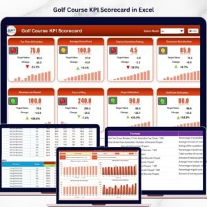
- Golf Course KPI Scorecard in Excel – the scorecard-only Excel build.
- Private Clubs Dashboard in Power BI – the analytical companion, for slicing rather than scoring.
- Sports & Recreation KPI Dashboard in Power BI – the wider leisure-sector scorecard.
- Browse the full Power BI KPI Dashboard category or every Power BI template.
Buy once, own it forever. You get the editable .pbix, the Data.xlsx pack with a full sample year plus prior year, and a Power BI user manual – no subscription, no locked visuals, no watermark. Replace the sample numbers with your own and you have your club’s monthly scorecard in an afternoon.
Last updated: 26 August 2026.














Reviews
There are no reviews yet.