

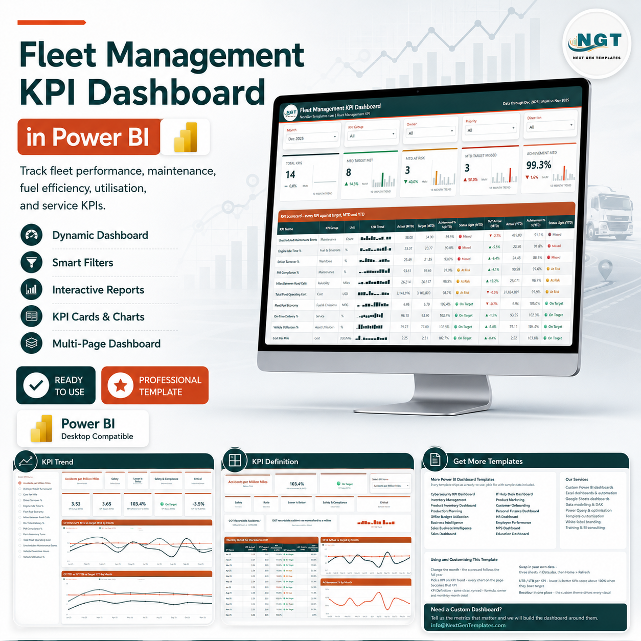
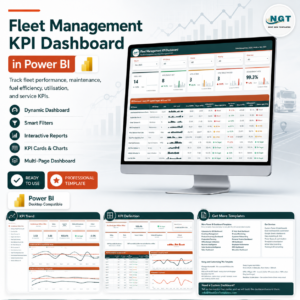
The Fleet Management KPI Dashboard in Power BI is a monthly KPI scorecard covering 14 fleet KPIs across 9 KPI groups, built on a semantic model with 104 DAX measures and laid out over 4 report pages plus 2 hover tooltip pages. Pick a month from the slicer and every card, traffic light and sparkline on the page follows it. Setup takes under 10 minutes: open the .pbix, paste your own actuals and targets into the input sheets of Data.xlsx, then Home > Refresh.
🌍 Join 8,400+ teams in 40+ countries using NextGenTemplates to replace paid SaaS tools with one-time-purchase Excel, Google Sheets and Power BI templates.
✅ Instant download · One-time payment · No subscription · No per-user fees · Lifetime access
⚠️ Read this first. This is a reporting template, not a telematics product. It does not connect to GPS trackers, ELD units, tachographs or any vehicle hardware, and it does not track vehicles in real time. It reads the fuel, maintenance, cost, utilisation and driver figures you type into a spreadsheet. Every target and threshold in the file is a placeholder you set yourself, and all shipped numbers are demo data covering 12 months of 2025.
🔑 Key Features of the Fleet Management KPI Dashboard in Power BI
🚛 14 fleet KPIs on one scorecard. Unscheduled Maintenance Events, Engine Idle Time %, Driver Turnover %, PM Compliance %, Miles Between Road Calls, Total Fleet Operating Cost, Fleet Fuel Economy, On-Time Delivery %, Vehicle Utilisation %, Cost Per Mile, Average Repair Turnaround, Parts Inventory Turns, Accidents per Million Miles and Vehicle Downtime Hours — each with its own unit, owner, priority and direction.
🗂️ 9 KPI groups organise the fleet. Maintenance, Fuel & Emissions, Workforce, Reliability, Cost, Service, Asset Utilisation, Parts & Supply and Safety. Filter to one group and the scorecard, the summary cards and the trend page all respond together.
🚦 Traffic lights on both MTD and YTD. Each KPI carries an On Target / At Risk / Missed light for month-to-date and again for year-to-date, so a KPI that is fine this month but slipping across the year shows two different colours side by side.
↕️ Higher-is-better and lower-is-better handled properly. Every KPI carries a Direction. Lower-is-better metrics such as Cost Per Mile, Engine Idle Time % and Vehicle Downtime Hours score above 100% achievement when the actual comes in under target — no manual sign-flipping.
📈 12-month sparkline on every row. The trend column always shows the full year regardless of which month the slicer is on, so you read the shape of the metric and the current position at the same time.
🎯 Five synced slicers. Month, KPI Group, Owner, Priority and Direction sit across the top of the scorecard and drive every visual beneath them.
🧮 104 DAX measures in the semantic model. MTD and YTD actuals, targets and prior-year values, achievement percentages, variance, month-on-month deltas, status lights, status colours, YoY arrows, sparkline series and the KPI-count roll-ups are all pre-written. A 17-column fact table and a proper M-generated Date table sit behind them.
🖱️ Two hidden tooltip pages. KPI Detail and Trend Detail are 280 x 360 tooltip pages set to HiddenInViewMode — hover a row or a data point and the detail surfaces without leaving the page.
📦 What’s Inside the Fleet Management KPI Dashboard in Power BI
The download is a single ZIP holding three files: the .pbix report, Data.xlsx (the data source), and a Power BI Dashboard – User Manual PDF. Data.xlsx has 4 sheets — a Read Me, Input_ Target with 168 target rows, Input_ Actual with 336 actual rows, and a KPI Definition sheet holding the 14 KPIs across 9 descriptive columns.
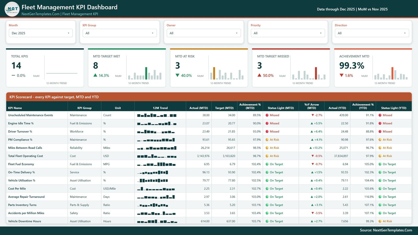
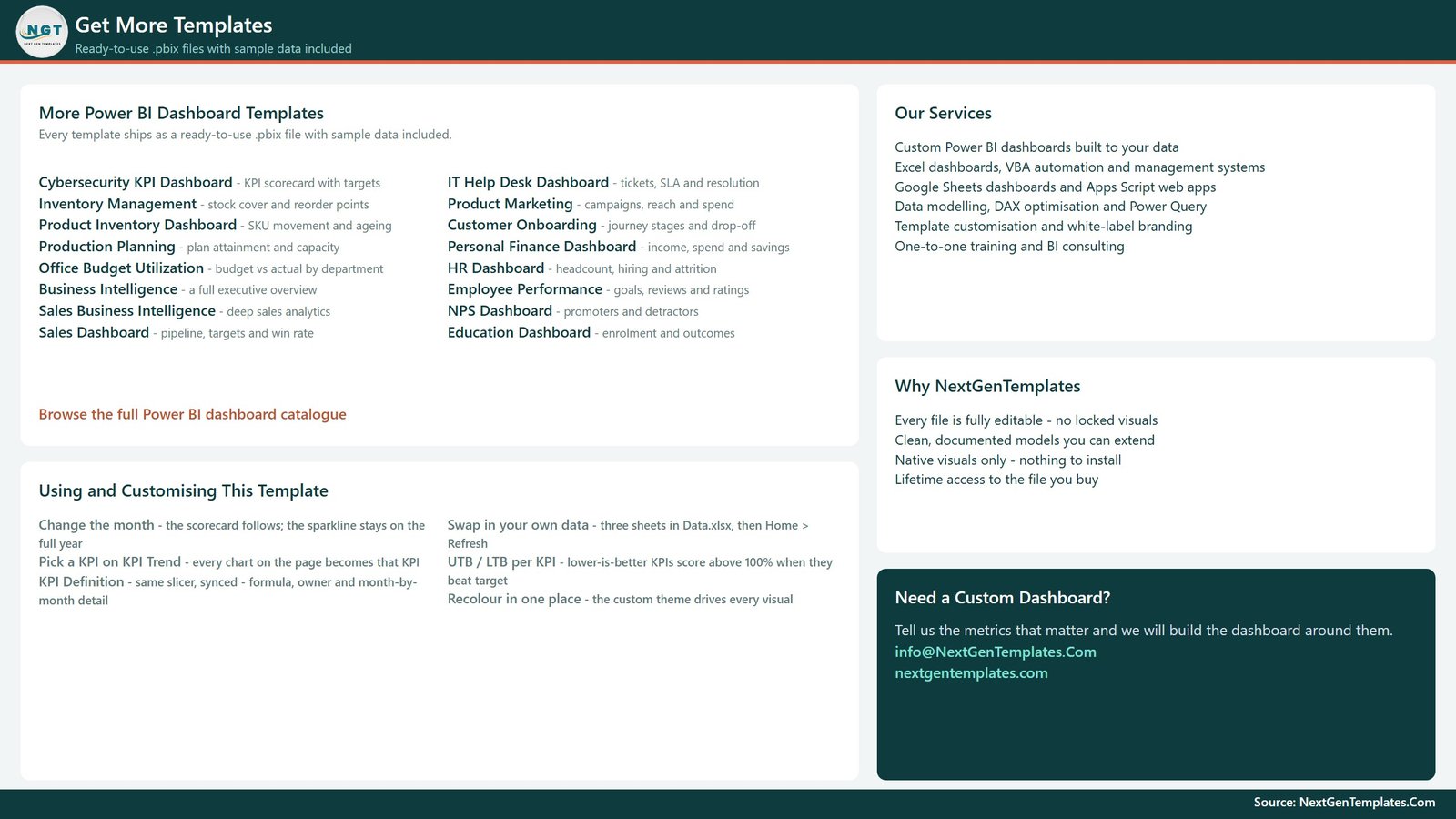
Page 1: KPI Scorecard
The landing page. Five slicers (Month, KPI Group, Owner, Priority, Direction) sit above five summary cards — Total KPIs, MTD Target Met, MTD At Risk, MTD Target Missed and Achievement MTD — each with a month-on-month delta and a 12-month mini trend. Below them the full scorecard table lists every KPI with its group, unit, 12M trend, MTD actual, MTD target, MTD achievement %, MTD status light, YoY arrow, YTD actual, YTD achievement % and YTD status light.
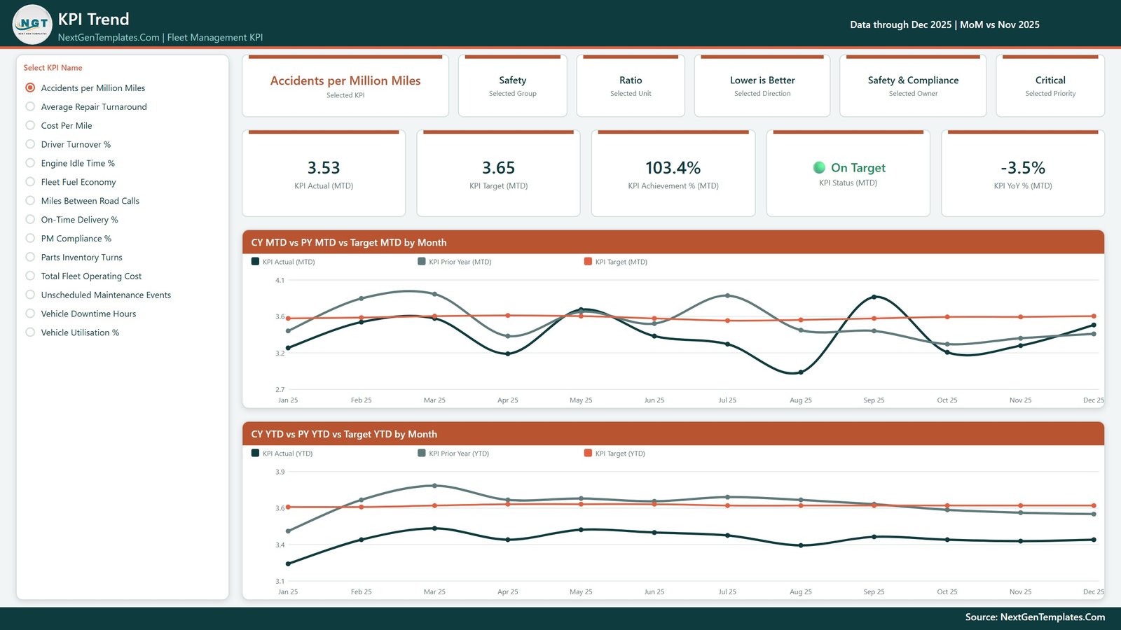
Page 2: KPI Trend
Pick one KPI from the list on the left and the whole page becomes that KPI. Six context cards restate the selected KPI, group, unit, direction, owner and priority; five value cards show KPI Actual (MTD), KPI Target (MTD), KPI Achievement % (MTD), KPI Status (MTD) and KPI YoY % (MTD). Two line charts follow: CY MTD vs PY MTD vs Target MTD by Month and CY YTD vs PY YTD vs Target YTD by Month.
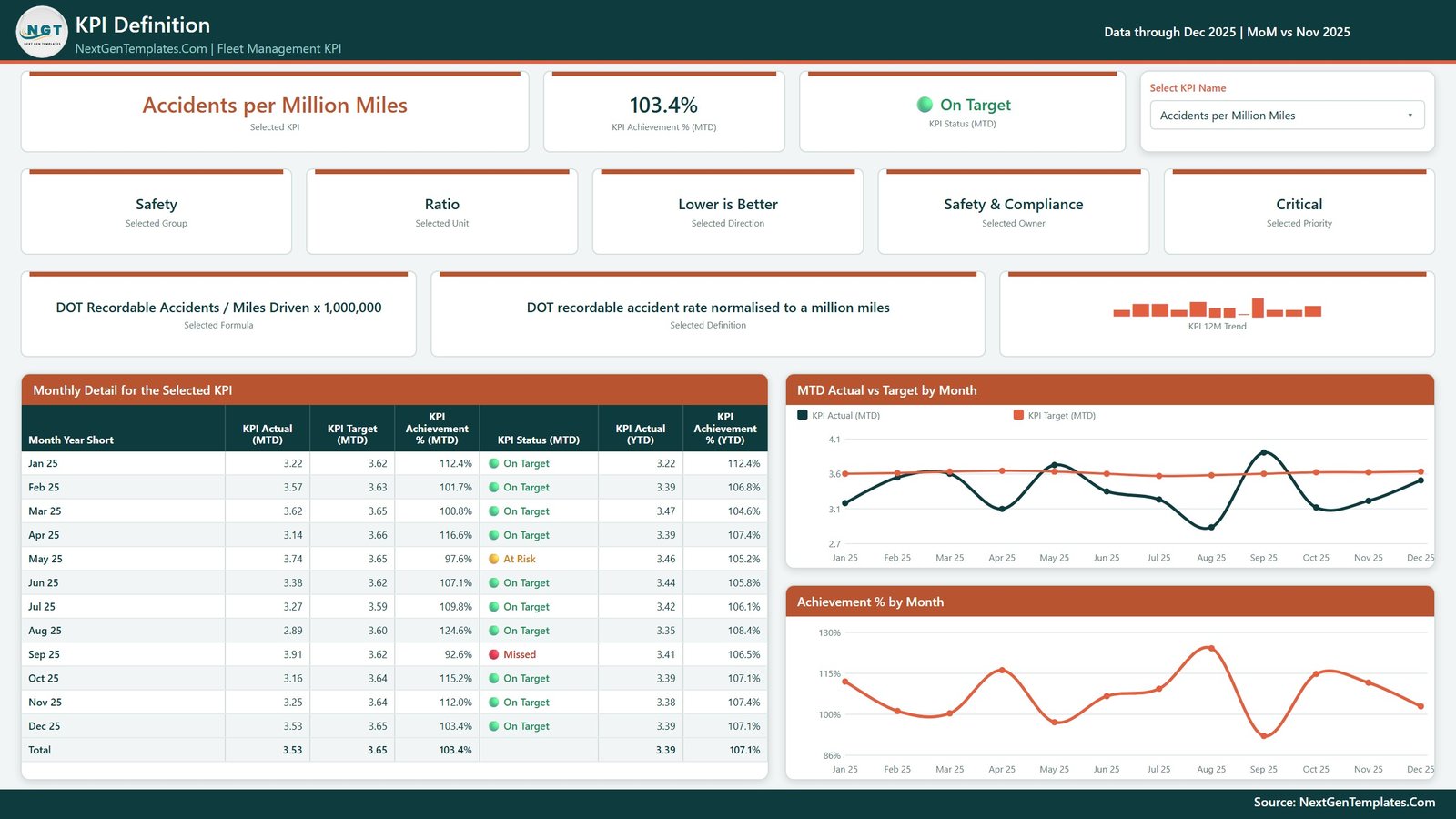
Page 3: KPI Definition
The same KPI selection, synced across from the Trend page, plus the documentation behind the number: the selected KPI’s formula text and definition text, its group, unit, direction, owner, priority and a 12-month trend. A Monthly Detail for the Selected KPI table lists all 12 months with actual, target, achievement % and status for MTD and YTD, alongside MTD Actual vs Target by Month and Achievement % by Month charts. The formula and definition text is read straight from Data.xlsx, so you rewrite it to match your own fleet’s definitions.
Page 4: Get More Templates
An in-file help and catalogue page. The left column is a short “Using and Customising This Template” guide — how the month picker drives the scorecard, how the KPI slicer syncs Trend and Definition, how upper and lower target bounds behave, how to swap in your own data and where to recolour the theme. The right side lists other NextGenTemplates Power BI dashboards and how to reach us for a custom build.
📊 Fleet Management KPI Dashboard in Power BI vs. Tableau / Qlik vs. Paid Fleet Reporting SaaS — Where This Fits
| Feature | Fleet Management KPI Dashboard in Power BI | Tableau / Qlik build | Paid fleet reporting SaaS |
|---|---|---|---|
| Cost | ✅ $12.99 one-time | $70+ / user / month plus build time | $25–150 / user / month |
| Platform | Power BI Desktop (free) + Excel | Tableau or Qlik licence required | Vendor web app |
| Setup time | ✅ Under 10 minutes | Days to weeks of modelling | Onboarding call, then data mapping |
| Pre-written measures | ✅ 104 DAX measures included | Written from scratch | Fixed vendor metrics |
| Live vehicle location / telematics feed | ❌ No — you enter figures manually | Only if you build the integration | Yes, that is what you pay for |
| You define your own KPIs and targets | ✅ Yes — edit a spreadsheet | Yes, with developer effort | Limited to the vendor’s metric set |
| Your data stays on your machine | ✅ Yes — local .pbix and .xlsx | Depends on server setup | Hosted by the vendor |
| Fully editable visuals | ✅ Yes — nothing locked | Yes | No |
| Year-1 cost at 5 users | ✅ $12.99 total | $4,200+ | $1,500–9,000 |
For fleet teams that want a clean monthly performance scorecard without a per-seat BI licence or a telematics contract, the Fleet Management KPI Dashboard in Power BI sits in the sweet spot.
👥 Who This Template Is For — and Who It’s Not For
✅ This template is built for:
- Fleet and transport managers who already pull monthly numbers into a spreadsheet and want them presented as a scorecard
- Operations and logistics teams running 10–500 vehicles who report fleet performance to a monthly management meeting
- Power BI users who want a finished, editable KPI-scorecard model to adapt rather than build from an empty canvas
- Analysts who need MTD vs YTD vs prior-year comparisons without writing the DAX themselves
❌ This template is NOT for:
- Anyone wanting live GPS or telematics tracking — this file has no vehicle connectivity of any kind
- ELD, hours-of-service, tachograph, DOT or FMCSA regulatory reporting — it produces no compliant record
- Emissions disclosure or fuel-tax filing — it is a management report, not a submission
- Teams needing a per-trip or per-driver operational system — this summarises monthly totals, it is not a dispatch or driver-scoring tool
- Anyone who cannot install Power BI Desktop (Windows only, free from Microsoft)
⚙️ How to Use the Fleet Management KPI Dashboard in Power BI
- Unzip the download and keep the .pbix and Data.xlsx together in one folder.
- Open Data.xlsx. On the KPI Definition sheet, rename the 14 KPIs, groups, units, owners, priorities, formulas and definitions to match your own fleet.
- Set the Direction for each KPI: higher-is-better or lower-is-better. This decides how achievement % is scored.
- Replace the demo rows on Input_ Target and Input_ Actual with your monthly targets and actuals. Every target is yours to choose.
- Open the .pbix in Power BI Desktop, click Home > Refresh, and confirm the fact table picked up your rows.
- Set the Month slicer on the KPI Scorecard page to your reporting month and read the traffic lights.
- Recolour once in the custom theme if you want your own brand palette — it drives every visual.
💼 Real-World Use Cases
Marcus runs a 60-truck regional haulage fleet. He already exports fuel and maintenance totals from his workshop system into Excel each month. He pastes those figures into Data.xlsx, refreshes the .pbix, and walks into the Monday management meeting with one page showing which of his 14 KPIs met the targets he set and which slipped against last year.
Priya is an operations analyst at a delivery company. She uses the KPI Trend page to isolate Cost Per Mile, compare the current year against prior year and target month by month, then switches to the KPI Definition page to show her director exactly how the number is calculated before anyone argues about it.
Ahmed manages a mixed municipal fleet of vans and light plant. He grouped his metrics into Maintenance, Cost and Asset Utilisation, assigned an owner to each group, and now filters the scorecard by owner so every supervisor sees only the KPIs they are accountable for.
❓ Frequently Asked Questions
Does this connect to my telematics or GPS system?
No. The Fleet Management KPI Dashboard in Power BI has no telematics, GPS, ELD or vehicle-hardware connectivity. It reads a spreadsheet you fill in yourself. If you want live vehicle positions you need a telematics platform — this is a monthly reporting template that sits alongside one.
Does this make my fleet DOT, FMCSA or tachograph compliant?
No. The Fleet Management KPI Dashboard in Power BI produces management reporting only. It is not an hours-of-service record, not an ELD, and not accepted for any regulatory filing, audit or insurance submission. Compliance obligations remain entirely with you.
Are the targets and thresholds in the file industry benchmarks?
No. Every target, upper bound and lower bound in the Fleet Management KPI Dashboard in Power BI is a placeholder you replace with your own. The shipped 2025 figures are demo data generated for the template — they are not real fleet data and not a recommendation.
What KPIs does the Fleet Management KPI Dashboard in Power BI track?
It ships with 14 KPIs across 9 groups, including Fleet Fuel Economy, Cost Per Mile, Vehicle Utilisation %, PM Compliance %, Unscheduled Maintenance Events, On-Time Delivery %, Driver Turnover % and Vehicle Downtime Hours. You can rename or replace all 14 in the spreadsheet.
How long does setup take?
Under 10 minutes if your monthly figures are already in a spreadsheet. Paste your targets and actuals into the two input sheets in Data.xlsx, edit the KPI Definition sheet, then refresh the .pbix in Power BI Desktop. No DAX writing and no data modelling required.
How does this compare to paid fleet reporting software?
Paid fleet platforms charge $25–150 per user per month and host your data. The Fleet Management KPI Dashboard in Power BI is a one-time purchase, runs on free Power BI Desktop, keeps every file on your own machine, and lets you define your own KPIs — but it does not do telematics, dispatch or live tracking.
Is this the same as your analytical fleet and transport dashboards?
No — this is the KPI scorecard line. It answers “did each KPI hit its target this month and year to date?” using a month picker, traffic lights and a KPI Trend page. Our analytical transport dashboards slice raw transaction data by route, vehicle and region instead. Many customers use both.
👤 About the Author
Built by PK — Microsoft Certified Professional with 15+ years of Excel, Google Sheets and Power BI experience. Founder of NextGenTemplates, reaching 300K+ subscribers across YouTube channels (@PK-AnExcelExpert, @NextGenTemplates, @NeoTechNavigators). Every template is hand-built and tested before release.
🔗 Explore Related Templates
Browse the full range of Power BI KPI Dashboard templates or the wider Power BI dashboard catalogue.
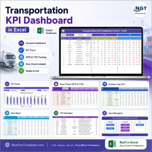
- Transportation KPI Dashboard in Excel — the same scorecard structure for transport operations, if your team lives in Excel rather than Power BI.
- Fleet Fuel Log Data Entry System in Excel — a form-driven way to capture the fuel records that feed this dashboard’s fuel and cost KPIs.
- Roadside Assistance Networks Dashboard in Power BI — the analytical counterpart for breakdown and callout data.
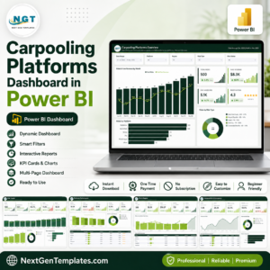
- Carpooling Platforms Dashboard in Power BI — mobility analytics with route, rider and utilisation detail.
- Transportation Services Dashboard in Google Sheets — a browser-based option for teams that share everything by link.
📖 Click here to read the Detailed Blog Post
🎥 Visit our YouTube channel for step-by-step video tutorials
👉 YouTube.com/@NextGenTemplates
📅 Last updated: August 2026









Reviews
There are no reviews yet.