

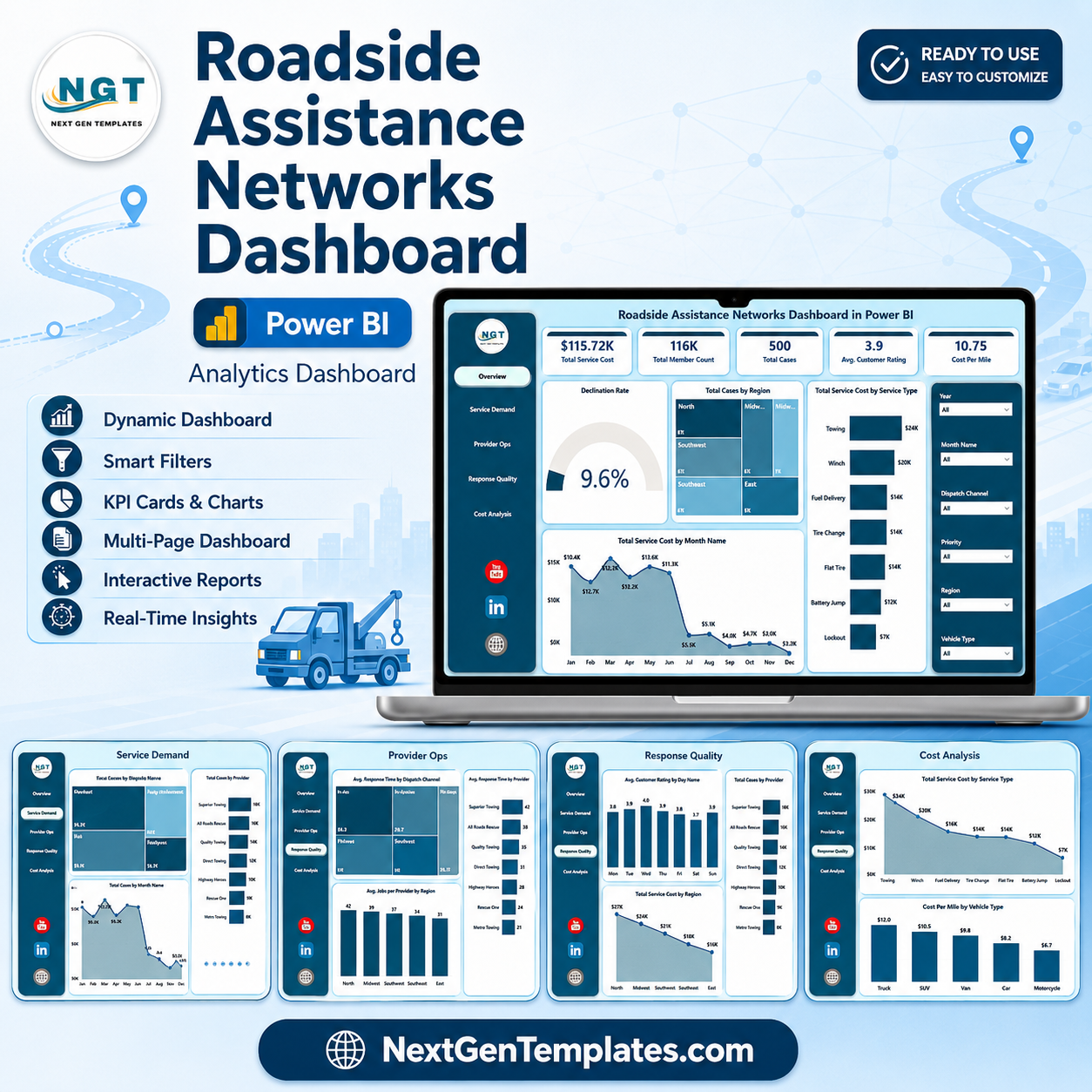
Last updated: August 5, 2026. AAA reports serving more than 65 million members across North America, and roadside assistance teams can handle high-volume service requests across towing, lockout, jump start, fuel, tire, and motor club workflows. The Roadside Assistance Networks Dashboard in Power BI gives dispatch managers, provider network teams, motor clubs, and operations analysts a 5-page PBIX report for tracking total service cost, member charges, total cases, customer ratings, provider response, completion performance, cost per mile, and escalation patterns. Built by PK for a 300K+ subscriber learning audience, this is a one-time purchase template with editable visuals, slicers, and measures you can review before using with internal data.
Key Features of Roadside Assistance Networks Dashboard in Power BI
- 5 Power BI pages: Overview, Service Demand, Provider Ops, Response Quality, and Cost Analysis.
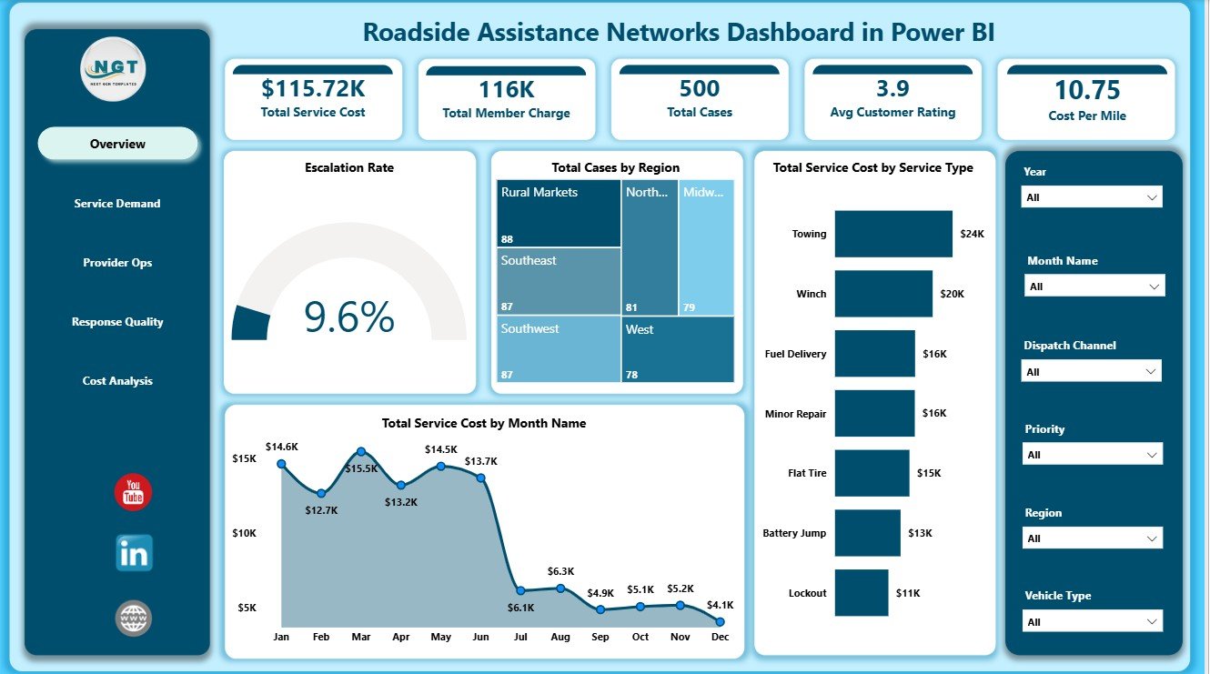
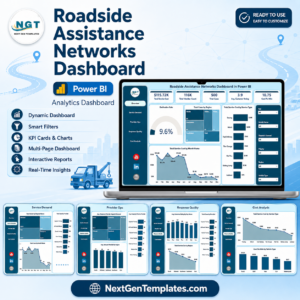
- 5 KPI cards: Total Service Cost, Total Member Charge, Total Cases, Avg Customer Rating, and Cost Per Mile.
- Roadside analytics: Review cases, service cost, member charges, response minutes, completion minutes, distance, ratings, and escalation rate.
- Provider network views: Compare providers by cases, response minutes, escalation rate, and operational performance.
- Interactive slicers: Filter report pages quickly by roadside assistance dimensions.
- Editable PBIX file: Customize visuals, fields, measures, page names, slicers, theme, and data model in Power BI Desktop.
What’s Inside the Roadside Assistance Networks Dashboard in Power BI
Overview Page
The Overview page gives leaders a high-level summary of roadside assistance network performance. Cards show Total Service Cost, Total Member Charge, Total Cases, Avg Customer Rating, and Cost Per Mile so cost, volume, satisfaction, and distance efficiency can be reviewed together.
Escalation Rate by Overall Cases: This visual compares escalation pressure against the broader case base. It helps users see whether service exceptions are isolated or becoming a network-level pattern.
Total Cases by Region: This chart shows where roadside demand is concentrated. It helps dispatch teams and provider managers review regional workload and coverage needs.
Total Service Cost by Month Name: This trend shows monthly cost movement. It helps identify seasonal spikes, cost-heavy months, and periods that may need provider or region-level review.
Total Service Cost by Service Type: This chart compares cost across towing, jump start, lockout, fuel, tire, or other assistance categories. It helps explain which service types are driving spend.
Service Demand
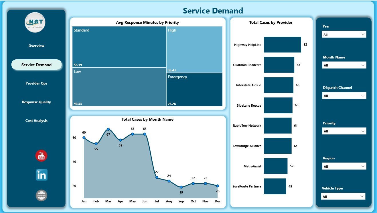
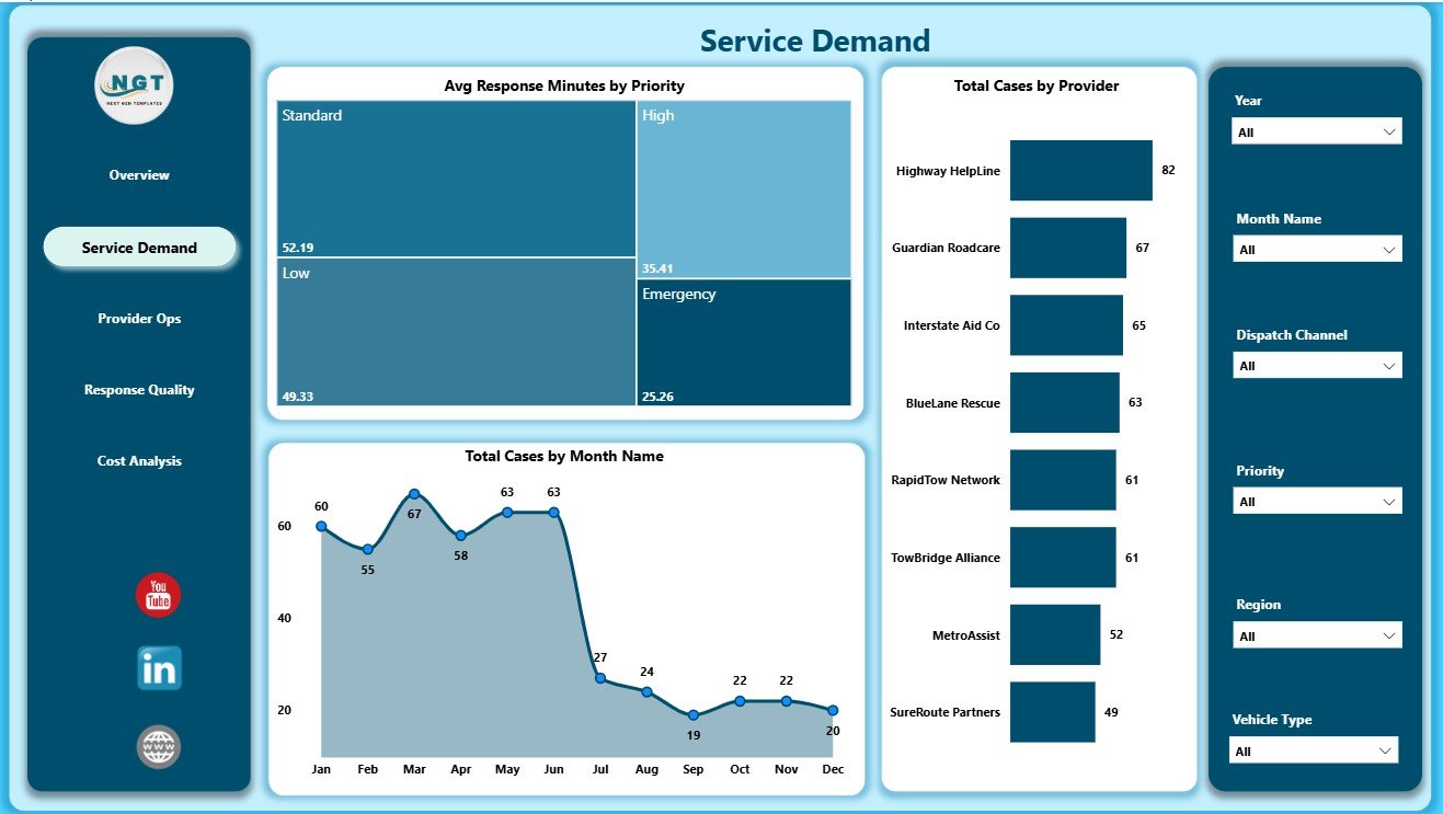
The Service Demand page focuses on response priority, case seasonality, and provider workload. It helps teams plan capacity and understand which parts of the network are carrying the most demand.
Avg Response Minutes by Priority: This chart compares response speed by priority level. It helps managers confirm whether urgent cases are receiving faster attention than normal or low-priority requests.
Total Cases by Month Name: This chart shows case count by month. It supports seasonality review, staffing conversations, and service demand forecasting.
Total Cases by Provider: This chart compares workload by provider. It helps managers review capacity balance, top-volume partners, and providers that may need operational support.
Provider Ops
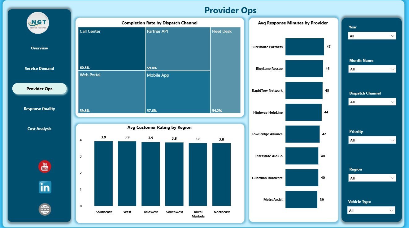
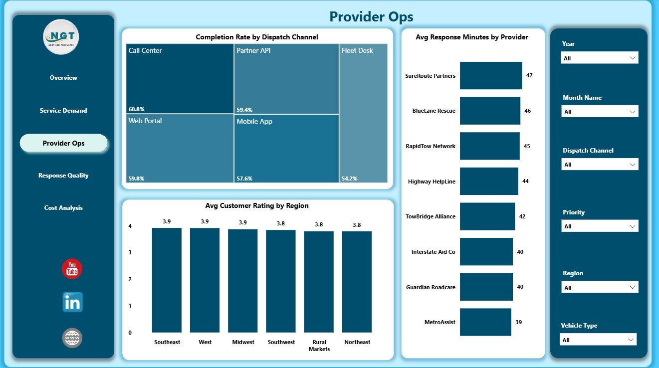
The Provider Ops page reviews dispatch channel completion, customer ratings, and response speed by provider. It is designed for recurring provider scorecards and partner performance meetings.
Completion Rate by Dispatch Channel: This chart compares completion performance across dispatch sources. It helps identify whether phone, app, web, partner, or other channels are closing cases reliably.
Avg Customer Rating by Region: This chart shows customer experience by region. It helps connect local service quality with provider availability, distance, and operational consistency.
Avg Response Minutes by Provider: This chart compares provider response time. It helps identify fast partners, slow partners, and outliers that need follow-up.
Response Quality
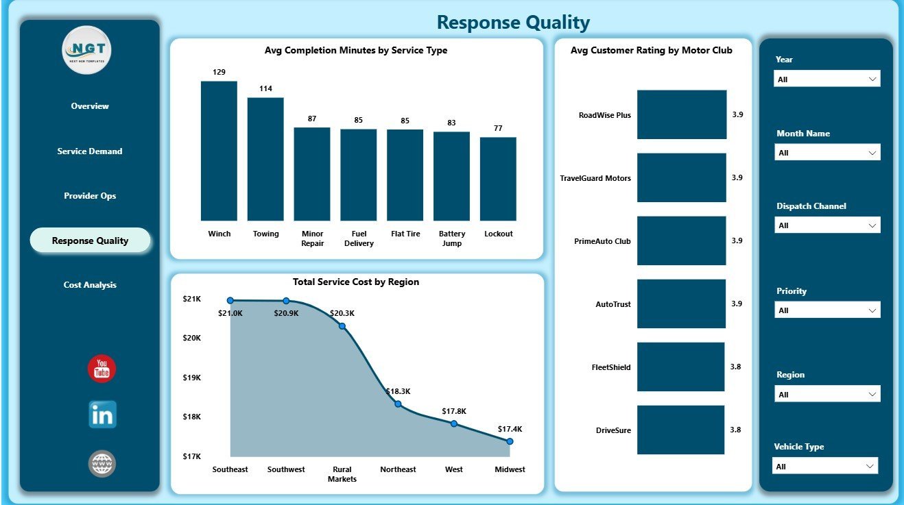
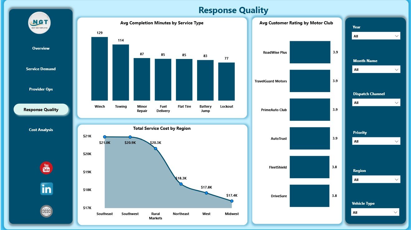
The Response Quality page brings completion time, service cost, customer rating, and motor club performance into one service reliability view. It helps teams move beyond case counts and evaluate the actual quality of service delivery.
Avg Completion Minutes by Service Type: This chart compares how long each service type takes to complete. It helps explain operational friction after the initial response.
Total Service Cost by Region: This chart compares service spend by region. It helps teams identify territories where distance, provider mix, or case type may be increasing costs.
Avg Customer Rating by Motor Club: This chart compares satisfaction by motor club. It supports partner reporting and helps teams understand which club relationships need attention.
Cost Analysis
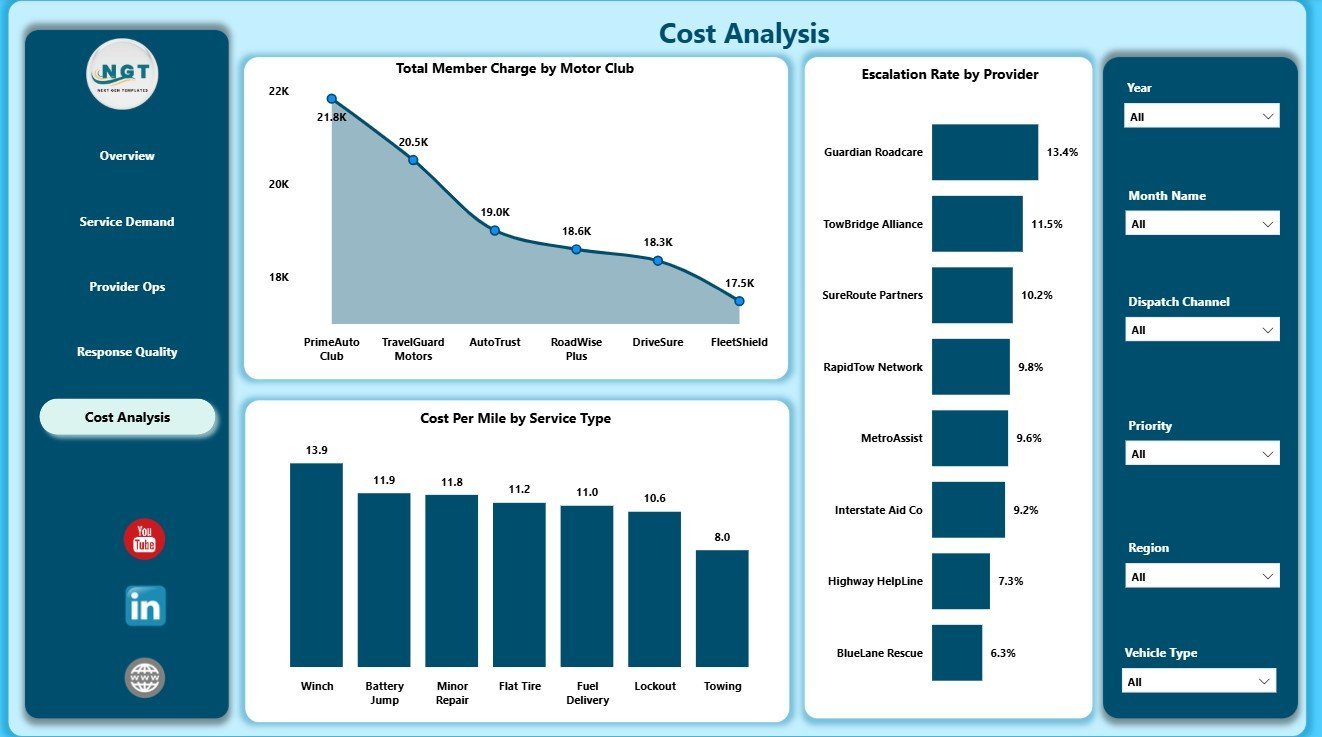
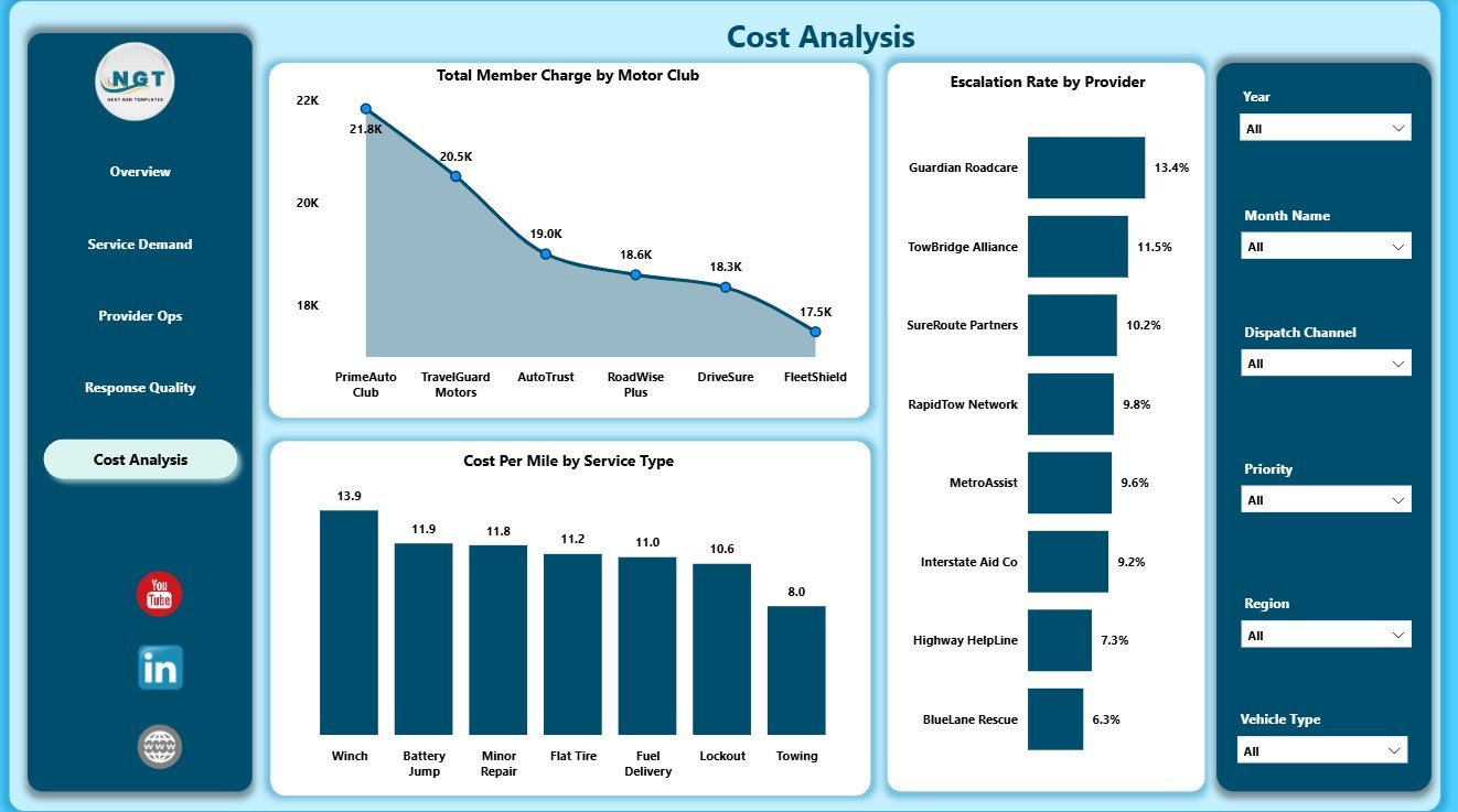
The Cost Analysis page is built for finance, operations, and network cost reviews. It helps users connect member charges, distance efficiency, service type, provider behavior, and escalation rate.
Total Member Charge by Motor Club: This chart compares member charge by motor club. It helps users review revenue-side contribution and partner billing patterns.
Cost Per Mile by Service Type: This chart compares distance-adjusted cost across service types. It helps separate high total cost from true cost efficiency.
Escalation Rate by Provider: This chart compares escalation percentage across providers. It helps identify partners that may need process review, training, or closer service monitoring.
Roadside Assistance Networks Dashboard in Power BI vs. Tableau vs. Paid CRM/SaaS – Where This Fits
| Criteria | This Power BI template | Tableau or Qlik alternative | Paid roadside SaaS |
|---|---|---|---|
| Cost | $17.99 one-time sale price | License plus report build time | Recurring subscription or contract pricing |
| Platform | Power BI Desktop and optional Power BI Service | Tableau, Qlik, or similar BI tool | Vendor-hosted dispatch or service platform |
| Setup time | Open PBIX, connect or replace data, refresh | Manual model and visual build | Implementation, configuration, and training |
| Real-time collaboration | Available through Power BI Service licensing | Available by BI platform plan | Usually included by plan |
| Customizable fields | Edit visuals, measures, relationships, slicers, and pages | Editable with analyst skills | Often limited by vendor settings |
| Year-1 cost at 5 users | Template cost plus Microsoft licensing choice | License cost plus analyst build time | Often much higher because of subscriptions |
| Roadside network reporting | Best for analysis from prepared service records | Best when the team already uses that BI stack | Best for live dispatch and workflow execution |
Who This Template Is For – and Who It’s Not For
This dashboard is for roadside assistance networks, motor clubs, provider managers, dispatch leaders, automotive service coordinators, fleet support teams, insurance assistance teams, and Power BI analysts who need a reporting layer for exported or prepared service records.
It is not a live dispatch system, GPS tracker, roadside mobile app, call center system, payment processor, provider portal, or replacement for an operational roadside assistance platform. Use it when you need analysis, management reporting, and editable Power BI visuals.
How to Use the Roadside Assistance Networks Dashboard in Power BI
- Download and unzip the product package.
- Open the PBIX file in Power BI Desktop.
- Review the sample pages, slicers, cards, and chart logic.
- Replace or connect the sample data source with your own roadside assistance records.
- Refresh the report and validate KPI totals against your source.
- Use slicers to filter by region, provider, month, service type, motor club, priority, or dispatch channel.
- Publish to Power BI Service if your team needs browser sharing, mobile viewing, or scheduled refresh.
Real-World Use Cases
Maya, provider network manager: reviews response minutes, completion rate, customer rating, and escalation rate before partner performance calls.
Daniel, dispatch operations lead: uses Service Demand to understand monthly case volume, priority response patterns, and provider workload.
Priya, finance analyst: compares service cost, member charge, cost per mile, motor club contribution, and regional spend before monthly cost reviews.
Frequently Asked Questions
Do I need Power BI Desktop?
Yes. Open and edit the PBIX file in Power BI Desktop, which is available from Microsoft.
Can I use my own roadside assistance data?
Yes. Replace or connect the sample source with your structured records and refresh the report.
Can I customize the dashboard pages?
Yes. You can edit visuals, measures, page names, slicers, relationships, and formatting in Power BI Desktop.
Is this a live dispatch system?
No. It is a Power BI reporting template for analysis. It does not dispatch providers, track vehicles live, or manage customer calls.
Can I share the report with my team?
Yes. Publish it to Power BI Service and share it according to your Microsoft licensing and workspace permissions.
Is this a subscription?
No. It is a one-time downloadable Power BI dashboard template.
About the Author
Built by PK – Microsoft Certified Professional with 15+ years of Excel, Google Sheets, and Power BI experience. Founder of NextGenTemplates, reaching 300K+ subscribers across YouTube channels. Every template is hand-built and tested before release.
Explore Related Templates
- Roadside Assistance Networks Dashboard in Excel
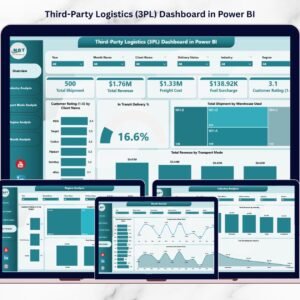
- Third-Party Logistics (3PL) Dashboard in Power BI
- Logistics Management System Web App
- RetailTech Dashboard in Power BI
- Power BI templates
- Power BI dashboard templates
Download the Roadside Assistance Networks Dashboard in Power BI when you want to review roadside service cost, member charge, cases, ratings, provider operations, response quality, and cost per mile in one editable PBIX report.
Last updated: August 5, 2026












Reviews
There are no reviews yet.