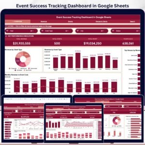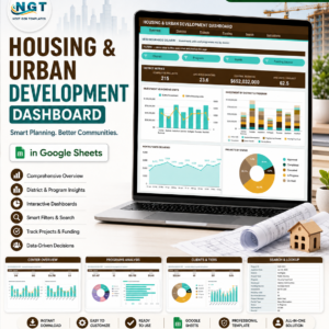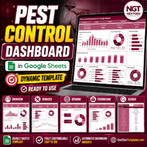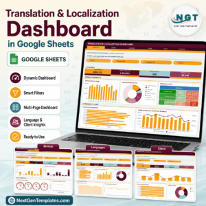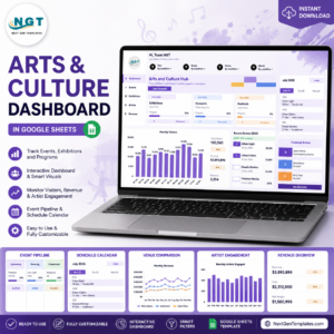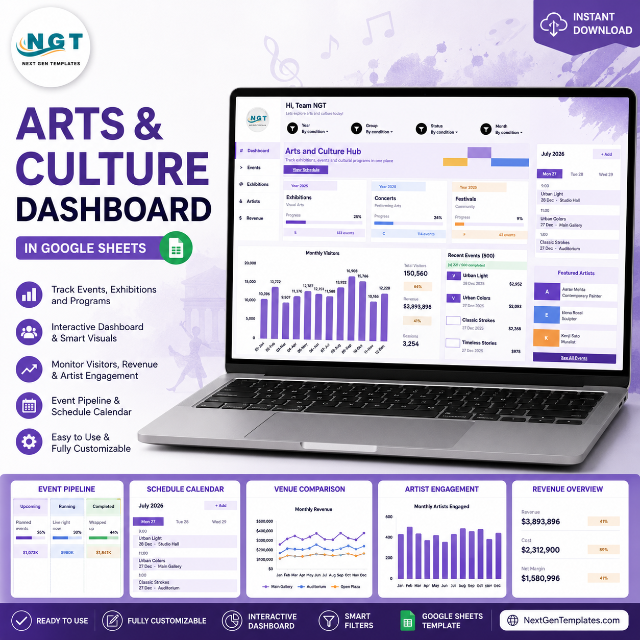
Arts and cultural production contributed $1.17 trillion to U.S. GDP in 2023, while nonprofit arts and culture activity generated $151.7 billion in 2022. The Arts and Culture Dashboard in Google Sheets helps arts teams turn that kind of impact into clear operating insight. Track exhibitions, concerts, festivals, visitors, revenue, sessions, recent events, artists, venues, programs, costs, and net margin in one editable Google Sheets dashboard. Built by PK: An Excel Expert, whose tutorials support a large spreadsheet community, this template gives you a practical reporting system without a monthly software subscription. Review the screenshots, buy once, and customize the workbook to your own arts organization.
Key Features
- Multi-page Google Sheets dashboard: Use dedicated tabs for overview reporting, event pipeline analysis, venue performance, artist and program tracking, revenue analysis, cost control, and raw data entry.
- Executive-ready cards: The Overview Page highlights Exhibitions, Concerts, Festivals, Total Visitors, Revenue, Sessions, Recent Events, and Featured Artists so leadership can scan high-level performance quickly.
- Interactive slicers: Filter dashboard views by the dimensions your team needs most, such as month, event type, venue, audience, program, category, and event pipeline.
- Arts-specific chart set: Analyze event progress, monthly visitors, recent event activity, artist engagement, venue revenue, audience revenue, ticket value, cost trends, and net margin.
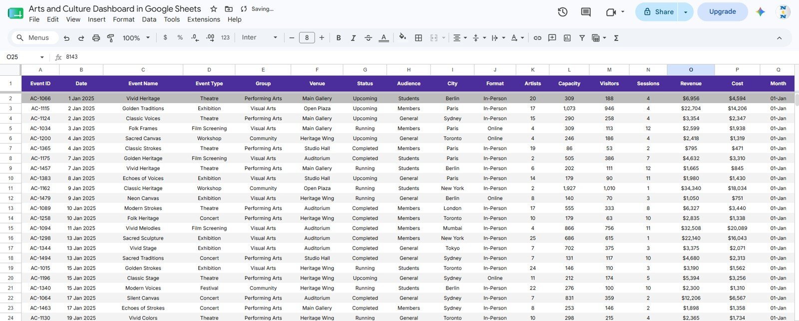
- Editable data structure: Add events, visitors, artists, revenue, costs, programs, venues, audiences, and pipeline details in the Data Sheet tab, then refresh or adapt the dashboards around your own records.
- Cloud-friendly workflow: Because the template runs in Google Sheets, teams can collaborate from the browser without sending different spreadsheet versions back and forth.
What’s Inside
This Google Sheets template includes six practical pages for arts and culture reporting. The workbook is designed for cultural teams that need a visual reporting layer, but still want spreadsheet flexibility.
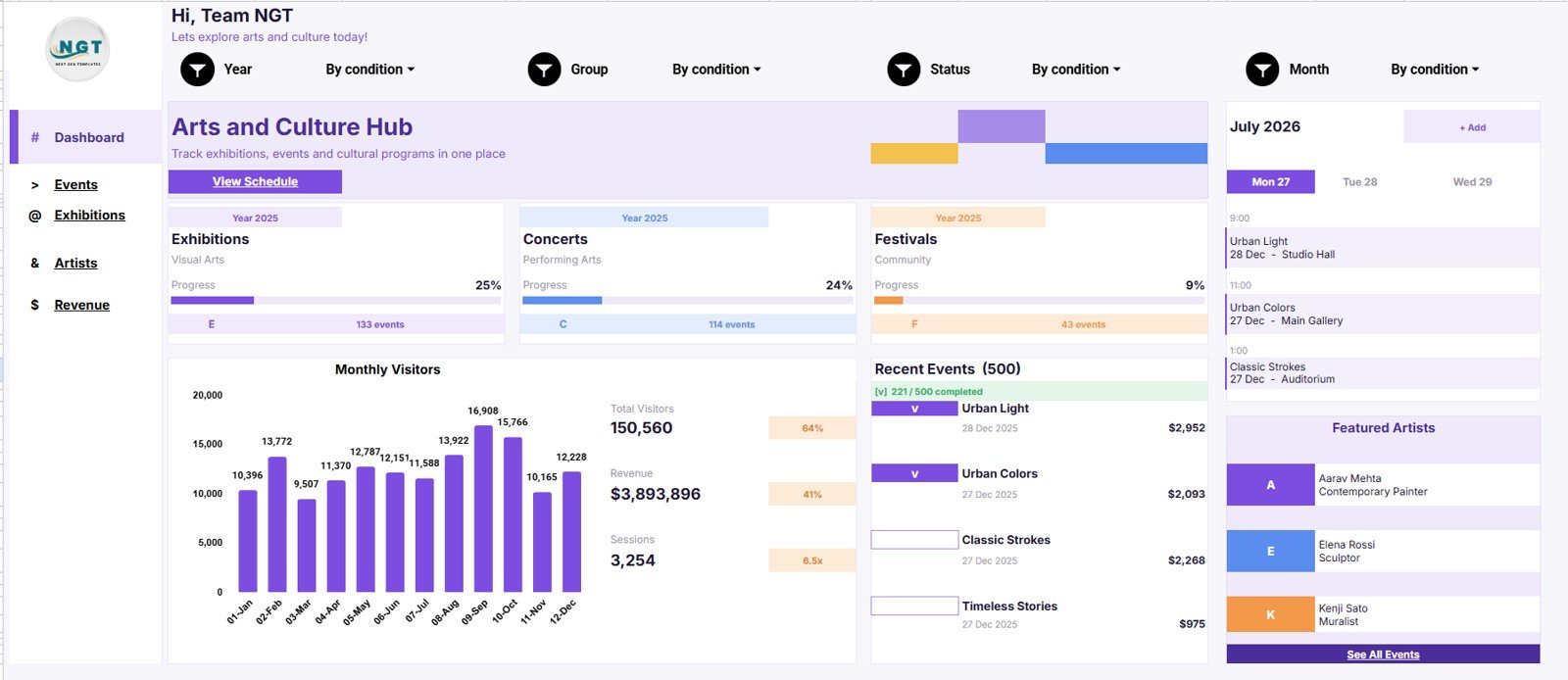
1. Overview Page
The Overview Page gives you a fast leadership summary with cards for Exhibitions, Concerts, Festivals, Total Visitors, Revenue, Sessions, Recent Events, and Featured Artists.
- Event Progress by Category: This chart compares cultural activity across categories so you can see which areas are moving fastest. Use it to review exhibition, concert, festival, workshop, and program progress in one place.
- Monthly Visitors by Month: This trend helps you understand visitor volume over time. It is useful for seasonality reviews, campaign follow-up, and board reporting.
- Recent Events by Event Name: This view keeps the newest or most relevant event records visible. Teams can use it to monitor recent exhibitions, concerts, launches, or community sessions.
- Featured Artists by Artist: This chart highlights artist participation and visibility. It helps programming teams understand who is represented in the current reporting period.
2. Event Command Center
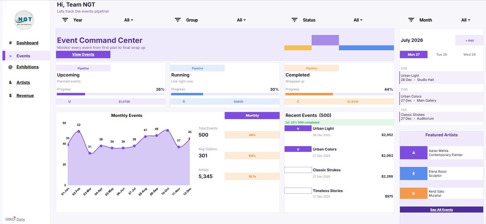
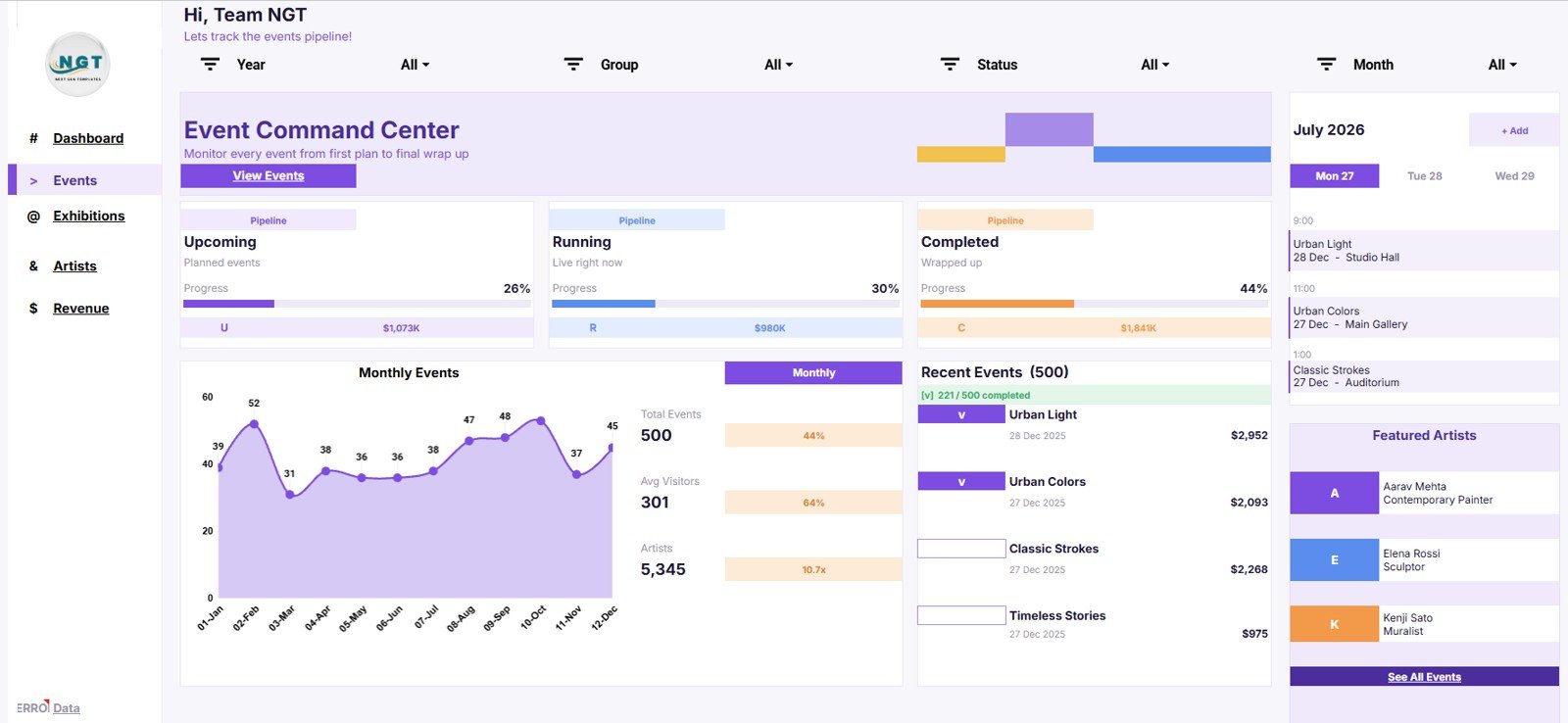
The Event Command Center focuses on event volume, pipeline stage, monthly trends, visitor averages, artist participation, and recent event monitoring.
- Events by Pipeline: This chart shows how events are distributed across planning, active, completed, or other pipeline stages. It helps managers spot bottlenecks before the calendar becomes difficult to manage.
- Monthly Events by Month: This view displays event activity by month. Use it to check programming density and avoid overloaded or underused months.
- Total Events by Month: This chart summarizes the overall event count across the reporting period. It supports capacity planning and simple monthly comparisons.
- Average Visitors by Month: This analysis shows average attendance patterns. It helps teams compare audience strength across months rather than only total event volume.
- Artists by Event Pipeline: This view connects artist involvement to the event pipeline. Programming teams can see where artist engagement is concentrated.
- Recent Events by Event Name: This chart surfaces recent event records for quick review. It helps teams move from top-line trends back to specific events.
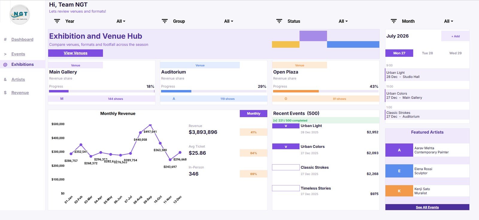
3. Exhibition and Venue Hub
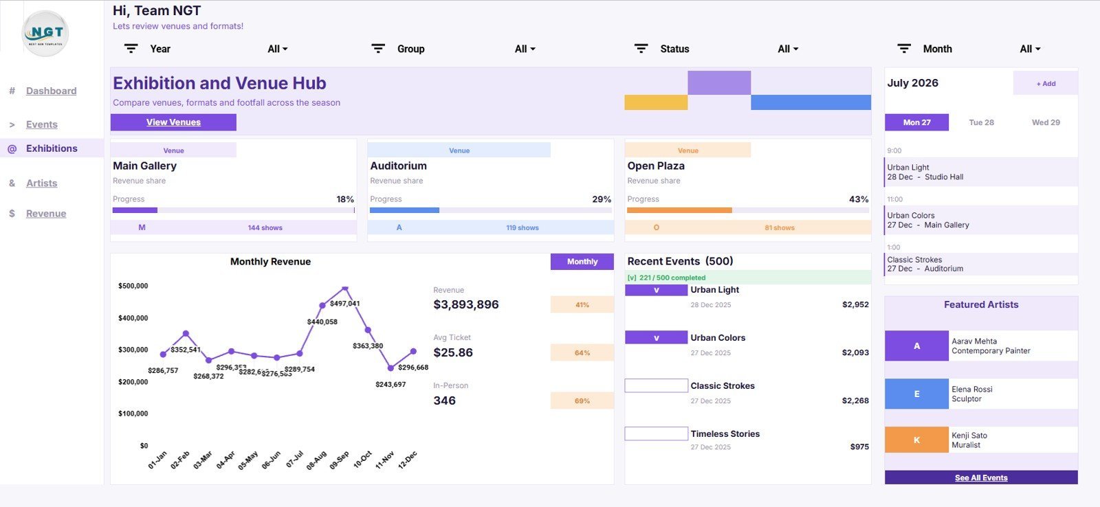
The Exhibition and Venue Hub helps arts organizations compare venues, in-person programming, ticket economics, and revenue patterns.
- Revenue Share by Venue: This chart shows how revenue is split across venues. It helps identify the venues that carry the strongest financial contribution.
- Shows by Venue: This view compares event or show volume by location. It is useful for balancing venue schedules and understanding space utilization.
- Monthly Revenue by Month: This trend shows revenue movement across months. Use it to connect seasonal programming, exhibitions, and events to income patterns.
- Average Ticket by Month: This chart tracks average ticket value over time. It can reveal shifts in audience mix, pricing, discounts, or event type.
- In-Person Events by Venue: This analysis focuses on physical attendance programming by venue. It helps teams review which locations are driving in-person engagement.
- Recent Events by Event Name: This view keeps current venue-linked events visible for follow-up. It helps operations teams connect recent activity to venue performance.
4. Artists and Programs
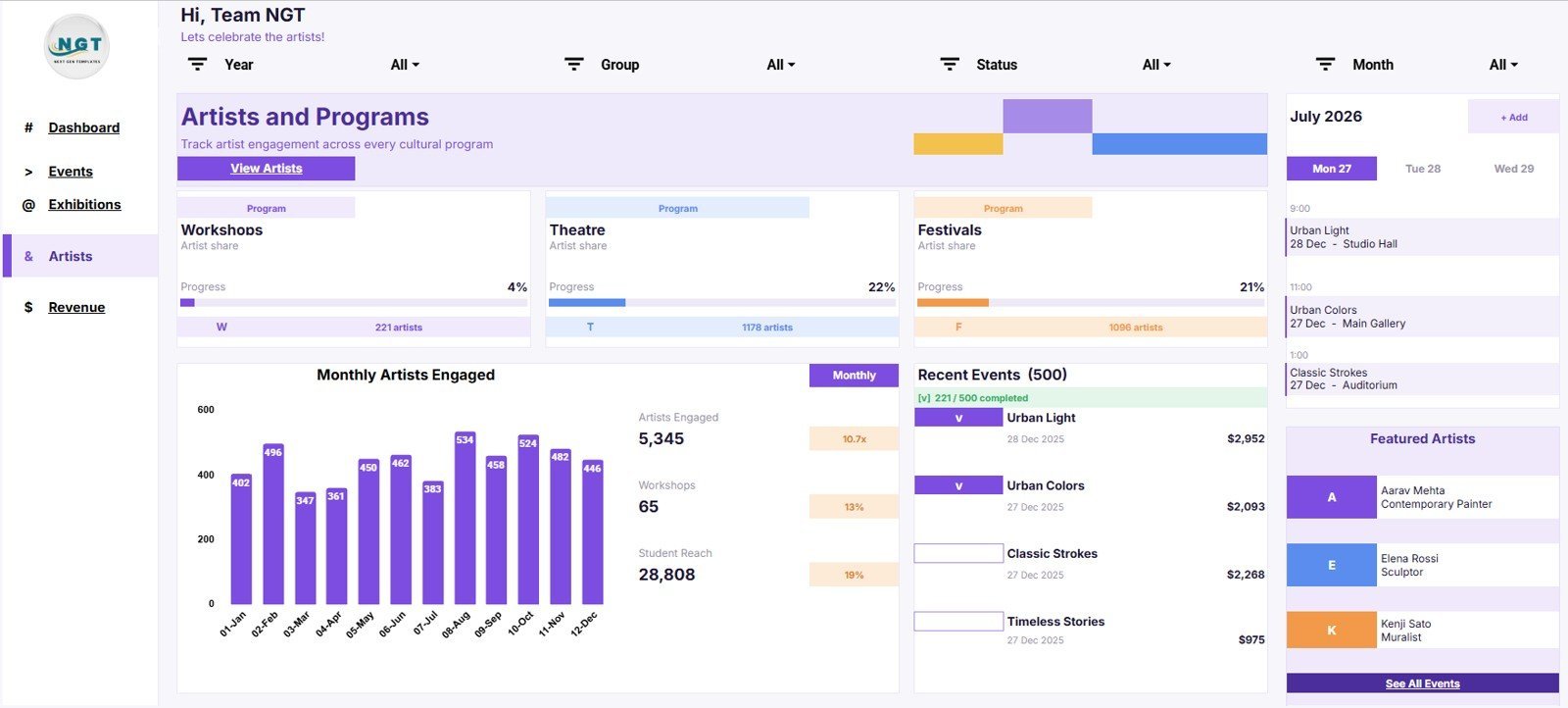
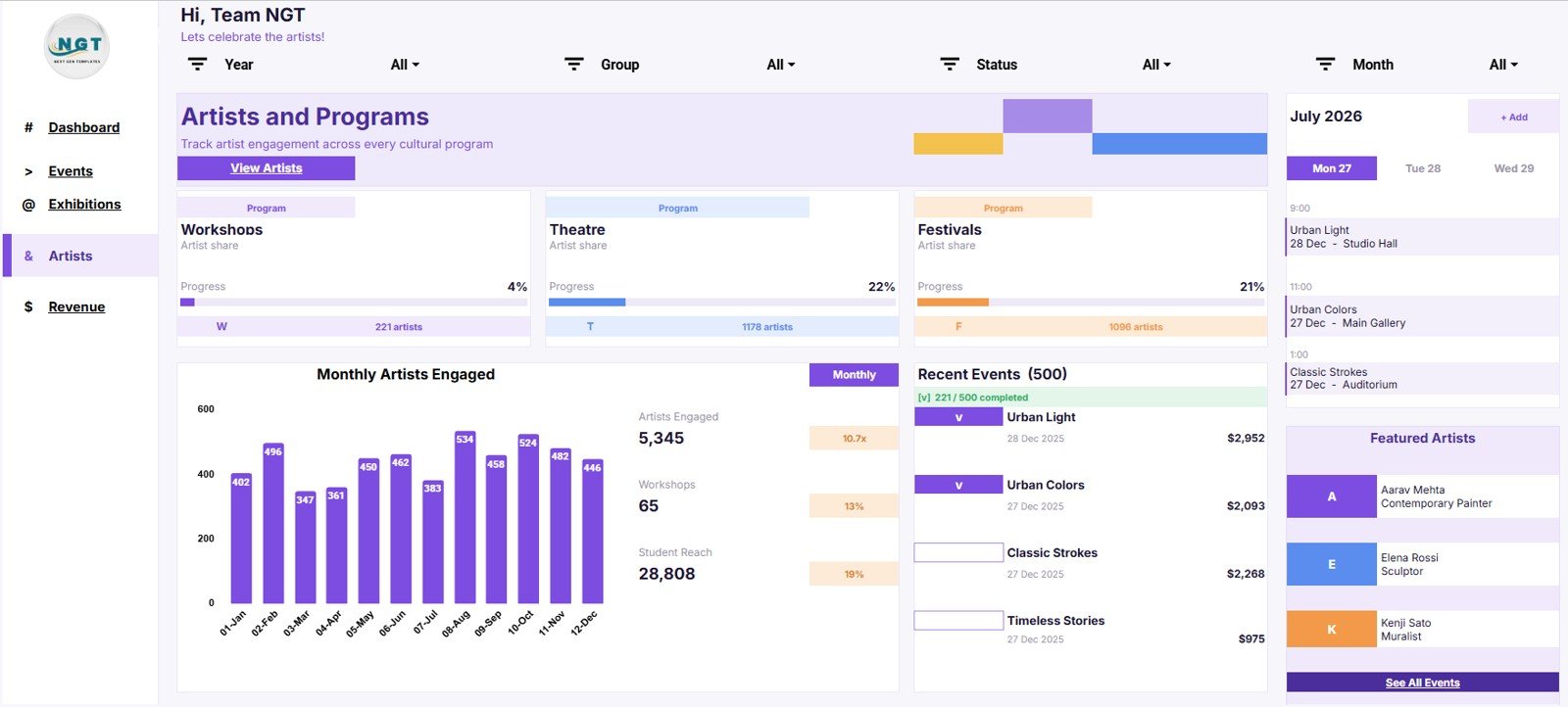
The Artists and Programs page gives program managers a clearer way to review artist mix, workshops, student reach, and program participation.
- Artist Share by Program: This chart shows how artist participation is distributed across program areas. It helps teams review representation and resource focus.
- Artists by Program: This view compares artist counts by program. It is useful for planning residencies, exhibitions, workshops, and community initiatives.
- Monthly Artists Engaged by Month: This trend tracks artist engagement over time. It helps teams understand when artist activity rises, dips, or requires additional outreach.
- Workshops by Program: This chart compares workshop volume across programs. Education and outreach teams can use it to see which programs are most active.
- Student Reach by Program: This analysis shows how programs reach students or learners. It supports grant reporting, education reviews, and community impact summaries.
- Recent Events by Event Name: This view connects program reporting back to specific events. It helps teams confirm what drove the latest results.
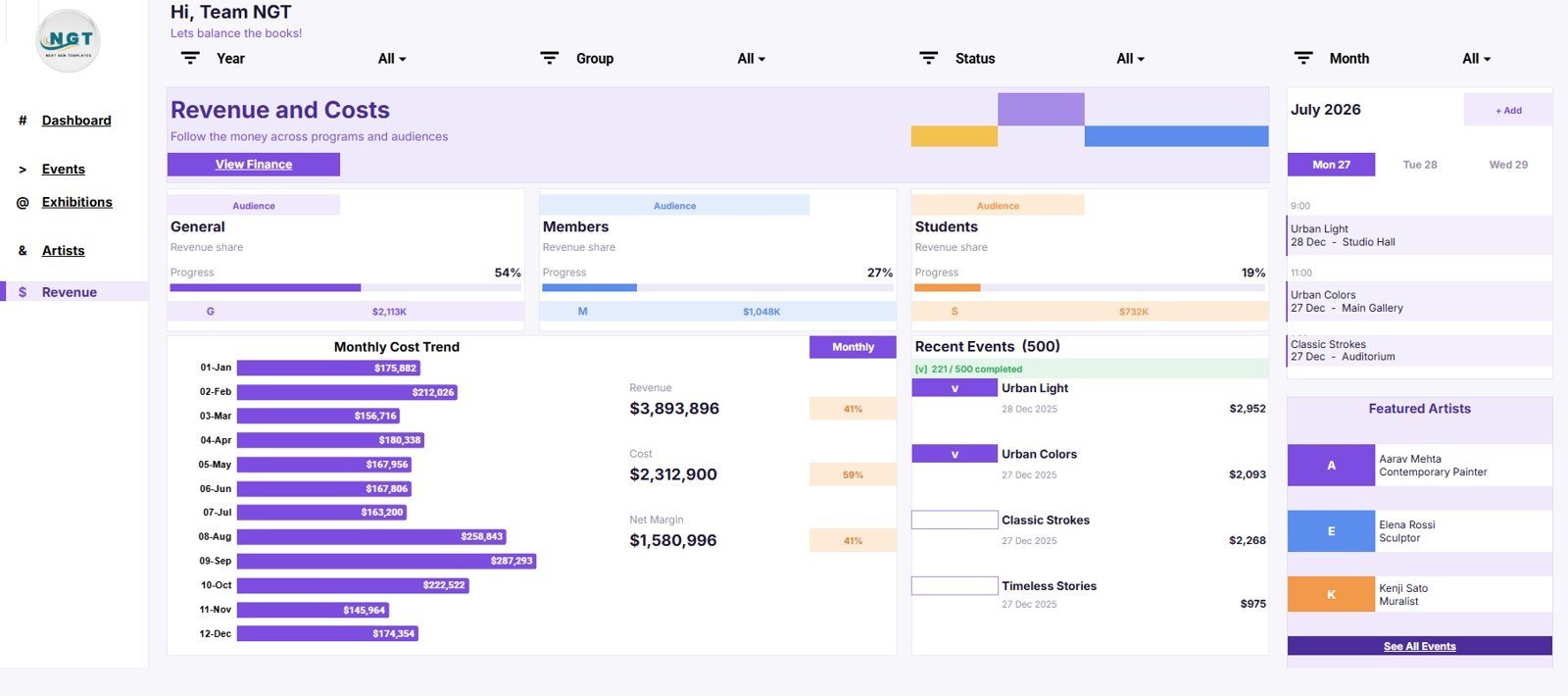
5. Revenue and Costs
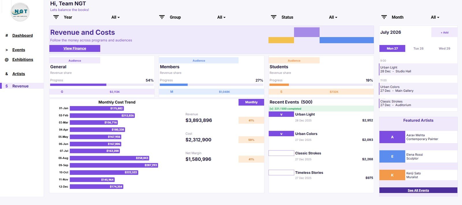
The Revenue and Costs page helps finance and operations teams review audience revenue, monthly costs, and net margin from the same dataset.
- Revenue Share by Audience: This chart shows revenue distribution by audience segment. It helps teams understand whether income is concentrated in public, member, donor, school, or partner audiences.
- Revenue by Audience: This view compares actual revenue amounts across audience groups. It is useful for pricing, fundraising, sponsorship, and campaign reviews.
- Monthly Cost Trend by Month: This trend shows how costs move over time. It helps finance teams spot expensive months and connect spending to programming activity.
- Cost by Month: This chart shows monthly cost totals in a direct comparison. It supports budget reviews and event cost control.
- Net Margin by Month: This analysis compares profitability or surplus by month. It helps leadership review whether revenue growth is translating into healthier margins.
- Recent Events by Event Name: This view links the financial picture back to specific events. It helps teams investigate which events require deeper follow-up.
6. Data Sheet Tab
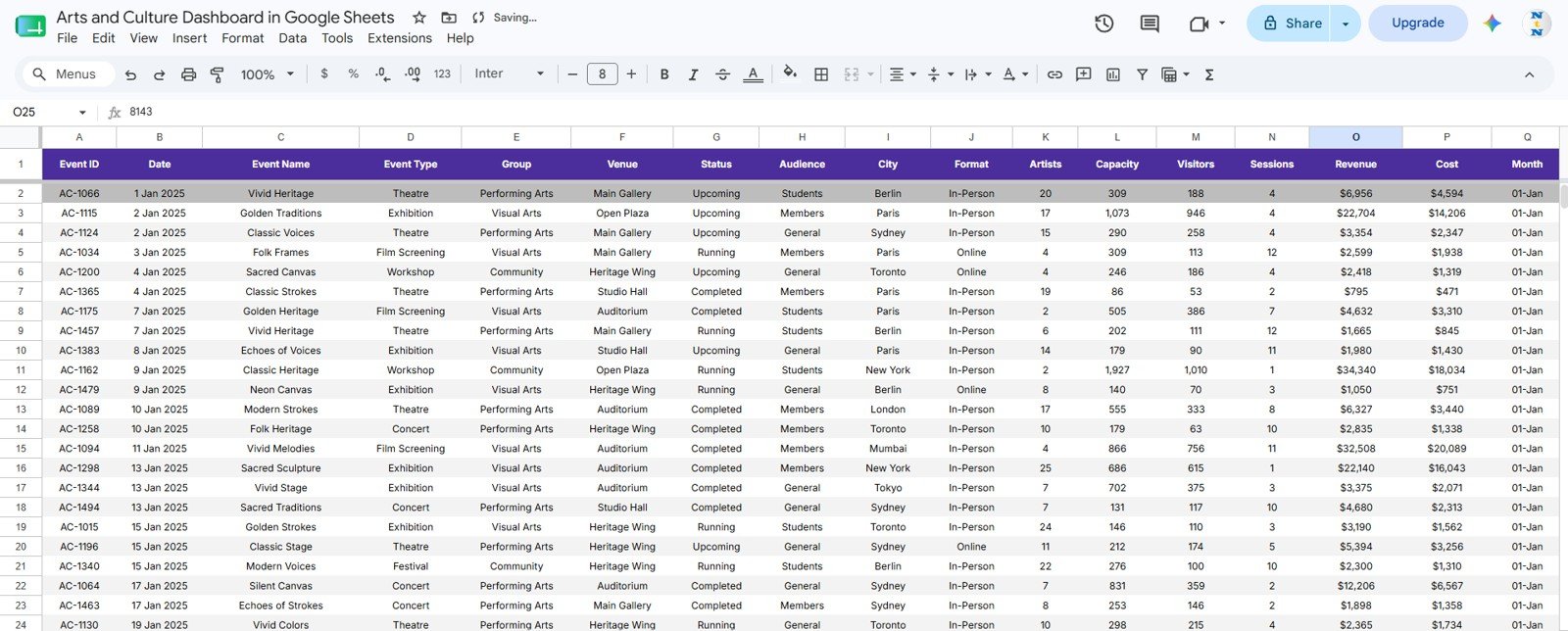
The Data Sheet tab is where you add the source records in the same reporting format used by the dashboard. Replace the sample information with your own events, venues, artists, programs, audiences, visitors, revenue, costs, and dates.
Google Sheets Dashboard vs Excel Dashboard vs Paid SaaS
| Option | Best For | Typical Tradeoff |
|---|---|---|
| Google Sheets arts dashboard | Teams that want browser access, easy sharing, and editable dashboards without a subscription. | Requires your team to keep the source data clean and update records consistently. |
| Excel arts dashboard | Teams that prefer desktop spreadsheet control, offline work, or advanced Excel workflows. | Version sharing can become harder unless your organization already uses cloud storage well. |
| Paid event or cultural SaaS | Larger institutions that need ticketing, CRM, donor management, memberships, and workflow automation. | Higher ongoing cost and more setup time, especially if you only need reporting. |
Who This Template Is For
- Museums and galleries tracking exhibitions, venues, visitors, artists, revenue, and costs.
- Concert organizers, festivals, and performing arts groups reviewing monthly events and attendance.
- Arts nonprofits preparing grant, board, sponsor, or donor reporting.
- Education and outreach teams measuring workshops, student reach, and program impact.
- Small cultural teams that want a dashboard before investing in a larger platform.
Who This Template Is Not For
- Teams that need a full ticketing, CRM, donor, or membership management system.
- Organizations that require automated integrations with every box office, finance, or marketing tool.
- Users who do not want to maintain a spreadsheet data source.
How to Use the Arts and Culture Dashboard in Google Sheets
- Open the included Google Sheets copy link and create your own editable copy in Google Drive.
- Review the Data Sheet tab so you understand the available columns and sample structure.
- Replace the sample events with your own exhibitions, concerts, festivals, programs, venues, audiences, artists, visitor counts, revenue, and cost records.
- Use the slicers to filter the dashboards by the period, category, venue, audience, program, or pipeline view you want to review.
- Share the workbook with team members, leadership, or collaborators who need dashboard access.
- Use the charts and cards for recurring weekly, monthly, board, grant, or sponsor reporting.
Real-World Use Cases
- Board reporting: Summarize visitor growth, revenue, event volume, program reach, and margin without rebuilding slides manually.
- Grant reporting: Show student reach, workshops, program activity, artist engagement, and community impact in a structured format.
- Venue review: Compare venue revenue, show volume, in-person events, and average ticket performance.
- Programming review: Track which event categories, programs, and artists are driving participation.
- Finance review: Monitor monthly cost trends, revenue by audience, and net margin before budget meetings.
Frequently Asked Questions
Is this template built in Google Sheets?
Yes. This is a Google Sheets dashboard template designed for browser-based editing, sharing, and collaboration.
Can I edit the charts and data fields?
Yes. You can replace the sample data and customize the dashboard structure, chart labels, colors, formulas, and fields based on your needs.
Does this connect automatically to ticketing or CRM software?
No. This version is a spreadsheet dashboard template. You can paste, import, or prepare data from other systems, but automated integrations are not included.
Can this work for museums, galleries, concerts, and festivals?
Yes. The structure is flexible enough for exhibitions, concerts, festivals, workshops, artist programs, venues, audiences, revenue, and cost reporting.
Do I need advanced Google Sheets skills?
No. The template is designed so you can update the Data Sheet tab and use the existing dashboard pages. More advanced users can also customize formulas, charts, and slicers.
About the Author
This template is created by PK: An Excel Expert for NextGenTemplates. PK builds practical Excel, Google Sheets, and dashboard resources for business teams, analysts, students, and creators who need polished reporting tools without starting from a blank file.
Sources
- BEA and NEA Arts and Cultural Production Satellite Account, 2023
- Americans for the Arts, Arts & Economic Prosperity 6
Explore Related Templates
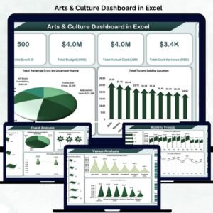
- Arts & Culture Dashboard in Excel
- Music Industry KPI Scorecard in Google Sheets
- Advertising Dashboard in Google Sheets
Ready to organize your arts reporting? Use the Arts and Culture Dashboard in Google Sheets to turn event, artist, venue, visitor, revenue, and cost data into a clear dashboard your team can update and share.
Watch the step-by-step video Demo:
Last updated: July 27, 2026.