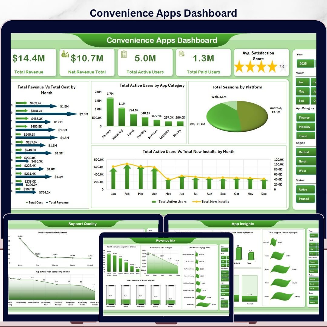


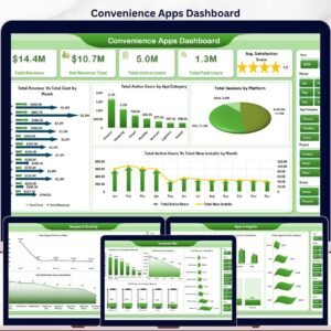
The Convenience Apps Dashboard in Excel gives app operators, product managers, subscription analysts, and support teams one workbook for tracking revenue, active users, paid users, sessions, installs, crashes, support tickets, platform performance, and satisfaction. It includes 5 KPI cards, 5 dashboard pages, 18 chart views, a structured Data Sheet, and a Support Sheet with pivot tables. For a one-time $17.99 sale price, you can replace recurring reporting work with an editable Excel dashboard that refreshes after updating the data and clicking Data > Refresh All.
Instant download. One-time payment. No subscription. No per-user fees. Lifetime access. Built by NextGenTemplates for a creator network reaching 300K+ subscribers across Excel, Power BI, and dashboard tutorial channels.
Key Features of Convenience Apps Dashboard in Excel
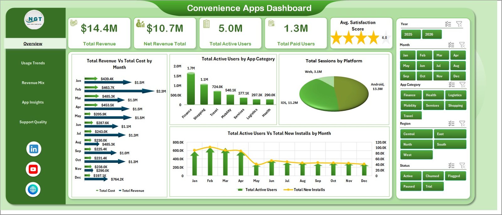
- 5 executive KPI cards showing Total Revenue, Net Revenue Total, Total Active Users, Total Paid Users, and Avg. Satisfaction Score.
- 5 analytical dashboard pages for Overview, Usage Trends, Revenue Mix, App Insights, and Support Quality.
- 18 chart views covering revenue, cost, active users, installs, sessions, platforms, plan types, regions, crashes, tickets, conversion, and satisfaction.
- Interactive slicers help users filter the dashboard quickly by app, category, plan, platform, status, region, month, quarter, release version, or user segment.
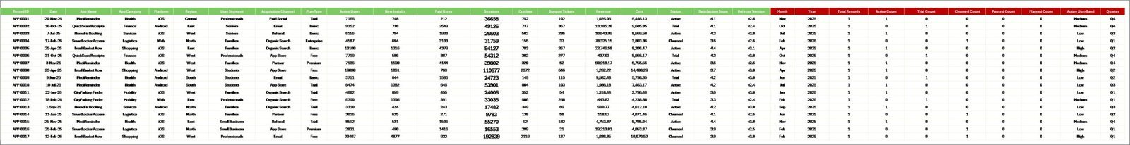
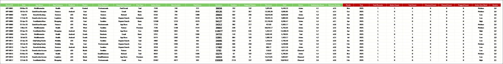
- Structured Data Sheet lets you paste app performance records in the same format and refresh the dashboard.
- Support Sheet with pivot tables powers the charts and can be hidden during normal use.
- No macros required because the workbook uses native Excel tables, pivot tables, charts, and slicers.
What’s Inside the Convenience Apps Dashboard in Excel
1. Overview Page
The Overview Page is the leadership summary for app performance. At the top, the KPI cards show Total Revenue, Net Revenue Total, Total Active Users, Total Paid Users, and Avg. Satisfaction Score so managers can review growth, monetization, adoption, and customer sentiment in one glance.
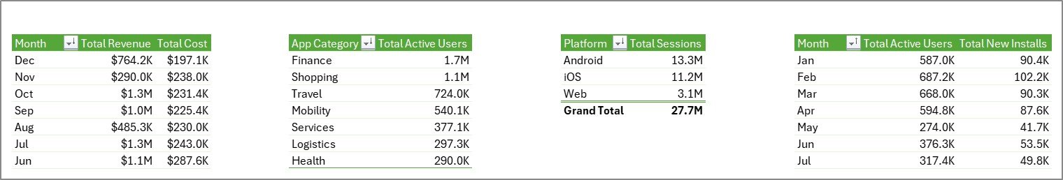
Total Revenue Vs Total Cost by Month: This chart compares monthly revenue against cost so teams can see whether app monetization is improving or margin pressure is increasing. It is useful for monthly reviews, budgeting, and pricing decisions.
Total Active Users by App Category: This chart shows which app categories have the largest active user base. Product teams can use it to identify strong categories and decide where to prioritize updates or campaigns.
Total Sessions by Platform: This chart compares session volume across platforms such as iOS, Android, web, or desktop. It helps operations teams understand where user activity is concentrated.
Total Active Users Vs Total New Installs by Month: This trend view compares existing active users with new installs. It helps teams spot whether acquisition is translating into retained usage.
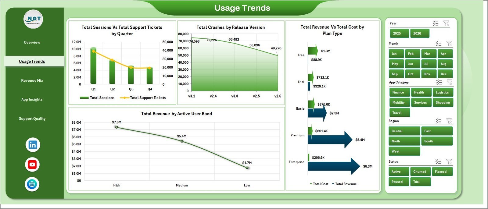
2. Usage Trends
The Usage Trends page focuses on engagement, stability, cost, and user bands. Total Sessions Vs Total Support Tickets by Quarter shows whether usage growth is creating more service pressure. Total Crashes by Release Version helps teams identify unstable releases. Total Revenue Vs Total Cost by Plan Type compares profitability across plans, while Total Revenue by Active User Band reveals which user scale groups generate the most revenue.

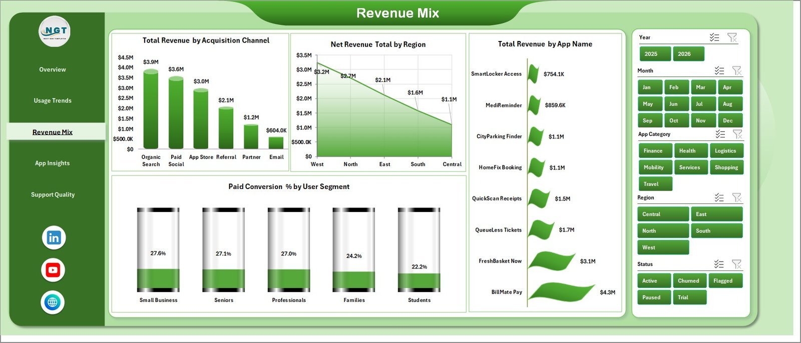
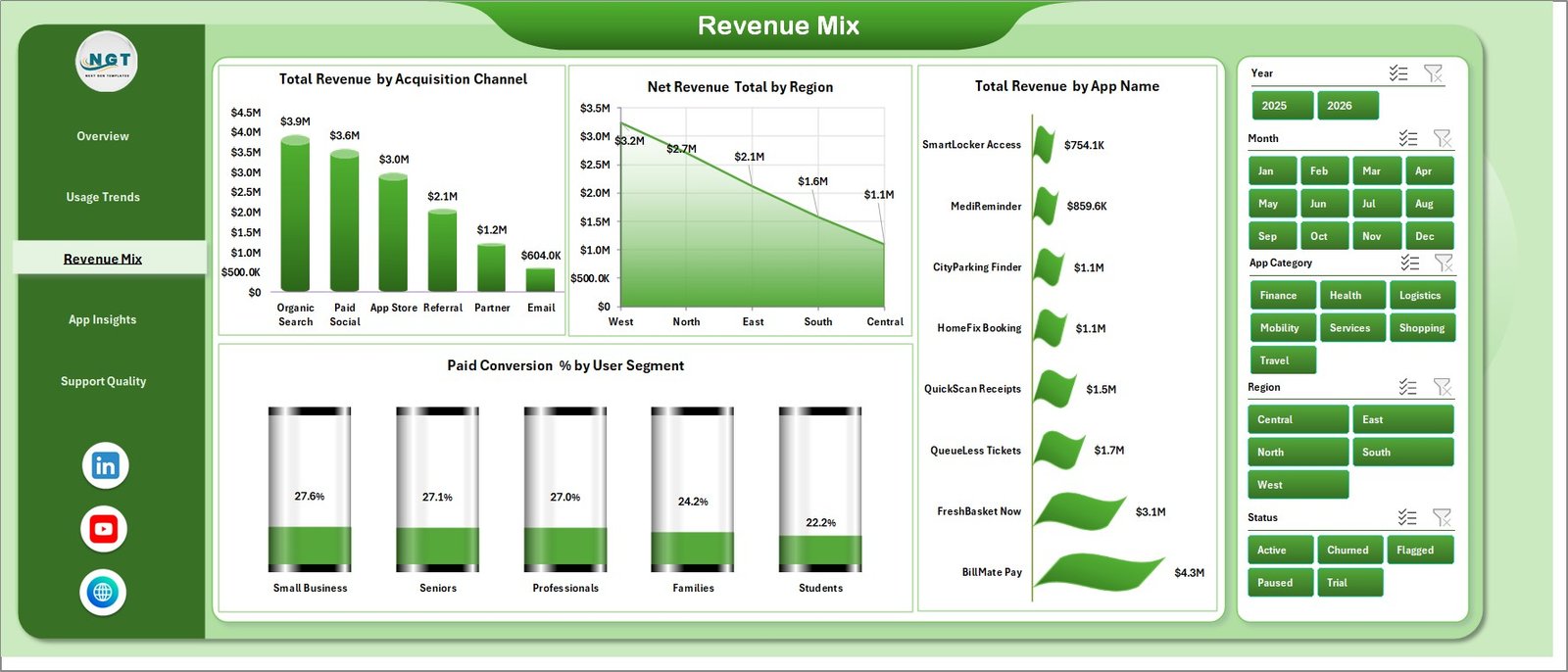
3. Revenue Mix
The Revenue Mix page explains where revenue comes from. It includes Total Revenue by Acquisition Channel, Net Revenue Total by Region, Total Revenue by App Name, and Paid Conversion % by User Segment. Together, these visuals help product and marketing teams compare channel quality, regional performance, app-level contribution, and segment monetization.
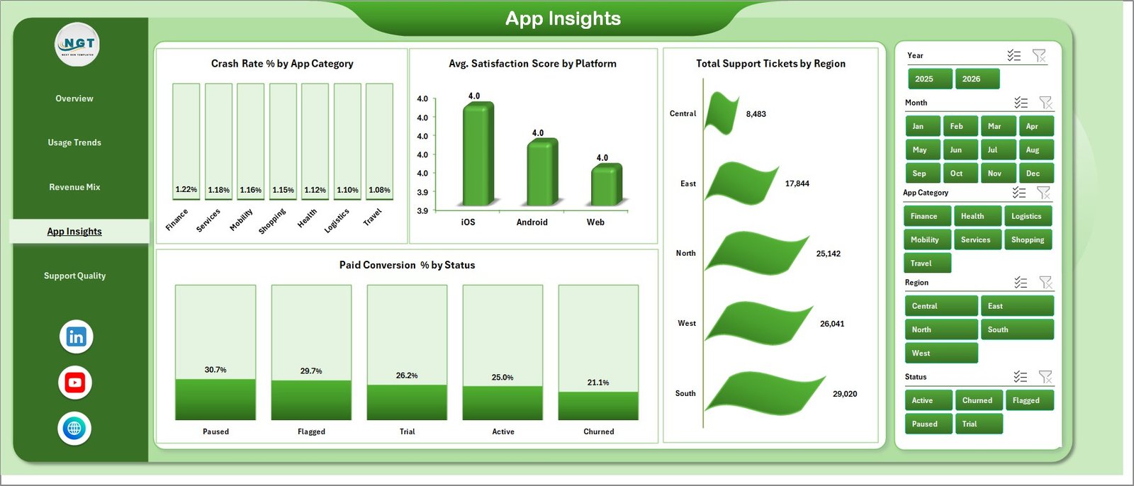
4. App Insights
The App Insights page connects product quality with customer experience. It includes Crash Rate % by App Category, Avg. Satisfaction Score by Platform, Total Support Tickets by Region, and Paid Conversion % by Status. Use it to find categories with quality risk, platforms with weaker satisfaction, regions with more support demand, and lifecycle statuses that convert best.
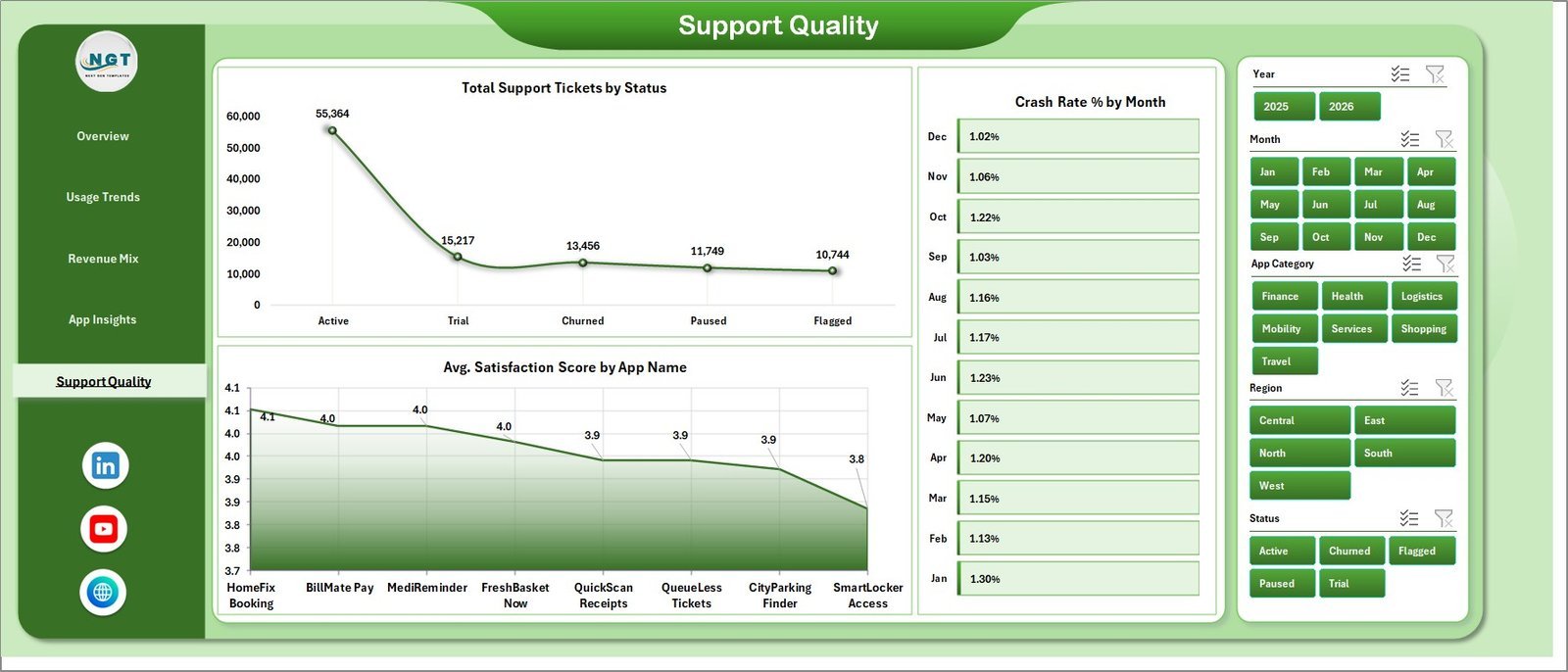
5. Support Quality
The Support Quality page is built for product support and quality review. Total Support Tickets by Status shows ticket workload and closure progress. Crash Rate % by Month helps teams monitor stability trends over time. Avg. Satisfaction Score by App Name highlights which apps are creating the best or weakest customer experience.

6. Data Sheet Tab
The Data Sheet is where you add or replace the source data in the same format. Keep the column structure intact, paste your updated records, and refresh the workbook so every dashboard page, card, chart, slicer, and pivot table updates together.
7. Support Sheet
The Support Sheet contains the pivot tables that drive the dashboard dynamically. After updating the Data Sheet, go to the Excel Ribbon, open the Data tab, and click Refresh All. You can keep this sheet hidden once the workbook is set up.
Convenience Apps Dashboard in Excel vs. Google Sheets vs. Paid CRM/SaaS – Where This Fits
| Feature | This Excel Dashboard | Google Sheets Alternative | Paid App Analytics SaaS |
|---|---|---|---|
| Cost | $17.99 one-time | Low software cost but requires manual build | $50-$500+ per month |
| Platform | Microsoft Excel | Browser-based spreadsheet | Vendor cloud app |
| Setup time | Under 10 minutes | 30-90 minutes if built manually | Hours or days of configuration |
| Real-time team collaboration | Possible with OneDrive or SharePoint | Native collaboration | Usually available by user seat |
| Mobile access | Excel mobile with limits | Google Sheets mobile | Usually available |
| Customizable fields | Fully editable workbook | Editable but formulas can break | Limited by vendor settings |
| Share with link | Possible through OneDrive or SharePoint | Native link sharing | Often requires login |
| Year-1 cost at 5 users | $17.99 total | Low tool cost plus build time | $3,000-$30,000+ |
| Pivot refresh workflow | Built in with Data > Refresh All | Requires formula or pivot setup | Handled by vendor system |
Who This Template Is For – and Who It’s Not For
This template is for mobile app teams, convenience app operators, subscription analysts, app marketing teams, customer support managers, and founders who need a practical Excel reporting layer for app performance. It works best when you can export monthly or transactional app records from your billing, analytics, store, or support system.
It is not a replacement for a live event analytics platform, app store console, data warehouse, API pipeline, or ticketing system. If you need real-time behavioral tracking, push notification automation, or direct database sync, use this workbook as a reporting layer after exporting your data.
How to Use the Convenience Apps Dashboard in Excel
- Download and unzip the Excel dashboard file.
- Open the workbook in Microsoft Excel 2016 or later.
- Go to the Data Sheet and replace the sample records with your own app performance data.
- Keep the same column structure so the pivot tables and charts continue to work.
- Go to Data > Refresh All in the Excel Ribbon.
- Use the slicers on each page to filter by app, platform, region, category, plan, release version, status, or time period.
Real-World Use Cases
Riya, a product manager, uses the Overview and App Insights pages during monthly product reviews to explain whether installs, active users, paid users, satisfaction, and crash rates are improving together.
Marcus, a subscription analyst, studies Revenue Mix to compare acquisition channels, regions, app names, and paid conversion by segment before recommending plan and campaign changes.
Anika, a support operations lead, refreshes the Data Sheet weekly and uses Support Quality to track ticket status, crash rate trends, and app-level satisfaction before leadership meetings.
Frequently Asked Questions
What does this dashboard track?
It tracks revenue, net revenue, active users, paid users, satisfaction, sessions, installs, platforms, app categories, plan types, acquisition channels, regions, crashes, release versions, support tickets, user segments, and statuses.
Do I need macros?
No. The dashboard uses native Excel tables, pivot tables, charts, and slicers.
How do I refresh the dashboard?
Update the Data Sheet, then click Data > Refresh All in Excel. The Support Sheet pivots and dashboard charts refresh together.
Can I customize the fields?
Yes. You can edit the workbook, but keep a backup before changing pivot source fields or chart structures.
Is this suitable for mobile apps and web apps?
Yes. It works for mobile apps, web apps, local service apps, delivery apps, subscription apps, and convenience platforms that track user, session, revenue, quality, and support data.
Does it connect directly to Firebase, App Store Connect, Google Play, Stripe, or Zendesk?
No direct connector is included. Export your data, paste it into the Data Sheet, and refresh the workbook.
About the Author
Built by PK – Microsoft Certified Professional with 15+ years of Excel, Google Sheets, and Power BI experience. Founder of NextGenTemplates, reaching 300K+ subscribers across YouTube channels. Every template is hand-built and tested before release.
Explore Related Templates
- Content Personalization Startups Dashboard in Excel – campaign, audience, and personalization reporting.
- SaaS Customer Success Dashboard in Excel – customer health, MRR, tickets, and renewals.
- Career Mentorship Platforms Dashboard in Power BI – platform and session analytics in Power BI.
- Browse Excel Dashboard templates.
Click here to read the detailed blog post
Ready to turn app performance data into a clear Excel dashboard? Download the Convenience Apps Dashboard in Excel and start tracking revenue, users, sessions, crashes, support, and satisfaction today.
Watch the step-by-step video tutorial:


Reviews
There are no reviews yet.