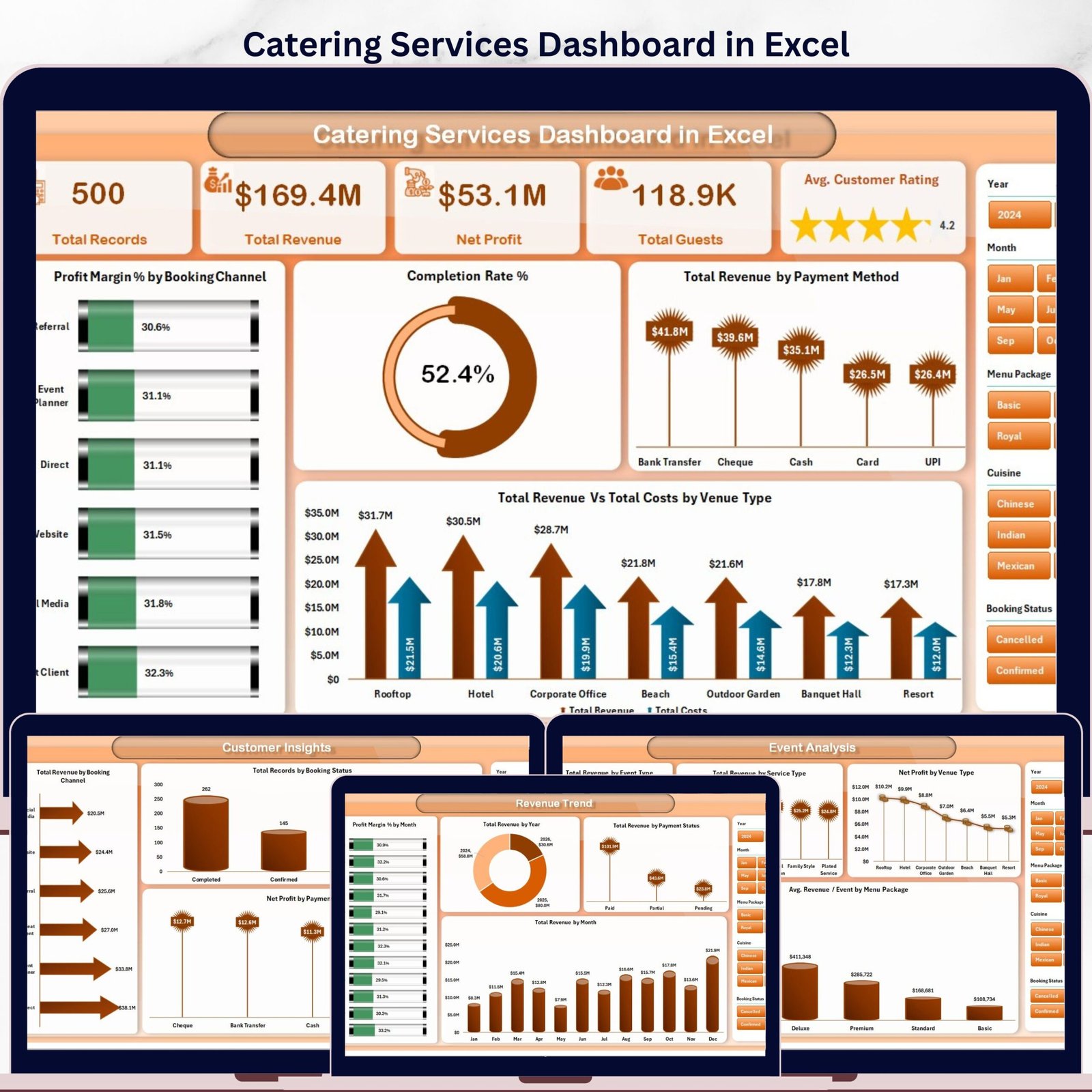

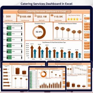
The Catering Services Dashboard in Excel tracks 5 KPIs across 5 interactive pages, with 16+ pre-built pivot-driven charts and dynamic slicers. Setup takes under 10 minutes — just replace the sample data in the Data Sheet and every chart and card updates automatically.
🌍 Join 8,400+ teams in 40+ countries using NextGenTemplates to replace paid SaaS tools with one-time-purchase Excel, Google Sheets, Power BI, and HTML templates.
✅ Instant download · One-time payment · No subscription · No per-user fees · Lifetime access
🔑 Key Features of Catering Services Dashboard in Excel
This dashboard tracks 5 core KPIs — Total Records, Total Revenue, Net Profit, Total Guests, and Avg. Customer Rating — across 5 dedicated analysis pages. It includes 16+ pre-built charts covering profit margin by booking channel, revenue by event type, cuisine-level cost analysis, and customer booking trends. All visuals are driven by pivot tables and update with a single Refresh All click after your data is updated. The template includes dynamic slicers for instant filtering without any formulas or coding required. Built-in venue type, payment method, and menu package analysis make it the most comprehensive catering analytics spreadsheet available as a one-time download.
📦 What’s Inside the Catering Services Dashboard in Excel
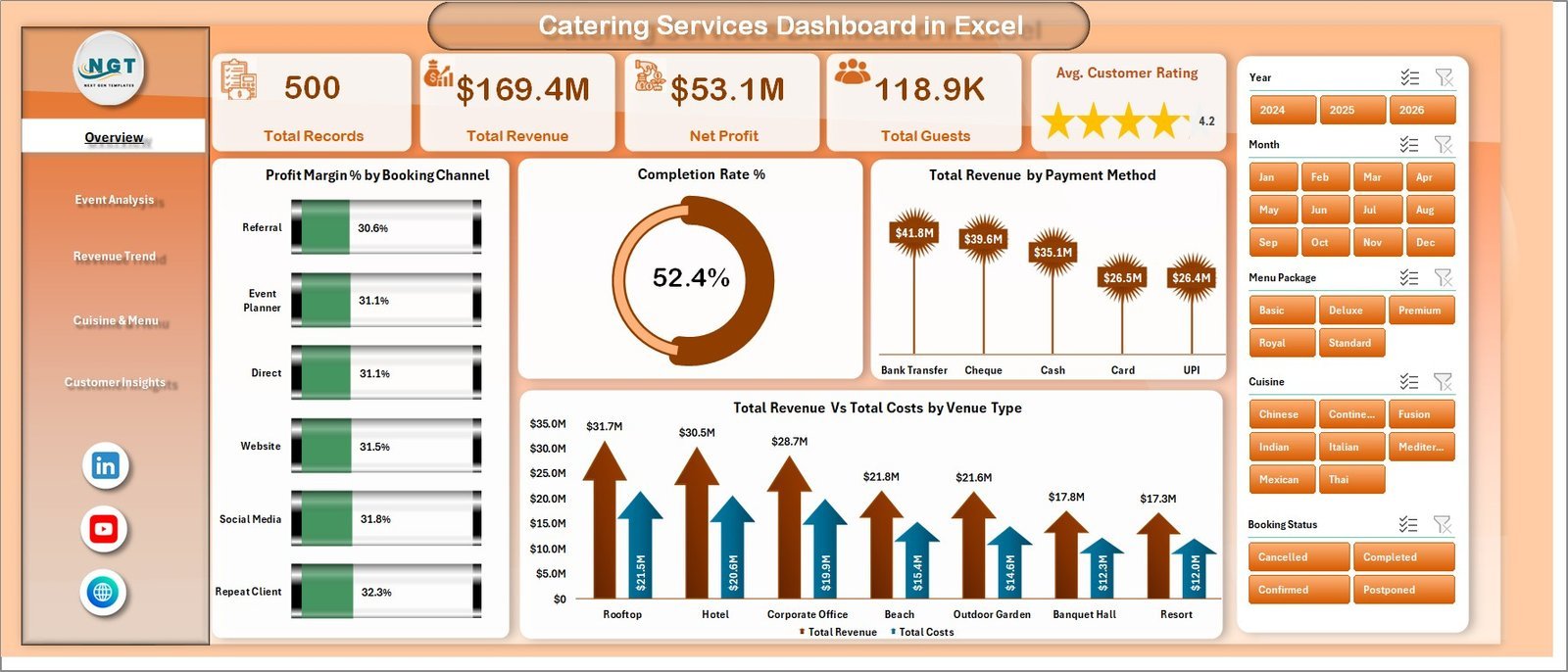
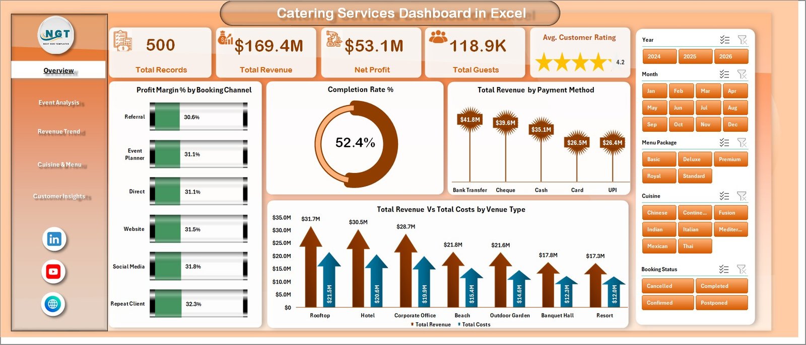
Page 1: Overview
This page shows high-level KPI cards for Total Records, Total Revenue, Net Profit, Total Guests, and Avg. Customer Rating, alongside charts for Profit Margin % by Booking Channel, Completion Rate %, Total Revenue by Payment Method, and Total Revenue vs Total Costs by Venue Type. Dynamic slicers let you filter the entire dashboard instantly.
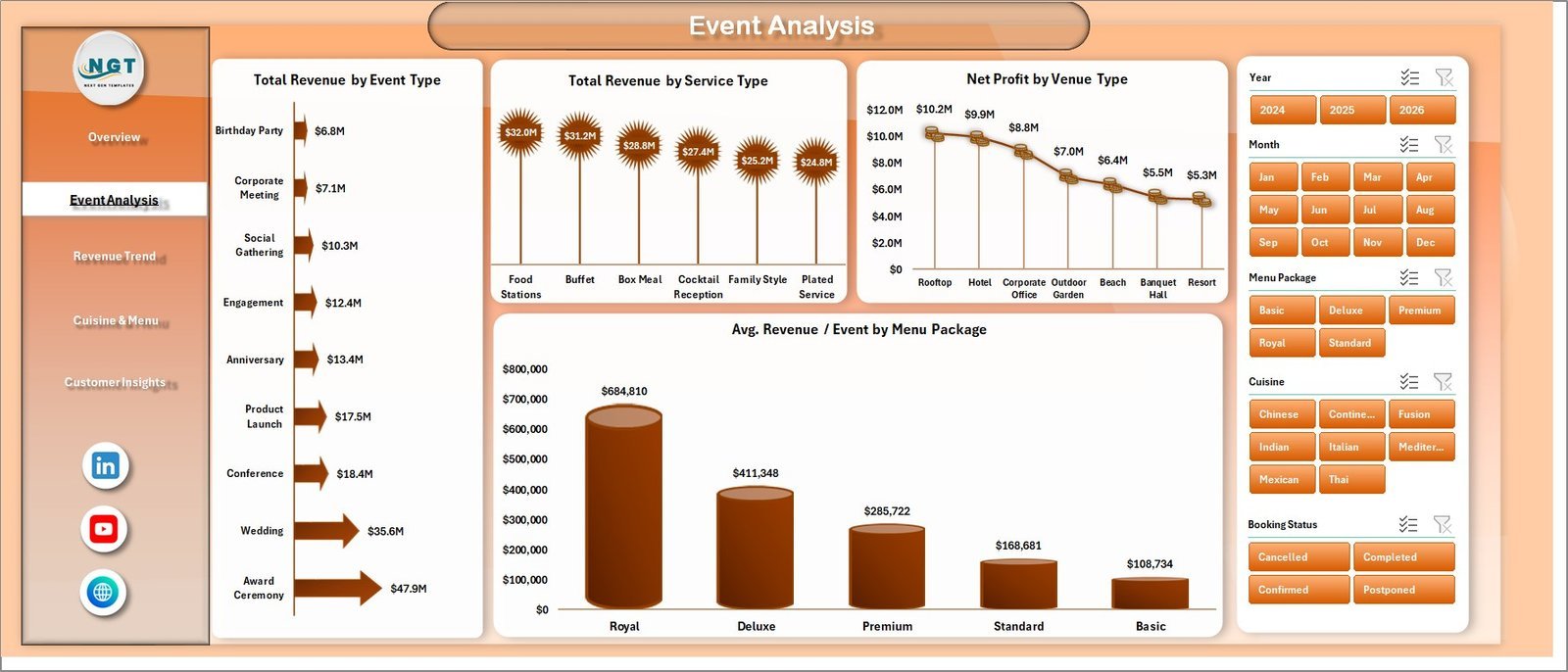
Page 2: Event Analysis
This page breaks down catering performance by event and service dimensions, with charts for Total Revenue by Event Type, Total Revenue by Service Type, Net Profit by Venue Type, and Avg. Revenue per Event by Menu Package.

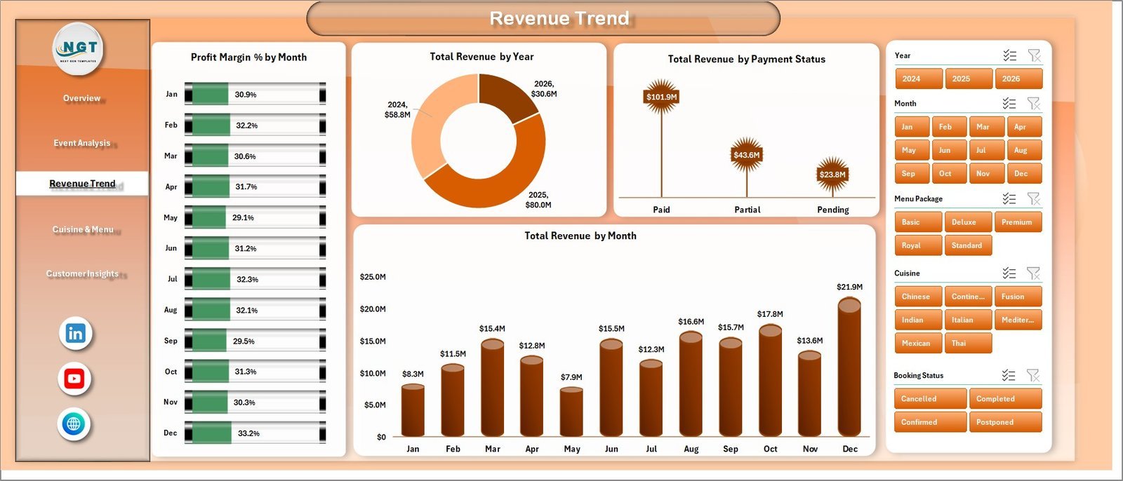
Page 3: Revenue Trend
This page surfaces temporal revenue patterns with charts for Profit Margin % by Month, Total Revenue by Year, Total Revenue by Payment Status, and Total Revenue by Month — giving catering managers a clear picture of seasonality and financial momentum.

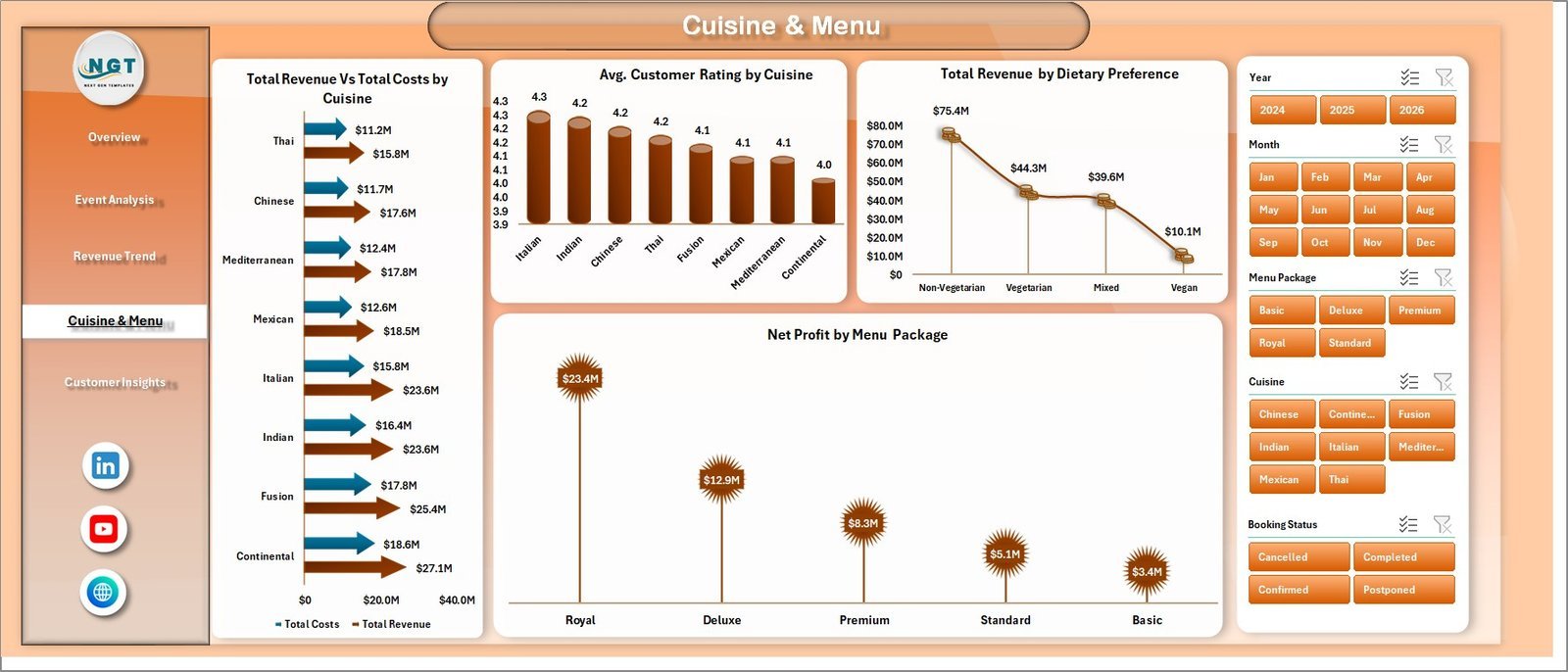
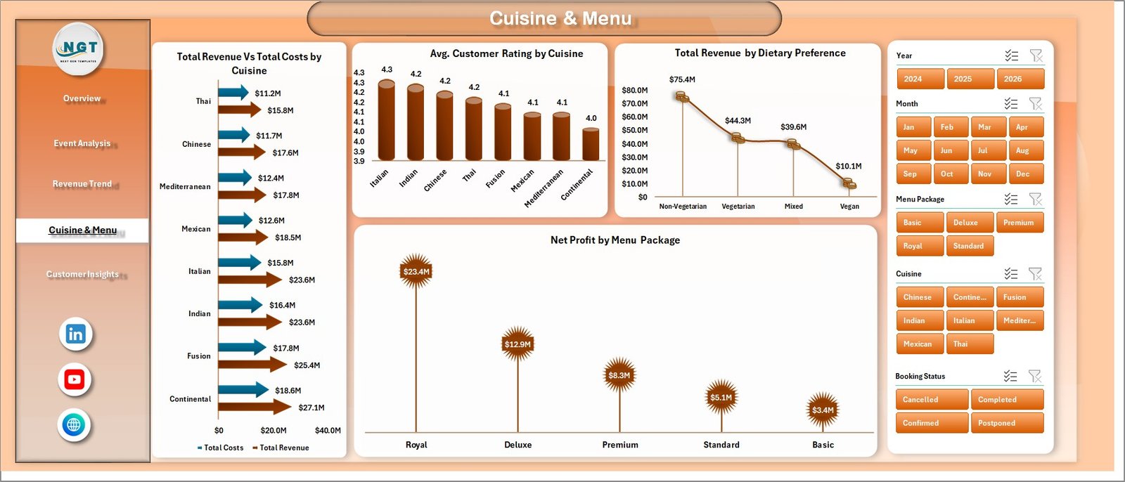
Page 4: Cuisine & Menu
This page dives into menu-level profitability with charts for Total Revenue vs Total Costs by Cuisine, Avg. Customer Rating by Cuisine, Total Revenue by Dietary Preference, and Net Profit by Menu Package.
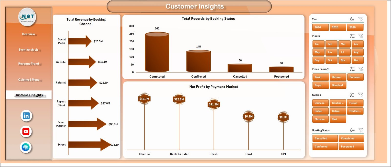
Page 5: Customer Insights
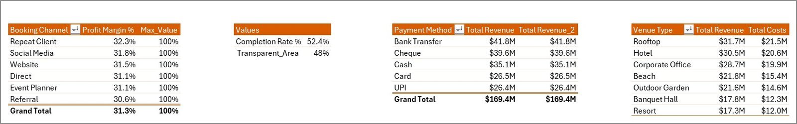
This page focuses on customer and booking intelligence, showing Total Revenue by Booking Channel, Total Records by Booking Status, and Net Profit by Payment Method to help identify the most profitable customer acquisition paths.
Data Sheet
The structured Data Sheet is where all your catering records go. Enter data in the same column format as the sample data — all dashboard pages update automatically after refreshing the pivot tables.

Support Sheet
The Support Sheet hosts all underlying pivot tables that power the dashboard charts. After updating your data, go to the Data tab in the Excel Ribbon and click Refresh All to update every chart. You can keep this sheet hidden during day-to-day use.
📊 Catering Services Dashboard in Excel vs. Google Sheets vs. Paid Catering SaaS — Where This Fits
| Feature | Catering Services Dashboard in Excel | Google Sheets Equivalent | Paid SaaS (Caterease / Total Party Planner) |
|---|---|---|---|
| Cost | $17.99 one-time | Free (basic) / ~$10 template | $80–$200/user/month |
| Platform | ✅ Microsoft Excel (offline) | Google Sheets (cloud) | Browser / app |
| Setup time | ✅ Under 10 minutes | 10–15 minutes | Days (onboarding + training) |
| Real-time team collaboration | Via SharePoint / OneDrive | ✅ Native real-time | ✅ Native real-time |
| Mobile access | Excel mobile app | ✅ Full mobile | ✅ Native mobile |
| Customizable fields | ✅ Fully editable | ✅ Fully editable | Limited / locked tiers |
| Pivot-driven charts | ✅ 16+ pre-built | Manual setup | ✅ Built-in but rigid |
| Year-1 cost (5 users) | $17.99 total | ~$50 (template) | $4,800–$12,000/year |
| Cuisine & Menu profitability | ✅ 4 dedicated charts | Manual setup | Partial (varies by tier) |
For catering teams that want deep analytics without paying hundreds per month, the Catering Services Dashboard in Excel sits in the sweet spot.
👥 Who This Template Is For — and Who It’s Not For
✅ This template is built for:
- Catering business owners and managers tracking event revenue and profitability
- Event coordinators who need cuisine-level and menu-package cost analysis
- Finance teams at catering companies building monthly or annual P&L summaries
- Operations managers monitoring booking channel performance and completion rates
❌ This template is NOT for:
- Teams needing real-time POS integration or automated order management
- Enterprise catering operations requiring SOC 2 compliance or SSO
⚙️ How to Use the Catering Services Dashboard in Excel
- Download and open the file in Microsoft Excel 2016 or later
- Navigate to the Data Sheet and replace the sample records with your catering data
- Click Refresh All on the Data tab in the Excel Ribbon to update all pivot tables
- Use the slicers on the Overview page to filter by date, event type, venue, or booking channel
- Review each tab — Event Analysis, Revenue Trend, Cuisine & Menu, and Customer Insights — for targeted insights
- Keep the Support Sheet hidden for a clean presentation and share with stakeholders
💼 Real-World Use Cases
Maria owns a corporate catering firm serving 15+ clients a month. She uses the Catering Services Dashboard in Excel to compare profit margins across her wedding, corporate lunch, and gala event packages — and identified that her buffet menu had a 12% lower margin than plated service, leading her to reprice it before the next quarter.
Rahul manages operations for a hotel catering department. He tracks monthly revenue trends and booking channel performance using the Revenue Trend and Customer Insights pages, presenting clean charts to hotel management without needing expensive BI software.
A small catering startup in its first year uses this template instead of investing $800+/month in SaaS platforms — they enter bookings weekly into the Data Sheet and use the Overview’s slicer filters to prepare client-ready reports in under 5 minutes.
❓ Frequently Asked Questions
What KPIs does the Catering Services Dashboard in Excel track?
The Catering Services Dashboard in Excel tracks 5 KPIs — Total Records, Total Revenue, Net Profit, Total Guests, and Avg. Customer Rating — plus 16+ derived metrics across event type, venue, cuisine, booking channel, and payment method dimensions.
Which version of Excel do I need?
The Catering Services Dashboard in Excel works with Microsoft Excel 2016 and later on both Windows and Mac, including Microsoft 365. It uses standard pivot tables and slicers, so no macros or special add-ins are required.
How do I update the dashboard with my own data?
Open the Data Sheet tab, replace the sample rows with your catering records in the same column format, then click Data → Refresh All in the Excel Ribbon. All 5 dashboard pages will update automatically within seconds.
Can I add new data columns or customize the charts?
Yes — the template is fully editable. You can add columns to the Data Sheet, update the pivot table source range, and modify chart types or colors to match your brand. The Support Sheet documents all pivot table configurations.
How does this compare to paid catering software like Caterease?
Caterease and Total Party Planner cost $80–$200/user/month and are designed for order management and event logistics. The Catering Services Dashboard in Excel focuses on analytics and reporting — it’s the ideal companion or standalone tool for teams that already manage bookings elsewhere and need affordable, customizable dashboards.
Is there a Google Sheets version available?
Yes — the Catering Business KPI Dashboard in Google Sheets is available for teams that prefer cloud-based collaboration. It covers similar KPIs in a native Sheets format with pivot tables and slicers.
Can I use this for multiple catering events or locations?
Absolutely. The Data Sheet supports unlimited rows. You can add a Location or Region column and filter by it using the slicers, making the dashboard suitable for multi-venue catering operations.
👤 About the Author
Built by PK — Microsoft Certified Professional with 15+ years of Excel, Google Sheets, and Power BI experience. Founder of NextGenTemplates, reaching 300K+ subscribers across YouTube channels (@PK-AnExcelExpert, @NextGenTemplates, @NeoTechNavigators). Every template is hand-built and tested before release.
🔗 Explore Related Templates
📊 Catering Services KPI Dashboard in Excel — Classic KPI scorecard format for monthly catering performance tracking
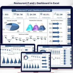
📊 Restaurant P and L Dashboard in Excel — Profit & loss analysis dashboard for restaurant and food service operators
📊 Food and Beverage KPI Dashboard in Excel — Broader F&B analytics covering supply, sales, and margins
Also available: Excel Dashboard Templates — browse all Excel dashboards across 50+ industries
📖 Click here to read the Detailed Blog Post
🎥 Visit our YouTube channel for step-by-step video tutorials
👉 YouTube.com/@NextGenTemplates
📅 Last updated: May 2026
Watch the step-by-step video tutorial:
YouTube


Reviews
There are no reviews yet.