


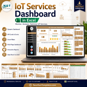
IoT Services Dashboard in Excel helps managed IoT service teams track subscription revenue, service cost, tickets, monitored devices, uptime, downtime, resolution rate, and client satisfaction across 7 worksheet tabs. IoT operations can become difficult to explain when device, network, support, SLA, technician, and client data live in separate files. Trusted by 8,400+ teams across 40+ countries, this one-time Excel dashboard gives you a refreshable reporting workbook with no subscription and no per-user template fee.
Key Features of IoT Services Dashboard in Excel
- 7 worksheet tabs: Overview, Service Mix, Device Ops, Client Health, Support SLA, Data Sheet, and Support Sheet.
- Executive cards: Total Subscription Revenue, Total Tickets Opened, Total Devices Monitored, and Avg. Satisfaction.
- Service analytics: Review service status, plan tier, service type, network type, and monthly ticket volume.
- Device operations: Track downtime hours, uptime percentage, resolution percentage, and monitored devices by region.
- Client health: Compare satisfaction, revenue, service cost, resolution percentage, uptime, and client profitability.
- SLA reporting: Analyze response time by priority, ticket resolution by status, and technician workload.
- Refreshable Excel design: Replace sample data, click Refresh All, and update pivot tables, slicers, and charts.
What’s Inside the IoT Services Dashboard in Excel
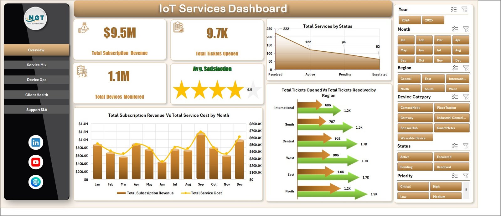
1. Overview Page
The Overview page gives managers the high-level IoT service view. The top cards show Total Subscription Revenue, Total Tickets Opened, Total Devices Monitored, and Avg. Satisfaction, while slicers let users filter the full dashboard quickly.
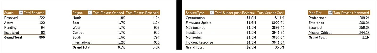
Total Services by Status shows how services are distributed by lifecycle state, helping teams see active, pending, closed, or at-risk service volume. Total Subscription Revenue and Total Service Cost by Month compares monthly income and delivery cost so managers can read margin pressure. Total Tickets Opened and Total Tickets Resolved by Region compares support demand and closure activity across operating regions.
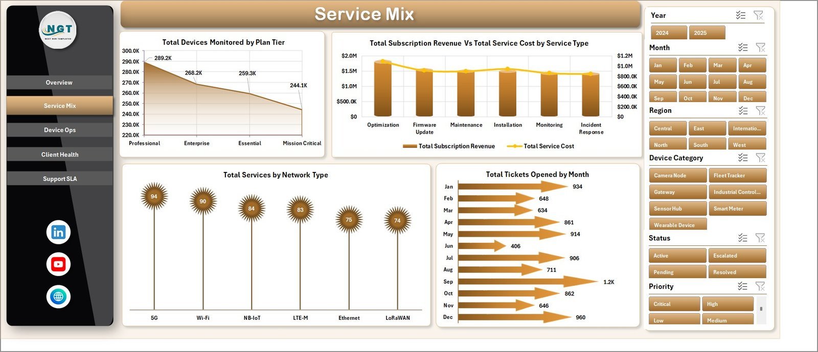
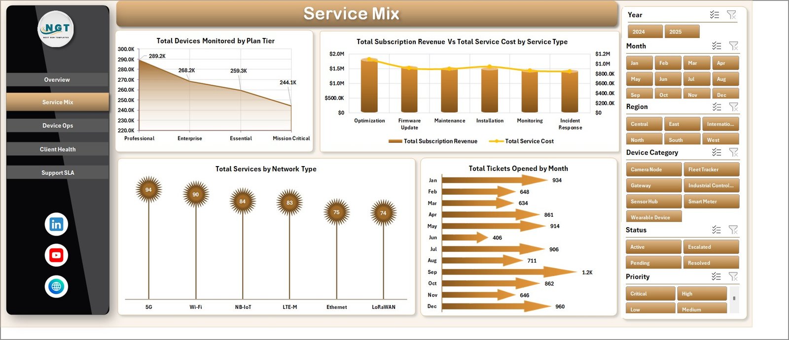
2. Service Mix
The Service Mix tab explains which plans, service types, network types, and months drive the service portfolio. Total Devices Monitored by Plan Tier shows device concentration by plan. Total Subscription Revenue and Total Service Cost by Service Type compares income and cost by service line. Total Services by Network Type highlights network mix, and Total Tickets Opened by Month shows support demand over time.
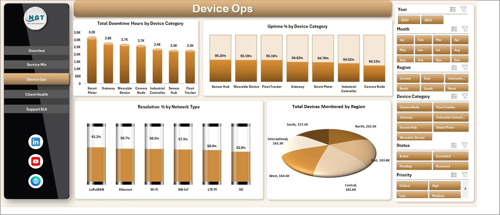
3. Device Ops
The Device Ops page focuses on device reliability and regional monitoring volume. Total Downtime Hours by Device Category identifies categories creating the most lost service time. Uptime % by Device Category compares reliability by device group. Resolution % by Network Type shows how quickly issues close across network types, while Total Devices Monitored by Region supports capacity and coverage review.
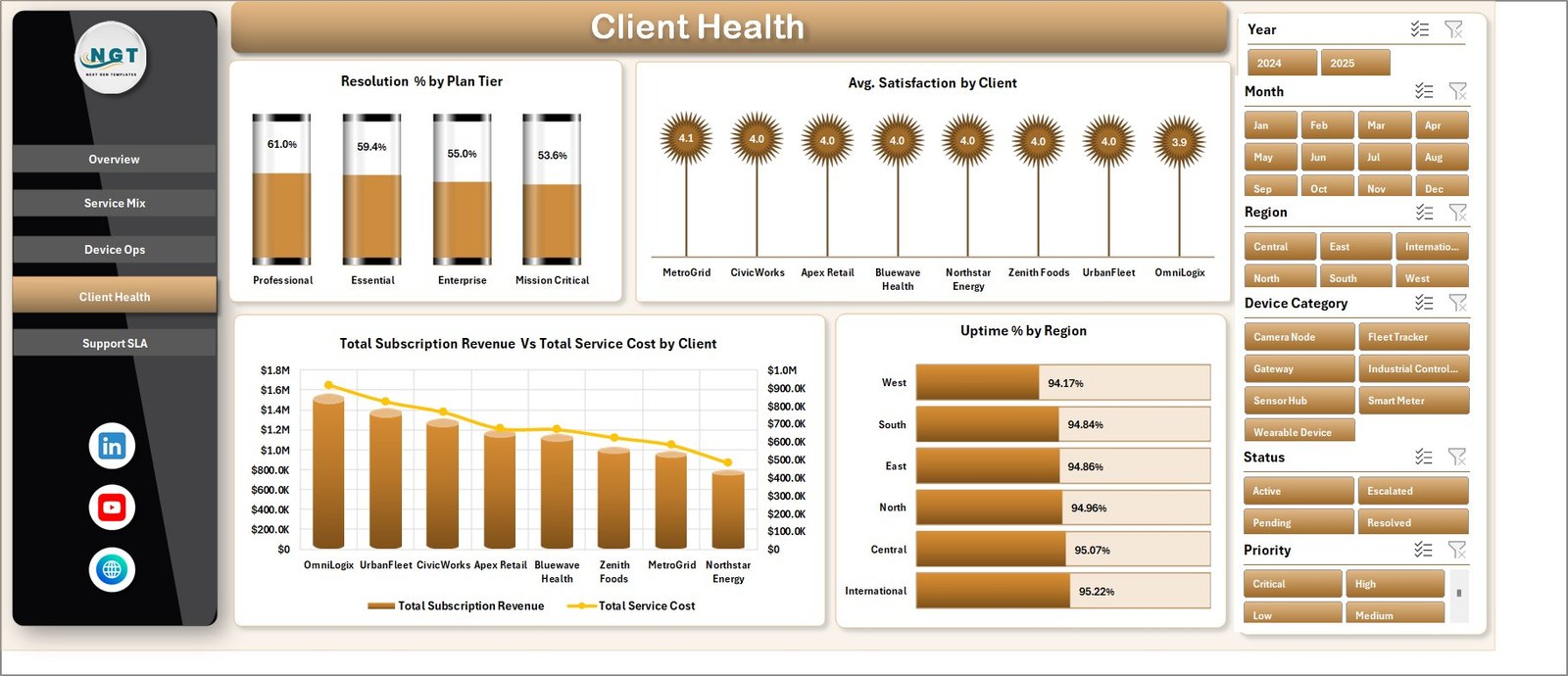
4. Client Health
The Client Health tab connects service quality with account performance. It includes Resolution % by Plan Tier, Avg. Satisfaction by Client, Total Subscription Revenue and Total Service Cost by Client, and Uptime % by Region. This makes it easier to spot valuable clients, service-cost pressure, and regions where reliability needs attention.
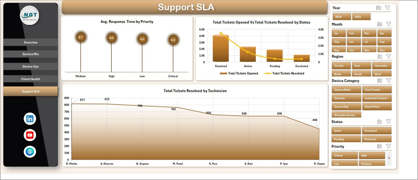
5. Support SLA
The Support SLA tab is built for support managers who need response, resolution, and technician performance visibility. It shows Avg. Response Time by Priority, Total Tickets Opened and Total Tickets Resolved by Status, and Total Tickets Resolved by Technician. These views help teams manage workload and improve SLA follow-up.

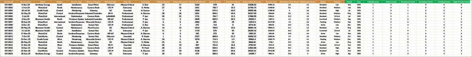
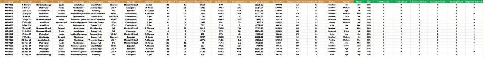
6. Data Sheet and 7. Support Sheet
The Data Sheet stores the source records in a structured format. Add your IoT service data in the same column layout, then use Excel’s Data tab and click Refresh All. The Support Sheet contains the pivot tables used to create the dashboard dynamically and can remain hidden during normal use.

IoT Services Dashboard in Excel vs. Google Sheets vs. Paid CRM/SaaS – Where This Fits
| Feature | This Excel dashboard | Google Sheets alternative | Paid IoT service SaaS |
|---|---|---|---|
| Cost | $17.99 one-time | Template cost or manual build | Monthly or annual subscription |
| Platform | Microsoft Excel | Browser-based spreadsheet | Vendor cloud |
| Setup time | Replace data and refresh | Copy and adapt formulas | Implementation required |
| Customizable fields | Editable workbook, pivots, and charts | Editable with permissions | Limited by vendor settings |
| IoT service analytics | Built in across service, device, client, and SLA pages | Must be configured | Depends on plan |
| Year-1 cost at 5 users | $17.99 plus Excel licensing if needed | Low software cost plus setup time | Often hundreds or thousands |
Who This Template Is For – and Who It’s Not For
This template is for IoT service providers, managed service teams, smart device support teams, telecom operations managers, client success leads, and Excel users who need a practical reporting layer. It is not a live device-monitoring platform, ticketing system, sensor gateway, CRM replacement, or automated SLA engine.
How to Use the IoT Services Dashboard in Excel
- Download and unzip the file.
- Open the workbook in Microsoft Excel.
- Replace sample rows in the Data Sheet with your own service records.
- Click Data, then Refresh All.
- Use slicers to review service mix, device operations, client health, and SLA performance.
Real-World Use Cases
Arjun, IoT operations manager: reviews uptime, downtime, and monitored devices by region before weekly operations meetings.
Maya, support lead: uses the SLA page to compare response time by priority and tickets resolved by technician.
Daniel, client success manager: checks revenue, service cost, satisfaction, and uptime by client before renewal reviews.
Frequently Asked Questions
What does this dashboard track?
It tracks subscription revenue, service cost, tickets opened, tickets resolved, devices monitored, uptime, downtime, response time, resolution rate, satisfaction, regions, clients, technicians, plan tiers, service types, network types, and priorities.
Do I need macros?
No. The workbook uses standard Excel sheets, pivot tables, slicers, and charts.
Can I replace the sample data?
Yes. Add your own records in the Data Sheet using the same format, then refresh the workbook.
Can I hide the Support Sheet?
Yes. The Support Sheet can stay hidden because it mainly stores pivot tables for the dashboard.
Is this a live IoT monitoring tool?
No. It is an Excel reporting dashboard, not a live sensor or device-monitoring platform.
Is this a one-time purchase?
Yes. It is sold as a downloadable Excel template with a one-time price.
About the Author
Built by PK – Microsoft Certified Professional with 15+ years of Excel, Google Sheets, and Power BI experience. Founder of NextGenTemplates, reaching 300K+ subscribers across YouTube channels. Every template is hand-built and tested before release.
Explore Related Templates
You may also like Digital Twin Services Dashboard in Excel, Digital Twin Services Dashboard in Power BI, and IT Asset Management Dashboard in Power BI. Browse more Excel templates and Excel dashboard templates.
Read the detailed walkthrough on PK-AnExcelExpert: IoT Services Dashboard in Excel Template.
Download the IoT Services Dashboard in Excel today and turn device, service, support, and client data into clear management reporting.
Last updated: June 2026


Reviews
There are no reviews yet.