
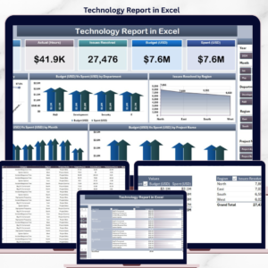
The Technology Report in Excel tracks 5 core IT KPIs across 4 structured sheets, with 5 interactive charts covering Spent % by Category, Budget vs Spend by Department, Issue Resolved by Region, Budget vs Spend by Month, and Budget vs Spend by Project Name. Setup takes under 10 minutes — paste your IT project and ticket data into the Data sheet, click Refresh All, and every card, chart, and slicer on the Summary Page rebuilds automatically through pivot tables.
🌍 Join 8,400+ teams in 40+ countries using NextGenTemplates to replace paid SaaS tools with one-time-purchase Excel, Google Sheets, Power BI, and HTML templates.
✅ Instant download · One-time payment · No subscription · No per-user fees · Lifetime access
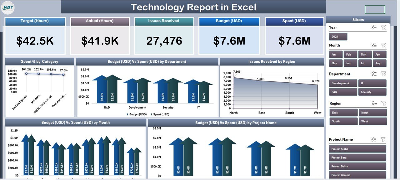
Technology Report in Excel – Summary Page
🔑 Key Features of the Technology Report
🔹 Five-KPI Summary Page – The top of the Summary Page displays 5 card-style KPIs giving IT directors and PMO leads an instant snapshot of technology spend and issue resolution health, while a right-side slicer panel lets you filter the entire report by department, region, project, or month in one click.
🔹 Spent % by Category – Shows how your IT budget is distributed across spend categories like software, hardware, cloud, services, and licensing. This is the chart finance asks for every quarter when IT budget conversations come up — instead of rebuilding it manually, you point them at the Summary Page.
🔹 Budget vs Spend by Department – Side-by-side comparison of allocated budget against actual spend for every business department your IT team serves. Highlights which departments are consistently overspending their allocation and which are under-utilizing — a direct input into next year’s budget planning conversation.
🔹 Issue Resolved by Region – Ranks every region by number of IT issues resolved in the reporting period. Regional IT managers use this to benchmark response performance between their sites, and to justify headcount when one region is carrying a disproportionate ticket load.
🔹 Budget vs Spend by Month – A 12-month trend view showing budget vs actual spend month-over-month. Surfaces seasonal spikes (cloud bill overruns in Q4, software renewal months), and tells you early when you’re trending toward a year-end overspend.
🔹 Budget vs Spend by Project Name – Project-level burn-rate view. Ranks every initiative by how close actual spend is to budget. This is the chart you bring to steering committee meetings — it tells the PMO exactly which projects need intervention before they slip.
🔹 Dedicated Report Page with Information Table – A separate worksheet with a left-side slicer and a line-item information table — ideal for project-level drilldowns, department-level reviews, or building an audit trail for finance at month-end.
🔹 100% Pivot-Table Driven – The Support sheet holds every pivot table that feeds the dashboard. Update one cell in the Data sheet, hit Refresh All, and every card, chart, and slicer updates automatically — no formula edits, no DAX, no VBA.
🔹 Works offline on Windows and Mac Excel – No internet, no cloud, no subscription. Budget figures, vendor contract costs, and project spend never leave your machine — which matters when IT cost data is commercially sensitive.
📦 What’s Inside the Technology Report
The file includes 4 Excel sheets, each with a specific purpose in the technology reporting workflow.
1. Summary Page — The main dashboard view. At the top, 5 KPI cards display headline metrics at a glance. The right-side slicer panel filters the entire page by department, region, project, or month. Five charts cover the core analytical questions: Spent % by Category, Budget vs Spend by Department, Issue Resolved by Region, Budget vs Spend by Month, and Budget vs Spend by Project Name.
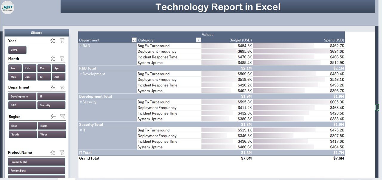
Report Page with slicer and information table
2. Report Page — A left-side slicer drives a detailed information table with project-level or ticket-level records. Use this page to pull filtered IT project lists for PMO reviews, steering committee packs, department-level spend audits, or monthly reconciliation against your finance system.
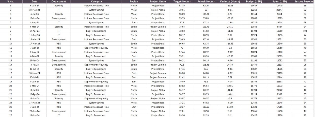
Data Sheet – replace sample data here
3. Data Sheet — The raw input sheet. Paste your IT project and ticket data into the same column structure (Project Name, Department, Region, Category, Budget, Spend, Issue Resolved count, Status, Month, Date). Keep the headers identical — the pivot tables depend on them.
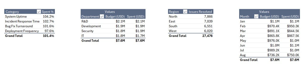
Support Sheet with pivot tables driving every chart
4. Support Sheet — Holds every pivot table that feeds the Summary Page charts and cards. After updating the Data sheet, click Data → Refresh All in the Excel ribbon and every pivot recalculates. Keep this sheet hidden in production — your team only needs to see the Summary Page and Report Page.
📊 Technology Report in Excel vs. Google Sheets Equivalent vs. ServiceNow / Jira Service Management — Where This Fits
| Feature | Technology Report in Excel | Google Sheets equivalent | ServiceNow / Jira Service Management |
|---|---|---|---|
| Cost | $7.99 one-time | ~$10 one-time template | $20–$100 / user / month |
| Platform | Microsoft Excel (desktop) | Google Sheets (browser) | Web + mobile SaaS |
| Works offline | ✅ Yes | ❌ Requires internet | ❌ Requires internet |
| Setup time | Under 10 minutes | ~15 minutes | 6–16 weeks onboarding |
| Customizable KPIs & charts | ✅ Fully editable | ✅ Editable | ❌ Admin-locked reports |
| Per-user licence fees | None — share freely | None | $20+ per user / month |
| Data stays on your device | ✅ Yes | ❌ Cloud (Google servers) | ❌ Vendor cloud |
| Year-1 cost at 5 users | $7.99 | ~$10 | $1,200 – $6,000 |
| Budget vs Spend tracking | ✅ Pre-built | Needs rebuild | Add-on module |
For IT teams and PMOs that want budget, spend, and issue-resolution visibility without paying $1,200+ per year in ServiceNow or Jira licences, the Technology Report in Excel sits in the sweet spot.
👥 Who This Template Is For — and Who It’s Not For
✅ This template is built for:
- IT directors and CIOs at 10–500 person companies who need a monthly technology spend and service report
- PMO leads tracking 5–50 active IT projects across multiple departments and regions
- IT finance analysts reconciling departmental IT chargebacks against budget allocations
- MSPs and IT consultants delivering monthly scorecards to 3–20 client organizations
- Operations leaders who haven’t yet committed to a $100/user/month ITSM platform
❌ This template is NOT for:
- Enterprise IT organizations running 500+ active projects needing SOC 2 + SSO + ITIL-certified workflows (use ServiceNow or BMC Helix)
- Teams needing real-time incident auto-routing, SLA automation, or CMDB integration (use Jira Service Management or Freshservice)
- Google Sheets-only teams — browse our Google Sheets Dashboards collection instead
⚙️ How to Use the Technology Report
- Download and open the .xlsx file in Microsoft Excel 2016 or later, on Windows or Mac.
- Go to the Data sheet and replace the sample rows with your IT project and ticket data. Keep all column headers identical.
- Click Data → Refresh All in the Excel ribbon. Every pivot table in the Support sheet recalculates.
- Open the Summary Page. All 5 KPI cards and 5 charts now reflect your data. Use the right-side slicer to filter by department, region, or project.
- Switch to the Report Page to pull filtered project or ticket lists for PMO reviews and department-level audits.
- Hide the Support sheet before sharing the file with steering committee or finance — they only need to see the Summary and Report pages.
💼 Real-World Use Cases
Rohit runs IT for a 220-person fintech startup in Bengaluru. He uses the Technology Report in Excel at every monthly steering committee to walk the CFO through Budget vs Spend by Project Name, flag the 2–3 projects burning faster than plan, and show the Spent % by Category split between cloud, software licences, and services. His CFO approved a $180K infrastructure refresh mid-cycle because the monthly trend chart made the capacity case obvious — something Rohit previously spent two days rebuilding in PowerPoint every month.
Priyanka leads a 5-person PMO at a mid-market pharma company in Mumbai. She points the template at her quarterly project data export and uses Issue Resolved by Region to balance incident-response staffing across her three regional IT teams. When her Delhi region showed 60% more resolved issues than Bengaluru with the same headcount, she redeployed two L2 engineers — closing tickets 40% faster without adding payroll.
Marco is an IT consultant in Austin running monthly scorecards for 8 SMB clients. He can’t justify $75/user/month for ServiceNow across his client base, and his clients can’t either. He drops each client’s project data into this Excel report, keeps the Support sheet hidden, and delivers a branded technology report on day 3 of each month instead of day 10 — keeping his billable hours on strategy, not spreadsheet plumbing.
❓ Frequently Asked Questions
What KPIs does the Technology Report in Excel track?
The Technology Report tracks 5 headline KPIs on the Summary Page shown as card visuals, plus 5 interactive charts covering Spent % by Category, Budget vs Spend by Department, Issue Resolved by Region, Budget vs Spend by Month, and Budget vs Spend by Project Name. All metrics auto-update when you refresh the pivot tables on the Support sheet.
How does this compare to ServiceNow or Jira Service Management?
ServiceNow typically runs $100+ per user per month and Jira Service Management starts around $20 per agent per month — reaching $6,000+ per year at 5 agents. The Technology Report in Excel is a $7.99 one-time purchase with no per-user fees, works offline, and keeps IT cost data on your device rather than in a vendor cloud.
How long does setup take?
Setup takes under 10 minutes. Open the .xlsx file, paste your IT project and ticket data into the Data sheet (keep the column headers identical), then click Data → Refresh All. Every card, chart, and slicer on the Summary Page updates automatically. No formulas to edit, no VBA to configure.
Does this template work on Mac Excel?
Yes. The Technology Report in Excel is built entirely with pivot tables and slicers — no VBA, no macros — so it runs identically on Windows Excel and Mac Excel 2016 or later. No internet connection is required at any point.
Can I add my own departments, regions, or project categories?
Yes. Add new departments, regions, categories, or project names directly to the Data sheet. After adding rows, click Data → Refresh All in the ribbon and every pivot table on the Support sheet will pick up the new values and populate the Summary Page charts automatically.
Is my IT budget data safe with this template?
Data stays on your device. The Technology Report in Excel doesn’t connect to any cloud service, API, or external database. Project-level budgets, vendor costs, and chargeback data never leave your machine — a critical advantage over cloud-based ITSM platforms where third parties can access your commercial data.
Can multiple team members use the same file?
Yes. Email the .xlsx file or share it via OneDrive, Dropbox, or SharePoint. There’s no per-user licence — PMO, IT finance, and department leads can all open and filter the Technology Report freely with any Microsoft Excel installation.
👤 About the Author
Built by PK — Microsoft Certified Professional with 15+ years of Excel, Google Sheets, and Power BI experience. Founder of NextGenTemplates, reaching 300K+ subscribers across YouTube channels (@PK-AnExcelExpert, @NextGenTemplates, @NeoTechNavigators). Every template is hand-built and tested before release.
🔗 Explore Related Templates
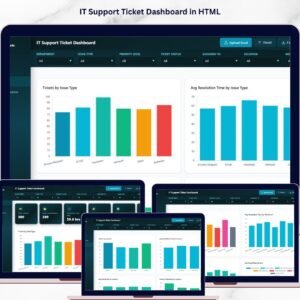
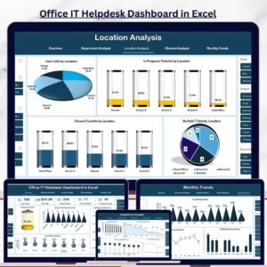
🔹 Office IT Helpdesk Dashboard in Excel — Deeper ticket-level view into IT helpdesk performance, resolution times, and technician load.
🔹 IT Helpdesk Ticket Management System V1.0 — Full VBA-powered ticket logging, assignment, and tracking system for IT teams managing daily incident flow.
🔹 IT Dashboard in Google Sheets — Browser-based version of the same analytics for teams that live in Google Workspace.
🔹 Office IT Helpdesk Dashboard in Power BI — Power BI counterpart with a 5-page interactive report model.
🔹 Product Inventory Report in Excel — Same 4-sheet report structure applied to inventory and stock management.
Also browse all our Excel Dashboard Templates and Power BI Dashboard Templates for more industry-specific reports.
📖 Click here to read the Detailed Blog Post
🎥 Visit our YouTube channel for step-by-step video tutorials
👉 YouTube.com/@NextGenTemplates
📅 Last updated: April 2026


Reviews
There are no reviews yet.