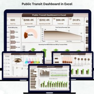

Public Transit Dashboard in Excel

MS Excel - instant download

Original price was: ₹2,499.00.Current price is: ₹1,799.00.
Details, requirements and demo below
Sale!

Public Transit Dashboard in Excel

Original price was: ₹2,499.00.Current price is: ₹1,799.00.

  • 🚍 Track all transit KPIs – Profit, delays, trips & revenue in one place.

  • 📊 City-wise performance insights – Identify top-performing locations.

  • 🚆 Transport mode analysis – Compare buses, metros, trams & ferries.

  • 🚐 Vehicle-level insights – See which vehicles are cost-efficient.

  • 🎟️ Ticket category performance – Analyze profit & demand patterns.

  • 💰 Cost vs. revenue analytics – Control expenses & boost margins.

  • 📅 Monthly trend charts – Forecast demand & plan seasonal schedules.

  • ⏱️ Delay analysis – Improve reliability & reduce complaints.

  • 🎛️ Smart slicers – Filter by city, passenger type, mode & month.

  • ⚡ Easy to update – Paste your data and the dashboard refreshes automatically.

- +

💡 Buy any 2 templates and save 20% automatically at checkout.

Pricing country
Prices follow your selected country; checkout uses your billing country.
Excel Pivot Tables & Dashboards: Basic to Advanced courseLaunch offer
🎓 NEXTGENTEMPLATES ACADEMY
Like this dashboard? Learn to build your own.
Excel Pivot Tables & Dashboards: Basic to Advanced

From your first Pivot Table to the Data Model, DAX, Power Query and a one-page KPI dashboard. 11h 51m of video by PK, with practice files, quizzes and a capstone.

Public transit systems are the backbone of modern cities—they support mobility, reduce congestion, and connect millions of passengers daily. But as operations grow, teams handle more vehicles, more routes, more ticket types, and more performance challenges. Manual reporting becomes slow and confusing. That’s why the Public Transit Dashboard in Excel is the perfect solution for transit authorities, city planners, and operations managers who want fast, reliable, and interactive insights. 🚍📊

This ready-to-use dashboard transforms raw passenger, vehicle, cost, and revenue data into clean charts, KPI cards, and dynamic slicers. With automated updates and easy navigation, teams understand performance instantly—without scrolling through multiple spreadsheets. Whether you manage buses, metros, trams, ferries, or shuttle services, this dashboard gives a 360° view of your transit ecosystem.


✨ Key Features of Public Transit Dashboard in Excel

This dashboard includes powerful features that help transit teams monitor performance with clarity and confidence.

📊 Instant KPI Visibility

View essential KPIs such as:

  • Total Profit (USD)

  • Delayed Trip %

  • Total Trip Count

  • Operating Cost (USD)

  • Revenue (USD)

These metrics help leaders make fast decisions based on real data.

🚦 City, Mode & Ticket Insights

Analyze performance from multiple angles—by city, vehicle type, transport mode, or ticket category.

🎛️ Smart Slicers

Filter the entire dashboard with one click. Compare months, cities, transport modes, or passenger types instantly.

📈 Clean Charts for Better Decisions

Track profit, cost, delays, passenger activity, and revenue using structured visuals.

⚡ Automatic Updates

Paste your data into the Data Sheet and the dashboard updates itself—no coding, no formulas needed.


📦 What’s Inside the Public Transit Dashboard in Excel

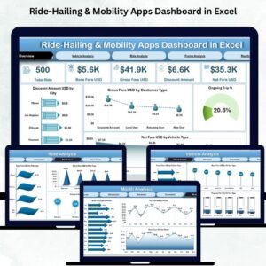
This dashboard includes five analytical pages, each designed to answer critical operational questions.

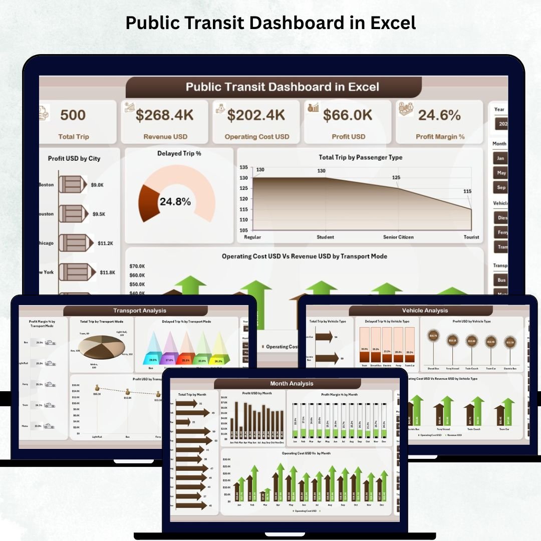
1️⃣ Overview Page
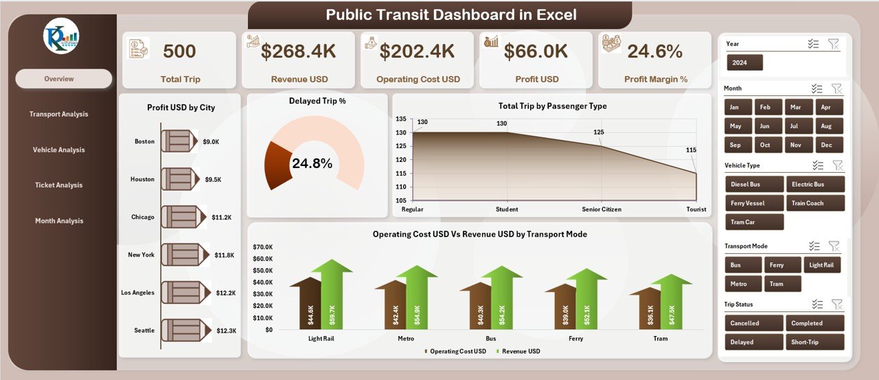
Public Transit Dashboard

Your main performance hub includes:

  • Slicers for dynamic filtering

  • Five KPI cards (Profit, Trips, Delays, Revenue, Operating Cost)

  • Four powerful charts:

    • Profit by City

    • Delayed Trip %

    • Total Trips by Passenger Type

    • Operating Cost vs. Revenue by Transport Mode

This page helps leaders understand the big picture instantly.

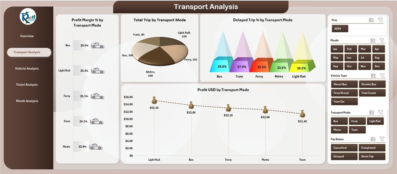
2️⃣ Transport Analysis Page

Compare performance across buses, metros, trams, ferries, or any other mode.
Charts include:

  • Profit by Transport Mode

  • Delayed Trip %

  • Total Trips

  • Cost vs. Revenue

Perfect for identifying top-performing and underperforming modes.

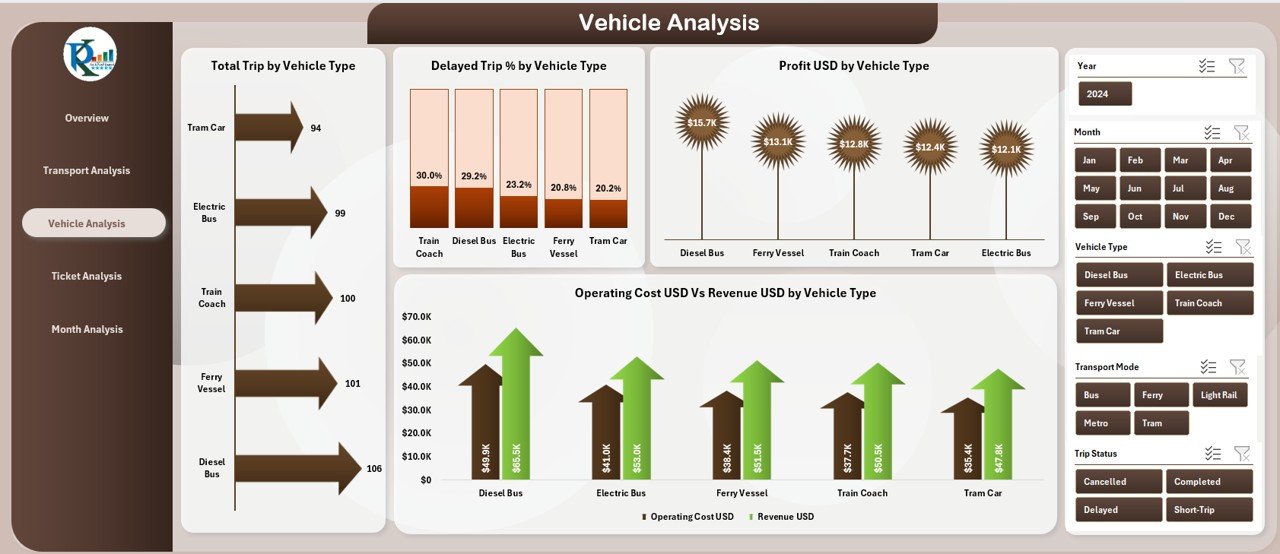
3️⃣ Vehicle Analysis Page

Understand which vehicle types generate more profit, lower delays, and better efficiency.
Charts include:

  • Profit by Vehicle Type

  • Delay %

  • Cost vs. Revenue

  • Total Profit by Vehicle Type

Great for maintenance decisions and fleet optimization.

4️⃣ Ticket Analysis Page

Analyze which ticket types bring the most value.
Charts include:

  • Profit by Ticket Type

  • Profit Margin (%)

  • Total Trips by Ticket Type

  • Cost vs. Revenue

Useful for pricing revisions and marketing campaigns.

5️⃣ Month Analysis Page

View seasonal patterns and monthly performance trends.
Charts include:

  • Profit by Month

  • Profit Margin (%)

  • Total Trips

  • Cost vs. Revenue

Ideal for forecasting, scheduling, and resource planning.


🛠️ How to Use the Public Transit Dashboard in Excel

Using this dashboard is extremely simple:

1️⃣ Update your Data Sheet with city, vehicle, ticket, cost, and trip data.
2️⃣ Refresh the dashboard to auto-update KPIs and charts.
3️⃣ Use slicers for deep analysis.
4️⃣ Explore each page for insights across modes, tickets, vehicles, and months.
5️⃣ Make data-driven operational and financial decisions.

No advanced Excel skills required—everything is automated. ⚡


🎯 Who Can Benefit from This Dashboard?

This dashboard is ideal for:

  • 🚍 Transit Agencies

  • 🚆 Metro, Tram & Rail Operators

  • 🚢 Ferry Services

  • 🚌 Bus Fleet Managers

  • 🏙️ City Planners

  • 💼 Operations Teams

  • 📊 Data Analysts

  • 🧮 Finance & Budgeting Teams

If you need clear visuals, fast insights, and better planning tools, this dashboard is perfect for you.


### Click here to read the Detailed blog post

Visit our YouTube channel to learn step-by-step video tutorials

👉 Youtube.com/@PKAnExcelExpert
Watch the step-by-step video tutorial:

Frequently asked questions

Which Excel version do I need?
Microsoft Excel 2016 or later on desktop (Microsoft 365 recommended). Many of our formula templates also open in Excel 2013 and Excel for the web - the exact requirement is listed in this product's description.
Does it work on Mac?
Yes. Formula-based Excel templates (no macros) work in Excel for Mac 2016 or later.
Does it work on mobile or Excel Online?
You can view it in the Excel mobile app and Excel for the web, but for entering data, using slicers and refreshing pivots we recommend desktop Excel.
How do I add my own data?
Replace the sample rows on the data sheet with your own (keep the column headers), then click Data > Refresh All so every chart and pivot updates.
Some sheets are protected - how do I edit them or change the logo?
A few of our trackers, data entry systems and dashboards protect sheets so formulas are not overwritten by mistake. Go to Review > Unprotect Sheet - most have no password. If Excel asks for one, message us with your order number and we will share it straight away.
How many records can it handle?
It has been tested with several thousand rows and suits normal small-business volumes. Excel itself handles over 1 million rows.
Is it a one-time payment or a subscription?
One-time payment. No subscription, no per-user fees and nothing to renew - the file is yours to keep.
How do I get the file after payment?
Instantly. The download link appears on screen after checkout, is emailed to you, and stays under My Account > Downloads on our website. If the email does not arrive within a few minutes, check your spam or promotions folder.
Is a user manual included?
Most of our newer products include a PDF user manual in the download. If yours does not have one, message us with your order number and we will send it.
Do I get free updates?
Bug fixes are always free - if something does not work as described, we fix it and send you the corrected file. New versions with new features are not included in the price, unless this product's description says otherwise.
Can you customise it for me?
Yes. Small changes to this template (your columns, categories, logo, colours, minor layout) cost the template price plus $40-80 (Rs 3,000-6,000 + GST), quoted once you send your list. A fully custom build is usually $100-200 (Rs 8,000-18,000 + GST) with two revision rounds. Email your requirements to [email protected] or message us on WhatsApp.
Can I use it for my business or my clients?
Yes, for your own personal or internal business use, for as long as you like. Reselling or redistributing the template is not allowed.
What is your refund policy?
Because these are digital downloads, they are non-refundable once delivered - except when the product does not match its description (report it within 48 hours of purchase) or there is a technical problem our team cannot fix within 72 hours. Email [email protected] with your order number.
How do I get help?
Email [email protected] (Mon-Fri, 10 AM-7 PM IST) or message us on WhatsApp +91 80770 90260 (chat only, no calls). Please include your order number.

Still have a question? Click Need help? at the bottom-left to ask our assistant, or message us on WhatsApp.

Application

MS Excel

Template Type

Dashboard

Price

Paid

Business Or Department

Public Relations

Reviews

There are no reviews yet.

Only logged in customers who have purchased this product may leave a review.

Public Transit Dashboard in ExcelPublic Transit Dashboard in Excel
Original price was: ₹2,499.00.Current price is: ₹1,799.00.
- +
Scroll to Top