

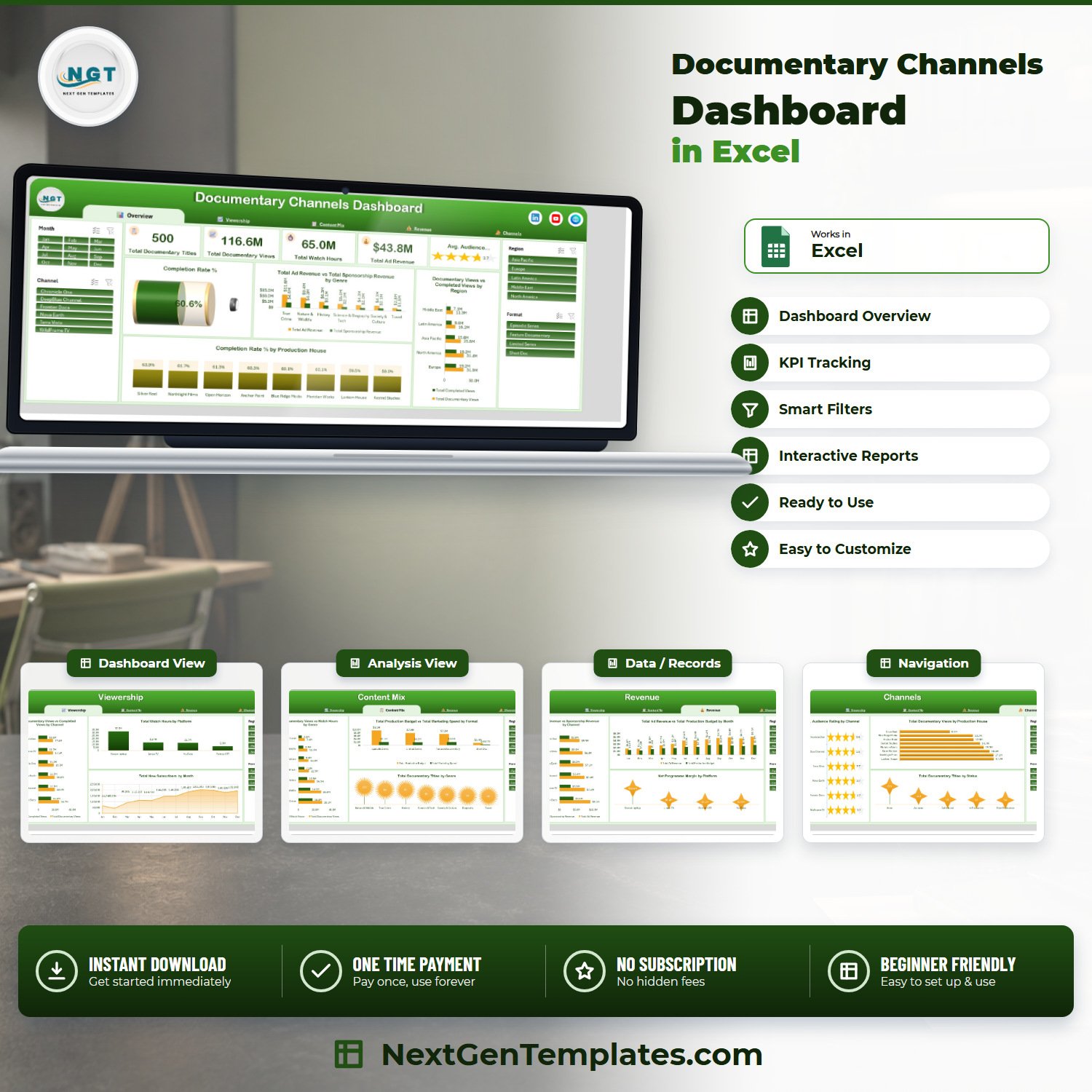

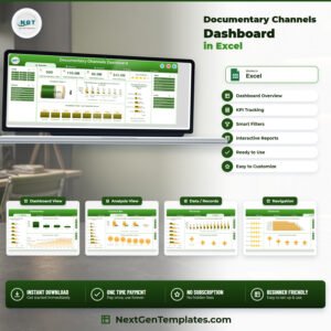
The Documentary Channels Dashboard in Excel turns 500 documentary title records into five linked report pages that answer what a channel controller is asked every month: where the 116.6M views actually came from, why only 60.6% of them finish a programme, which of seven genres pays for itself, and which of four platforms leaves a margin worth defending. This is the analytical Excel dashboard line – pivot tables and slicers, not a traffic-light scorecard. $17.99 once, instant download, no subscription, no macros.
Key Features of the Documentary Channels Dashboard in Excel
- Five report pages – Overview, Viewership, Content Mix, Revenue and Channels – reached from a fixed tab strip that stays in the same place on every page.
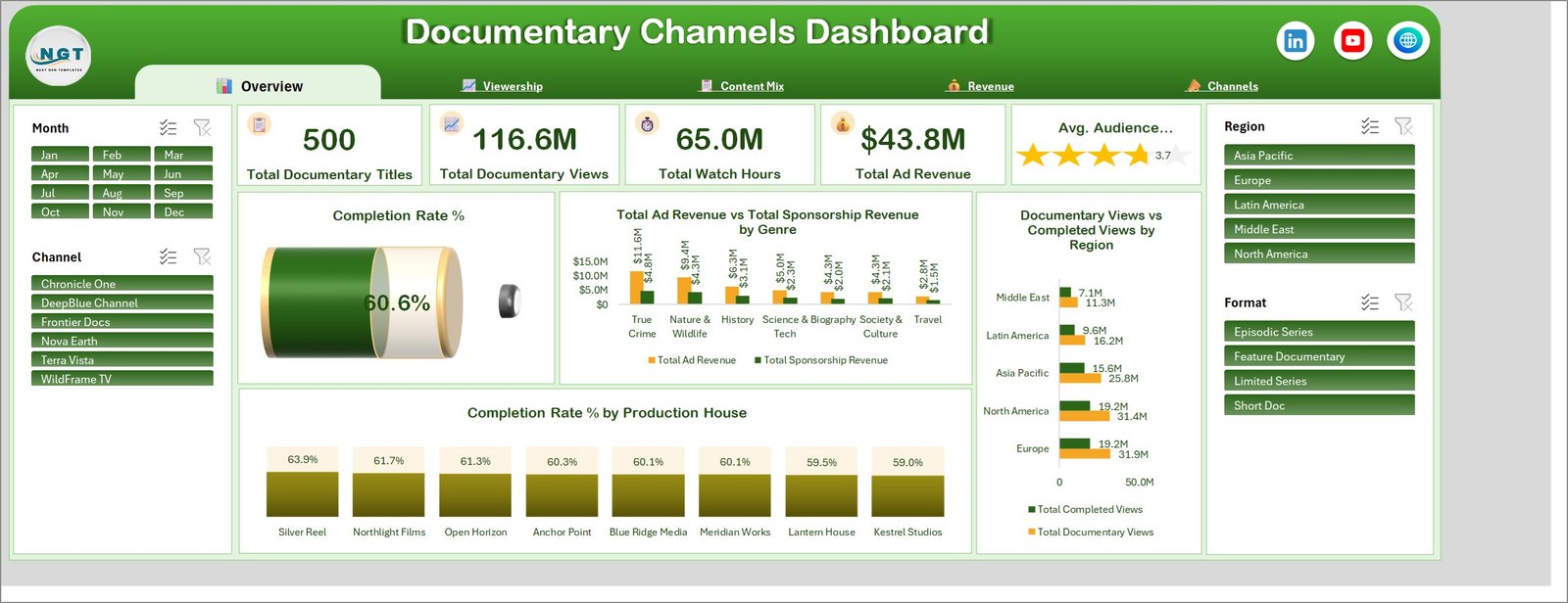
- Five KPI cards: Total Documentary Titles, Total Documentary Views, Total Watch Hours, Total Ad Revenue and Avg. Audience Rating, the last one drawn as a star meter rather than a number.
- Four synchronised slicers – Month, Channel, Region and Format – repeated on all five pages and wired to the same cache, so filtering to one channel on Overview leaves Revenue already filtered when you get there.
- 17 charts, each named for the metric it shows (for example Net Programme Margin by Platform), so a screenshot needs no caption.
- Six channels and eight production houses pre-loaded: Chronicle One, DeepBlue Channel, Frontier Docs, Nova Earth, Terra Vista and WildFrame TV, commissioning from Silver Reel, Northlight Films, Open Horizon, Anchor Point, Blue Ridge Media, Meridian Works, Lantern House and Kestrel Studios.
- Seven genres and four formats – True Crime, Nature & Wildlife, History, Science & Tech, Society & Culture, Biography and Travel, delivered as Episodic Series, Limited Series, Feature Documentary or Short Doc.
- Four distribution platforms compared side by side: Streaming App, Linear TV, YouTube and Partner OTT.
- 500 sample title rows across 24 data fields – air date, channel, region, genre, format, platform, language, production house, episodes, runtime, views, completed views, watch hours, new subscribers, production budget, marketing spend, ad revenue, sponsorship revenue, audience rating and status among them. Paste your own export over them, refresh, and every page redraws.
- No VBA – a plain .xlsx built on 22 pivot tables for Excel 2016+, Microsoft 365 and Excel for Mac, with a PDF user manual in the ZIP.
What’s Inside the Documentary Channels Dashboard in Excel
Overview. The five KPI cards read 500 titles, 116.6M views, 65.0M watch hours, $43.8M ad revenue and a 3.7 average audience rating. Beneath them a Completion Rate % cylinder gauge sits at 60.6%, Total Ad Revenue vs Total Sponsorship Revenue by Genre puts True Crime’s $11.6M and $4.8M against Travel’s $2.8M and $1.5M, Documentary Views vs Completed Views by Region ranks Europe and North America at 31.9M and 31.4M views against the Middle East’s 11.3M, and Completion Rate % by Production House spreads eight suppliers across a narrow 63.9% to 59.0% band.
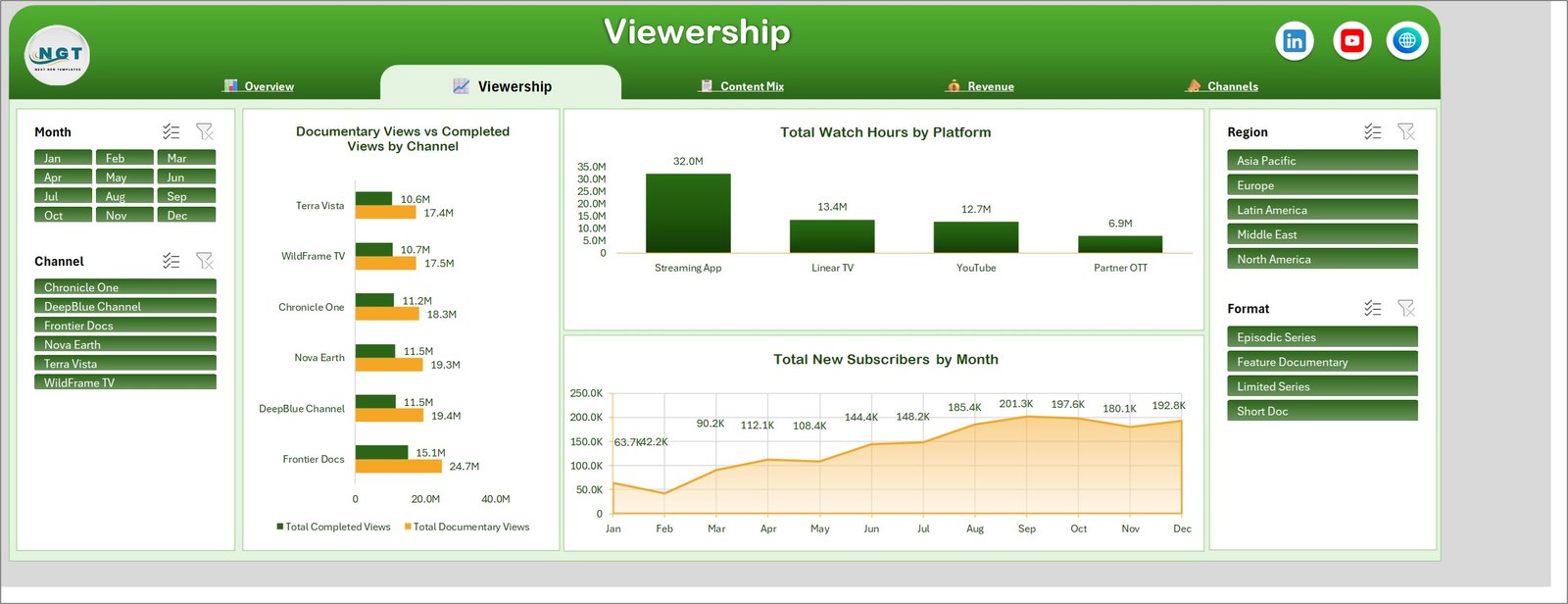
Viewership. Documentary Views vs Completed Views by Channel shows Frontier Docs pulling 24.7M views to Terra Vista’s 17.4M, with completion holding around 60% for all six. Total Watch Hours by Platform is the page’s blunt finding – Streaming App carries 32.0M hours against Linear TV’s 13.4M, YouTube’s 12.7M and Partner OTT’s 6.9M. Total New Subscribers by Month climbs from a 42.2K February trough to a 201.3K September peak and holds near 190K to year end.
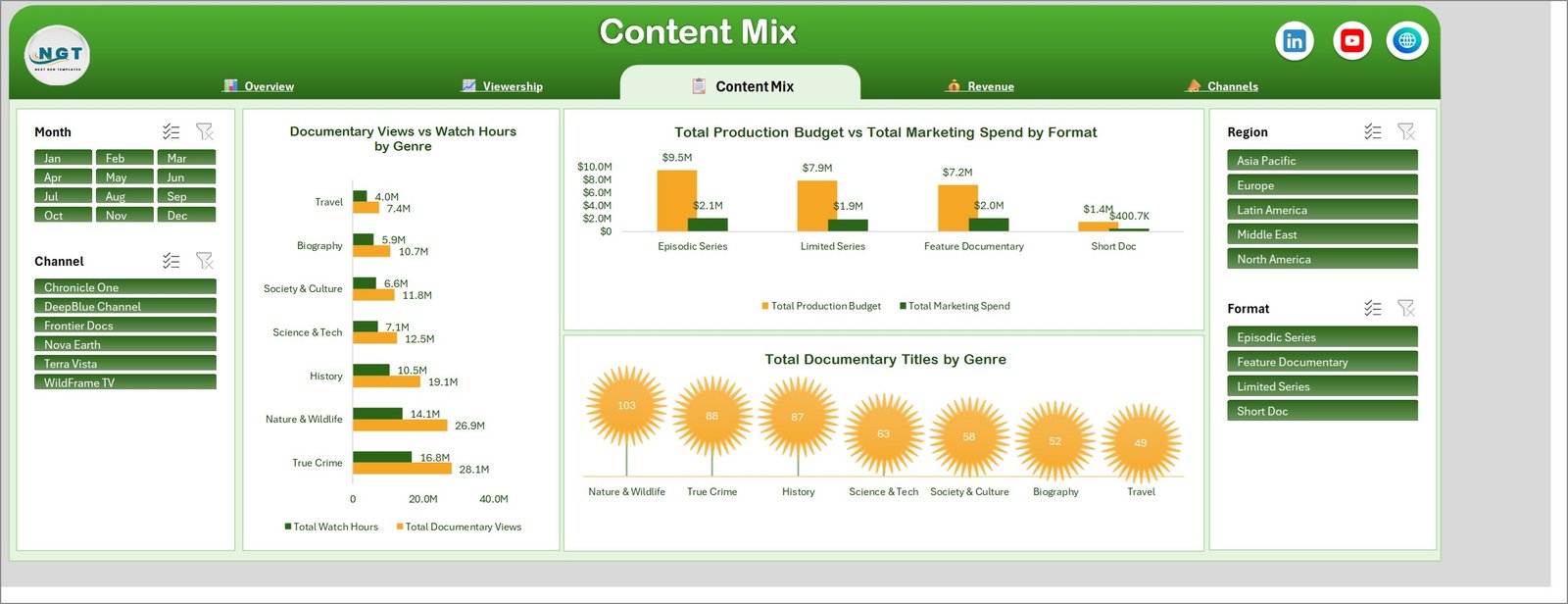
Content Mix. Documentary Views vs Watch Hours by Genre puts True Crime at 28.1M views and 16.8M hours, Nature & Wildlife just behind at 26.9M and 14.1M, and Travel last at 7.4M. Total Production Budget vs Total Marketing Spend by Format shows Episodic Series absorbing $9.5M of budget against $2.1M of marketing while Short Doc runs on $1.4M and $400.7K. Total Documentary Titles by Genre counts 103 Nature & Wildlife, 88 True Crime and 87 History titles down to 49 in Travel – which is the commissioning mix set against the viewing mix above it.
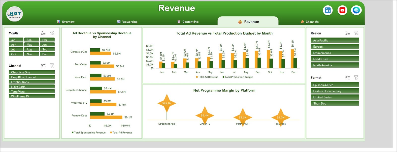
Revenue. Ad Revenue vs Sponsorship Revenue by Channel gives Frontier Docs $9.1M of ad revenue against $4.1M of sponsorship, and Chronicle One $5.9M against $2.9M. Total Ad Revenue vs Total Production Budget by Month traces both lines from $1.8M and $1.4M in January to $5.1M and $2.8M in December, so the widening gap is visible month by month. Net Programme Margin by Platform settles the platform argument: $19.9M from the Streaming App against $5.4M, $3.1M and $3.0M from Linear TV, Partner OTT and YouTube.
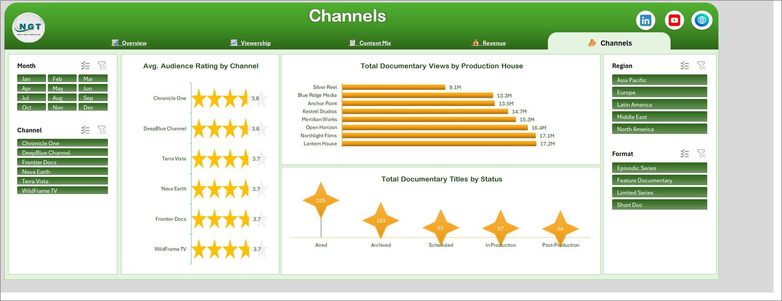
Channels. Avg. Audience Rating by Channel draws six star meters clustered between 3.6 and 3.7 – close enough that rating is not the variable to optimise. Total Documentary Views by Production House is the wider spread, from Lantern House at 17.2M down to Silver Reel at 9.1M. Total Documentary Titles by Status counts 225 aired, 103 archived, 61 scheduled, 57 in production and 54 in post-production, which is the slate view a commissioning meeting starts from.
Documentary Channels Dashboard in Excel vs. Google Sheets vs. Paid Media Analytics SaaS – Where This Fits
| What matters | This Excel dashboard | Google Sheets equivalent | Paid SaaS (Nielsen, Parrot Analytics, Conviva) |
|---|---|---|---|
| Cost | $17.99 once | $9.99 once | $20,000-$100,000 per year |
| Platform | Excel 2016+, Microsoft 365, Mac | Browser, any device | Vendor cloud only |
| Setup time | Under 15 minutes | Under 15 minutes | 4-12 weeks |
| Real-time team collaboration | OneDrive or SharePoint co-authoring | Native, simultaneous | Native, with approvals |
| Mobile access | Excel mobile app | Full browser and app | Full app |
| Customizable fields | Any column you add | Any column you add | Admin-configured, often chargeable |
| Works with your own channel export | Yes, paste and refresh | Yes, paste and refresh | Requires a data feed integration |
| Year-1 cost at 5 users | $17.99 | $9.99 | $30,000+ |
| Ad and sponsorship revenue against production budget | Built in | Built in | Usually a separate finance module |
| Data leaves your organisation | No | Stays in your Google account | Yes, vendor-hosted |
Who This Template Is For – and Who It’s Not For
A good fit for: documentary channel controllers and heads of factual running a slate across several strands, streaming and OTT programming teams that need views, watch hours and completion in one view, independent production houses reporting delivery and audience performance back to a commissioner, and media finance managers who have to set ad and sponsorship revenue against production budget and marketing spend before a renewal decision.
Not a good fit if you need a live feed from your player telemetry or ad server – this is a reporting workbook you refresh, not a pipeline. It is also wrong if your catalogue runs past roughly 100,000 title-months, if you need per-title permissions for external producers, or if you want minute-by-minute concurrency and buffering diagnostics. If you only want a one-page monthly scorecard with red/amber/green thresholds, the Excel KPI dashboard line fits better than this analytical build.
How to Use the Documentary Channels Dashboard in Excel
- Download the ZIP and unzip it – you get the .xlsx workbook and a PDF user manual.
- Open the workbook and read the Overview page against the sample data so you know what each KPI card and chart measures.
- Replace the 500 sample rows on the Data sheet with your own title export, keeping the 24 column headers exactly as they are.
- Match your values to the existing Channel, Region, Genre, Format, Platform, Production House and Status entries, or edit them once and let the slicers pick up the new names.
- Press Ctrl + Alt + F5 (Data > Refresh All) to rebuild all 22 pivot tables and every chart.
- Filter with the four slicers – one channel for a commissioning review, one region for a distribution update – then export that page to PDF.
Real-World Use Cases
Aisha, channel controller, six factual strands. Her monthly pack used to be three separate exports. She now filters Channel to Frontier Docs and shows the 24.7M views and $9.1M of ad revenue on one page, then flips the same filter onto Content Mix to argue for two more True Crime commissions.
Tom, head of distribution. He only cares about the platform split. Total Watch Hours by Platform and Net Programme Margin by Platform together make the case that the Streaming App carries 32.0M hours and $19.9M of margin while Partner OTT returns $3.1M on a full rights window.
Lena, production finance manager. Filtering Format to Short Doc shows $1.4M of production budget against $400.7K of marketing – the ratio she uses to challenge the marketing allocation on the next Episodic Series slate.
Frequently Asked Questions
Which Excel versions does this work in?
Excel 2016, 2019, 2021, 2024 and Microsoft 365 on Windows, and Excel for Mac. It is a standard .xlsx with pivot tables and slicers – no macros to enable, no add-ins.
How is this different from the Excel KPI Dashboard and KPI Scorecard templates?
This is the analytical dashboard line: five exploration pages, 17 charts and free-form slicing across 500 records. A KPI dashboard is a month-picker scorecard with targets and traffic lights; a KPI scorecard is a one-page summary. Near-identical names exist across all three lines – they answer different questions, and this is the one you slice.
Can I add my own channels, genres or platforms?
Yes. Type your own values into the Data sheet and refresh – the slicers and charts rebuild around whatever list they find. Nothing is hard-coded to the six sample channels.
How many title records can it hold?
It ships with 500 rows and stays responsive into the tens of thousands. Past roughly 100,000 rows, refresh times become noticeable on an average laptop.
Do the charts update automatically when I paste new data?
They update on refresh. Paste your rows, then Data > Refresh All (Ctrl + Alt + F5) redraws all five pages in one step.
Is any of the sample data real?
No. Channel names, production houses, titles and figures are realistic sample data used to demonstrate the charts. Replace them before sharing anything externally.
About the Author
Built by PK – Microsoft Certified Professional with 15+ years of Excel, Google Sheets, and Power BI experience. Founder of NextGenTemplates, reaching 300K+ subscribers across YouTube channels. Every template is hand-built and tested before release.
Explore Related Templates
- TV Channels Dashboard in Excel – the same build for a general-entertainment channel group.
- Public Broadcasting Dashboard in Excel – licence-fee and public-service reporting instead of ad revenue.
- Content Rights Agencies Dashboard in Excel – the rights and licensing side of the same catalogue.
- Audio Streaming Services Dashboard in Excel – listening hours and subscriber churn for audio.
- Podcast Analytics Dashboard in Excel – episode-level downloads and completion.
- TV Channels Dashboard in Power BI – the Power BI alternative if your data already sits in a model.
- Film and Television Dashboard in Google Sheets – the browser-based alternative.
- Digital Streaming Platforms KPI Dashboard in Excel – the scorecard view, with targets and thresholds.
- Browse the Excel Dashboard category or every MS Excel template.
Get the Documentary Channels Dashboard in Excel for $17.99 (regular $29.99) – instant download, one-time payment, lifetime access, no subscription.
Last updated: 6 September 2026.
Watch the demo video:
Compatibility and Requirements
- Works in Microsoft Excel desktop (Excel 2016 or later, or Microsoft 365) and Excel for Mac.
- The dashboard uses pivot tables and slicers to filter all five pages. Microsoft explains slicers in Use slicers to filter data.





















Reviews
There are no reviews yet.