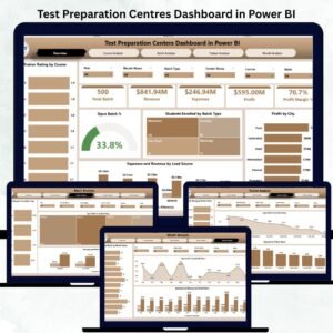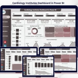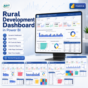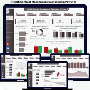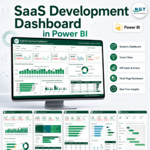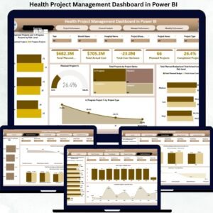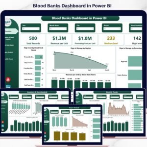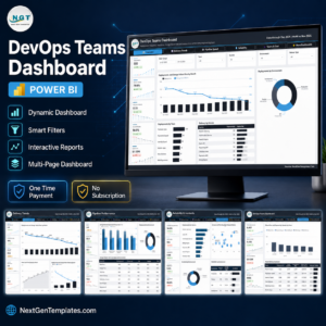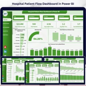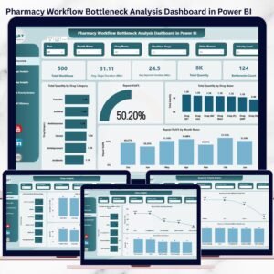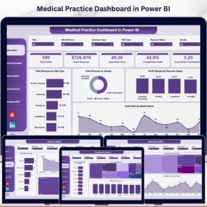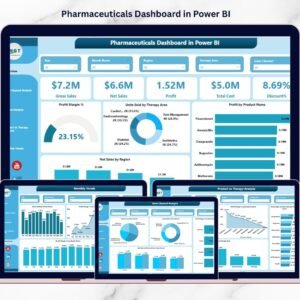
In the fast-evolving healthcare landscape, data is your strongest ally. The Healthcare Dashboard in Power BI gives you the power to monitor critical metrics—patient visits, treatment costs, satisfaction scores, and doctor performance—all in one place. Designed for healthcare managers, financial analysts, and administrators, this dashboard turns complex healthcare data into easy-to-understand visuals to drive better decisions and healthier outcomes.
⚙️ Key Features of the Healthcare Dashboard in Power BI
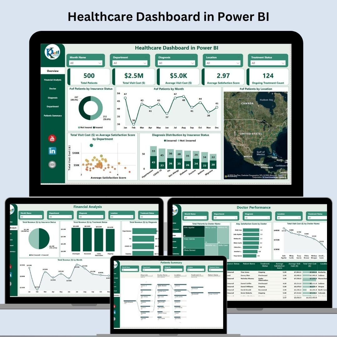
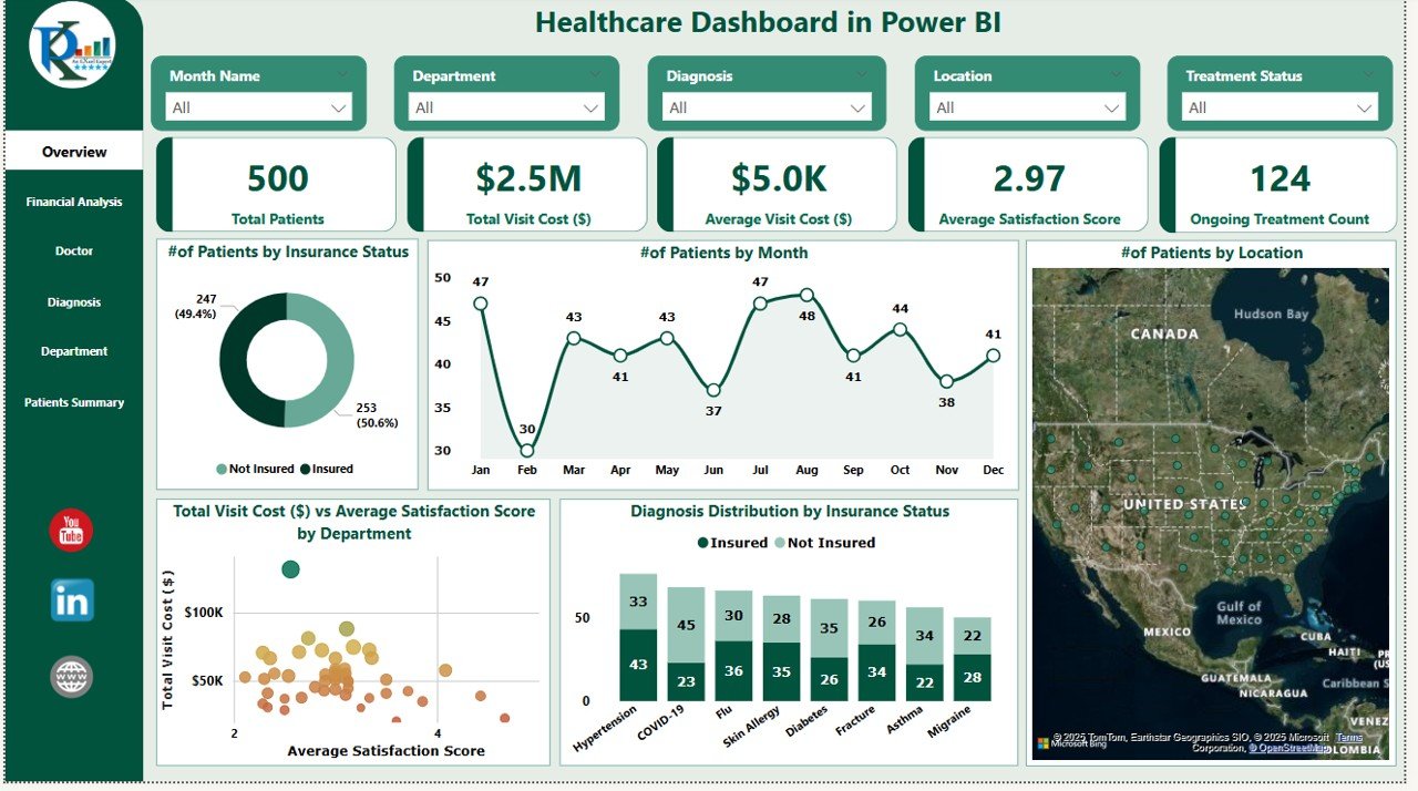
📊 Interactive Overview Dashboard
Get a high-level snapshot with key KPI cards:
Total Patients
Total Visit Cost
Average Visit Cost per Patient
Avg. Satisfaction Score
Ongoing Treatments
Charts include:
Patients by Month, Location & Insurance
Diagnosis Breakdown by Insurance
Visit Cost vs. Satisfaction Score by Department
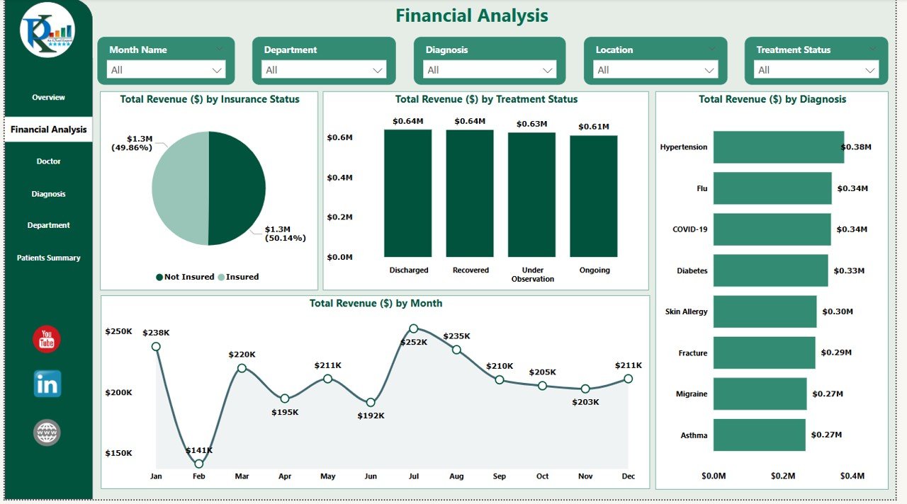
💰 Financial Analysis Page
Track profitability and revenue performance:
Revenue by Insurance, Treatment Status, Diagnosis, and Month
Clear trend analysis for financial forecasting
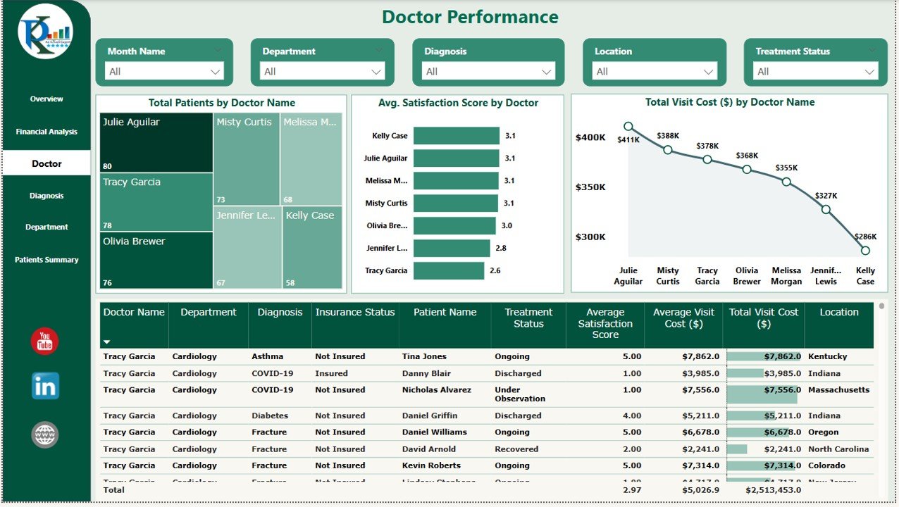
👨⚕️ Doctor Performance Page
Assess how doctors perform across key metrics:
Total Patients Treated
Avg. Satisfaction Score
Total Visit Cost
Doctor Specialty & Experience Table
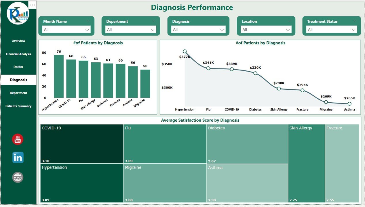
🩺 Diagnosis Page
Analyze patient metrics based on diagnosis:
Patients by Diagnosis
Avg. Satisfaction Score by Diagnosis
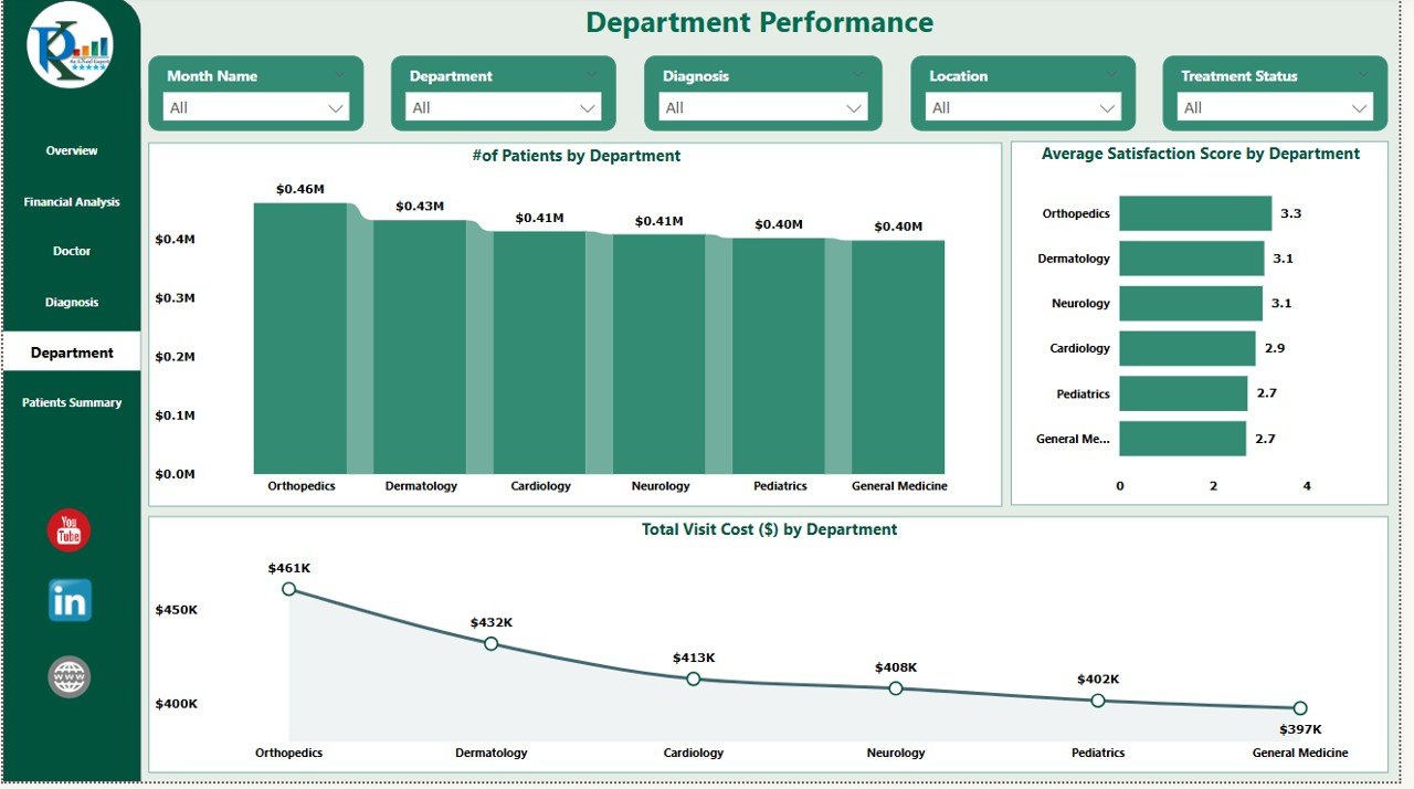
🏥 Department Page
Measure and improve department-level performance:
Patients by Department
Visit Costs and Satisfaction Trends
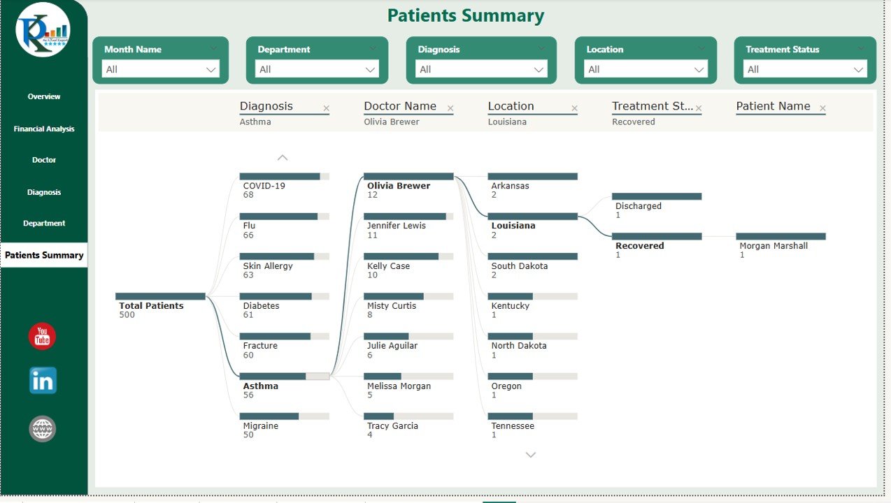
👥 Patients Summary Page
Use a Decomposition Tree to drill down patient-wise details:
Cost, Satisfaction, Diagnosis & Treatment Info
All sheets are interactive and connected—change a slicer and the entire dashboard responds in real-time!
📦 What’s Inside the Healthcare Dashboard
You’ll get six expertly built pages, each serving a focused purpose:
Overview – All KPIs & multi-dimensional visual filters
Financial Analysis – Revenue tracking by categories
Doctor Metrics – Doctor-level breakdowns & satisfaction
Diagnosis Analytics – Disease-level insights
Department Performance – Monitor efficiency by unit
Patient Summary Tree – Deep-dive analytics per patient
Each page includes charts, slicers, and dynamic cards that auto-refresh based on your data.
🧑⚕️ How to Use the Healthcare Dashboard in Power BI
📥 Step 1: Connect your data source (Excel, SQL, CSV, etc.)
📊 Step 2: Explore KPIs and filter by doctor, location, or diagnosis
💡 Step 3: Analyze financial and satisfaction trends
📈 Step 4: Use insights to allocate resources and improve care
🧩 Step 5: Customize visuals, colors, and layouts to match your branding
No coding required. Everything updates dynamically—just plug and play.
👥 Who Can Benefit from This Dashboard?
🏥 Hospital Administrators – Gain full visibility into operations
📊 Financial Analysts – Monitor cost efficiency and revenue trends
👨⚕️ Department Heads – Track satisfaction and performance
📈 Healthcare Consultants – Support strategic decision-making
🧑⚕️ Medical Directors – Align care delivery with patient satisfaction
✅ Why Choose This Power BI Healthcare Dashboard?
✔ 100% Customizable & Scalable
✔ Real-time data refresh and filtering
✔ Designed for non-technical users
✔ Works with any standard patient, finance, or diagnosis dataset
✔ Reduces reporting time with automated charts
✔ Share via Power BI Service, PDF, or Excel
This tool brings the full power of Power BI to healthcare professionals without needing a data science degree!
🔁 Click here to read the Detailed blog post
Click here to read the Detailed blog post