

Managing parking in offices has always been a logistical challenge. Employees arrive at different times, vehicles vary in type, and demand for limited parking often causes inefficiency, frustration, and wasted time. Without a structured system, organizations risk underutilized spaces, conflicts, and dissatisfied employees.
The Office Parking Utilization Dashboard in Power BI is the perfect solution. Designed as a ready-to-use, interactive, and customizable dashboard, it transforms parking data into visual insights and actionable intelligence. From monitoring daily usage to forecasting future needs, this tool empowers facilities managers, HR teams, and operations leaders to manage parking resources efficiently.
🚗 What Is the Office Parking Utilization Dashboard in Power BI?
It is a data visualization tool built in Microsoft Power BI that consolidates parking utilization data into an easy-to-understand format.
Instead of juggling manual spreadsheets or guesswork, managers can now:
Track occupied vs. vacant spaces in real time.
Identify department-wise utilization.
Monitor overstays and high-category vehicle usage.
Compare monthly trends to forecast demand.
The dashboard connects seamlessly with Excel or other data sources, converting raw data into structured visuals with just a few clicks.
🌟 Key Features of the Dashboard
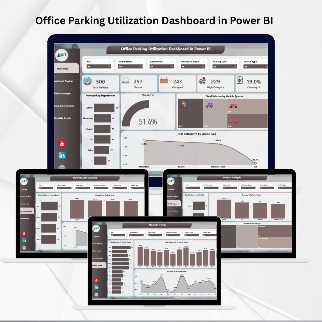
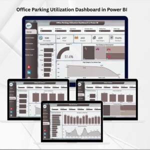
The Office Parking Utilization Dashboard is structured into five analytical pages, each with unique insights:
1. Overview Page
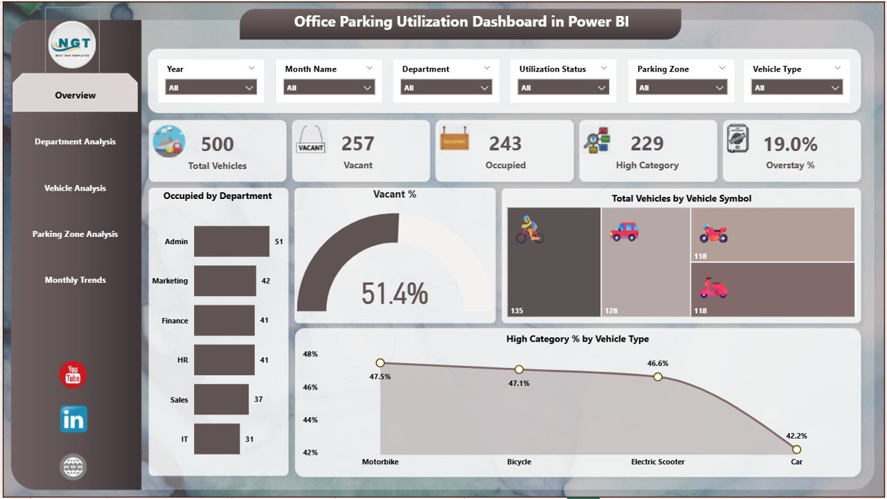
Six slicers for filtering by department, vehicle type, or parking zone.
Five KPI cards showing: total vehicles, occupied %, vacant %, overstays, and high-category utilization.
Four charts for quick insights:
Occupied by Department
Vacant %
Total Vehicles by Vehicle Symbol
High Category % by Vehicle Type
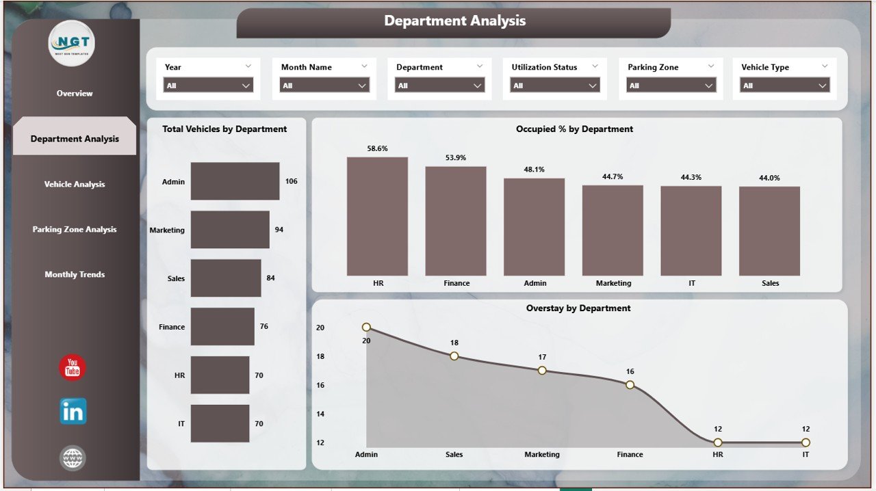
2. Department Analysis Page
Highlights utilization by department.
Charts include:
Total Vehicles by Department
Occupied % by Department
Overstay by Department
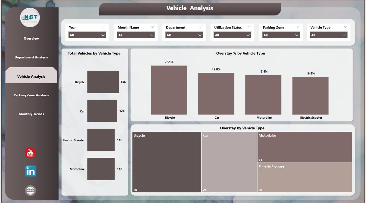
3. Vehicle Analysis Page
Focuses on vehicle-type data.
Charts include:
Total Vehicles by Vehicle Type
Overstay % by Vehicle Type
Overstay by Vehicle Type
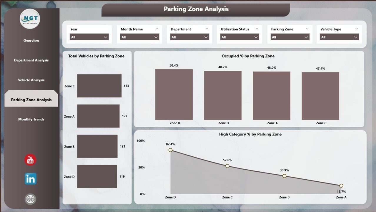
4. Parking Zone Analysis Page
Reveals utilization patterns across zones.
Charts include:
Total Vehicles by Parking Zone
Occupied % by Parking Zone
High Category % by Parking Zone
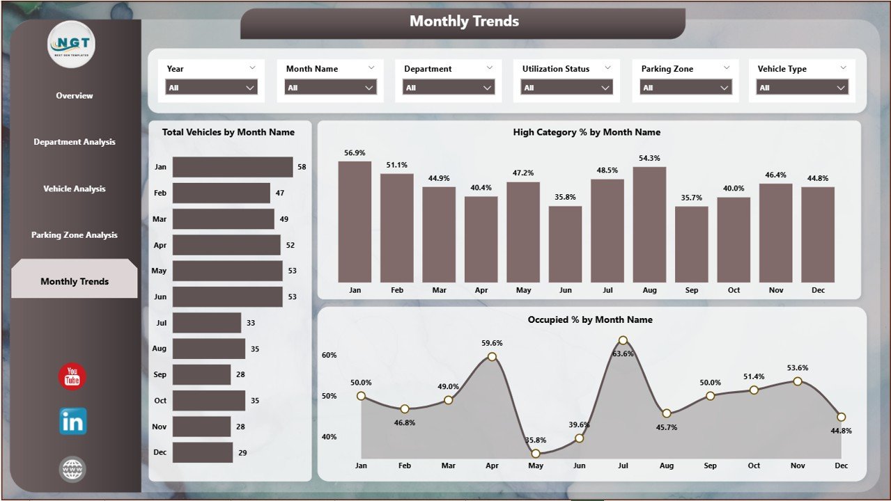
5. Monthly Trends Page
Tracks long-term performance.
Charts include:
Total Vehicles by Month
High Category % by Month
Occupied % by Month
✅ Advantages of the Office Parking Utilization Dashboard
🚀 Real-Time Insights – See updated utilization instantly.
📊 Better Space Management – Optimize slot allocation by department, vehicle type, or zone.
😀 Improved Employee Satisfaction – Reduce conflicts and frustrations.
🛡 Risk & Overstay Management – Track extended stays and enforce policies.
💲 Cost Savings – Maximize current resources before considering expansion.
🌍 Sustainability Support – Monitor EVs, carpooling, or vehicle mix for green initiatives.
🔧 Opportunities for Improvement
While powerful, organizations can enhance the dashboard further with:
IoT sensor integration for live space detection.
Mobile-friendly versions for employees to view slot availability.
Automated alerts for overstays or congestion.
AI-driven forecasting to predict peak periods.
Role-based access for department-specific reporting.
📌 Best Practices for Using the Dashboard
Keep data sources updated regularly.
Use slicers to filter insights by vehicle type, department, or zone.
Monitor overstays closely and enforce policies.
Analyze monthly trends to forecast demand.
Share insights with HR and facilities teams for collaborative improvement.
🎯 How It Supports Decision-Making
This dashboard goes beyond reporting—it enables strategic planning:
Helps HR assign parking quotas fairly.
Supports facilities managers in planning expansions or reallocating zones.
Encourages sustainability by tracking EVs and carpool usage.
Provides leadership with cost insights for infrastructure decisions.
📌 Conclusion
The Office Parking Utilization Dashboard in Power BI is more than just a monitoring tool—it is a strategic solution for smarter parking management. With real-time insights, interactive visuals, and detailed analytics, organizations can reduce inefficiencies, improve employee satisfaction, and optimize resource use.
Visit our YouTube channel to learn step-by-step video tutorials
🔗 Click here to read the Detailed blog post







Reviews
There are no reviews yet.