

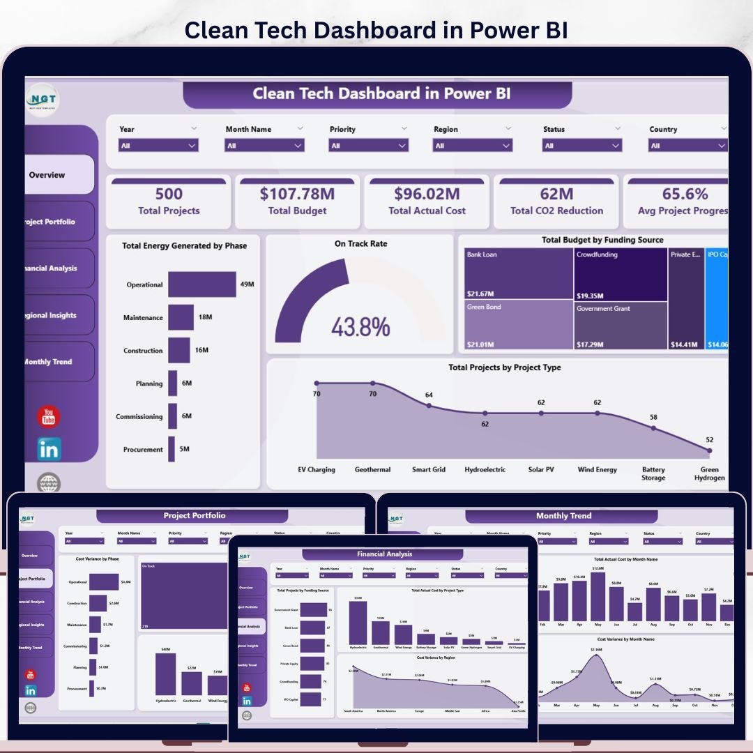
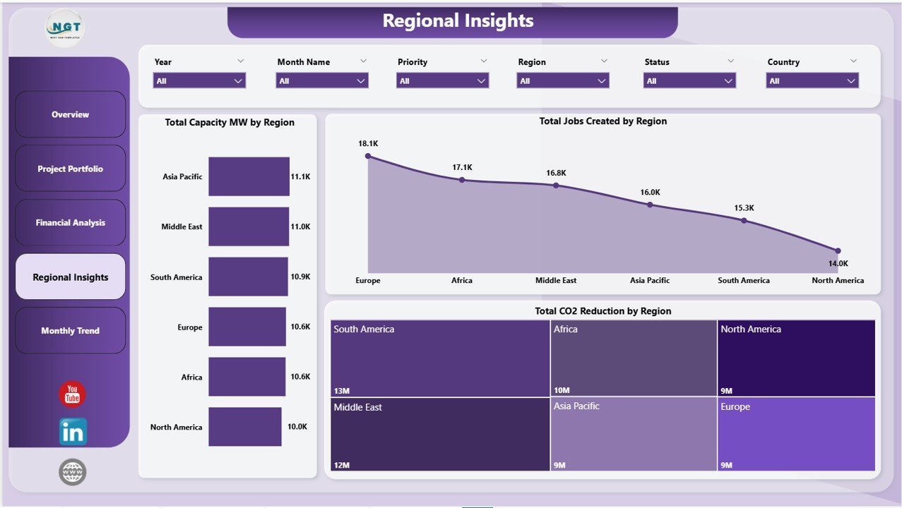
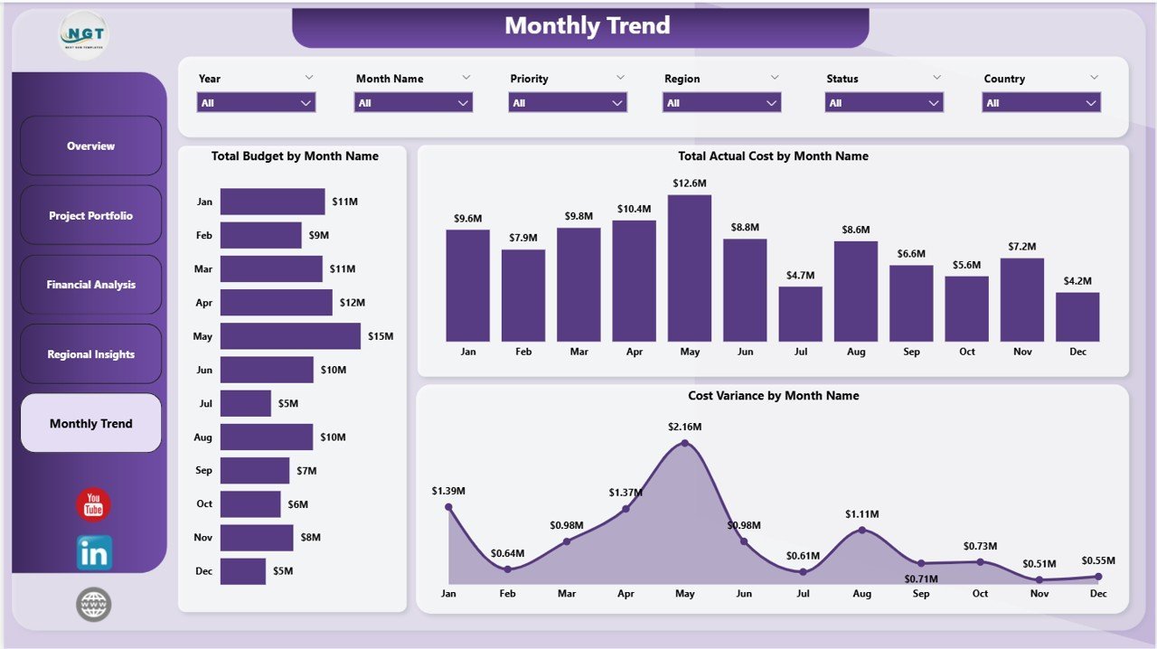

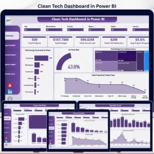
The Clean Tech Dashboard in Power BI tracks 5 portfolio-level KPIs across 5 interactive pages, with 13 pre-built charts and multi-dimensional slicers covering project portfolio, financial performance, regional impact, and monthly trends. Setup takes under 10 minutes — open the .pixy file in Power BI Desktop, replace the sample data with your own clean energy project records, and every card, chart, and slicer updates automatically.
🌍 Join 8,400+ teams in 40+ countries using Nextgen Templates to replace paid SaaS tools with one-time-purchase Excel, Google Sheets, Power BI, and HTML templates.
✅ Instant download · One-time payment · No subscription · No per-user fees · Lifetime access
🔑 Key Features of Clean Tech Dashboard in Power BI
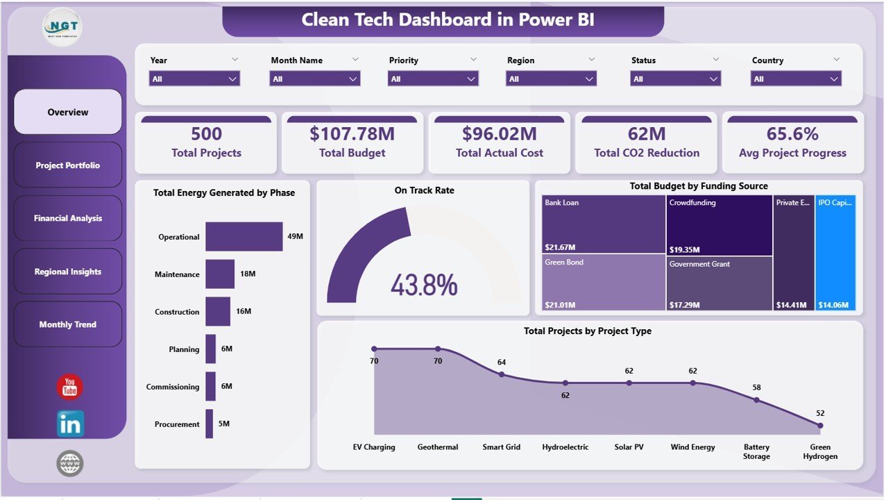
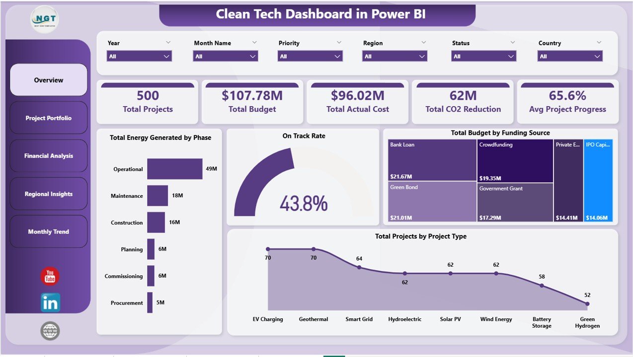
🌱 5 executive KPI cards on the Overview page — Total Projects, Total Budget, Total Actual Cost, Total CO2 Reduction, and Avg Project Progress sit at the top of the Clean Tech Dashboard in Power BI so sustainability leads and project sponsors see portfolio health in 5 seconds without navigating through pages.
📊 5 dedicated analysis pages covering Overview, Project Portfolio, Financial Analysis, Regional Insights, and Monthly Trend. Each page uses Power BI’s native visuals and cross-filtering so every slicer selection instantly updates all charts on that page — no manual chart rebuilds required.
🔍 13 pre-built charts — Total Energy Generated by Phase, On Track Rate, Total Budget by Funding Source, Total Projects by Project Type, Cost Variance by Phase, Total Projects by Status, Total Actual Cost by Project Type, Cost Variance by Region, Total Capacity MW by Region, Total Jobs Created by Region, Total CO2 Reduction by Region, Total Budget by Month Name, and Cost Variance by Month Name. Each chart is driven by Power BI’s analytics engine.
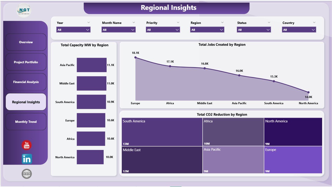
🌎 Regional impact tracking built in — the Regional Insights page measures Total Capacity (MW), CO2 Reduction, and Jobs Created by region. These are the three sustainability metrics ESG reports and impact-investor decks require, captured automatically from the project data table.
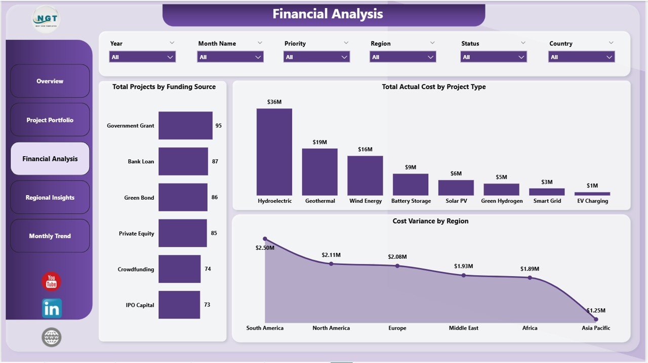
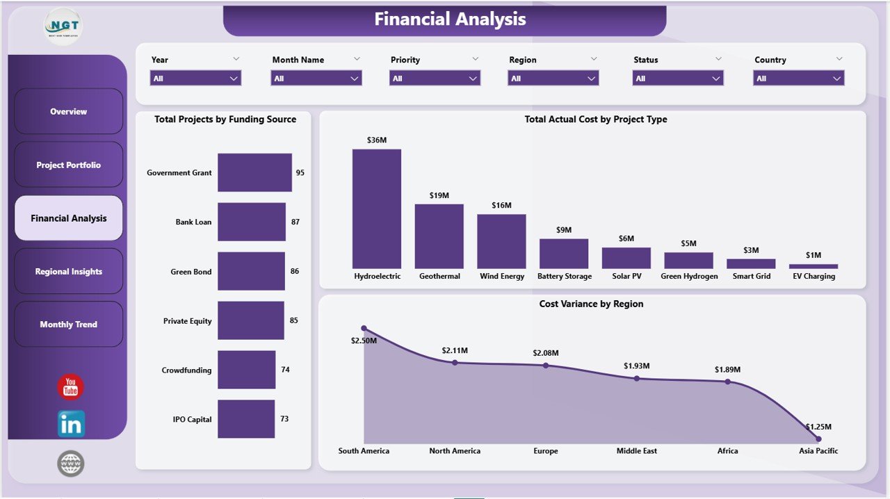
💰 Cost variance and funding source analysis — the Financial Analysis page calculates Cost Variance by Region and Total Actual Cost by Project Type, while the Project Portfolio page tracks Cost Variance by Phase. Finance leads spot over-budget projects and high-burn phases before quarter-end review.
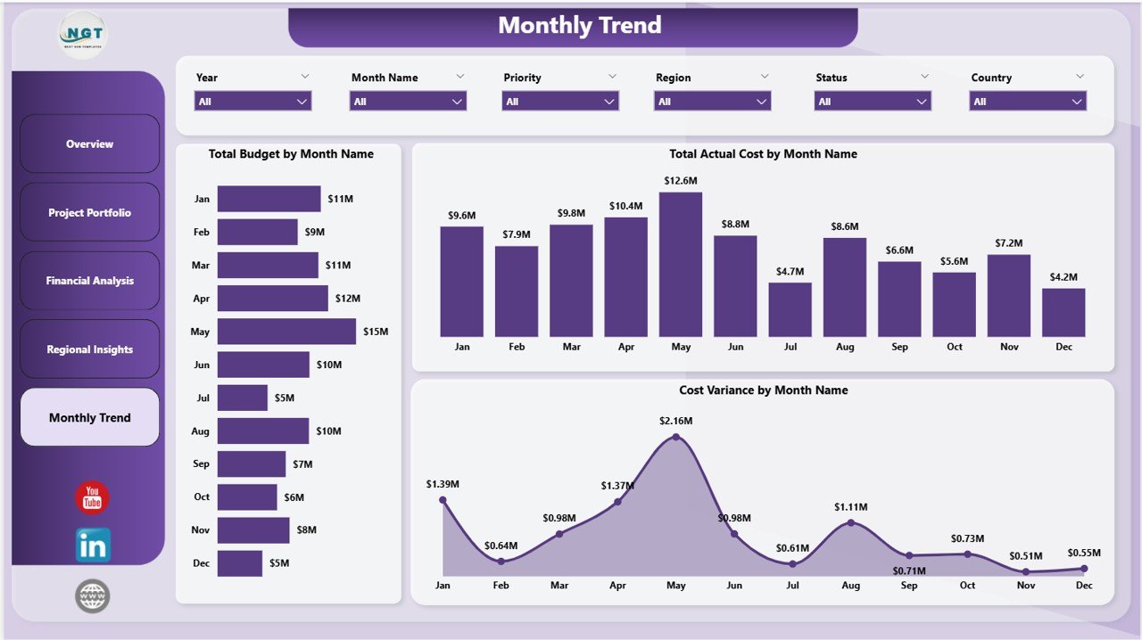
📅 Monthly trend analytics — the Monthly Trend page tracks Total Budget, Total Actual Cost, and Cost Variance by Month Name to surface seasonal cost spikes and month-over-month delivery patterns across the clean energy portfolio.
🎛️ Multi-dimensional slicer filtering — drill from a portfolio-wide view down to a single project type, region, phase, status, or funding source in two clicks. Slicers cross-filter every visual on the page using Power BI’s native filter propagation.
📤 Publish to Power BI Service — share a read-only Service link with stakeholders so executives, investors, or grant officers see the live dashboard without anyone needing an extra license beyond your existing Power BI Pro seat.
📦 What’s Inside the Clean Tech Dashboard in Power BI
Page 1: Overview
The Overview page surfaces five KPI cards — Total Projects, Total Budget, Total Actual Cost, Total CO2 Reduction, and Avg Project Progress — paired with four anchor charts: Total Energy Generated by Phase, On Track Rate, Total Budget by Funding Source, and Total Projects by Project Type. Slicers above the cards filter the entire portfolio instantly across project type, region, phase, status, and funding source.
Page 2: Project Portfolio
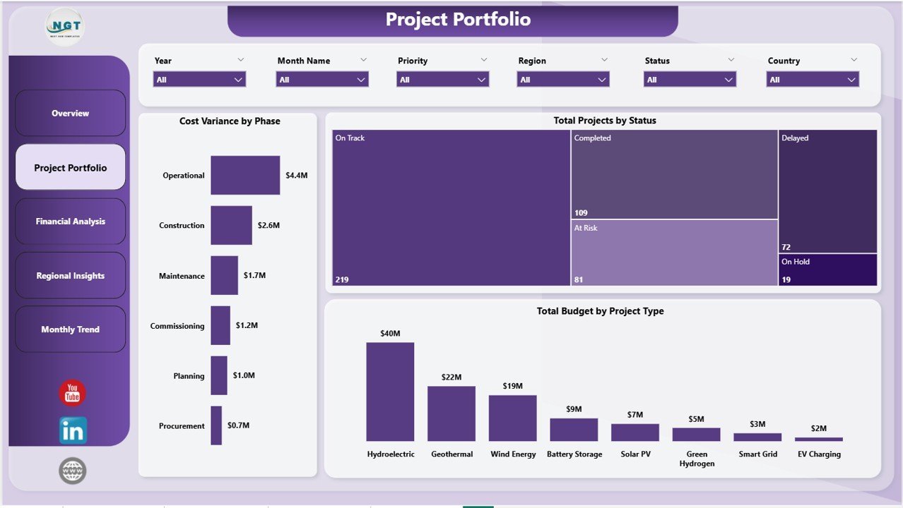
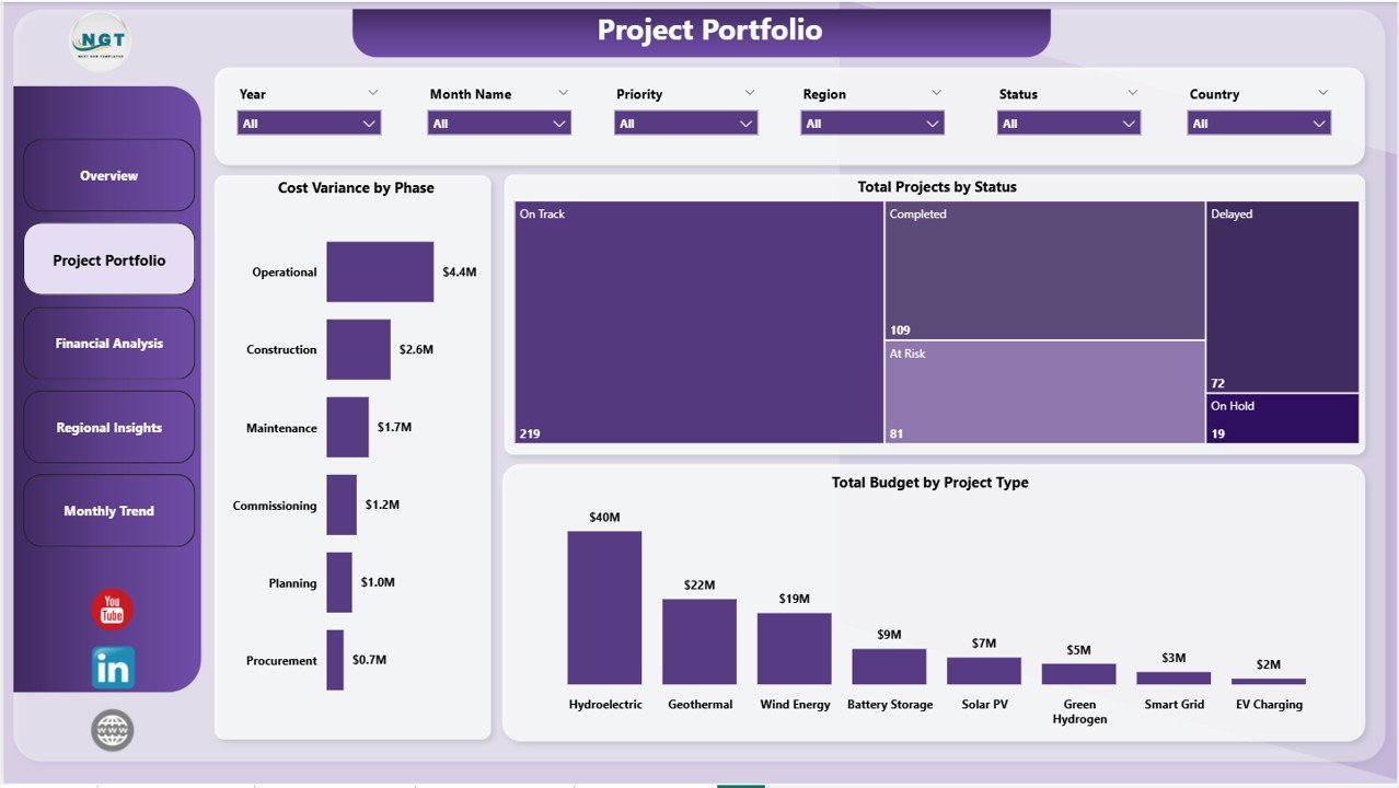
The Project Portfolio page profiles the active project pipeline with Cost Variance by Phase, Total Projects by Status, and Total Budget by Project Type. Use this view to identify which phases are consuming the most budget, which projects are stalled or at-risk by status, and which project types dominate the portfolio’s total commitment.
Page 3: Financial Analysis
The Financial Analysis page focuses on money flow with Total Projects by Funding Source, Total Actual Cost by Project Type, and Cost Variance by Region. This is the page CFOs and finance controllers return to before each quarterly review to see where grants, equity, and debt are being deployed and which regions are running over plan.
Page 4: Regional Insights
The Regional Insights page measures the on-the-ground impact of the portfolio with Total Capacity MW by Region, Total Jobs Created by Region, and Total CO2 Reduction by Region. These three charts answer the questions investors and grant officers ask first: where are we deploying capacity, what employment are we creating, and how much carbon are we displacing per region?
Page 5: Monthly Trend
The Monthly Trend page tracks portfolio performance over time with Total Budget by Month Name, Total Actual Cost by Month Name, and Cost Variance by Month Name. Use this view to spot seasonal cost spikes, identify months where actuals are drifting from budget, and brief leadership on month-over-month delivery patterns.
📊 Clean Tech Dashboard in Power BI vs. Excel Equivalent vs. Paid Sustainability SaaS — Where This Fits
| Feature | Clean Tech Dashboard in Power BI | Clean Tech Dashboard in Excel | Watershed / Persefoni / Sphera |
|---|---|---|---|
| Cost | $17.99 one-time ✅ | $17.99 one-time | $25,000–$150,000 / year |
| Platform | Power BI Desktop + Service ✅ | Microsoft Excel (desktop + web) | Vendor-hosted SaaS |
| Setup time | Under 10 minutes ✅ | Under 10 minutes | 6–12 weeks onboarding |
| Interactive cross-filtering | ✅ Native Power BI | ⚠️ Slicer-only | ✅ Yes |
| Publish to Service / shareable link | ✅ Power BI Service | ❌ Not applicable | ✅ Paid seat per viewer |
| CO2 + MW capacity + jobs tracking | ✅ Built-in | ✅ Built-in | ✅ Built-in |
| Customizable visuals + DAX | ✅ Full control | ✅ Full control | ⚠️ Vendor-controlled templates |
| Year-1 cost at 5 users | $17.99 total ✅ | $17.99 total | $25,000+ |
| No per-user fees | ✅ One-time | ✅ One-time | ❌ Per seat, per month |
For clean energy and sustainability teams already standardized on Power BI who want portfolio-level capacity, CO2, and budget tracking without enterprise SaaS rates, the Clean Tech Dashboard in Power BI sits in the sweet spot.
👥 Who This Template Is For — and Who It’s Not For
✅ This template is built for:
- Project managers running portfolios of 5–500 clean energy, solar, wind, EV-infrastructure, or energy-efficiency projects on the Power BI stack
- Sustainability and ESG leads needing CO2 reduction, MW capacity, and jobs-created metrics in a single Power BI executive view
- Finance controllers at clean-tech firms tracking budget vs. actuals across funding sources (grants, equity, debt, public funding) by region and phase
- Consultants and impact-investing analysts who need a portable .pbix template to replicate dashboards across multiple client engagements
- NGOs and government bodies reporting on clean energy program outcomes by region with secure Power BI Service sharing
❌ This template is NOT for:
- Enterprise sustainability teams that need automated carbon-emission ingestion from IoT, ERP, or supply-chain feeds (use Watershed or Persefoni)
- Teams requiring GHG Protocol Scope 1/2/3 calculation engines audited to ISO 14064 — this tracks portfolio outcomes, not regulatory carbon accounting
- Users without Power BI Desktop — Excel and Google Sheets versions are available separately
⚙️ How to Use the Clean Tech Dashboard in Power BI
- Download and unzip the file to your preferred folder.
- Open the .pixy file in Power BI Desktop (free from Microsoft).
- Open the data model and replace the sample project rows with your own — keep the same column structure (Project ID, Project Type, Region, Phase, Funding Source, Budget, Actual Cost, Capacity MW, CO2 Reduction, Jobs Created, Status, Progress %, Month).
- Click Refresh in the Home ribbon. Every KPI card, chart, and slicer recalculates instantly.
- Apply slicers at the top of any page to filter by Project Type, Region, Phase, Status, or Funding Source.
- Publish to Power BI Service to share a read-only link with stakeholders — no extra license required beyond your existing Pro seat.
- Customize visuals or DAX measures as needed to match your reporting standards or color theme.
💼 Real-World Use Cases
Anika manages a 60-project clean energy portfolio at a mid-sized renewable infrastructure firm. She uses the Clean Tech Dashboard in Power BI to publish a weekly Service report to her CFO showing Cost Variance by Region and Total CO2 Reduction by Region — replacing a $40,000/year sustainability SaaS contract her finance team refused to renew.
Marcus runs ESG reporting at a private-equity-backed solar developer. He uses the Regional Insights page to show LPs jobs-created impact across deployment regions and the Monthly Trend page to demonstrate on-track delivery percentage month-over-month. His team replaced three separate Excel exports with this single Power BI dashboard, cutting board-pack preparation from 2 days to 3 hours.
Priya leads the climate-action grant program at a regional NGO deploying $12M across rural clean-cooking, micro-grid, and solar-water-pumping projects. She uses the Financial Analysis page to show budget utilization by project type and the Project Portfolio page to keep grant officers informed on phase progress — replacing a manual reporting workflow that previously consumed 1 FTE.
❓ Frequently Asked Questions
What KPIs does the Clean Tech Dashboard in Power BI track?
The Clean Tech Dashboard in Power BI tracks 5 portfolio-level KPIs — Total Projects, Total Budget, Total Actual Cost, Total CO2 Reduction, and Avg Project Progress. It also analyses energy generated by phase, on-track rate, cost variance by phase and region, capacity in MW by region, jobs created by region, and monthly budget vs actual cost across 13 charts on 5 pages.
Which version of Power BI do I need?
The Clean Tech Dashboard in Power BI works with Power BI Desktop (free from Microsoft) on Windows. To share via Power BI Service and enable scheduled refresh, a Power BI Pro or Premium Per User license is required. No third-party add-ins or custom DAX is required to use the template out of the box.
How long does setup take for a new project portfolio?
Setup typically takes under 10 minutes. Open the .pbix file in Power BI Desktop, paste your project rows into the data table (Project ID, Type, Region, Funding Source, Budget, Actual Cost, Capacity MW, CO2 Reduction, Jobs Created, Status, Progress %, Phase, Month), then click Refresh. Every chart and slicer updates instantly.
Can I add new project types, regions, or funding sources?
Yes — the Clean Tech Dashboard in Power BI uses native Power BI auto-discovery for categorical fields. Add new project types, regions, or funding sources in the data table and after refresh, slicers, charts, and KPI cards pick them up automatically with no DAX or model edits required.
How does this compare to Watershed, Persefoni, or Sphera?
Watershed, Persefoni, and Sphera are enterprise carbon-accounting platforms starting at $25,000/year with multi-week onboarding. The Clean Tech Dashboard in Power BI is a $17.99 one-time-purchase project portfolio tool — ideal for project tracking, budget oversight, and CO2 outcome reporting, but not a substitute for audited GHG Protocol calculation engines.
Is the Clean Tech Dashboard in Power BI fully editable?
Yes — every visual, DAX measure, and slicer in the Clean Tech Dashboard in Power BI is fully editable in Power BI Desktop. You own a perpetual license to customize KPIs, add pages, recolor the theme to your brand palette, change column structures, and connect your own SQL, Excel, or SharePoint data source.
Is there an Excel or Google Sheets version available?
Yes — the Clean Tech Dashboard in Excel covers the same 5 pages and KPI set for teams on the Microsoft Excel stack. For Google Sheets users, the Renewable Energy KPI Scorecard in Google Sheets is the closest equivalent for KPI-style reporting.
👤 About the Author
Built by PK — Microsoft Certified Professional with 15+ years of Excel, Google Sheets, and Power BI experience. Founder of Nextgen Templates, reaching 300K+ subscribers across YouTube channels (@PK-AnExcelExpert, @NextGenTemplates, @NeoTechNavigators). Every template is hand-built and tested before release.
🔗 Explore Related Templates
- 📊 Clean Tech Dashboard in Excel — the Excel version with pivot tables and slicers for teams on the Microsoft Excel stack.
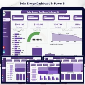
- ☀️ Solar Energy Dashboard in Power BI — focused dashboard for solar EPC and installation portfolios.
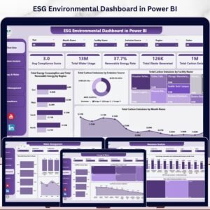
- 🌿 ESG Environmental Dashboard in Power BI — pair your project numbers with full carbon emissions, water usage, and compliance tracking.
- ⚡ Renewable Energy Dashboard in Power BI — broader renewable energy operational view.
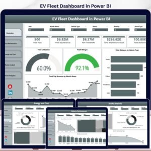
- 🚗 EV Fleet Dashboard in Power BI — clean mobility companion dashboard.
Also available as: Clean Tech Dashboard in Excel for teams on the Microsoft Excel stack.
Browse the full library: Power BI Dashboard Templates | Excel Dashboard Templates
📖 Click here to read the Detailed Blog Post
🎥 Visit our YouTube channel for step-by-step video tutorials
👉 YouTube.com/@NextGenTemplates
📅 Last updated: May 2026
Watch the step-by-step video tutorial:
YouTube








Reviews
There are no reviews yet.