

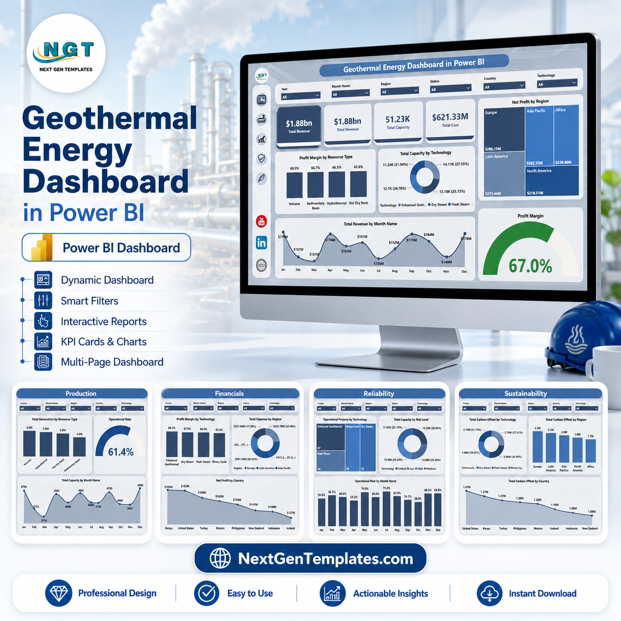
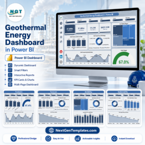
Geothermal Energy Dashboard in Power BI helps geothermal operators, renewable energy analysts, finance teams, and sustainability leads track revenue, capacity, cost, profit margin, generation, operational rate, and carbon offset performance in one editable PBIX report. The dashboard includes 5 report pages, executive KPI cards, multiple slicers, and focused visuals across production, financial, reliability, and sustainability views. Built by a Microsoft Certified Professional with 15+ years of Excel and Power BI experience, it gives teams a one-time purchase reporting layer without a recurring energy analytics SaaS subscription.
Key Features of Geothermal Energy Dashboard in Power BI
- 5 Power BI report pages for Overview, Production, Financials, Reliability, and Sustainability analysis.
- Executive KPI cards for Total Revenue, Total Capacity, Total Cost, and high-level geothermal performance tracking.
- Interactive slicers to filter by region, country, plant, technology, resource type, month, and risk level.
- Production analytics for total generation, operational rate, generation by technology, generation by resource type, and capacity trends.
- Financial reporting for revenue, cost, net profit, profit margin, country-level results, region-level performance, and technology comparisons.
- Reliability and risk views for operational projects, capacity by risk level, plant-level profit, and month-wise operational rate.
- Sustainability insights for carbon offset by technology, region, country, and plant.
- Editable PBIX file that can be customized in Power BI Desktop.
What’s Inside the Geothermal Energy Dashboard in Power BI
1. Overview Page
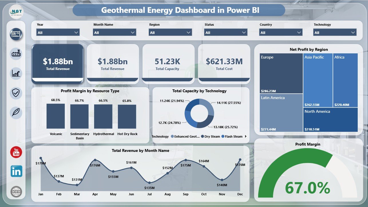
The Overview page gives leaders a fast summary of geothermal business performance. KPI cards show Total Revenue, Total Capacity, and Total Cost, while slicers make it easy to review filtered performance by the selected geothermal dimensions.
Profit Margin by Resource Type: This chart compares profitability across geothermal resource groups. It helps teams understand which resource types generate stronger financial returns after costs are considered.
Total Capacity by Technology: This visual shows installed or available capacity by geothermal technology. It helps users see whether capacity is concentrated in binary, flash, dry steam, or other technology groups.
Net Profit by Region: This chart compares profit by operating region. It helps managers identify regions that are delivering better financial outcomes and regions that need cost or output review.
Total Revenue by Month Name: This chart shows monthly revenue movement. It is useful for spotting seasonality, pricing changes, or operational months that need deeper investigation.
Profit Margin: This margin visual summarizes profitability quality, not only revenue size. It helps teams review whether higher revenue is translating into efficient returns.
2. Production
The Production page focuses on output and capacity performance. Total Generation by Resource Type shows how different geothermal resources contribute to total generation. Operational Rate helps track how effectively the plants are operating. Total Generation by Technology compares output across technical approaches, while Total Capacity by Month Name shows capacity movement over time.

3. Financials
The Financials page is designed for revenue and profitability review. Profit Margin by Technology helps compare the financial efficiency of geothermal technologies. Total Revenue by Region shows regional revenue contribution. Total Revenue by Country supports country-level reporting, and Net Profit by Country highlights where profitability is strongest or weakest.

4. Reliability
The Reliability page connects operations, risk, and plant performance. Operational Projects by Technology shows active project distribution. Total Capacity by Risk Level helps users understand where capacity exposure sits. Net Profit by Plant Name identifies plant-level financial contribution, and Operational Rate by Month Name tracks reliability trends over time.

5. Sustainability
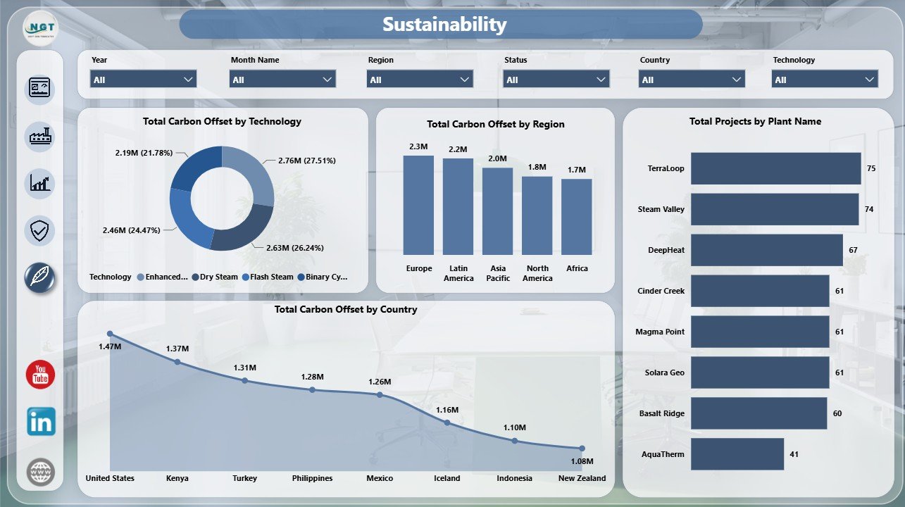
The Sustainability page tracks the environmental contribution of geothermal operations. Total Carbon Offset by Technology compares sustainability impact by technology. Total Carbon Offset by Region and Total Carbon Offset by Country support ESG reporting, while Total Projects by Plant Name helps users review plant-level project contribution.
Geothermal Energy Dashboard in Power BI vs. Tableau vs. Paid Energy SaaS – Where This Fits
| Feature | This Power BI Dashboard | Tableau Alternative | Paid Energy SaaS |
|---|---|---|---|
| Cost | $17.99 one-time template purchase | License plus build time | Monthly or annual subscription |
| Platform | Power BI Desktop / Power BI Service | Tableau Desktop / Cloud | Vendor cloud platform |
| Setup time | Open PBIX, connect or replace data, refresh | Build model and visuals manually | Implementation and onboarding |
| Real-time team collaboration | Available after publishing to Power BI Service | Available after publishing | Usually seat-based |
| Mobile access | Available through Power BI mobile after publishing | Available after publishing | Usually included |
| Customizable fields | Edit measures, visuals, pages, slicers, and data model | Editable if you own the workbook | Limited by vendor settings |
| Share with link | Possible through Power BI Service permissions | Possible through Tableau Cloud permissions | Usually login controlled |
| Year-1 cost at 5 users | $17.99 plus any Microsoft licensing | Usually higher with licenses and build work | Often hundreds or thousands |
| Geothermal report structure | Included across five report pages | Requires custom setup | Depends on module and plan |
Who This Template Is For – and Who It’s Not For
This Power BI dashboard is for geothermal plant managers, renewable energy analysts, energy finance teams, utility reporting teams, ESG leads, consultants, regional managers, and operations teams that need structured reporting for geothermal generation, capacity, revenue, cost, profit, reliability, risk, and carbon offset.
It is not a live SCADA system, automated meter data platform, IoT telemetry system, maintenance management system, or audited finance platform. It works best when your geothermal data is available in a structured source and you need a clear Power BI report for analysis and presentation.
How to Use the Geothermal Energy Dashboard in Power BI
- Download and unzip the dashboard package after purchase.
- Open the PBIX file in Power BI Desktop, which is free from Microsoft.
- Review the sample data structure and map your own geothermal records to the same fields.
- Replace or connect your data source, then refresh the report.
- Use slicers to filter by region, country, technology, resource type, plant, month, risk level, and other available dimensions.
- Customize visuals, labels, measures, pages, and colors as needed.
- Publish to Power BI Service if your team needs secure sharing, scheduled refresh, or browser/mobile viewing.
Real-World Use Cases
Priya, geothermal operations manager: Priya reviews the Overview and Reliability pages before monthly leadership meetings to explain capacity, cost, operational rate, plant-level profit, and risk exposure.
Marcus, renewable energy finance analyst: Marcus uses the Financials page to compare revenue by region and country, margin by technology, and net profit by country before preparing management commentary.
Asha, ESG reporting lead: Asha filters the Sustainability page to summarize carbon offset by technology, region, country, and plant for stakeholder reporting.
Frequently Asked Questions
Does this dashboard work in Power BI Desktop?
Yes. The template is delivered as a PBIX file for Power BI Desktop.
What pages are included?
The report includes Overview, Production, Financials, Reliability, and Sustainability pages.
Can I use my own geothermal data?
Yes. Replace or connect your own structured data source, keep the required fields mapped, and refresh the report.
Does it include slicers?
Yes. The report includes multiple slicers so you can filter dashboard pages quickly.
Can I customize the Power BI report?
Yes. You can edit visuals, measures, page names, slicers, colors, relationships, and formatting in Power BI Desktop.
Is this a real-time plant monitoring system?
No. It is an analytics dashboard template, not a real-time telemetry or plant control system.
About the Author
Built by PK – Microsoft Certified Professional with 15+ years of Excel, Google Sheets, and Power BI experience. Founder of NextGenTemplates, reaching 300K+ subscribers across YouTube channels. Every template is hand-built and tested before release.
Explore Related Templates
- Geothermal Energy Dashboard in Excel
- Renewable Infrastructure Projects Dashboard in Power BI
- Clean Tech Dashboard in Power BI
Browse more Power BI templates and Power BI dashboard templates.
Read the supporting blog post: Geothermal Energy Dashboard in Power BI.
Download the Geothermal Energy Dashboard in Power BI and turn geothermal production, finance, reliability, and sustainability data into clear Power BI insights.
Last updated: June 17, 2026.














Reviews
There are no reviews yet.