

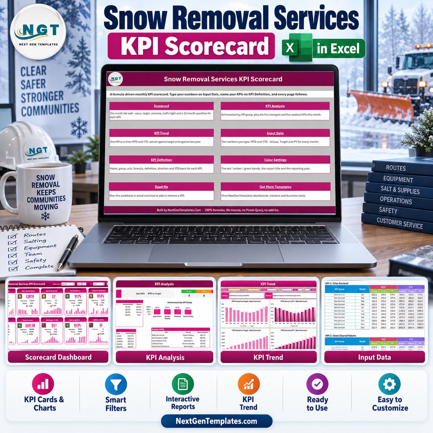
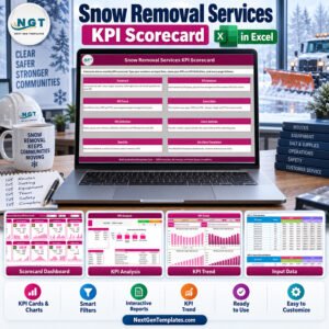
The Snow Removal Services KPI Scorecard in Excel tracks 10 snow and ice management KPIs in 4 groups (Operations, Service Quality, Financial and Fleet & Safety) on one tile-wall Scorecard, backed by a KPI Analysis page, a KPI Trend page and 9 visible sheets in total. Pick a month, switch between MTD and YTD, compare against Target, last year or the prior month, and every tile, traffic light and 12-month sparkline follows. The workbook is 100% formulas: no macros, no Power Query, no add-ins.
❄️ Built by NextGenTemplates for plowing and de-icing contractors who want one monthly performance page instead of a software licence for every manager.
✅ Instant download · One-time payment · No subscription · No per-user fees · Lifetime access
📌 Which template is this? This listing is the KPI Scorecard edition: 10 KPIs shown as tiles with sparklines, one Input Data sheet and 9 sheets. It is a different product from the Snow Removal Services KPI Dashboard in Excel, which belongs to our KPI Dashboard family and tracks 14 KPIs in a row-by-row table across 10 pages. Choose the scorecard for ten headline numbers at a glance; choose the dashboard for a longer KPI list.
🔑 Key Features of the Snow Removal Services KPI Scorecard in Excel
- 🚜 Ten snow removal KPIs, already named and defined – Sites Serviced, Snow Cleared Volume (tons), Avg Response Time (hours), SLA Compliance, Customer Satisfaction, Callback Rate, Service Revenue (USD 000s), Salt Cost per 1k SqFt, Equipment Uptime and Safety Incidents. Each carries a unit, a formula and a plain-English definition on KPI Definition.
- 🚦 Direction-aware traffic lights – 6 KPIs are Upper-the-Better and 4 are Lower-the-Better (Avg Response Time, Callback Rate, Salt Cost per 1k SqFt and Safety Incidents). A faster response or a lower salt cost turns green, and the change arrow follows the same rule.
- 📅 Four header controls – Select Month (Jan-2025 to Dec-2025), an MTD / YTD switch, a Vs. picker for Target, PY or Prior Month, and a KPI set picker that flips the tiles between slots 1-10 and 11-20.
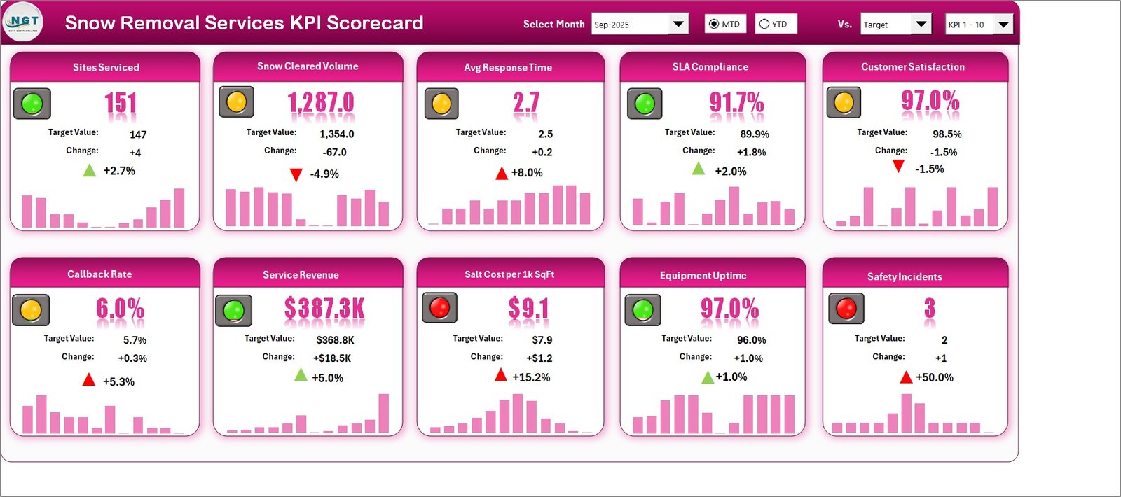
- 📈 Every tile tells the whole story – actual value, comparison value, absolute change, percentage change with an arrow, a traffic light and a 12-month sparkline.
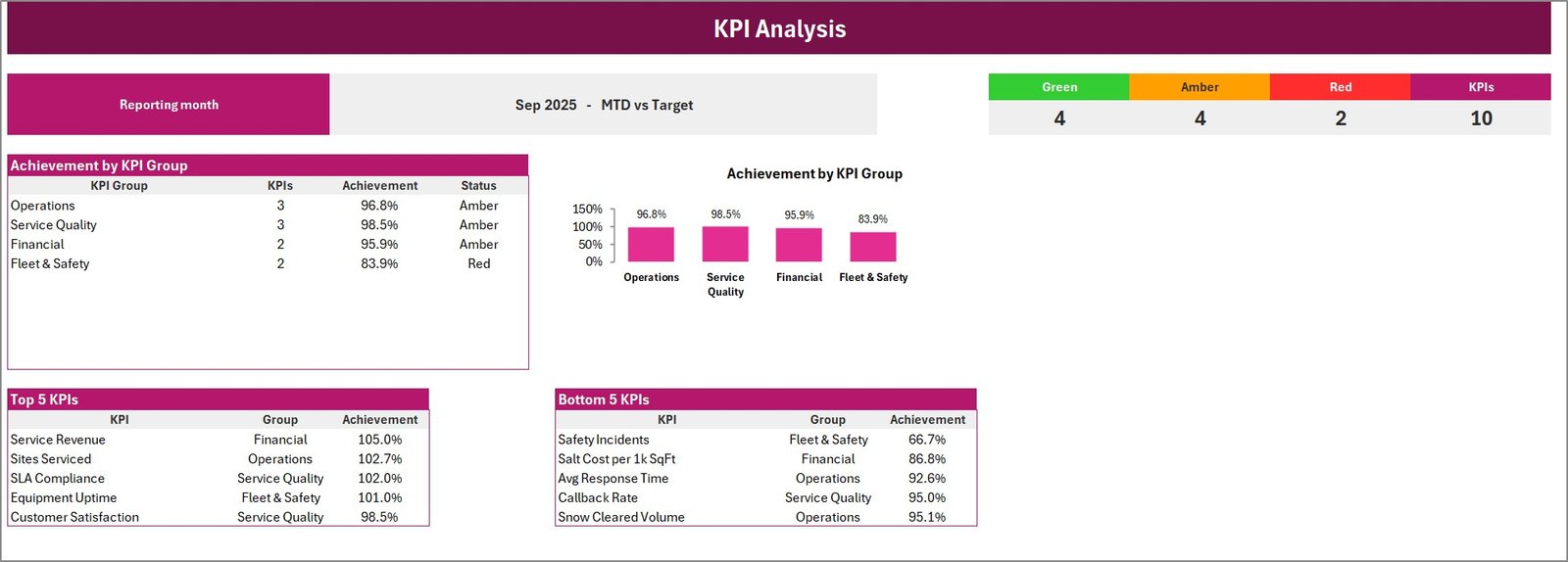
- 📊 KPI Analysis page – green, amber and red counts, achievement by KPI group with a chart, and the Top 5 and Bottom 5 KPIs. In the September 2025 sample, 4 KPIs are green, 4 amber and 2 red.
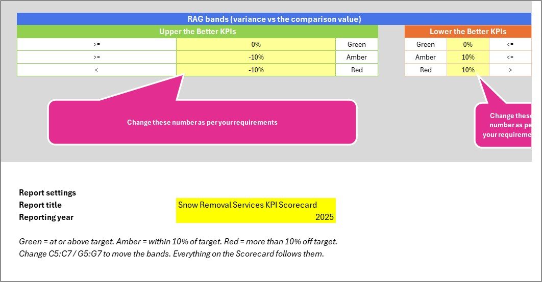
- 🎯 Bands you control – by default green means at or above target, amber within 10% and red more than 10% off. The thresholds are plain cells on Color Settings, and the status formulas read them directly.
- ➕ Room for 20 KPIs – KPI Definition and Input Data each carry 20 numbered slots; the sample fills 10. A Check column flags a duplicate KPI name before it can double-count.
📦 What’s Inside the Workbook: 9 Sheets
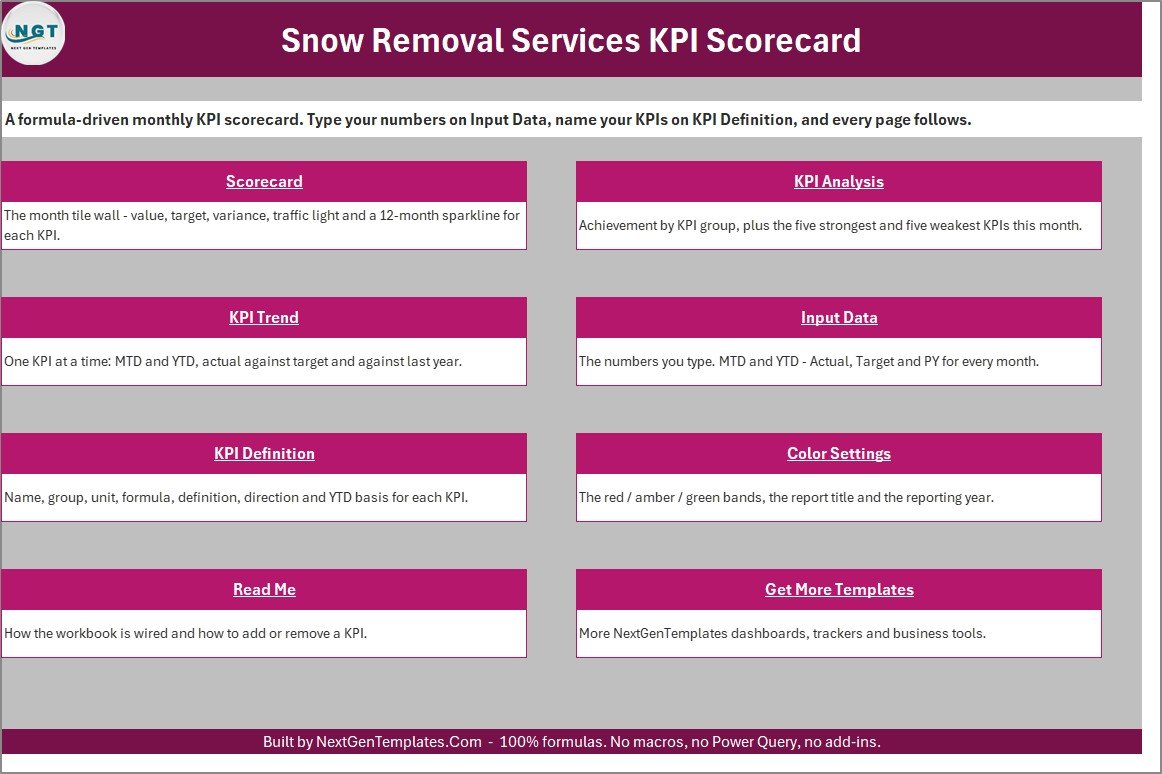
Home
A navigation page with one button per sheet and a one-line explanation of each, so a new user knows where to type and where to read.
Scorecard
The tile wall: 10 KPI cards in two rows of five. In the September 2025 sample, Sites Serviced reads 151 against 147 (green), Avg Response Time reads 2.7 hours against 2.5 (amber, because lower is better), Service Revenue reads $387.3K against $368.8K (green) and Salt Cost per 1k SqFt reads $9.1 against $7.9 (red).
KPI Analysis
Achievement by KPI Group as a table and a chart (Service Quality 98.5%, Operations 96.8%, Financial 95.9%, Fleet & Safety 83.9%), RAG counts, and the Top 5 and Bottom 5 KPIs. Service Revenue leads the sample at 105.0%; Safety Incidents trails at 66.7%.
KPI Trend
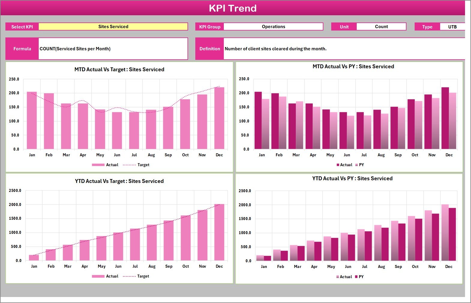
Choose one KPI and see its group, unit, type, formula and definition above four charts: MTD Actual vs Target by Month, MTD Actual vs PY by Month, YTD Actual vs Target by Month and YTD Actual vs PY by Month.
Input Data
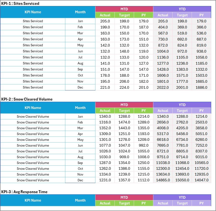
Twenty numbered KPI blocks, 12 months each, with MTD Actual, Target and PY plus YTD Actual, Target and PY. You type the YTD figures too, because the right roll-up differs by KPI (a sum for tons and revenue, an average for rates and response times).
KPI Definition
One row per KPI: group, name, unit, formula, definition, UTB or LTB, YTD basis and a Check column. Units match the measures: Tons for Snow Cleared Volume, Hours for Avg Response Time, USD (000s) for Service Revenue.

Color Settings
The red, amber and green bands for Upper-the-Better and Lower-the-Better KPIs, the report title and the reporting year that labels the month picker.
Read Me
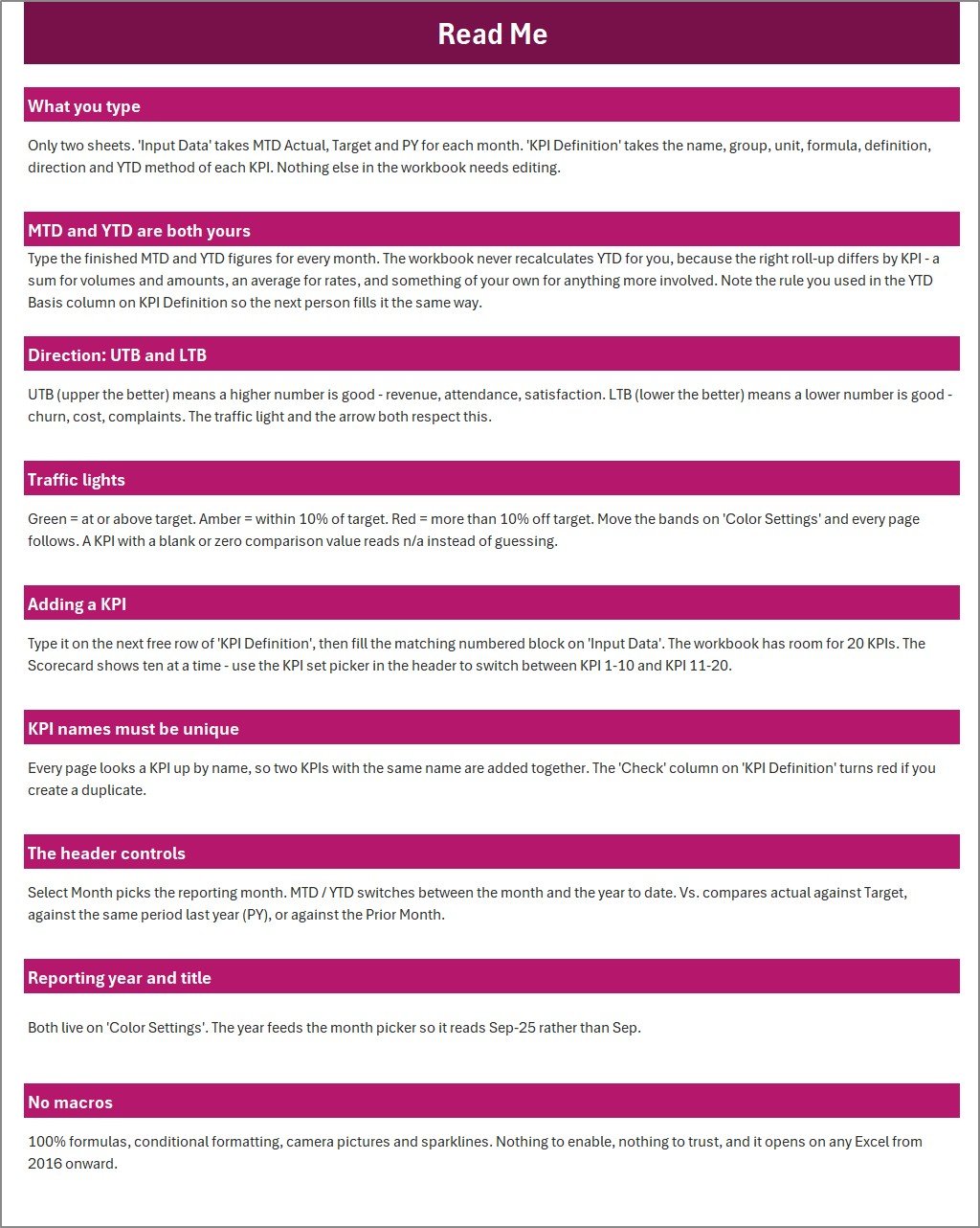
Nine short sections: what you type, MTD and YTD, UTB and LTB, traffic lights, adding a KPI, unique names, the header controls, year and title, and why there are no macros.
Get More Templates
Links to the other NextGenTemplates families, plus a contact line if you want the scorecard customised to your own KPIs.
📊 Excel Scorecard vs. Google Sheets vs. Field Service Software
| Feature | This Excel snow removal scorecard | Build-your-own Google Sheets KPI sheet | Field service software (Jobber / Service Autopilot) |
|---|---|---|---|
| Cost | ✅ $9.99 one-time | Free app, your time to build | Recurring monthly subscription |
| Platform | Desktop Excel 2016 or later | Browser | Web and mobile apps |
| Setup time | ✅ Minutes: rename KPIs and paste 12 months of numbers | Days to build formulas, lights and charts | An onboarding project |
| Real-time team collaboration | Share the file; not built for co-editing | ✅ Live co-editing | ✅ Multi-user roles |
| Mobile access | View only; dropdown controls need desktop Excel | ✅ Yes | ✅ Native apps |
| Customizable KPIs | ✅ 20 slots: names, units, formulas, direction and bands | ✅ Whatever you build | Within the vendor’s reports |
| Traffic lights and sparklines ready | ✅ On all 10 tiles | ❌ Build yourself | Varies by plan |
| Year-1 cost at 5 users | ✅ $9.99 once | Staff time | Subscription fees every month |
| Route dispatch, GPS and invoicing | ❌ Monthly totals only | ❌ Unless you build it | ✅ Yes |
For snow contractors who want a clear monthly KPI review without paying for a full dispatch platform, the Snow Removal Services KPI Scorecard in Excel sits in the sweet spot.
👥 Who This Template Is For — and Who It’s Not For
✅ This template is built for:
- Owners and operations managers of commercial plowing and de-icing contractors who hold a monthly performance review
- Landscaping firms that add a winter snow division and want its numbers on one page
- Finance leads tracking Service Revenue and Salt Cost per 1k SqFt against target and last year
- Fleet or safety coordinators reporting Equipment Uptime and Safety Incidents to the owner
❌ This template is NOT for:
- Teams that need route dispatch, GPS tracking, per-storm logs or invoicing – it holds monthly totals only
- Anyone expecting a spreadsheet to verify insurance, contract or environmental obligations – it reports only the numbers you type
- Teams that must co-edit live in a browser, or who work only in Excel for the web
⚙️ How to Use the Snow Removal Services KPI Scorecard in Excel
- Open Color Settings and set the report title and reporting year.
- On KPI Definition, keep or rename the 10 KPIs and set unit, formula, UTB / LTB and YTD basis. Confirm every Check cell reads OK.
- On Input Data, type MTD Actual, Target and PY for each month, then the YTD figures using the roll-up you chose.
- Adjust the amber and red bands on Color Settings if 10% does not suit your targets.
- On the Scorecard, pick the month, MTD or YTD, and the comparison.
- Open KPI Analysis for group achievement and Top 5 / Bottom 5, then KPI Trend for the KPI that needs discussion.
💼 Real-World Use Cases
Erik runs operations for a commercial plowing contractor with 150 client sites. At the monthly review, Avg Response Time shows 2.7 hours against a 2.5-hour target in amber, so the team looks at crew start times before the next storm cycle rather than adding another truck.
Dana manages finance for a landscaping firm with a winter snow division. Salt Cost per 1k SqFt is red at $9.1 against $7.9 while Service Revenue is green, so she opens KPI Trend to see whether de-icing spend has been rising for several months or spiked once.
Marcus coordinates fleet and safety. He types monthly Equipment Uptime and Safety Incidents from the firm’s own maintenance and incident records, and the Fleet & Safety group at 83.9% gives the owner a clear agenda item. To learn how the tiles are calculated he uses Microsoft’s overview of formulas in Excel.
❓ Frequently Asked Questions
What KPIs does the Snow Removal Services KPI Scorecard track?
It ships with 10 KPIs in 4 groups: Sites Serviced, Snow Cleared Volume and Avg Response Time (Operations); SLA Compliance, Customer Satisfaction and Callback Rate (Service Quality); Service Revenue and Salt Cost per 1k SqFt (Financial); and Equipment Uptime and Safety Incidents (Fleet & Safety).
How is this different from the Snow Removal Services KPI Dashboard?
They are separate templates. This scorecard shows 10 KPIs as tiles with sparklines across 9 sheets. The KPI Dashboard edition belongs to a different family, tracks 14 KPIs in a row-by-row table and spans 10 pages. Choose by how many KPIs you review each month.
Does it need macros, and which Excel version do I need?
No macros. The workbook uses formulas, conditional formatting, linked pictures, form controls and sparklines, and opens in desktop Excel 2016 or later. The month, comparison and KPI-set dropdowns are form controls, so use desktop Excel rather than Excel for the web.
Can I report a winter season that runs from November to March?
The month picker covers January to December of the single year set on Color Settings, so a season that crosses New Year spans two files. Many contractors keep one file per calendar year and compare seasons with the PY columns.
How long does setup take?
If the 10 sample KPIs suit your business, setup is typing 12 months of MTD and YTD numbers on Input Data and setting the year on Color Settings, usually under an hour. Renaming KPIs is a few minutes on KPI Definition.
Can I add KPIs or change the traffic-light thresholds?
Yes. Type a new KPI in the next free row of KPI Definition and fill its numbered block on Input Data, up to 20 KPIs. The KPI set picker switches the Scorecard to slots 11-20. Thresholds are editable cells on Color Settings.
How does it compare to Jobber or Service Autopilot?
Those platforms schedule crews, dispatch routes and invoice clients on a subscription. This scorecard does one job, a monthly KPI review, for a one-time $9.99. Many contractors use both: software for daily operations, the scorecard for the management summary.
👤 About the Author
Built by PK — Microsoft Certified Professional with 15+ years of Excel, Google Sheets, and Power BI experience. Founder of NextGenTemplates, reaching 300K+ subscribers across YouTube channels (@PKAnExcelExpert, @NextGenTemplates, @NeoTechNavigators). Every template is hand-built and tested before release.
🔗 Explore Related Templates
If the Snow Removal Services KPI Scorecard in Excel suits your monthly review, these published templates cover neighbouring service trades:
- 🌿 Landscaping Dashboard in Excel – an interactive dashboard for the green-season side of the business.
- 🏊 Swimming Pool Service KPI Scorecard in Excel – the same scorecard layout for a seasonal route-based service.
- 🚰 Septic Tank Service KPI Scorecard in Excel – monthly KPIs for a truck-based field service.
- 🔧 Plumbing Business KPI Scorecard in Excel – callback, response and revenue KPIs for plumbing firms.
- 💎 KPI Dashboard Library (Excel) – 15 premium KPI templates in one bundle.
Browse more KPI Dashboard and Scorecard Templates or all MS Excel Templates.
📖 Click here to read the Detailed Blog Post
🎥 Visit our YouTube channel for step-by-step video tutorials
👉 YouTube.com/@NextGenTemplates
📅 Last updated: September 2026




















Reviews
There are no reviews yet.