

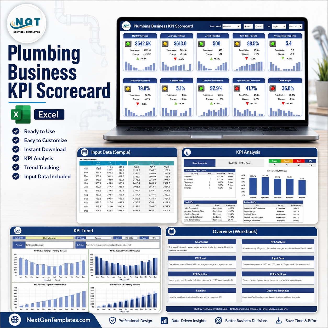
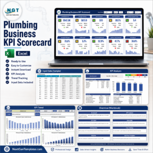
Plumbing Business KPI Scorecard in Excel is a ready-to-use monthly KPI review pack for a plumbing company – residential service, commercial contracting or a mixed book. You type the month’s numbers on one input sheet, name your KPIs on one definition sheet, and a wall of ten KPI tiles, a KPI Trend page and a KPI Analysis page all recalculate from a single month dropdown.
This is the tile-wall scorecard product: ten large KPI cards, each with a traffic light, the target, the change and a twelve-month sparkline. It is deliberately not the analytical, slicer-driven dashboard line, and it is not the table-style KPI dashboard either. If you want pivot charts, slicers and job-level drilldown, that is a different template – see Related Templates at the end.
Key Features
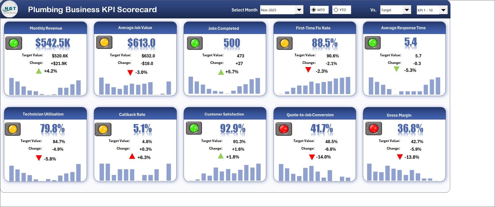
- A ten-tile scorecard wall, not a table. Each KPI gets its own card: the current value in large type, a red / amber / green traffic light, the target value, the absolute change, the percentage change with a direction arrow, and a twelve-month sparkline underneath.
- One header row drives the whole page. Select Month picks the reporting month (it reads Nov-2025, not just Nov). MTD / YTD switches between the month and the year to date. Vs. compares against Target, against the same period last year (PY), or against the Prior Month. A fourth picker switches the wall between KPI 1-10 and KPI 11-20.
- Ten plumbing KPIs across five groups – Revenue, Operations, Workforce, Customer and Finance – already filled in with twelve months of realistic sample numbers so every formula, light and sparkline is working before you touch it.
- Direction-aware traffic lights. Every KPI is marked UTB (upper the better) or LTB (lower the better) on KPI Definition. A falling Average Response Time or Callback Rate is scored as an improvement, so it shows a green down-arrow instead of looking like a miss.
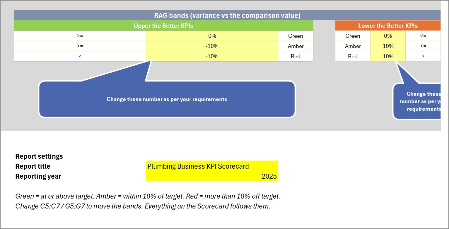
- You own the RAG bands. Green at or above target, amber within 10% of target, red more than 10% off. The thresholds are three cells on the Color Settings sheet – change them and every tile, the analysis page and the status counts follow.
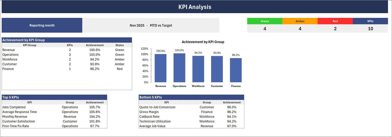
- A KPI Analysis page that ranks the month for you. Achievement by KPI group with a matching column chart, a Green / Amber / Red / total KPI counter strip, and automatic Top 5 KPIs and Bottom 5 KPIs tables so the review starts with the two lists that matter.
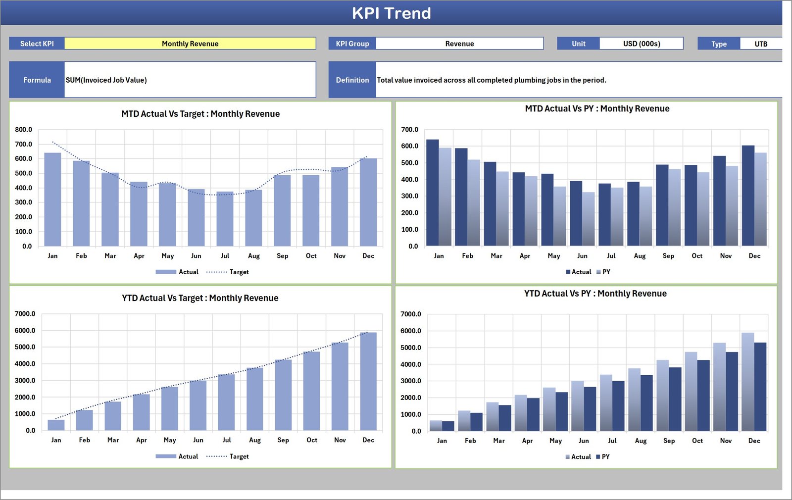
- A KPI Trend page for one KPI at a time. Pick the KPI and the group, unit, type, formula text and plain-English definition all appear, alongside four charts: MTD Actual Vs Target, MTD Actual Vs PY, YTD Actual Vs Target and YTD Actual Vs PY.
- Room for 20 KPIs. Type a new KPI on the next free row of KPI Definition, fill its numbered block on Input Data, and it flows through every page. A Check column flags a duplicate KPI name before it silently doubles a number.
- Nothing to install and nothing to refresh. 100% worksheet formulas, conditional formatting, camera pictures and native sparklines. No macros, no Power Query, no Power Pivot, no add-ins – it just opens.
The 10 KPIs In The File
| KPI Group | KPI | Unit | Direction | YTD Basis |
|---|---|---|---|---|
| Revenue | Monthly Revenue | USD (000s) | UTB | Sum |
| Revenue | Average Job Value | USD | UTB | Average |
| Operations | Jobs Completed | Count | UTB | Sum |
| Operations | First-Time Fix Rate | % | UTB | Average |
| Operations | Average Response Time | Hours | LTB | Average |
| Workforce | Technician Utilisation | % | UTB | Average |
| Workforce | Callback Rate | % | LTB | Average |
| Customer | Customer Satisfaction | % | UTB | Average |
| Customer | Quote-to-Job Conversion | % | UTB | Average |
| Finance | Gross Margin | % | UTB | Average |
Each one carries its own formula text and a plain-English definition on the KPI Definition sheet – for example Callback Rate = (Return Visits Within 30 Days / Jobs Completed) * 100, “share of completed jobs needing a return visit within thirty days”. All of it is editable text: rename any KPI to your own vocabulary and the rest of the workbook follows.

What You Get – Nine Sheets
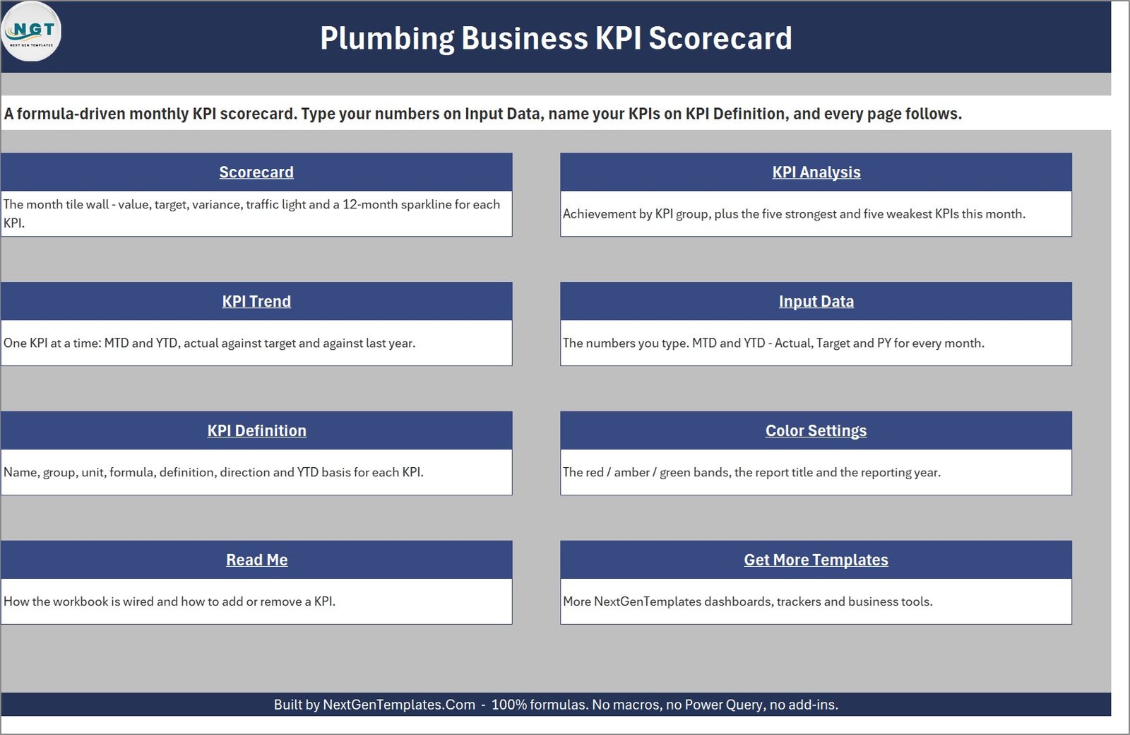
1. Home
A navigation page. Eight linked tiles – Scorecard, KPI Analysis, KPI Trend, Input Data, KPI Definition, Color Settings, Read Me and Get More Templates – each with a one-line description of what that sheet is for.
2. Scorecard
The tile wall. Ten KPI cards in two rows of five, each showing the value, traffic light, target, change, percentage change and a twelve-month sparkline, under a header strip holding the month picker, the MTD/YTD switch, the comparison picker and the KPI set picker.
3. KPI Analysis
The month in one page: a reporting-month banner (Nov 2025 – MTD vs Target), a Green / Amber / Red / KPIs counter strip, an Achievement by KPI Group table with its column chart, and the automatic Top 5 KPIs and Bottom 5 KPIs tables.
4. KPI Trend
One KPI at a time. Select the KPI and its group, unit, type, formula and definition appear across the top, followed by four twelve-month charts – MTD and YTD, each against Target and against Prior Year.
5. Input Data
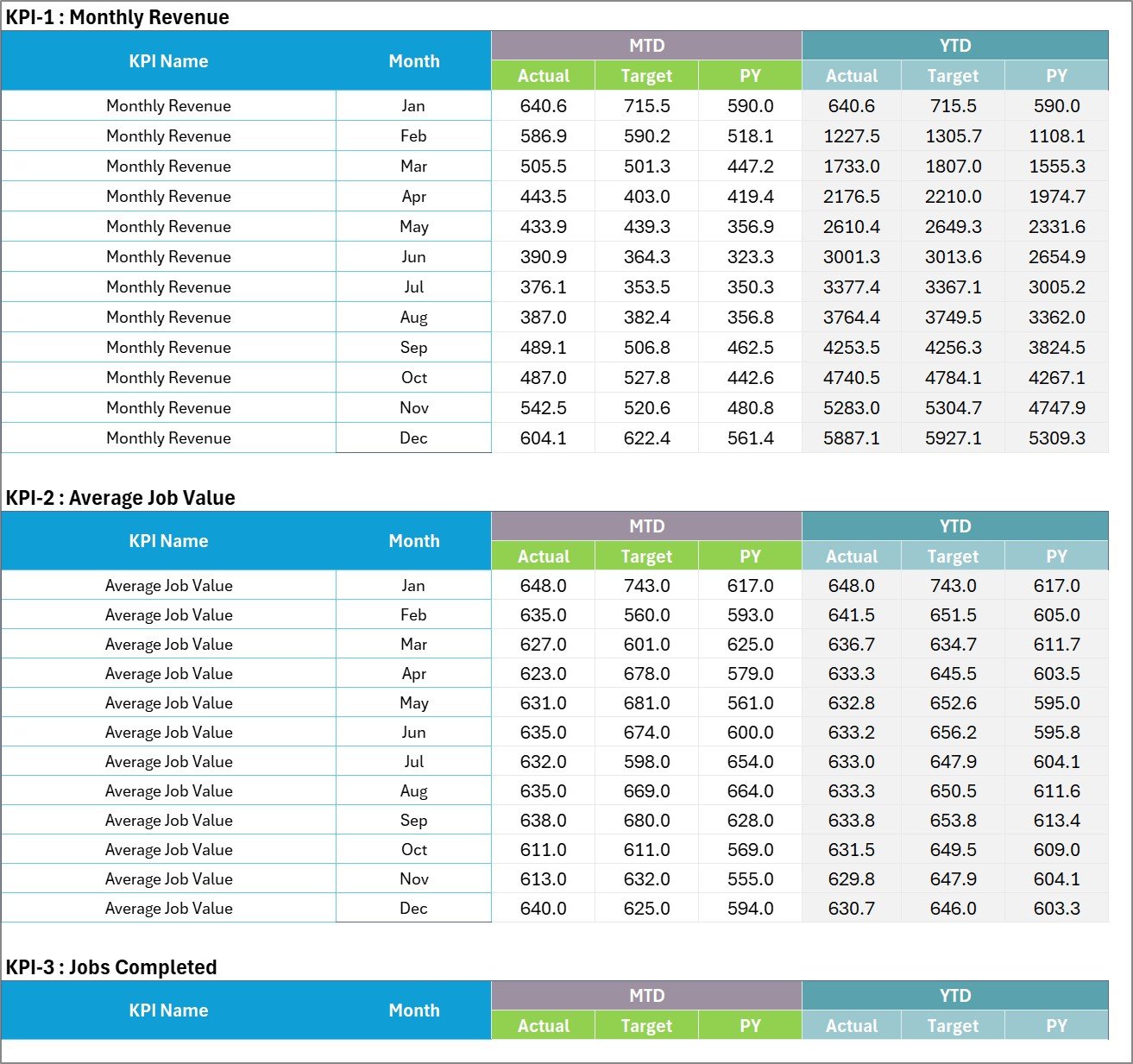
The one sheet you type on. A numbered block per KPI (KPI-1, KPI-2 and so on), each with twelve month rows and six columns: MTD Actual, Target and PY, then YTD Actual, Target and PY.
6. KPI Definition
The master list: number, group, name, unit, formula, definition, type (UTB or LTB), YTD basis and a duplicate-name Check column. Every other page looks a KPI up by name from here.
7. Color Settings
The RAG bands for upper-the-better and lower-the-better KPIs, plus the report title and the reporting year. The year is what makes the month picker read Nov-25 rather than a bare Nov.
8. Read Me
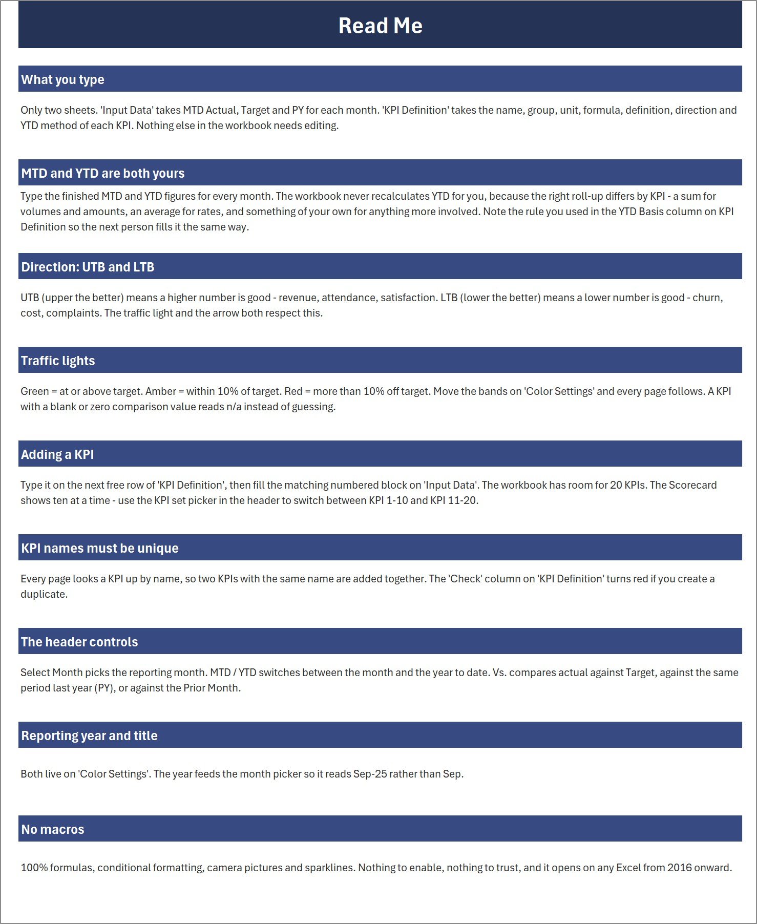
Nine short sections covering what you type, why MTD and YTD are both yours, UTB versus LTB, the traffic lights, how to add a KPI, why KPI names must be unique, the header controls, the reporting year, and the fact that there are no macros anywhere in the file.
9. Get More Templates
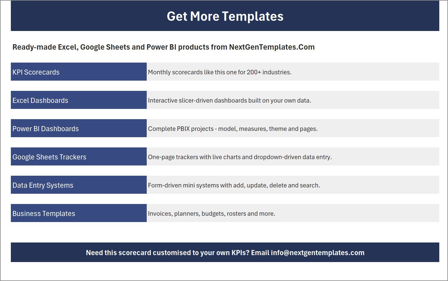
A short index of the other NextGenTemplates product lines – KPI scorecards, Excel dashboards, Power BI dashboards, Google Sheets trackers, data entry systems and business templates.
Scorecard Or Analytical Dashboard – Which One Do You Want?
NextGenTemplates sells two very different plumbing templates in Excel and they are often confused because the names are close. Pick by the question you are trying to answer.
| This product – KPI Scorecard | Plumbing Contractor Dashboard in Excel | |
|---|---|---|
| What it shows | Ten KPI tiles: value, target, variance, traffic light, sparkline | Pivot charts and tables built on job-level records |
| Question it answers | Did we hit target this month, and where are we slipping? | What is happening inside the data – by technician, job type, area, period? |
| What you type | Ten to twenty finished monthly KPI numbers | A transaction table of jobs |
| Controls | Month picker, MTD/YTD, Vs. Target / PY / Prior Month | Slicers and pivot filters |
| Best for | The monthly management review pack | Digging into the detail |
Many owners run both: the scorecard for the monthly meeting, the analytical dashboard when a number on it looks wrong.
How To Use It
- Set the title and year. On Color Settings, type your company’s report title and the reporting year. The month picker and every page title follow.
- Name your KPIs. On KPI Definition, keep the ten supplied plumbing KPIs, rename them, or type your own on the free rows – up to 20. Set the group, unit, formula text, definition, UTB/LTB direction and YTD basis for each.
- Type your numbers. On Input Data, fill the numbered block for each KPI: MTD Actual, Target and PY, then YTD Actual, Target and PY, for each of the twelve months.
- Open the Scorecard. Pick the month, choose MTD or YTD, and pick what you are comparing against – Target, PY or Prior Month. The ten tiles redraw.
- Tune the bands if you need to. The default green / amber / red split is 0% / -10% variance. Move it on Color Settings and the whole workbook follows.
- Run the review off KPI Analysis and KPI Trend. Analysis gives you the group scores and the top and bottom five; Trend gives you the twelve-month story behind any single KPI.
Who It Is For
- Plumbing company owners and directors who want one page for the monthly numbers
- Service managers tracking first-time fix, response time and callbacks across a team of technicians
- Operations and dispatch leads reporting jobs completed and technician utilisation
- Bookkeepers and finance staff who produce the monthly management pack
- Franchise and multi-branch groups that need every branch reporting the same ten KPIs the same way
- Anyone in a field-service trade – HVAC, electrical, drainage, appliance repair – the KPI list transfers almost unchanged
What This Template Is Not
- It is not job management, dispatch or scheduling software. It does not book jobs, route vans or raise invoices.
- It does not connect to your field-service platform, accounting package or CRM. There is no connector, no API and no query – you type or paste the monthly numbers, which is exactly why it opens anywhere with no refresh step.
- It does not calculate YTD for you. You type both MTD and YTD, because the right roll-up differs by KPI – a sum for revenue and job counts, an average for rates. The YTD Basis column records which rule you used.
- It is not the analytical dashboard product, and it is not the table-style KPI dashboard product. It is the tile-wall scorecard.
- The sample numbers are invented demo data. They describe no real plumbing business and are not an industry benchmark.
Technical Details
- Format: .xlsx workbook, 9 sheets
- Engine: worksheet formulas, conditional formatting, camera pictures and native sparklines – no macros, no VBA, no Power Query, no Power Pivot, no data model, no add-ins
- Compatibility: Excel 2016 and later on Windows and Mac
- Capacity: 20 KPIs and 12 months, shown ten at a time on the scorecard wall
- Editable: nothing is locked, hidden or password-protected
- Delivery: instant download after purchase – a ZIP containing the workbook and a user manual PDF
Frequently Asked Questions
Is this the tile scorecard or the analytical dashboard?
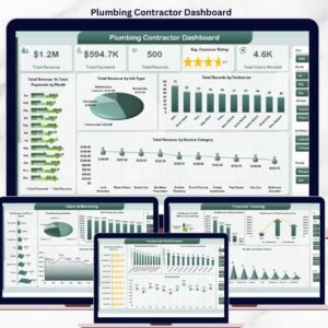
The tile scorecard. Ten large KPI cards with traffic lights and sparklines, a month picker, an MTD/YTD switch, a KPI Trend page and a KPI Analysis page. If you want slicers and pivot charts over job-level records, that is the Plumbing Contractor Dashboard in Excel – a different product, not a newer version of this one.
Do I have to use these ten KPIs?
No. KPI Definition is the master list. Rename, clear or add rows there and Input Data, the scorecard wall, the trend page and the analysis page all follow. No formula editing is needed, up to 20 KPIs.
Why do I have to type YTD as well as MTD?
Because the correct roll-up differs by KPI. Monthly Revenue and Jobs Completed sum; First-Time Fix Rate and Gross Margin average; something like a weighted rate may need a rule of your own. The workbook does not guess – you type the finished figure and note the rule in the YTD Basis column so the next person fills it the same way.
Why does a lower-is-better KPI show a green down-arrow?
Because scoring is direction-aware. Average Response Time and Callback Rate are marked LTB on KPI Definition, so a fall is an improvement and the light and the arrow both respect that.
Can I change the green / amber / red thresholds?
Yes. They live in three cells on Color Settings – by default green at or above target, amber within 10% of target, red beyond that – with a separate set for lower-the-better KPIs. Every page reads them.
Can I show more than ten KPIs at once?
The wall shows ten tiles at a time by design, so the cards stay readable. The workbook holds 20 – use the KPI set picker in the header to switch between KPI 1-10 and KPI 11-20.
Does it contain macros?
No. It is a plain .xlsx: formulas, conditional formatting, camera pictures and sparklines. There is no security prompt and nothing to enable.
Will it work for HVAC, electrical or drainage?
Yes, with very little editing. Revenue, average job value, jobs completed, first-time fix, response time, utilisation, callbacks, satisfaction, quote conversion and gross margin are the standard field-service KPI set. Rename what does not fit.
Can I rebrand it?
Yes. Nothing is locked. Change the colours, fonts, title banner and logo as you like.
What exactly do I download?
A ZIP holding the .xlsx workbook and the Excel KPI Scorecard user manual as a PDF. Nothing else is needed.
Related Templates
If you want the analytical style instead: Plumbing Contractor Dashboard in Excel · HVAC Service Dashboard in Excel
The same trade in another tool: Plumbing Contractor Dashboard in Power BI · Plumbing Contractor Dashboard in Google Sheets
Day-to-day plumbing tools: Plumbing Maintenance Checklist Template in Excel
Neighbouring trades: Pest Control Dashboard in Excel · Landscaping Dashboard in Excel · Auto Repair Dashboard in Excel
Need this scorecard built around your own KPI list, in Excel, Power BI or Google Sheets? Tell us the KPIs that matter and we will build it – [email protected].

















Reviews
There are no reviews yet.