


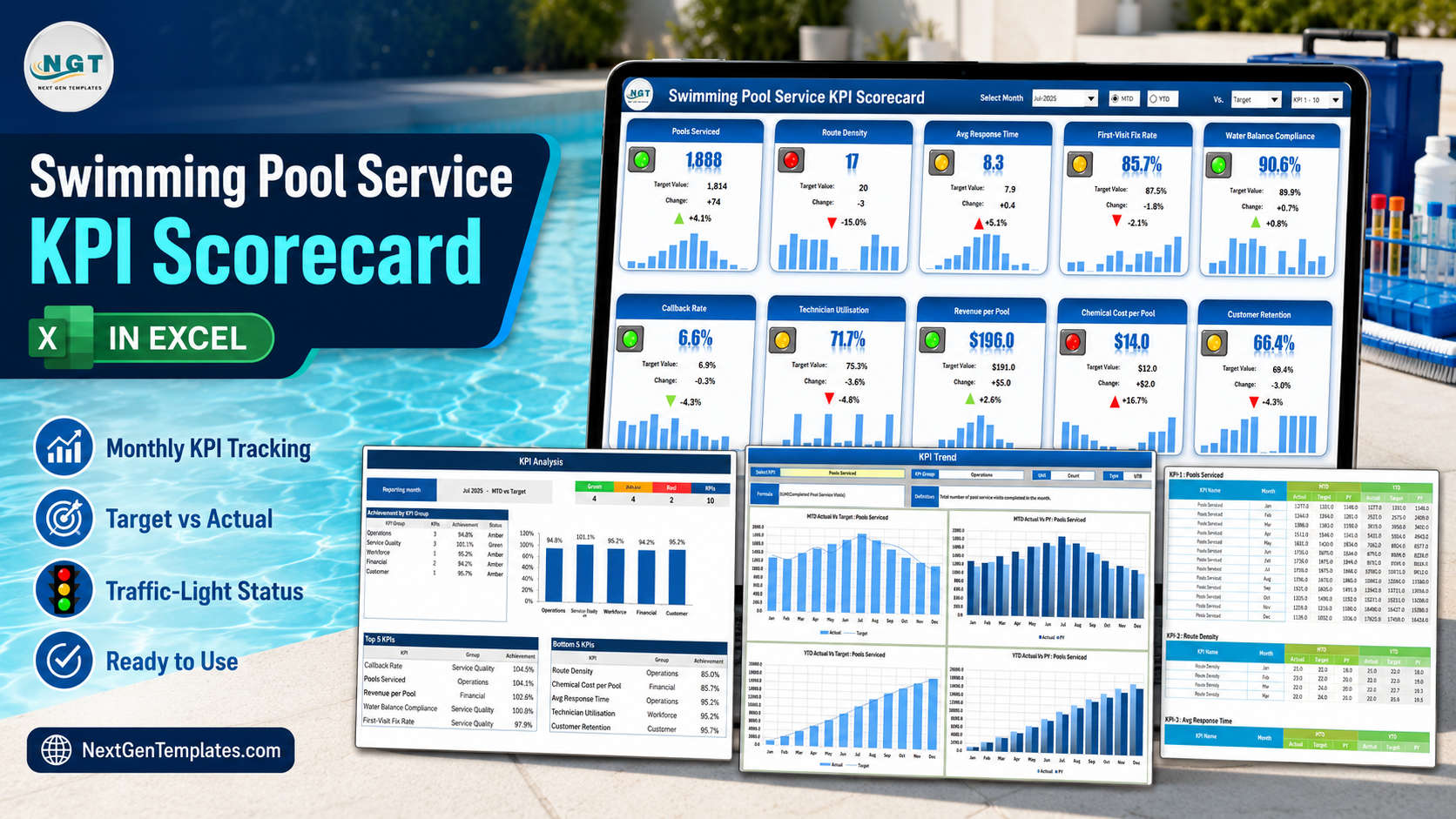

Every pool service company already owns the numbers. Completed visits are on the route sheets, the return trips are in the scheduling app, chemical spend is on the supplier invoices, and technician hours are on the timesheets. What almost nobody has is the one page that puts all of them side by side, month after month, in the same shape – so a bad month looks different from a good one at a glance instead of after an evening of spreadsheet archaeology.
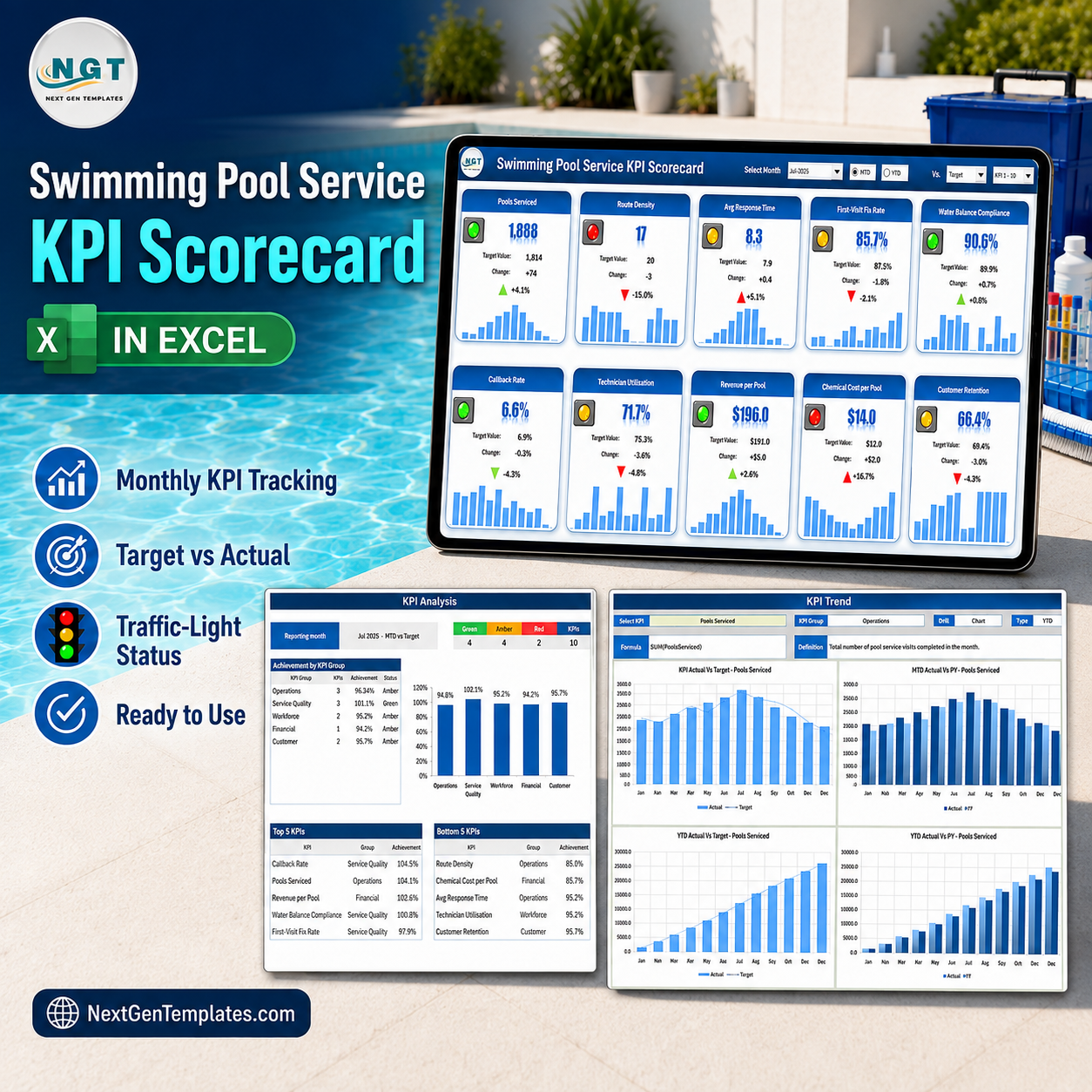
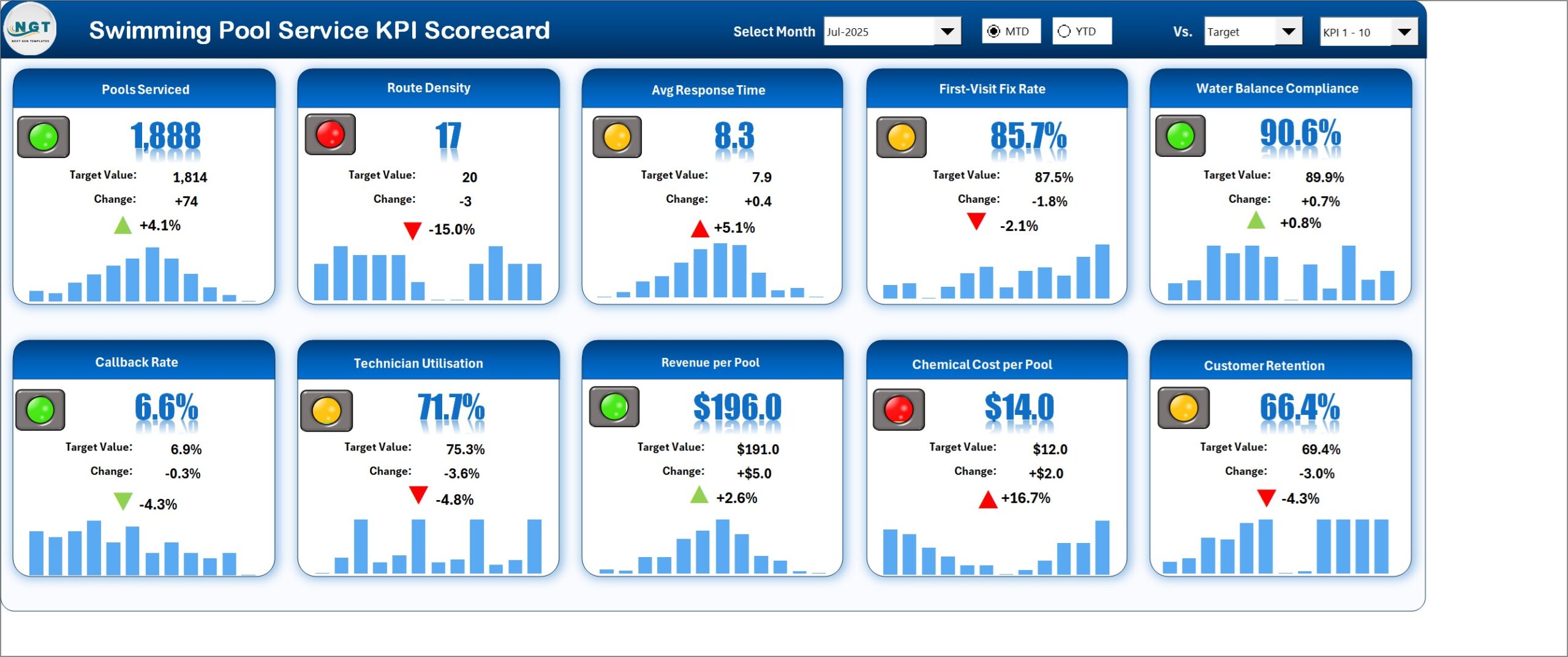
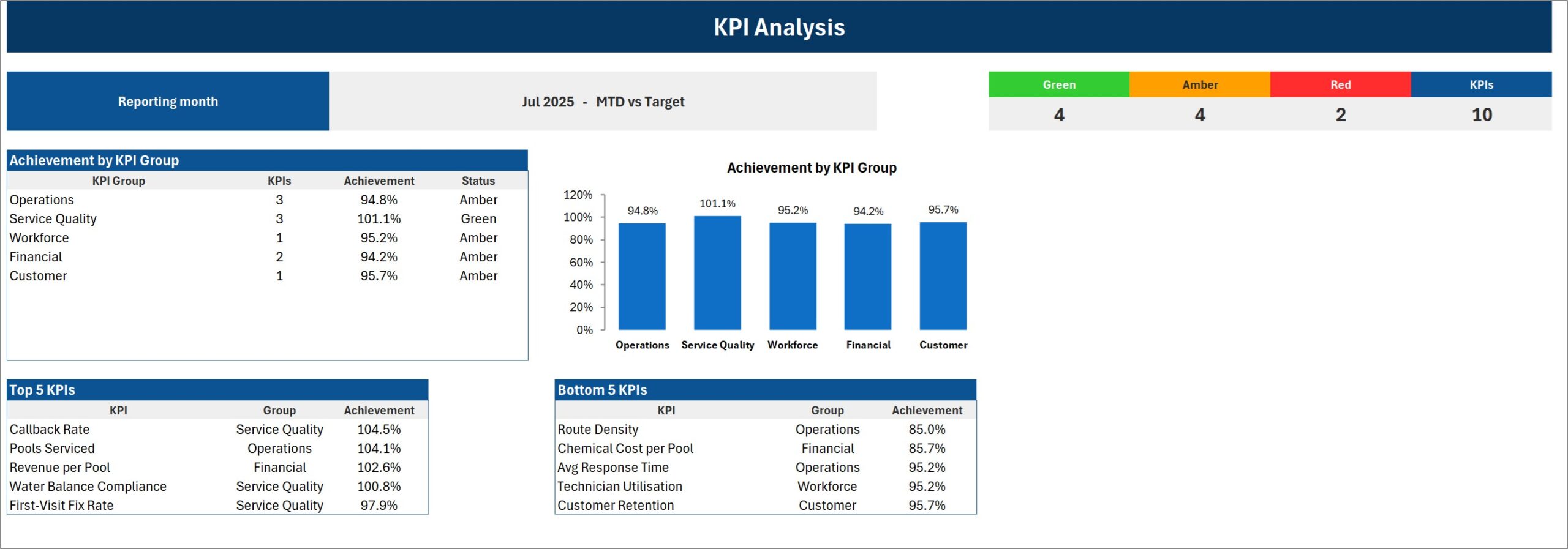
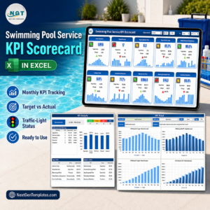
The Swimming Pool Service KPI Scorecard in Excel is that page. Ten pool-service KPIs across five groups, a month picker, an MTD/YTD switch and traffic lights that know which direction is good. It ships loaded with a complete 2025 sample year: open it on Jul-2025 and you get 4 Green, 4 Amber and 2 Red, with Pools Serviced at 1,888 against a 1,814 target and Route Density at 17 against 20. It is 100% formulas – no macros, no Power Query, no add-ins – and it opens on any Excel from 2016 onward.
One thing worth naming up front, because three NextGenTemplates families carry near-identical titles: this is the KPI Scorecard line. It is a monthly reporting page driven by a month picker and a KPI Definition sheet you rename. It is not the slicer-driven Excel KPI Dashboard line, and it is not the analytical Excel Dashboard line. Different tools, different questions – all three are linked at the bottom of this page.
Key Features of the Swimming Pool Service KPI Scorecard in Excel
- Ten pool-service KPIs on one page – operations, service quality, workforce, financial and customer, each as a tile with value, target, change, a direction-aware arrow and a traffic light.
- Month picker with an MTD / YTD switch – a dropdown of Jan-2025 through Dec-2025 in the header, two option buttons for month-to-date or year-to-date, and every page on the workbook follows the same selection.
- Compare against three things – a second dropdown switches the comparison between Target, PY (the same period last year) and Prior Month. The tile labels rename themselves to match.
- Direction-aware traffic lights – seven KPIs are Upper-the-Better and three are Lower-the-Better (Avg Response Time, Callback Rate, Chemical Cost per Pool). A rising cost goes red with a red up-arrow; a falling callback rate goes green with a green down-arrow. No false greens.
- A 12-month sparkline on every tile – a column sparkline running Jan to Dec sits under each KPI, so the tile shows the level and the shape at once.
- KPI Analysis page – Green / Amber / Red counts against the KPI total, an Achievement by KPI Group table with a matching column chart, and Top 5 / Bottom 5 KPI tables ranked by achievement.
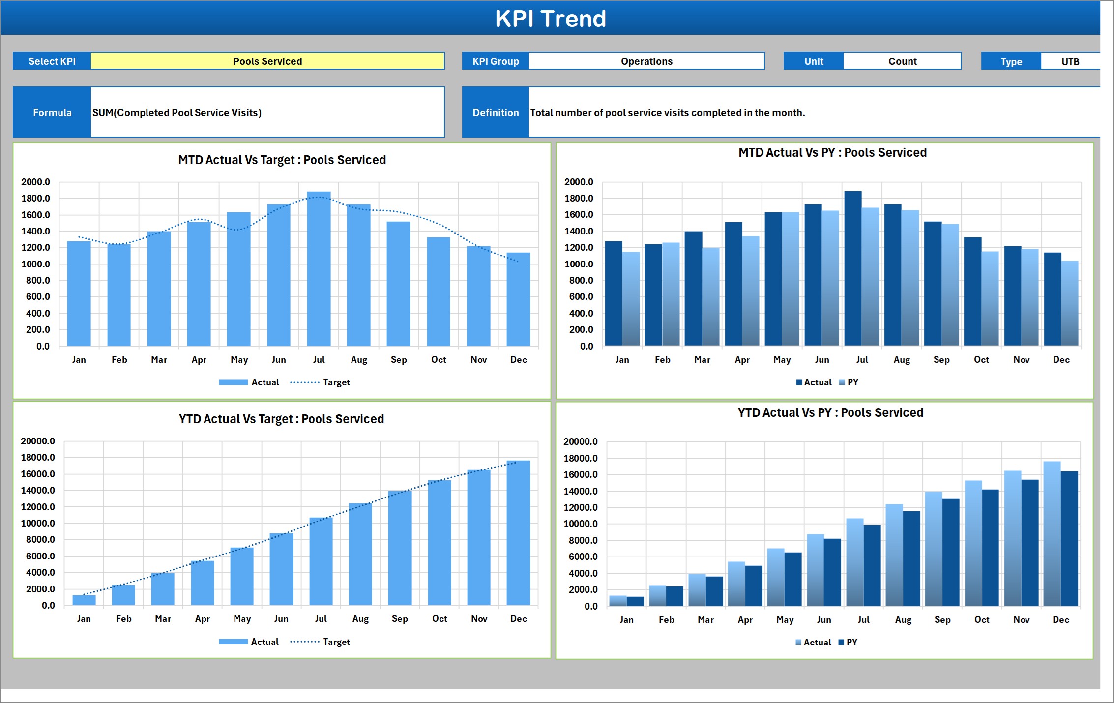
- KPI Trend page – pick any one KPI and get four charts: MTD Actual vs Target, MTD Actual vs PY, YTD Actual vs Target and YTD Actual vs PY, with that KPI’s group, unit, direction, formula and definition printed above them.
- Rename every KPI – the workbook has twenty numbered KPI slots; ten arrive filled with pool-service metrics. The Scorecard shows ten at a time and a header picker flips between KPI 1-10 and KPI 11-20.
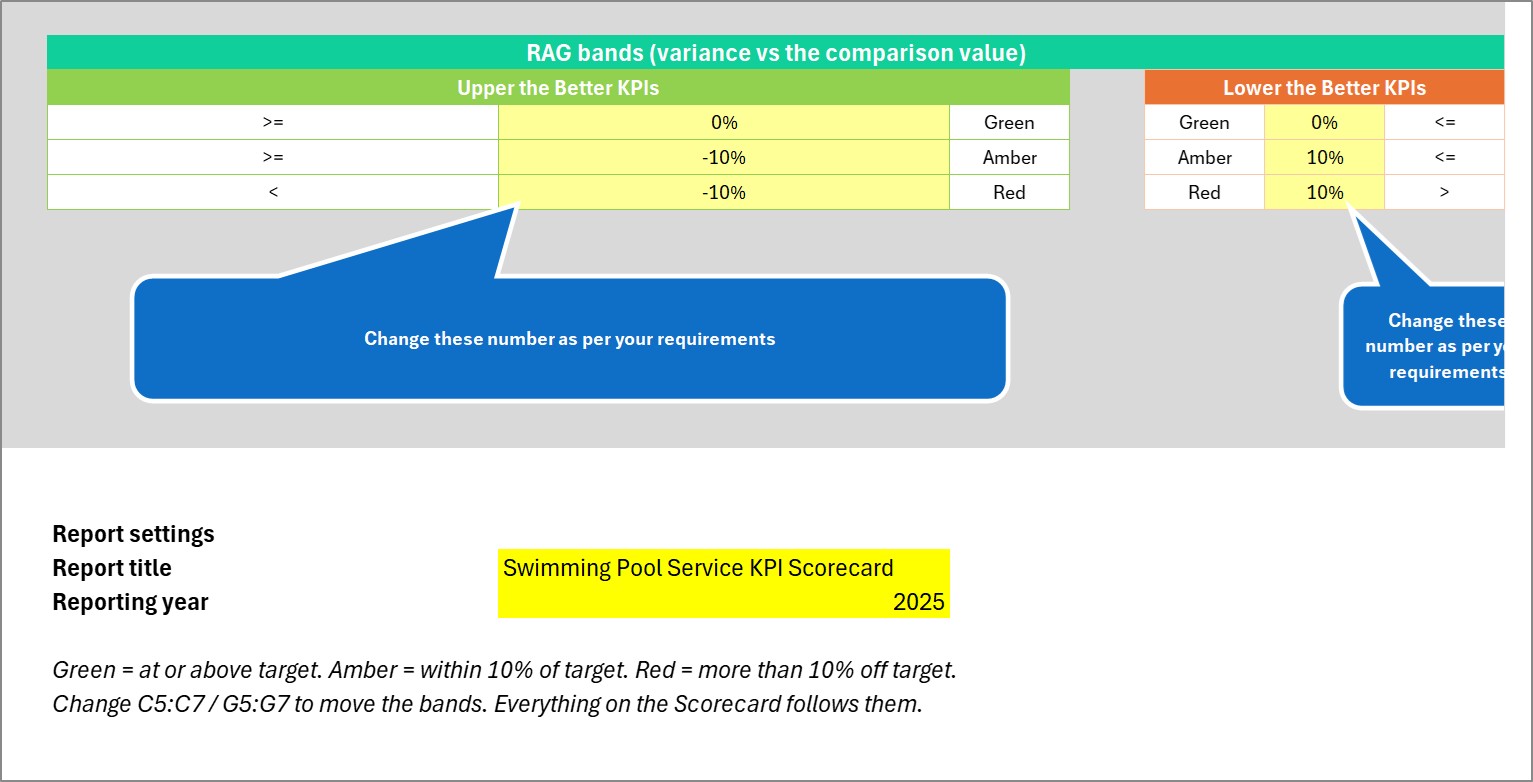
- Editable RAG bands – Green, Amber and Red thresholds live on one Color Settings sheet, separately for Upper-the-Better and Lower-the-Better KPIs. Move them and every page follows.
- Two input sheets, nothing else to touch – Input Data takes your monthly figures, KPI Definition names the KPIs. A Check column turns red if you create a duplicate KPI name.
- 100% formulas, zero macros – conditional formatting, camera pictures and sparklines. Nothing to enable, and it opens on any Excel 2016 or later.
- Instant download – the .xlsx workbook plus the Excel KPI Scorecard user manual PDF, in one ZIP.
What’s Inside the Swimming Pool Service KPI Scorecard in Excel
Nine visible sheets, plus two hidden calculation sheets that do the lookups and feed the trend charts. You never open the hidden pair.
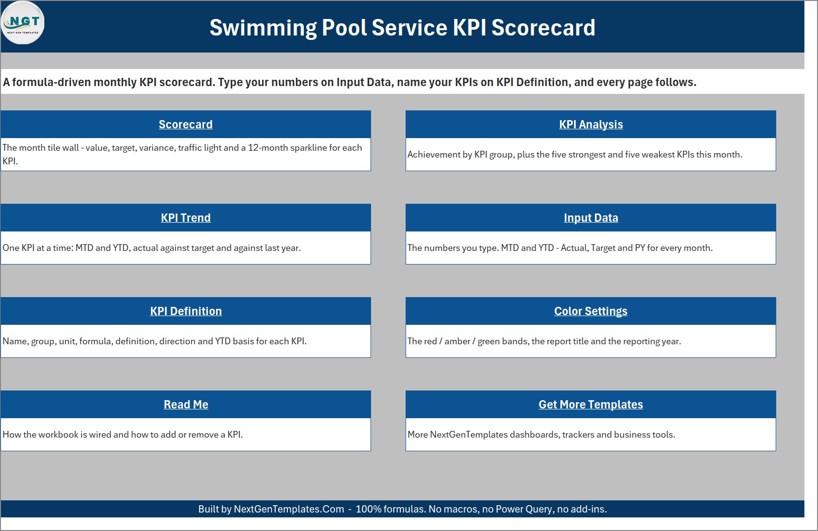
- Home – a navigation page with a linked card for each sheet and a one-line description of what it does.
- Scorecard – the tile wall. Header controls on the left, ten KPI tiles in two rows of five below.
- KPI Analysis – the reporting-month banner, the RAG counts, achievement by group and the Top 5 / Bottom 5 tables.
- KPI Trend – one KPI at a time across its full twelve months, in four charts.
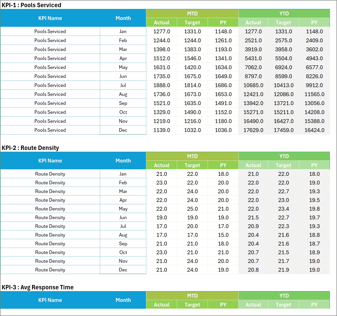
- Input Data – twenty numbered blocks, each twelve rows (Jan to Dec) wide by six columns: MTD Actual, Target and PY, then YTD Actual, Target and PY.
- KPI Definition – the table that names everything: #, KPI Group, KPI Name, Unit, Formula, Definition, Type (UTB or LTB), YTD Basis and the duplicate-name Check.
- Color Settings – the RAG bands, the report title and the reporting year. The year is what makes the month picker read “Jul-2025” rather than “Jul”.
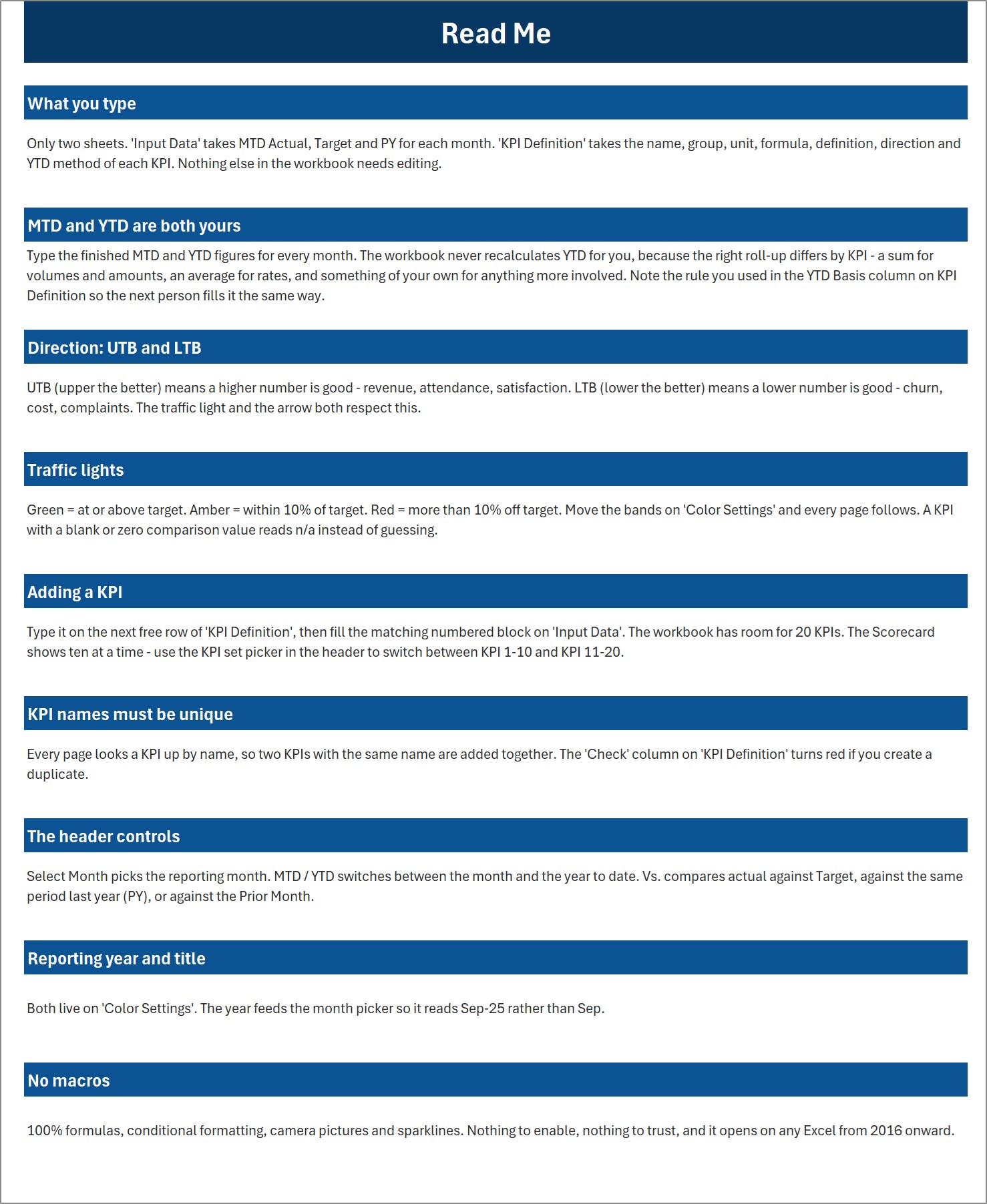
- Read Me – nine short sections covering what you type, how MTD and YTD work, UTB vs LTB, the traffic lights, adding a KPI, unique names, the header controls, the title and year, and the no-macros promise.
- Get More Templates – the other NextGenTemplates lines and the customisation contact.
The ten KPIs it ships with
| # | KPI | Group | Unit | Direction | Jul-2025 sample vs target |
|---|---|---|---|---|---|
| 1 | Pools Serviced | Operations | Count | Upper the better | 1,888 vs 1,814 – Green |
| 2 | Route Density | Operations | Count | Upper the better | 17 vs 20 – Red |
| 3 | Avg Response Time | Operations | Hours | Lower the better | 8.3 vs 7.9 – Amber |
| 4 | First-Visit Fix Rate | Service Quality | % | Upper the better | 85.7% vs 87.5% – Amber |
| 5 | Water Balance Compliance | Service Quality | % | Upper the better | 90.6% vs 89.9% – Green |
| 6 | Callback Rate | Service Quality | % | Lower the better | 6.6% vs 6.9% – Green |
| 7 | Technician Utilisation | Workforce | % | Upper the better | 71.7% vs 75.3% – Amber |
| 8 | Revenue per Pool | Financial | USD | Upper the better | $196.0 vs $191.0 – Green |
| 9 | Chemical Cost per Pool | Financial | USD | Lower the better | $14.0 vs $12.0 – Red |
| 10 | Customer Retention | Customer | % | Upper the better | 66.4% vs 69.4% – Amber |
Every one of those names, units, directions, formulas and definitions is text on the KPI Definition sheet. Change any of them and the tile, the analysis page and the trend page all follow, because each page looks a KPI up by name.
Excel Scorecard vs. Google Sheets vs. Pool Service Software – Where This Fits
| This Excel scorecard | The Google Sheets edition | Field-service / pool software | |
|---|---|---|---|
| What it is | A monthly reporting page you type figures into | The same idea, built natively in Google Sheets | A live operational system – scheduling, routing, invoicing |
| Where the numbers come from | You type them, from whatever you already use | You type them | It generates them from live jobs |
| Cost | One payment, this page | One payment | Per technician, per month, ongoing |
| Works offline | Yes | No | Usually partly |
| KPIs you can rename | All twenty slots | Its own set, editable | Whatever the vendor exposes |
| Best for | The monthly owners’ or ops review | Teams that live in Google Workspace | Running the day-to-day operation |
These are complements, not rivals. Most pool companies that buy this one keep running their scheduling software and use the scorecard as the page they actually look at on the first Monday of the month.
Who This Template Is For – and Who It’s Not For
It is for pool service and maintenance companies running weekly or fortnightly routes, owner-operators with two to twenty technicians, service managers who report monthly to an owner or a franchise, and anyone who currently rebuilds the same summary by hand every month.
It is not for anyone who wants the numbers to appear on their own. Nothing connects. There is no import, no API and no sync – you type twelve months of figures per KPI, or paste them in. It is also not a scheduling, routing, invoicing or customer-record system, and it is not a water-testing or chemical-dosing tool. If you want interactivity across a transaction table rather than a monthly close, the Excel Dashboard line is the better fit.
What it deliberately does not claim. Water Balance Compliance is a single percentage that you work out elsewhere and type in. The workbook stores no water test readings – no pH, chlorine, alkalinity or stabiliser figures – performs no chemical calculation, and prescribes no dosing. It is a business reporting template, not a public-health, water-safety, chemical-compliance or testing-certification system, and it makes no claim about any health-department pool code, operator certification or testing standard. It is also not a safety or OSHA recordkeeping system: this KPI set ships no safety or incident metric at all, and if you want one you would rename a spare slot and type the figure in yourself.
How to Use the Swimming Pool Service KPI Scorecard in Excel
- Open the .xlsx. There are no macros to enable and no security prompt to clear.
- Set the title and year on Color Settings. The reporting year is what makes the month picker read “Jan-2026” instead of “Jan”.
- Name your KPIs on KPI Definition – group, unit, formula, definition, UTB or LTB, and the YTD basis you intend to use. Keep the names unique; the Check column tells you if you slip.
- Type your numbers on Input Data. Each KPI has its own numbered block of twelve months, and each month takes six figures: MTD Actual, Target and PY, then the YTD equivalents.
- Work the header. Pick a month, choose MTD or YTD, and switch the comparison between Target, PY and Prior Month. Every tile, both analysis tables and all four trend charts move together.
- Tune the bands on Color Settings if 10% is the wrong Amber width for your business – separately for the Upper-the-Better and the Lower-the-Better side.
- Print or export. Each page is laid out to fit a landscape sheet, so the Scorecard and the KPI Analysis pages go straight into a monthly pack.
Real-World Use Cases
- The monthly owners’ review. One page, ten numbers, three colours. The conversation starts at the two red tiles instead of at the top of a spreadsheet.
- Seasonal planning. The sample data is deliberately seasonal – visits peak in July and bottom out in December – so the sparkline and the trend charts show you where the season really turns rather than where you assume it does.
- Route productivity. Route Density and Avg Response Time sit next to Technician Utilisation, which is where an understaffed summer usually shows itself first.
- Cost control on chemicals. Chemical Cost per Pool is Lower-the-Better, so a rising unit cost goes red immediately – even in a month when total revenue is up.
- Franchise or multi-branch reporting. Save one copy per branch, keep the KPI Definition sheet identical, and the pages are directly comparable.
- Board or lender packs. Export the Scorecard and KPI Analysis pages to PDF each month and the format never changes.
Frequently Asked Questions
Does this connect to Skimmer, Pool Brain, Jobber, ServiceTitan or QuickBooks?
No. Nothing connects. This is a reporting template: you type or paste the monthly figures, from whatever system you already use. That is exactly why it works for a company running on paper route sheets as well as one running on software.
Does it test, track or calculate pool water chemistry?
No. Water Balance Compliance is one percentage you calculate elsewhere – the share of pools that met your own target ranges at visit close – and type in. The workbook holds no test readings, does no chemical maths, and gives no dosing or treatment guidance of any kind.
Are macros required?
No. The file is a plain .xlsx. Everything is formulas, conditional formatting, camera pictures, sparklines and Excel form controls. There is nothing to enable and nothing to trust.
Can I change the KPI names to my own?
Yes, that is the design. Rename any row on KPI Definition and every page follows, because each page looks a KPI up by name rather than by position. Keep the names unique – the Check column flags duplicates.
Does it calculate year-to-date for me?
No, and that is deliberate. You type the YTD figures alongside the MTD ones, because the right roll-up differs by KPI – a sum for visit counts, an average for rates. The YTD Basis column on KPI Definition is where you record which rule you used, so the next person fills it the same way.
How many KPIs can it hold?
Twenty. Ten arrive filled with pool-service metrics, and Input Data carries twenty numbered blocks. The Scorecard shows ten at a time, and the KPI set picker in the header flips between KPI 1-10 and KPI 11-20.
Is this the same as your Excel KPI Dashboard?
No – and the names are close enough that it is worth being precise. This is the KPI Scorecard line: a month picker, tiles, traffic lights and a KPI Definition sheet, built for a monthly close. The KPI Dashboard line is slicer-driven and built for interactive analysis across a dataset. The plain Dashboard line is analytical reporting on a full transaction table. Three different products.
Is there a Google Sheets version?
Yes – a companion Swimming Pool Service KPI Scorecard in Google Sheets is available. It is a separate build rather than a file conversion, so treat its KPI list and page count as its own; check that listing for what it actually ships.
Which Excel versions does it work on?
Excel 2016 and later on Windows, plus Microsoft 365. It opens on Excel for Mac and Excel mobile for reading, but the header dropdowns and option buttons are most comfortable on desktop.
What exactly is in the download?
One ZIP containing the .xlsx workbook and the Excel KPI Scorecard user manual as a PDF. Nothing else.
Are the figures in the screenshots real?
They are a complete, internally consistent 2025 sample year, generated for the template – not data from a real pool company, and not a benchmark. Replace them with your own on Input Data. Two cosmetic notes in the interests of full disclosure: the two callouts on Color Settings read “Change these number as per your requirements” and the right-hand one is clipped at the edge of the exported page image, and on the KPI Trend page the two “vs PY” charts colour the Actual series differently from one another. Neither affects a single calculation.
About the Author
Built by NextGenTemplates.com, where we have been shipping Excel, Google Sheets and Power BI templates for small businesses for years – including scorecards for more than 200 industries. This one was built to the same rule as the rest of the line: everything the buyer needs is on two input sheets, and nothing on any other sheet needs touching.
Explore Related Templates
Other trades on the same scorecard line, all live and all at the same price: Plumbing Business KPI Scorecard in Excel, Insulation Contractor KPI Scorecard in Excel, Concrete Contractor KPI Scorecard in Excel and Drywall Contractor KPI Scorecard in Excel. Each ships its own KPI set – they are not the same ten metrics with the trade name swapped.
If you want slicers and an interactive dataset rather than a month picker, look at the Plumbing Business KPI Dashboard in Excel. For analytical reporting across a full transaction table, see the Plumbing Contractor Dashboard in Excel or the Facility Services Dashboard in Google Sheets. And for pools attached to hotels and clubs rather than to a route, the Hospitality & Resorts Dashboard in Google Sheets covers the wider property.
Watch the demo video:
Compatibility and Requirements
- Works in Microsoft Excel desktop (Excel 2016 or later, or Microsoft 365).
- The Scorecard header uses dropdowns for the month and the comparison basis. Microsoft explains them in Create a drop-down list.
Related Swimming Pool Service Templates
- Swimming Pool Service KPI Dashboard in Excel: the slicer-driven dashboard version for the same business
- Swimming Pool Service KPI Dashboard in Power BI: the same topic in Power BI
- Swimming Pool Service KPI Scorecard in Google Sheets: the scorecard for teams that work in Google Sheets
- Pool Maintenance Checklist in Excel: a checklist for the routine pool visit
- Cleaning Services KPI Dashboard in Excel: a KPI dashboard for another route-based service business
Browse all Excel KPI dashboards or the full MS Excel template range.










Reviews
There are no reviews yet.