

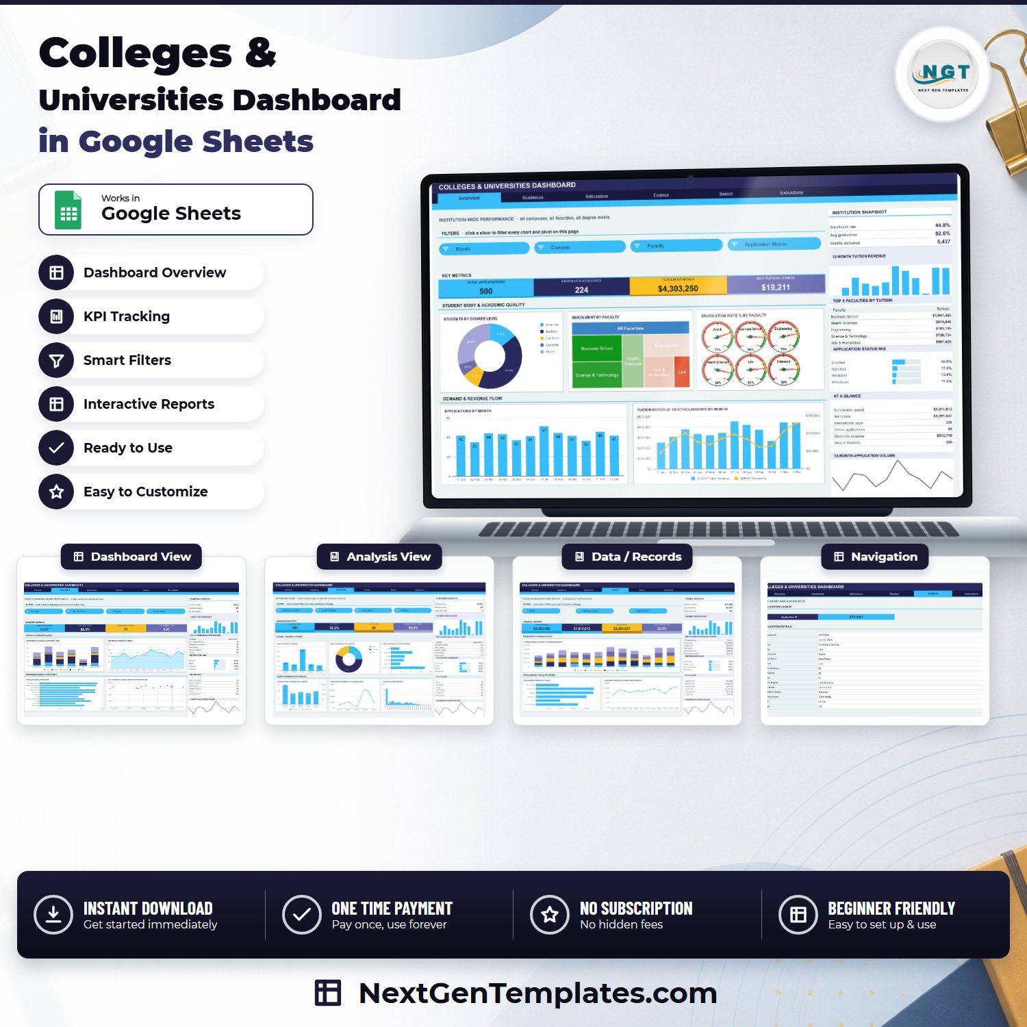

The Colleges & Universities Dashboard in Google Sheets turns a flat application log into six linked report pages. It ships with 500 sample application records spread across 5 campuses, 6 faculties, 11 programs and 5 degree levels, and every chart on every page is driven by native Google Sheets pivot tables and slicers – no add-ons, no monthly fee, nothing to install. Pivots, slicers and formulas already cover 1,000 rows, so you can paste a full intake cycle in and the whole file recalculates on its own. One-time payment, instant download, and a PDF guide with a “Make a copy” link so the file lands in your own Google Drive in about a minute.
Key Features of the Colleges & Universities Dashboard in Google Sheets
- Six working sheets – Overview, Academics, Admissions, Finance, Search and Instructions, plus the Data sheet that feeds them.
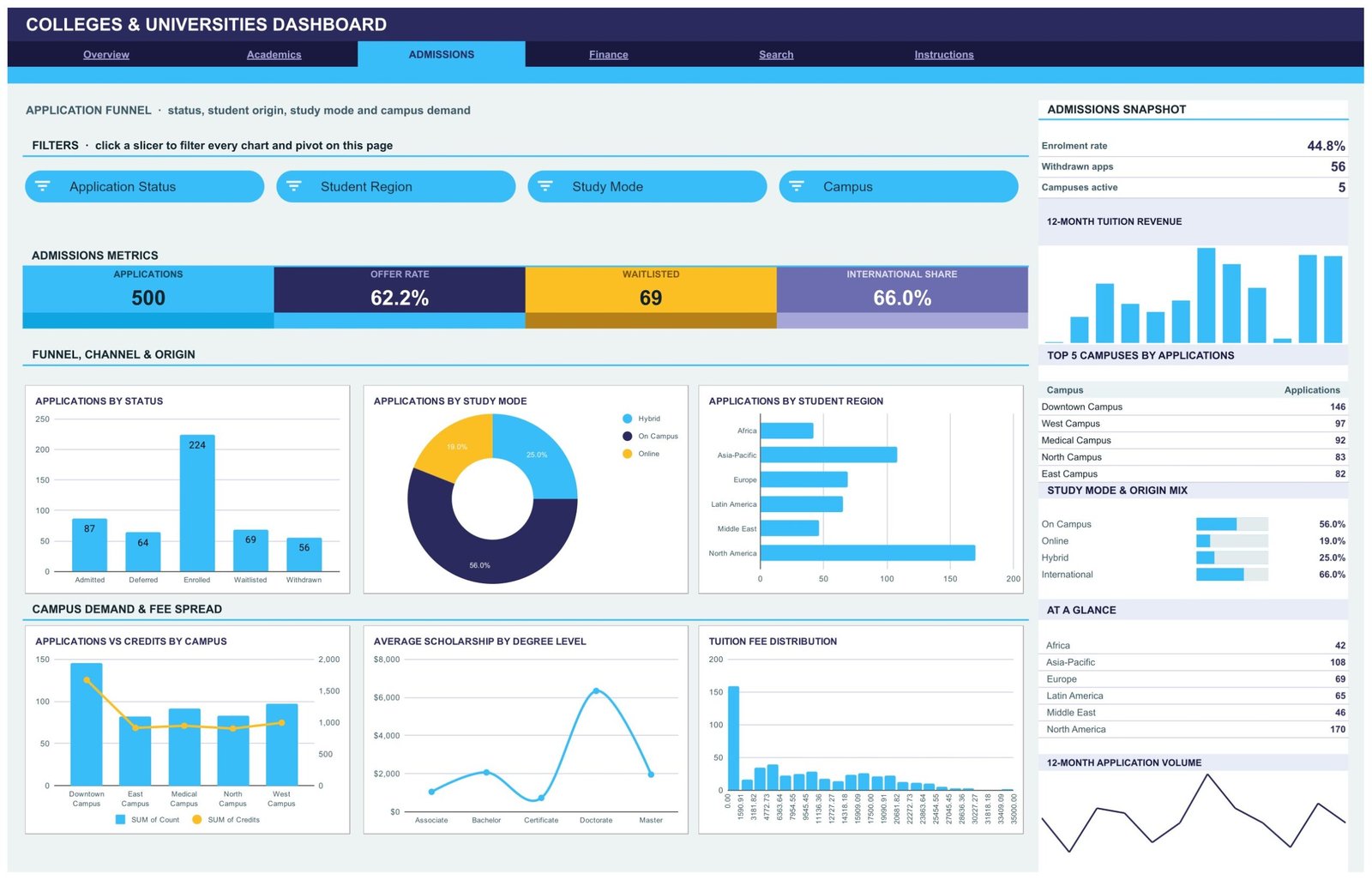
- Fifteen slicers across four report pages – Month, Campus, Faculty and Application Status on Overview; Faculty, Degree Level, Program and Study Mode on Academics; Application Status, Student Region, Study Mode and Campus on Admissions; Month, Funding Source and Degree Level on Finance.
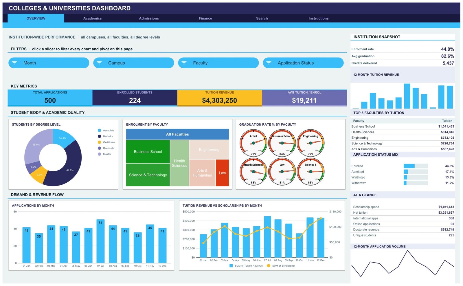
- Sixteen charts including a degree-level donut, a faculty treemap, six graduation-rate gauges, a stacked enrolment column, a credits area chart, a tuition-versus-scholarship combo, a tuition fee histogram and a tuition-versus-graduation scatter.
- Four KPI tiles per report page – Total Applications 500, Enrolled Students 224, Tuition Revenue $4,303,250 and Avg Tuition / Enrol $19,211 on the Overview page, with a different four on each of the other three.
- A right-hand rail on every report page carrying a snapshot block, a 12-month tuition revenue bar strip, a Top 5 table, a percentage mix panel and an At a Glance list.
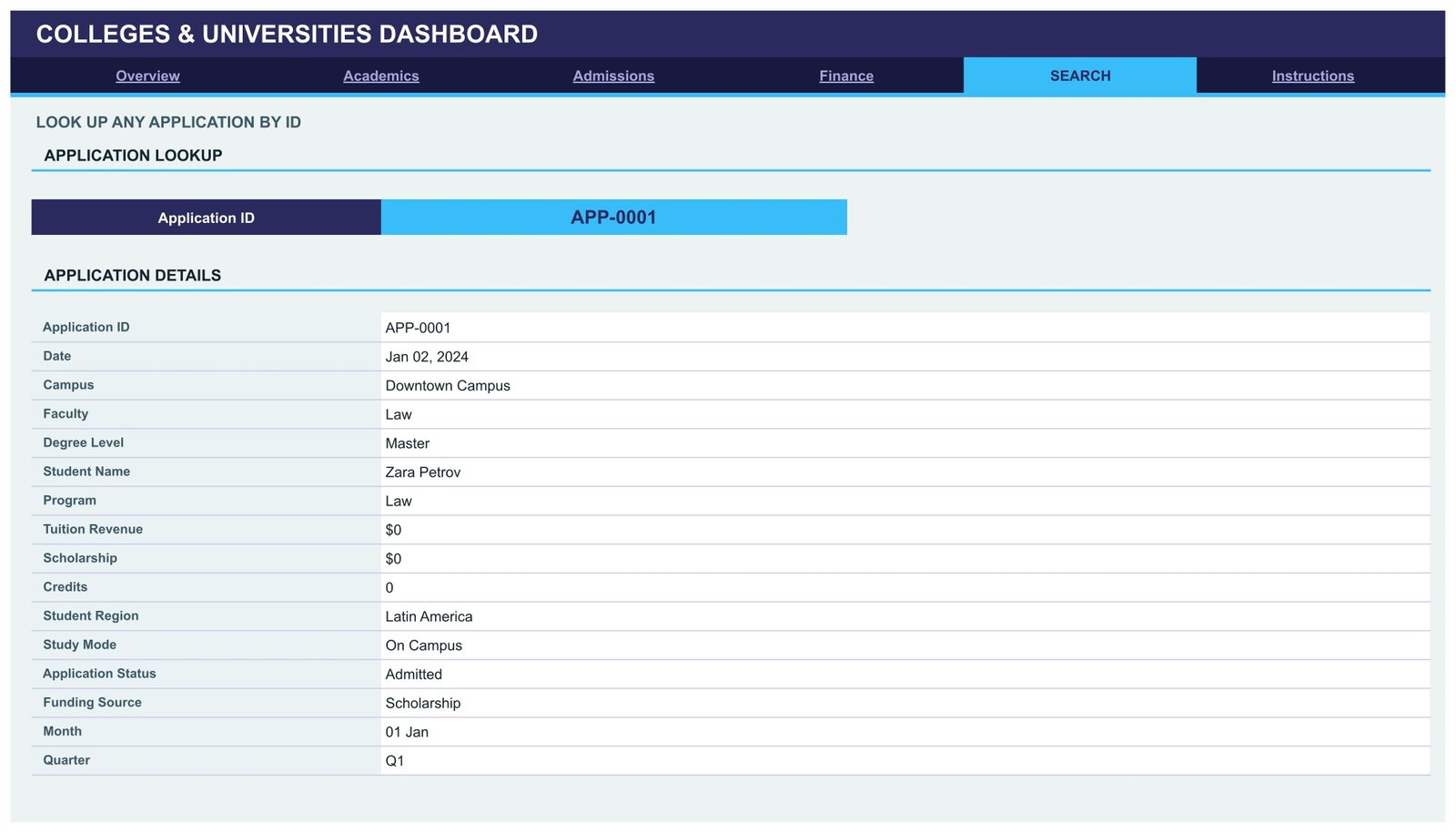
- An Application ID lookup sheet – type any ID such as APP-0001 and the full 16-field record renders underneath it.
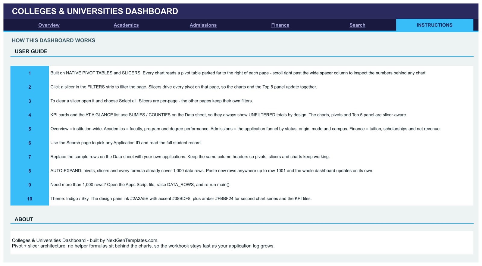
- Auto-expanding to 1,000 rows, with a documented way to go further by raising DATA_ROWS in the source script.
- Indigo and sky theme – ink #2A2A5E, accent #38BDF8, amber #FBBF24 – applied consistently across tiles, charts and headers.
What Is Inside the Colleges & Universities Dashboard in Google Sheets
Overview is the institution-wide page: four KPI tiles, Students by Degree Level, Enrolment by Faculty, Graduation Rate % by Faculty, Applications by Month and Tuition Revenue vs Scholarships by Month, with an Institution Snapshot showing enrolment rate 44.8%, average graduation 82.6% and 5,437 credits delivered.
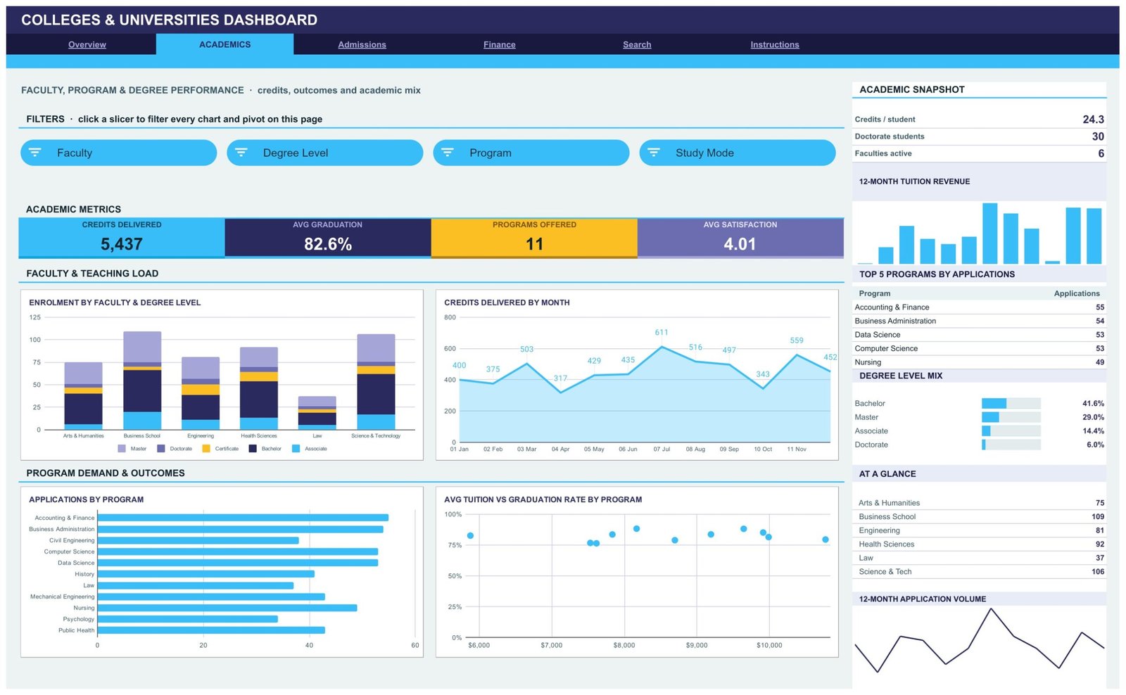
Academics covers faculty, program and degree performance: Credits Delivered 5,437, Avg Graduation 82.6%, Programs Offered 11 and Avg Satisfaction 4.01, with Enrolment by Faculty & Degree Level, Credits Delivered by Month, Applications by Program and Avg Tuition vs Graduation Rate by Program.
Admissions is the application funnel: Applications 500, Offer Rate 62.2%, Waitlisted 69 and International Share 66.0%, broken out by status (Admitted 87, Deferred 64, Enrolled 224, Waitlisted 69, Withdrawn 56), by study mode, by student region and by campus, plus Average Scholarship by Degree Level and a tuition fee distribution.
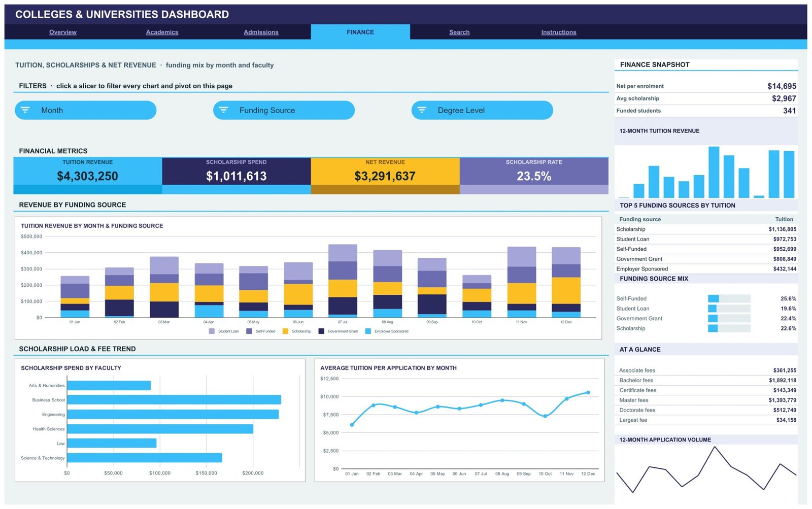
Finance reports Tuition Revenue $4,303,250, Scholarship Spend $1,011,613, Net Revenue $3,291,637 and a Scholarship Rate of 23.5%, with Tuition Revenue by Month & Funding Source, Scholarship Spend by Faculty and Average Tuition per Application by Month.
Search is a single-cell lookup, and Instructions is a ten-point user guide covering slicers, the unfiltered KPI cards, the 1,000-row auto-expand and the theme colours.
What the Data sheet actually holds – read this before you load real records
The Data sheet carries 20 columns: Application ID, Date, Campus, Faculty, Degree Level, Student Name, Program, Tuition Revenue, Scholarship, Credits, Student Region, Study Mode, Application Status, Funding Source, Month, Year, Quarter, Count, Graduation Rate and Satisfaction. The sample rows are applicant-level and the Student Name column is populated with invented names.
That matters. If you replace the sample data with real applicants, this file will hold named individuals alongside their funding source and scholarship amount. Our recommendation is to leave the Student Name column blank and identify people only by an internal code – the Application ID column already does that job, and every chart, pivot and slicer works without a single name. The template stores no date of birth, no contact details, and no disability or disciplinary field, and it never needs one. Decide where the file lives and who it is shared with before you paste anything real into it, in line with your own institution’s data protection policy.
Colleges & Universities Dashboard in Google Sheets vs. Excel vs. a Paid BI Suite – Where This Fits
| This template (Google Sheets) | Excel dashboard build | Paid BI suite (e.g. Tableau Creator) | |
|---|---|---|---|
| Cost | $9.99 one time | $0 if you build it yourself, plus your hours | Roughly $70-$75 per creator per month |
| Platform | Google Sheets in a browser | Desktop Excel | Desktop authoring plus a hosted server |
| Setup time | About 1 minute to copy, then paste your data | Days to build the pivots and charts | Days, plus licence procurement |
| Real-time team collaboration | Yes, native Google Sheets editing | Only via OneDrive co-authoring | Yes, on the paid server |
| Mobile access | Yes, Google Sheets app | Limited | Yes, with a licence |
| Customisable fields | Yes – it is a spreadsheet | Yes | Yes, with modelling work |
| Share with a link | Yes | No | Only to licensed viewers |
| Year-1 cost at 5 users | $9.99 | $0 plus build time | Roughly $4,200 |
| Application ID record lookup | Built in on the Search sheet | Build it yourself | Build it yourself |
| Live link to your student record system | No – you paste or import an export | No | Possible with a connector and a data engineer |
A student information system is a different category of product altogether. An SIS is the system of record for enrolment, timetabling and transcripts; this file is a reporting layer you point at an export from it. The two are not substitutes, and this listing does not price itself against one.
Who This Template Is For – and Who It Is Not For
It is for planning and admissions officers who want a shareable weekly view of intake, faculty administrators comparing programs on credits and satisfaction, and finance teams tracking tuition against scholarship spend by funding source. It suits an institution or a faculty that already exports application data and wants it read, not re-keyed.
It is not for anyone who needs a live connection to their SIS or CRM – this is a static file you refresh by pasting. It does not make admissions decisions, score applicants, predict attainment, forecast retention, or produce anything you could submit to a statutory return, an accreditation review or a ranking body. Those numbers come from your registrar’s system, not from a spreadsheet template. It is also not the right tool if your dataset runs to hundreds of thousands of rows; Google Sheets will slow down long before that.
How to Use the Colleges & Universities Dashboard in Google Sheets
- Buy, download the PDF guide, and click the “Make a copy” link inside it to create your own editable copy in Google Drive.
- Open the Data sheet and look at the 500 sample rows so you can see the shape of each column before you touch anything.
- Replace the sample rows with your own export, keeping the column headers exactly as they are – the pivots, slicers and charts read them by name.
- Leave Student Name blank and rely on Application ID unless you have a documented reason to hold names in this file.
- Click any slicer in the FILTERS strip to filter every chart and pivot on that page. Slicers are per page, so each sheet keeps its own filters; open a slicer and choose Select all to clear it.
- Remember the KPI cards and the At a Glance list use SUMIFS and COUNTIFS on the Data sheet, so they deliberately show unfiltered totals while the charts and the Top 5 panel respond to slicers.
- Use the Search sheet to pull any single application record by its ID.
Real-World Use Cases
Priya, admissions manager at a five-campus university. She exports the application log every Monday, pastes it in, and filters the Admissions page to Waitlisted to see which campuses are sitting on offers. The funnel counts and the region bar chart give her the two numbers her director asks for before the meeting starts.
Daniel, faculty administrator for Science & Technology. He filters the Academics page to his own faculty and reads credits delivered by month against average satisfaction, then uses Applications by Program to see which of his eleven programs are pulling demand and which are flat.
Aisha, finance analyst. She uses the Finance page to split tuition revenue by funding source across the year and watches scholarship spend by faculty against the 23.5% scholarship rate, so the bursary conversation starts from a chart rather than a spreadsheet argument.
Frequently Asked Questions
Do I need Excel or any add-on to use this?
No. It runs entirely in Google Sheets using native pivot tables, slicers and charts. There is nothing to install.
How many records can it handle?
Pivots, slicers and formulas already cover 1,000 data rows. Paste new rows anywhere up to row 1001 and everything updates. The Instructions sheet explains how to raise that limit in the source script if you need more.
Does it connect to my student information system?
No. It is a static file. You paste or import an export from your own system; there is no live connection, no API and no sync.
Does it store student names?
The sample data includes a Student Name column filled with invented names. We recommend you leave that column blank in your own copy and identify records by the Application ID instead. Nothing in the dashboard depends on names.
Can it tell me who to admit or predict who will graduate?
No, and it does not try to. It reports what you already recorded. Admissions decisions, attainment and retention modelling belong to your institution’s own processes and systems.
Can my whole team use it at once?
Yes. It is an ordinary Google Sheets file, so you share it by link and colleagues can view or edit with the permissions you set.
Can I change the colours and add my own charts?
Yes. It is an unlocked spreadsheet. The Instructions sheet lists the three theme colours so you can re-skin it to your institution’s palette.
About the Author
Built by PK – Microsoft Certified Professional with 15+ years of Excel, Google Sheets, and Power BI experience. Founder of NextGenTemplates, reaching 300K+ subscribers across YouTube channels. Every template is hand-built and tested before release.
Explore Related Templates
- Colleges & Universities Dashboard in Excel – the same analysis for people who live in desktop Excel.
- Colleges & Universities Dashboard in Power BI – a Power BI build with a full semantic model.
- Colleges & Universities KPI Dashboard in Excel – a different product: a month-picker KPI scorecard with traffic lights, not an analytical dashboard.
- Colleges & Universities KPI Dashboard in Power BI – the Power BI version of that KPI scorecard.
- Student Academic Insights Dashboard in Google Sheets – course and cohort level rather than institution level.
- Browse more in Google Sheets Dashboards or the wider Google Sheets category.
Get the Colleges & Universities Dashboard in Google Sheets for $9.99 – one payment, instant download, yours to keep and edit. Add it to your cart above, open the PDF, click “Make a copy”, and paste your first export in.
Watch the step-by-step video Demo:
Last updated: 1 September 2026.
Compatibility and Requirements
- Works in Google Sheets. You need a free Google account and a web browser.
- The dashboard uses native Google Sheets pivot tables, slicers and charts. Google explains chart creation in Add & edit a chart or graph.
More Questions About This Template
Is there an Excel or Power BI version of this dashboard?
Yes. See the Colleges & Universities Dashboard in Excel and the Colleges & Universities Dashboard in Power BI.
Which pages does the dashboard have?
Overview, Academics, Admissions and Finance report pages, a Search sheet for looking up one application by ID, and an Instructions sheet. The Data sheet feeds all of them.
Which filters can I use on the Finance page?
The Finance page has slicers for Month, Funding Source and Degree Level. They filter the charts on that page.
Can I look up a single application?
Yes. Type an Application ID such as APP-0001 on the Search sheet and the full record for that application appears underneath.
























Reviews
There are no reviews yet.