

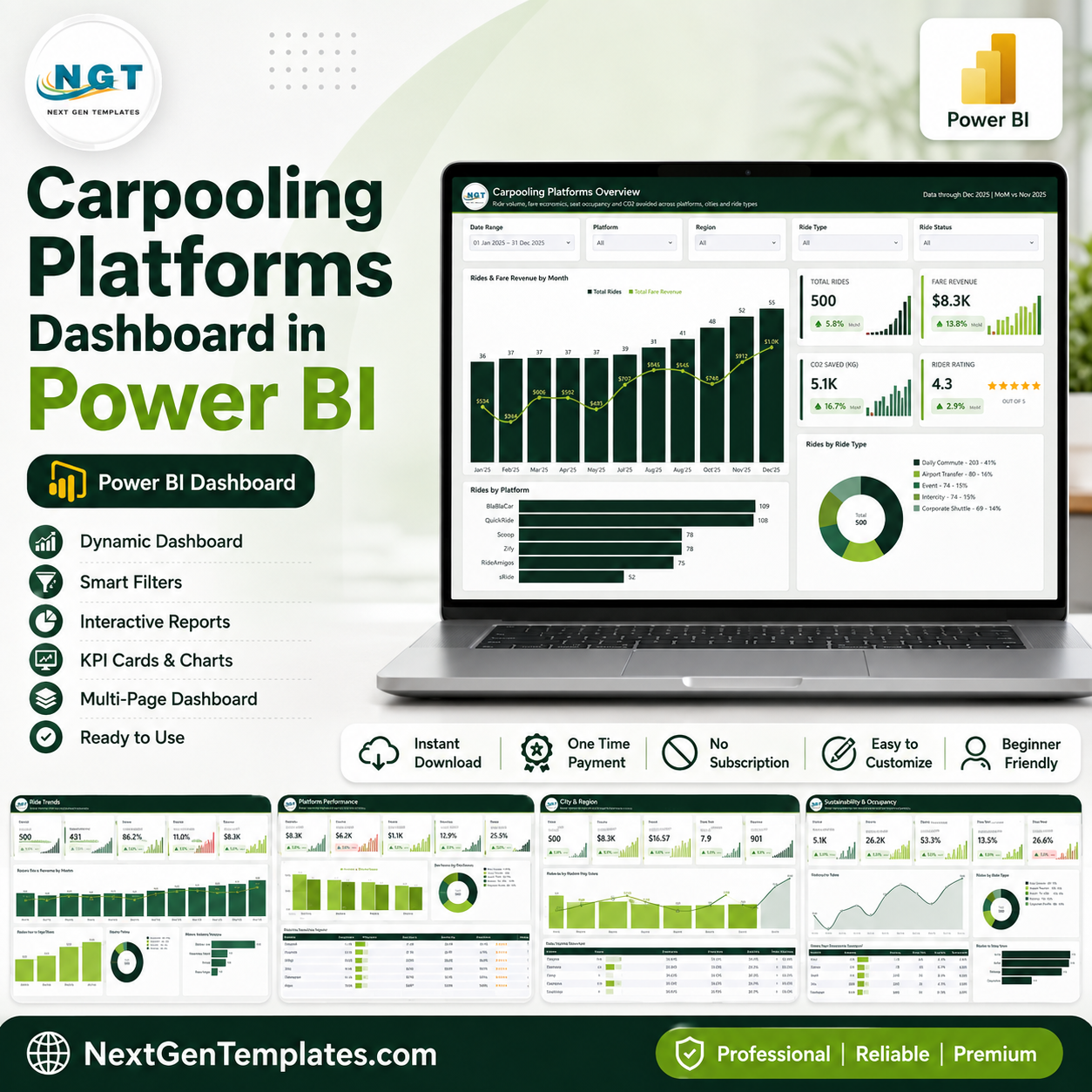
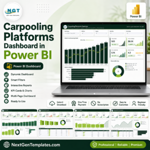
The Carpooling Platforms Dashboard in Power BI turns a ride-level export into five slicer-filtered report pages backed by an 80+ measure semantic model. The shipped file carries 500 sample ride records across 6 platforms, 7 cities, 5 ride types and 21 columns, and every number you see on screen is a DAX measure rather than a typed value. Swap the sample table for your own export, refresh, and all 5 pages, 3 scorecards and 24 KPI cards recalculate together. Built by PK, a Microsoft Certified Professional whose YouTube channels reach 300K+ subscribers. Instant download, lifetime access, free video tutorials, and the same dashboard is also available in Microsoft Excel if your team does not run Power BI Desktop.
Every figure in the screenshots below is sample data generated for the template. The model records ride-level operating metrics only – it is a reporting layer, not a rider or driver database.
Key Features of the Carpooling Platforms Dashboard in Power BI
- A real semantic model, not a flat sheet. One Data table (21 columns) joined to a generated Date table through a single active relationship, so month, quarter and year slicing behaves consistently on every page.
- 80+ DAX measures already written.
Ride Completion %,Cancellation Rate %,Platform Take Rate %,Net Margin %,Seat Fill Rate %,Full Occupancy %,EV Ride Share %,CO2 Saved Per Ride,Avg Revenue Per Ride,Revenue Per SeatandRevenue Per Kmare all defined in the model – you never open the formula bar unless you want to. - Month-on-month deltas built in. A parallel set of
... MoM %measures compares the latest month in your data against the one before it, so the header line and every KPI arrow update themselves when new rows arrive. - SVG KPI cards. Each card renders as a measure-driven SVG: the big number, a green or red MoM chip, and a 12-month sparkline that inherits the current slicer selection.
- Slicers synced across pages. Date Range, Platform, Region and Ride Type follow you from page to page; each page adds one filter of its own – Ride Status, Plan, Vehicle Type, Rider Segment or Booking Channel.
- Hidden Details drillthrough. Right-click any platform, city or ride type and drill through to the underlying ride rows without cluttering the page navigation.
- Two tooltip report pages. Hovering a bar or a line point opens a small report page instead of a plain value list.
- Scorecard tables with data bars and star ratings. The platform, city and vehicle scorecards use measure-driven bars and a
Avg Rider Rating Starsmeasure rather than static images.
What’s Inside the Carpooling Platforms Dashboard in Power BI
Page 1 – Carpooling Platforms Overview
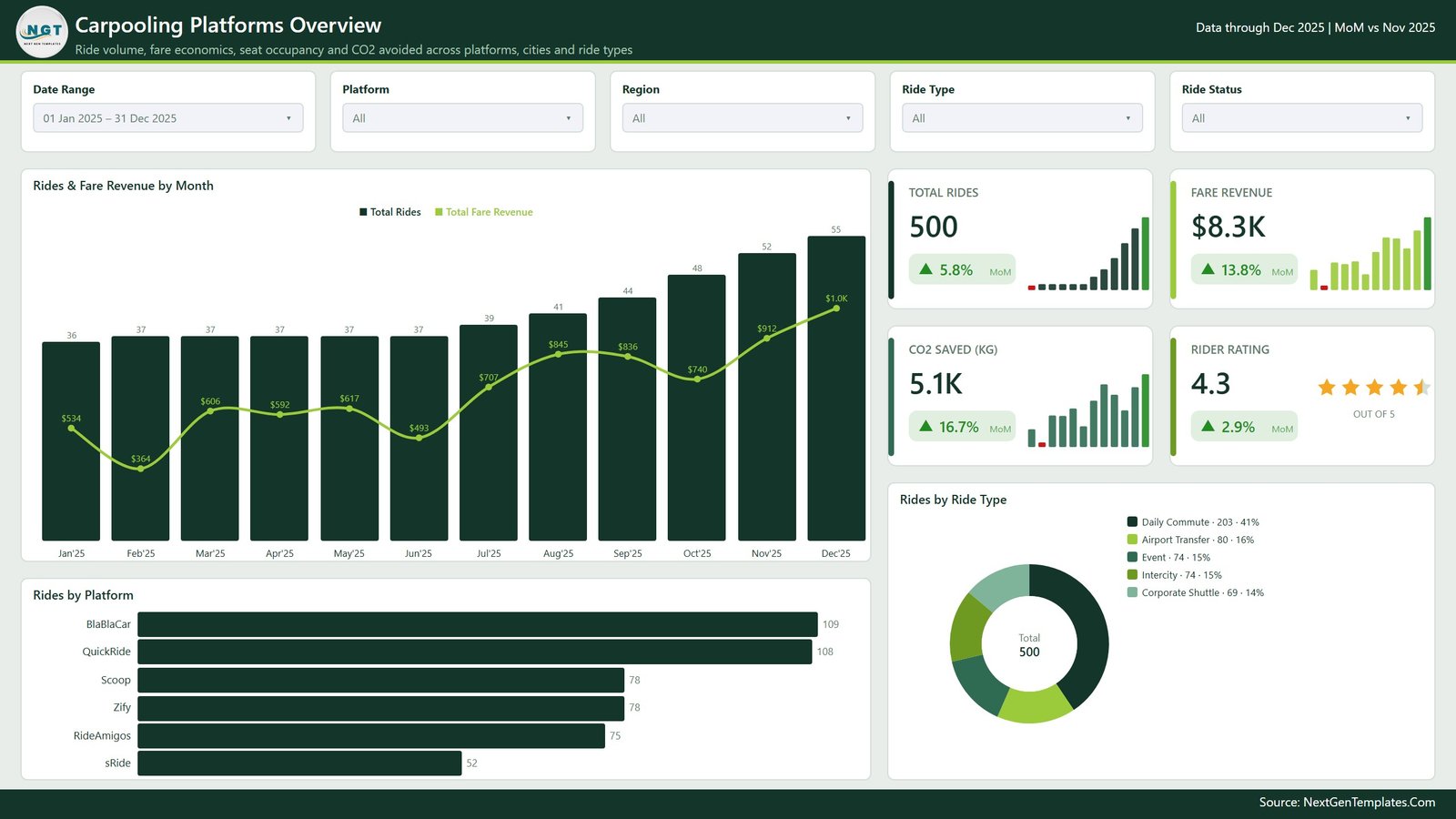
The landing page answers “how big is this, and is it growing”. Four KPI cards carry Total Rides, Fare Revenue, CO2 Saved (KG) and Rider Rating, each with its MoM chip. Rides & Fare Revenue by Month puts ride counts as columns against a fare-revenue line on a secondary axis, Rides by Platform ranks the six platforms, and Rides by Ride Type splits daily commute, airport transfer, event, intercity and corporate shuttle demand.
Page 2 – Ride Trends
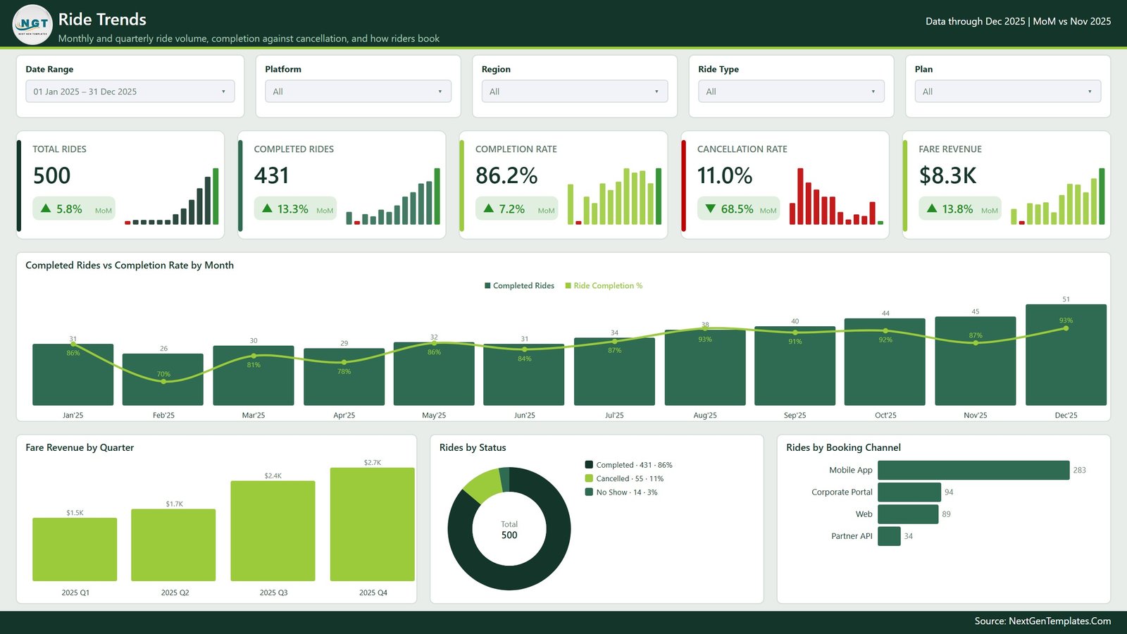
Five cards – Total Rides, Completed Rides, Completion Rate, Cancellation Rate and Fare Revenue – sit above Completed Rides vs Completion Rate by Month, which is the page that tells you whether growth is real or just more bookings falling through. Fare Revenue by Quarter, a Rides by Status donut and Rides by Booking Channel finish the page, so you can see at a glance whether app, web, corporate portal or partner API traffic is driving the change.
Page 3 – Platform Performance
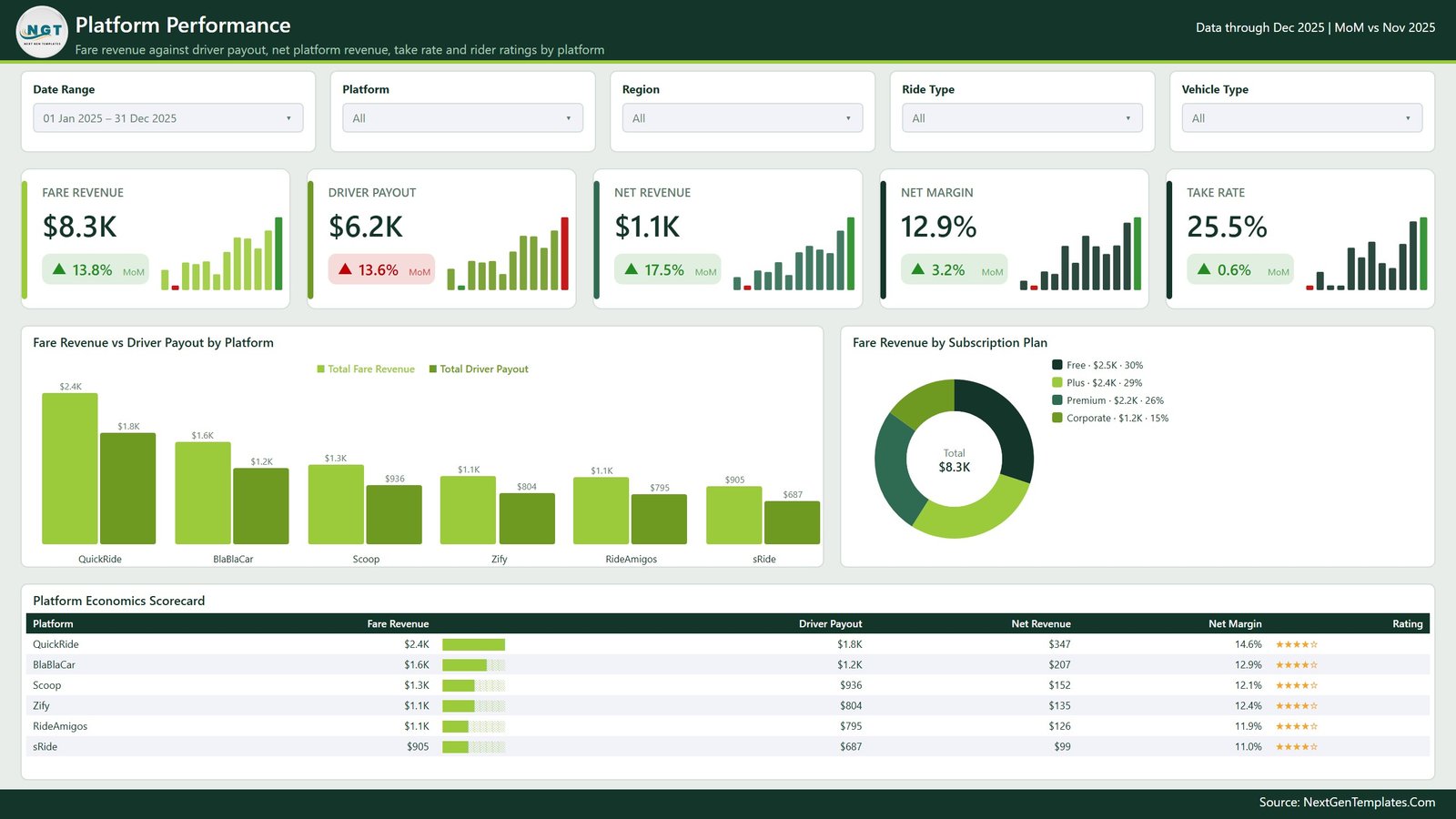
The unit-economics page. Fare Revenue, Driver Payout, Net Revenue, Net Margin and Take Rate run across the top, Fare Revenue vs Driver Payout by Platform pairs the two bars per platform, and Fare Revenue by Subscription Plan shows how much of the total comes from Free, Plus, Premium and Corporate riders. Below them, the Platform Economics Scorecard lists every platform with revenue, payout, net revenue, margin and a star rating in one sortable table.
Page 4 – City & Region
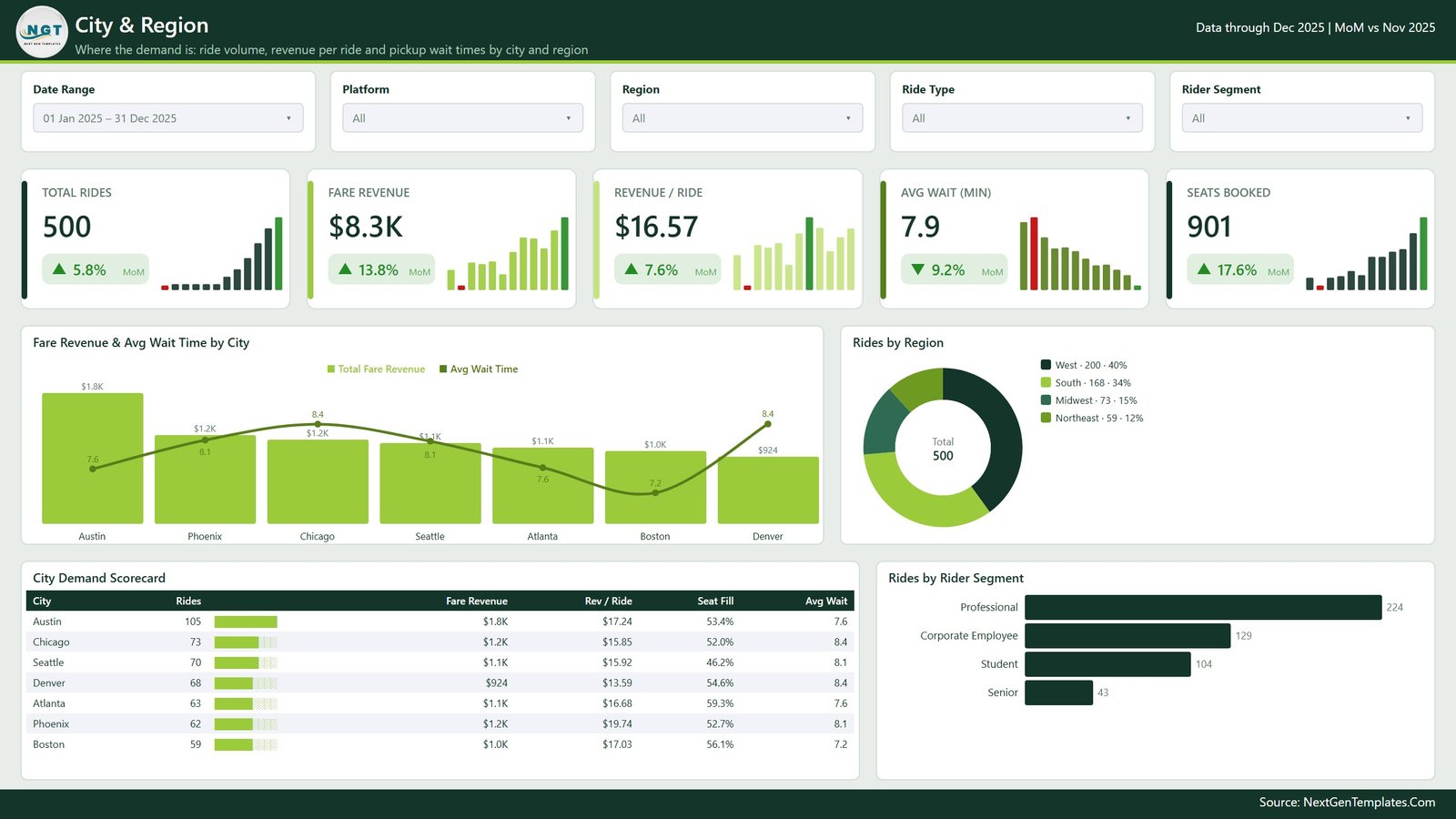
Where the demand actually is. Total Rides, Fare Revenue, Revenue / Ride, Avg Wait (min) and Seats Booked head the page; Fare Revenue & Avg Wait Time by City overlays a wait-time line on revenue columns so you can spot a city earning well while riders queue. The City Demand Scorecard adds seat fill and average wait per city, and Rides by Region plus Rides by Rider Segment break the same 500 rides down by geography and by professional, corporate, student or senior riders.
Page 5 – Sustainability & Occupancy
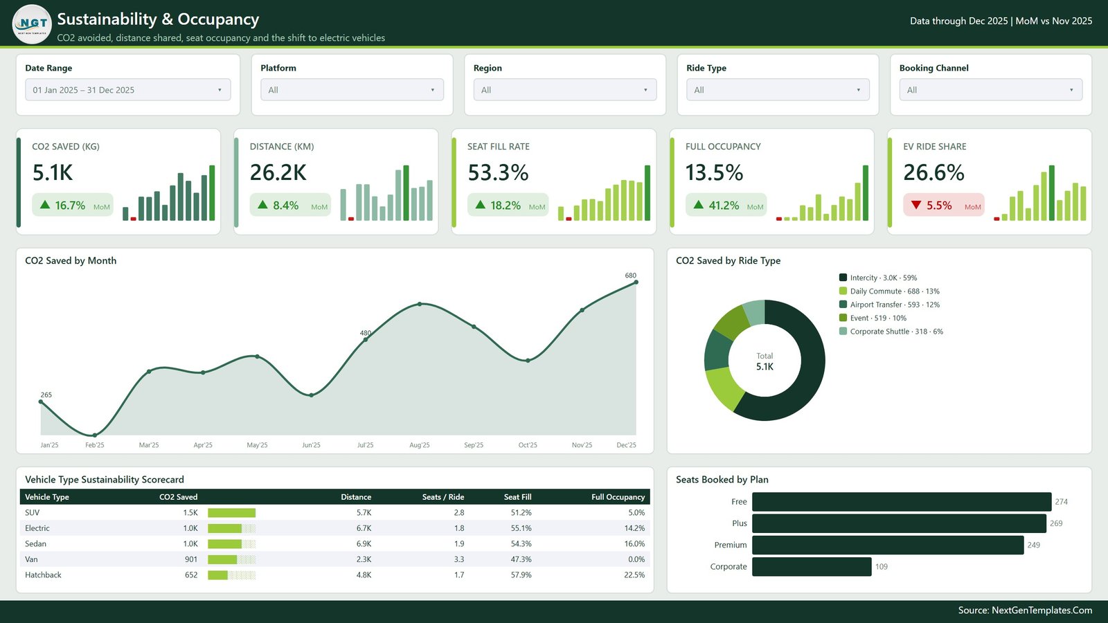
The page most carpooling operators need for their impact reporting. CO2 Saved (KG), Distance (KM), Seat Fill Rate, Full Occupancy and EV Ride Share sit above a CO2 Saved by Month area chart and a CO2 Saved by Ride Type donut. The Vehicle Type Sustainability Scorecard compares SUV, electric, sedan, van and hatchback rides on CO2 saved, distance, seats per ride, seat fill and full-occupancy share, and Seats Booked by Plan closes the page.
Behind the pages
A sixth navigation page links to the wider NGT Power BI catalogue, and three further pages stay hidden: a Details drillthrough that shows the ride rows behind any selection, plus two tooltip pages that appear on hover. The zip also contains the sample Data.xlsx source and a PDF user manual.
Carpooling Platforms Dashboard in Power BI vs. Tableau vs. Paid Mobility SaaS – Where This Fits
| This template (Power BI) | Tableau / Qlik build | Paid mobility SaaS | |
|---|---|---|---|
| Cost | 29.99 one-off (17.99 on sale) | Roughly 70+ per user per month for Tableau Creator | Typically 200-1,000+ per month |
| Platform | Power BI Desktop (free) or Power BI Service | Tableau Desktop or Qlik Sense | Vendor web app |
| Setup time | Minutes – repoint the Data query and refresh | Days to model and build the sheets yourself | Weeks of onboarding plus a data feed |
| Real-time team collaboration | Yes, once published to a Power BI workspace | Yes, with a Server or Cloud licence | Yes |
| Mobile access | Power BI mobile app | Vendor mobile app | Vendor mobile app |
| Customizable fields | Full – it is your model, edit any measure | Full, but you build it from scratch | Limited to what the vendor exposes |
| Share with link | Yes, via the Power BI Service | Yes, with a server licence | Yes |
| Year-1 cost at 5 users | 29.99 plus Power BI licensing you already pay | 4,000+ | 2,400-12,000+ |
| Carpool metrics ready on day one | Seat fill, full occupancy, take rate, CO2 per ride | You write every measure | Only if the vendor tracks them |
| Owns your data | Yes – the file lives on your machine | Yes | No, it lives in the vendor’s cloud |
Who This Template Is For – and Who It’s Not For
A good fit if you are: an operations or BI analyst at a ride-sharing or carpooling platform who already exports rides to Excel or CSV; a corporate mobility manager reporting on an employee shuttle programme; a sustainability lead who needs CO2-avoided and occupancy numbers in a repeatable format; a consultant or student who wants a finished Power BI model to study and adapt.
Not a good fit if you need: live GPS tracking or dispatch – this is a reporting layer over completed rides, not an operations console; a rider or driver CRM – there are no personal identifiers in the model and none should be added; automatic refresh from a ride-hailing API – you supply the export, or wire your own Power Query connector; or a dashboard you can open without Power BI Desktop, in which case take the Excel version instead.
How to Use the Carpooling Platforms Dashboard in Power BI
- Unzip and open. Extract the download and open the .pbix in Power BI Desktop. The five pages load with the 500 sample rides already in place.
- Walk the sample first. Click through Overview to Sustainability with the sample data so you can see what each measure is meant to say before you replace anything.
- Match your export to the Data columns. Ride ID, Ride Date, Platform, City, Region, Ride Type, Vehicle Type, Booking Channel, Subscription Plan, Rider Segment, Ride Status, Seats Offered, Seats Booked, Trip Distance, Wait Time, Fare Revenue, Discount Amount, Driver Payout, Operating Cost, CO2 Saved, Rider Rating.
- Repoint the query. In Transform Data, change the source of the Data query to your own file or database, keep the column names, and close and apply.
- Refresh and check the header. The report header shows the latest month in your data and the month it is comparing against – if that line looks wrong, your date column is the thing to fix.
- Slice and drill. Use the synced slicers to narrow to a platform or region, right-click a bar to drill through to the ride-level Details page, and hover any point for its tooltip page.
- Publish. Push to a Power BI workspace so the team reads the same numbers, and set a scheduled refresh if the source supports it.
Real-World Use Cases
Nadia, operations lead at a city carpooling app. Her weekly question is whether cancellations are eating growth. She opens Ride Trends, sets the slicer to the last quarter, and reads Completion Rate against Completed Rides in one chart instead of reconciling two exports. When a city looks off she drills through to the ride rows and sends the list to the city manager.
Marcus, mobility programme manager at a 900-person employer. He runs a corporate shuttle and needs to justify it every budget cycle. Sustainability & Occupancy gives him CO2 saved, seat fill rate and the share of rides at full occupancy; City & Region tells him which office sites actually use the scheme. He publishes the report to a workspace so HR can read it without asking him.
Priya, finance analyst at a mid-size platform. She lives on Platform Performance. Take rate, payout ratio and net margin per platform are already measures, so her monthly pack is a filter change and an export rather than a rebuilt pivot.
Frequently Asked Questions
Which version of Power BI do I need?
Power BI Desktop, which Microsoft gives away free. The file was built and rendered on a current Desktop release. You only need a paid licence if you want to publish and share through the Power BI Service.
Are the numbers in the screenshots real?
No. Every figure is sample data generated for the template – 500 synthetic ride records with invented platform names. Nothing in the file comes from a live carpooling service.
Does the model store rider or driver personal data?
No. The Data table holds ride-level operating fields only: dates, platform, city, seats, distance, wait time, money and a rating. There are no names, phone numbers or addresses, and we would not recommend adding them – keep personal identifiers in your source system and report on aggregates here.
Can I change the KPIs and add my own measures?
Yes. Every measure sits in the Data table in plain DAX and can be edited, duplicated or removed. The KPI cards are SVG measures, so a new card is a copy of an existing one with the underlying measure swapped.
Will it work with more than 500 rows?
Yes. 500 rows is only the sample. The measures use standard aggregations and DIVIDE, so they scale to hundreds of thousands of rides in the Power BI import engine.
What if I do not have Power BI at all?
Take the Carpooling Platforms Dashboard in Excel – same five pages, same metric set, built on pivot tables and slicers instead of a semantic model.
What exactly is in the download?
One zip containing the .pbix report, the sample Data.xlsx source, and a PDF user manual covering the pages, the slicers and how to repoint the query.
About the Author
Built by PK – Microsoft Certified Professional with 15+ years of Excel, Google Sheets, and Power BI experience. Founder of NextGenTemplates, reaching 300K+ subscribers across YouTube channels. Every template is hand-built and tested before release.
Explore Related Templates
- Carpooling Platforms Dashboard in Excel – the same dashboard for teams without Power BI Desktop.
- School Transportation Services Dashboard in Power BI – route, fleet and student ridership reporting.
- Railway Tech Startups Dashboard in Power BI – a rail-side view of the same mobility market.
- Postal Services Dashboard in Power BI – delivery volume, cost and service-level tracking.
- Airline Loyalty Programs Dashboard in Power BI – travel-side loyalty and revenue analysis.
- Transportation Services Dashboard in Google Sheets – a lighter, browser-based companion for sharing with non-BI colleagues.
- Browse the full Power BI library or jump straight to Power BI Dashboards.
Download the Carpooling Platforms Dashboard in Power BI today and start the month with a model that already knows what seat fill rate, take rate and CO2 saved per ride mean. Instant download, lifetime access, and free tutorials on youtube.com/@PKAnExcelExpert.
Last updated: 14 August 2026.




















Reviews
There are no reviews yet.