

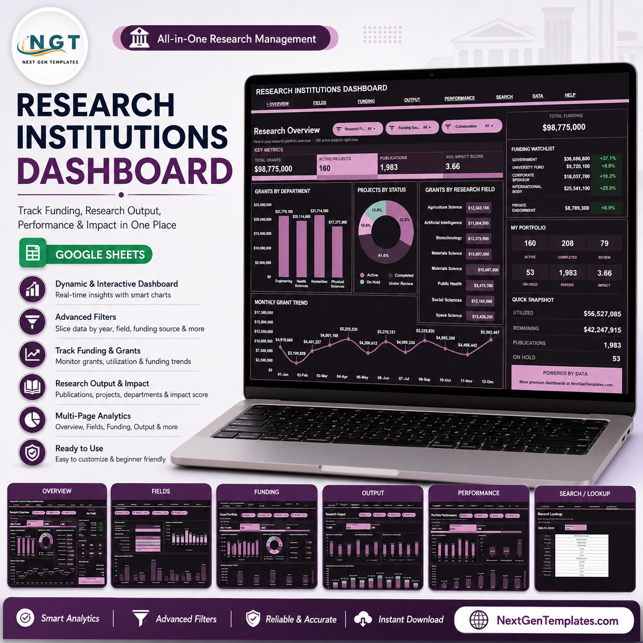

The Research Institutions Dashboard in Google Sheets helps research offices, grant administrators, program directors, and institutional leaders turn scattered project records into a clear reporting dashboard. NSF NCSES reported that university R&D expenditures reached over USD 117 billion in FY 2024, up 8.1%, so grant visibility and portfolio control matter. Built by PK for a 300K+ subscriber learning audience, this one-time purchase gives you an editable Google Sheets dashboard before you spend time or budget on a custom grant reporting system.
Key Features of Research Institutions Dashboard in Google Sheets
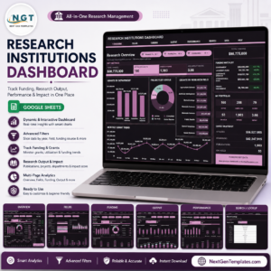
- Seven Google Sheets tabs: Overview, Field Performance, Grant Portfolio, Research Output, Portfolio Performance, Search Sheet, and Data Sheet.
- High-level KPI cards: Track Total Grants, Active Projects, Publications, and Avg Impact Score from one overview page.
- Multiple slicers: Filter the dashboard quickly by research field, department, funding source, collaboration, status, priority, lead researcher, and month.
- Grant portfolio analytics: Review grant amount, funds utilized, funding source mix, collaboration patterns, and monthly utilization.
- Research output views: Monitor publications by month, collaboration, department, and impact score trend.
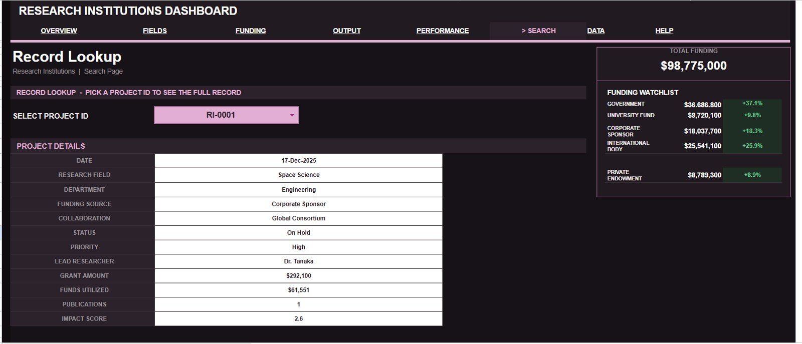
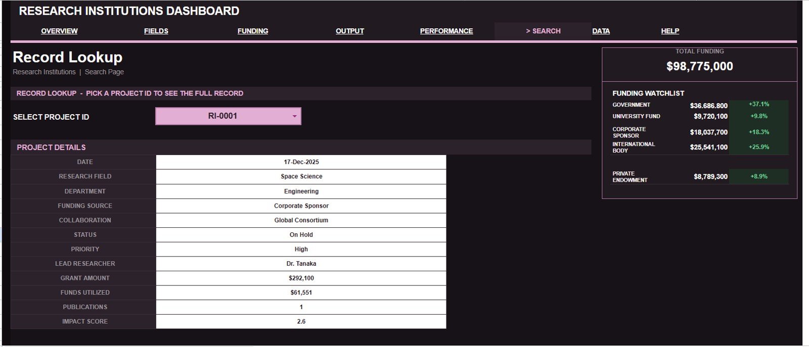
- Project lookup: Select a Project ID and return the full project record without scanning the Data Sheet.
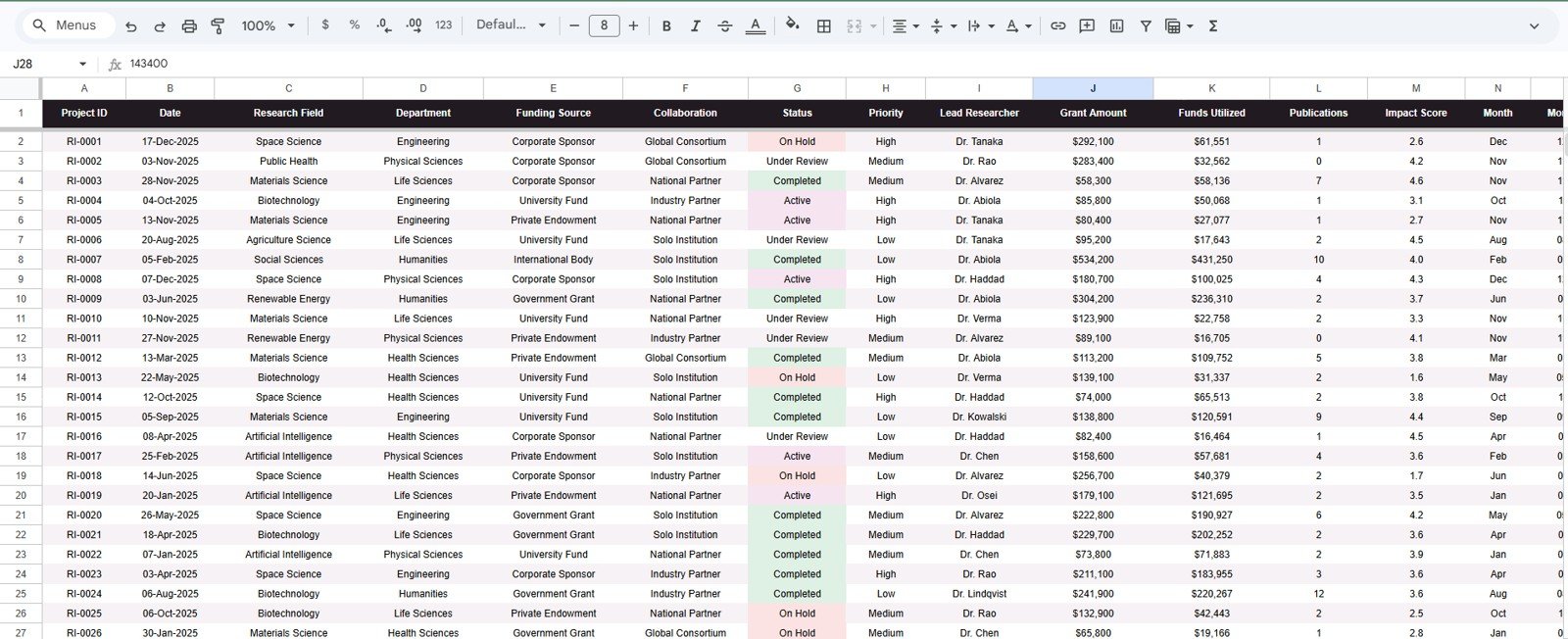
- Editable source data: Replace the sample records in the same column format and keep charts, cards, slicers, and lookup views connected.
What’s Inside the Research Institutions Dashboard in Google Sheets
1 – Overview Page
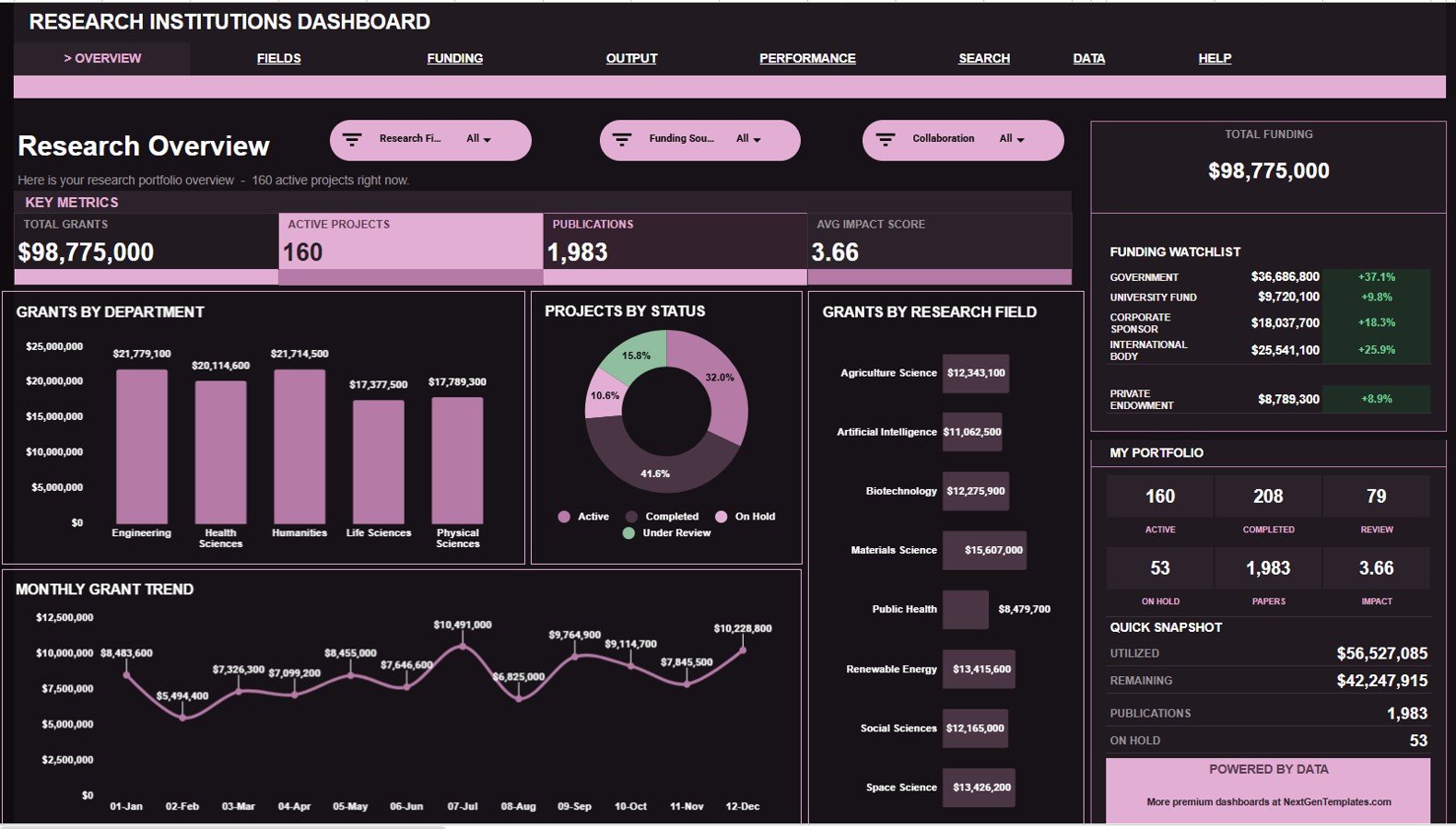
The Overview page gives decision-makers a quick snapshot of research activity. The top cards show Total Grants, Active Projects, Publications, and Avg Impact Score, while slicers help users filter the dashboard quickly during review meetings.
Total Grants by Department: This chart compares grant amount across departments. It helps leaders see where funding is concentrated and which departments may need a closer portfolio review.
Projects by Status: This chart separates active, completed, pending, delayed, or other project groups. It helps managers monitor delivery progress and open workload.
Total Grants by Research Field: This chart shows grant distribution across research fields. It helps institutions understand which disciplines are attracting the most funding.
Monthly Grant Amount by Month: This chart tracks grant amount month by month. It helps users spot funding seasonality, spikes, and quieter periods.
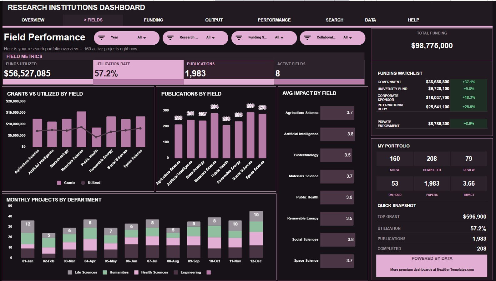
2 – Field Performance
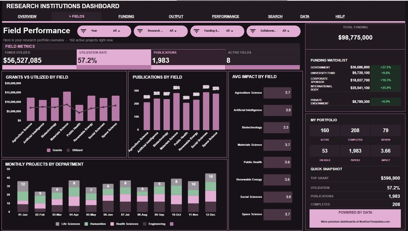
This sheet compares research fields across funding, utilization, publications, impact, and department activity.
Grants and Funds Utilized by Research Field: This chart compares grant amount with funds utilized for each field. It helps show whether funded areas are also converting budget into active research work.
Publications by Research Field: This chart counts publications by field. It helps identify which research areas are producing the most visible output.
Avg Impact Score by Research Field: This chart compares average impact score across fields. It helps leaders review output quality alongside funding volume.
Monthly Projects by Department: This chart shows project count movement by department over time. It helps users spot workload changes and department-level activity patterns.
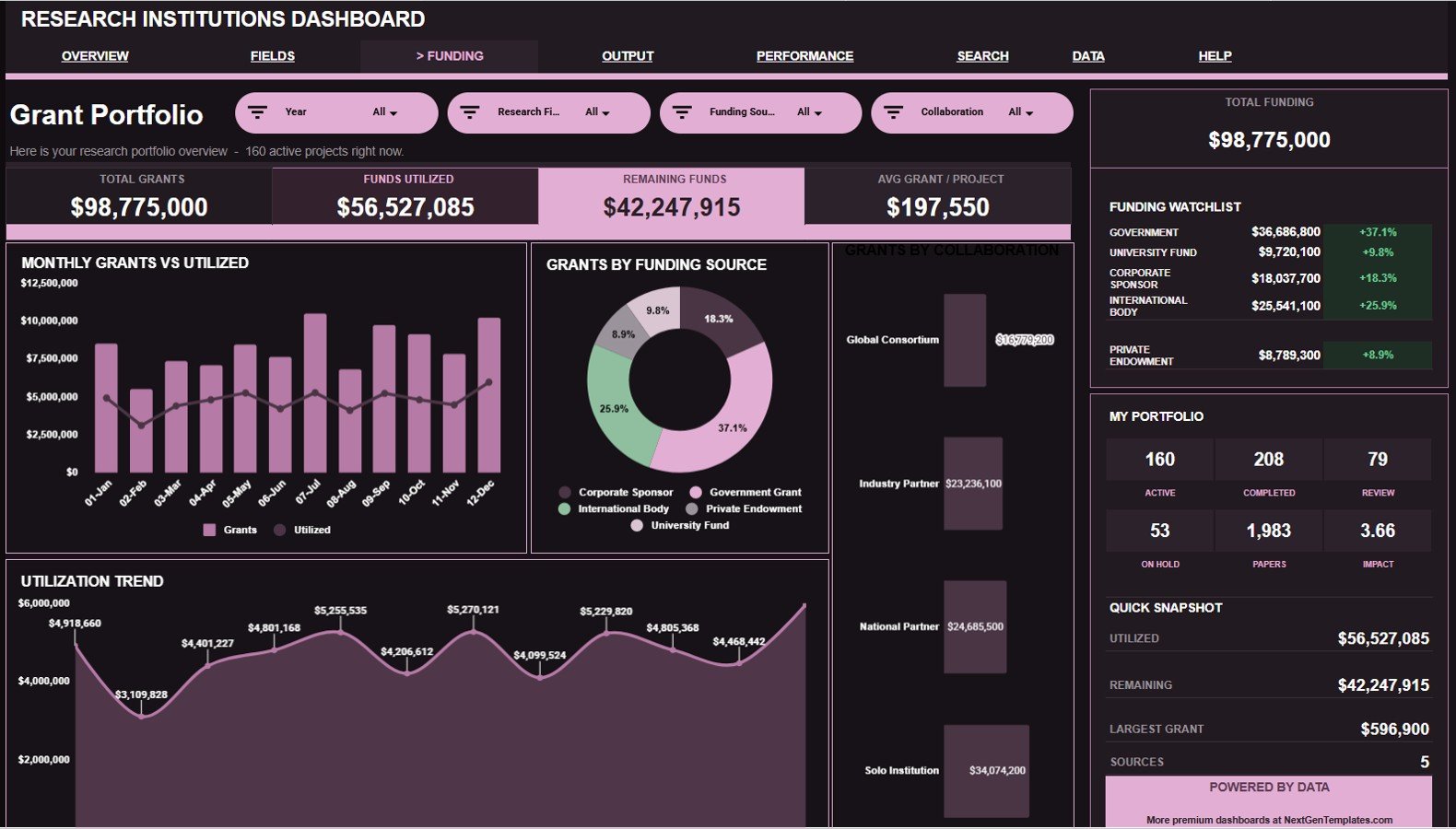
3 – Grant Portfolio
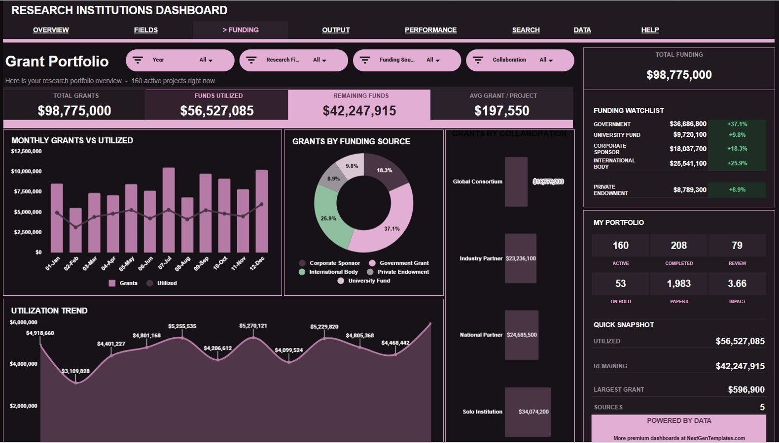
This tab is built for finance, grants, and program teams that need a clearer view of grant sources, collaboration type, and utilization timing.
Grants and Funds Utilized by Month: This chart compares grant amount with utilized funds by month. It helps reveal whether spending is keeping pace with awarded funding.
Total Grants by Funding Source: This chart breaks grant amount down by source. It helps teams understand dependence on government, private, internal, nonprofit, or other funding channels.
Total Grants by Collaboration: This chart compares grants by collaboration type. It helps show whether internal, external, industry, or cross-institution work is driving funding.
Funds Utilized by Month: This trend shows utilization movement over time. It helps grant managers review burn rate and flag slow-spending periods.
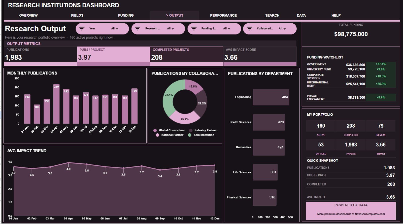
4 – Research Output
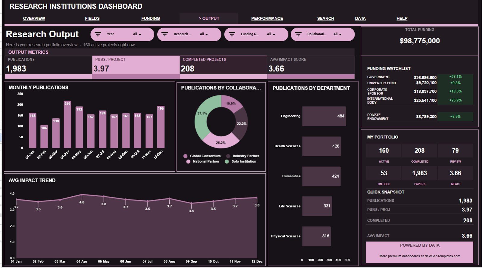
The Research Output tab focuses on publication activity and impact trends across departments, collaboration types, and months.
Publications by Month: This chart shows publication volume over time. It helps research offices identify productive months and publication slowdowns.
Publications by Collaboration: This chart compares publication counts by collaboration type. It helps show whether collaborative work is producing more research output.
Publications by Department: This chart ranks departments by publication count. It helps leaders compare productivity across academic or research units.
Avg Impact Score by Month: This chart tracks impact score by month. It helps teams review whether research quality indicators are improving or slipping.
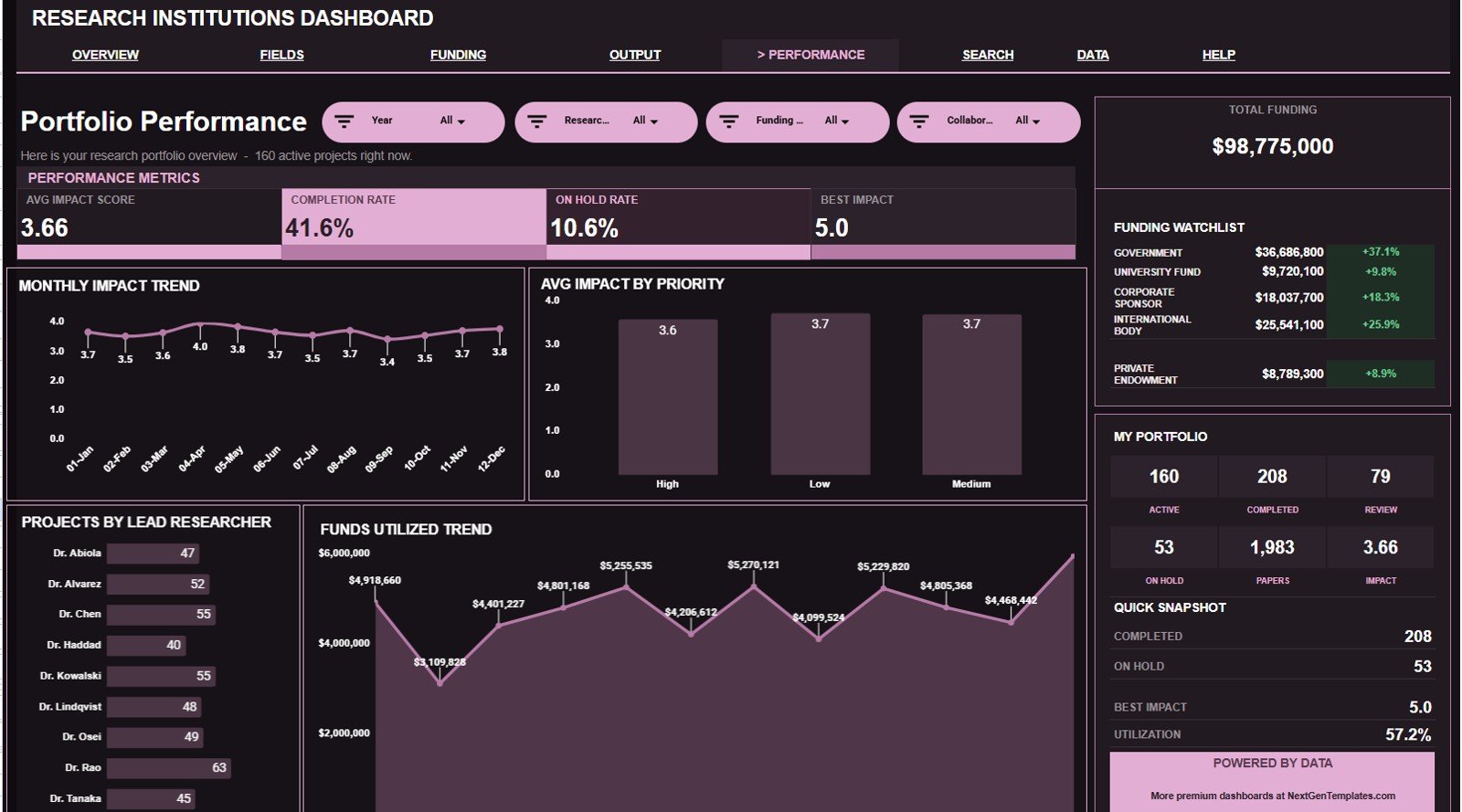
5 – Portfolio Performance
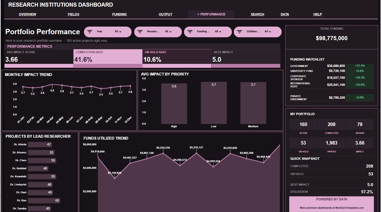
The Portfolio Performance page connects impact score, priority, researcher ownership, and funding utilization.
Avg Impact Score by Month: This trend shows how average impact changes across months. It helps users monitor whether portfolio performance is moving in the right direction.
Avg Impact Score by Priority: This chart compares impact by priority level. It helps leaders check whether high-priority projects are producing stronger outcomes.
Projects by Lead Researcher: This chart shows project ownership by researcher. It helps managers understand workload distribution and leadership concentration.
Funds Utilized by Month: This trend explains spending activity across the portfolio. It helps connect financial utilization with project delivery reviews.
6 – Search Sheet Tab
The Search Sheet lets you select a Project ID and view the full project record, including date, research field, department, funding source, collaboration, status, priority, lead researcher, grant amount, funds utilized, publications, and impact score.
7 – Data Sheet Tab
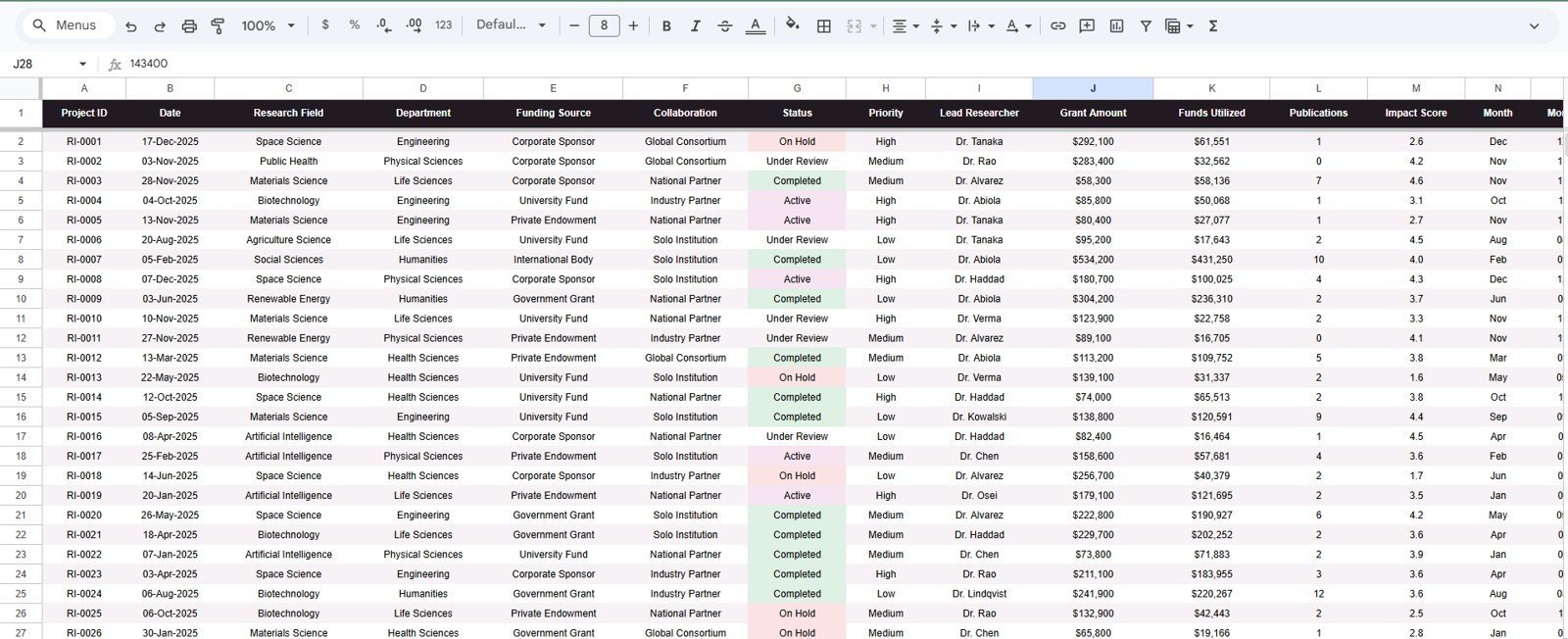
The Data Sheet is where you add or paste the project records in the same format as the sample data. Keep the column structure consistent so the KPI cards, slicers, charts, and Project ID lookup continue to update correctly.
Research Institutions Dashboard in Google Sheets vs. Microsoft Excel Dashboard vs. Paid Grant Management SaaS – Where This Fits
| Feature | This Google Sheets dashboard | Microsoft Excel dashboard | Paid grant management SaaS |
|---|---|---|---|
| Cost | $9.99 sale price, one-time | Template cost plus Microsoft licensing | Usually monthly or annual subscription |
| Platform | Google Sheets in Drive | Excel desktop or web | Vendor-hosted system |
| Setup time | Copy the file and replace sample data | Open workbook and customize | Implementation and configuration |
| Real-time team collaboration | Native Google Drive sharing | Requires OneDrive or SharePoint | Usually role-based |
| Mobile access | Google Sheets app or browser | Excel mobile app or browser | Usually included |
| Customizable fields | Editable sheets, labels, charts, and source rows | Editable workbook structure | Depends on vendor settings |
| Share with link | Yes, through Drive permissions | Yes, through Microsoft sharing | Usually invite-based |
| Year-1 cost at 5 users | $9.99 before any Google Workspace cost | Template plus license costs | Can increase with seats and modules |
| Project ID lookup | Included Search Sheet | Must be built or customized | Usually included |
| Research portfolio focus | Grants, projects, publications, and impact score | Depends on workbook design | Usually broader workflow coverage |
Who This Template Is For – and Who It’s Not For
This template is for research institutions, universities, academic departments, grant offices, R&D teams, research administrators, department heads, principal investigators, and analysts who track project records in spreadsheets and need a faster reporting layer.
It is not a full grant management system, finance ledger, publication database, compliance workflow, IRB system, procurement tool, or institutional repository. If you need approvals, audit trails, role-based compliance workflows, or accounting integrations, use this dashboard as a reporting companion.
How to Use the Research Institutions Dashboard in Google Sheets
- Open the PDF guide from your download and copy the Google Sheets template to your Drive.
- Go to the Data Sheet and replace the sample records with your own project data.
- Keep the same columns for Project ID, date, research field, department, funding source, collaboration, status, priority, lead researcher, grant amount, funds utilized, publications, and impact score.
- Use slicers on the dashboard pages to filter by the field needed for your review.
- Open the Search Sheet when you need to inspect one project record quickly.
Real-World Use Cases
Dr. Meera, research office director: uses the Overview and Grant Portfolio tabs before leadership meetings to explain grant amount, utilization, and active project status.
Alex, department administrator: reviews Field Performance to compare funding, publications, and impact score across research fields.
Priya, grant analyst: uses the Search Sheet to pull a single Project ID record during funding reviews without scrolling through the raw data table.
Frequently Asked Questions
What does this dashboard track?
It tracks grants, active projects, publications, average impact score, research field, department, funding source, collaboration, status, priority, lead researcher, grant amount, funds utilized, and project lookup details.
Does it work in Google Sheets?
Yes. The dashboard is designed for Google Sheets and can be copied into your own Google Drive for editing and sharing.
Can multiple users collaborate?
Yes. After copying the file, you can share it using Google Drive permissions for view or edit access.
Can I customize the research fields and departments?
Yes. The file is editable, but keep the source data structure aligned so charts, cards, slicers, and lookup formulas continue to work.
Does this replace grant management software?
No. It is a dashboard template for reporting and analysis. It does not replace approvals, compliance checks, accounting workflows, or sponsor submission systems.
What happens when I add new project records?
Add new rows in the Data Sheet using the same format, then review the dashboard pages and slicers to analyze the updated portfolio.
About the Author
Built by PK – Microsoft Certified Professional with 15+ years of Excel, Google Sheets, and Power BI experience. Founder of NextGenTemplates, reaching 300K+ subscribers across YouTube channels. Every template is hand-built and tested before release.
Explore Related Templates
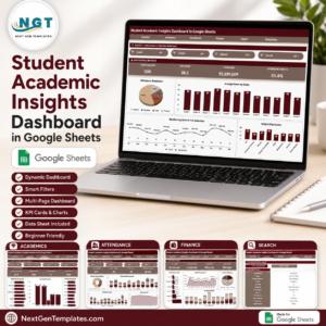
- Student Academic Insights Dashboard in Google Sheets for academic performance, attendance, and fee tracking.
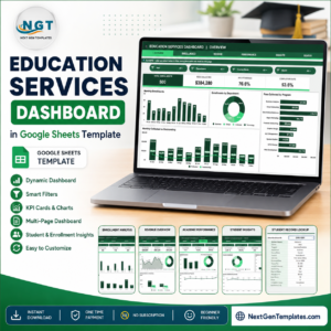
- Education Services Dashboard in Google Sheets for enrollment, fees, attendance, and completion reporting.
- International Development Dashboard in Google Sheets for funded program and impact reporting.
- Public Safety Dashboard in Google Sheets for operational record analysis.
- Browse more Google Sheets templates and Google Sheets dashboard templates.<
Watch the step-by-step video Demo:
Get the Research Institutions Dashboard in Google Sheets to turn research project records into a clear, filterable grants, publication, and impact reporting view.
Last updated: July 20, 2026.
Compatibility and Requirements
- Works in Google Sheets. You need a free Google account and a web browser.
- The Search Sheet tab uses a Project ID dropdown to pull one project record. Google explains dropdowns in Create an in-cell dropdown list.
More Questions About This Template
Is there an Excel or Power BI version?
Yes. See the Research Institutions Dashboard in Excel and the Research Institutions Dashboard in Power BI.
Which sheets does the dashboard have?
Seven tabs: Overview, Field Performance, Grant Portfolio, Research Output, Portfolio Performance, Search Sheet and Data Sheet.
How do I look up a single project?
Open the Search Sheet and select a Project ID. It returns the full record, including field, department, funding source, status, grant amount, funds utilized, publications and impact score.
Related Research Templates
- Research Institutions Dashboard in Excel: the same dashboard for Excel users
- Research Institutions Dashboard in Power BI: the Power BI edition
- Scientific Research KPI Dashboard in Google Sheets: KPI view for scientific research teams
- Medical Research KPI Dashboard in Google Sheets: KPI view for medical research
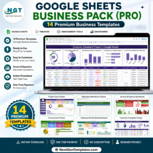
- Google Sheets Business Pack (Pro): 14 business templates in one download
Browse all Google Sheets dashboards.






















Reviews
There are no reviews yet.