

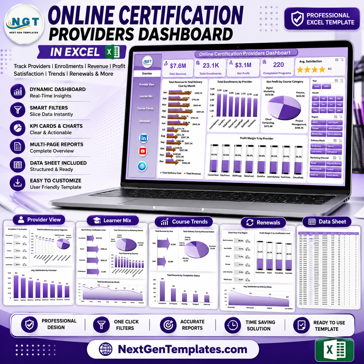
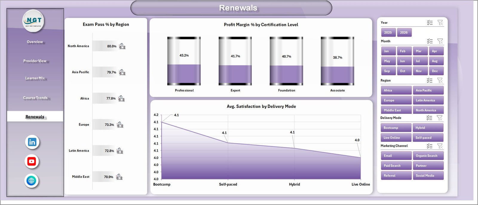



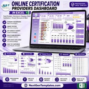
Online Certification Providers Dashboard in Excel gives certification teams a ready-made reporting workbook with 7 sheet tabs, 5 headline KPI cards, and 15 chart views across provider, learner, course, renewal, cost, satisfaction, and profit analysis. It is built for training companies, online academies, exam-prep providers, and certification program managers who want a one-time Excel dashboard instead of another monthly analytics subscription. Replace the sample records, refresh the pivots, and review performance by month, provider, course category, delivery mode, learner segment, country, region, and renewal status.
Instant download. One-time payment. No subscription. Lifetime access.
Key Features of Online Certification Providers Dashboard in Excel
- 5 executive KPI cards: Total Revenue, Total Enrollments, Net Profit, Completed Programs, and Avg. Satisfaction.
- 5 dashboard pages: Overview, Provider View, Learner Mix, Course Trends, and Renewals.
- 15 analysis charts: Track revenue, delivery cost, enrollments, net profit, profit margin, completion %, exam pass %, satisfaction, records, and renewal performance.
- Interactive slicers: Filter the dashboard quickly by key certification business dimensions.
- Editable Data sheet: Add your records in the same format and refresh the dashboard through Excel’s Data tab.
- Support sheet with pivot tables: Keep it hidden while the workbook powers all dashboard charts dynamically.
What’s Inside the Online Certification Providers Dashboard in Excel
1 – Overview Page
The Overview page starts with high-level cards for Total Revenue, Total Enrollments, Net Profit, Completed Programs, and Avg. Satisfaction. Use this page when you need the full certification business summary before drilling into provider, learner, course, or renewal details.
Total Revenue and Total Delivery Cost by Month: This chart compares monthly revenue against delivery cost, helping you see whether growth is profitable or simply more expensive. It is useful for monthly reviews, budgeting, and spotting cost pressure early.
Total Enrollments by Provider: This chart ranks certification providers by enrollment volume. It helps identify which partners, platforms, or providers are producing the strongest learner demand.
Net Profit by Course Category: This chart shows which certification categories contribute the most profit after delivery cost. It helps prioritize categories for marketing, pricing, and content investment.
Profit Margin % by Provider: This chart compares margin quality by provider, not just revenue size. It helps reveal providers that generate high revenue but weaker profitability.
2 – Provider View
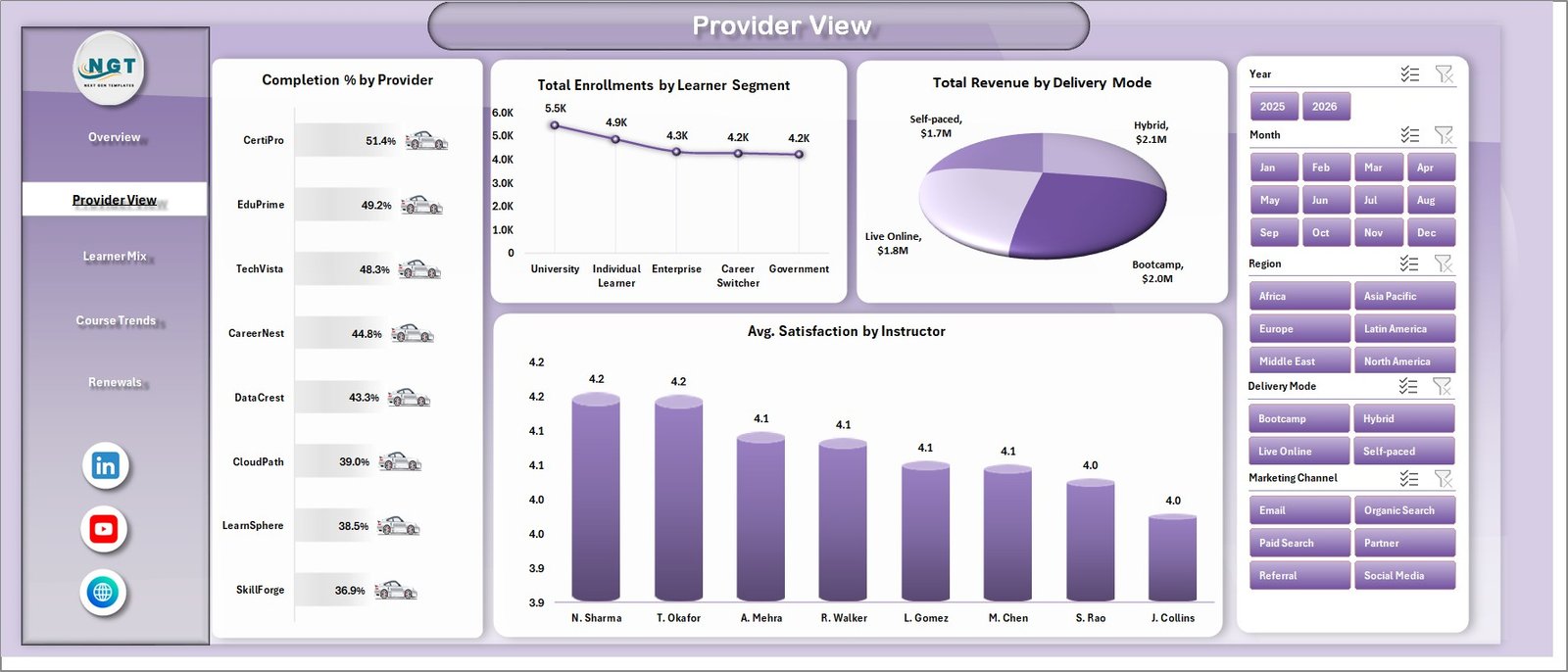
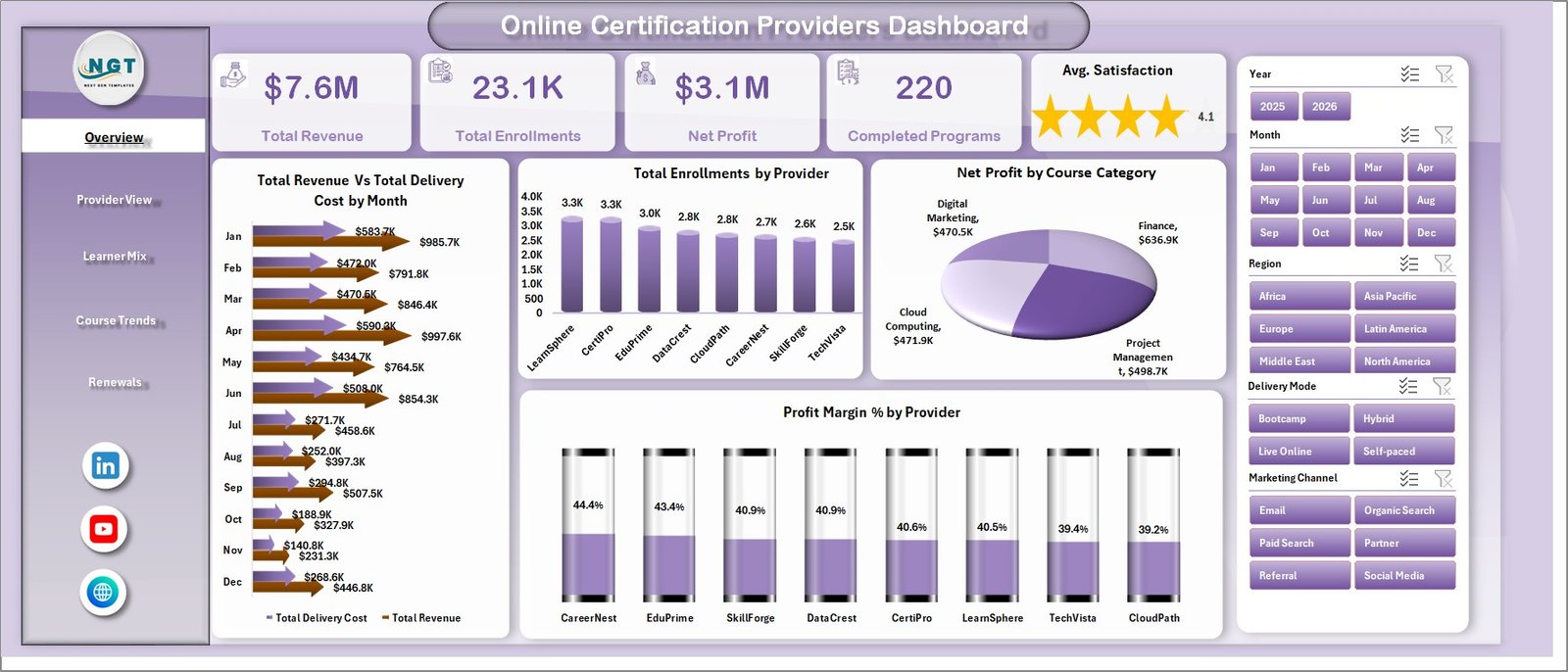
The Provider View page focuses on provider-level delivery, learner segments, delivery modes, and instructor satisfaction. It is useful for comparing provider quality, learner reach, and delivery performance in one place.
Completion % by Provider: This chart compares how successfully each provider moves learners through to completion. It helps flag providers with strong enrollments but weak completion outcomes.
Total Enrollments by Learner Segment: This chart shows which learner groups are joining your certification programs. It supports segmentation decisions for campaigns, pricing, and course positioning.
Total Revenue by Delivery Mode: This chart compares revenue from online, blended, live, self-paced, or other delivery modes. It helps decide where delivery capacity and content investment should go.
Avg. Satisfaction by Instructor: This chart highlights instructor-level learner satisfaction. It supports coaching, instructor allocation, and quality review discussions.
3 – Learner Mix
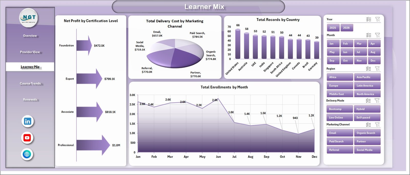
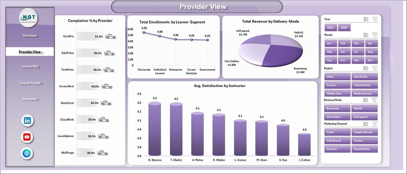
The Learner Mix page explains who your learners are, where records are coming from, and how certification levels and marketing channels affect profit and cost. It is built for enrollment, marketing, and operations review.
Net Profit by Certification Level: This chart compares profitability across beginner, intermediate, advanced, professional, or other certification levels. It helps identify which levels deserve more promotion or curriculum expansion.
Total Delivery Cost by Marketing Channel: This chart connects delivery cost to marketing source. It helps teams understand whether certain channels bring learners that are more expensive to serve.
Total Records by Country: This chart shows country-level participation or record volume. It is useful for geographic planning, localization, and regional performance checks.
Total Enrollments by Month: This trend tracks enrollment movement month by month. It helps spot seasonality, campaign lift, and slow periods in certification demand.
4 – Course Trends
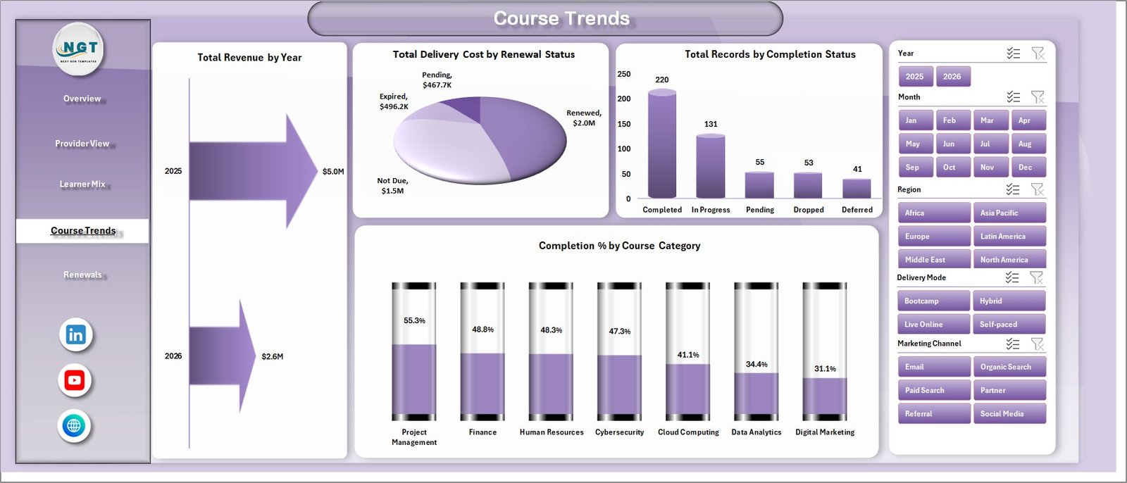
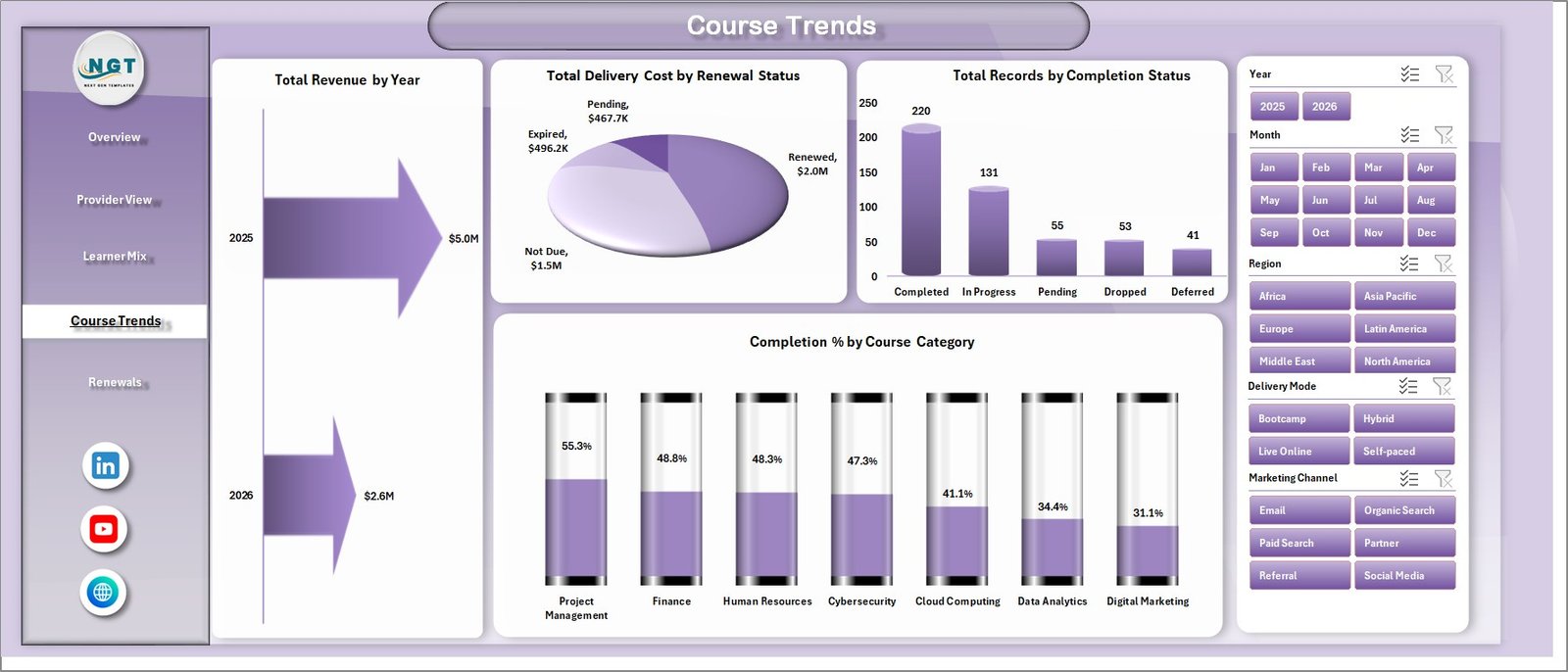
The Course Trends page helps you review performance by year, renewal status, completion status, and course category. It is best for spotting long-term changes in revenue, cost, and learner completion patterns.
Total Revenue by Year: This chart shows year-over-year certification revenue. It helps leadership see whether the overall program portfolio is expanding or slowing.
Total Delivery Cost by Renewal Status: This chart compares delivery cost for renewed, new, expired, or other renewal-status groups. It helps reveal whether renewals are cheaper or more expensive to serve.
Total Records by Completion Status: This chart breaks records into completed, in progress, dropped, or other completion states. It supports completion monitoring and operational follow-up.
Completion % by Course Category: This chart compares completion rates across course categories. It helps identify categories where course design, difficulty, or learner support may need attention.
5 – Renewals
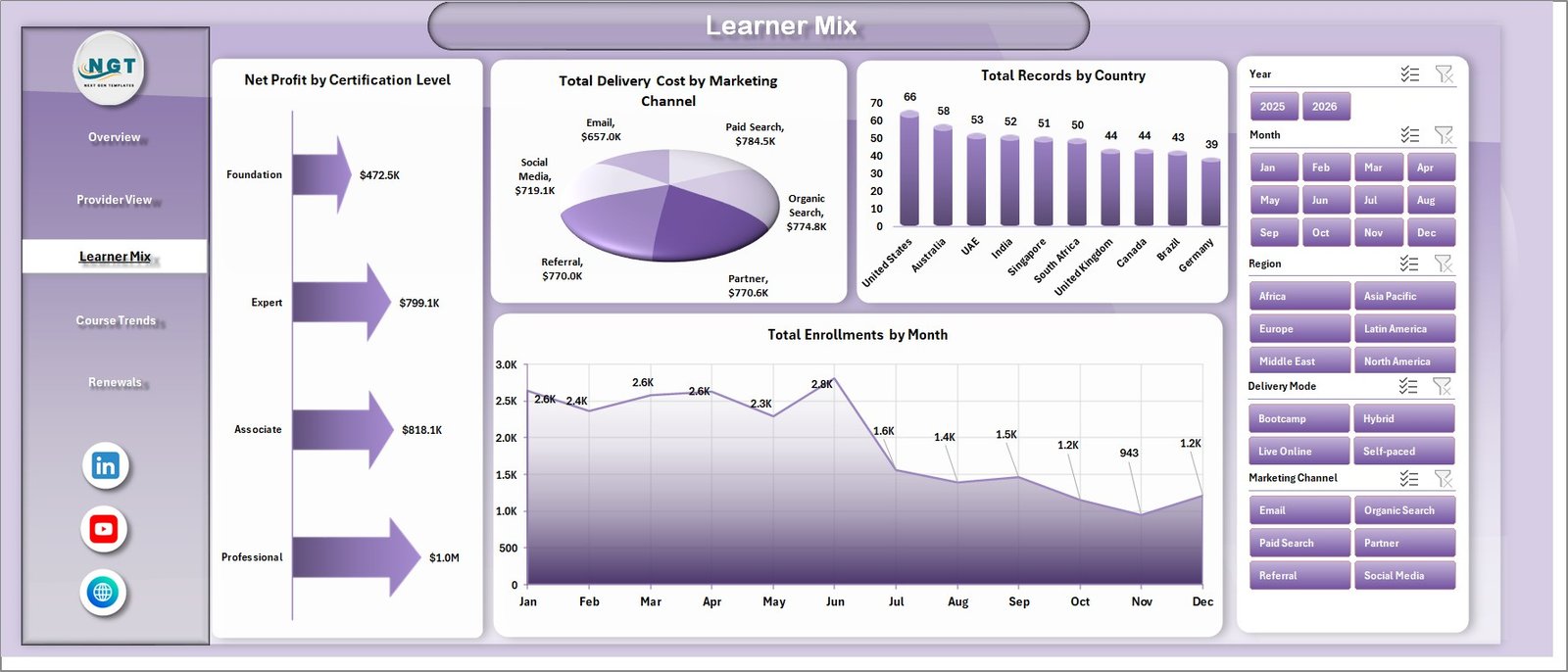
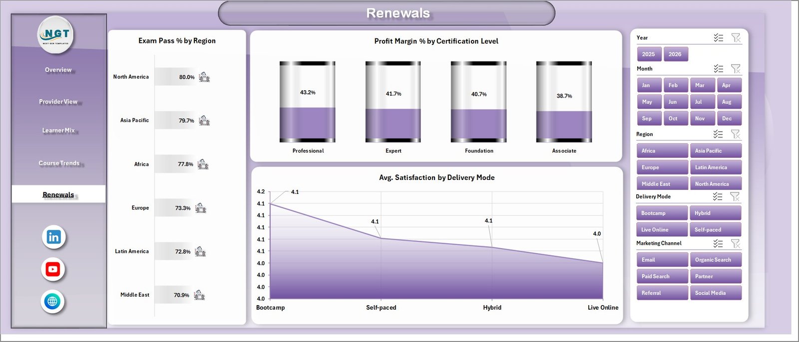
The Renewals page focuses on exam pass performance, margin quality, and satisfaction across renewal and delivery dimensions. Use it for certification retention, learner success, and profitability discussions.
Exam Pass % by Region: This chart compares exam pass performance across regions. It helps identify where learner preparation, instructor support, or exam readiness may need improvement.
Profit Margin % by Certification Level: This chart shows margin quality by certification level. It helps determine whether advanced or entry-level programs create better profitability.
Avg. Satisfaction by Delivery Mode: This chart compares learner satisfaction across delivery modes. It helps decide whether online, live, blended, or self-paced models are delivering the best learner experience.
6 – Data Sheet Tab
The Data sheet is where you add or replace the sample certification records. Keep the same column format, paste your own data, and the workbook will feed the pivots, cards, slicers, and charts from this source table.

7 – Support Sheet
The Support sheet contains the pivot tables used to build the dashboard dynamically. After updating the Data sheet, go to the Excel Ribbon, open the Data tab, click Refresh All, and the pivots and dashboard charts will refresh; you can keep this sheet hidden during normal use.

Online Certification Providers Dashboard in Excel vs. Google Sheets vs. Paid LMS/SaaS – Where This Fits
| Feature | This Excel Dashboard | Google Sheets Alternative | Paid LMS/SaaS |
|---|---|---|---|
| Cost | $17.99 sale price, one-time | One-time template or manual sheet build | Monthly or annual subscription |
| Platform | Microsoft Excel | Browser-based Google Sheets | Vendor cloud platform |
| Setup time | Paste data and refresh pivots | Paste data and configure sharing | Implementation and onboarding |
| Customizable fields | Editable workbook, charts, pivots, and data | Editable sheet structure | Depends on vendor permissions |
| Best fit | Reporting and analysis for certification performance | Collaborative lightweight reporting | Course hosting, learner logins, and automated workflows |
Who This Template Is For – and Who It’s Not For
This template is for online certification providers, training academies, course marketplaces, exam-prep businesses, and education analysts who need Excel-based reporting for revenue, enrollments, completions, profit, exam pass %, renewals, and satisfaction.
It is not a learning management system, payment gateway, student portal, or automated course delivery tool. Use it after your data is exported or maintained in a structured table.
How to Use the Online Certification Providers Dashboard in Excel
- Download and unzip the Excel dashboard file.
- Open the workbook in Microsoft Excel.
- Go to the Data sheet and replace the sample rows with your own certification records.
- Keep the same column format so the pivot tables can read the data correctly.
- Go to the Excel Ribbon, click Data, then click Refresh All.
- Use slicers on the dashboard pages to filter the views during review meetings.
- Keep the Support sheet hidden if you want users to see only the dashboard and data-entry tabs.
Real-World Use Cases
An online academy owner uses the Overview page every Monday to compare revenue, enrollments, delivery cost, and profit margin before changing campaign spend.
A certification program manager uses Provider View and Renewals to compare completion %, exam pass %, satisfaction, and profit margin across providers and regions.
A training operations analyst updates the Data sheet monthly, refreshes all pivots, and shares the workbook summary with leadership instead of preparing charts manually.
Frequently Asked Questions
What software do I need?
You need Microsoft Excel to open, edit, refresh, and customize the dashboard workbook.
Can I replace the sample data?
Yes. Add your certification records in the Data sheet using the same format, then click Refresh All from the Data tab.
How many dashboard pages are included?
The workbook includes Overview, Provider View, Learner Mix, Course Trends, Renewals, Data Sheet, and Support Sheet tabs.
Can I hide the Support sheet?
Yes. The Support sheet contains pivot tables for the dashboard and can stay hidden after setup.
Does this dashboard connect directly to an LMS?
No direct LMS connector is included. Export your LMS or platform data, paste it into the Data sheet, and refresh the workbook.
Can I customize the charts?
Yes. Since this is an Excel workbook, you can edit charts, pivots, colors, slicers, formulas, and sheet names.
About the Author
Built by PK – Microsoft Certified Professional with 15+ years of Excel, Google Sheets, and Power BI experience. Founder of NextGenTemplates, reaching 300K+ subscribers across YouTube channels. Every template is hand-built and tested before release.
Explore Related Templates
- Read the detailed blog post
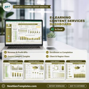
- E-learning Content Services Dashboard in Excel
- Education Services Dashboard in Google Sheets
- Professional Training and Coaching Dashboard in Google Sheets
- Browse Excel Dashboard Templates
- Browse Education Excel Templates
Download the Online Certification Providers Dashboard in Excel and start tracking provider, learner, course, renewal, revenue, cost, profit, and satisfaction performance in one editable workbook.
Last updated: July 16, 2026.
Watch the step-by-step video tutorial:
Compatibility and Requirements
- Works in Microsoft Excel desktop (Excel 2016 or later, or Microsoft 365).
- The dashboard uses pivot tables and slicers. Microsoft explains slicers in Use slicers to filter data.




Reviews
There are no reviews yet.