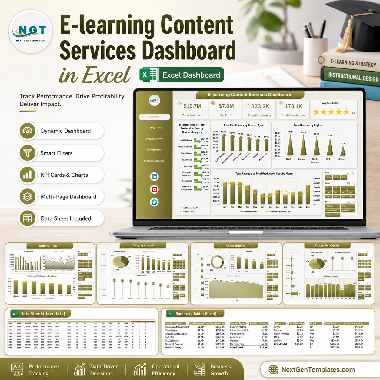


E-learning Content Services Dashboard in Excel helps training teams, content operations managers, and education service providers review costs, spend, downtime, customers affected, safety score, regions, assets, and maintenance activity in one Excel reporting file. The template includes 7 sheet tabs, high-level KPI cards, multiple slicers, pivot-driven charts, a structured data sheet, and a support sheet for dynamic refresh. One-time download. No monthly SaaS subscription. Editable Excel workbook. Built by PK, a Microsoft Certified Professional with 15+ years of Excel dashboard experience.
Key Features of E-learning Content Services Dashboard in Excel
- Interactive Excel dashboard with slicers for fast filtering.
- Overview cards for Total Maintenance Cost, Total Spend, Total Downtime Hours, Total Customers, and Avg. Safety Score.
- Monthly trend page for cost, parts, downtime, spend, and customer impact analysis.
- Asset, regional, and maintenance type pages for deeper operational review.
- Dedicated data sheet where users can replace sample rows with their own data.
- Support sheet with pivot tables that refresh the complete dashboard after data updates.
- Works inside Microsoft Excel with no subscription dashboard platform required.
What’s Inside the E-learning Content Services Dashboard in Excel
1. Overview Page
The Overview page gives a high-level snapshot of the full e-learning content services operation. KPI cards show Total Maintenance Cost, Total Spend, Total Downtime Hours, Total Customers, and Avg. Safety Score so managers can understand service health before opening the detailed tabs.
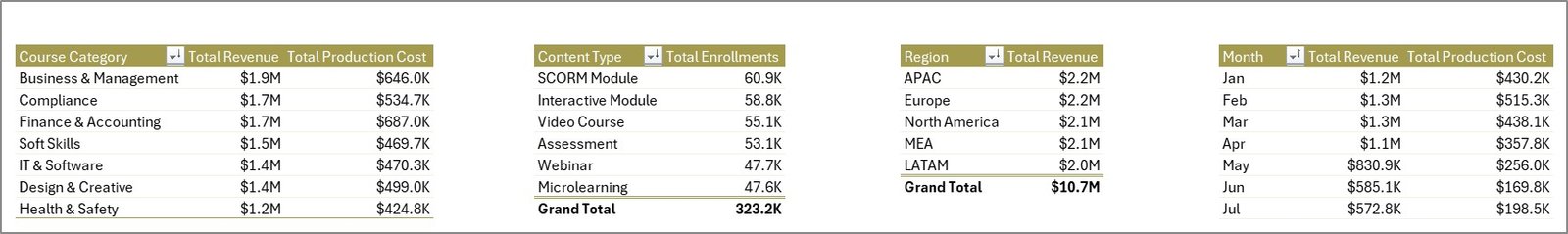
Completion % by Total Records: This chart shows how much work has moved through completion compared with all tracked records. It helps managers monitor progress and quickly identify whether outstanding work is building up.
Total Downtime Hours by Region: This visual compares downtime across regions. It helps teams spot locations where service interruptions, content delivery delays, or operational issues need attention.
Total Records by Maintenance Type: This chart groups records by maintenance type. It helps users understand whether preventive, corrective, emergency, or other work types are driving workload.
Total Maintenance Cost Vs Total Parts Cost by Asset Type: This comparison shows how labor/service cost and parts cost behave by asset type. It is useful for identifying expensive asset categories and planning future budget control.
Overview Page
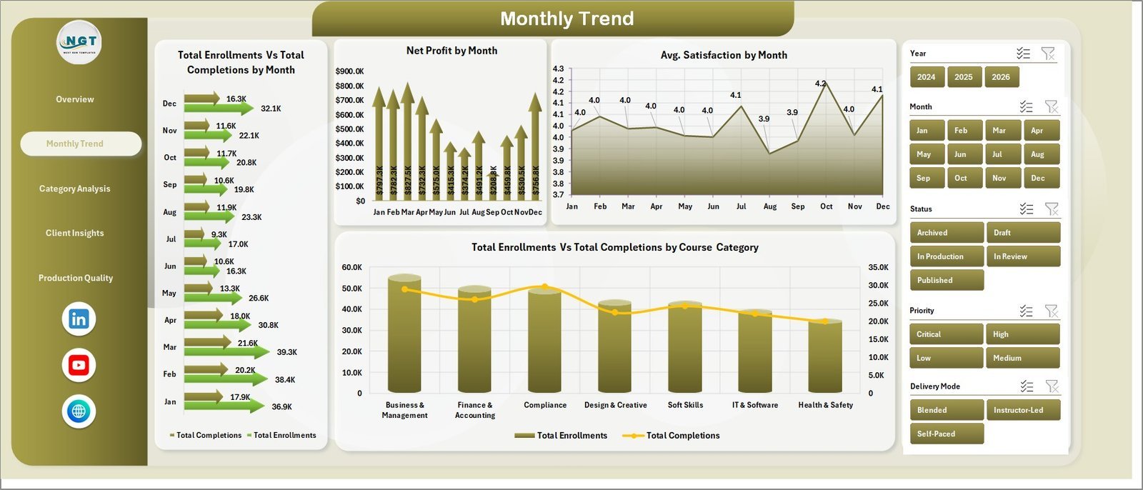
2. Monthly Trend
The Monthly Trend tab helps users analyze how activity changes month by month. It includes Total Maintenance Cost Vs Total Parts Cost by Month, Total Downtime Hours by Month, Total Spend by Month, and Total Customers Affected by Month.

Monthly Trend
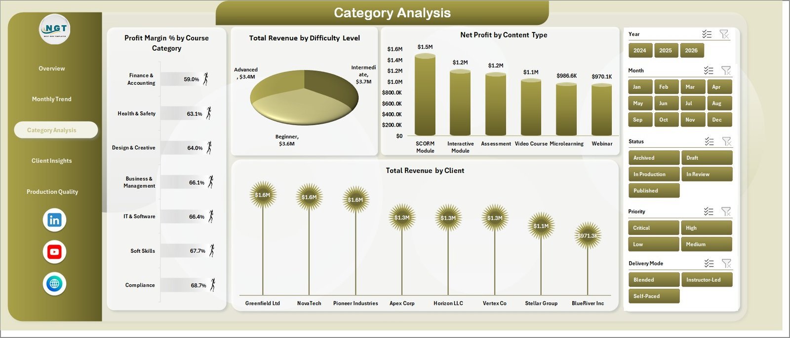
3. Asset Analysis
The Asset Analysis tab focuses on performance by asset type and voltage level. It includes Total Downtime Hours by Asset Type, Total Spend by Asset Type, Total Maintenance Cost by Voltage Level, and Avg. Safety Score by Asset Type.

Asset Analysis
4. Regional Analysis
The Regional Analysis tab compares results across regions and substations. Users can review Total Maintenance Cost by Region, Total Customers Affected by Region, SLA Compliance % by Region, and Total Spend by Substation.
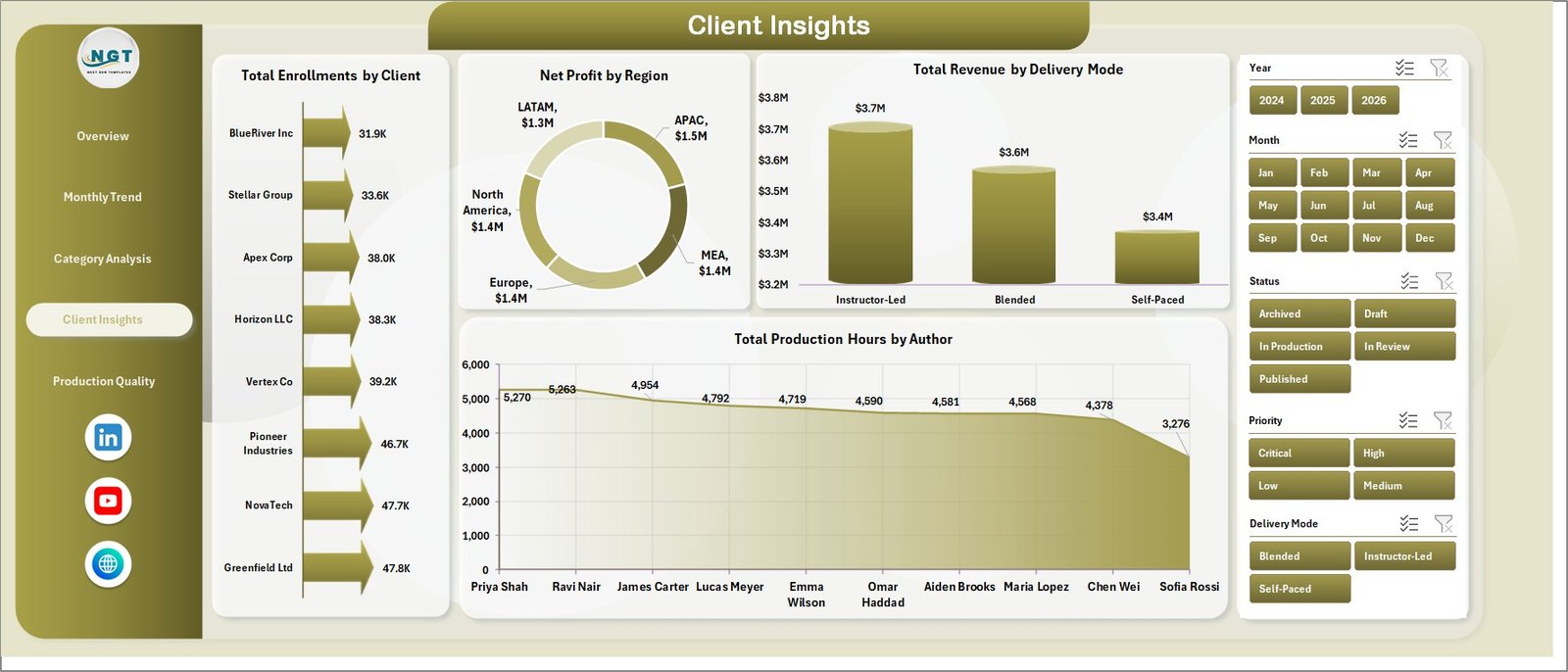
Regional Analysis
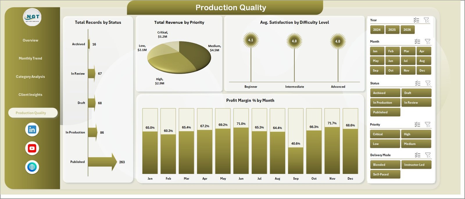
5. Maintenance Type
The Maintenance Type tab helps users understand workload, priority, status, and crew activity. It includes Total Records by Priority, Total Maintenance Cost by Maintenance Type, Total Records by Status, and Total Labor Hours by Crew Lead.

Maintenance Type
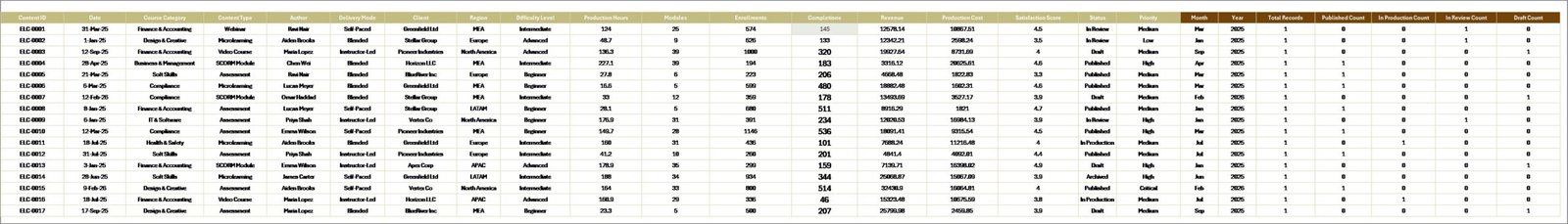
6. Data Sheet Tab
The Data sheet stores the source data in the same structured format used by the dashboard. Replace the sample records with your own rows, keep the column structure consistent, and refresh the workbook to update the analysis.
Data Sheet tab
7. Support Sheet
The Support sheet contains pivot tables that power the complete dashboard. After updating the Data tab, go to the Data tab in the Excel Ribbon and click Refresh All. You can keep this support sheet hidden after setup.
Support sheet tab
E-learning Content Services Dashboard in Excel vs. Google Sheets vs. Paid SaaS – Where This Fits
| Feature | This Excel Template | Google Sheets Alternative | Paid SaaS Alternative |
|---|---|---|---|
| Cost | $17.99 one-time | Free to build manually | Monthly or annual subscription |
| Platform | Microsoft Excel | Google Sheets | Vendor cloud platform |
| Setup time | Replace data and refresh | Build pivots and charts manually | Requires onboarding and configuration |
| Customization | Editable formulas, pivots, charts, and sheets | Editable but slower for large files | Limited by plan and vendor settings |
| Year-1 cost at 5 users | $17.99 plus existing Excel access | Usually low, but manual build time required | Often hundreds or thousands |
| Pivot-driven dashboard | Included | Must be created | Depends on reporting module |
Who This Template Is For – and Who It’s Not For
This template is for e-learning content operations teams, education service vendors, content delivery managers, maintenance coordinators, training platform analysts, and reporting specialists who want Excel-based visibility into service records, spend, downtime, assets, regions, status, priority, and labor hours.
It is not a learning management system, course authoring tool, ticketing system, asset registry, or real-time monitoring platform. It is best when your source data is already available in a structured table and you want quick dashboard reporting inside Excel.
How to Use the E-learning Content Services Dashboard in Excel
- Download and unzip the product file.
- Open the Excel workbook in Microsoft Excel.
- Go to the Data sheet and replace the sample records with your own data.
- Keep the same column structure for clean pivot refresh.
- Use Data > Refresh All to update pivot tables and charts.
- Use slicers to filter the dashboard by region, asset type, month, status, priority, or maintenance type.
Real-World Use Cases
Aisha, content operations manager: Aisha uses the Overview and Monthly Trend pages to explain service cost, downtime, and customer impact during weekly delivery reviews.
Rahul, education platform analyst: Rahul uses Asset Analysis and Regional Analysis to identify cost-heavy asset types and regions with repeated downtime.
Meera, service coordinator: Meera reviews Maintenance Type to track priority, status, maintenance cost, and labor hours by crew lead before planning the next work cycle.
Frequently Asked Questions
What is included in this Excel dashboard?
The workbook includes Overview, Monthly Trend, Asset Analysis, Regional Analysis, Maintenance Type, Data Sheet, and Support Sheet tabs.
Can I use my own data?
Yes. Replace the sample records in the Data sheet while keeping the same column format, then refresh all pivots.
Do I need advanced Excel skills?
No advanced coding is required. Basic Excel skills and the ability to refresh pivots are enough for normal use.
Can I hide the Support sheet?
Yes. The Support sheet can remain hidden after setup because it mainly stores pivot tables used by the charts.
Can the dashboard be customized?
Yes. You can edit charts, slicers, formulas, colors, and sheet layouts as needed.
Is this a SaaS reporting tool?
No. It is an Excel dashboard template for local reporting, not a hosted SaaS product.
About the Author
Built by PK – Microsoft Certified Professional with 15+ years of Excel, Google Sheets, and Power BI experience. Founder of NextGenTemplates, reaching 300K+ subscribers across YouTube channels. Every template is hand-built and tested before release.
Explore Related Templates
- Educational NGOs Dashboard in Power BI
- Disability Support NGOs Dashboard in Power BI
- Browse Excel Dashboard Templates
- Browse Education Excel Templates
Download the E-learning Content Services Dashboard in Excel and turn service, downtime, asset, region, and cost data into clear Excel reporting.
Last updated: June 7, 2026.


Reviews
There are no reviews yet.