

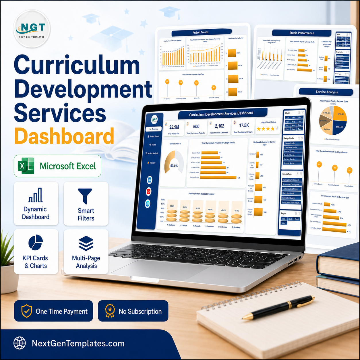

A curriculum studio that bills by the module usually knows its revenue and almost nothing else. The Curriculum Development Services Dashboard in Excel fixes that: one workbook, five linked pages and 20 pivot-driven charts that turn a flat project log into an answer. The sample build tracks 500 curriculum projects, $2.9M in project fees, 2,102 modules delivered against 2,594 planned, 17.5K development hours and a 4.1 average client rating across six design studios, six service types, five client types and four regions. Built by a Microsoft Certified Professional whose channels reach 300K+ subscribers, and hand-tested before release. Download it once and own it forever – no subscription, no licence key, nothing to install beyond the copy of Excel you already have.
This is the analytical five-page dashboard, not a month-picker scorecard. If you want traffic lights against monthly targets instead, the Curriculum Development Services KPI Dashboard is the scorecard version of the same subject – a different template, and plenty of teams buy both.
Key Features of the Curriculum Development Services Dashboard in Excel
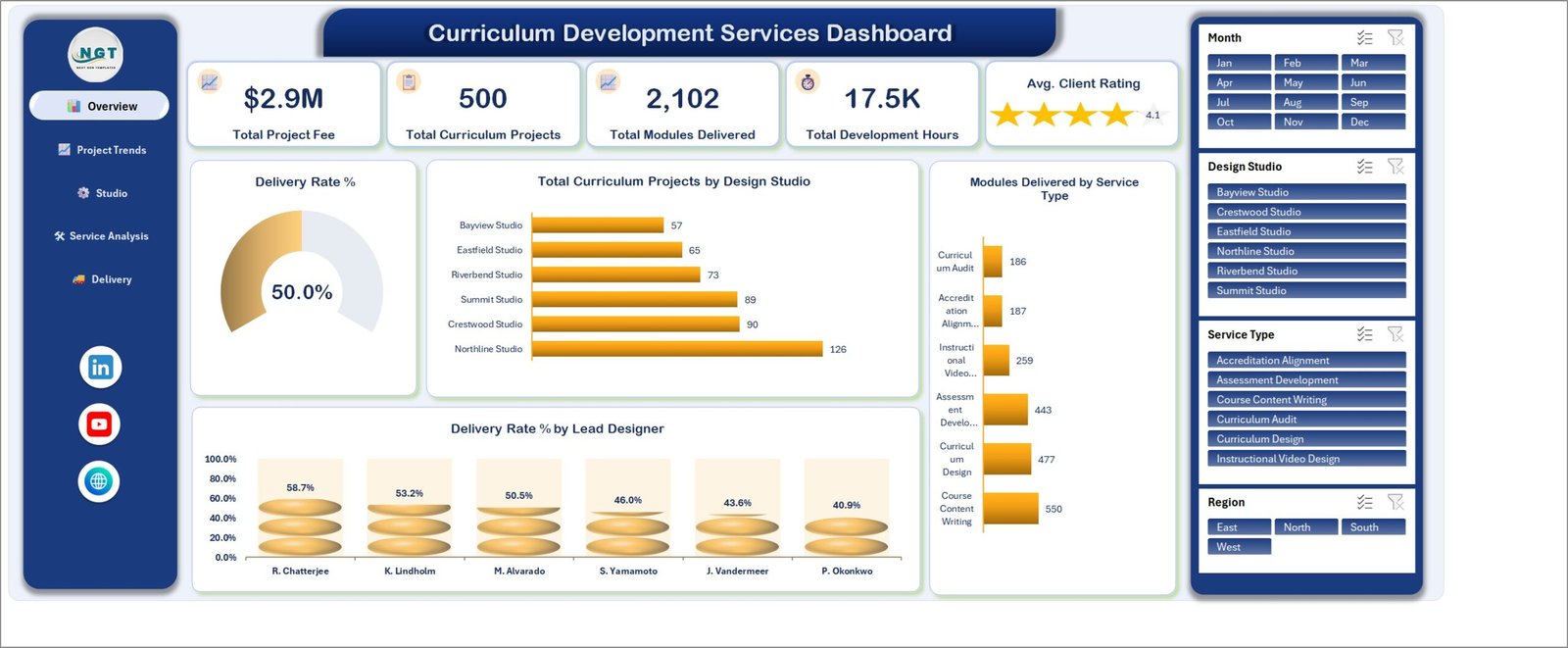
- Five headline KPI cards on the Overview page – Total Project Fee ($2.9M), Total Curriculum Projects (500), Total Modules Delivered (2,102), Total Development Hours (17.5K) and Avg. Client Rating (4.1), each recalculating the moment a slicer changes.
- Four slicers wired to every page – Month, Design Studio, Service Type and Region share one pivot cache, so filtering to Q4 Curriculum Design work in the Northline Studio reshapes all 20 charts at once.
- A delivery rate that is a ratio, not a guess – the Overview gauge reads 50.0% because 250 of the 500 sample projects carry a Delivered status, and it moves with every filter you apply.
- Charts built for questions – Total Curriculum Projects by Design Studio, Modules Delivered by Service Type, Delivery Rate % by Lead Designer, Total Modules Delivered vs Total Modules Planned by Month, Project Fee vs Operating Cost by Design Studio, Total Project Fee by Region and Development Hours by Service Type.
- 27 source columns covering Project ID, Start Date, Design Studio, Region, Lead Designer, Client Type, Service Type, Delivery Format, Client Source, Project Status, modules planned and delivered, development hours, project fee, designer cost, operating cost, client rating and the month/quarter helper fields.
- 500 sample project records so every chart is populated on first open – delete them and paste your own in the same layout.
- No macros and no add-ins – it is a plain .xlsx, so it opens on locked-down machines and passes the email filters that reject .xlsm.
What’s Inside the Curriculum Development Services Dashboard in Excel
Seven worksheets: five dashboard pages, one Data sheet and one Support sheet holding the pivot tables that feed the charts.
1. Overview
The single-screen summary. Five KPI cards sit above a Delivery Rate % gauge at 50.0%, Total Curriculum Projects by Design Studio (Northline 126 down to Bayview 57), Modules Delivered by Service Type (Course Content Writing 550, Curriculum Design 477, Assessment Development 443, Instructional Video Design 259, Accreditation Alignment 187, Curriculum Audit 186) and Delivery Rate % by Lead Designer, where R. Chatterjee converts 58.7% of her projects and P. Okonkwo 40.9%.
2. Project Trends
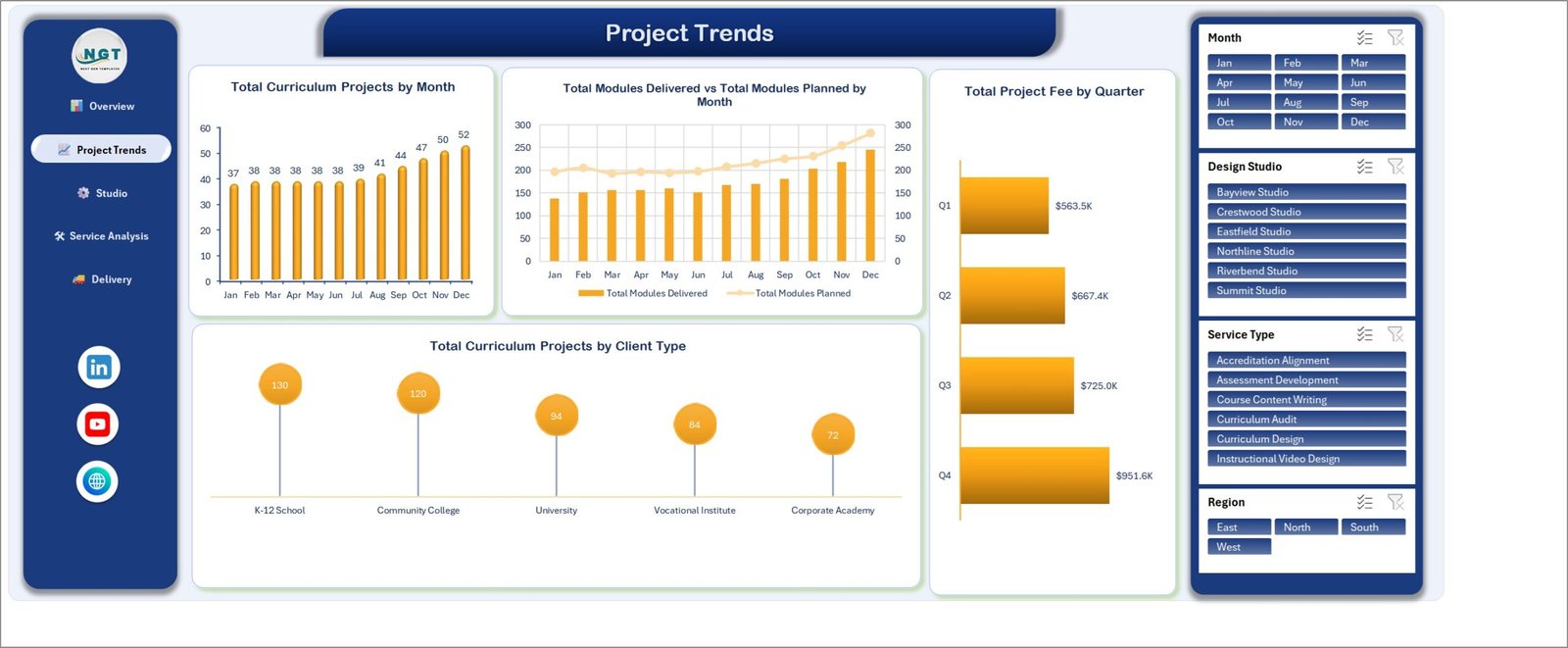
The time view. Total Curriculum Projects by Month climbs from 37 in January to 52 in December. Total Modules Delivered vs Total Modules Planned by Month is the honest one – the planned line sits above the delivered bars in every month, which is what an 81% overall delivery-to-plan ratio looks like on a chart. Total Project Fee by Quarter runs $563.5K, $667.4K, $725.0K and $951.6K, and Total Curriculum Projects by Client Type puts K-12 Schools first at 130 and Corporate Academies last at 72.
3. Studio Performance
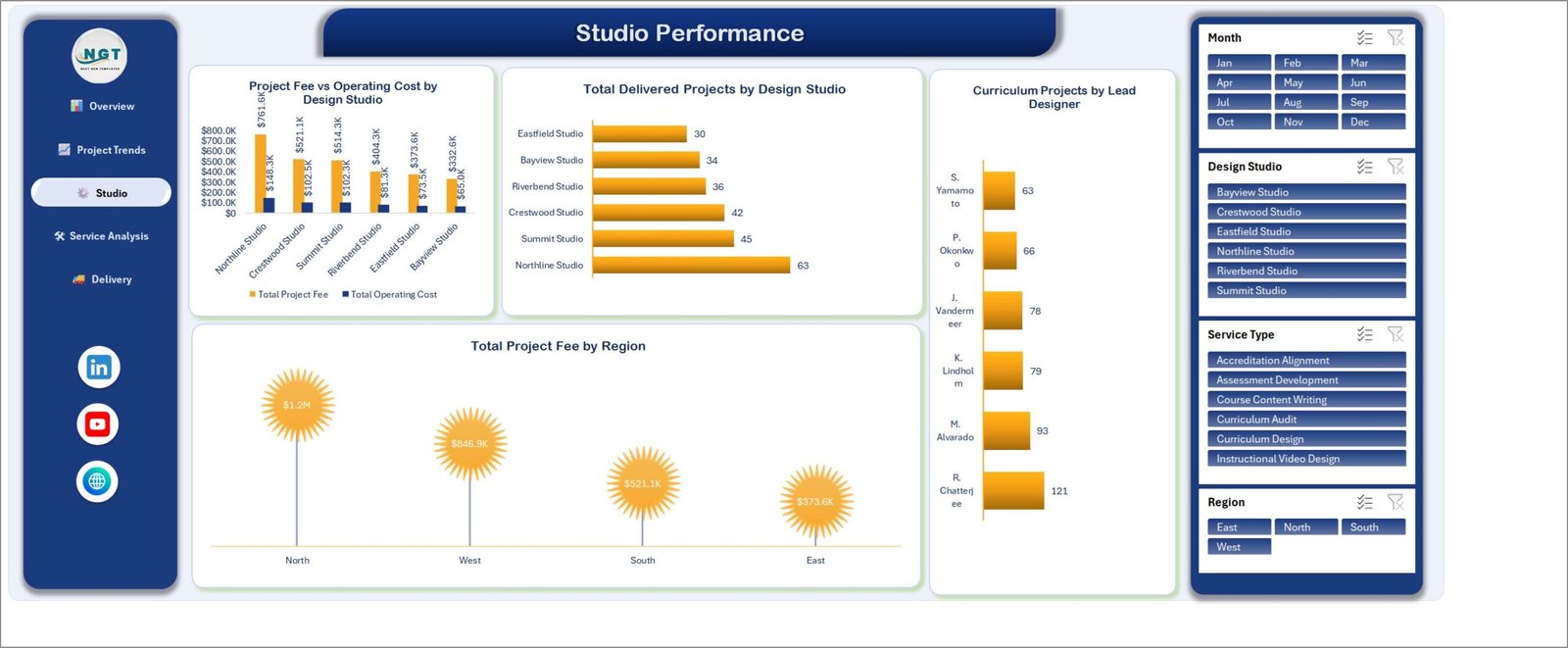
Who is carrying the studio. Project Fee vs Operating Cost by Design Studio pairs each studio’s revenue with its running cost – Northline at $761.6K against $148.3K, Bayview at $332.6K against $65.0K. Total Delivered Projects by Design Studio ranks Northline 63 down to Eastfield 30, Curriculum Projects by Lead Designer spreads the 500 projects across six designers from R. Chatterjee’s 121 to S. Yamamoto’s 63, and Total Project Fee by Region shows North at $1.2M against East at $373.6K.
4. Service Analysis
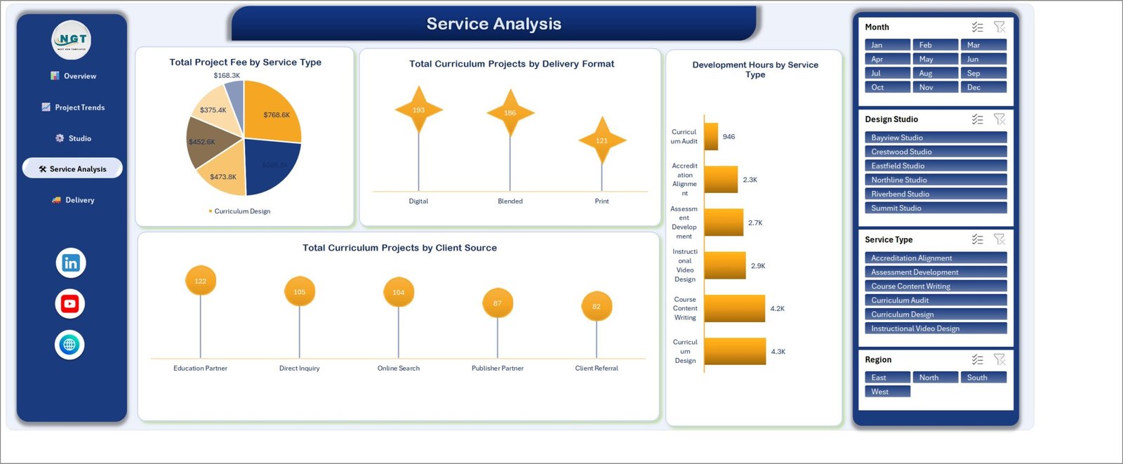
Which work is worth doing. Total Project Fee by Service Type splits the $2.9M six ways, led by Curriculum Design at $768.6K and Course Content Writing at $668.8K, with Curriculum Audit last at $168.3K. Put that next to Development Hours by Service Type – Curriculum Design 4.3K hours, Course Content Writing 4.2K, Curriculum Audit 946 – and the fee-per-hour picture appears without a single formula. Total Curriculum Projects by Delivery Format reads Digital 193, Blended 186, Print 121, and Total Curriculum Projects by Client Source ranks Education Partner 122, Direct Inquiry 105, Online Search 104, Publisher Partner 87 and Client Referral 82.
5. Delivery Outcomes
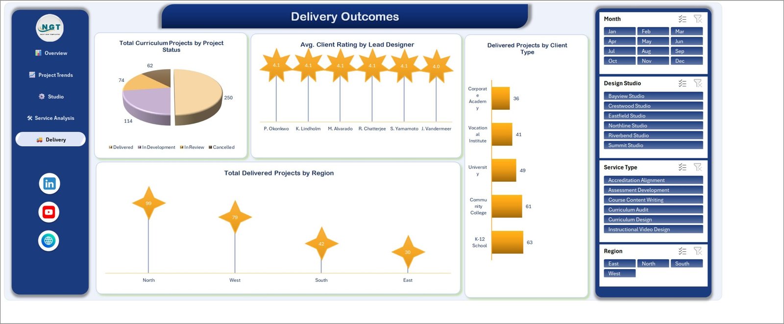
What actually shipped. Total Curriculum Projects by Project Status breaks the 500 into 250 Delivered, 114 In Development, 74 In Review and 62 Cancelled – the cancellation count is deliberately visible rather than buried. Avg. Client Rating by Lead Designer sits between 4.0 and 4.1 across all six designers, Delivered Projects by Client Type runs K-12 School 63 down to Corporate Academy 36, and Total Delivered Projects by Region reads North 99, West 79, South 42, East 30.
6. Data
500 rows across 27 columns, laid out as a single flat table. This is the only sheet you edit.
7. Support
The pivot tables behind every chart. Nothing to configure – it is there so you can see how a number is built, and extend it if you want a chart of your own.
Curriculum Development Services Dashboard in Excel vs. Google Sheets vs. Paid Project SaaS – Where This Fits
| This Excel dashboard | Google Sheets build | Monday.com / Smartsheet | |
|---|---|---|---|
| Cost | $17.99 once | Free, but you build it | $12-$25 per user per month |
| Platform | Excel 2016+ / Microsoft 365, Windows or Mac | Browser | Browser and mobile app |
| Setup time | Paste your data in, about 15 minutes | Days of chart building | Weeks of configuration |
| Real-time team collaboration | Via OneDrive or SharePoint co-authoring | Yes, natively | Yes, natively |
| Mobile access | Excel mobile, view-only in practice | Yes | Yes |
| Customisable fields | Any column you like – it is your workbook | Any column you like | Within the plan’s field limits |
| Share with a link | Yes, through OneDrive | Yes | Yes |
| Year-1 cost at 5 users | $17.99 | $0 plus your build time | $720-$1,500 |
| Fee vs operating cost by studio | Built in, on page 3 | Build it yourself | Usually a paid reporting add-on |
| Works offline | Yes | No | No |
Who This Template Is For – and Who It’s Not For
It fits curriculum development agencies and instructional-design studios billing project work to schools, colleges and corporate academies; in-house curriculum teams at multi-campus institutions; publisher services groups tracking authoring and accreditation-alignment work; and freelance instructional designers who manage a handful of studios’ worth of subcontracted output and want one honest view of fee, hours and delivery.
It does not fit if you need a live task board with assignments and due-date notifications – this reports on projects, it does not run them. It is not a learning management system and does not host or deliver courses to learners. It will not connect to your LMS, your accounting package or your time-tracking tool automatically; you export and paste. And it is not an accreditation compliance tool: “Accreditation Alignment” is a service-type label on your own project records, and nothing in the workbook assesses, certifies or evidences compliance with any accrediting body’s standards.
How to Use the Curriculum Development Services Dashboard in Excel
- Unzip and open the workbook. The download contains the .xlsx and an Excel Dashboard User Manual PDF. Open the workbook in Excel 2016 or later, or Microsoft 365.
- Look at the sample first. Click through Overview, Project Trends, Studio Performance, Service Analysis and Delivery Outcomes with the sample data in place, so you know what each chart is telling you before the numbers become yours.
- Open the Data sheet and match your columns. Keep the 27 headers where they are. Rename the value labels freely – Design Studio can be your practice, pod or vendor; Service Type can be your own service catalogue.
- Replace the 500 sample rows. Delete them and paste your projects in the same layout. Every row is one curriculum project with its studio, designer, client, service, modules planned and delivered, hours, fee and status.
- Refresh. Data > Refresh All. The pivot caches rebuild and all five pages update together.
- Filter and read. Use the Month, Design Studio, Service Type and Region slicers. They are synced, so a filter set on one page holds across the workbook.
Real-World Use Cases
Priya runs a 22-person curriculum studio serving K-12 districts and two community colleges. She had revenue in Xero and project status in a spreadsheet nobody trusted. Pasting twelve months of projects into the Data sheet gave her page 3 in one afternoon: two studios were producing 40% of the fee on 35% of the operating cost, and one was not. That conversation had been overdue for a year.
Daniel is head of learning design at a multi-campus vocational institute. His board asks the same question every quarter – are we delivering what we planned? Page 2’s Total Modules Delivered vs Total Modules Planned by Month is now the slide, because it does not flatter him: the gap between the two series is the answer, and it is the same chart every quarter.
Ana subcontracts assessment writing to six freelancers. She filters Service Type to Assessment Development and reads Delivery Rate % by Lead Designer and Avg. Client Rating by Lead Designer side by side, which is how she decides who gets the next accreditation-alignment brief.
Frequently Asked Questions
Is this the same as the Curriculum Development Services KPI Dashboard?
No. That one is a month-picker KPI scorecard with traffic lights against targets. This is the five-page analytical dashboard – slicers, twenty charts, and a 500-row project table you filter and explore. Different templates on the same subject.
Do I need macros or an add-in?
No. It is a plain .xlsx built on pivot tables, pivot charts and slicers. There is nothing to enable and nothing to install.
Which versions of Excel does it work in?
Excel 2016 and later on Windows, Excel for Mac, and Microsoft 365. Slicers need the desktop app – Excel for the web will display the pages but slicer behaviour is limited there.
Can I add my own service types, studios or designers?
Yes. Those are values in the data, not hard-coded settings. Type your own into the Data sheet, refresh, and the charts and slicers pick them up.
Is the data in the screenshots real?
No. All 500 rows are generated sample records for a fictional studio, included so the dashboard is populated the moment you open it. Delete them before you paste your own.
Does this manage projects or store learner information?
Neither. It reports on curriculum projects you have already recorded. There are no learner records, no personal data fields and no task assignment or notifications.
Can I use it for client reporting?
Yes – filter to a client type or region and screenshot the page, or save the filtered workbook as a PDF. Nothing is locked.
About the Author
Built by PK – Microsoft Certified Professional with 15+ years of Excel, Google Sheets, and Power BI experience. Founder of NextGenTemplates, reaching 300K+ subscribers across YouTube channels. Every template is hand-built and tested before release.
Explore Related Templates
- Curriculum Development Services KPI Dashboard – the traffic-light scorecard version of this subject.
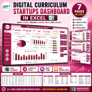
- Digital Curriculum Startups Dashboard in Excel – the same analysis aimed at product-led curriculum businesses.
- Online Certification Providers Dashboard in Excel – for the certification side of the same market.
- Teacher Training Institutes KPI Dashboard in Excel – training delivery rather than content production.
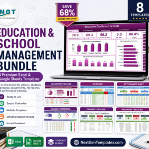
- Education & School Management Bundle – eight education templates in one purchase.
- Browse every Excel dashboard template or the full Excel education category.
A full walkthrough of every page is on the blog: Curriculum Development Services Dashboard in Excel.
Buy it once, keep it forever. Instant download, unlimited re-downloads, and free bug fixes to this template. Add it to your cart and you will have your first filtered view inside fifteen minutes.
Last updated: 26 August 2026.









Reviews
There are no reviews yet.