

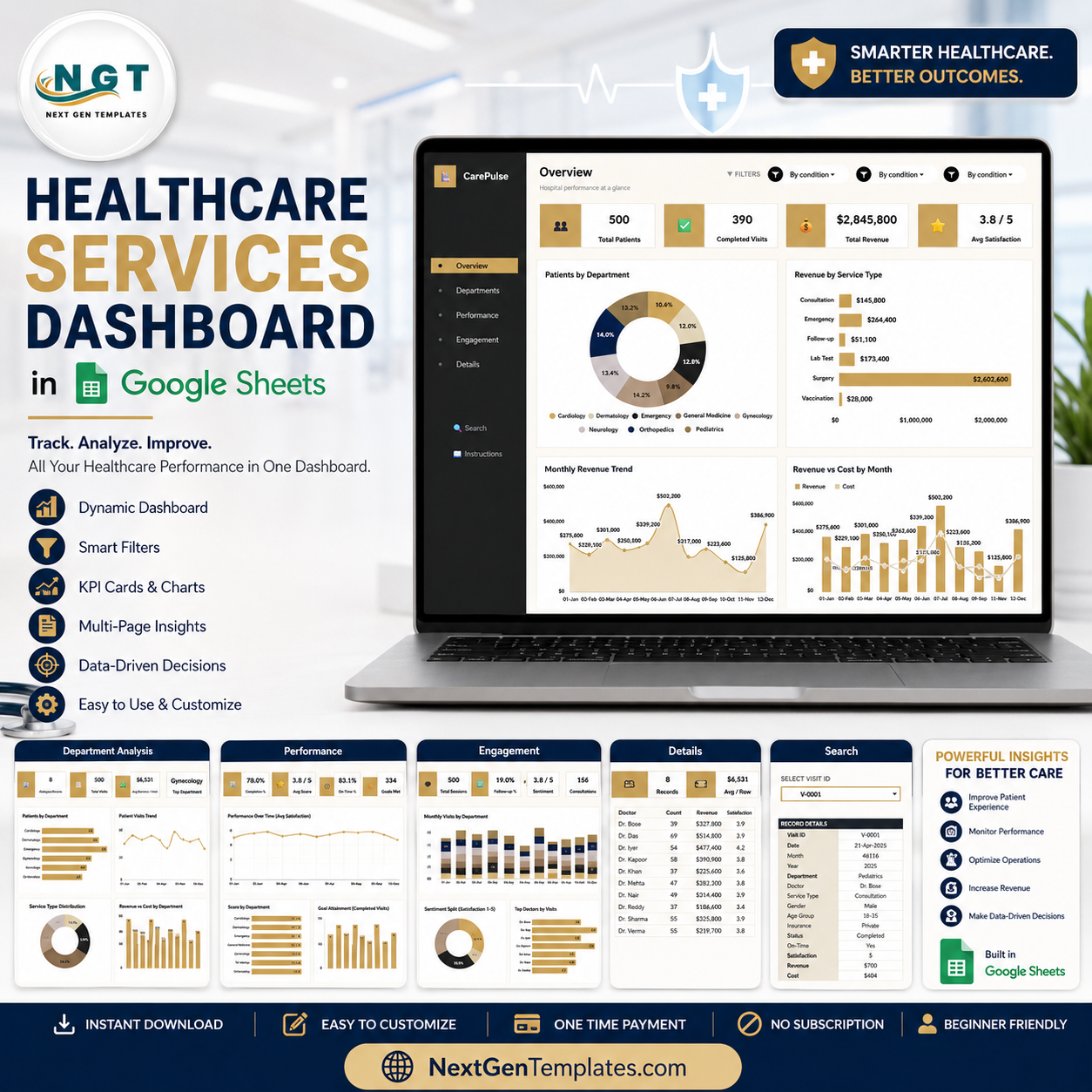

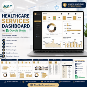
Healthcare Services Dashboard in Google Sheets gives clinic managers, service-line leaders, analysts, and consultants one editable place to monitor patients, completed visits, revenue, costs, satisfaction, department mix, service type performance, and doctor-level output. The workbook includes 7 sheet tabs, 4 executive KPI cards, 17 focused chart views, slicers for quick filtering, a Visit ID search sheet, and a structured data input sheet. Built by PK, a Microsoft Certified Professional with 15+ years of Excel, Google Sheets, and Power BI experience and 300K+ YouTube subscribers across channels, this template offers a low-risk reporting layer: $9.99 one-time, no monthly SaaS seat, and an editable Google Drive copy.
Key Features of Healthcare Services Dashboard in Google Sheets
- 4 KPI cards: Track Total Patients, Completed Visits, Total Revenue, and Avg Satisfaction from the Overview page.
- 7 organized sheet tabs: Overview, Department Analysis, Performance, Engagement, Details, Search, and Data Sheet.
- 17 chart views: Review patient volume, revenue, costs, satisfaction, department trends, service types, and doctor performance.
- Interactive slicers: Filter the dashboard quickly during department reviews, monthly meetings, and service-line analysis.
- Visit ID lookup: Select a Visit ID and view the complete visit record in one place.
- Structured Data Sheet: Replace the sample records in the same format so charts and cards stay connected.
- Google Sheets workflow: Share the copied file with authorized team members through Google Drive permissions.
What’s Inside the Healthcare Services Dashboard in Google Sheets
1 – Overview Page
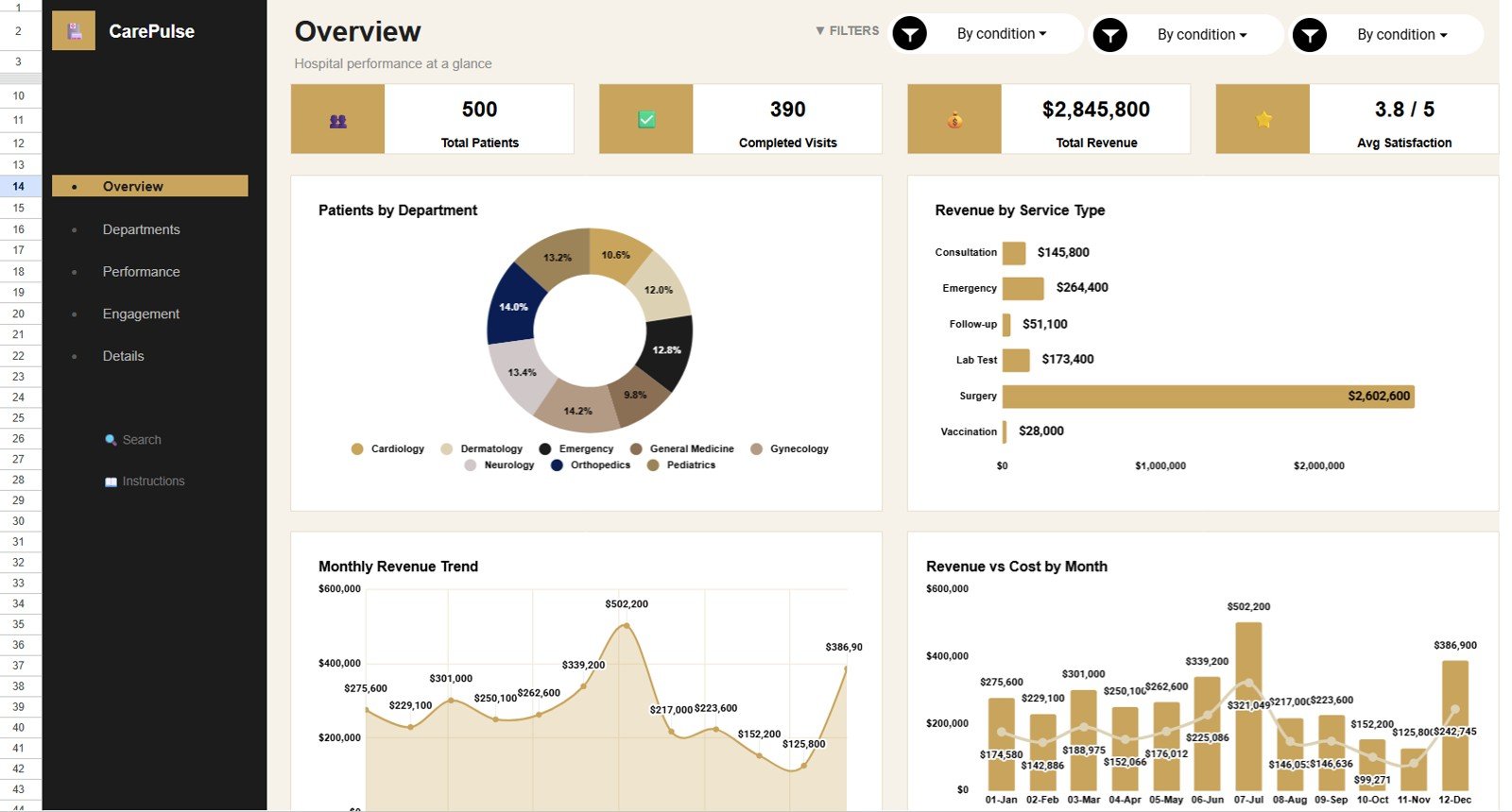
The Overview Page gives leadership a fast readout of Total Patients, Completed Visits, Total Revenue, and Avg Satisfaction. Slicers help users filter the whole view without changing formulas.
Patients by Department: This chart shows how patient volume is distributed across departments. It helps managers identify busy service areas and departments needing attention.
Revenue by Service Type: This chart compares revenue across service categories. It helps finance teams see which services contribute the most income.
Revenue by Month: This trend view tracks monthly revenue movement. It helps teams compare stronger and weaker months at a glance.
Revenue and Cost by Month: This chart compares revenue against cost over time. It helps reveal whether higher activity is also producing healthier margins.
2 – Department Analysis
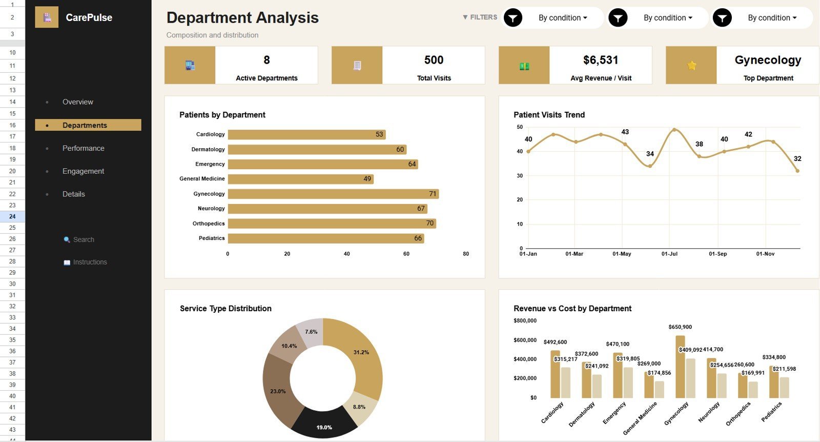
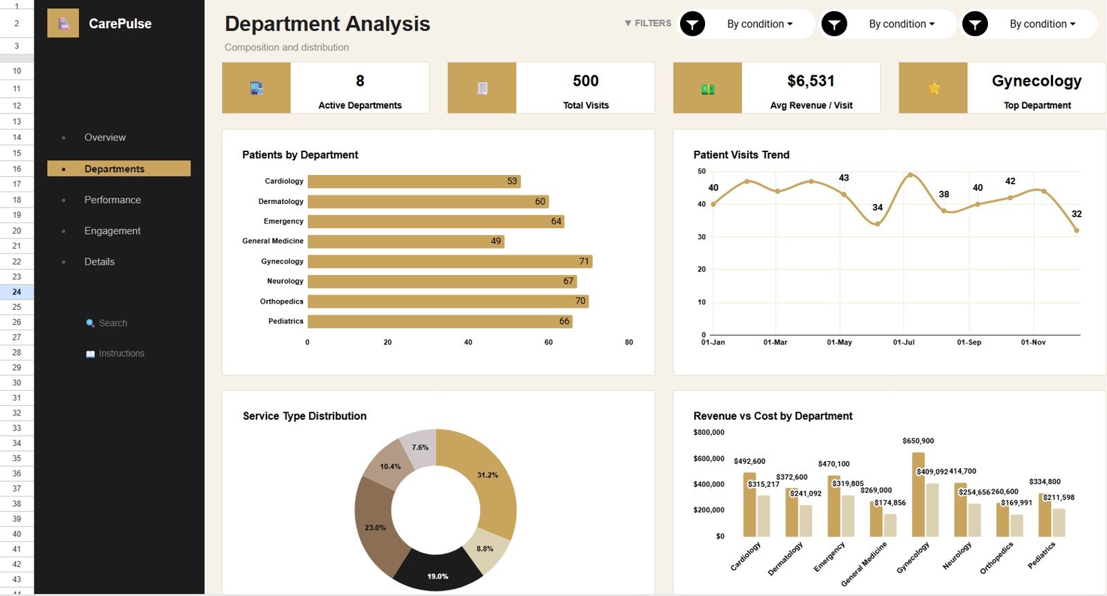
The Department Analysis tab reviews how patient visits, service type demand, and department revenue compare. It is useful for department heads and practice administrators who need a quick operational breakdown.
Patients by Department: This view compares total patients across departments. It helps identify where demand is concentrated.
Patient Visits by Month: This monthly chart shows visit movement over time. It helps teams plan staffing and review seasonality.
Patient Visits by Service Type: This chart shows which services generate the most visits. It helps managers understand demand by service category.
Revenue and Cost by Department: This chart compares money earned and cost incurred by department. It supports margin review and budget conversations.
3 – Performance
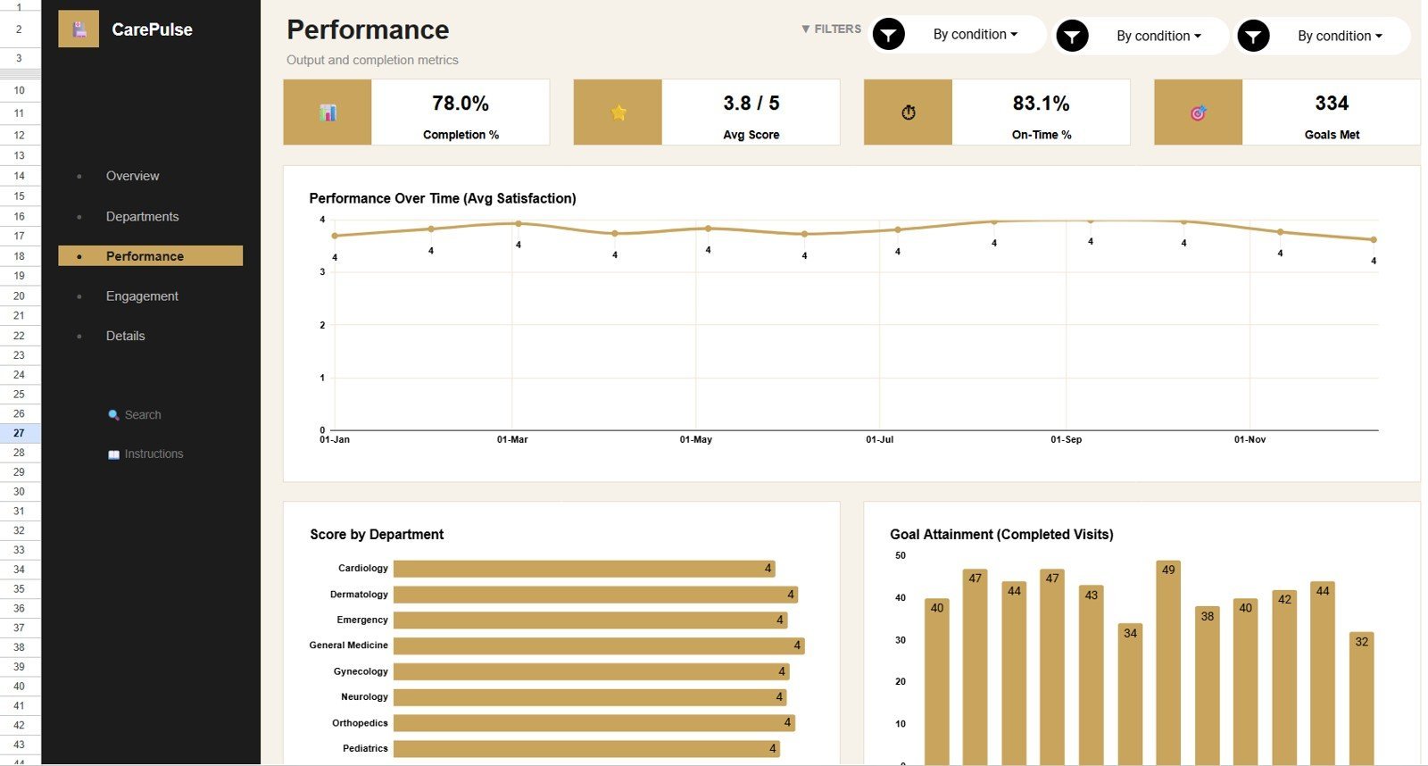
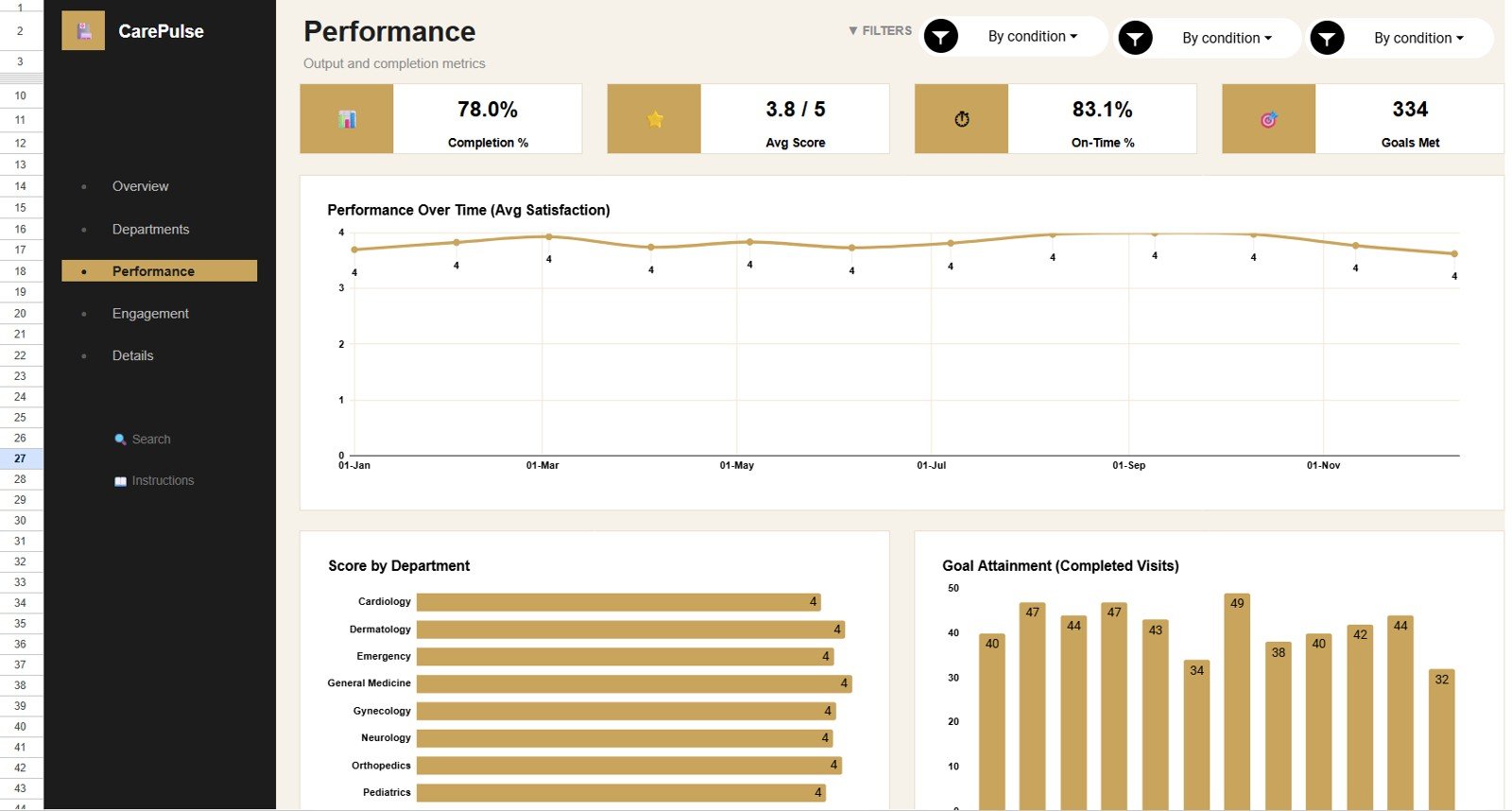
The Performance tab focuses on patient satisfaction, department scores, and completed visit movement. It helps leaders connect service quality with operational throughput.
Avg Satisfaction by Month: This chart tracks satisfaction movement month by month. It helps identify periods where patient experience improved or weakened.
Avg Score by Department: This chart compares average score across departments. It helps teams locate departments with stronger or weaker service feedback.
Completed Visits by Month: This chart shows completed visit volume over time. It helps managers monitor throughput and follow-up effectiveness.
4 – Engagement
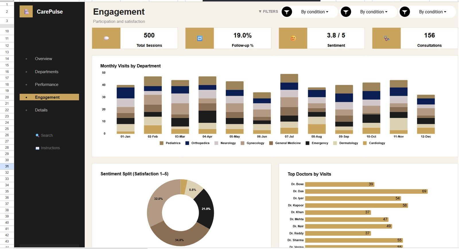
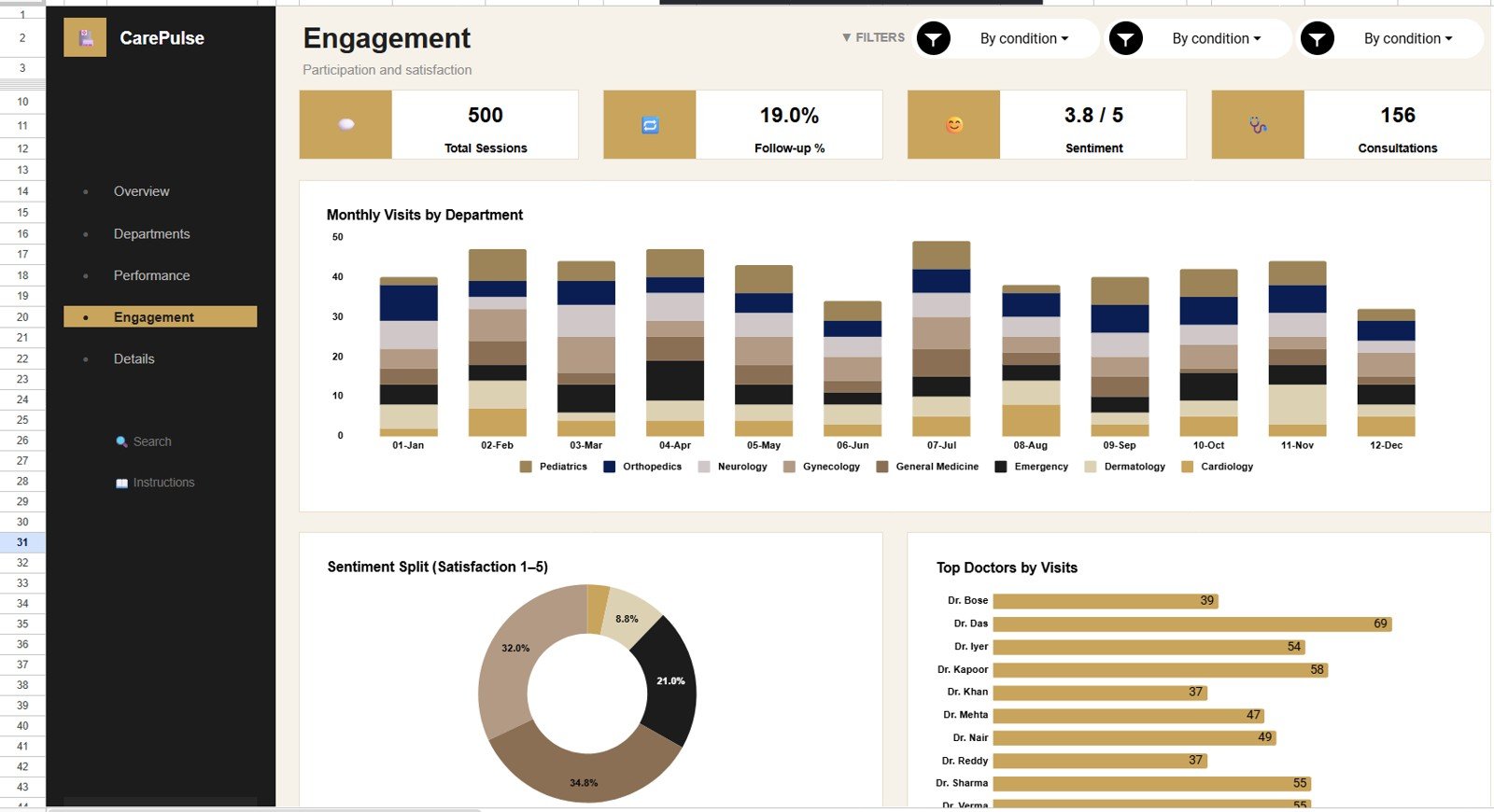
The Engagement tab looks at visits by department and month, satisfaction rating distribution, and doctor activity. It is useful for workload reviews and patient experience discussions.
Visits by Department and Month: This chart shows how department visit volume changes across months. It helps identify demand shifts by department.
Satisfaction Count by Rating: This chart counts satisfaction responses by rating level. It helps teams understand whether feedback is clustered high, low, or mixed.
Doctor Visits by Doctor: This chart compares visit volume by doctor. It helps review workload distribution and capacity.
5 – Details
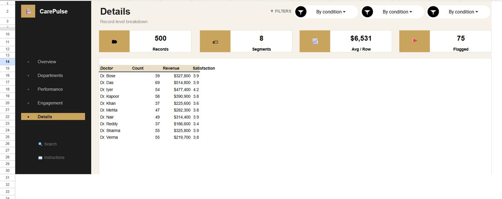
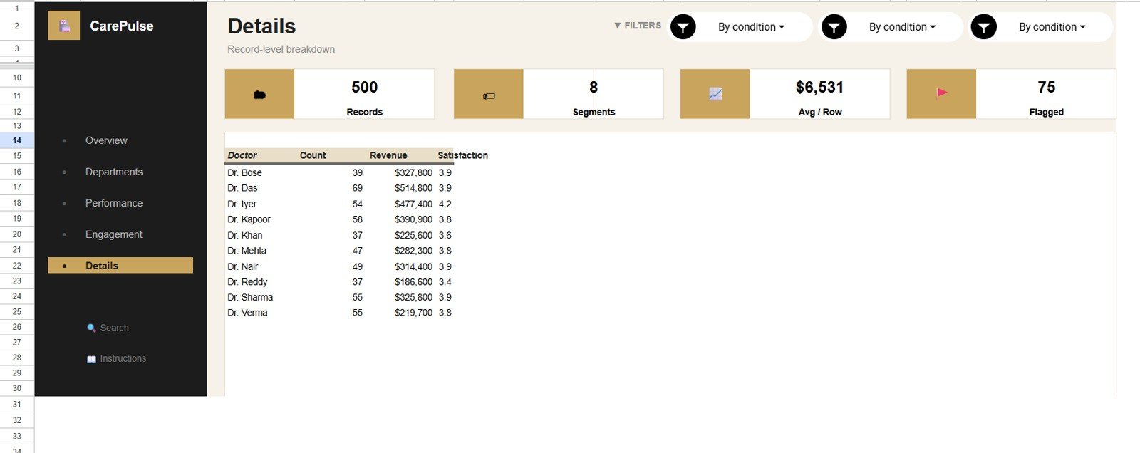
The Details tab provides doctor-level analysis for records, revenue, and satisfaction. It helps administrators compare activity, financial contribution, and experience indicators in one place.
Records by Doctor: This chart shows how many records are tied to each doctor. It helps identify workload concentration.
Revenue by Doctor: This chart compares revenue generated by doctor. It helps finance and operations teams review provider-level contribution.
Satisfaction by Doctor: This chart compares satisfaction performance by doctor. It helps leadership review service quality signals carefully and fairly.
6 – Search Sheet Tab
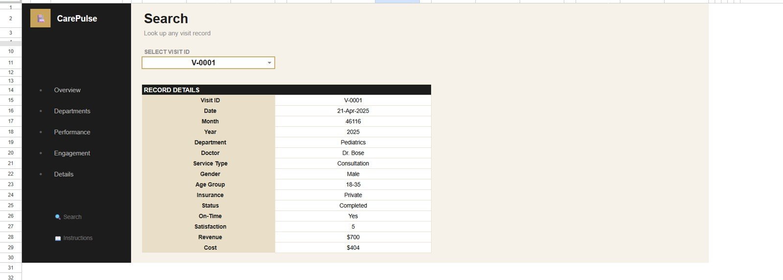
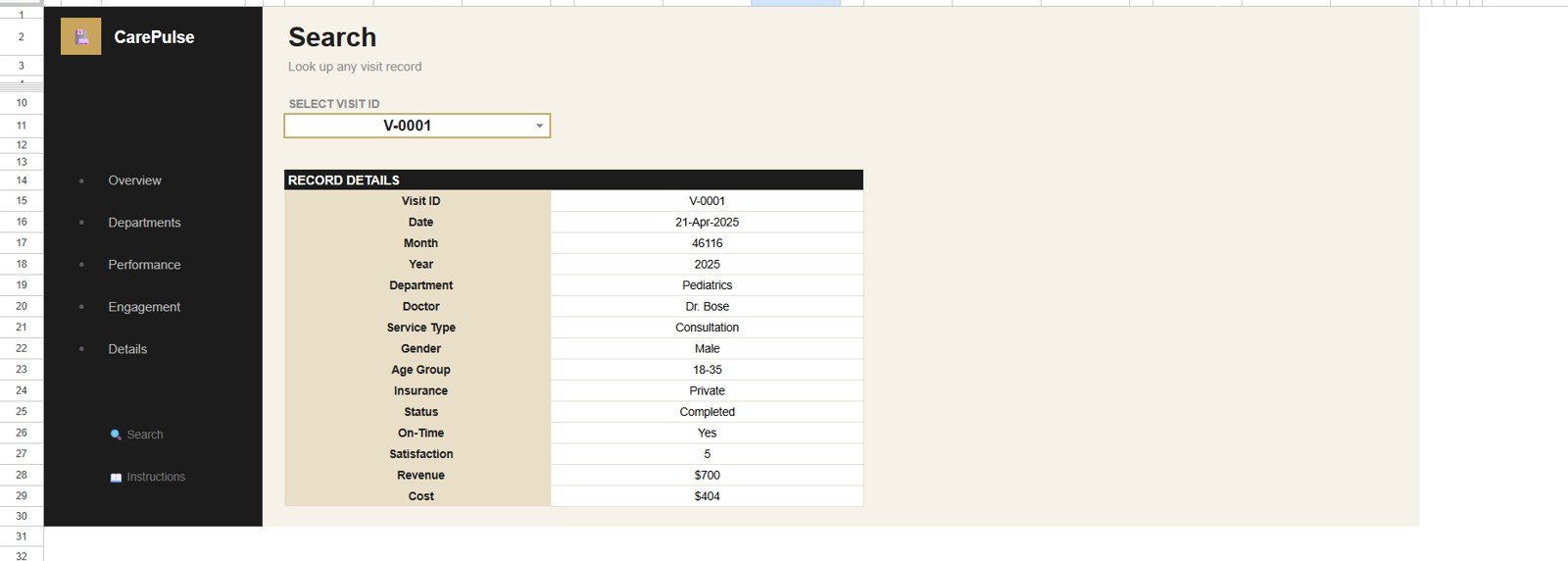
The Search tab lets users select a Visit ID and view the complete visit record details in one place. It is useful for billing questions, support follow-up, doctor review, and record-level checks.
7 – Data Sheet Tab
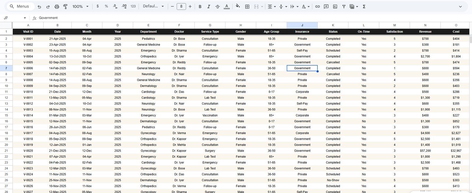
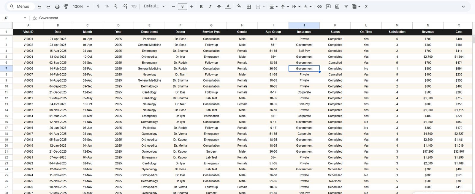
The Data Sheet is where users add their healthcare services records in the same structure as the sample data. Keeping the same columns and format helps the cards, slicers, charts, and search sheet update correctly.
Healthcare Services Dashboard in Google Sheets vs. Microsoft Excel vs. Paid Healthcare SaaS – Where This Fits
| Feature | This Google Sheets dashboard | Microsoft Excel dashboard | Paid healthcare SaaS |
|---|---|---|---|
| Cost | $9.99 one-time | Template cost plus Excel access | Monthly or annual subscription |
| Platform | Google Sheets in browser | Excel desktop or web | Vendor-hosted system |
| Setup time | Create copy, replace sample data, review | Open workbook, replace data, refresh | Implementation and onboarding |
| Team collaboration | Built into Google Drive sharing | Requires OneDrive or SharePoint | Usually role-based |
| Custom fields | Editable sheet structure | Editable workbook | Limited by vendor setup |
| Year-1 cost at 5 users | $9.99 plus Google Workspace, if used | Template plus licensing | Often hundreds or thousands |
| Best fit | Fast internal healthcare services reporting | Offline spreadsheet reporting | System-of-record workflows |
Who This Template Is For – and Who It’s Not For
This template is for healthcare administrators, clinic managers, department heads, healthcare finance analysts, operations leads, and consultants who need a clear Google Sheets dashboard for patients, visits, revenue, cost, satisfaction, service type, department, and doctor-level analysis.
It is not an EHR, EMR, patient portal, billing system, claims processor, or HIPAA compliance product by itself. If your team needs automated clinical workflows, live integrations, or advanced access controls, use this dashboard as an internal reporting layer after data is exported or prepared.
How to Use the Healthcare Services Dashboard in Google Sheets
- Open the PDF guide included with the product download.
- Click the Google Sheets copy link and create your own editable file in Google Drive.
- Go to the Data Sheet tab and replace sample records in the same format.
- Use slicers on the dashboard pages to filter by available fields.
- Review Overview first, then Department Analysis, Performance, Engagement, and Details.
- Use the Search tab when you need to look up one Visit ID quickly.
Real-World Use Cases
Priya, clinic operations manager: reviews completed visits, department demand, and doctor workload before weekly staffing meetings.
Marco, healthcare finance analyst: compares revenue and cost by month, service type, department, and doctor to explain financial performance.
Fatima, healthcare consultant: prepares a quick reporting layer for a client that exports visit data but does not yet need a full BI implementation.
Frequently Asked Questions
What does this dashboard track?
It tracks patients, completed visits, revenue, costs, satisfaction, departments, service types, monthly trends, doctors, Visit ID lookup, and raw healthcare services records.
Do I need Excel to use it?
No. The template is built for Google Sheets and runs in the browser after you create your own copy.
Can I replace the sample data?
Yes. Add your records to the Data Sheet tab using the same structure as the sample data.
Can multiple team members view it?
Yes. You can share the copied Google Sheet through Google Drive permissions, depending on your organization’s data rules.
Does it connect directly to an EHR?
No. It is a Google Sheets reporting template. Export, prepare, or paste structured records into the Data Sheet.
Is this HIPAA compliant?
The template alone does not guarantee HIPAA compliance. Compliance depends on your Google Workspace configuration, access control, data handling, and internal policies.
About the Author
Built by PK – Microsoft Certified Professional with 15+ years of Excel, Google Sheets, and Power BI experience. Founder of NextGenTemplates, reaching 300K+ subscribers across YouTube channels. Every template is hand-built and tested before release.
Explore Related Templates
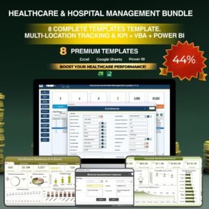
- Healthcare & Hospital Management Bundle – Best-value healthcare template collection.
- Medical Practice Dashboard in Google Sheets – Clinic operations and visit analytics.
- Telehealth Dashboard in Google Sheets – Virtual care reporting in Google Sheets.
- Google Sheets Templates – Browse all Google Sheets products.
- Google Sheets Dashboard Templates – More browser-based dashboards.
Ready to review healthcare services performance in one editable Google Sheet? Download the Healthcare Services Dashboard in Google Sheets and start replacing sample records with your own data.
Watch the step-by-step video Demo:
Last updated: July 11, 2026.






















Reviews
There are no reviews yet.