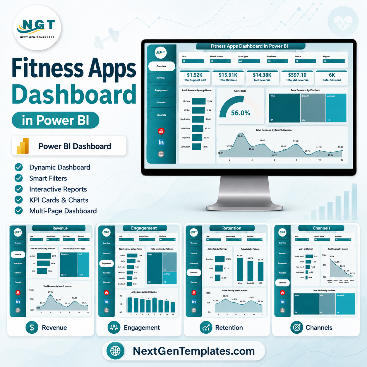


Fitness Apps Dashboard in Power BI gives fitness app founders, product managers, growth analysts, subscription teams, and wellness app operators a ready .pbix report for tracking app revenue, ad revenue, sessions, active users, support cost, regions, platforms, plans, trainers, acquisition channels, and workout categories. The report includes 5 Power BI pages, 5 executive KPI cards, multiple slicers, and 16 analysis visuals. For a one-time price of $17.99, teams can move from scattered exports to an interactive Power BI dashboard without starting from a blank report or paying for another dashboard subscription.
Key Features of Fitness Apps Dashboard in Power BI
- 5 Power BI pages covering Overview, Revenue, Engagement, Retention, and Channels.
- 5 headline KPI cards for Total Support Cost, Total Revenue, Net Revenue, Total Ad Revenue, and Total Sessions.
- Multiple slicers so users can filter app performance quickly by available report fields.
- Revenue analysis by app name, acquisition channel, region, workout category, and month number.
- Engagement analysis by ad revenue, user segment, trainer, active users, and sessions.
- Retention views for revenue, active users, plan type, and acquisition channel performance.
- Channel reporting for user segment, app name, platform, support cost, and net revenue.
- Editable .pbix file for Power BI Desktop customization.
What’s Inside the Fitness Apps Dashboard in Power BI
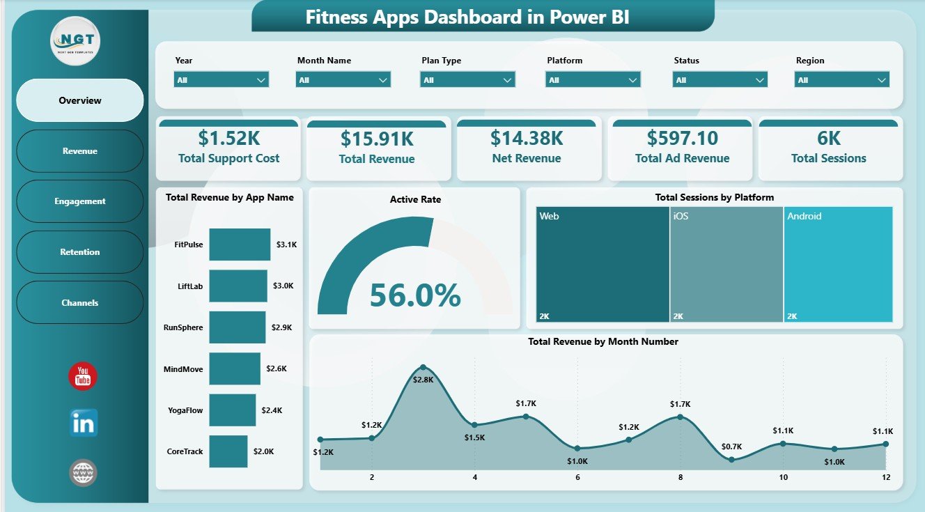
1. Overview Page
The Overview page is the executive summary of the report. At the top, KPI cards show Total Support Cost, Total Revenue, Net Revenue, Total Ad Revenue, and Total Sessions so leaders can review app performance before moving into detailed pages.
Total Revenue by App Name: This chart compares revenue contribution across app brands or app names. It helps portfolio owners see which fitness apps are driving the strongest income.
Active Rate by Overall Users: This visual shows the active-user share compared with the overall user base. It is useful for checking whether app usage is healthy or if activation needs attention.
Total Sessions by Platform: This chart compares sessions across platforms such as iOS, Android, or web. It helps product teams understand where user activity is strongest.
Total Revenue by Month Number: This monthly chart highlights revenue movement over time. It helps teams find growth patterns, seasonality, and months that need deeper review.
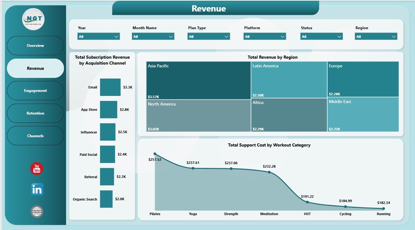
2. Revenue
The Revenue page focuses on monetization and support cost. It includes Total Subscription Revenue by Acquisition Channel, Total Revenue by Region, and Total Support Cost by Workout Category.
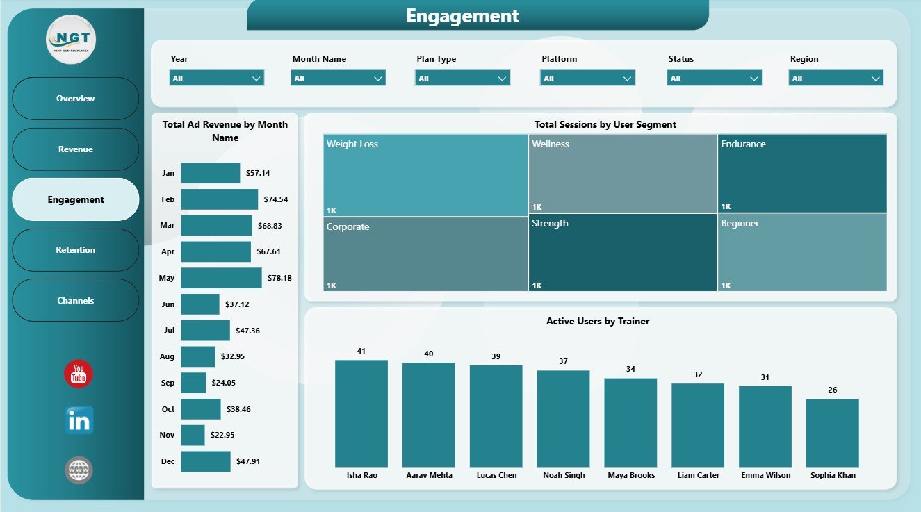
3. Engagement
The Engagement page helps users understand how people interact with the fitness app. It includes Total Ad Revenue by Month Name, Total Sessions by User Segment, and Active Users by Trainer.
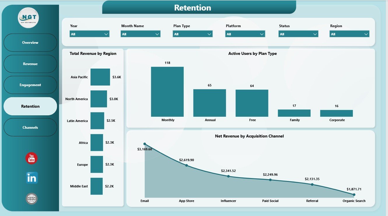
4. Retention
The Retention page connects revenue, active users, plan type, and acquisition channel. It includes Total Revenue by Region, Active Users by Plan Type, and Net Revenue by Acquisition Channel.

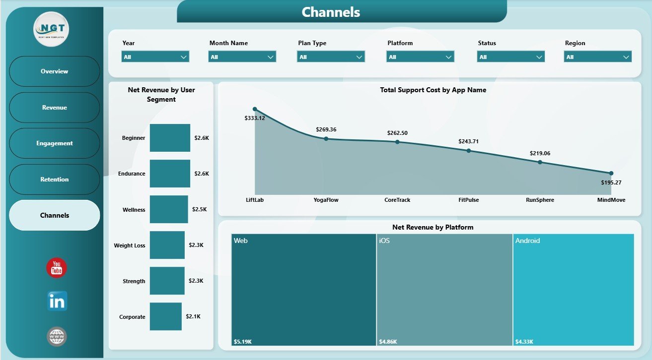
5. Channels
The Channels page shows how user segments, app names, and platforms affect profitability. It includes Net Revenue by User Segment, Total Support Cost by App Name, and Net Revenue by Platform.

Fitness Apps Dashboard in Power BI vs. Tableau vs. Paid App Analytics SaaS – Where This Fits
| Feature | This Power BI Dashboard | Tableau Alternative | Paid App Analytics SaaS |
|---|---|---|---|
| Cost | $17.99 one-time | License plus dashboard build time | Monthly or annual subscription |
| Platform | Power BI Desktop and Power BI Service | Tableau Desktop or Cloud | Vendor cloud platform |
| Setup time | Open .pbix, replace or connect data, refresh | Build or adapt workbook | Requires onboarding and integrations |
| Real-time team collaboration | Available after publishing to Power BI Service | Available through Tableau Cloud | Usually included by plan |
| Mobile access | Available after Power BI publishing | Available after publishing | Usually included |
| Customizable fields | Editable model, visuals, measures, and filters | Editable if you own the workbook | Limited by vendor configuration |
| Year-1 cost at 5 users | $17.99 plus any Microsoft licensing | Usually much higher | Often hundreds or thousands |
| Fitness app reporting | 5 ready report pages included | Requires dashboard design | Depends on plan and data connectors |
Who This Template Is For – and Who It’s Not For
This template is for fitness app founders, wellness app teams, product managers, subscription analysts, growth marketers, finance teams, trainer-led program managers, and consultants who need recurring Power BI reporting for revenue, engagement, retention, and acquisition-channel review.
It is not a live app-store connector, mobile SDK, attribution system, cohort engine, push notification tool, or replacement for Firebase, Amplitude, Mixpanel, Appsflyer, or billing platforms. It works best when your app data can be exported or connected to Power BI in a clean table structure.
How to Use the Fitness Apps Dashboard in Power BI
- Download and unzip the dashboard package.
- Open the .pbix file in Power BI Desktop.
- Review the included sample fields and pages.
- Replace or connect your own fitness app dataset.
- Refresh the report and validate KPI cards, visuals, and slicers.
- Use slicers to review app, region, platform, plan, channel, trainer, segment, and time-based views.
- Publish to Power BI Service if you want controlled sharing or scheduled refresh.
Real-World Use Cases
Aarav, Fitness App Founder: Aarav reviews revenue, net revenue, ad revenue, sessions, and support cost before investor or leadership updates.
Maya, Product Manager: Maya filters engagement by user segment and trainer to understand which programs create stronger app activity.
Jordan, Growth Analyst: Jordan compares subscription revenue by acquisition channel and region to decide where campaign spend should move next.
Frequently Asked Questions
What pages are included?
The report includes Overview, Revenue, Engagement, Retention, and Channels pages.
What KPI cards are shown on the Overview page?
The Overview page shows Total Support Cost, Total Revenue, Net Revenue, Total Ad Revenue, and Total Sessions.
Do I need Power BI Desktop?
Yes. Power BI Desktop is used to open, refresh, edit, and customize the .pbix report.
Can I use data from more than one app?
Yes. The report includes analysis by App Name, so multiple fitness or wellness app brands can be reviewed together.
Can I customize the dashboard?
Yes. You can edit visuals, measures, colors, labels, pages, filters, and fields in Power BI Desktop.
Does this replace app analytics software?
No. It is a reporting dashboard for prepared data, not a real-time event tracking or attribution platform.
About the Author
Built by PK – Microsoft Certified Professional with 15+ years of Excel, Google Sheets, and Power BI experience. Founder of NextGenTemplates, reaching 300K+ subscribers across YouTube channels. Every template is hand-built and tested before release.
Explore Related Templates
- Fitness Apps Dashboard in Excel
- FinOps Teams Dashboard in Power BI
- Franchise Performance Dashboard in Power BI
- Browse Power BI Dashboard Templates
- Browse Power BI Templates
Download the Fitness Apps Dashboard in Power BI and turn app performance data into a clear report for revenue, engagement, retention, channels, and support-cost review.
Last updated: June 13, 2026.


Reviews
There are no reviews yet.