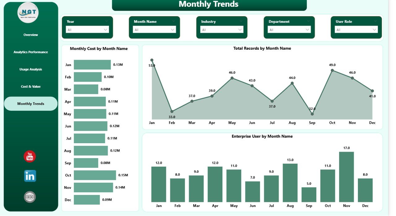

In today’s fast-paced digital landscape, businesses are flooded with massive volumes of data every single day. However, when this data remains scattered across reports and spreadsheets, it becomes difficult to extract meaningful insights. As a result, organizations struggle with slow decision-making and missed opportunities.
So, how can you transform raw data into powerful, AI-driven insights instantly?
👉 The answer is the Augmented Analytics Dashboard in Power BI.
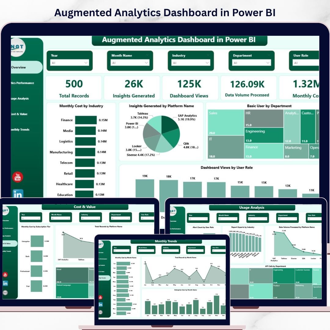
This advanced and interactive dashboard leverages artificial intelligence and business intelligence to automate insights, enhance accuracy, and improve decision-making. Moreover, it converts complex datasets into visually rich and easy-to-understand reports. Therefore, you can identify trends, monitor performance, and take action faster than ever before.
🚀 Key Features of Augmented Analytics Dashboard in Power BI
✨ AI-Powered Insights Generation
Automatically uncover hidden patterns and trends without manual analysis.
📊 5 Interactive Dashboard Pages
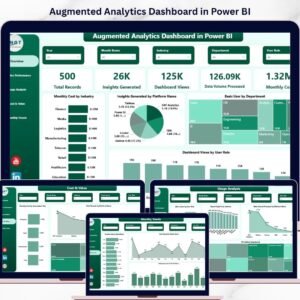
Includes Overview, Analytics Performance, Usage Analysis, Cost & Value, and Monthly Trends.
📈 Dynamic KPI Cards
Track key metrics like Total Records, Insights Generated, Monthly Cost, and more.
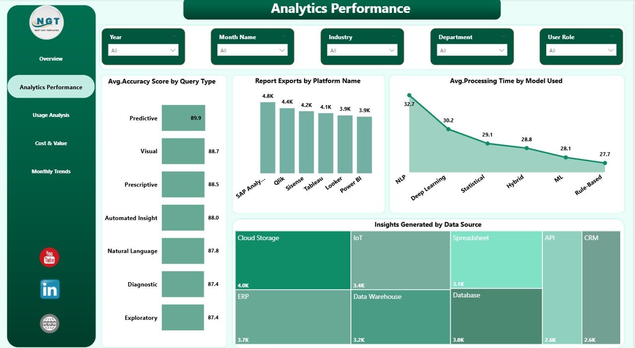
⚙️ Advanced Performance Tracking
Measure accuracy, processing time, and analytics efficiency with detailed visuals.
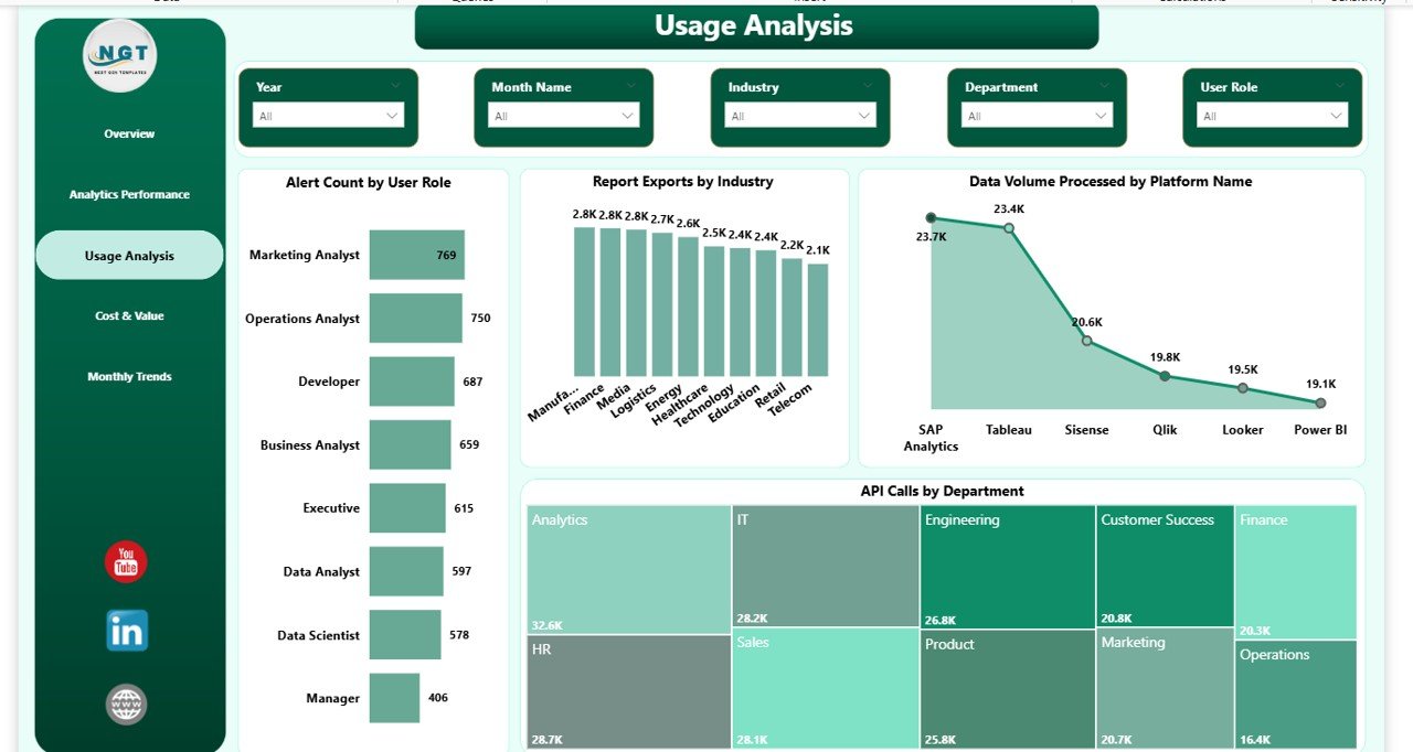
📉 User Behavior & Usage Insights
Understand how users interact with dashboards, APIs, and reports.
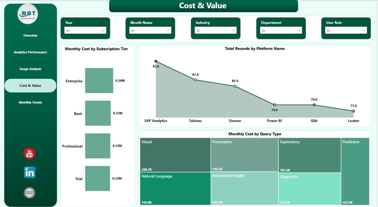
💰 Cost & ROI Monitoring
Analyze subscription costs, data usage, and value generated.
📅 Trend Analysis Over Time
Track monthly growth, user trends, and performance patterns.
🎯 Interactive Filters & Slicers
Drill down into data and perform customized analysis effortlessly.
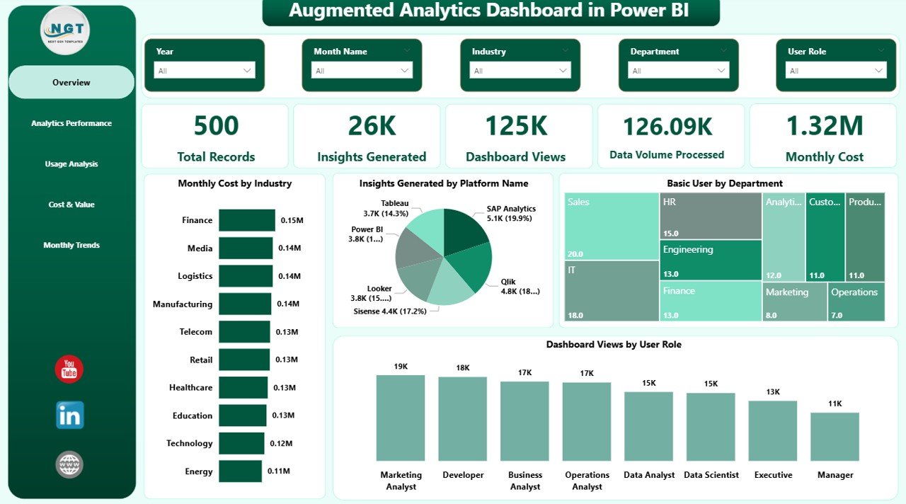
📦 What’s Inside the Augmented Analytics Dashboard in Power BI
📁 Power BI Dashboard File (.pbix)
Fully functional and ready-to-use dashboard with interactive visuals.
📊 5 Structured Pages with Charts & KPIs
Each page is designed to provide specific insights—from performance to cost analysis.
📌 Pre-Built Visualizations
Includes bar charts, KPI cards, trend charts, and comparative visuals.
🎛️ Slicers & Filters for Easy Navigation
Allow users to explore data dynamically and efficiently.
📑 Well-Organized Data Model
Ensures smooth performance and easy customization.
🛠️ How to Use the Augmented Analytics Dashboard in Power BI
1️⃣ Import Your Data into Power BI
Load your dataset quickly into the dashboard.
2️⃣ Connect Data Sources
Link your data with the existing model for seamless integration.
3️⃣ Use Slicers for Filtering
Customize views based on departments, platforms, or time periods.
4️⃣ Analyze KPIs & Charts
Monitor performance metrics and identify key insights.
5️⃣ Make Data-Driven Decisions
Use AI-powered insights to improve strategy and outcomes.
👉 Within minutes, you’ll turn complex data into actionable intelligence.
🎯 Who Can Benefit from This Augmented Analytics Dashboard in Power BI
👨💼 Business Analysts – Gain deeper insights and improve reporting efficiency
📊 Data Analysts & Scientists – Automate analysis and reduce manual work
🧠 Decision Makers & Executives – Make faster, data-driven decisions
💻 IT & BI Teams – Monitor system performance and analytics efficiency
🏢 Industries (Finance, Healthcare, Retail, Tech) – Optimize operations and strategy
This dashboard is designed for anyone who wants to unlock the true power of data using AI-driven analytics.
Click here to read the Detailed blog post
Watch the step-by-step video tutorial:
Visit our YouTube channel to learn step-by-step video tutorials
https://www.youtube.com/@PKAnExcelExpert
Compatibility and Requirements
- Open the .pbix file in Power BI Desktop, which is free. Microsoft explains how to install it in Get Power BI Desktop.
- Use the slicers on each page to filter the visuals. Sharing a report online needs a Power BI account, but building and viewing it in Desktop does not.
Frequently Asked Questions
What pages are in the Augmented Analytics Dashboard in Power BI?
Five pages: Overview, Analytics Performance, Usage Analysis, Cost & Value, and Monthly Trends.
Which KPIs appear on the cards?
The KPI cards track metrics such as Total Records, Insights Generated and Monthly Cost. Other pages cover accuracy, processing time, usage by dashboards, APIs and reports, and subscription cost.
Can I filter the report?
Yes. Slicers let you filter the views by department, platform or time period.
What do I get in the download?
A ready-to-use Power BI file (.pbix) with the five pages, the charts, KPI cards, slicers and the data model.
Is there an Excel version?
Yes, the Augmented Analytics Dashboard in Excel covers the same topic for Excel users.
Related Analytics Templates
- Augmented Analytics Dashboard in Excel: the same dashboard for Excel.
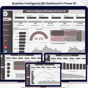
- Business Intelligence (BI) Dashboard in Power BI: a wider BI view in Power BI.
- Data Analytics KPI Dashboard in Power BI: monthly KPIs for an analytics team.
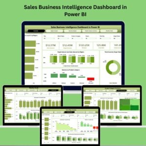
- Sales Business Intelligence Dashboard in Power BI: BI reporting for sales data.
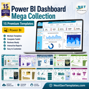
- Power BI Dashboard Mega Collection: 15 Power BI dashboards in one bundle.
Browse all Power BI dashboards or the Power BI KPI dashboards.