

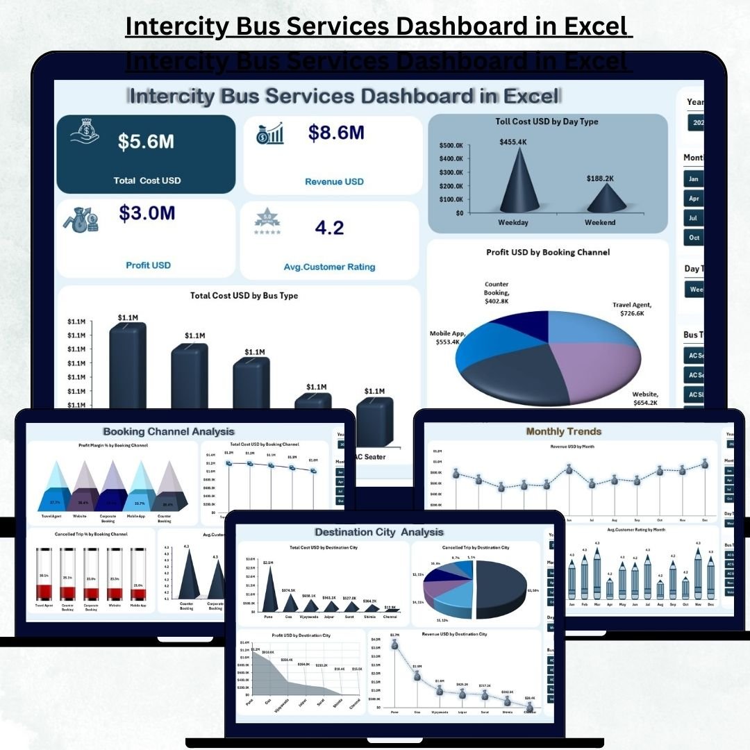
Intercity Bus Services Dashboard in Excel Running intercity bus services requires constant monitoring, accurate reporting, and real-time insights. Every day, transport companies manage hundreds of trips, multiple routes, fluctuating fuel costs, booking channels, cancellations, and thousands of passengers. Handling this manually becomes confusing, slow, and inefficient. Intercity Bus Services Dashboard in Excel Intercity Bus Services Dashboard in Excel That’s exactly why the Intercity Bus Services Dashboard in Excel is the perfect solution for transport companies of any size.
This ready-to-use Excel dashboard consolidates all critical data—operational, financial, and customer-related—into clean visual charts, KPI cards, and interactive slicers. With just a few clicks, business owners and transport managers get a complete snapshot of their performance. Intercity Bus Services Dashboard in Excel Whether you want to compare routes, track booking channel profitability, identify cost-heavy operations, or analyze monthly trends, this dashboard gives you everything instantly.
Here’s a complete breakdown of what this powerful dashboard includes and how it helps you improve decision-making 👇
✨ Key Features of the Intercity Bus Services Dashboard in Excel
🚍 1. Five Insightful Analysis Pages
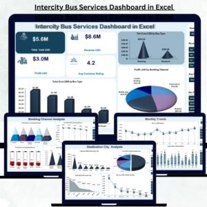
Includes Overview, Route Name Analysis, Destination City Analysis, Booking Channel Analysis, and Monthly Trends — each offering deep insights into your transport operations.
💰 2. KPI Cards for Instant Financial Clarity
Track Total Revenue, Total Cost, Profit, and Profit Margin % — all updated dynamically with slicers.
🔄 3. Smart Slicers for Deep Analysis
Filter data by month, bus type, booking channel, route, or city. All visuals update instantly.
📈 4. Automated Trend Analysis
Monthly charts reveal seasonal demands, profit fluctuations, and customer rating patterns.
🛠️ 5. User-Friendly & Fully Customizable
Built entirely in Excel, making it easy to update, maintain, and personalize.
📦 What’s Inside the Intercity Bus Services Dashboard in Excel
🏠 1. Overview Page – Your Central Performance Dashboard

This page acts as the main control center. On the left, the Page Navigator helps you switch between analytical pages. On the right, slicers let you filter the dashboard instantly.
⭐ KPI Cards on the Overview Page
Total Revenue
Total Cost
Profit
Profit Margin %
These high-level KPIs help managers assess overall performance within seconds.
⭐ Powerful Visual Charts
Toll Cost (USD) by Day Type → Evaluate weekday vs weekend vs holiday toll expenses.
Total Cost (USD) by Bus Type → Identify which bus models generate higher operational costs.
Profit (USD) by Booking Channel → Measure profit contribution from app, website, counter, and agent bookings.
This page gives a complete business snapshot in the simplest way possible.
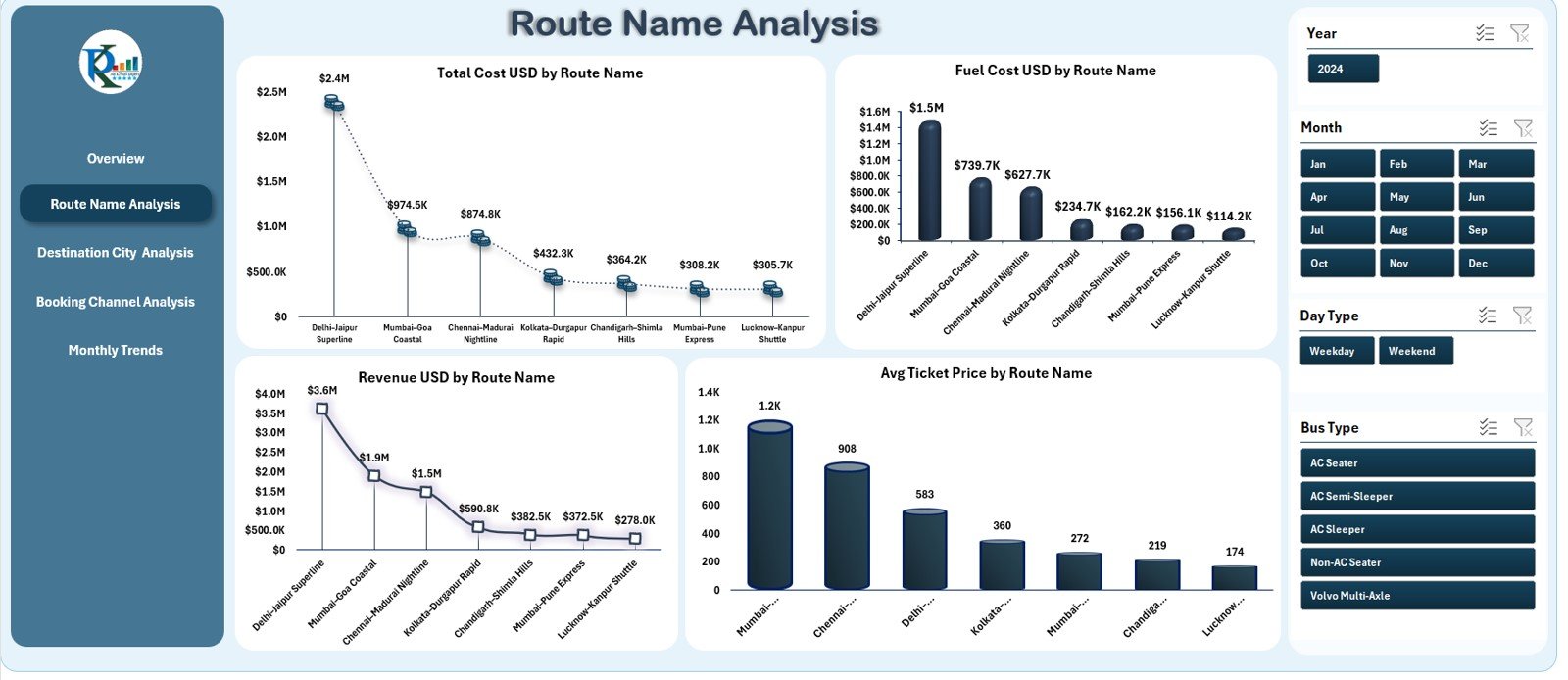
🛣️ 2. Route Name Analysis – Route-Wise Performance Insights
This page helps transport companies evaluate profitability at the route level.
📊 Charts Included
Total Cost (USD) by Route Name
Fuel Cost (USD) by Route Name
Revenue (USD) by Route Name
Average Ticket Price by Route Name
These visuals help you identify profitable routes, fuel-heavy routes, and high-demand routes.
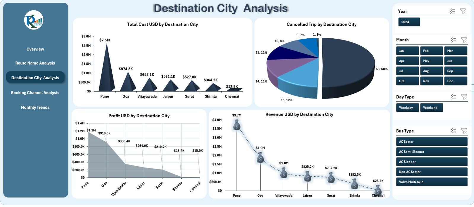
🏙️ 3. Destination City Analysis – City-Based Performance Breakdown
City-wise performance makes route planning and scheduling smarter.
📊 Charts Included
Total Cost (USD) by Destination City
Cancelled Trip Count by Destination
Profit (USD) by Destination City
Revenue (USD) by Destination City
These insights help you increase services in profitable cities and modify plans for low-performing ones.
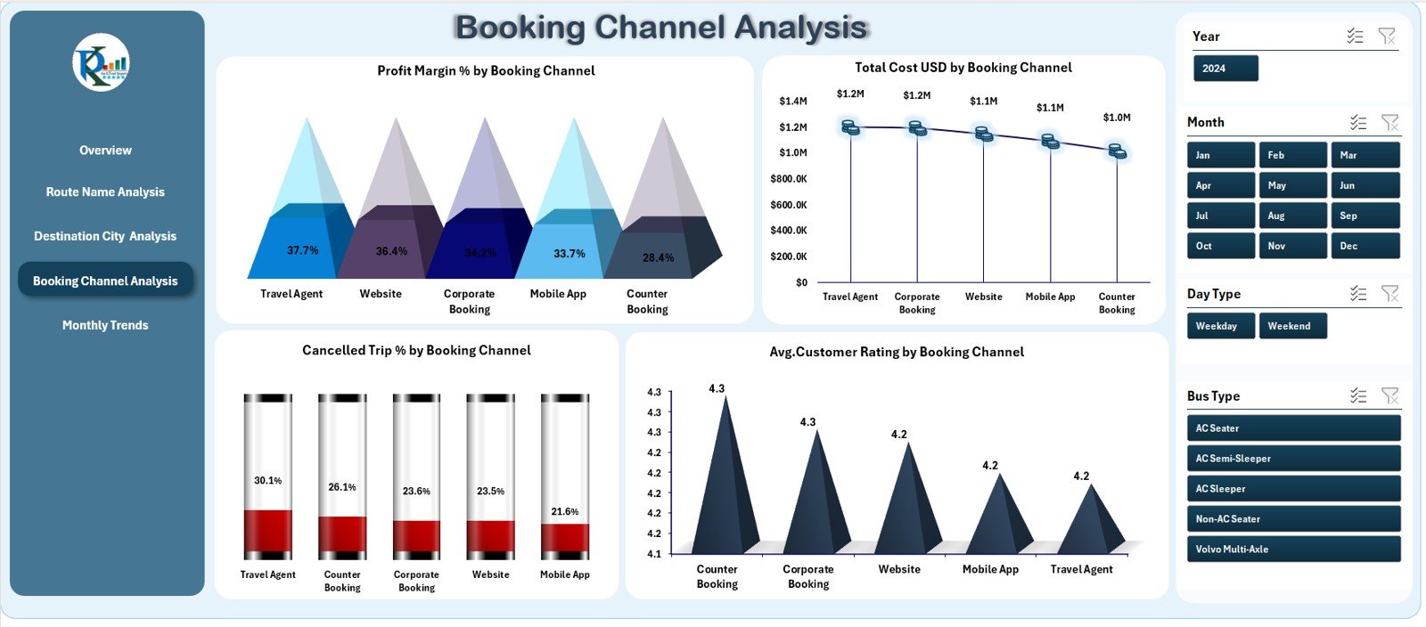
🎫 4. Booking Channel Analysis – Understand Channel-Wise Profitability
Booking channels affect cost, profit, and customer experience.
📊 Charts Included
Profit Margin % by Booking Channel
Total Cost (USD) by Booking Channel
Cancelled Trip % by Booking Channel
Average Customer Rating by Booking Channel
This page helps optimize channel mix, improve customer satisfaction, and reduce cancellation patterns.
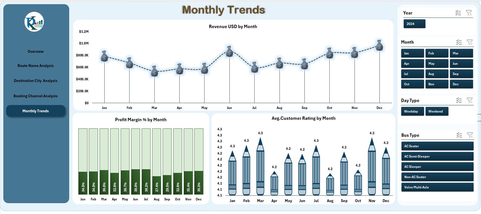
📅 5. Monthly Trends – Clear Month-Wise Performance Tracking
Monthly behavior analysis helps identify seasonal demand and financial trends.
📈 Trend Charts
Revenue (USD) by Month
Profit Margin % by Month
Average Customer Rating by Month
These insights help transport companies plan marketing campaigns, adjust pricing, and allocate buses more effectively.
👥 Who Can Benefit from the Intercity Bus Services Dashboard?
🚌 Transport Managers
Monitor route performance, bus efficiency, and profitability.
💼 Business Owners & Directors
Review overall financial health and operational KPIs.
📊 Data Analysts
Use automated visuals to generate meaningful insights.
🧑💻 Customer Experience Teams
Understand customer satisfaction patterns and service quality.
🚏 Operations & Planning Teams
Improve scheduling, route assignments, and monthly forecasting.










Reviews
There are no reviews yet.