




Transportation Services Dashboard move fast—but costs, delays, and shrinking margins can spiral even faster when visibility is poor. Fuel prices fluctuate, routes change, service expectations rise, and managers are forced to make decisions daily. However, when transportation data lives in scattered spreadsheets and static reports, teams lose control and profits suffer.
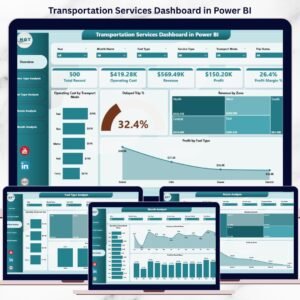
The Transportation Services Dashboard in Power BI is a ready-to-use, interactive analytics solution that brings operating cost, revenue, profit, routes, fuel types, service performance, delays, and monthly trends into one powerful dashboard. Instead of guessing, you gain real-time insights that help you reduce costs, improve efficiency, and grow profitability.
This dashboard turns transportation data into clear decisions—not complicated reports.
🚀 Key Features of Transportation Services Dashboard in Power BI
📊 Centralized Transportation Performance View – All KPIs in one interactive dashboard
🚚 Transport Mode Cost Analysis – Instantly identify high-cost transport modes
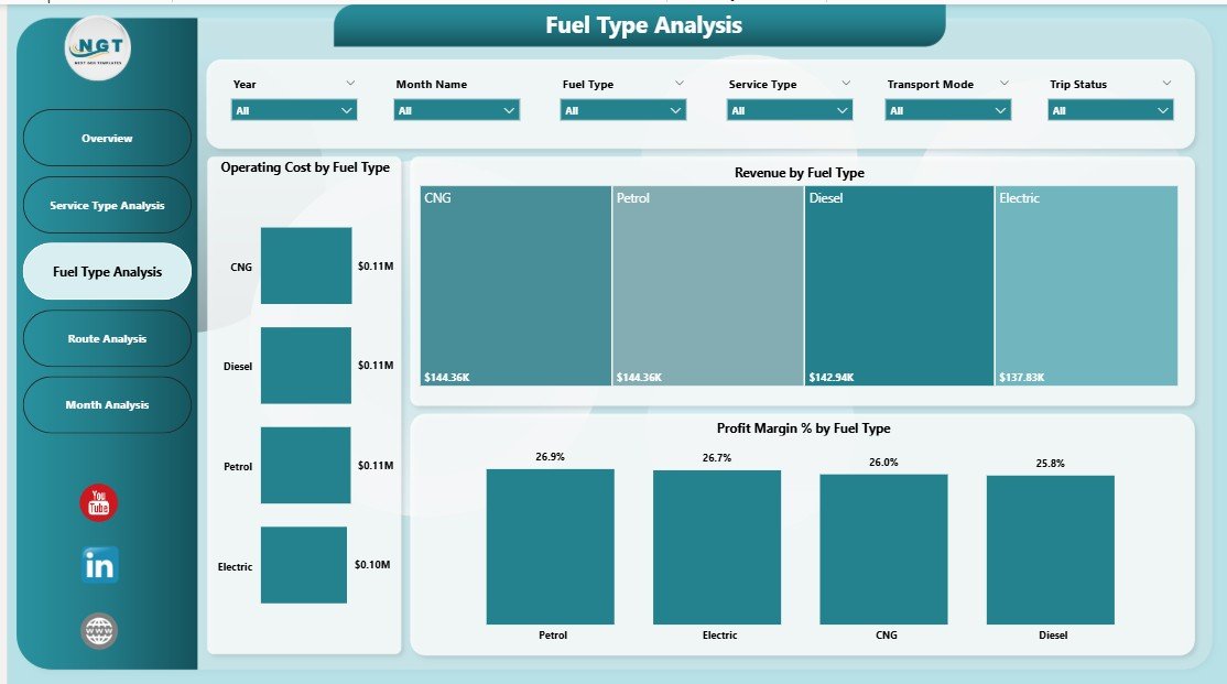
⛽ Fuel Type Profitability Insights – Understand fuel impact on margins
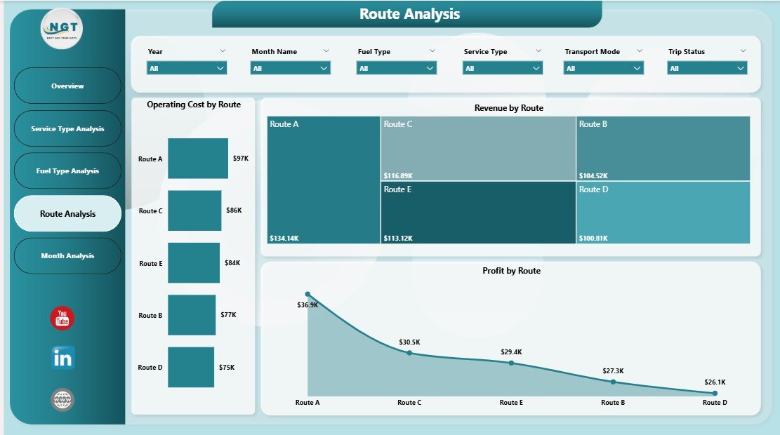
🗺️ Route-Wise Performance Tracking – Spot profitable and loss-making routes
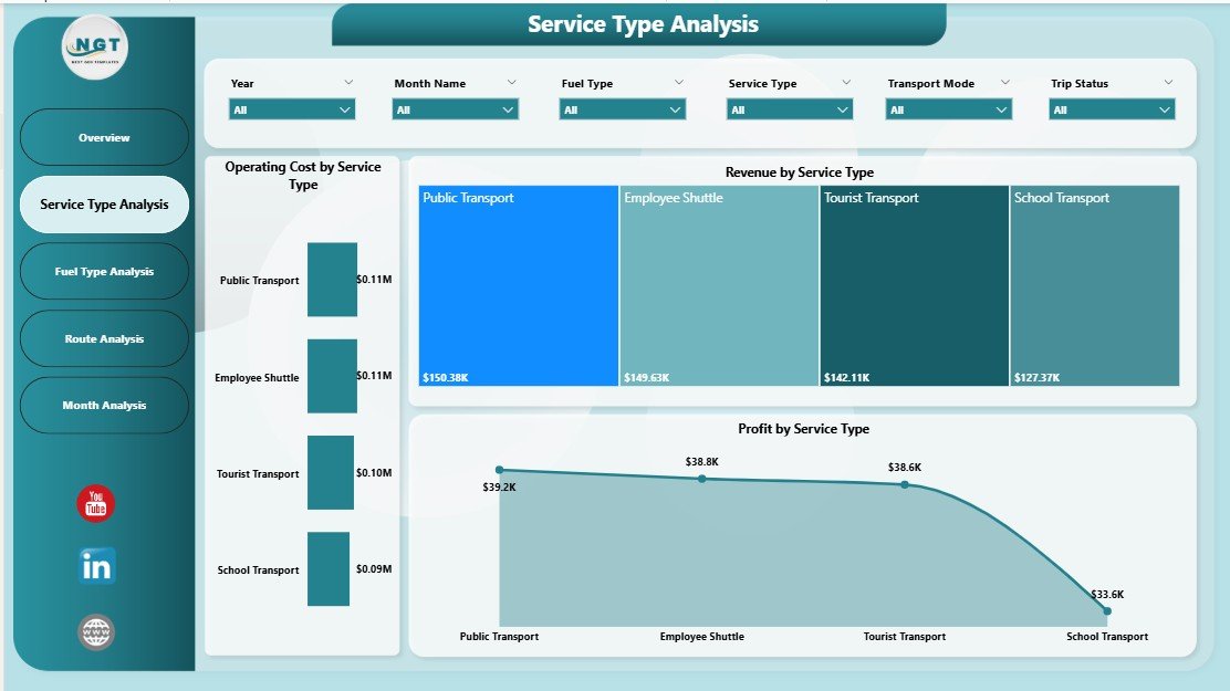
📈 Service Type Performance Comparison – Evaluate services by cost, revenue, and profit
⏱️ Delay & Reliability Monitoring – Measure delayed trip percentages
📅 Monthly Trend Analysis – Track seasonality and performance changes
🎛️ Interactive Power BI Slicers – Filter by route, service type, fuel, zone, or month
🔄 Real-Time Data Refresh – Always analyze the latest data
📦 What’s Inside the Transportation Services Dashboard in Power BI

📁 Power BI (.pbix) File with a professional, business-ready layout
📊 Overview Page – Instant snapshot of overall transportation performance
🚛 Service Type Analysis Page – Compare services by cost, revenue, and profit
⛽ Fuel Type Analysis Page – Evaluate fuel efficiency and margin impact
🗺️ Route Analysis Page – Route-level cost, revenue, and profitability insights
📆 Monthly Trends Page – Time-based cost, revenue, and profit trends
📊 Interactive KPI Cards & Charts – Clean visuals for quick understanding
⚙️ Scalable Data Model – Works for small fleets and large logistics operations
Each page answers a specific operational question, making analysis fast and decision-ready.
🧠 How to Use the Transportation Services Dashboard in Power BI
1️⃣ Connect your transportation data (Excel, database, or ERP export)
2️⃣ Open the Power BI dashboard file
3️⃣ Refresh data to update all visuals instantly
4️⃣ Use slicers to filter by service type, fuel type, route, zone, or month
5️⃣ Analyze cost, revenue, profit, and delays visually
6️⃣ Identify inefficiencies and optimize operations
No advanced Power BI skills are required. The dashboard is easy to navigate and business-friendly.
👥 Who Can Benefit from This Transportation Services Dashboard in Power BI
🚚 Transportation & Logistics Companies – Improve cost control and margins
📦 Fleet & Operations Managers – Optimize routes, fuel usage, and service mix
🏭 Supply Chain Teams – Improve delivery reliability and planning
💼 Finance & Cost Control Teams – Track profitability clearly
📊 Business Owners & Executives – Make fast, data-driven decisions
This dashboard is suitable for small transportation firms, growing logistics providers, and large enterprises.
🔗 Click here to read the Detailed Blog Post
🎥 Visit our YouTube channel to learn step-by-step video tutorials
https://www.youtube.com/@PKAnExcelExpert
Watch the step-by-step video tutorial:
Compatibility and Requirements
- Works in Power BI Desktop, which is free to download from Microsoft. The template is a .pbix file.
- You can connect your own transportation data from Excel, a database or an ERP export, then refresh to update all visuals. Microsoft explains how to get the app in Get Power BI Desktop.
Frequently Asked Questions
Which pages are included?
The dashboard has an Overview page, a Service Type Analysis page, a Fuel Type Analysis page, a Route Analysis page and a Monthly Trends page.
What data can I connect?
You can connect transportation data from Excel, a database or an ERP export. Refresh the data and all visuals update.
Can I filter the dashboard?
Yes. Slicers let you filter by service type, fuel type, route, zone or month.
Does it show which routes lose money?
Yes. The Route Analysis page shows cost, revenue and profit by route, so you can spot profitable and loss-making routes.
Is there an Excel version?
Yes. See the Transportation Dashboard in Excel and the Transportation & Logistics Dashboard in Excel.
Related Transportation and Logistics Templates
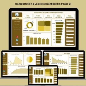
- Transportation & Logistics Dashboard in Power BI: another Power BI view of transport and logistics data
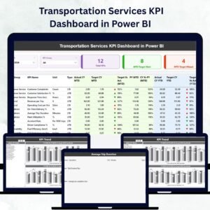
- Transportation Services KPI Dashboard in Power BI: a KPI-focused Power BI dashboard for transport services
- Transportation Services KPI Dashboard in Excel: the KPI dashboard in Excel
- Transportation Dashboard in Excel: a transportation dashboard for Excel users
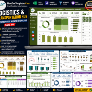
- Logistics and Transportation Hub: 7 templates for logistics and transport in one download
Browse all Power BI dashboards.









Reviews
There are no reviews yet.