

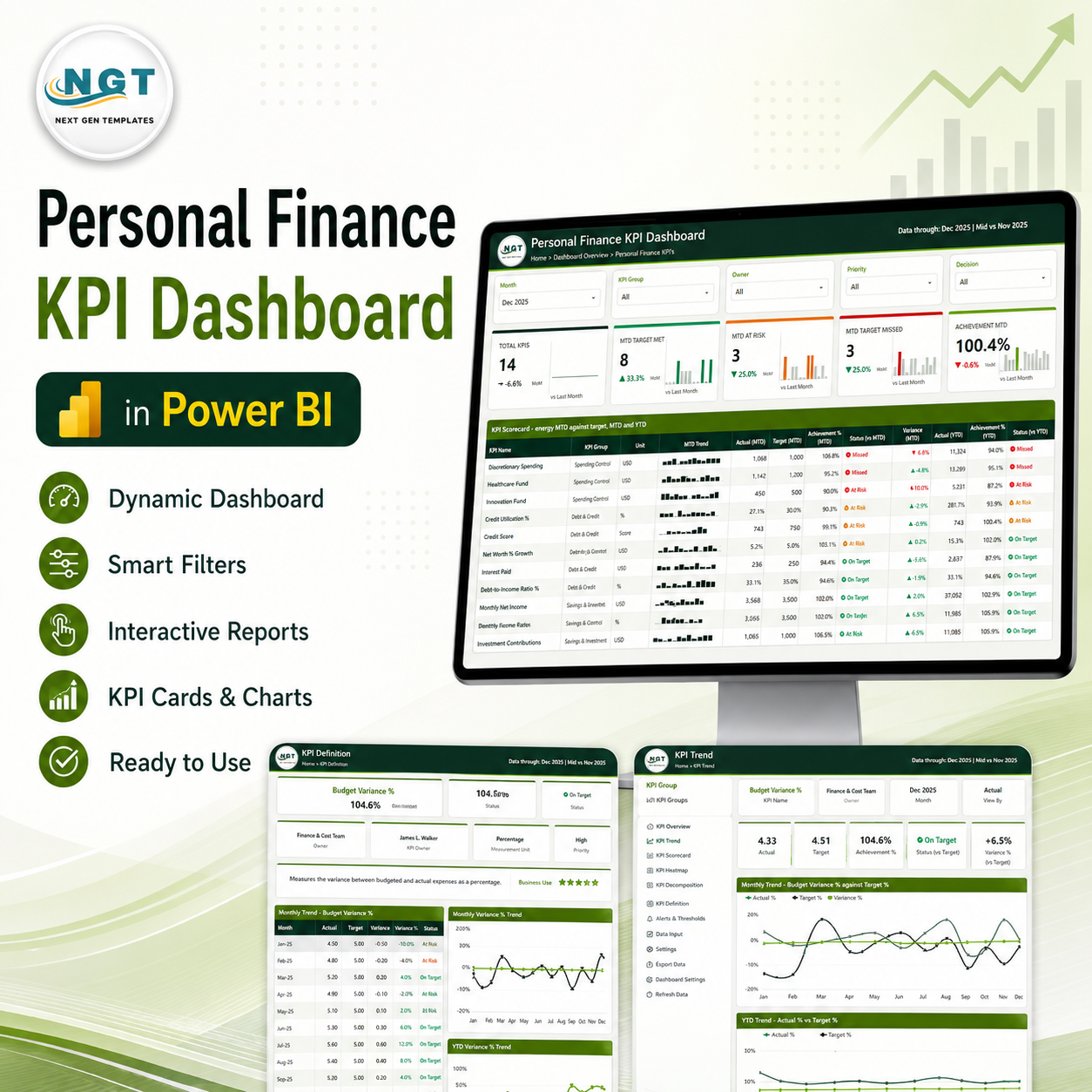
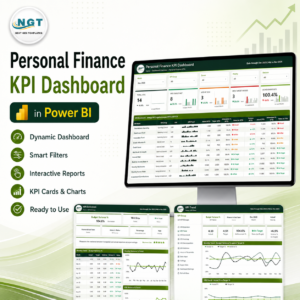
The Personal Finance KPI Dashboard in Power BI is a month-picker KPI scorecard built around your own household figures. It tracks 14 personal finance KPIs across four groups – Income & Cash Flow, Spending Control, Debt & Credit, and Savings & Investment – and gives each one an MTD actual, a YTD actual, a target you type in yourself, an achievement percentage, a red/amber/green status light and a 12-month sparkline. It ships as a ready-to-open .pbix with 6 report pages (4 you navigate plus 2 hidden tooltip pages) and 38 DAX measures, fed by a plain four-sheet Excel workbook you edit in place. This is not financial advice, and the file does not connect to any bank, card or brokerage account – you enter every number. Instant download, lifetime access to the file you buy, and every visual is unlocked so you can rename, recolour or delete anything.
Personal Finance KPI Dashboard in Power BI
Key Features of the Personal Finance KPI Dashboard in Power BI
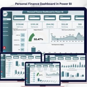
- A scorecard, not an analytics report. One row per KPI, one status light per row, and the same month applied everywhere. If you want charts that slice transactions by category and merchant instead, that is a different template – see the Personal Finance Dashboard in Power BI.
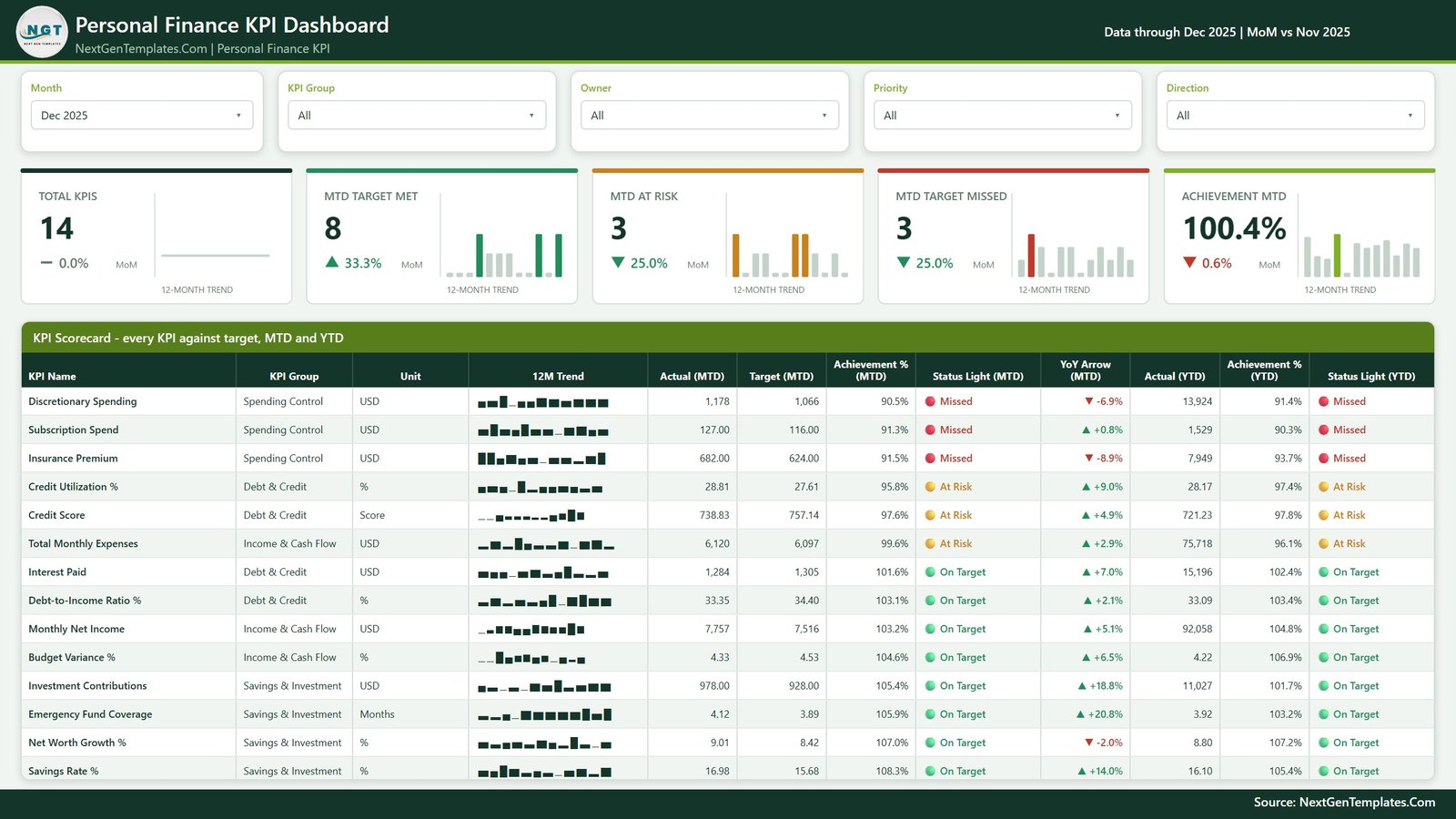
- Five slicers on the scorecard page – Month, KPI Group, Owner, Priority and Direction – so you can look at one group of KPIs, one owner, or only the lower-is-better ones.
- Five summary cards with 12-month sparklines – Total KPIs, MTD Target Met, MTD At Risk, MTD Target Missed and Achievement MTD, each with a month-on-month delta.
- Direction-aware scoring. Each KPI is flagged upper-the-better or lower-the-better, so a lower-is-better KPI such as Total Monthly Expenses scores above 100% when it comes in under your target rather than below it.
- Prior-year comparison built in – current year, prior year and target plotted together on both an MTD and a YTD basis.
- Every KPI documented inside the file – formula, plain-English definition, unit, direction, owner and priority all live on the KPI Definition page.
- One theme file drives every colour, so rebranding the report is a single change rather than a visual-by-visual edit.
Personal Finance KPI Dashboard in Power BI
What’s Inside the Personal Finance KPI Dashboard in Power BI
The download is a single ZIP holding three files: Personal Finance KPI Dashboard in Power BI.pbix, Data.xlsx, and Power BI Dashboard – User Manual.pdf. Everything shipped in them is demo data.
Page 1 – KPI Scorecard
The landing page. Five slicers across the top (Month, KPI Group, Owner, Priority, Direction), then five summary cards, then the scorecard table itself: KPI Name, KPI Group, Unit, a 12-month trend sparkline, Actual (MTD), Target (MTD), Achievement % (MTD), Status Light (MTD), a year-on-year arrow, and then Actual (YTD), Achievement % (YTD) and Status Light (YTD). The 14 demo KPIs are Monthly Net Income, Total Monthly Expenses, Budget Variance %, Discretionary Spending, Subscription Spend, Insurance Premium, Credit Utilization %, Credit Score, Interest Paid, Debt-to-Income Ratio %, Savings Rate %, Investment Contributions, Emergency Fund Coverage and Net Worth Growth %. All of them are editable labels – swap in whatever you actually want to watch.
Page 2 – KPI Trend
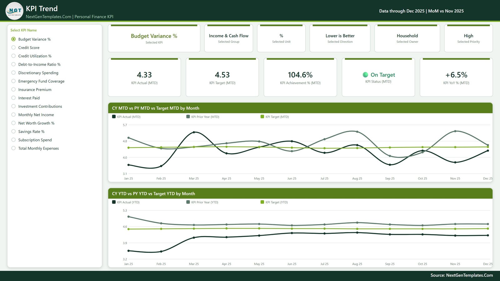
Pick one KPI from the list on the left and the whole page becomes that KPI. Six context cards restate the selected KPI, its group, unit, direction, owner and priority; five metric cards show KPI Actual (MTD), KPI Target (MTD), KPI Achievement % (MTD), KPI Status (MTD) and KPI YoY % (MTD). Below them sit two line charts: CY MTD vs PY MTD vs Target MTD by Month and CY YTD vs PY YTD vs Target YTD by Month. Personal Finance KPI Dashboard in Power BI
Page 3 – KPI Definition
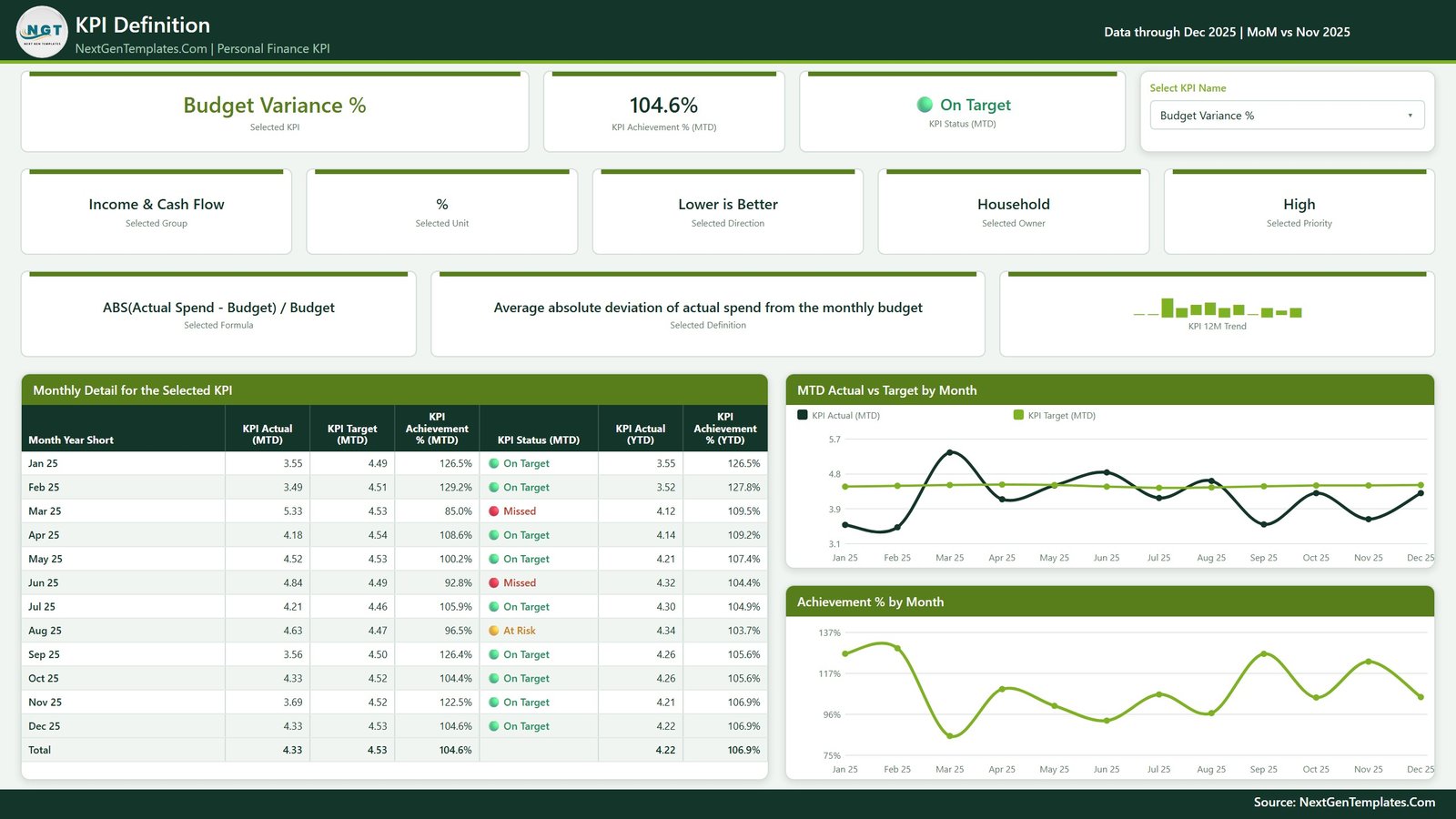
Same KPI selection, carried across automatically – the dropdown here and the list on the KPI Trend page belong to one sync group, so choosing a KPI on either page selects it on both. This page answers “what is this number, exactly?”: the formula, the written definition, the unit, the direction, the owner and the priority, plus a Monthly Detail for the Selected KPI table running month by month with actual, target, achievement % and status on both MTD and YTD bases and a total row. Two charts sit alongside it – MTD Actual vs Target by Month and Achievement % by Month. Personal Finance KPI Dashboard in Power BI
Page 4 – Get More Templates
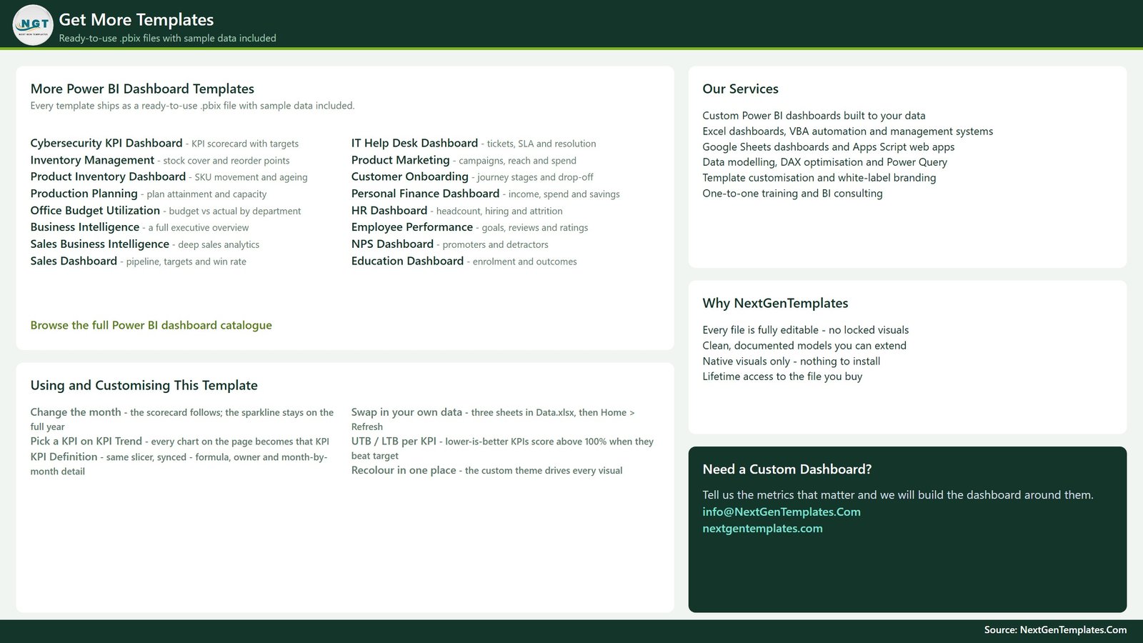
An in-file help and catalogue page. The left column is a short “Using and Customising This Template” guide – how the month picker works, how to swap in your own data, how upper/lower-the-better scoring behaves, and where the colours come from – alongside a list of other NextGenTemplates Power BI files. It is part of the product, not a screenshot of the report, and we show it here so you know exactly what you are getting.
Two hidden tooltip pages and the data pack
Behind the four visible pages sit KPI Detail and Trend Detail, two 280×360 tooltip pages set to hidden in view mode. They pop up when you hover a scorecard row or a trend point. Data.xlsx has four sheets – a Read Me, an Input_ Target sheet (168 demo rows), an Input_ Actual sheet (336 demo rows) and a KPI Definition sheet holding 14 KPIs across 9 columns. Type over the demo rows, save, and press Home > Refresh in Power BI Desktop. Personal Finance KPI Dashboard in Power BI
Personal Finance KPI Dashboard vs. Tableau vs. a Paid Money App – Where This Fits
| This template (Power BI) | Tableau / Qlik build | Paid personal-finance app | |
|---|---|---|---|
| Cost | One-time purchase of this file | Per-user subscription plus build time | Recurring subscription |
| Platform | Power BI Desktop (free) + Excel | Tableau Desktop / Qlik Sense | Vendor’s web and mobile app |
| Setup time | Open, replace the demo rows, Refresh | Days – model, measures and layout from scratch | Minutes, but on their data model |
| Real-time collaboration | Via Power BI Service if you publish it | Via their server product | Built in on shared plans |
| Mobile access | Power BI mobile app once published | Vendor mobile app | Built in |
| Customizable fields | Every KPI, target, group, owner and label | Fully, if you build it | Limited to the categories they offer |
| Share with link | Yes, once published to Power BI Service | Yes, on their server | Yes, within the app |
| Year-1 cost at 5 users | The one-time file price – no per-user fee | Five paid Tableau/Qlik seats | Five subscriptions, renewed annually |
| Traffic-light KPI scorecard against your own targets | Yes – the whole point of the file | Only if you build it | Rarely; most show categories, not KPI targets |
| Connects to your bank or card | No – you type every figure | No | Usually yes, that is their model |
Those are structural differences, not a verdict. If automatic transaction import is what you want, a money app does that and this file does not. If you want a KPI scorecard you own outright, that scores your own targets and that nobody can change the pricing on, this is the cheaper end of that.
Who This Template Is For – and Who It’s Not For
A good fit if you already keep your figures in a spreadsheet and want them turned into a monthly scorecard; want one page that shows whether each of 14 measures beat the target you chose; are learning Power BI and want a finished, readable model to take apart; run a household budget with two owners and want an Owner slicer; or want a KPI framework you can rebrand and reuse for something else entirely.
Not a good fit if you want automatic bank, card or brokerage syncing – there is none, and none can be added without rebuilding the data layer; want transaction-level categorisation and merchant analysis, which is what an analytical dashboard does, not a scorecard; want the file to tell you what your savings rate or budget ratio should be, because it deliberately does not; want it to run in a browser without Power BI Desktop; or want tax, credit-score or investment guidance of any kind. Personal Finance KPI Dashboard in Power BI
How to Use the Personal Finance KPI Dashboard in Power BI
- Unzip and open. Extract all three files into one folder and open the .pbix in Power BI Desktop (free from Microsoft).
- Look around the demo data first. Change the Month slicer and watch every card, light and table follow it.
- Edit the KPI list. Open Data.xlsx, go to the KPI Definition sheet, and rename the 14 KPIs, their groups, units, directions, owners, priorities, formulas and definitions to yours.
- Set your own targets. On Input_ Target, replace the demo target rows with the levels you choose. Nothing in the file suggests a level for you – every shipped number is a placeholder.
- Enter your actuals. On Input_ Actual, type the month-by-month figures you are tracking.
- Save the workbook, then Refresh. In Power BI Desktop press Home > Refresh. If the file moved, update the source path in Transform data > Data source settings.
- Recolour if you want. The custom theme drives every visual, so one change restyles the whole report. Personal Finance KPI Dashboard in Power BI
Real-World Use Cases
Priya, a two-income household in Bristol. She and her partner each own a handful of KPIs – she takes Savings Rate % and Investment Contributions, he takes Subscription Spend and Interest Paid. On the first Sunday of the month they open the scorecard, set the Month slicer, and use the Owner slicer to look at their own rows. The traffic lights are measured against targets they agreed between themselves, and nothing else.
Daniel, a freelancer with lumpy income. Monthly Net Income swings a lot, so the single-month view is noisy. He uses the KPI Trend page, where the YTD line smooths the swings and the prior-year line shows whether this year is genuinely different. The Achievement % by Month chart on the KPI Definition page tells him which months pulled the year around.
Meera, learning Power BI on purpose. She bought the file to read the model rather than to budget with it – 38 measures covering MTD/YTD patterns, prior-year offsets, direction-aware achievement scoring, SVG card visuals and synced slicers, all in a small, readable report she can open and pick apart.
Frequently Asked Questions
Is this financial advice, and does it connect to my bank?
No – to both. This is a reporting template. It gives no financial, investment, tax, debt or retirement advice, and it has no bank, card, brokerage or Open Banking connection of any kind. Every figure in it is one you type in yourself.
Are the targets in the file recommended levels?
No. Every target, threshold, ratio and status band shipped in the file is a placeholder put there so the demo renders. They are not recommendations and are not benchmarked against anything. Replace them with levels you decide on.
Are the numbers in the screenshots real?
No. All 168 target rows and 336 actual rows are generated demo data, there so you can see the report working before you type a thing.
What software do I need?
Power BI Desktop, which Microsoft gives away free for Windows, plus Excel (or any app that can save .xlsx) to edit the data pack. No add-ins, no custom visuals, nothing to install from AppSource.
Can I change the 14 KPIs to my own?
Yes – the KPI names, groups, units, owners, priorities, formulas and definitions are all rows in Data.xlsx, not hard-coded in the report. Fewer or more than 14 works too; the scorecard grows and shrinks with the list.
How is this different from the Personal Finance Dashboard in Power BI?
That one is an analytical dashboard – it slices and charts your underlying detail. This one is a scorecard: fixed KPIs, a month picker, a target per KPI and a status light per KPI. They answer different questions, and plenty of people own both.
Can I use it for something other than personal finance?
Yes. Nothing in the model is finance-specific once you rewrite the KPI Definition sheet – the same file works as a scorecard for any 14 monthly measures.
About the Author
Built by PK – Microsoft Certified Professional with 15+ years of Excel, Google Sheets, and Power BI experience. Founder of NextGenTemplates, reaching 300K+ subscribers across YouTube channels. Every template is hand-built and tested before release.
Explore Related Templates
- Personal Finance Dashboard in Power BI – the analytical companion to this scorecard.
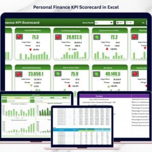
- Personal Finance KPI Scorecard in Excel – the same idea without Power BI Desktop.
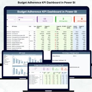
- Budget Adherence KPI Dashboard in Power BI – budget-versus-actual on the same scorecard pattern.
- Investment Management Dashboard in Power BI and Crypto Portfolio Dashboard in Power BI for holdings reporting.
- Browse the whole Power BI KPI Dashboard category or every Power BI template.
Download instantly after checkout. You get the .pbix, the Excel data pack and the PDF user manual, with lifetime access to the file you buy. Questions before or after? Email [email protected].
Not financial advice. This template is a reporting tool for figures you enter yourself; it makes no recommendation about savings, budgeting, debt or investment, and it does not connect to any financial institution.
Last updated: 17 August 2026. Personal Finance KPI Dashboard in Power BI








Reviews
There are no reviews yet.