


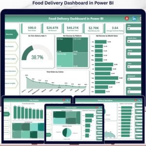
The Food Delivery Dashboard in Power BI tracks 5 high-level KPIs and 13 visualizations across 5 interactive pages, giving operators a single-pane view of orders, revenue, riders, restaurants, and customers. Setup takes under 10 minutes — drop your delivery data into the source table, hit refresh, and every chart updates automatically.
🌍 Join 8,400+ teams in 40+ countries using NextGenTemplates to replace paid SaaS tools with one-time-purchase Excel, Google Sheets, Power BI, and HTML templates.
✅ Instant download · One-time payment · No subscription · No per-user fees · Lifetime access
🔑 Key Features of Food Delivery Dashboard in Power BI
🎯 5 KPI cards on the Overview page — Total Orders, Net Revenue, Total Order Value, Total Delivery Fee, and Average Customer Rating — surface the headline numbers leadership needs in under three seconds.
📊 13 interactive Power BI visuals across 5 themed pages covering platform mix, city and zone performance, cuisine economics, delivery operations, and customer segmentation — every visual reacts to the slicers on the page.
🍽️ Restaurant- and cuisine-level economics built in — drill into Total Order Value by Cuisine, Average Order Value by Cuisine, and Net Revenue by Restaurant to see exactly where your margin lives.
🛵 Operational metrics for riders and zones — On Time Delivery Rate % by Zone, Average Delivery Time by Zone, and Average Delivery Time by Top Ten Riders make rider reviews and zone planning data-driven instead of anecdotal.
👤 Customer segmentation and promo analysis — Net Revenue by Customer Segment, Total Discount by Promo Used, and Cancellation Rate % by Customer Segment expose which segments and promos drive profit versus chargebacks.
⚡ Slicers on every page let you isolate a city, zone, platform, restaurant, or month and watch the entire page repaint — no DAX edits, no model changes.
🎨 Compatible with Power BI Desktop (free) and publishable to Power BI Service for browser and mobile viewing — no extra license required to open and edit.
📦 What’s Inside the Food Delivery Dashboard in Power BI
The .pixy file contains five themed report pages. Each page is built around the chart patterns and slicers described below — the screenshots show exactly how each page is laid out.
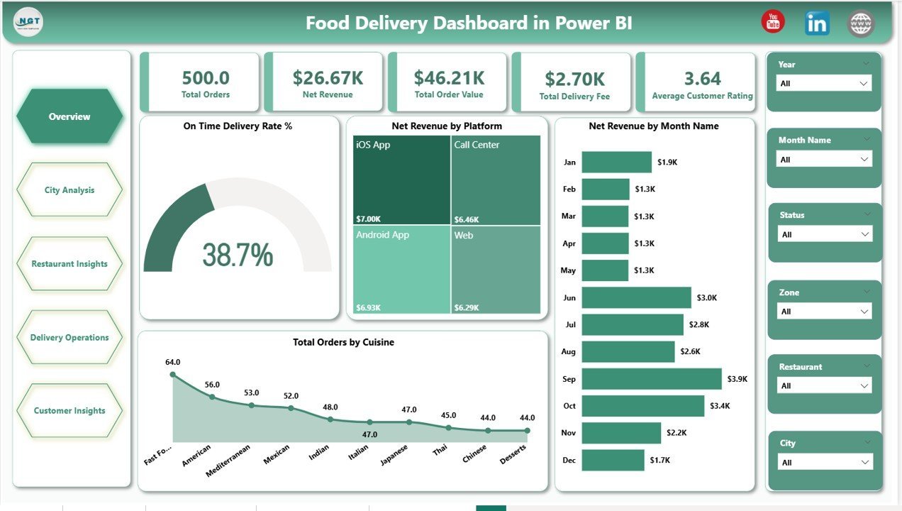
Page 1: Overview
The Overview page surfaces the five headline KPI cards — Total Orders, Net Revenue, Total Order Value, Total Delivery Fee, and Average Customer Rating — alongside four charts: On Time Delivery Rate % (gauge-style indicator of operational health), Net Revenue by Platform (channel mix across Swiggy, Zomato, Uber Eats, in-house app, etc.), Net Revenue by Month Name (seasonal trend), and Total Orders by Cuisine (demand by category). Slicers on the top let you filter the entire page by City, Zone, Platform, and Date Range.

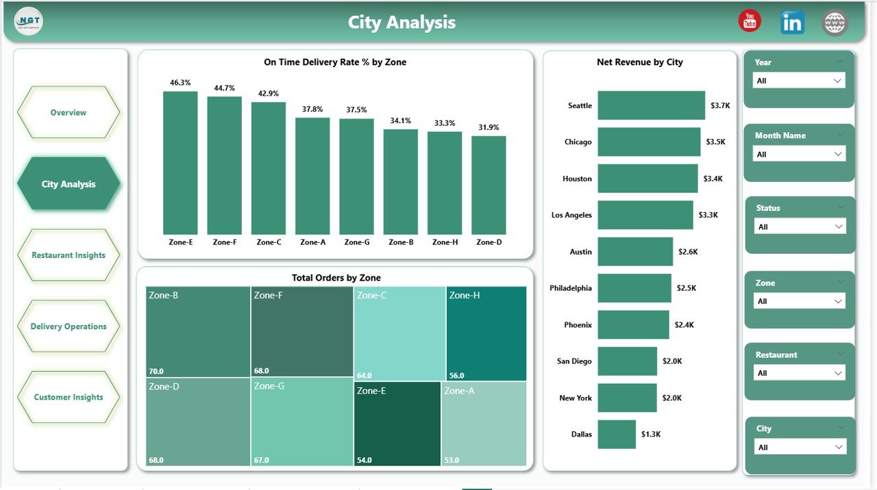
Page 2: City Analysis
This page breaks performance down geographically with three charts: On Time Delivery Rate % by Zone, Total Orders by Zone, and Net Revenue by City. Operations managers use it to spot under-performing zones and revenue-leading cities at a glance, then act with the page-level slicers.
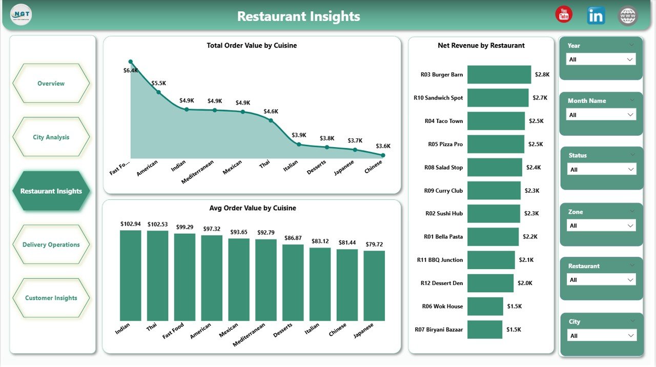
Page 3: Restaurant Insights
Three restaurant- and cuisine-level views: Total Order Value by Cuisine, Average Order Value by Cuisine, and Net Revenue by Restaurant. This is the page restaurant partners and category managers open first — it tells you which cuisines drive volume versus margin, and which restaurant partners carry the topline.
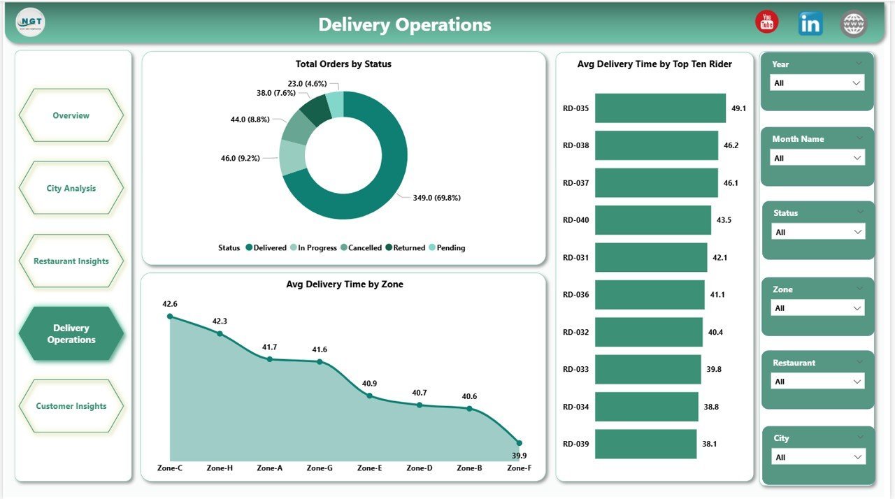
Page 4: Delivery Operations
Operations-focused page with Total Orders by Status (Delivered, Cancelled, Returned, In-Transit), Average Delivery Time by Zone, and Average Delivery Time by Top Ten Riders. Use it for rider performance reviews, SLA tracking, and zone-level dispatch planning.

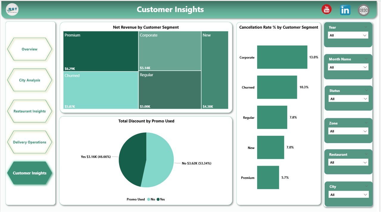
Page 5: Customer Insights
Customer-side analytics: Net Revenue by Customer Segment (New, Returning, Loyal, VIP), Total Discount by Promo Used, and Cancellation Rate % by Customer Segment. Marketing teams use this page to validate which promo codes lift revenue without spiking cancellations, and which segments are worth re-targeting.

📊 Food Delivery Dashboard in Power BI vs. Tableau vs. Paid Food-Delivery SaaS — Where This Fits
| Feature | Food Delivery Dashboard in Power BI | Tableau / Qlik build | Paid SaaS (Otter / Deliverect Analytics) |
|---|---|---|---|
| Cost | $17.99 one-time ✅ | $70+ / user / month (Tableau Creator) | $49-249 / location / month |
| Platform | Power BI Desktop (free) ✅ | Tableau Desktop / Cloud | Vendor-hosted SaaS |
| Setup time | Under 10 minutes ✅ | 2-6 weeks of build time | 1-3 days onboarding |
| Pages included | 5 themed pages, 13 visuals ✅ | Build from scratch | Fixed vendor templates |
| Customizable visuals & DAX | Full edit access ✅ | Full edit access ✅ | Limited to vendor settings |
| Share with link | Publish to Power BI Service ✅ | Tableau Cloud ✅ | Built-in sharing ✅ |
| Mobile access | Power BI mobile app ✅ | Tableau Mobile ✅ | Vendor mobile app ✅ |
| Vendor lock-in | None — you own the .pbix ✅ | Tableau ecosystem | High — data lives in vendor |
| Year-1 cost at 5 users | $17.99 total ✅ | $4,200+ / year | $2,940-14,940 / year per location |
For food delivery operators who want city, restaurant, rider, and customer analytics without paying SaaS per-location fees or commissioning a multi-week Tableau build, the Food Delivery Dashboard in Power BI sits in the sweet spot.
👥 Who This Template Is For — and Who It’s Not For
✅ This template is built for:
- Cloud kitchen and dark kitchen operators running 3-50 outlets who need a single Power BI view across platforms
- Restaurant chains with in-house delivery teams tracking riders, zones, and on-time SLAs
- Multi-platform delivery aggregators consolidating Swiggy, Zomato, Uber Eats, DoorDash, and direct-app orders
- Operations analysts replacing CSV-based monthly reports with a refreshable Power BI report
- Founders and category managers presenting weekly delivery performance to investors and partners
❌ This template is NOT for:
- Enterprise delivery platforms (Swiggy/DoorDash internal use) needing 10M+ orders/day at sub-second latency
- Teams without Power BI Desktop access on Windows — Power BI Desktop is Windows-only
- Operators who need live POS streaming — this is a refresh-based report, not a real-time event stream
- Single-store local restaurants without delivery — the Catering Business KPI Scorecard or Bakery KPI Scorecard is a better fit
⚙️ How to Use the Food Delivery Dashboard in Power BI
- Download and extract the .zip file from your purchase email.
- Open the .pbix file in Power BI Desktop (free download from Microsoft).
- Click Transform Data → Data Source Settings and point the source query to your own delivery orders file or database.
- Hit Refresh — all 5 pages and 13 visuals repopulate with your data automatically.
- Use the slicers on each page to filter by City, Zone, Platform, Cuisine, or Date Range.
- Publish to Power BI Service to share with your team via browser and mobile.
💼 Real-World Use Cases
Priya runs operations for a 12-outlet cloud kitchen brand in Bengaluru. She loads the previous week’s order export every Monday morning, refreshes the Power BI file, and walks her city managers through the Delivery Operations and City Analysis pages — zone-level on-time rate and top-ten rider delivery time drive that week’s rider reviews and dispatch adjustments. She replaced three Excel files and a weekly all-hands slide deck with this single .pbix.
Marco is a category manager at a regional delivery aggregator in Italy. He uses the Restaurant Insights page to identify which cuisines lift Average Order Value and which restaurant partners are underperforming on Net Revenue. He layers the Customer Insights page on top to confirm that his promo spend isn’t driving cancellations in the loyal-customer segment.
Sarah is a founder pitching Series A for a dark-kitchen startup. Instead of paying $249/month/location for Deliverect Analytics, she uses this Power BI report as the operational dashboard in her board pack — On Time Delivery Rate %, Net Revenue by Platform, and Net Revenue by Customer Segment are the three slides her lead investor screenshots every quarter.
❓ Frequently Asked Questions
What KPIs does the Food Delivery Dashboard in Power BI track?
The Food Delivery Dashboard in Power BI tracks five headline KPIs — Total Orders, Net Revenue, Total Order Value, Total Delivery Fee, and Average Customer Rating — plus 13 visualizations covering platform mix, city and zone performance, cuisine economics, rider delivery time, customer segments, and promo-driven cancellations.
How long does setup take?
Setup takes under 10 minutes. Download the .zip, open the .pbix in Power BI Desktop, point the data source to your delivery orders file, and click Refresh. All five pages and every visual update automatically — no DAX edits required unless you want to add new metrics.
How does this compare to Otter or Deliverect Analytics?
Otter and Deliverect Analytics charge $49-249 per location per month and lock your historical data inside their platform. The Food Delivery Dashboard in Power BI is a one-time $17.99 purchase, runs on free Power BI Desktop, and you own the .pbix and the data forever.
Do I need a Power BI Pro license?
No. The Food Delivery Dashboard in Power BI opens and edits in Power BI Desktop (free, Windows-only). A Power BI Pro license ($10/user/month) is only required if you want to publish to Power BI Service and share refreshable reports with teammates inside your workspace.
Can I add my own platforms (DoorDash, Grubhub, Talabat) and zones?
Yes. The Food Delivery Dashboard in Power BI uses standard Platform, City, Zone, and Cuisine fields in the source data — add any platform or zone name to your data file and it appears in the slicers and charts automatically on next refresh.
Is the dashboard available in Excel or Google Sheets?
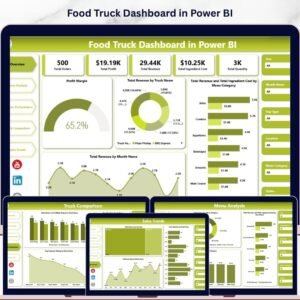
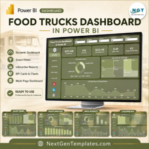
Yes — the same template is available as the Food Delivery Dashboard in Excel. For related food-business analytics, see the Food Truck Dashboard in Power BI and Food Truck Dashboard in Google Sheets.
Will updates be free if the template is improved?
Yes. Customers receive free updates whenever the Food Delivery Dashboard in Power BI is revised — new visuals, DAX improvements, or layout fixes are pushed to existing buyers at no extra cost.
👤 About the Author
Built by PK — Microsoft Certified Professional with 15+ years of Excel, Google Sheets, and Power BI experience. Founder of Nextgen Templates, reaching 300K+ subscribers across YouTube channels (@PK-AnExcelExpert, @NextGenTemplates, @NeoTechNavigators). Every template is hand-built and tested before release.
🔗 Explore Related Templates
If you operate across multiple platforms, you might also want the same template in spreadsheet form: Food Delivery Dashboard in Excel mirrors the same KPIs and pages in an Excel file. For adjacent food-business reporting, the Food Truck Dashboard in Power BI and the Bakery Business Dashboard in Power BI share the same Power BI structure for adjacent verticals. Browse all Power BI Dashboard Templates on Nextgen Templates.
📖 Click here to read the Detailed Blog Post
🎥 Visit our YouTube channel for step-by-step video tutorials
👉 YouTube.com/@NextGenTemplates
📅 Last updated: May 2026
Watch the step-by-step video tutorial:
YouTube


Reviews
There are no reviews yet.