

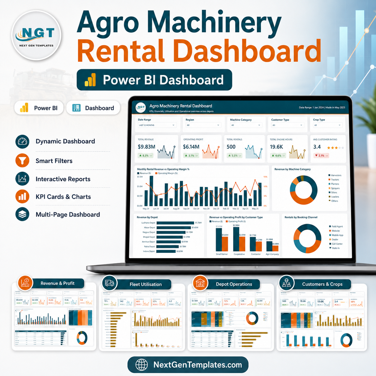
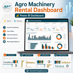
Agro Machinery Rental Dashboard in Power BI helps farm equipment rental businesses turn machinery booking data into clear decisions across 5 report pages, 5 executive KPI cards, and 21 analysis visuals. Instead of checking separate rental logs, depot files, customer lists, and cost reports, managers can review revenue, operating profit, rentals, engine hours, downtime, return performance, customer rating, crop segments, and payment modes in one PBIX dashboard. Built by PK, a Microsoft Certified Professional with 15+ years of Excel, Google Sheets, and Power BI experience and 300K+ YouTube subscribers, this template gives rental teams a practical reporting layer for a $17.99 one-time sale price.
Key Features of Agro Machinery Rental Dashboard in Power BI
- 5 Power BI report pages: Overview, Revenue and Profit, Fleet Utilisation, Depot Operations, and Customers and Crops.
- 5 KPI cards: Total Revenue, Operating Profit, Total Rentals, Total Engine Hours, and Avg Customer Rating.
- Revenue analytics: Track monthly revenue, operating cost, operating margin, category mix, model profitability, and depot margin.
- Fleet utilisation: Review engine hours, downtime rate, downtime by category, rental days, and machine model workload.
- Depot operations: Monitor return performance, rental status, on-time returns, overdue returns, and delivery distance by region.
- Customer and crop reporting: Compare crop demand, customer type revenue, average rating, crop segment performance, and payment mode.
- Interactive slicers: Filter the report quickly by available time, depot, machine, customer, crop, channel, region, and status fields.
What’s Inside the Agro Machinery Rental Dashboard in Power BI
1. Overview Page
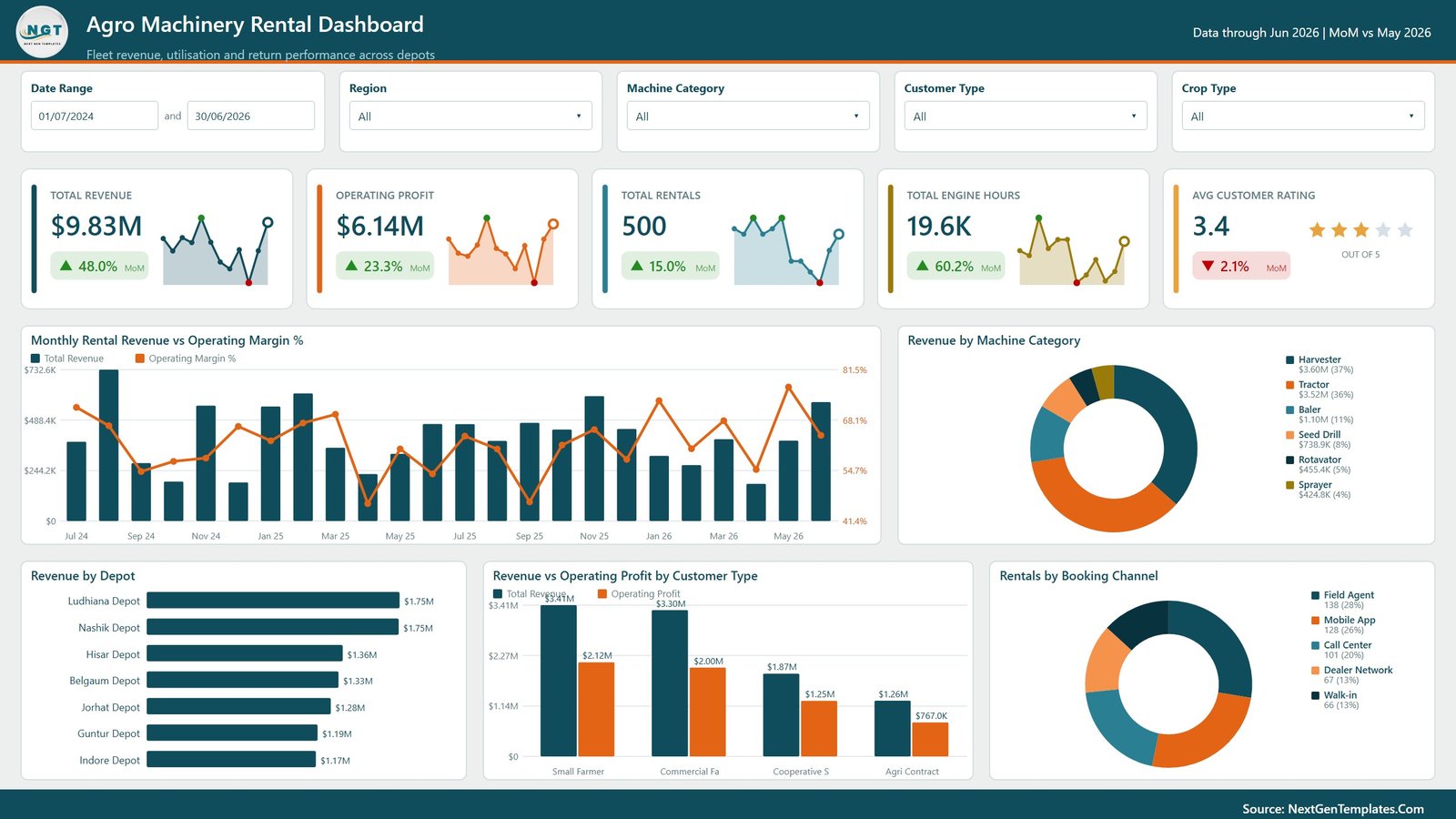
The Overview page gives managers a fast summary of rental performance. The top cards show Total Revenue, Operating Profit, Total Rentals, Total Engine Hours, and Avg Customer Rating, while supporting charts explain monthly revenue, margin, category revenue, depot revenue, customer type profitability, and booking channel mix.
Monthly Rental Revenue vs Operating Margin % by Month: This chart compares monthly revenue with operating margin percentage so managers can see whether growth is also producing healthier margins.
Revenue by Machine Category: This visual shows which equipment categories generate the most revenue and helps fleet planners prioritize high-demand categories.
Revenue by Depot: This chart compares depot locations and helps leadership identify top-performing depots and locations needing support.
Revenue vs Operating Profit by Customer Type: This visual compares customer segments by revenue and profit so teams can identify valuable customer groups.
Rentals by Booking Channel: This chart shows rentals by booking channel and helps marketing and operations teams review demand sources.
2. Revenue and Profit
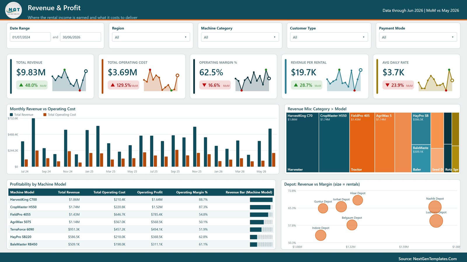
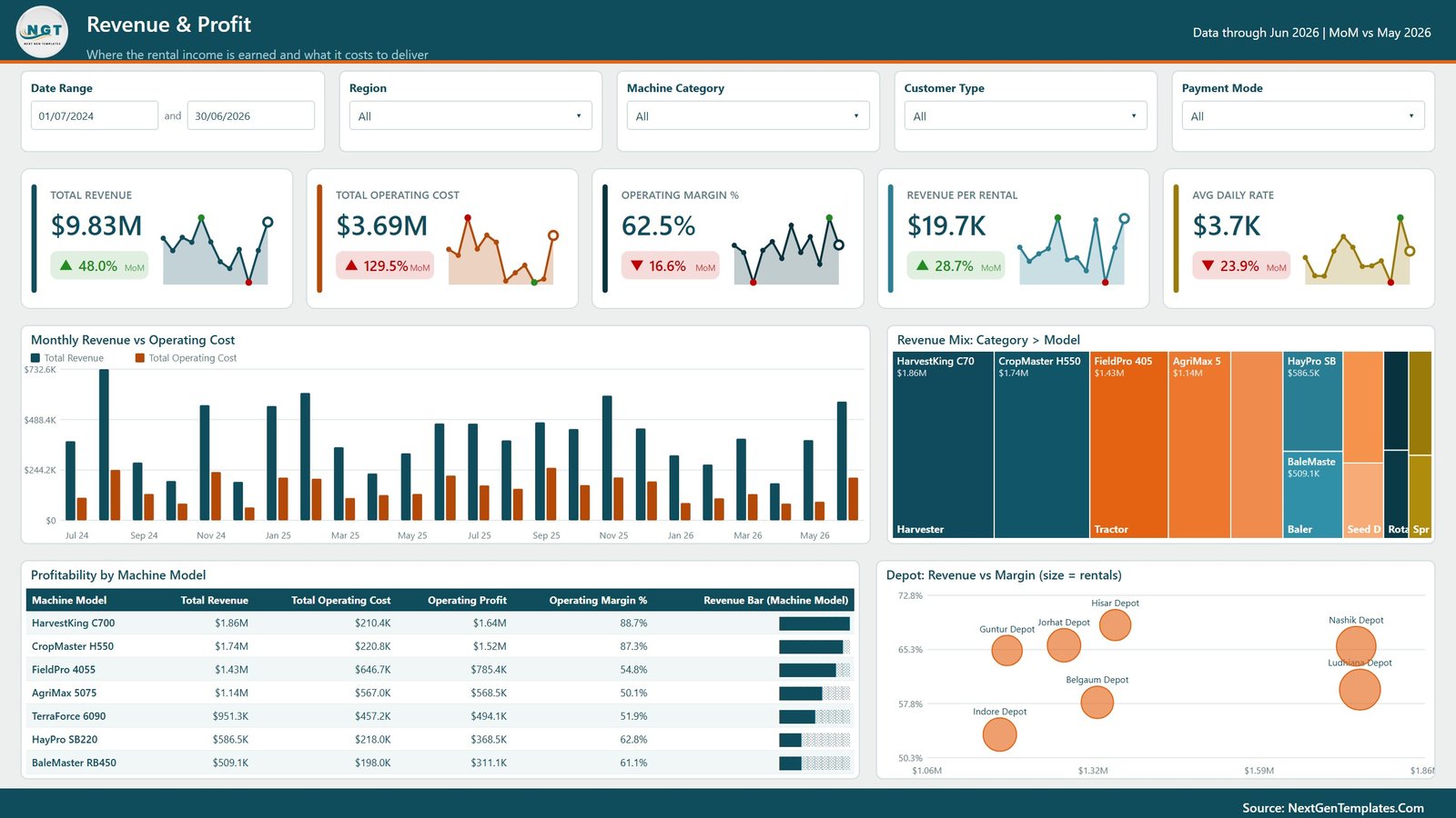
The Revenue and Profit page focuses on financial performance across time, machine categories, models, and depots. It is useful for monthly review meetings, pricing decisions, and profitability analysis.
Monthly Revenue vs Operating Cost by Month: This chart compares revenue and operating cost by month, helping finance teams spot periods where costs rise faster than revenue.
Revenue Mix by Category and Model: This visual breaks revenue down by machine category and model so users can identify which models drive category performance.
Profitability by Machine Model: This chart ranks machine models by profit contribution and helps managers review pricing, maintenance priority, or future investment.
Revenue vs Margin by Depot: This visual compares depot revenue with margin performance so teams avoid judging depots only by sales volume.
3. Fleet Utilisation
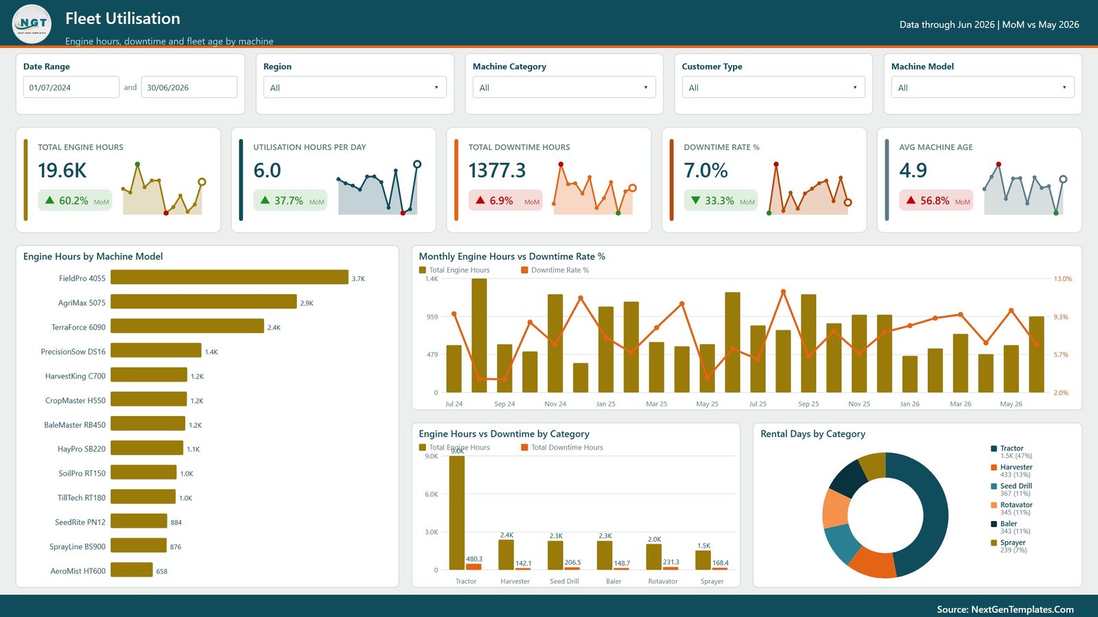
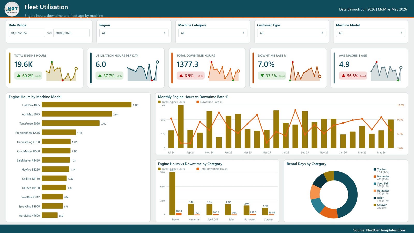
The Fleet Utilisation page helps operations teams understand how machines are being used and where downtime may affect rental capacity. It combines engine hours, downtime, rental days, and category-level performance.
Engine Hours by Machine Model: This chart shows machine workload by model and helps identify heavily used models needing preventive maintenance.
Monthly Engine Hours vs Downtime Rate % by Month: This chart compares monthly engine hours with downtime rate to show whether increased utilisation is creating reliability pressure.
Engine Hours vs Downtime by Category: This visual compares usage and downtime across categories and highlights categories with high workload and maintenance risk.
Rental Days by Category: This chart shows rental days by machine category and helps managers understand demand intensity.
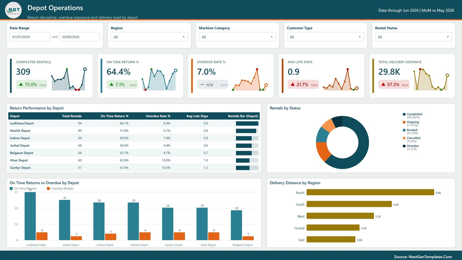
4. Depot Operations
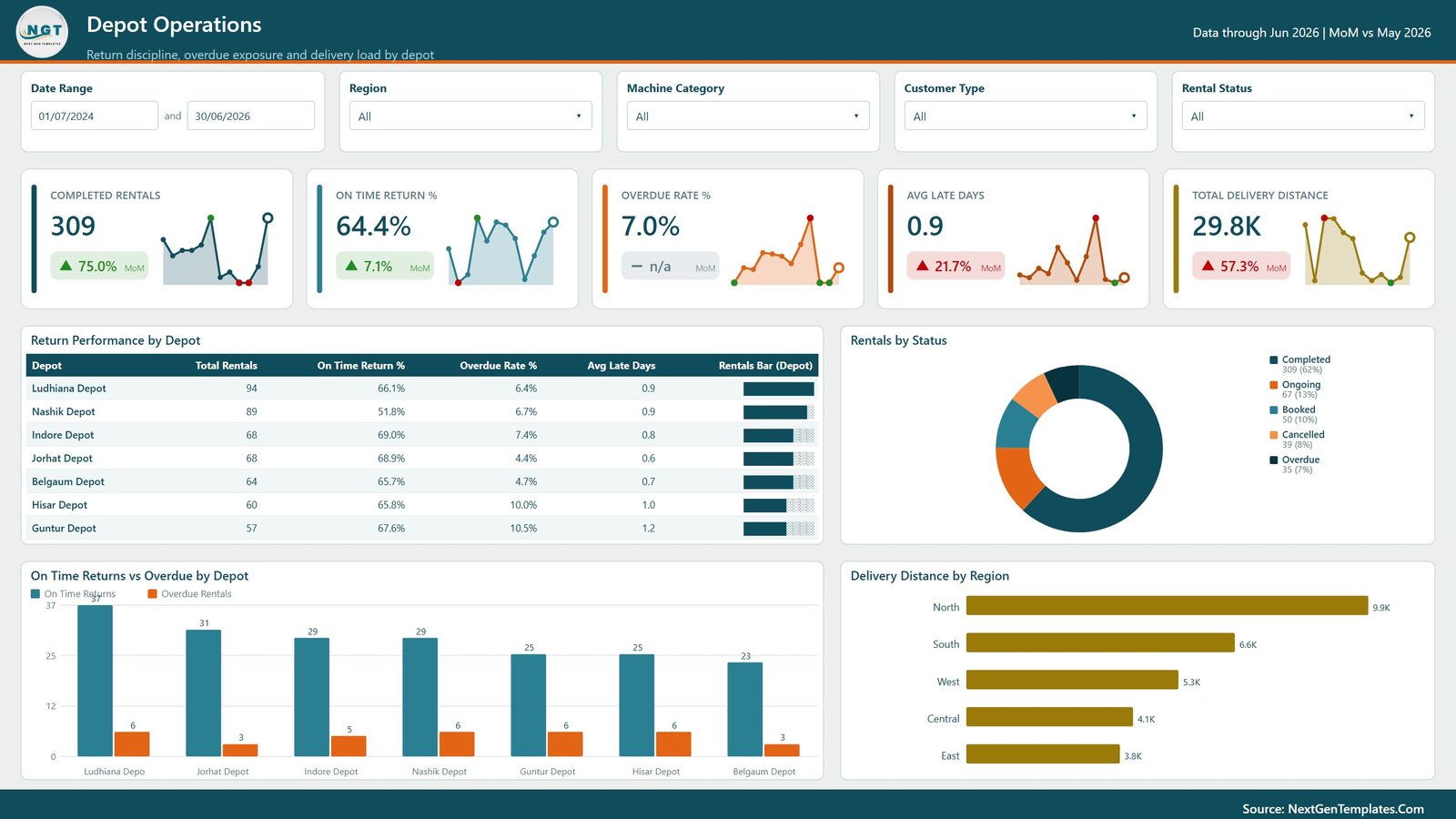
The Depot Operations page focuses on execution quality at depot and region level. It helps teams review return performance, overdue rentals, active statuses, and delivery distance.
Return Performance by Depot: This chart compares depots by return performance and helps identify locations with delayed-return issues.
Rentals by Status: This visual shows rental counts by status so operations teams can quickly understand workload and exceptions.
On Time Returns vs Overdue by Depot: This chart compares on-time and overdue returns by depot, supporting follow-up and scheduling decisions.
Delivery Distance by Region: This visual shows delivery distance across regions and helps teams review logistics workload.
5. Customers and Crops
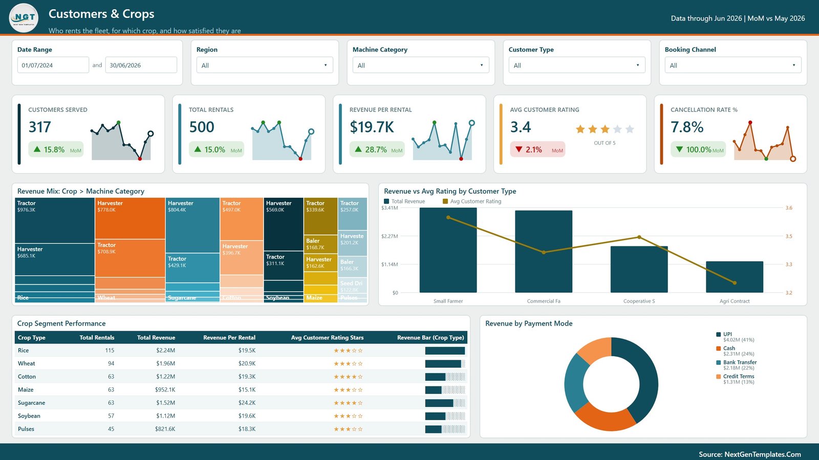
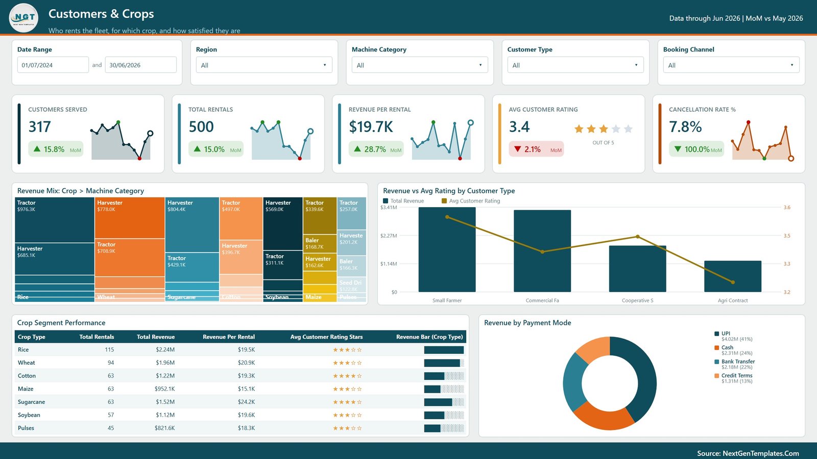
The Customers and Crops page explains demand from the customer and agricultural segment side. Sales, account management, and depot teams can understand which crop segments, customer types, and payment modes drive rental activity.
Revenue Mix by Crop and Machine Category: This chart connects equipment demand with crop-season patterns.
Revenue vs Avg Rating by Customer Type: This visual compares customer type revenue with average rating and helps identify service gaps.
Crop Segment Performance: This chart ranks crop segments by performance indicators such as revenue, rentals, or profit.
Revenue by Payment Mode: This chart shows revenue split by payment method and helps finance teams review customer payment behavior.
Agro Machinery Rental Dashboard in Power BI vs. Tableau vs. Paid CRM/SaaS – Where This Fits
| Feature | This Power BI dashboard | Tableau alternative | Paid rental SaaS |
|---|---|---|---|
| Cost | $17.99 one-time sale price | Requires Tableau licensing and build time | Recurring subscription |
| Platform | Microsoft Power BI Desktop | Tableau Desktop or Cloud | Vendor-hosted rental system |
| Setup time | Open PBIX, replace source data, and refresh | Manual dashboard build and data modeling | Implementation and onboarding required |
| Customizable fields | Editable visuals, measures, model, and pages | Editable if you build and own the workbook | Depends on vendor configuration |
| Year-1 cost at 5 users | Low template cost plus Microsoft licensing if published | Higher license and build cost | Often much higher due to subscriptions |
| Machinery rental analytics | Revenue, margin, cost, rentals, engine hours, downtime, depots, crops, customers, channels, and payments | Must be designed manually | Depends on rental module depth |
Who This Template Is For – and Who It’s Not For
Best for: farm machinery rental companies, agricultural equipment dealers, cooperative machinery banks, depot managers, fleet coordinators, operations managers, finance analysts, and Power BI consultants.
Not for: teams needing rental contracts, payment collection, GPS telemetry, operator dispatch, maintenance tickets, or customer portals. This is a reporting dashboard, not a transaction system.
How to Use the Agro Machinery Rental Dashboard in Power BI
- Download and unzip the product file.
- Open the PBIX file in Microsoft Power BI Desktop.
- Replace or map the sample data source to your rental data.
- Refresh the report and validate cards, slicers, and visuals.
- Customize visuals, labels, colors, and measures if needed.
- Publish to Power BI Service only after checking data privacy and sharing permissions.
Real-World Use Cases
Anika, depot manager: reviews rentals, return performance, overdue records, depot revenue, and customer rating before the weekly operations call.
Rohan, fleet coordinator: compares engine hours and downtime by model to schedule preventive maintenance before the busy season.
Meera, finance analyst: uses revenue, operating cost, margin, customer type, and depot visuals to explain monthly profitability.
Frequently Asked Questions
What software do I need?
You need Microsoft Power BI Desktop to open and edit the PBIX file.
Can I use my own rental data?
Yes. Replace the sample data source with your own data and refresh the report after mapping the required fields.
Is this a rental management system?
No. It is a Power BI reporting dashboard, not a transaction system for contracts, payments, dispatch, or service tickets.
Can I customize the visuals?
Yes. You can edit pages, measures, visuals, colors, labels, and data model settings in Power BI Desktop.
Is this useful for depot-level analysis?
Yes. The report includes depot revenue, depot margin, return performance, on-time returns, overdue rentals, and delivery distance.
Can I publish it to Power BI Service?
Yes, if you have the required Microsoft licensing and have checked source data privacy and sharing permissions.
About the Author
Built by PK – Microsoft Certified Professional with 15+ years of Excel, Google Sheets, and Power BI experience. Founder of NextGenTemplates, reaching 300K+ subscribers across YouTube channels. Every template is hand-built and tested before release.
Explore Related Templates
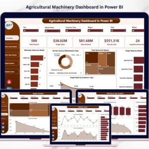
Pair this dashboard with Agro Machinery Rental Dashboard in Excel, Remote Crop Monitoring Dashboard in Power BI, Agri Insurance Dashboard in Power BI, and Agricultural Machinery Dashboard in Power BI. Browse more Power BI dashboard templates and Power BI templates.
Detailed blog post: Agro Machinery Rental Dashboard in Power BI.
Download the Agro Machinery Rental Dashboard in Power BI to review rental revenue, operating profit, fleet utilisation, depot operations, customers, crops, and payment behavior in one editable Power BI report.
Last updated: August 11, 2026.












Reviews
There are no reviews yet.