

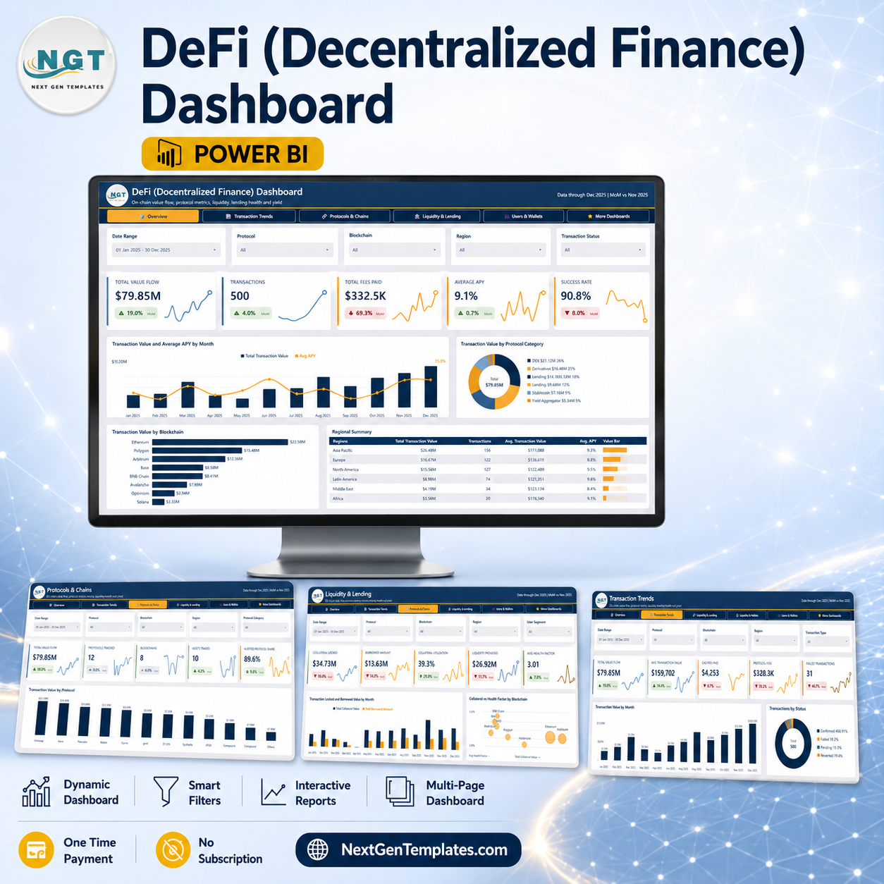

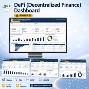
The DeFi (Decentralized Finance) Dashboard in Power BI is a five-page analytical report that turns a flat transaction export into on-chain value flow, protocol mix, liquidity, lending health and yield reporting. The sample file ships with 500 transaction records across 12 protocols, 8 blockchains, 10 assets and 6 regions, a semantic model with a proper date table, synced slicers on every page, and a drillthrough plus two tooltip pages already wired to the visuals. You get the .pbix file, the sample Data.xlsx and a PDF user manual in one download, editable end to end – no locked visuals, no external images, no subscription. One-time payment, instant download, and a 7-day support window if anything does not open cleanly.
Read this first: this is a reporting template, not a market tool. It does not connect to any blockchain, wallet, exchange, node or price feed. It loads a single Excel table that you supply, and every figure shown in the screenshots is sample data you replace. Nothing here is investment advice, and nothing here performs, verifies or certifies an audit, a custody arrangement or a regulatory filing.
Key Features of the DeFi (Decentralized Finance) Dashboard in Power BI
- Five analysis pages – Overview, Transaction Trends, Protocols & Chains, Liquidity & Lending, and Users & Wallets – reachable from a page-navigation bar built into the report header.
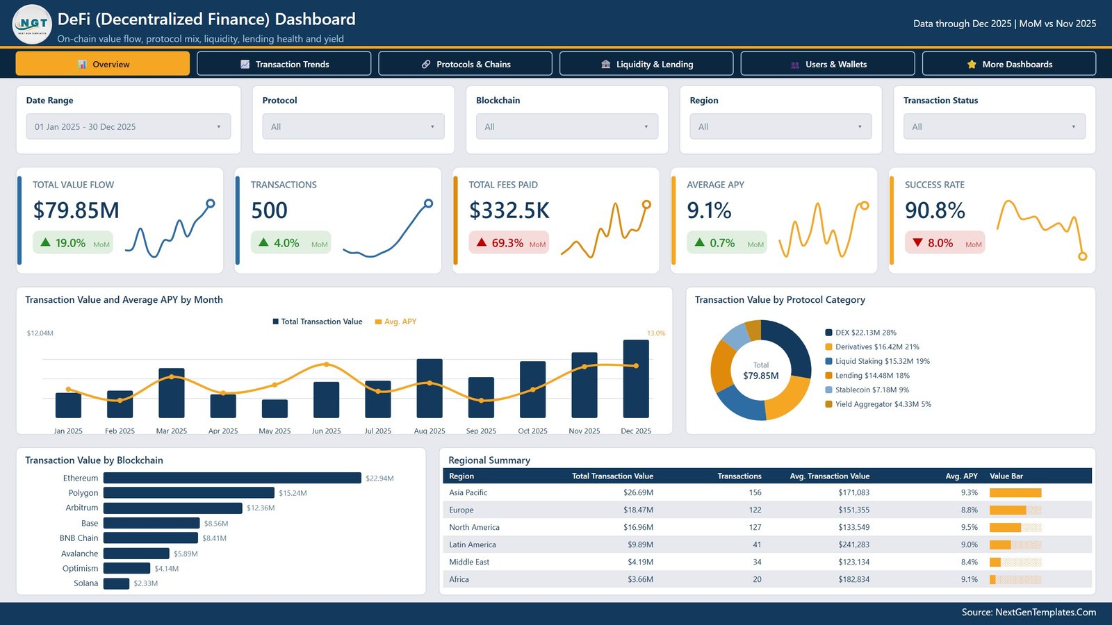
- 25 KPI cards with month-over-month deltas – five per page, each with an inline sparkline and a coloured MoM chip, and a “Data through Dec 2025 | MoM vs Nov 2025” stamp in the header so the comparison period is never ambiguous.
- Synced slicers on every page – Date Range, Protocol, Blockchain and Region carry across all five pages, plus one page-specific slicer each: Transaction Status, Transaction Type, Protocol Category, User Segment and Wallet Type.
- Four scorecard tables – Regional Summary, Blockchain Scorecard, Protocol Category Lending Scorecard and User Segment Scorecard, each with an in-cell value bar so the ranking reads without a chart.
- A 23-column data model covering transaction value, gas fee, protocol fee, liquidity provided, collateral value, borrowed amount, rewards earned, impermanent loss, APY, health factor, transaction status and an audited-protocol flag.
- Drillthrough and tooltip pages already wired to the charts, so a right-click on any bar opens the underlying detail without you building the plumbing.
- Custom theme JSON included – recolour the whole report from one file instead of touching 40+ visuals by hand.
- Your own workbook drops in – one file path to change in Power Query, then refresh. The column names are the contract; match them and every page keeps working.
What’s Inside the DeFi (Decentralized Finance) Dashboard in Power BI
The download is a single ZIP containing three files: DeFi (Decentralized Finance) Dashboard in Power BI.pbix, Data.xlsx (the 500-row sample table), and Power BI Dashboard - User Manual.pdf.
Page 1 – Overview
Total Value Flow, Transactions, Total Fees Paid, Average APY and Success Rate sit across the top. Below them, Transaction Value and Average APY by Month pairs monthly value columns against an APY line; Transaction Value by Protocol Category splits the total across DEX, Derivatives, Liquid Staking, Lending, Stablecoin and Yield Aggregator; Transaction Value by Blockchain ranks Ethereum, Polygon, Arbitrum, Base, BNB Chain, Avalanche, Optimism and Solana; and the Regional Summary table lists total value, transaction count, average transaction value and average APY per region.
Page 2 – Transaction Trends
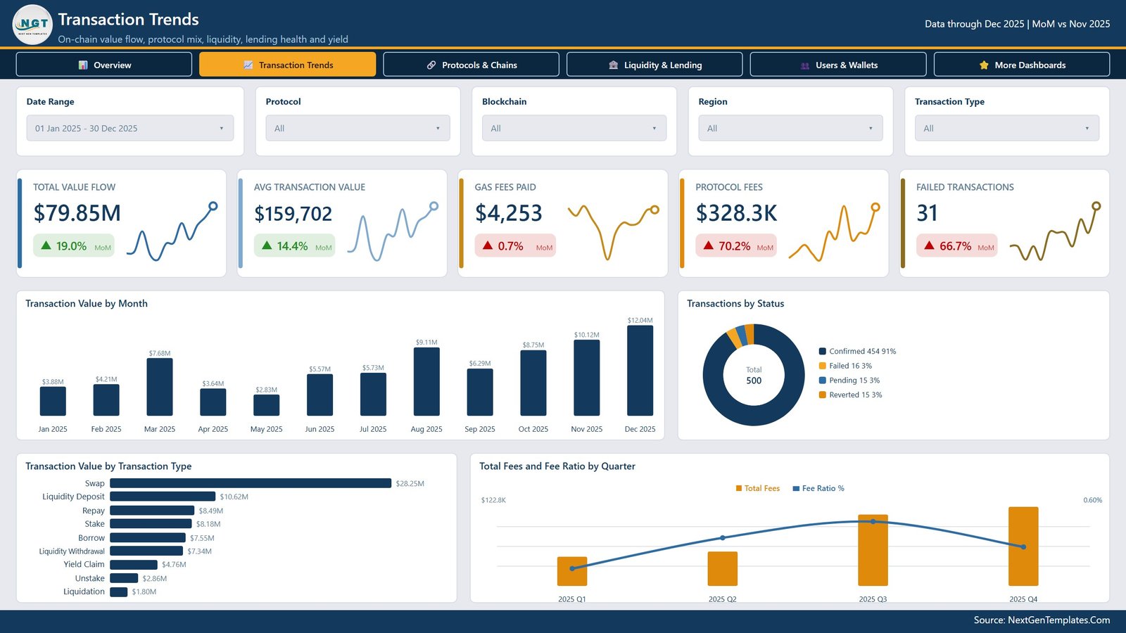
Total Value Flow, Avg Transaction Value, Gas Fees Paid, Protocol Fees and Failed Transactions. Transaction Value by Month carries data labels on every column, Transactions by Status splits Confirmed / Failed / Pending / Reverted, Transaction Value by Transaction Type ranks Swap, Liquidity Deposit, Repay, Stake, Borrow, Liquidity Withdrawal, Yield Claim, Unstake and Liquidation, and Total Fees and Fee Ratio by Quarter puts fee spend and fee ratio on one combo chart.
Page 3 – Protocols & Chains
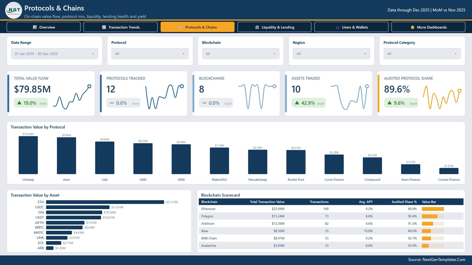
Protocols Tracked, Blockchains, Assets Traded and Audited Protocol Share join Total Value Flow. Transaction Value by Protocol ranks all twelve protocols in the sample, Transaction Value by Asset ranks the ten assets, and the Blockchain Scorecard table adds average APY and audited share per chain. The audited-protocol figure is read from a column in your own data – the template reports what you record, it does not verify anything.
Page 4 – Liquidity & Lending
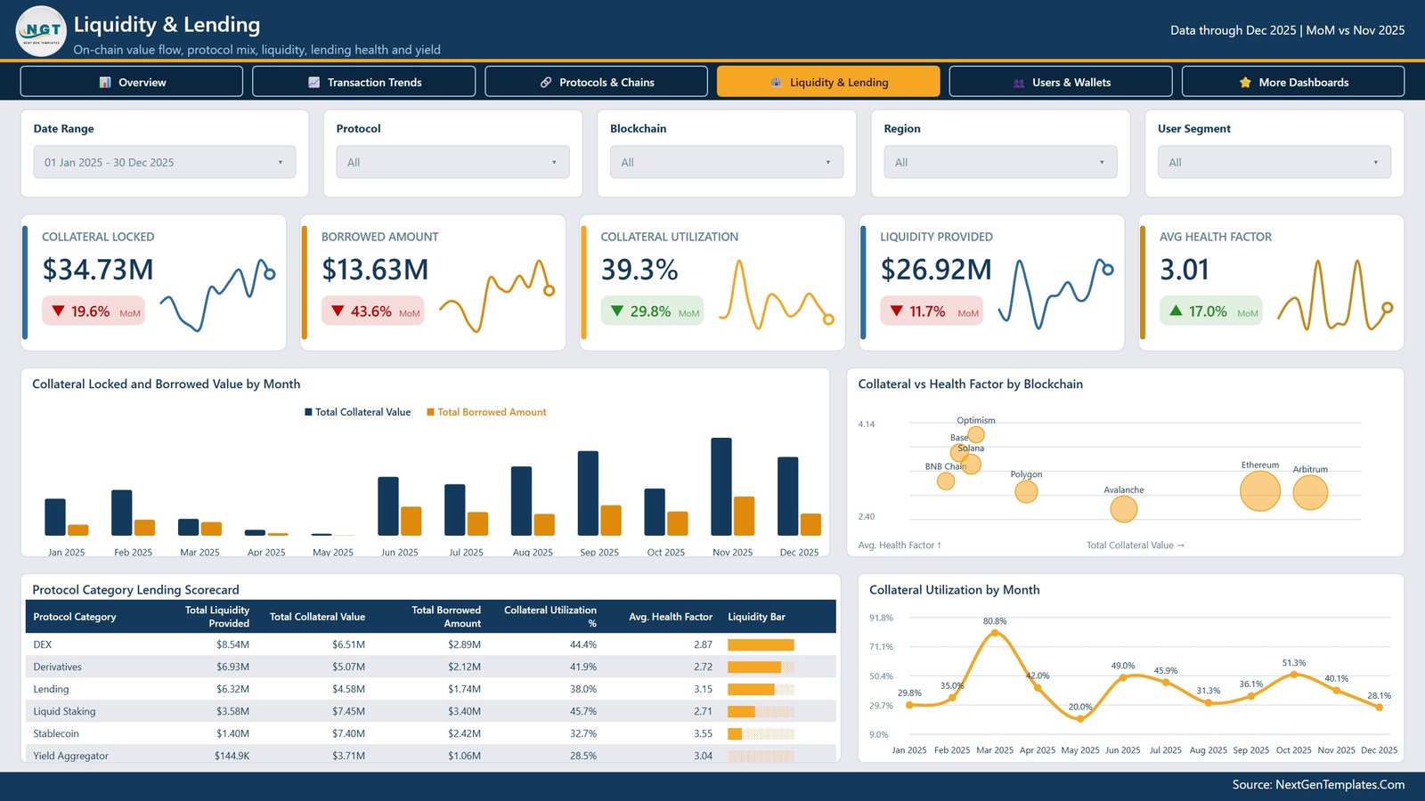
Collateral Locked, Borrowed Amount, Collateral Utilization, Liquidity Provided and Avg Health Factor. Collateral Locked and Borrowed Value by Month puts both series side by side, Collateral vs Health Factor by Blockchain plots each chain as a bubble against collateral and health factor, the Protocol Category Lending Scorecard breaks liquidity, collateral, borrowings, utilisation and health factor down by category, and Collateral Utilization by Month tracks the ratio across the year with a label on every point.
Page 5 – Users & Wallets
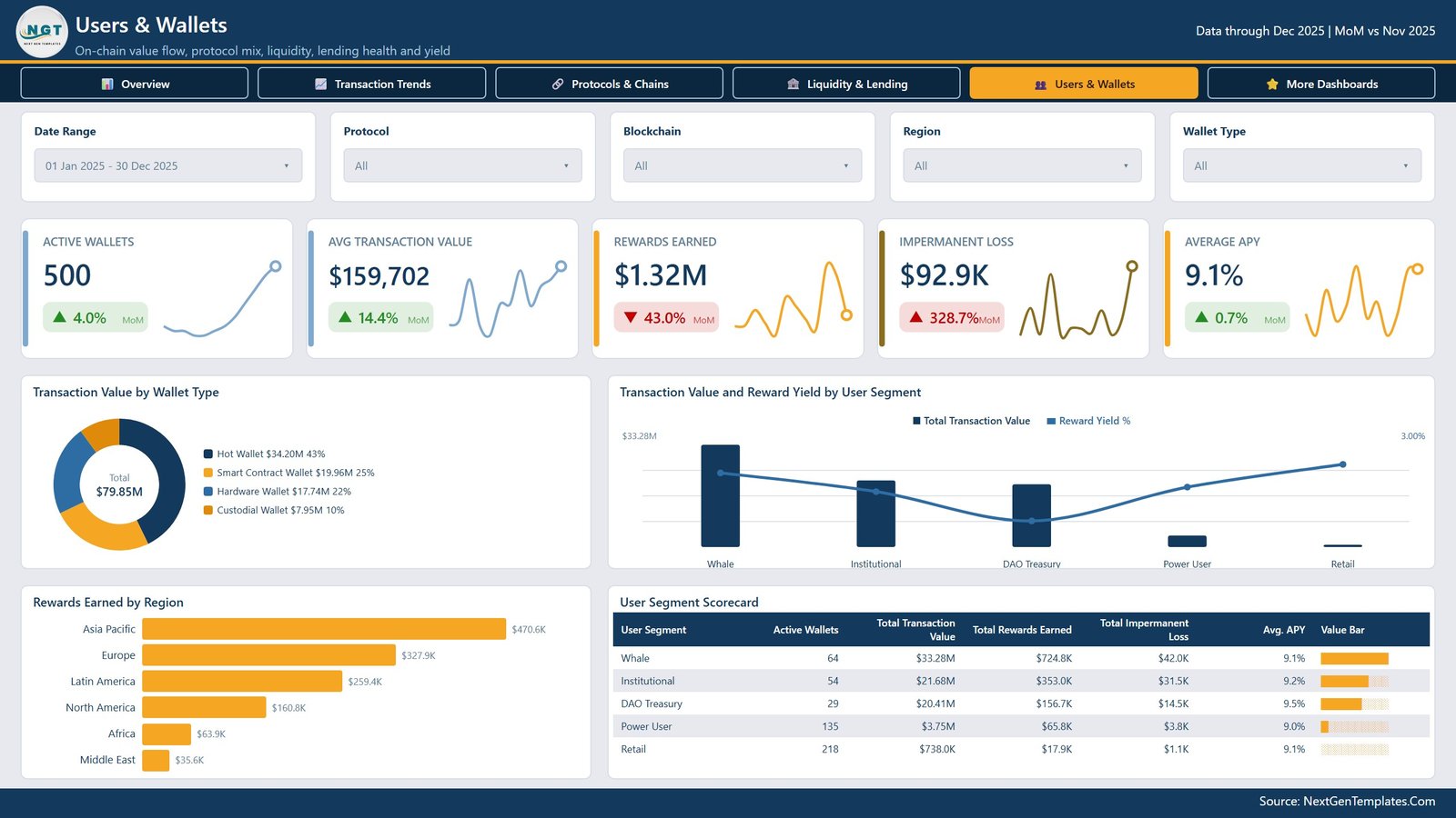
Active Wallets, Avg Transaction Value, Rewards Earned, Impermanent Loss and Average APY. Transaction Value by Wallet Type splits Hot, Smart Contract, Hardware and Custodial wallets; Transaction Value and Reward Yield by User Segment compares Whale, Institutional, DAO Treasury, Power User and Retail; Rewards Earned by Region ranks the six regions; and the User Segment Scorecard table lists wallets, value, rewards, impermanent loss and APY per segment.
DeFi (Decentralized Finance) Dashboard in Power BI vs. Tableau or Qlik vs. Paid On-Chain Analytics SaaS – Where This Fits
| This template (Power BI) | Tableau / Qlik build | Paid on-chain analytics SaaS | |
|---|---|---|---|
| Cost | $17.99 one time | Licence plus build time | Recurring per-seat subscription |
| Platform | Power BI Desktop (free from Microsoft) | Tableau Desktop or Qlik Sense | Vendor web app |
| Setup time | Minutes – swap the file path and refresh | Days to model and lay out five pages | Minutes, but you work inside their schema |
| Real-time team collaboration | Via Power BI Service if you publish it | Via that vendor’s server | Built in |
| Mobile access | Power BI mobile app once published | Vendor mobile app | Browser and app |
| Customizable fields | Fully – every measure, visual and column is editable | Fully, if you build it | Limited to what the vendor exposes |
| Share with link | Yes, after publishing to your workspace | Yes, on their server | Yes |
| Year-1 cost at 5 users | $17.99 plus your existing Power BI licences | Several thousand in licences alone | Recurring, and it never stops |
| Works on your own private ledger export | Yes – it reads your Excel file | Yes, if you build the model | Usually only what their indexer already covers |
| Connects to a chain, wallet or price feed | No – you supply the data | No, unless you build a connector | Yes, that is the product |
Who This Template Is For – and Who It’s Not For
It fits a treasury or finance analyst at a protocol or fund who already exports transactions to Excel and needs a board-ready view; a DAO operations lead reporting quarterly value flow, fee spend and reward distribution to token holders; a research or BI team that wants a working Power BI model to fork rather than a blank canvas; and a consultant who needs to show a client something concrete in the first meeting.
It does not fit you if you want live prices, a wallet connection or an indexer – it has none of those, and no template can add them. It does not fit you if you need signed, auditor-ready statements or a regulated custody record; this produces management reporting, not an attestation. And it does not fit you if you are looking for trading signals or portfolio recommendations – it reports what already happened in the data you load, and makes no forecast of any kind.
How to Use the DeFi (Decentralized Finance) Dashboard in Power BI
- Unzip and open the .pbix in Power BI Desktop, free from Microsoft. The report opens fully populated with the sample data, so you can click through all five pages before changing anything.
- Open Data.xlsx and study the column headers. The 23 columns are the contract between your export and the model: Transaction ID, Transaction Date, Wallet ID, User Segment, Protocol, Protocol Category, Blockchain, Asset, Transaction Type, Region, Wallet Type, Transaction Value, Gas Fee, Protocol Fee, Liquidity Provided, Collateral Value, Borrowed Amount, Rewards Earned, Impermanent Loss, APY, Health Factor, Transaction Status and Audited Protocol.
- Paste your own rows in, keeping those headers exactly as they are. Leave a column blank rather than renaming it if you do not track that field.
- Point Power Query at your file – Transform data, then change the single source path – and hit Refresh. Every page, measure and slicer follows.
- Set your date window on the Date Range slicer and check the header stamp reflects the period you actually loaded.
- Recolour if you want by editing the included theme JSON, then publish to your Power BI workspace to share by link.
Real-World Use Cases
Ravi, treasury analyst at a mid-size protocol. He exports the quarter’s transactions from the team’s internal ledger, pastes them in, and uses the Liquidity & Lending page to show the risk committee how collateral utilisation and average health factor moved month by month – one screenshot instead of four spreadsheets.
Amara, operations lead at a DAO. Her quarterly token-holder update needs fee spend, rewards distributed and value flow by chain. She filters to the quarter, exports the Overview and Users & Wallets pages to PDF, and is done in an afternoon.
Daniel, BI consultant. A fintech client asked for on-chain reporting. He forks the model, renames three measures to the client’s vocabulary, drops in their export, and delivers a working prototype in the first week rather than the third.
Frequently Asked Questions
Does this connect to a blockchain, wallet or exchange?
No. It reads one Excel table that you supply. There is no node connection, no wallet integration, no exchange API and no price feed anywhere in the file. If you need live on-chain data, you need an indexer or a data provider, and you would feed its export into this report.
Are the numbers in the screenshots real?
No. Every figure – the $79.85M total value flow, the 500 transactions, the protocol and chain splits – is generated sample data included so the report opens populated. You replace all of it with your own.
Is this investment advice or a trading tool?
Neither. It is a reporting template. It summarises transactions you have already recorded and makes no projection, recommendation or forecast about any asset, protocol or return.
What does “Audited Protocol Share” mean here?
It is a percentage calculated from a Yes/No column in your own data. The template reports the flag you record; it does not verify, perform or certify any audit, and it carries no regulatory or compliance standing.
Do I need a paid Power BI licence?
Not to use the file. Power BI Desktop is free from Microsoft and opens and edits the .pbix. A Pro or Premium licence is only needed if you want to publish to the Power BI Service and share by link.
Can I change the metrics, add pages or rebrand it?
Yes. Nothing is locked. Measures, visuals, page layout, the navigation bar and the theme JSON are all editable, and you can add your own logo and colours.
My export has different column names. Will it still work?
Rename your columns to match the 23 headers in Data.xlsx and it will refresh cleanly. If you would rather remap inside Power Query, the transformation steps are visible and unlocked.
About the Author
Built by PK – Microsoft Certified Professional with 15+ years of Excel, Google Sheets, and Power BI experience. Founder of NextGenTemplates, reaching 300K+ subscribers across YouTube channels. Every template is hand-built and tested before release.
Explore Related Templates
- DeFi (Decentralized Finance) Dashboard in Excel – the same subject built as an Excel workbook, if your team does not run Power BI.
- Crypto Portfolio Dashboard in Power BI – holdings and allocation reporting rather than protocol-level flow.
- Blockchain Finance Dashboard in Power BI – a wider finance view across blockchain operations.
- Derivatives Trading Dashboard in Power BI – derivatives desk reporting, useful alongside the Derivatives category on page 1.
- Power BI Dashboard Mega Collection – 15 Premium Templates – the bundle, if you need more than one.
Browse everything in Power BI Dashboards, or the full Power BI category.
Note: this is the analytical Power BI Dashboard line – five multi-visual analysis pages. It is not the Power BI KPI Dashboard line, which is a different product family built around a month picker and traffic-light scorecards. If you want that shape instead, browse the Power BI KPI Dashboards.
Get the DeFi (Decentralized Finance) Dashboard in Power BI for $17.99 (regular $29.99). Instant download, one-time payment, no subscription. Open it in free Power BI Desktop, drop in your own export, and have five pages of on-chain reporting the same afternoon.
Last updated: September 2026.
Watch the demo video:
Compatibility and Requirements
- Works in Power BI Desktop, which is free from Microsoft. Windows is needed to run the desktop app.
- Get Power BI Desktop from Get Power BI Desktop.
- The download includes the .pbix file, the sample Data.xlsx and a PDF user manual. Your own data goes in as an Excel table with the same 23 column headers.
- A Pro or Premium licence is only needed if you publish to the Power BI Service and share by link.
Related DeFi and Finance Templates
- DeFi (Decentralized Finance) Dashboard in Excel: the same subject as an Excel workbook
- Finance KPI Dashboard in Power BI: general finance KPIs in Power BI
- Personal Finance Dashboard in Power BI: another finance report on the same platform
- Finance & Accounting Command Center: 8 finance templates in one download
Browse all Power BI dashboards.








Reviews
There are no reviews yet.