

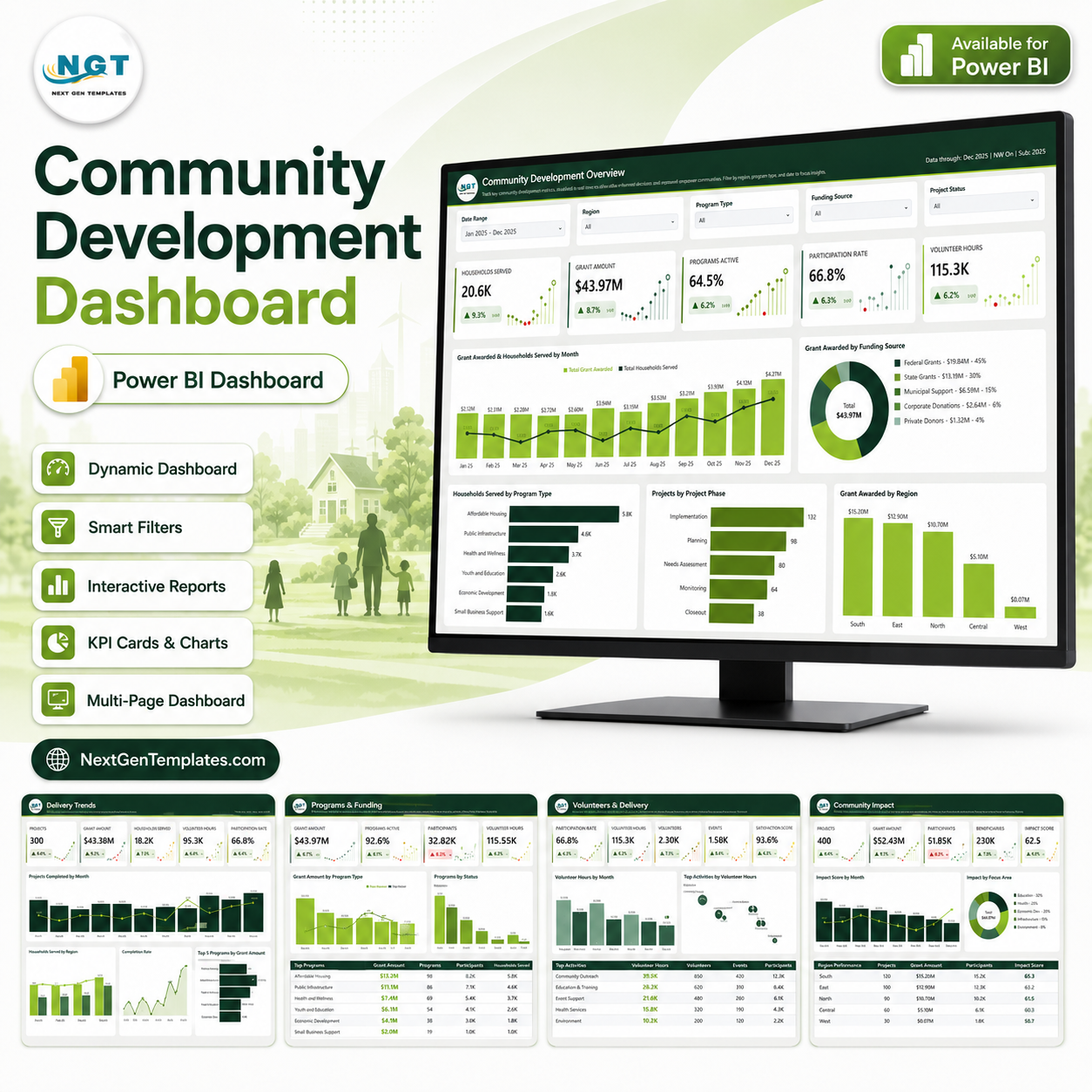
Community Development Dashboard in Power BI
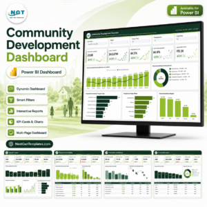
Most community development teams already hold the raw material for good reporting – a project list, a grant register, a volunteer log, a milestone plan. What they usually do not have is a single place where all of it is summarised on one screen. The Community Development Dashboard in Power BI is that place: a finished, fully laid-out Power BI report that sits on top of an ordinary Excel workbook and turns it into five interactive pages.
It is a reporting layer over your own data, and nothing more than that. It does not measure social impact, verify outcomes, assess grant compliance, or produce a report that any funder, donor or authority has agreed to accept. Every value on screen is either a number your team typed into the workbook or a straightforward calculation over those numbers.
The download ships with a 500-row sample dataset that is demonstration data – invented rows used to show the layout working. The communities, delivery partners, programme types and focus areas in it are placeholder labels, not references to any real organisation, place or group. Replace them with your own before you show the report to anyone.
Report Pages
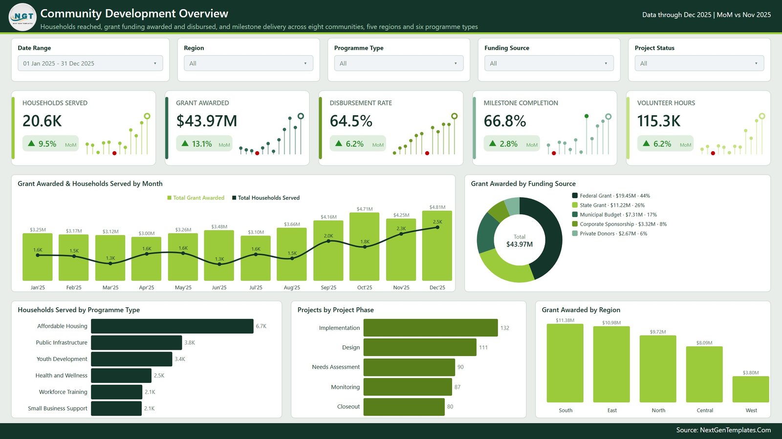
Page 1 – Overview
The landing page. Five KPI cards across the top – Households Served, Grant Awarded, Disbursement Rate, Milestone Completion and Volunteer Hours – each with a month-on-month delta and a small sparkline. Below them, Grant Awarded & Households Served by Month pairs funding against reach on a combined column-and-line chart, Grant Awarded by Funding Source splits the total across funder types in a donut, and a bottom row carries Households Served by Programme Type, Projects by Project Phase and Grant Awarded by Region.
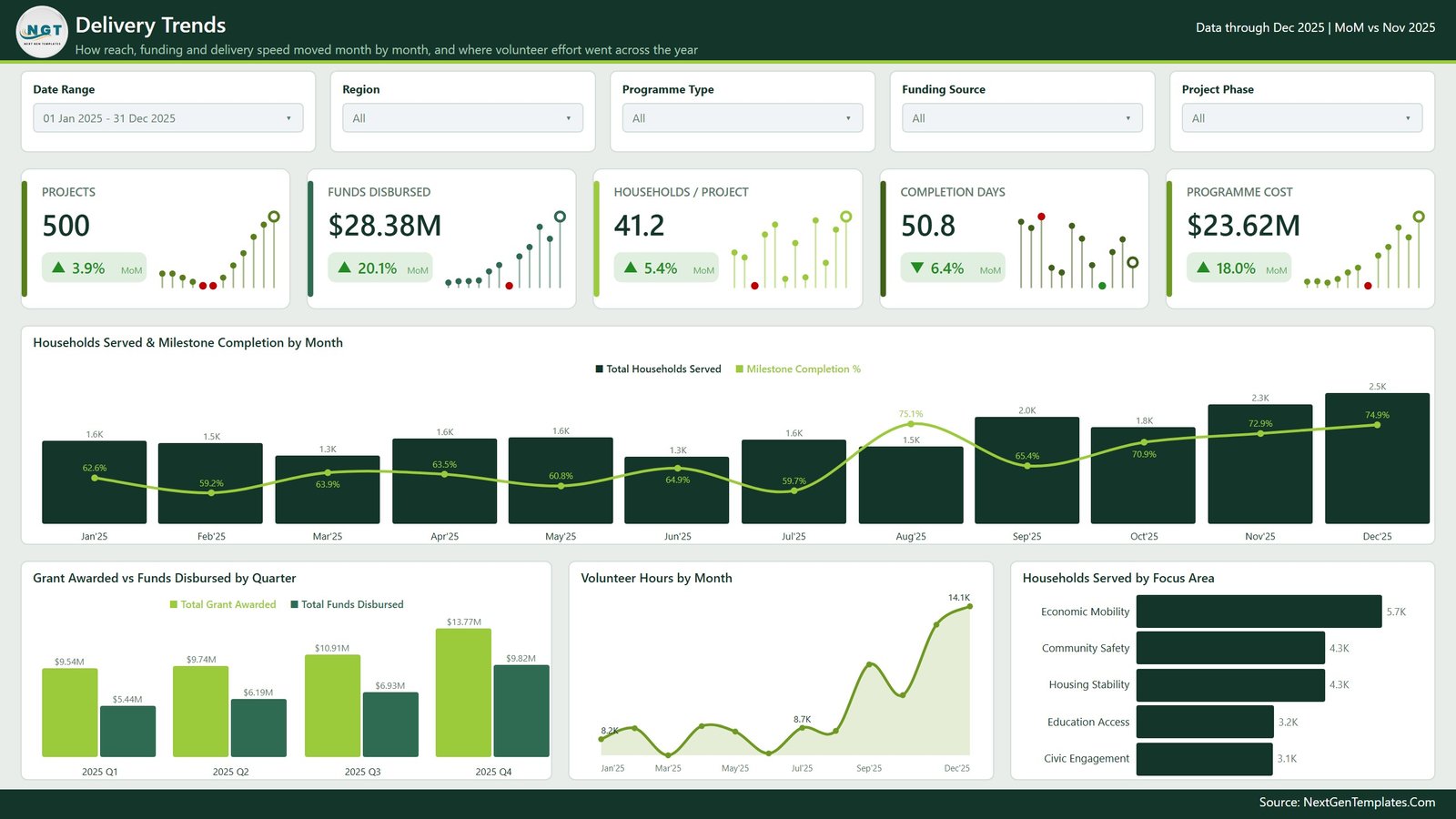
Page 2 – Delivery Trends
How reach, funding and delivery speed moved through the year. KPI cards show Projects, Funds Disbursed, Households / Project, Completion Days and Programme Cost. Households Served & Milestone Completion by Month overlays a completion percentage line on monthly household columns; Grant Awarded vs Funds Disbursed by Quarter puts awarded against released money side by side; Volunteer Hours by Month is an area chart of volunteer effort; and Households Served by Focus Area ranks the focus-area labels you define.
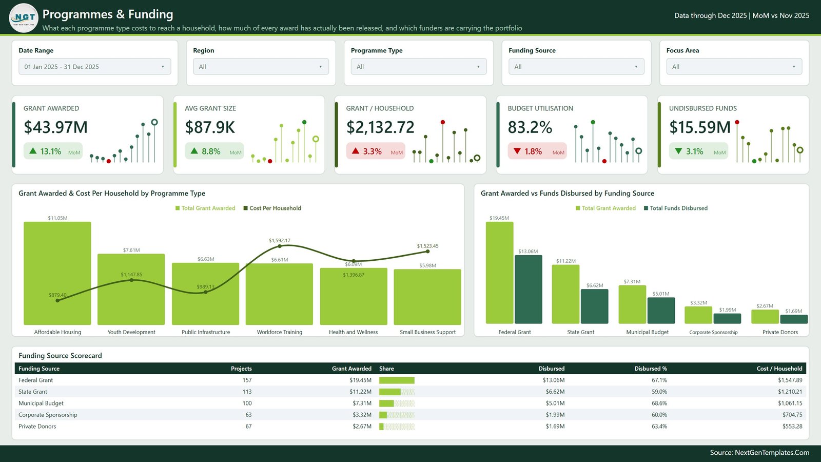
Page 3 – Programmes & Funding
The cost-and-funding view. Cards cover Grant Awarded, Avg Grant Size, Grant / Household, Budget Utilisation and Undisbursed Funds. Grant Awarded & Cost Per Household by Programme Type shows where money goes against what it costs to reach a household; Grant Awarded vs Funds Disbursed by Funding Source compares committed with released per funder type. Underneath, a Funding Source Scorecard table lists projects, grant awarded, share bar, disbursed, disbursed % and cost per household for each funding source.
Page 4 – Milestones & Delivery
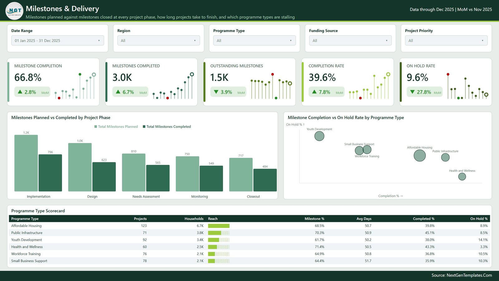
Planned milestones against closed ones. Cards show Milestone Completion, Milestones Completed, Outstanding Milestones, Completion Rate and On Hold Rate. Milestones Planned vs Completed by Project Phase is a paired column chart across the five phases; Milestone Completion vs On Hold Rate by Programme Type plots each programme type as a bubble. The Programme Type Scorecard below lists projects, households, a reach bar, milestone %, average days, completed % and on-hold % per programme type.
Page 5 – Communities & Partners
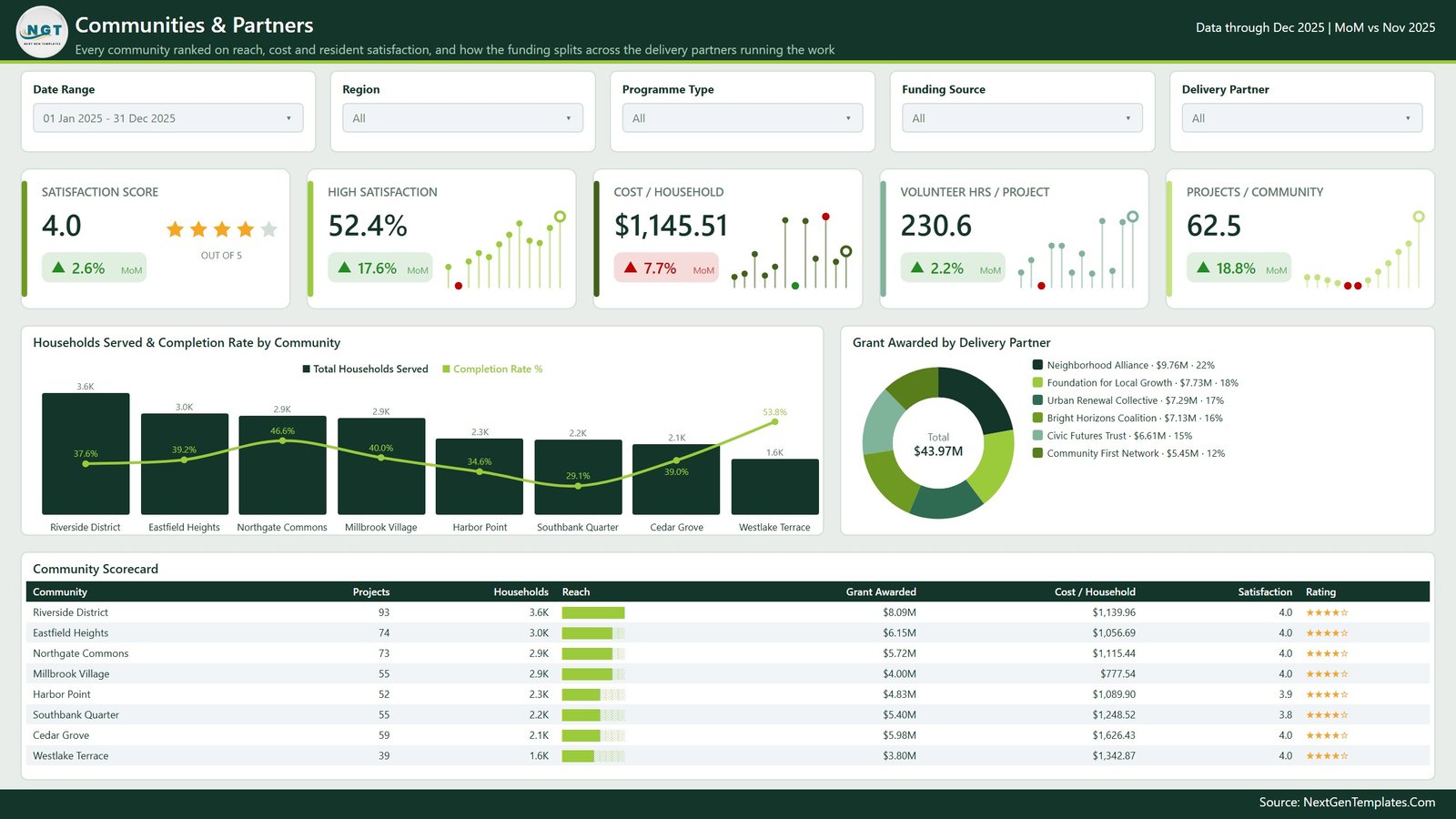
Every community ranked side by side, and the funding split across delivery partners. Cards show Satisfaction Score (with a star row), High Satisfaction, Cost / Household, Volunteer Hrs / Project and Projects / Community. Households Served & Completion Rate by Community combines reach columns with a completion line; Grant Awarded by Delivery Partner is a donut across partner organisations. The Community Scorecard table closes the page with projects, households, reach bar, grant awarded, cost per household, satisfaction and a star rating per community.
Behind the five pages
The report file also carries a hidden Details drillthrough page – right-click any community, region, programme type, focus area, funding source, priority, project lead, delivery partner, phase or status and jump straight to the underlying project rows – plus two compact hover tooltip pages (Category Detail and Trend Detail) that pop up small breakdowns when you hover a chart. A sixth visible page, Get More Dashboards, is our own catalogue link and can be deleted in one click.
Key Features
- Five finished report pages plus a hidden drillthrough page and two tooltip pages – nine pages in the file in total.
- 25 KPI cards across the five pages, each with a month-on-month delta and a sparkline.
- Five slicers on every page: Date Range, Region, Programme Type, Funding Source and one page-specific slicer (Project Status, Project Phase, Focus Area, Project Priority or Delivery Partner). Slicers are synced, so a filter set on one page carries to the others.
- Three scorecard tables – Funding Source, Programme Type and Community – with in-cell share bars and star ratings.
- Right-click drillthrough on ten fields straight to the project-level detail page.
- Import-mode semantic model with a proper date table, so month, quarter and year-to-date logic works out of the box.
- Custom theme and branded chrome – consistent green palette, page headers with subtitles, and a source footer.
- Editable everywhere: every measure, visual, colour and label is yours to change in Power BI Desktop. Nothing is locked.
What’s Inside the Download
Community Development Dashboard in Power BI.pbix– the report file, ready to open in Power BI Desktop.Data.xlsx– the demonstration workbook the report points at, with 500 sample project rows.Power BI Dashboard - User Manual.pdf– setup and customisation notes.
How to Use It
- Unzip the download and open the
.pbixin Power BI Desktop (free from Microsoft). - Click through the five pages with the sample data first, so you can see which column feeds which visual.
- Open
Data.xlsxand replace the sample rows with your own – keep the column headers exactly as they are. - In Power BI, change the data source path to your copy of the workbook and hit Refresh.
- Rename the placeholder labels – programme types, focus areas, community names, delivery partners, funding sources – to match how your organisation actually describes its work.
- Delete the Get More Dashboards page before you share the file internally.
Who It Is For
- Community development and programme teams that already track projects in a spreadsheet and want a summary view.
- Programme managers preparing an internal monthly or quarterly pack.
- Operations and finance staff who need awarded-versus-disbursed and cost-per-household figures in one place.
- Power BI learners who want a complete, well-structured report to pull apart.
What It Does Not Do
Being clear about this is more useful than a longer feature list:
- It does not measure or validate social impact. Any figure that looks like an outcome is a number entered in the workbook.
- It does not check grant compliance, and it is not a funder, donor or government reporting format. No funder has reviewed or approved this layout.
- It does not audit anything, and it produces no assurance over your figures.
- It does not analyse demographics or equity, and it makes no findings about any community, group or cause.
- It does not connect to any grant, CRM or case-management system on its own – the input is a workbook you maintain.
- It is not legal, financial or programme advice.
A Note on Personal Data
The template ships with no personal data – the sample rows contain placeholder organisation, community and staff labels only. If you extend the workbook with anything that identifies a beneficiary, household or individual, that becomes personal data under your own data-protection obligations, and it is your responsibility to handle, store and share it accordingly. The dashboard has no access control, encryption or anonymisation of its own; a .pbix file is as protected as the folder you keep it in. The safest pattern is to keep individual-level records out of the workbook and load only aggregated counts.
How It Compares
| This Power BI Dashboard | A plain Excel summary | Building it yourself | |
|---|---|---|---|
| Setup time | Under an hour | Already there | Days to weeks |
| Report pages | 5 laid out + drillthrough + 2 tooltips | One sheet, usually | Whatever you build |
| Cross-page filtering | Synced slicers on all pages | Manual | You wire it |
| Row-level detail | Right-click drillthrough on 10 fields | Filter the raw sheet | You wire it |
| Design and theme | Included and consistent | Default formatting | Your own time |
| Fully editable | Yes – nothing locked | Yes | Yes |
Frequently Asked Questions
Does this prove or measure our programme’s impact?
No. It displays the numbers you put into the workbook and does arithmetic on them. It performs no impact measurement, no outcome validation and no independent verification of anything.
Will a funder or donor accept a report from this?
We cannot say. No funder, donor or authority has reviewed this template, and it is not built to any particular reporting format. Treat it as an internal management view and check your own funder’s requirements separately.
Are the numbers in the screenshots real?
No. Every figure, community name, delivery partner and programme label in the images is demonstration data generated to show the layout working. None of it refers to a real organisation, place or programme.
Do I need a Power BI licence?
To open, edit and use the file locally you only need Power BI Desktop, which Microsoft provides free. Publishing to the Power BI Service to share with colleagues needs whatever licence your organisation already uses for that.
Can I change the programme types and focus areas?
Yes – they are ordinary text labels in the workbook, chosen as neutral placeholders. Rename them to your own taxonomy and refresh; the charts and scorecards follow.
Can I connect it to our grants or case-management database instead of Excel?
Yes, but that is a change you make. Repoint the query in Power Query to your source and map your columns to the same names the model expects.
Is beneficiary data included?
No. The sample workbook holds no individual-level records. If you add any, see the personal-data note above – protecting it is your responsibility, not the template’s.
Can I get a refund?
This is an instantly delivered digital file, so it is non-returnable once downloaded. Please read this page and the screenshots carefully before buying, and message us first if anything is unclear.
Related Templates
- Nonprofit Grant Dashboard in Power BI
- Nonprofit Fundraising Dashboard in Power BI
- Civil Rights Organizations Dashboard in Excel
- Community Support Impact Dashboard in Google Sheets
- Browse all Power BI dashboards
In Short
If your community development records already live in a spreadsheet and you would rather spend your time on the programme than on building charts, this gives you five finished report pages, a project-level drillthrough and a set of scorecards for the price of an afternoon’s work. Swap in your data, rename the labels, and you have an internal reporting pack you can refresh every month – with every number still coming from, and belonging to, your own records.

Reviews
There are no reviews yet.