

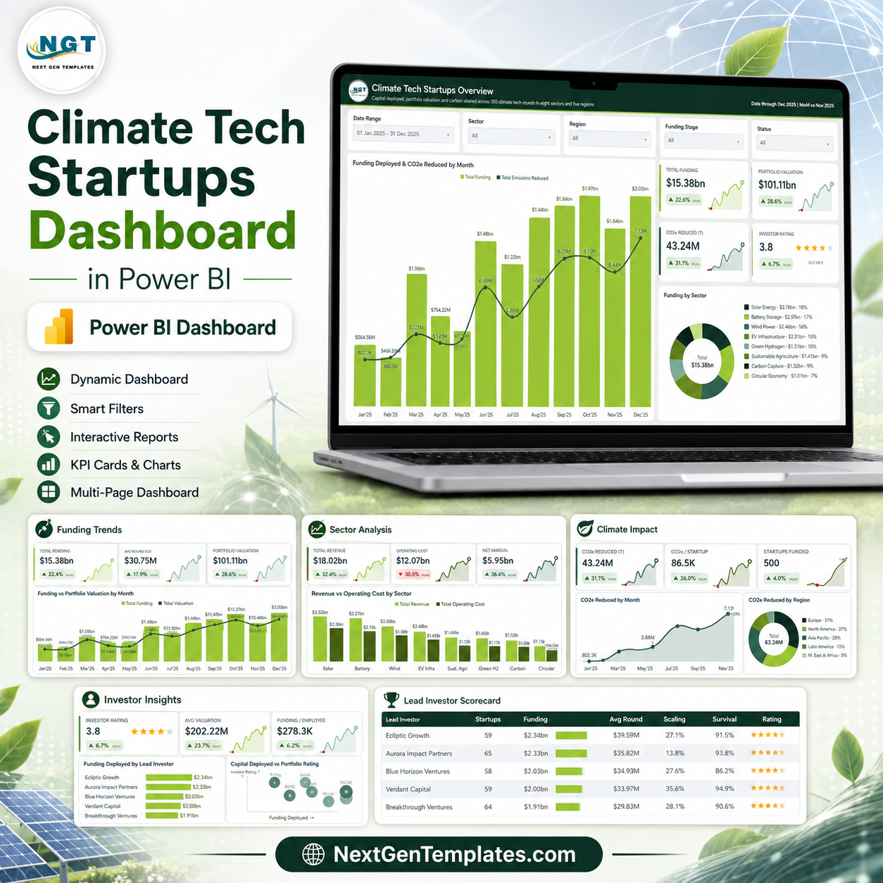
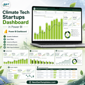
The Climate Tech Startups Dashboard in Power BI is a ready-to-use, five-page analytical report for anyone who has to explain a climate tech portfolio to somebody else. Fund partners, accelerator programme managers, corporate venture teams, climate-focused analysts and sustainability finance students all end up building the same four views by hand – where the money went, what it is worth now, which sectors actually earn their operating cost back, and how much carbon the portfolio claims to have abated. This template already has them, laid out, themed and connected.
You open one PBIX, point the query at your own copy of the included Excel workbook, refresh, and every page redraws against your rounds. There is no setup wizard, no premium capacity requirement and no external data connection – the whole model imports from a single flat table.
Which template is this?
NextGenTemplates publishes two different products with similar names, and it is worth ten seconds to make sure you are buying the one you want.
- This one – the analytical dashboard. Five exploratory pages, five slicers per page, drillthrough and tooltip pages, charts you interrogate. Built for asking “why did Q3 look like that?”
- A KPI scorecard dashboard. A different product family entirely – a month picker, a table of KPIs with targets and traffic lights, a KPI Trend page and a KPI Analysis page. Built for reporting “are we on target this month?”
If you want a red/amber/green scorecard against monthly targets, this is not it. If you want to slice a portfolio and follow the story, this is exactly it. There is also an Excel version of this same analytical dashboard if you would rather stay inside a workbook.
Key Features
- Five analysis pages plus a navigation-friendly upsell page – Overview, Funding Trends, Sector Analysis, Climate Impact and Investor Insights, each with its own headline KPI cards and its own slicer row.
- Page-synced slicers. Date Range, Sector, Region and Funding Stage carry across pages, so a filter you set on Overview is still applied when you land on Climate Impact. Each page adds one slicer of its own – Status, Business Model, Lead Investor or Country.
- SVG KPI cards with month-on-month deltas and sparklines. Each card shows the current value, the MoM change with an up or down arrow, and a small trend line – so a number is never presented without its direction.
- A hidden Details drillthrough page. Right-click a bar, a donut slice or a scorecard row and drill through to the underlying rounds behind that selection.
- Two tooltip report pages (Category Detail and Trend Detail, both 280×360) so hovering a visual gives you context rather than a bare value.
- A proper Date table and DAX measures for month, quarter and MoM comparisons – not a pile of calculated columns.
- Two scorecard tables – Sector Economics and Lead Investor – with in-cell data bars and star ratings, the kind of view an investment committee actually reads.
- A custom green theme applied through a Power BI theme JSON, so recolouring the whole report to your own brand is one file change, not 60 visual edits.
- 500 rows of realistic demo data across 8 sectors, 5 regions, 21 countries, 6 funding stages, 4 business models and 8 lead investors – enough that every chart looks like a real portfolio the moment you open it.
What Is Inside the Download
| File | What it is |
|---|---|
| Climate Tech Startups Dashboard in Power BI.pbix | The report itself – all nine pages, the semantic model, the DAX measures and the theme. |
| Data.xlsx | The source workbook the model imports from. Replace the rows with your own and refresh. |
| Power BI Dashboard – User Manual.pdf | Setup guide – repointing the data source, refreshing, and editing visuals. |
The Five Pages
1. Climate Tech Startups Overview
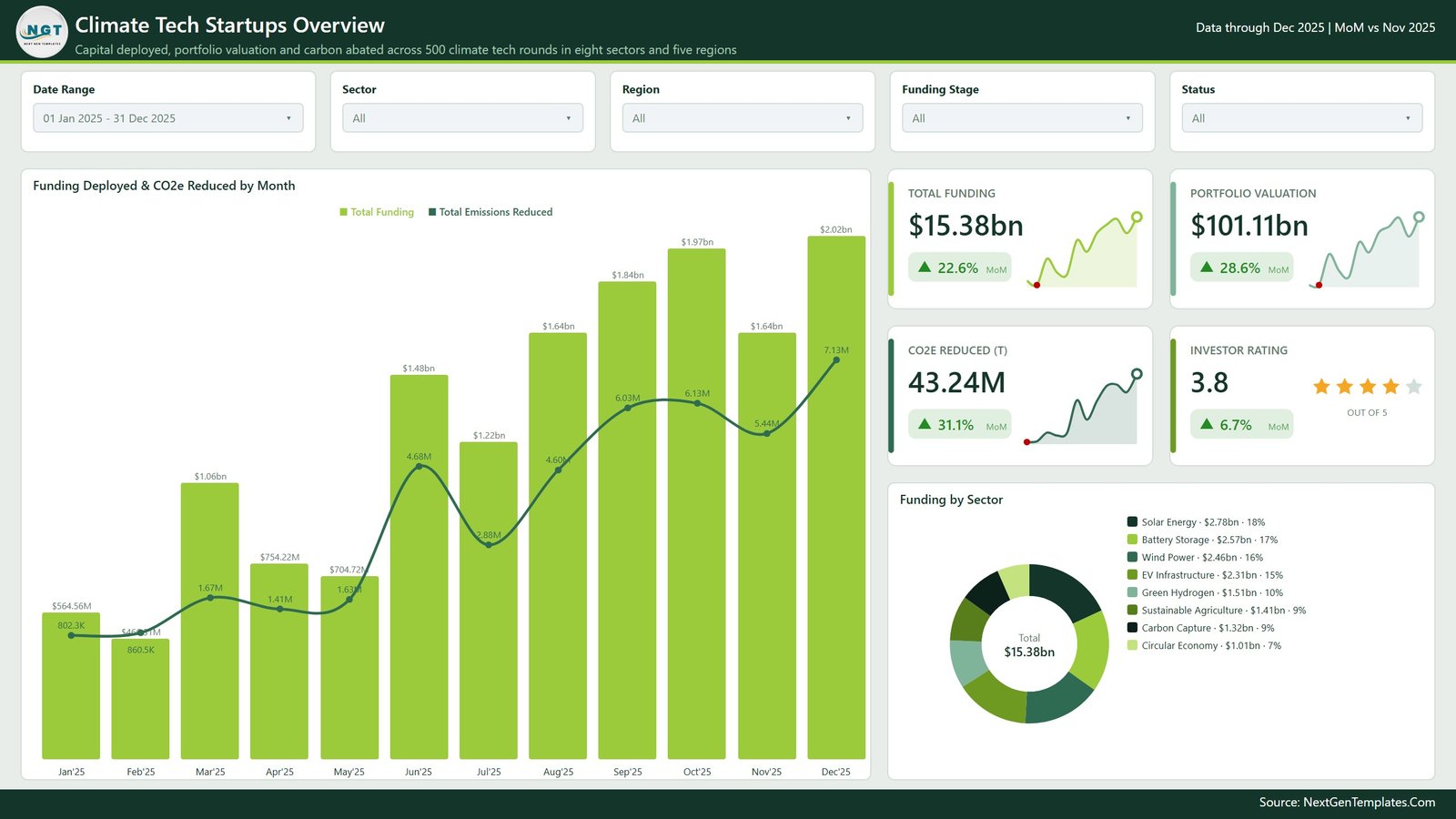
The one-screen answer. A combined column-and-line chart puts Funding Deployed & CO2e Reduced by Month on the same axis, so you can see whether capital and carbon abatement move together. Four KPI cards – Total Funding, Portfolio Valuation, CO2e Reduced (T) and Investor Rating – sit beside a Funding by Sector donut with the value and share printed next to every sector name, so nobody has to hover to read the split.
2. Funding Trends
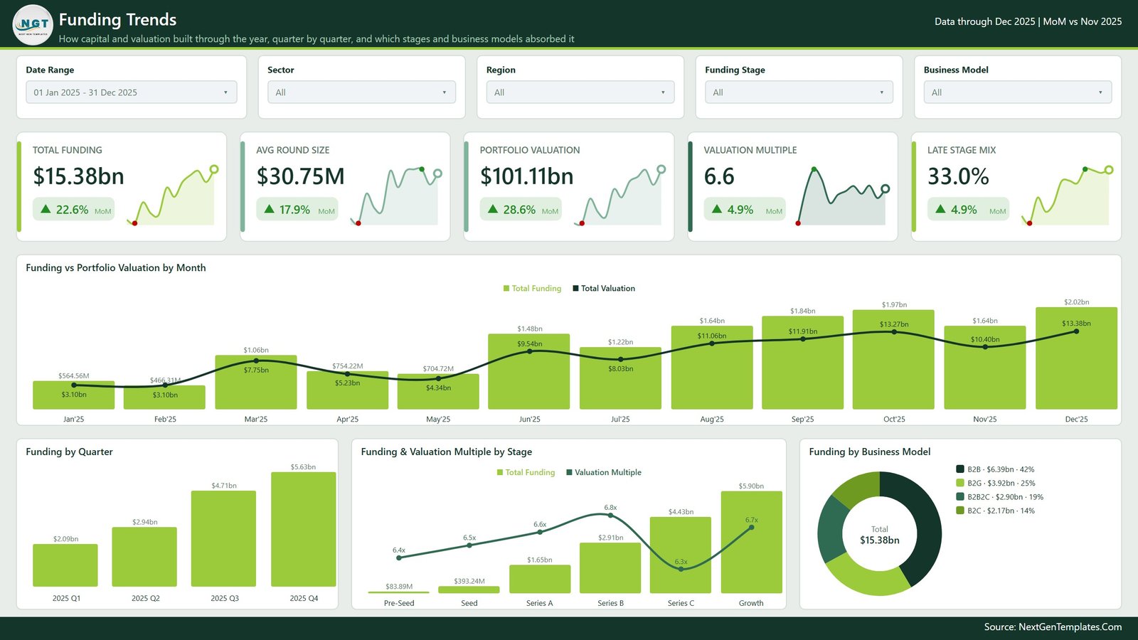
How capital and valuation built through the year. Five KPI cards (Total Funding, Avg Round Size, Portfolio Valuation, Valuation Multiple, Late Stage Mix) sit above Funding vs Portfolio Valuation by Month, then the page breaks the same total three ways – Funding by Quarter, Funding & Valuation Multiple by Stage from Pre-Seed through Growth, and Funding by Business Model across B2B, B2G, B2B2C and B2C.
3. Sector Analysis
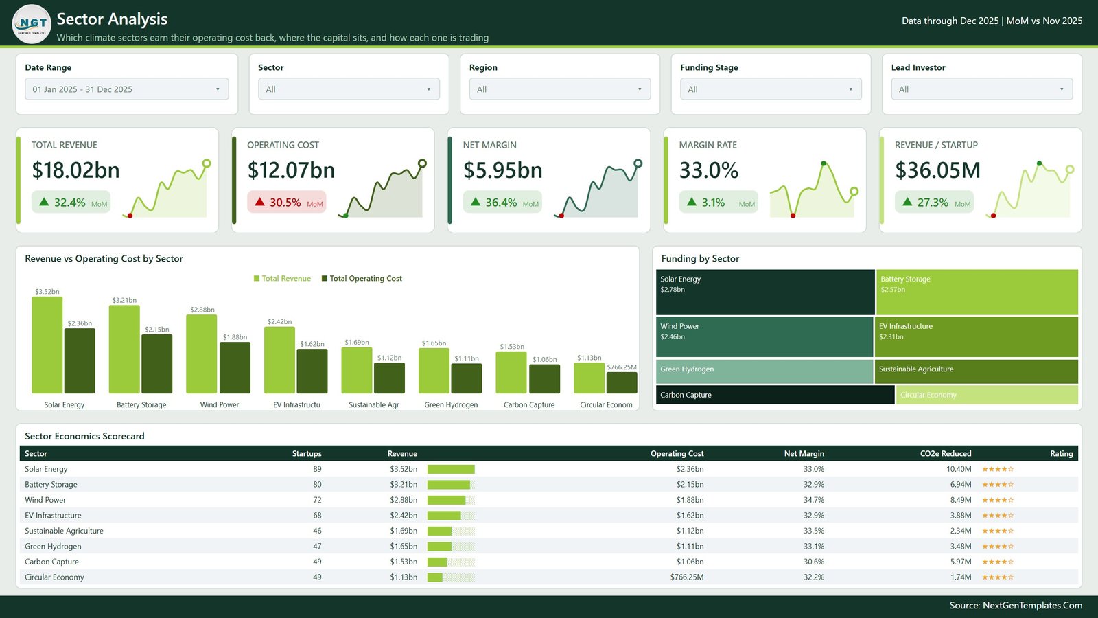
Which climate sectors earn their operating cost back. Revenue vs Operating Cost by Sector pairs the two bars side by side for all eight sectors, a treemap shows where the capital actually sits, and the Sector Economics Scorecard table lists startups, revenue, operating cost, net margin, CO2e reduced and rating for each one. Headline cards cover Total Revenue, Operating Cost, Net Margin, Margin Rate and Revenue per Startup.
4. Climate Impact
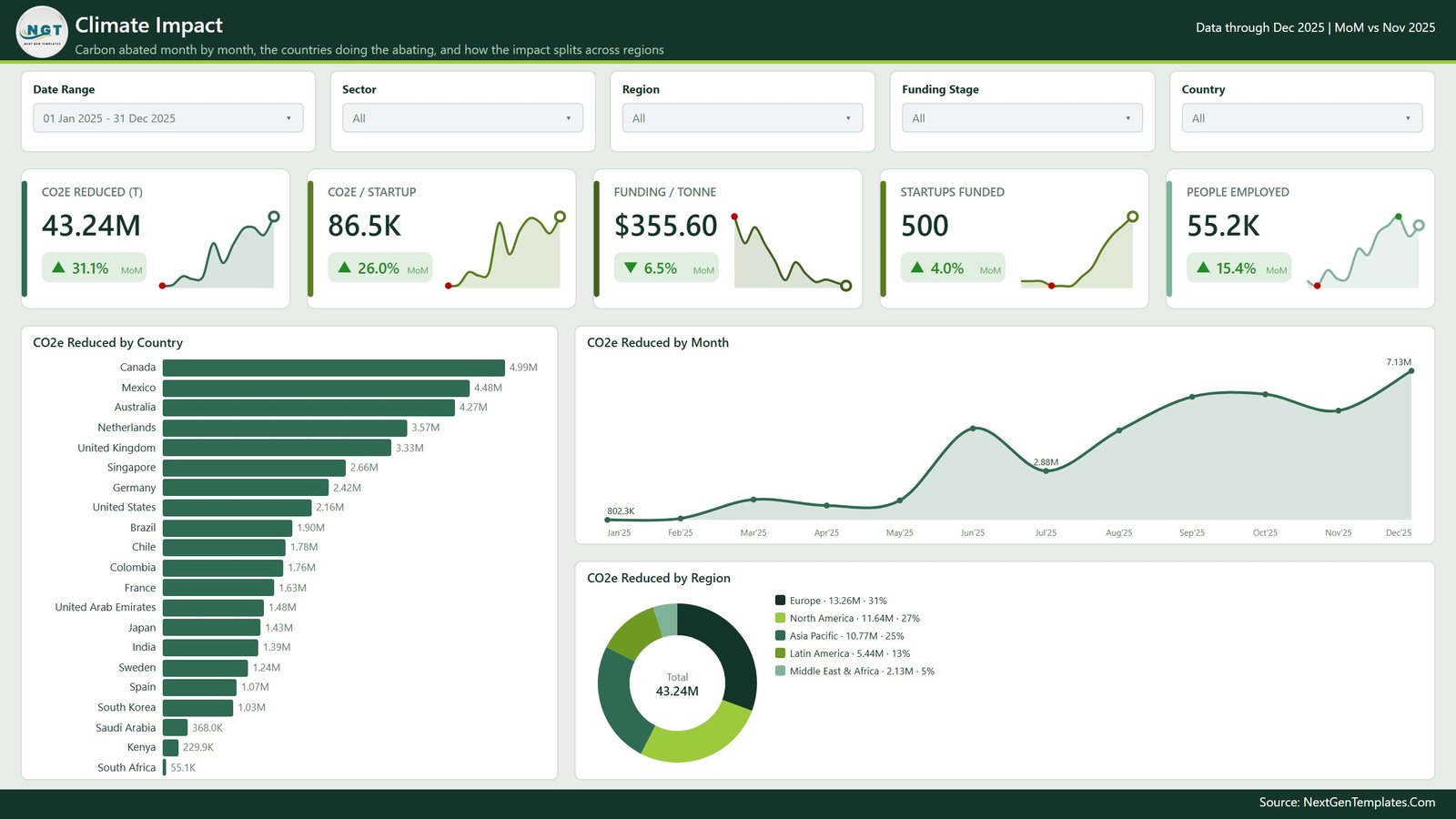
Carbon abated, month by month and country by country. A horizontal bar ranks CO2e Reduced by Country across the full country list, an area line tracks CO2e Reduced by Month, and a donut splits CO2e Reduced by Region. The KPI row adds CO2e per Startup, Funding per Tonne, Startups Funded and People Employed – the efficiency questions, not just the totals.
5. Investor Insights
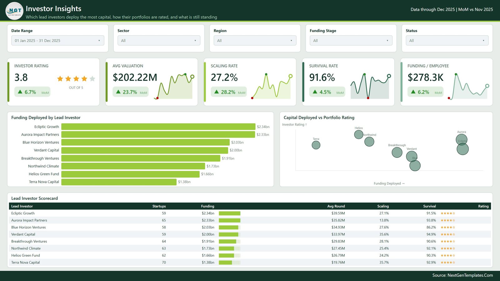
Which lead investors deploy the most capital and how their portfolios are rated. Funding Deployed by Lead Investor ranks the eight funds, a scatter plots Capital Deployed vs Portfolio Rating with bubble size, and the Lead Investor Scorecard table carries startups, funding, average round, scaling rate, survival rate and rating. Cards cover Investor Rating, Avg Valuation, Scaling Rate, Survival Rate and Funding per Employee.
How to Use It
- Unzip the download and open the PBIX in Power BI Desktop (the free version is enough).
- Explore the demo data first – click a sector, drill through a bar, hover a chart. Five minutes here tells you whether the layout fits your reporting.
- Open
Data.xlsxand replace the 500 demo rows with your own rounds, keeping the column headers exactly as they are. - In Power BI Desktop, go to Transform data > Data source settings and point the query at your copy of the workbook.
- Hit Refresh. Every page, card, chart and scorecard redraws against your data.
- Optional – edit the theme JSON to swap the green palette for your own brand colours.
Who It Is For
- Climate tech and impact VC funds reporting to LPs
- Accelerator and incubator programme managers tracking a cohort
- Corporate venture and innovation teams with a clean tech portfolio
- Sustainability finance analysts who need a presentable portfolio view fast
- Power BI learners who want a finished, well-structured report to take apart
What This Template Does Not Do
Being straight about this saves everyone a refund request.
- It does not measure, calculate, model or verify emissions or carbon abatement. The CO2e figures are values you type into the workbook. There is no measurement methodology, no lifecycle assessment and no verification step inside this file.
- It is not aligned to, and does not produce reporting for, any disclosure framework – not the GHG Protocol, SBTi, CDP, ISSB, CSRD, TCFD or any national scheme. Do not submit its output as a compliance filing.
- It makes no claim about carbon credit validity, additionality, registry status or offset quality, and it is not a carbon accounting or MRV system.
- It is not investment advice and produces no valuation opinion. Valuation Multiple, Scaling Rate, Survival Rate and Investor Rating are arithmetic on the numbers you enter, and Investor Rating in particular is a label you assign yourself, not an independent assessment.
- It does not connect to any fund administration system, cap table platform, CRM or data provider. The only data source is the Excel workbook you point it at.
- It is not a KPI scorecard – no monthly target column, no traffic lights, no variance-to-target page. That is a separate product family.
- It does not publish itself to the Power BI Service or configure scheduled refresh for you – that is standard Power BI work you do in your own tenant.
Frequently Asked Questions
Does this actually calculate my portfolio’s carbon impact?
No. It reports CO2e figures that you supply in the workbook. It has no emissions model and performs no verification. If you need measured or assured emissions data, that comes from your measurement provider – this dashboard presents it afterwards.
Is this the KPI scorecard version?
No. This is the analytical dashboard – five exploratory pages with slicers, drillthrough and tooltips. The KPI scorecard family is a different template with a month picker, targets and traffic lights.
Do I need a Power BI Pro or Premium licence?
Not to use the file. Power BI Desktop is free and opens, refreshes and edits everything here. A licence only matters if you want to publish and share it through the Power BI Service, which is your own tenant’s arrangement.
Can I use my own data?
Yes – that is the point. Replace the rows in Data.xlsx, keep the headers, repoint the data source and refresh. If you add new sectors, regions or investors they flow through into the slicers and charts automatically.
Can I change the colours and add my logo?
Yes. The report ships with a Power BI theme JSON, so a palette swap is one file. The logo sits in the header of every page as a standard image and can be replaced in Power BI Desktop.
Does it connect to my fund admin or cap table software?
No. There is no live connector. Everything comes from the Excel workbook.
Is there an Excel version?
Yes – the Climate Tech Startups Dashboard in Excel covers the same analysis inside a workbook, for teams that do not run Power BI Desktop.
Is the demo data real?
No. All 500 rounds, the eight lead investor names and every figure in the screenshots are synthetic sample data created to demonstrate the layout. No real fund, startup or transaction is represented.
Get It Now
An instant download – open it in Power BI Desktop, swap in your rows, and have a five-page climate tech portfolio report ready for your next partner meeting the same afternoon. Add it to your cart above.


Reviews
There are no reviews yet.