

Fourteen service KPIs, twelve months, one dropdown. The Auto Repair Shop KPI Dashboard in Excel is a month-picker scorecard that shows Average Repair Order Value, First-Time Fix Rate, Bay Utilization, Comeback Rate and eleven more metrics side by side with their target, their achievement percentage, a traffic-light status and last year’s number — for the selected month and for the year to date at the same time. Every figure is a plain worksheet formula. There is no Power Query, no data model, no macro and no add-in, so the file simply opens in Excel 2013 or later and in Excel for the web. Sample data for a full 2025 reporting year is already in place, with 2024 loaded as the prior year, so you can see the whole thing working before you type a single number of your own.

Key Features of the Auto Repair Shop KPI Dashboard in Excel
- One month dropdown drives everything. Cell D6 on the KPI Dashboard sheet holds the twelve months of the reporting year. Change it and the seven summary cards, all fourteen KPI rows and the whole KPI Analysis page re-read at once.
- MTD and YTD in the same row. Each KPI carries Actual, Target, Achievement %, Status, Prior Yr and vs PY for the selected month, and the identical six columns for the year to date.
- Direction-aware scoring. Every KPI is flagged UTB (Upper The Better) or LTB (Lower The Better) on the KPI Definition sheet. Achievement is Actual ÷ Target for a UTB metric and Target ÷ Actual for an LTB one, so beating a 3.30% Comeback Rate target with 2.45% scores 134.7% instead of reading as a miss.
- Traffic lights you control. On Target from 100%, At Risk from 95% to 99%, Missed below 95%. The thresholds sit in the formulas in columns L and U on the dashboard and can be edited to match your own governance.
- Arrows that mean two things at once. The arrow direction shows whether the actual is above or below the comparator; its colour shows whether that direction is good for that KPI, which is why a falling Comeback Rate and a falling Average Cycle Time both show a green down arrow.
- A trend page for any single KPI. Pick a KPI in cell B4 on KPI Trend and its attribute strip, its formula, its definition, its twelve-month table and both combo charts redraw.
- Group roll-up and rankings. KPI Analysis totals achievement by KPI Group and lists the top five and bottom five performers for the year to date.
- Room to grow without formula work. The sheets are wired for 22 KPIs and 14 are filled in. Type a fifteenth on KPI Definition and it appears on the input sheets, the dashboard, the trend page and the analysis page on its own.
- Plain formulas only. VLOOKUP, MATCH, INDEX and COUNTIF. Nothing is locked, nothing is hidden, and there is no refresh step to remember.
What’s Inside the Auto Repair Shop KPI Dashboard
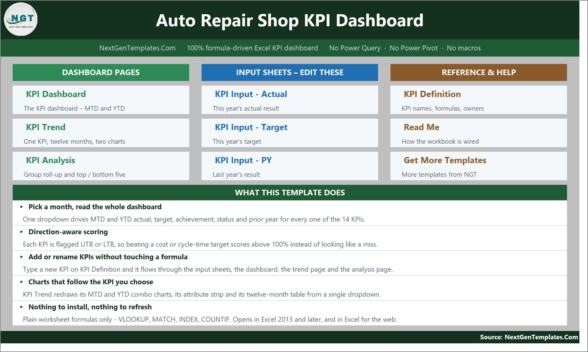
The gallery shows ten pages. The Home page is a navigation hub split into Dashboard Pages, Input Sheets – Edit These and Reference & Help, with a “What This Template Does” panel underneath.
KPI Dashboard
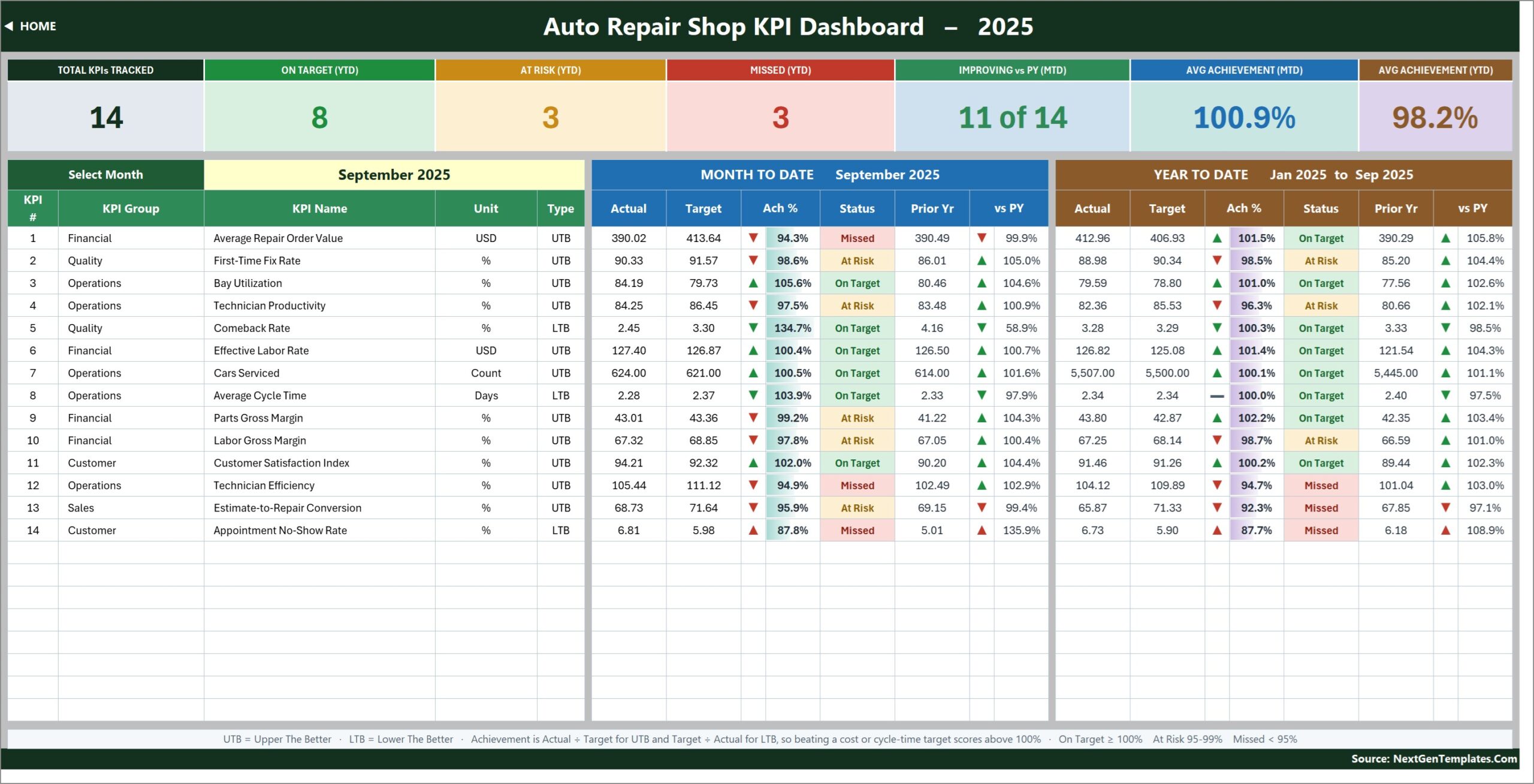
Seven summary cards run across the top: Total KPIs Tracked, On Target (YTD), At Risk (YTD), Missed (YTD), Improving vs PY (MTD), Avg Achievement (MTD) and Avg Achievement (YTD). In the sample month of September 2025 they read 14, 8, 3, 3, 11 of 14, 100.9% and 98.2%. Below them every KPI is listed with its number, group, name, unit and type, then the Month To Date block and the Year To Date block. The fourteen KPIs are Average Repair Order Value, First-Time Fix Rate, Bay Utilization, Technician Productivity, Comeback Rate, Effective Labor Rate, Cars Serviced, Average Cycle Time, Parts Gross Margin, Labor Gross Margin, Customer Satisfaction Index, Technician Efficiency, Estimate-to-Repair Conversion and Appointment No-Show Rate.
KPI Trend
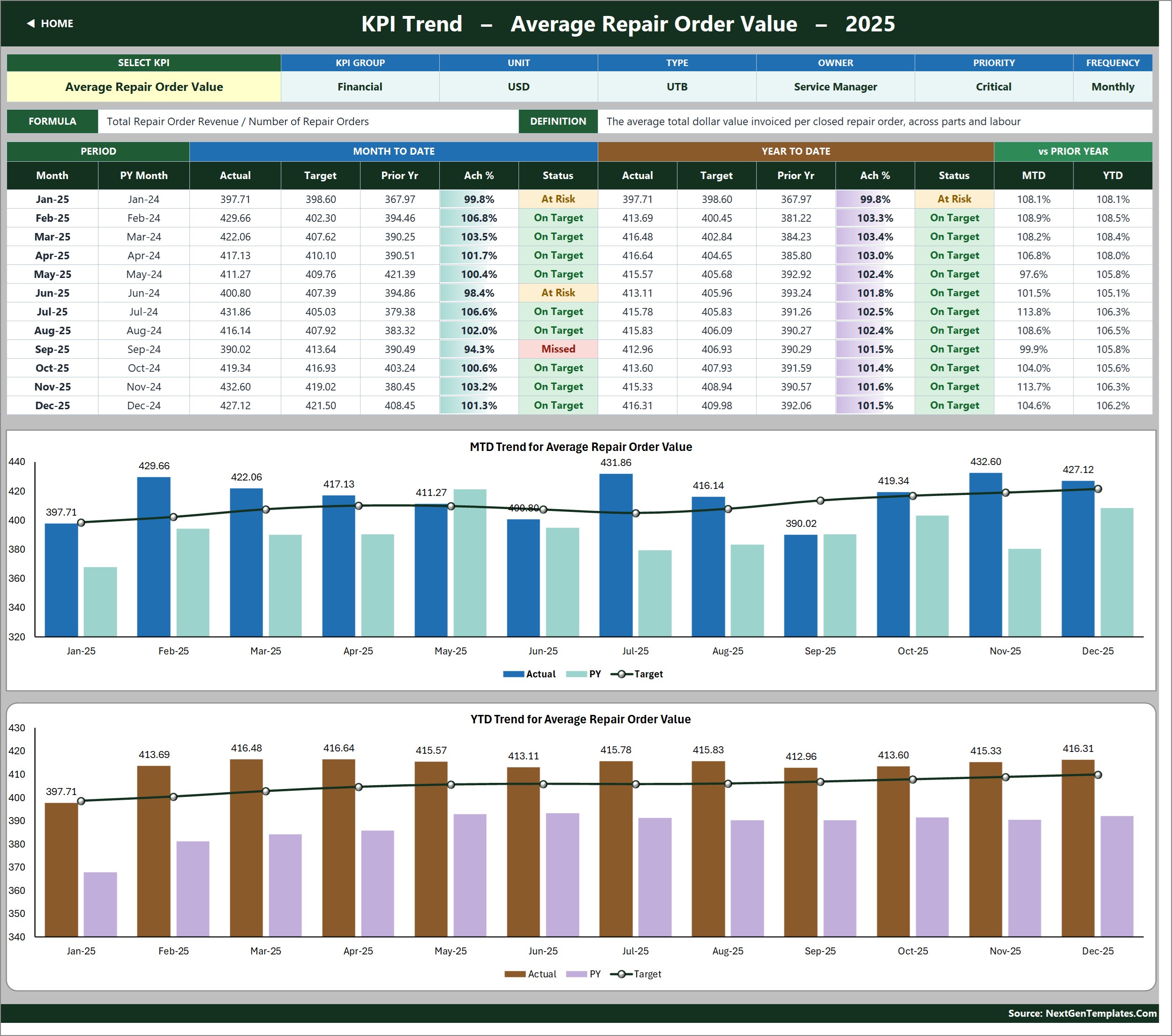
One KPI at a time, twelve months deep. The strip at the top shows KPI Group, Unit, Type, Owner, Priority and Frequency, with the metric’s formula and its written definition beside it. The table below gives every month’s MTD and YTD actual, target, prior year, achievement and status, plus MTD and YTD movement against last year. Two combo charts sit underneath — MTD Trend for Average Repair Order Value and YTD Trend for Average Repair Order Value — each plotting actual and prior-year columns against a target line, and both retitle themselves when you choose a different KPI.
KPI Analysis
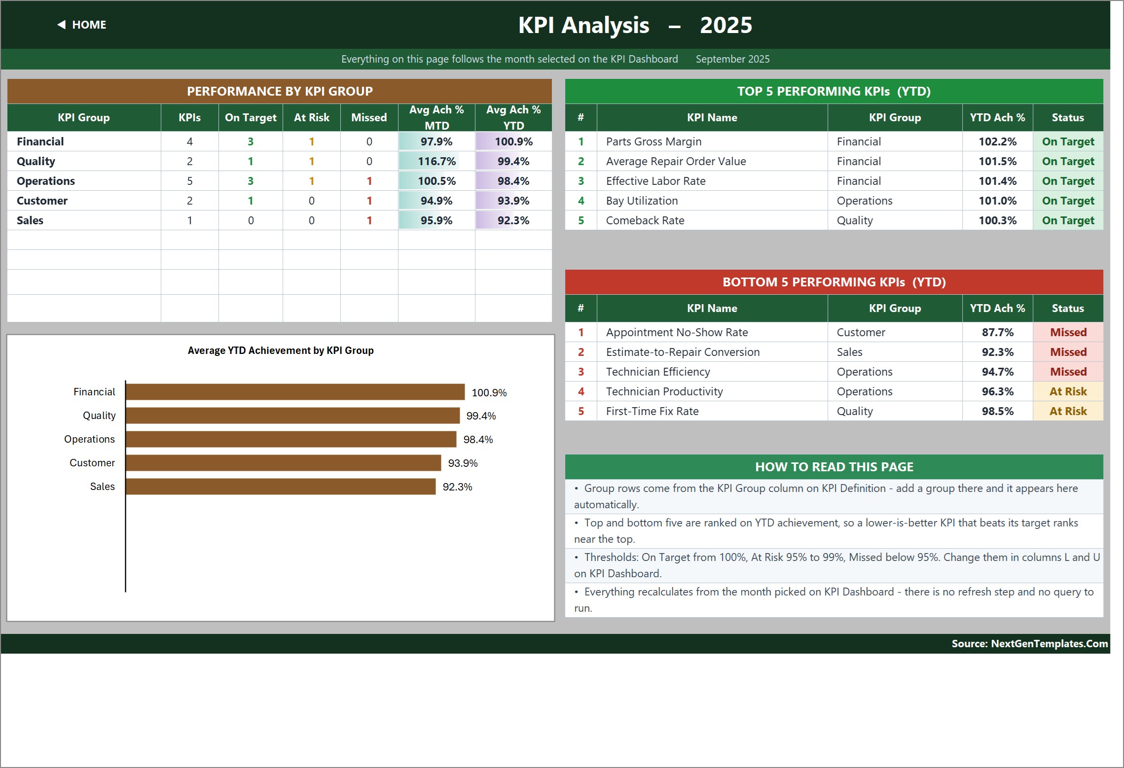
Performance By KPI Group counts the KPIs in each group and how many are On Target, At Risk or Missed, then averages their MTD and YTD achievement. In the sample that is Financial 4, Quality 2, Operations 5, Customer 2 and Sales 1. The Average YTD Achievement by KPI Group bar chart plots the same five figures, and two ranked tables list the Top 5 and Bottom 5 Performing KPIs for the year to date. A How To Read This Page panel explains the ranking logic and where the thresholds live.
The three input sheets

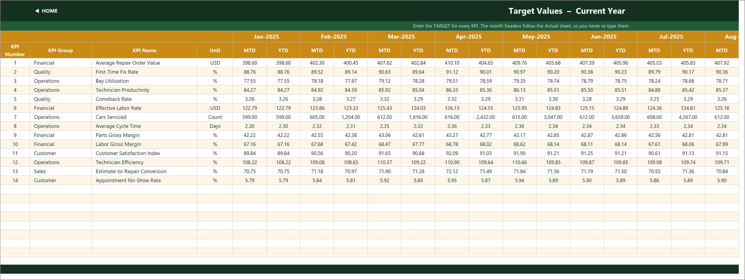
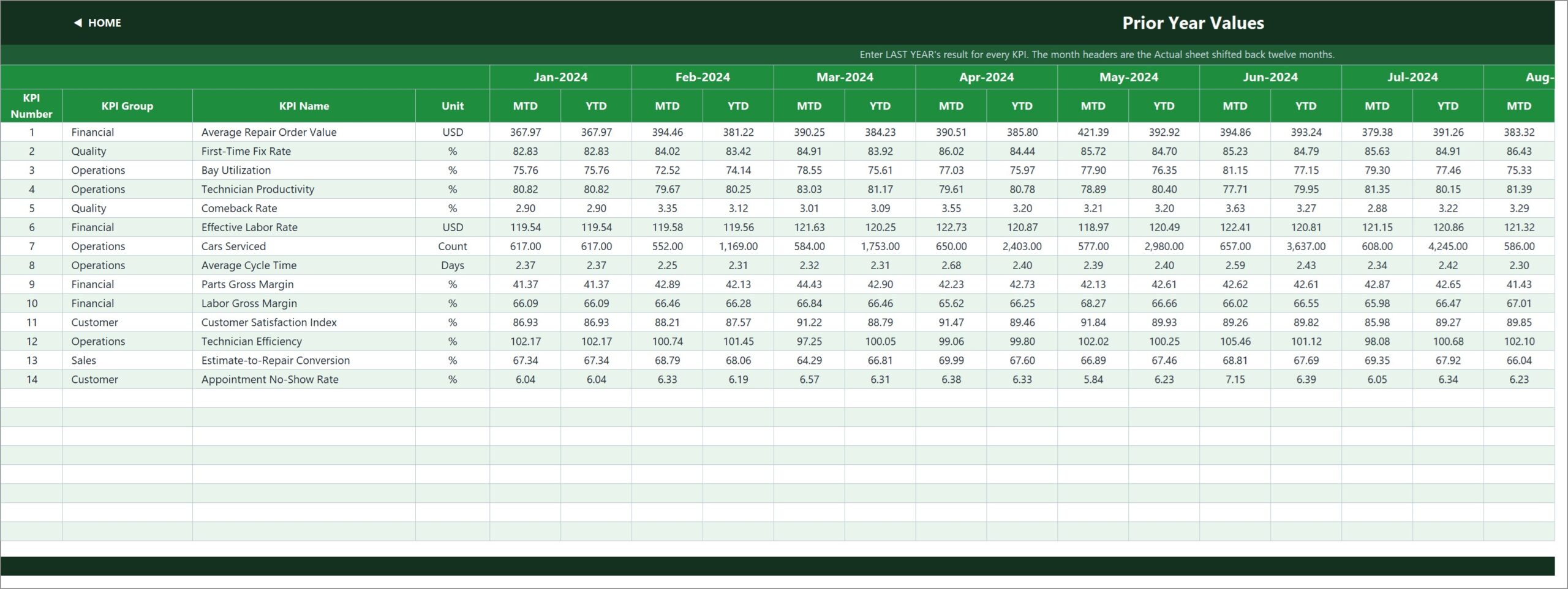
KPI Input – Actual, KPI Input – Target and KPI Input – PY are the only sheets you normally type into. Each holds an MTD and a YTD column for every month, and all three take their KPI rows straight from KPI Definition so they can never drift out of line. Cell E3 on the Actual sheet is the first month of the reporting year — change it and the Target sheet, the Prior Year sheet, the month dropdown and every sheet title re-base themselves.
KPI Definition, Read Me and Get More Templates
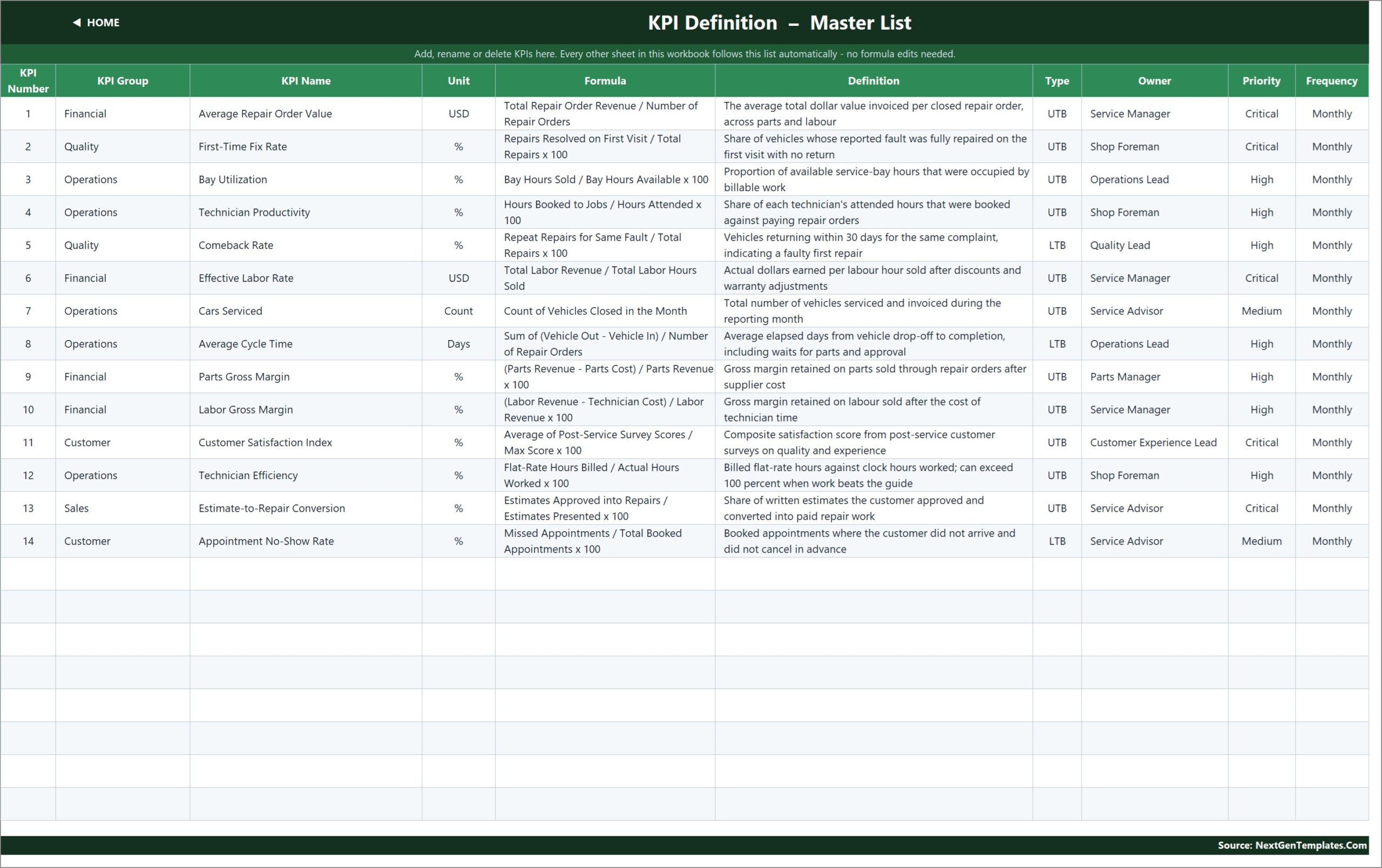
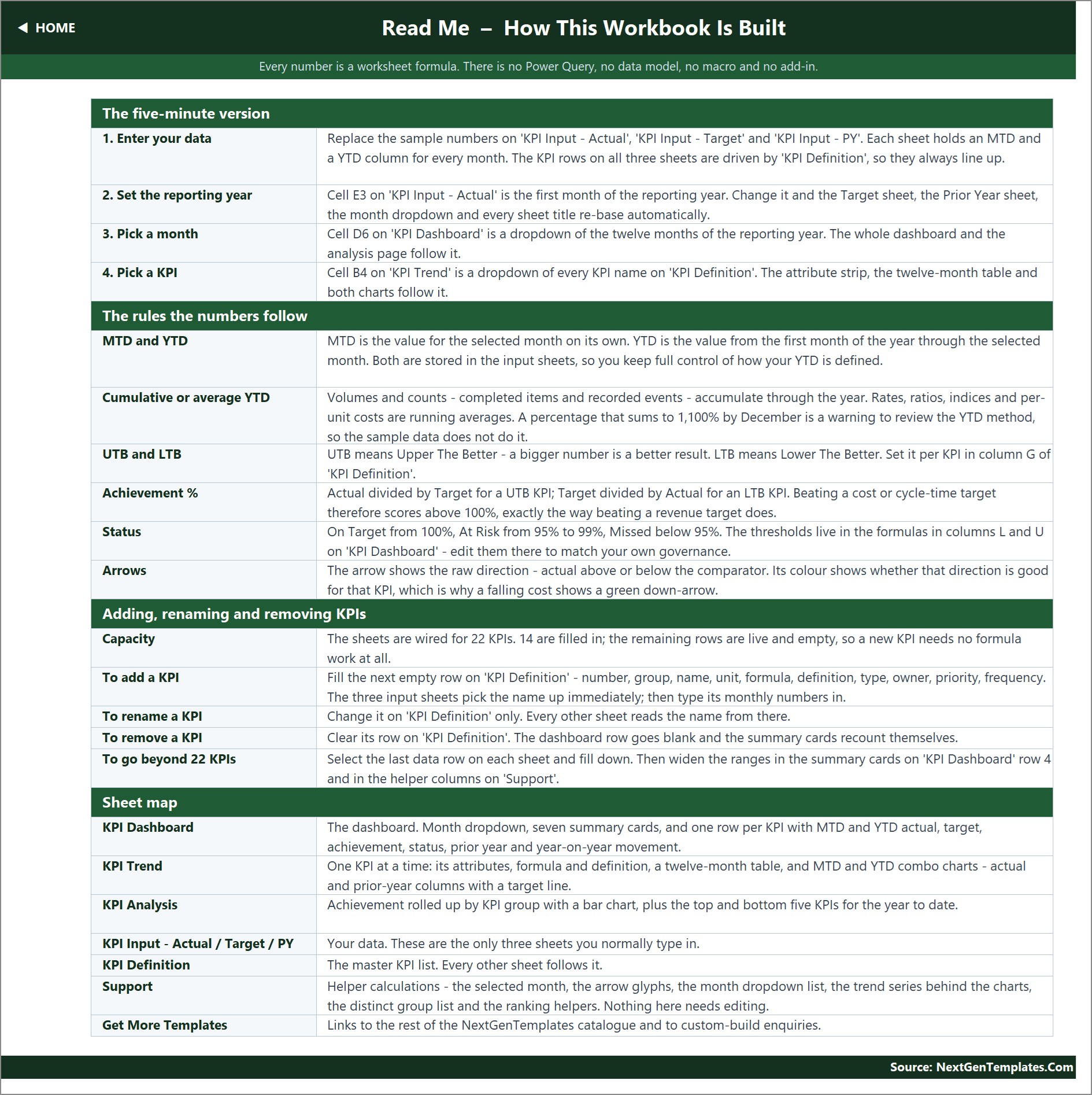
KPI Definition is the master list: number, group, name, unit, formula, written definition, UTB or LTB type, owner, priority and frequency. Owners in the sample run across Service Manager, Shop Foreman, Operations Lead, Quality Lead, Parts Manager, Service Advisor and Customer Experience Lead. Read Me is a full page of documentation covering the five-minute setup, the rules the numbers follow, how to add or rename a KPI and a sheet-by-sheet map. Get More Templates links out to the rest of the catalogue. A Support sheet holds the helper calculations behind the dropdowns, the arrow glyphs and the chart series, and needs no editing.
Auto Repair Shop KPI Dashboard vs. Google Sheets vs. Paid Shop-Management SaaS — Where This Fits
| This Excel template | A Google Sheets build | Tekmetric / Shopmonkey-class SaaS | |
|---|---|---|---|
| Cost | One-time file purchase | One-time file purchase | Monthly subscription per shop |
| Platform | Excel 2013+ desktop and Excel for the web | Browser, Google account required | Vendor cloud |
| Setup time | Type three months of numbers and it is live | Similar | Weeks, plus data migration |
| Real-time team collaboration | Through OneDrive or SharePoint co-authoring | Native | Native |
| Mobile access | Excel mobile app, read-only in practice | Browser and app | Full mobile app |
| Customizable fields | Every cell, formula and label | Every cell | Vendor-defined fields only |
| Share with link | Yes, via OneDrive | Yes | Named user seats |
| Year-1 cost at 5 users | The file price, once | The file price, once | Typically four figures and up |
| Writes repair orders / orders parts | No — reporting only | No | Yes |
| Direction-aware UTB / LTB scoring | Built in per KPI | Must be built | Varies by vendor |
| Owns your data file | You do, offline | You do, in Drive | Vendor hosts it |
If you already run a shop-management platform, this sits alongside it as the monthly management view your owner or franchise group actually reads. If you do not, it gives you the KPI discipline without the subscription.
Who This Template Is For — and Who It’s Not For
The Auto Repair Shop KPI Dashboard in Excel suits a specific job. It is for independent garages and multi-bay repair shops that already close repair orders somewhere and want a monthly scorecard on top; service managers who report to an owner, a group or a franchisor; fixed-operations managers comparing this year against last; and consultants who need a clean KPI pack they can re-skin per client.
It is not for shops that want live, per-repair-order tracking — this is a monthly reporting layer, not an operational system. It does not connect to Mitchell 1, Shopware, Tekmetric or any other shop-management platform, it does not link to a dealer management system or an accounting package, and it does not price jobs or order parts. Numbers arrive because you type them in, or paste them from whatever report your existing system produces. The data shipped in the file is fictional sample data, provided so the dashboard is demonstrably working on arrival, and it should be cleared before you publish anything from it.
How to Use the Auto Repair Shop KPI Dashboard in Excel
- Open the Read Me page first. It is the five-minute version of everything below.
- Set your reporting year. Change cell E3 on KPI Input – Actual to your first month. Every other sheet follows it.
- Edit the KPI list. On KPI Definition, rename, delete or add KPIs and set each one’s unit, UTB or LTB type, owner, priority and frequency. Clearing a row blanks it everywhere and the summary cards recount themselves.
- Enter your numbers. Fill the MTD and YTD columns on the Actual, Target and PY sheets. Volumes such as Cars Serviced accumulate through the year; rates such as First-Time Fix Rate are running averages.
- Pick a month. Use the dropdown in cell D6 on KPI Dashboard — it is an ordinary Excel data validation list, nothing more exotic.
- Tune the thresholds. If your shop calls 98% On Target rather than At Risk, edit columns L and U on the dashboard.
- Work the exceptions. Read the Bottom 5 table on KPI Analysis, then open each one on KPI Trend to see whether it is a bad month or a bad year.
Real-World Use Cases
Ravi, owner of a four-bay independent garage. He closes his month in his invoicing software, pastes fourteen numbers into the Actual sheet and prints the dashboard for the Monday meeting. In the sample month his foreman can see instantly that Technician Efficiency at 94.9% and Estimate-to-Repair Conversion at 95.9% are the two rows to argue about, not Bay Utilization at 105.6%.
Dana, fixed-operations manager for three locations. She keeps one copy of the file per site, renames two KPIs to match group definitions and uses the KPI Analysis page to compare Financial against Operations achievement across the three shops in a single slide.
Marcus, a service consultant. He drops a client’s twelve months into the input sheets, switches the month dropdown through the year and uses the YTD Trend chart on KPI Trend to show an owner that Average Repair Order Value has beaten target every month since February while Appointment No-Show Rate has quietly worsened against last year.
Frequently Asked Questions
Does this connect to my shop-management system?
No. It has no connection to Mitchell 1, Shopware, Tekmetric or any dealer management or accounting system. You type or paste the monthly numbers into the three input sheets. That is deliberate — it keeps the file portable and means it never breaks when a vendor changes an export.
Are macros required?
No. There are no macros, no Power Query, no Power Pivot and no add-ins. It is a plain .xlsx built on VLOOKUP, MATCH, INDEX and COUNTIF, so it also opens in Excel for the web. If you have ever been blocked by a macro-security prompt, this file will not do that to you. Microsoft’s own VLOOKUP reference covers the one function doing most of the lookup work.
Can I add my own KPIs?
Yes. The sheets are wired for 22 KPIs and 14 are filled in, so eight more need no formula work at all — type the new row on KPI Definition and enter its monthly numbers. Beyond 22, select the last data row on each sheet, fill down, and widen the ranges in the summary cards on dashboard row 4 and in the Support helper columns.
Why does a lower number sometimes score above 100%?
Because Comeback Rate, Average Cycle Time and Appointment No-Show Rate are flagged LTB, so achievement is Target ÷ Actual for them. Beating a cost or cycle-time target scores above 100% exactly the way beating a revenue target does, instead of looking like a miss.
Is the data in the file real?
No. It is fictional sample data for a 2025 reporting year with 2024 as the prior year, included so you can see every card, chart and traffic light working before you replace it.
What do I actually download?
A ZIP containing the .xlsx workbook and an Excel KPI Dashboard user manual in PDF. Nothing is locked or password protected.
How is this different from the Auto Repair Dashboard in Excel?
The Auto Repair Dashboard in Excel is an analytics dashboard — it slices a transaction table by job type, technician and period. This is a KPI scorecard: a fixed list of fourteen metrics measured against target and prior year, month by month. Shops that want both usually buy both, because they answer different questions.
About the Author
Built by PK – Microsoft Certified Professional with 15+ years of Excel, Google Sheets, and Power BI experience. Founder of NextGenTemplates, reaching 300K+ subscribers across YouTube channels. Every template is hand-built and tested before release.
Explore Related Templates
- Auto Repair Dashboard in Excel — the transaction-level analytics companion to this scorecard.
- Vehicle Service Log Data Entry System in Excel — capture the jobs whose totals feed this dashboard.
- Tyre Shop Stock Data Entry System in Excel — parts and stock movement for the tyre side of the business.
- HVAC Contractor KPI Dashboard in Excel and Welding Shop KPI Dashboard in Excel — the same scorecard engine for other trades.
- Browse every MS Excel template or the full Dashboard category.
- An Auto Repair Shop KPI Scorecard in Excel and a Tire Shop KPI Dashboard in Excel are being prepared and are not published yet, so they are named here without links.
Get the file
The Auto Repair Shop KPI Dashboard in Excel downloads as a ZIP with the workbook and its user manual, opens without add-ins and carries a full year of sample data you can overwrite in an afternoon. The long-form walkthrough, with every page explained, is on the blog: Auto Repair Shop KPI Dashboard in Excel — page-by-page guide.
Last updated: 23 September 2026.



























Reviews
There are no reviews yet.