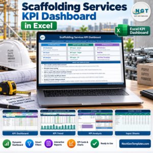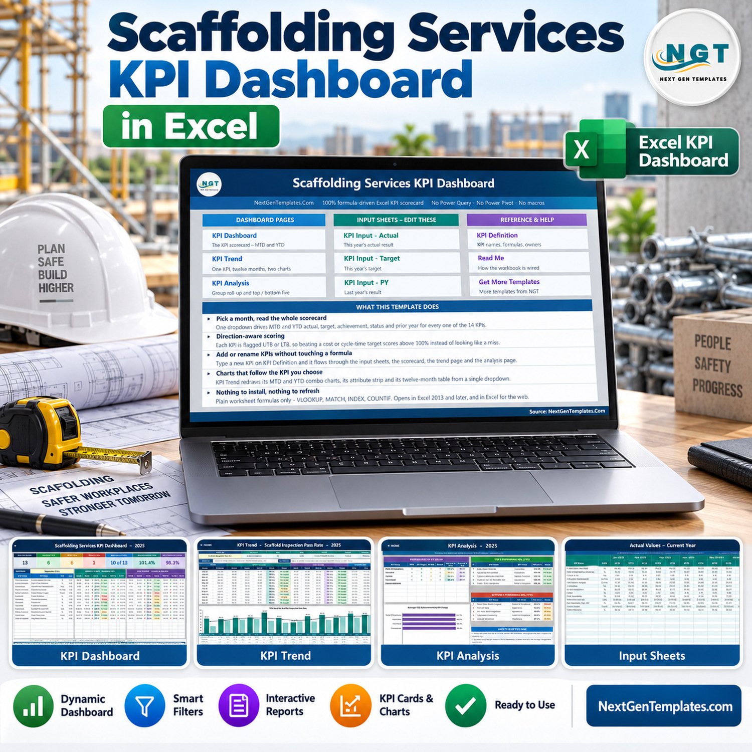
The Scaffolding Services KPI Dashboard in Excel is a month-by-month management scorecard for a scaffolding contractor: thirteen KPIs across Safety & Compliance, Operations, Workforce and Commercial, each shown month-to-date and year-to-date against target and against last year, with direction-aware traffic lights, a twelve-month trend page and a group roll-up page. It is a plain .xlsx workbook – every number is a worksheet formula, and you type your own figures over the sample data.
Read this first. This is a reporting template that sits on top of numbers you type in. It does not inspect, certify or prove the safety, stability or load capacity of any scaffold, tower, tie or component. It does not establish compliance with the Work at Height Regulations, NASC TG20 or SG4, OSHA 1926 subpart L, EN 12811, HSE requirements, any scaffold-inspection regime, or any licensing or CISRS-type competence scheme. It is not a scaffold design, a handover certificate, a statutory inspection record such as a seven-day or post-alteration inspection, a defect notice, or a tag of any legal standing, and it does not replace a competent person’s statutory duties. Every inspection, incident, utilisation and defect figure in the file is a buyer-entered number, and the figures it ships with are demo data – nothing in this workbook is evidence that a scaffold is safe to use or has been inspected.
Key Features of the Scaffolding Services KPI Dashboard in Excel
- 13 scaffolding KPIs across four groups – Safety & Compliance (6), Operations (4), Workforce (2) and Commercial (1)
- One month dropdown drives the whole scorecard, the seven summary cards and the entire KPI Analysis page
- MTD and YTD side by side – actual, target, achievement %, status, prior year and the year-on-year movement, for every KPI
- Direction-aware scoring – 10 Upper-The-Better and 3 Lower-The-Better KPIs, so cutting cycle time, rework or the RIDDOR rate below target scores above 100% instead of reading as a miss
- Arrows coloured by meaning, not by movement – the conditional-formatting rules test the KPI’s direction, so a falling incident rate shows a green down-arrow and a rising one shows red (verified in the file’s rules, not assumed)
- Traffic lights you control – On Target from 100%, At Risk 95-99%, Missed below 95%, with the thresholds sitting in plain formulas you can edit
- KPI Trend page – pick any KPI and get its attribute strip, formula, definition, a twelve-month table and MTD and YTD combo charts with a target line
- KPI Analysis page – achievement rolled up by KPI group with a bar chart, plus the top five and bottom five KPIs by year-to-date achievement
- Wired for 22 KPIs – 13 are filled in, the rest are live and empty, so adding a KPI needs no formula work
- No macros, no Power Query, no add-ins – a plain .xlsx for Excel 2013+, Excel for Mac, Microsoft 365 and Excel for the web
- Every cell unlocked – rename a KPI, change a target, re-group the list, restyle it in your own colours
The 13 KPIs This Template Ships With
The KPI list is the master sheet; every other page reads from it. These are the thirteen it arrives with, and each one is a heading you type your own measured numbers under – the sample figures are demo data.
| # | KPI | Group | Unit | Direction |
|---|---|---|---|---|
| 1 | Scaffold Inspection Pass Rate | Safety & Compliance | % | Higher is better |
| 2 | TG20 / SG4 Compliance | Safety & Compliance | % | Higher is better |
| 3 | Scaffold Erect & Dismantle Cycle Time | Operations | Days | Lower is better |
| 4 | RIDDOR Incident Rate | Safety & Compliance | Per 100K hours | Lower is better |
| 5 | Near-Miss Reports Logged | Safety & Compliance | Count | Higher is better |
| 6 | Labour Utilisation | Workforce | % | Higher is better |
| 7 | On-Time Job Completion | Operations | % | Higher is better |
| 8 | Rework Rate | Operations | % | Lower is better |
| 9 | Equipment Availability | Operations | % | Higher is better |
| 10 | Average Revenue per Job | Commercial | USD | Higher is better |
| 11 | First-Time Inspection Sign-Off | Safety & Compliance | % | Higher is better |
| 12 | Man-Hours Worked | Workforce | Count | Higher is better |
| 13 | Tag Register Accuracy | Safety & Compliance | % | Higher is better |
Every one of those rows carries its own formula text, plain-English definition, owner, priority and reporting frequency on the KPI Definition sheet, so the pack explains itself to whoever reads it. Note what KPI 5 is doing: Near-Miss Reports Logged is scored Upper-The-Better, because a rising count of near-miss reports is a leading indicator of a reporting culture, not of a worsening site. That is a judgement, and you can reverse it in one cell if your governance says otherwise.
What Is Inside the Scaffolding Services KPI Dashboard in Excel
Eleven sheets: Home, KPI Dashboard, KPI Trend, KPI Analysis, three input sheets (Actual, Target, Prior Year), KPI Definition, Support, Read Me and Get More Templates.
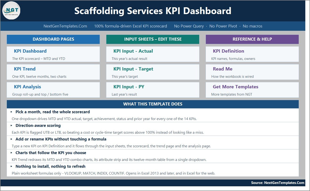
Home is a navigation page – three tiles for the dashboard pages, three for the input sheets you edit, three for reference and help, and a summary of what the workbook does.
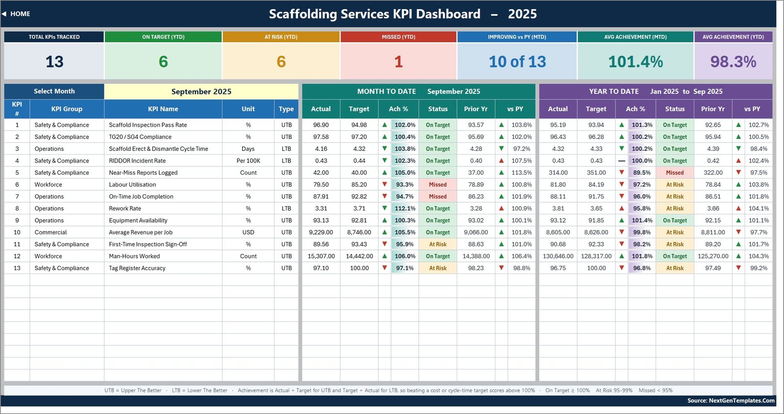
KPI Dashboard is the scorecard. Pick a month in the dropdown and seven cards recount themselves – KPIs tracked, On Target, At Risk, Missed, how many are improving against prior year, and average achievement for MTD and YTD. Below them, one row per KPI with the month-to-date block on the left and the year-to-date block on the right: actual, target, an arrow, achievement % with a data bar, status, prior year and the vs-PY ratio. In the shipped demo month (September 2025) it reads 13 tracked, 6 On Target, 6 At Risk, 1 Missed, 10 of 13 improving, 101.4% average MTD achievement and 98.3% YTD.
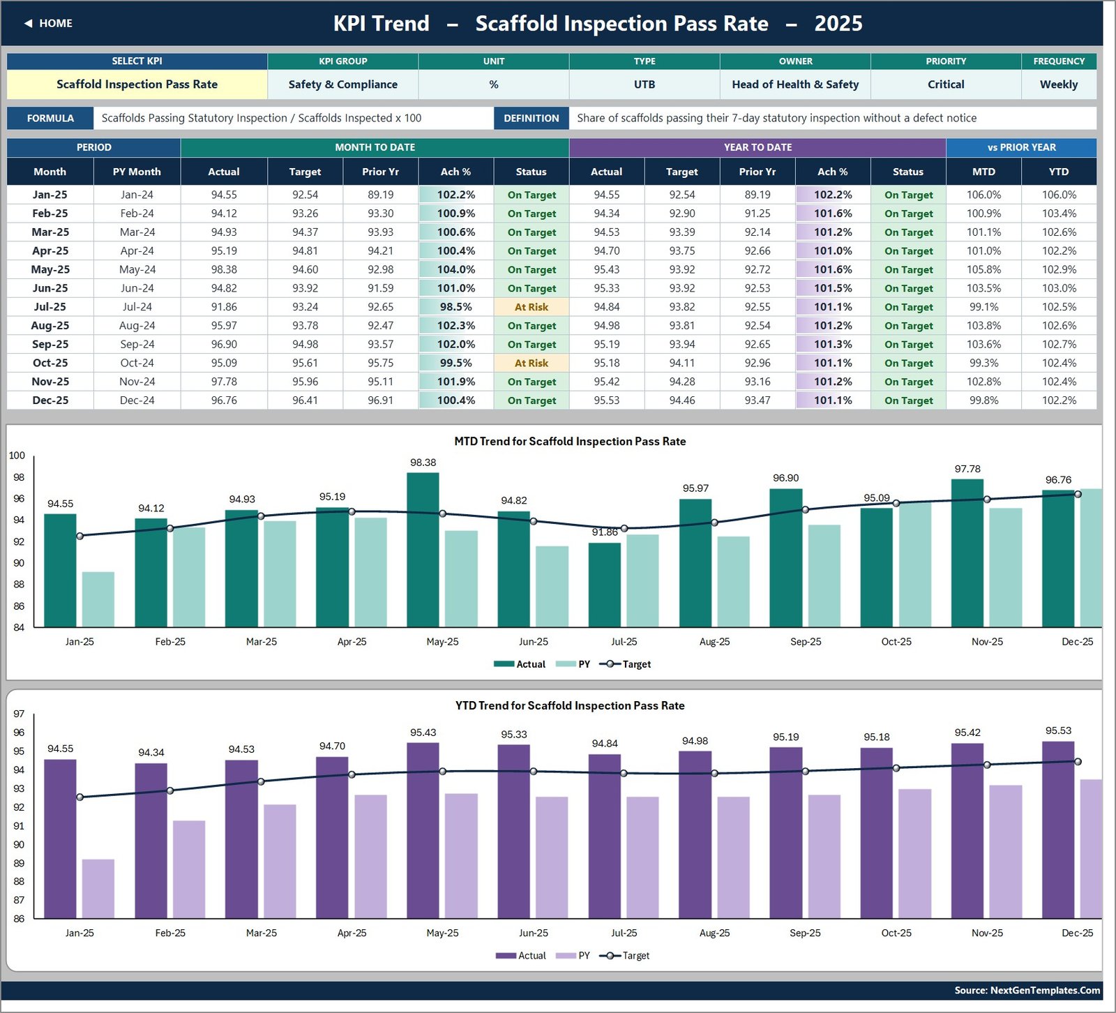
KPI Trend takes one KPI at a time. Choose it in the dropdown and the attribute strip, the formula and definition, the twelve-month table and both charts – MTD Trend for [KPI] and YTD Trend for [KPI] – all redraw. Each chart is actual and prior-year columns with a target line over the top.
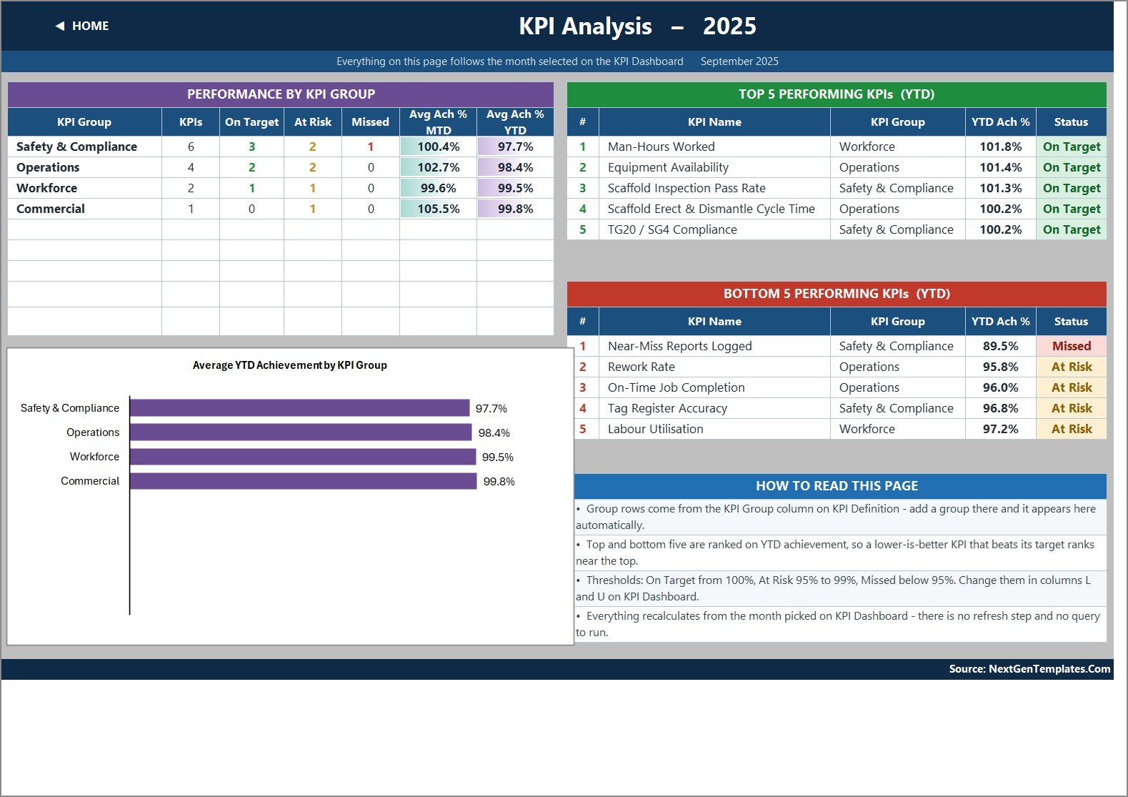
KPI Analysis rolls achievement up by KPI group – how many KPIs in each group, how many On Target, At Risk and Missed, and average achievement for MTD and YTD – with an Average YTD Achievement by KPI Group bar chart, and the top five and bottom five KPIs for the year to date beside it.
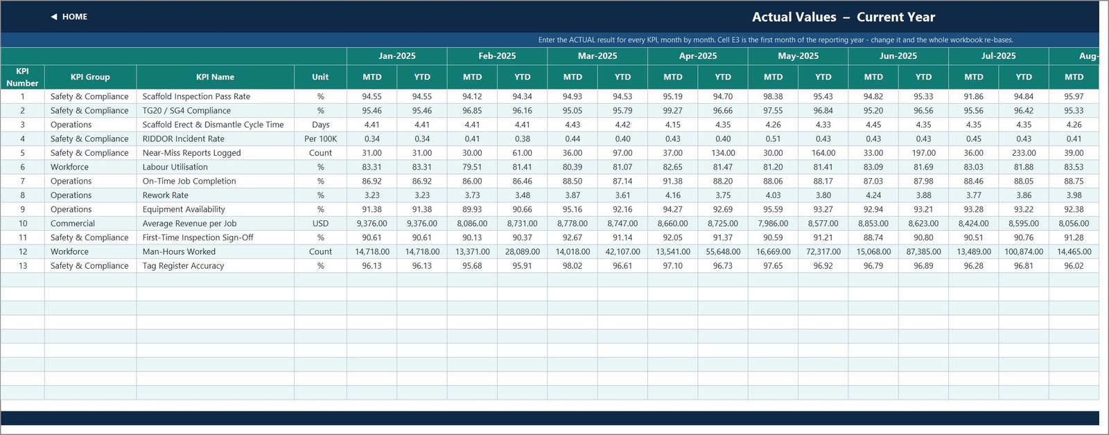
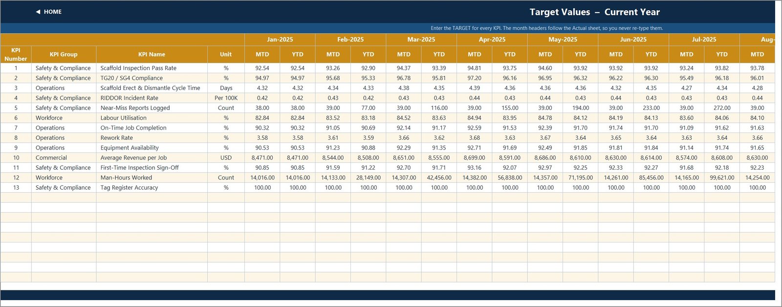
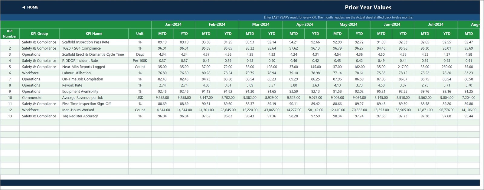
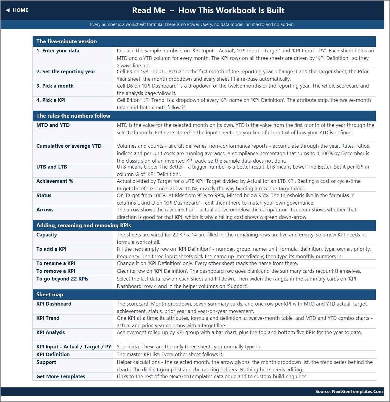
KPI Input – Actual, Target and Prior Year are the three sheets you type in. Each holds an MTD and a YTD column for all twelve months. Set the first month of your reporting year in one cell on the Actual sheet and the other two sheets, the month dropdown and every sheet title re-base themselves.
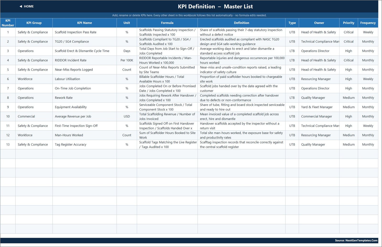
KPI Definition is the master list, Support holds the helper calculations behind the arrows and the charts, and Read Me explains how the whole thing is wired.
The product gallery shows nine pages. The workbook also has a tenth page image, a “Get More Templates” catalogue page, which is an NGT cross-promotion sheet rather than part of the product, so it has been left out of the gallery.
Scaffolding Services KPI Dashboard in Excel vs. Power BI vs. Paid Field-Service SaaS – Where This Fits
| What you need | This Excel KPI Dashboard | A Power BI build | Scaffold-management SaaS |
|---|---|---|---|
| Cost | One-off 12.99, lifetime access | One-off, similar price | Typically 50-300+ per user per month |
| What you need installed | Excel 2013+, Excel for Mac, or a browser | Power BI Desktop (Windows) | A browser and a subscription |
| Setup time | Open it and type your numbers over the demo data | Open the .pbix and point it at a data file | Implementation, data mapping, training |
| Filtering | Two dropdowns – month, and KPI on the trend page | Slicers on several fields | Whatever the vendor built |
| Where your data lives | Your own file, on your own machine | Your own .pbix and data file | The vendor’s cloud |
| Works offline | Yes | Yes | No |
| Captures inspections from a tagging app or handheld | No – you type MTD and YTD in | No – it reads a file you maintain | Yes, that is what you are paying for |
| Holds statutory inspection records or issues tags | No, and it never should be used as one | No | Sometimes – check the vendor’s claims carefully |
| Change a KPI, a target or a threshold | Type it – every cell is unlocked | Edit the model | Vendor roadmap or a paid customisation |
Put plainly: this is the right tool if your inspection log, timesheet summary, yard stock check and sales ledger already exist somewhere and you want a governed monthly scorecard on top of them without a subscription. It is the wrong tool if you want the numbers to arrive on their own, and it is emphatically the wrong tool if what you actually need is an inspection and tagging system of record.
Who This Template Is For – and Who It Is Not For
It is for: owners and contracts managers of scaffolding firms; operations directors tracking erect-and-dismantle cycle time and on-time handover; health and safety leads who already keep the statutory records elsewhere and want the headline rates in the monthly pack; yard and fleet managers watching serviceable tube, fitting and board stock; resourcing managers reporting labour utilisation and man-hours; commercial managers watching revenue per job; and anyone preparing a monthly management report for a board, a principal contractor, an insurer or a lender.
It is not for you if you need a system of record for scaffold inspections, handover certificates or tags; if you need scaffold design or load calculations; if you want the workbook to prove compliance to a regulator, an auditor or a client; or if you want the numbers captured automatically from a site app. None of those are what this file does, and treating a typed-in percentage as proof of anything on site would be dangerous.
How to Use the Scaffolding Services KPI Dashboard in Excel
- Set your year. One cell on the Actual input sheet is the first month of your reporting year. Change it and the Target sheet, the Prior Year sheet, the month dropdown and every title follow.
- Replace the demo data. Type your own MTD and YTD figures for each KPI on the three input sheets. Both numbers are typed on purpose – it lets you decide which KPIs accumulate (near-miss reports, man-hours) and which run as an average (rates and ratios).
- Adjust the KPI list. Rename, re-group or delete on KPI Definition; every other sheet follows. Nine wired rows are still free.
- Pick a month. The scorecard and the analysis page recalculate immediately – no refresh, no query.
- Work the trend page. Pick a KPI, read twelve months of MTD and YTD against target and prior year, and take the two charts straight into your pack.
- Re-check the thresholds. On Target 100%, At Risk 95-99%, Missed below 95% are the defaults; they live in visible formulas, so change them to match your own governance before you circulate anything.
If you want a refresher on the underlying functions, Microsoft’s own Excel support pages cover VLOOKUP, MATCH, INDEX and conditional formatting in detail – there is nothing exotic in this file.
Real-World Use Cases
- The monthly contracts review. One page, thirteen KPIs, MTD and YTD, colour-coded – instead of five spreadsheets and a verbal summary.
- Reporting to a principal contractor. Inspection pass rate, first-time sign-off and TG20 / SG4 audit results in a fixed format every month, with the prior-year column to show direction of travel.
- Yard and stock planning. Equipment availability against target, tracked monthly, to justify the next tube-and-fitting purchase.
- Crew productivity. Labour utilisation and man-hours worked side by side, so a utilisation dip can be read against the exposure base rather than in isolation.
- Commercial hygiene. Average revenue per job trended over twelve months, to see whether job mix is drifting.
- Safety culture reporting. Near-miss reports logged, deliberately scored so that more reporting scores better, alongside the RIDDOR rate.
Verified Build Notes – What We Checked and What Is Wrong
We recomputed every headline figure in this build from the three input sheets before listing it. All thirteen dashboard rows reconcile exactly – MTD and YTD actual, target and prior year match the input cells; achievement is actual divided by target for UTB and target divided by actual for LTB throughout; every status label follows the stated thresholds; the seven summary cards (13 / 6 / 6 / 1 / 10 of 13 / 101.4% / 98.3%) match a fresh count; all four KPI-group roll-ups match a fresh average; and the Top 5 and Bottom 5 tables match a fresh ranking. The conditional-formatting rules were read directly and the year-on-year arrow colouring is genuinely direction-aware.
Four cosmetic defects ship with this build, and we would rather you heard them from us:
- The Home page and the Read Me say “14 KPIs”. The file contains 13, and every formula-driven count in the workbook correctly says 13. Two lines of hard-typed copy are stale.
- One Read Me line carries an example from another industry. The “Cumulative or average YTD” note illustrates accumulating volumes with “aircraft deliveries, non-conformance reports”. The rule it describes is right; the example is a leftover.
- Two cells on the KPI Definition page are clipped. “Technical Compliance Manager” renders as “Technical Compliance Man”, and KPI 11’s formula text loses its trailing “100”. Widening the columns fixes both.
- The three input-sheet page images stop in August. The workbook itself holds all twelve months – the screenshots were captured at a width that cuts off after Jul and the start of Aug.
One formatting note rather than a defect: the two Count KPIs render with two decimals, so a count of 42 reads “42.00”. Change the number format on those rows if it bothers you. All amounts use standard thousands grouping, and the USD KPI is unformatted numerically rather than currency-symbolled, which is deliberate so you can apply your own currency.
Frequently Asked Questions
Does this certify our scaffolds or make our sites compliant? No. It is a reporting spreadsheet over numbers you type in. It does not inspect, certify or prove the safety, stability or load capacity of any scaffold, tower, tie or component; it does not establish compliance with the Work at Height Regulations, TG20 or SG4, OSHA 1926 subpart L, EN 12811, HSE requirements, any inspection regime or any CISRS-type competence scheme; it is not a design, a handover certificate, a statutory inspection record, a defect notice or a tag with any legal standing; and it does not replace a competent person’s statutory duties. A green cell in this workbook means a number you typed beat a target you set. Nothing more.
Are the numbers in the file real? No – they are demo data, generated so you can see every formula, chart and traffic light working the moment you open it. Overwrite them with your own before you show the file to anyone.
Does it contain macros? No. It is a plain .xlsx with worksheet formulas only – VLOOKUP, MATCH, INDEX, COUNTIF and friends. No VBA, no Power Query, no Power Pivot, no add-in, so there is no security prompt and nothing to enable.
Which Excel versions does it work in? Excel 2013 and later on Windows, Excel for Mac, Microsoft 365 and Excel for the web. The dropdowns, charts and conditional formatting behave the same way in all of them.
Does it pull data from our tagging app, timesheets or accounts? No. You type your monthly figures onto the three input sheets. Both the MTD and the YTD numbers are typed, which is deliberate – it lets you define year-to-date as a running total for near-miss reports and man-hours and a running average for rates, ratios and revenue per job – but it does mean two numbers per KPI per month.
Can I change the KPIs to ours? Yes. KPI Definition is the master list and every other sheet reads from it. Rename, re-group, delete or add – there are 22 wired rows and 13 are used, so nine more KPIs need no formula work at all. To go past 22, select the last data row on each sheet and fill down, then widen the ranges in the summary cards and the helper columns.
Why does a lower-is-better KPI score above 100%? Because achievement is inverted for LTB KPIs – target divided by actual. Beating a cycle-time, rework or incident-rate target therefore scores above 100%, exactly the way beating a revenue target does, and the arrows are coloured by whether the movement is good for that KPI rather than by whether the number went up.
What do I actually get? A .zip containing the .xlsx workbook and the Excel KPI Dashboard User Manual PDF. Instant download, lifetime access to the file you buy, every cell unlocked.
How is this different from the Scorecard edition? The Scorecard line is a lighter ten-KPI build with a different layout. This is the KPI Dashboard line – thirteen KPIs, MTD and YTD blocks side by side, a dedicated trend page and a group analysis page. A Scaffolding Services KPI Scorecard in Excel (product 95053) is being prepared and is not published yet, so it is named here rather than linked.
About the Author
Built by the NextGenTemplates team, who have been shipping Excel, Power BI and Google Sheets reporting templates for construction, field-service and industrial businesses for over a decade. We build these the way a working management accountant would: plain formulas you can trace, no hidden sheets, no locked cells, and an honest note about what a spreadsheet can and cannot do.
Explore Related Templates
- Scaffolding Services KPI Scorecard in Google Sheets – the same trade in the lighter scorecard format, built for Sheets.
- Scaffolding Services KPI Scorecard in Excel (product 95053) – the Excel edition of that scorecard, currently being prepared and not yet published.
- Fencing Contractor KPI Dashboard in Excel and Paving Contractor KPI Dashboard in Excel – the same KPI Dashboard line for neighbouring site trades.
- Concrete Contractor KPI Scorecard in Excel and Concrete Contractor KPI Dashboard in Power BI – useful if you bundle or sub out groundworks.
- Swimming Pool Service KPI Dashboard in Excel – the same engine applied to a field-service round, if you want to see the layout on a different trade.
- Browse the KPI Dashboard category and the MS Excel category for the rest of the shelf.
Download it now – instant delivery, the .xlsx plus the Excel KPI Dashboard User Manual PDF, lifetime access, and every cell unlocked so the Scaffolding Services KPI Dashboard in Excel becomes yours the moment you open it.